Hey everyone, Salik Waquas here from Color Culture. As a colorist, I spend most of my life staring at scopes and tweaking curves, trying to manipulate how an audience feels without them realizing it. But sometimes, you watch a film where the technical craft is so dialed in that it stops being about “grading” or “lighting” and becomes pure emotion. Life Is Beautiful (La vita è bella) is exactly that kind of film.
It’s easy to get distracted by Roberto Benigni’s performance, but visually, this movie is pulling off one of the hardest tricks in cinema: shifting from a vibrant, slapstick romantic comedy to a desaturated Holocaust tragedy without the transition feeling jarring. It’s a study in visual duality. Let’s break down the technical choices that make it work.
1. Introduction
From the first frame, you aren’t just watching a story; you are seeing the world through Guido Orefice’s eyes. As filmmakers, we often talk about “POV,” but here the visual language actually morphs to match the protagonist’s psychological state.
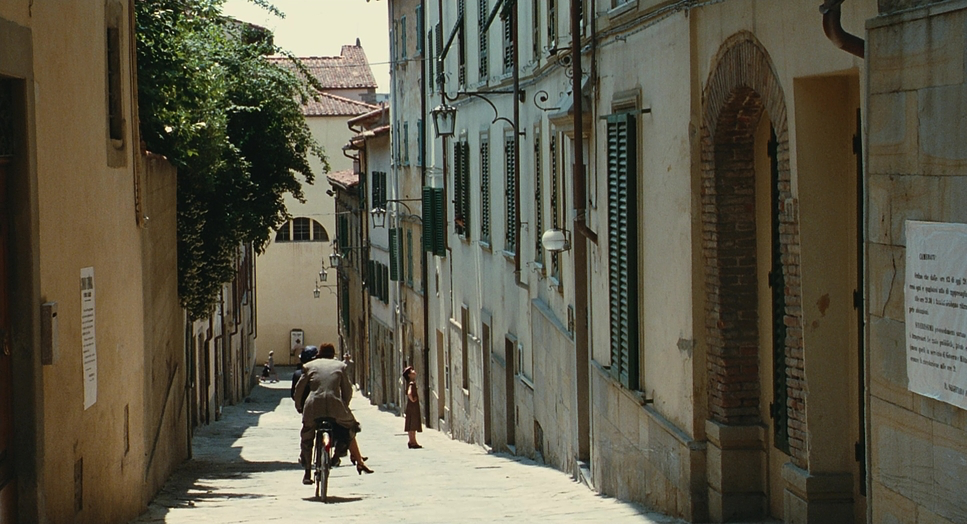
The film starts in a high-key, sun-drenched Italy—a world where the physics of reality seem suspended for the sake of a joke. But then, the gear shifts. The saturation drops, the frame tightens, and the camera stops dancing. What fascinates me is that the film finds beauty in the “ugly” half not by ignoring the horror, but by framing it with a specific dignity. It preserves Guido’s fable. The cinematography isn’t just documenting the events; it’s protecting the son, Giosuè, from the truth just as much as Guido is.
2. About the Cinematographer: Tonino Delli Colli
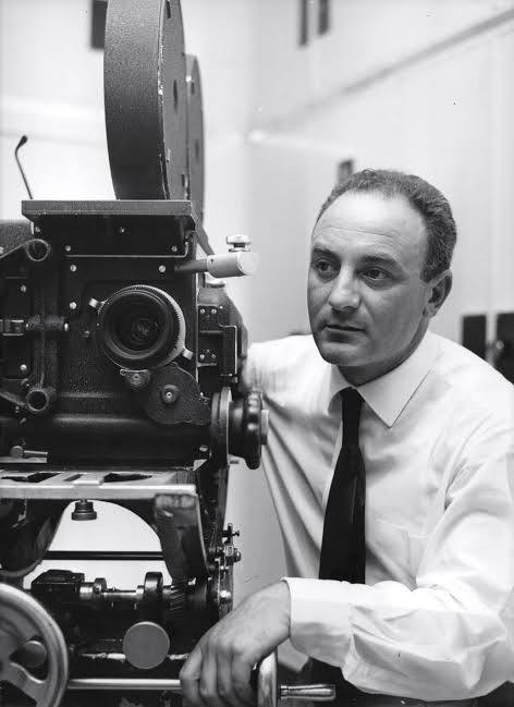
To understand the look of this film, you have to look at the DP, Tonino Delli Colli. We are talking about a heavyweight of Italian cinema—this is the man who shot Sergio Leone’s The Good, the Bad and the Ugly and Once Upon a Time in America.
Delli Colli was a master of harsh light and grit, but also of sweeping romanticism. By the time he shot Life Is Beautiful in 1997, he was in his 70s and brought an incredible restraint to the project. He didn’t try to “stylize” the concentration camp with overly dramatic, moody lighting like a modern noir. Instead, he shot it with a stark, flat realism that made it feel terrifyingly mundane. His experience allowed him to step back and let the light serve the story, creating a look that feels classic, almost like a fable that has faded over time.
3. Inspiration for the Cinematography
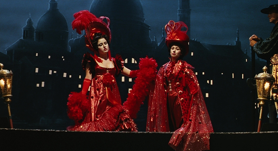
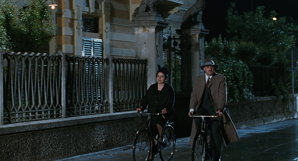
The film is visually split into two distinct chapters. The first half draws heavily on the “White Telephone” films of the Italian fascist era and the glossy romanticism of 1950s Hollywood musicals. It’s an idealized, postcard version of Tuscany. The inspiration here is clearly “The Fable”—bright, colorful, and slightly artificial.
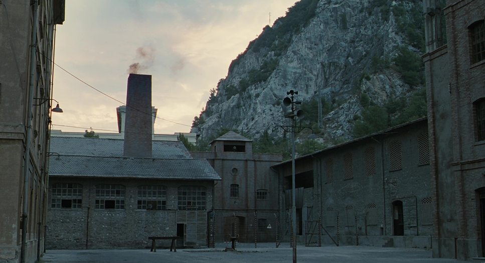
The second half pivots to a reference palette that feels more like the neorealism of Vittorio De Sica, but stripped of the romance. The inspiration here isn’t just “sadness”; it’s industrialization. The camp is shot with repetitive geometry and cold tones. It avoids the handheld “shaky cam” style often used for war; instead, it uses a steady, observational style that feels like a prison. The contrast between these two inspirations—the magical fable and the industrial nightmare—is what creates the film’s tension.
4. Camera Movements
In the first act, the camera has a personality. It’s fluid, tracking Guido on his bicycle, whipping around corners, and utilizing distinct dolly moves that emphasize depth and energy. The movement matches Guido’s chaotic, kinetic energy. There is a “musicality” to the pans and tilts—they hit the beat of the comedy.
Once they board the train, the camera locks down. The fluid dolly shots are replaced by static tripod shots or slow, linear tracking shots that only move along the axis of the camp’s fences. We lose the verticality and freedom of the camera. Even when there is movement, it feels heavy, motivated by the guards or the machinery of the camp, rather than Guido’s whimsy. The only exception is when Guido is “performing” the game for his son; in those moments, the camera briefly regains a touch of its old life, subtly reinforcing that the game is keeping them alive.
5. Compositions
Compositionally, Delli Colli uses space to dictate power dynamics. In Arezzo, the frames are wide and open. There is significant “look space” and headroom, suggesting possibility and freedom. We see town squares, high ceilings, and depth.
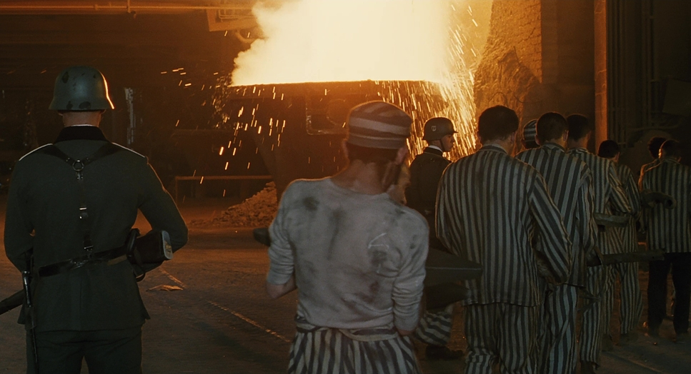
In the camp, the composition becomes oppressive. The framing relies heavily on “frames within frames”—shooting through windows, between bunk beds, and through barbed wire. The characters are often pushed into the bottom corners of the frame or dwarfed by the massive, gray walls of the camp. It’s a textbook use of negative space to create isolation. By compressing the foreground and background elements, the lens makes the world feel physically smaller, mirroring the characters’ entrapment.
6. Lighting Style
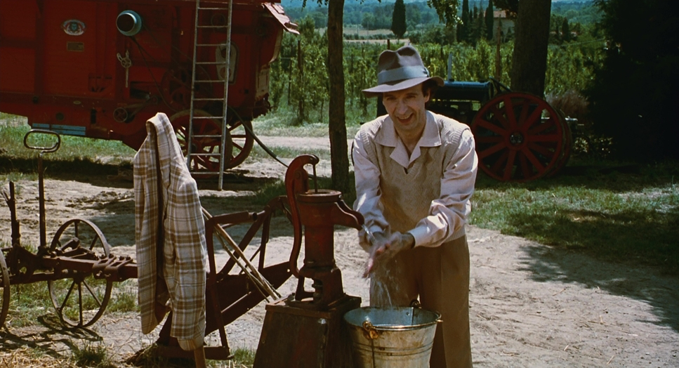
Lighting is where the storytelling really happens. The first half is textbook “High Key” lighting. The fill ratios are high, meaning the shadows are bright and open. It creates a soft, flattering modeling on the faces, typical of romantic comedies. The light sources feel motivated by a warm, perpetually setting sun.
In the camp, the lighting ratio changes drastically. We switch to “Low Key” lighting, but not in a cool, sexy way. It’s drab. The interiors of the barracks are lit with motivated practicals (the hanging bulbs), creating deep, hard shadows that obscure the eyes. Delli Colli let the blacks crush a bit more here, but he kept the “roll-off” on the highlights harsh. The light doesn’t wrap around the faces anymore; it hits them flatly, emphasizing the gauntness and fatigue of the actors. It’s a brutal, un-romanticized light.
7. Lensing and Blocking
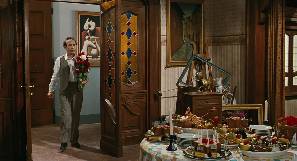
For the first half, it feels like we are living in the 28mm to 40mm range—standard focal lengths that give a sense of presence and environment. The blocking is deep; characters move from the deep background to the close foreground, using the full volume of the set.
In the second half, the focal lengths seem to increase (telephoto), which compresses the background. This optical compression makes the crowds of prisoners look like a single, crushed mass, stripping away their individuality. The blocking becomes lateral—movement happens side-to-side (like the line-ups) rather than deep into the frame. This 2D “flatness” subconsciously tells the audience that there is nowhere to go.
8. Color Grading
LIFE IS BEAUTIFUL (1997)
Technical Specifications
| Genre | Adventure, Comedy, Disaster, Drama, Family, Fatherhood, History, Marriage, Military, Motherhood, Prison, Romance, Survival, World War II, Political, Epic, War, Science-Fiction |
| Director | Roberto Benigni |
| Cinematographer | Tonino Delli Colli |
| Production Designer | Danilo Donati |
| Costume Designer | Danilo Donati |
| Editor | Simona Paggi |
| Colorist | Pasquale Cuzzupoli |
| Time Period | 1940s |
| Color | Red, Blue |
| Aspect Ratio | 1.85 – Spherical |
| Format | Film – 35mm |
| Lighting | Hard light, High contrast, Top light |
| Lighting Type | Artificial light |
| Story Location | Europe > Italy |
| Filming Location | Italy > Tuscany |
| Camera | Panavision Cameras |
| Lens | Panavision Lenses |
This is my favorite part to analyze. Since this was 1997, this was a photochemical finish, likely printed on Kodak vision stock, not a digital grade. But the principles apply to what we do in DaVinci Resolve today.
The “Arezzo” look is defined by Color Separation. You have warm skin tones (pushing into orange/red) sitting against cool blues in the sky and lush greens in the foliage. It’s a broad, rich palette with high saturation in the mid-tones.
The “Camp” look creates a “Bleach Bypass” effect. It looks like they pulled the saturation out of the mid-tones significantly. The skin tones lose that healthy red blood underneath; they go pale and yellow/magenta. The shadows aren’t neutral black; they are tinted with a sickly cyan-green, which makes the whole environment feel industrial and diseased. As a colorist, if I were recreating this, I’d be pulling down my Saturation vs. Lum curve, desaturating the shadows completely, and tinting the Lift toward teal while keeping the Gamma muddy.
- Also Read: TERMINATOR 2: JUDGMENT DAY (1991) – CINEMATOGRAPHY ANALYSIS
- Also Read: THE GREEN MILE – CINEMATOGRAPHY ANALYSIS & STILLS
Browse Our Cinematography Analysis Glossary
Explore directors, cinematographers, cameras, lenses, lighting styles, genres, and the visual techniques that shape iconic films.
Explore Glossary →