Hey everyone, Salik Waquas here from Color Culture. There are certain films that stick with you, not just because the story is good, but because the visual language is so distinct it burns into your brain. For me, Luc Besson’s 1994 classic Léon: The Professional is top of that list. It’s a weird mix: a gritty urban thriller that somehow works as a tender, unconventional love story.
As a colorist, I spend my days staring at monitors, obsessing over how light and hue manipulate emotion. But before I was grading footage, I was just a filmmaker trying to figure out how a vision actually translates to the screen. Léon is the perfect case study for that. It demands a closer look—not just at the plot, but at the mechanics of why it looks so good. So, let’s break down the cinematography that makes Léon an enduring visual benchmark.
About the Cinematographer: Thierry Arbogast
The man behind the lens was Thierry Arbogast, a regular collaborator with Luc Besson. Their partnership is legendary because they consistently managed to push boundaries together. Before Léon, they had already established a specific aesthetic with La Femme Nikita and Atlantis, proving Arbogast knew how to blend high-octane action with serious atmosphere.
Arbogast isn’t just a technician; he understands how to use light to make a scene feel tense without overdoing it. His style mirrors Besson’s narrative: energetic but controlled. What I love about his work in Léon is how he grounds the ridiculous elements (like a hitman who drinks milk and talks to a plant) in a stark reality. He crafts images that are beautiful and brutal at the same time—a balance that is incredibly hard to pull off.
Inspiration for the Cinematography
Visually, Léon feels like a mashup of influences that became something unique. The primary inspiration comes from the grimy world of American neo-noir thrillers, specifically the ones set in New York. Think Scorsese or Lumet—where the city feels oppressive, dirty, and dangerous. You can feel that texture in every exterior shot.
But Besson and Arbogast mixed that American grit with the French Cinéma du look movement. This was a style Besson was famous for, emphasizing slick visuals and stylized production design. That’s why the movie feels almost like a graphic novel—bold compositions and a heightened reality.
The contrast is the whole point: the harsh, dangerous city versus the surprisingly warm intimacy of Léon’s apartment. The cinematography leans into this duality, creating a visual language that feels grounded but also slightly dreamlike.
Camera Movements
If you watch closely, the camera in Léon is rarely just “there.” It’s an active participant. It moves with purpose.
One of the standout techniques is the fluidity of the tracking shots. We see this when Léon is moving through the streets or when Mathilda is exploring. It has a voyeuristic vibe, like we are stalking them. The opening shot that introduces Léon is a perfect example—the camera follows him with this predatory grace, ending on that iconic close-up of the milk. It immediately tells you everything you need to know about his presence.
On the flip side, for the high-tension moments, Arbogast switches to handheld camera work. This isn’t the shaky-cam mess we see in a lot of modern action movies; it’s deliberate. During the standoffs with Stansfield, the slight instability makes you feel the panic and the unpredictability of the violence.
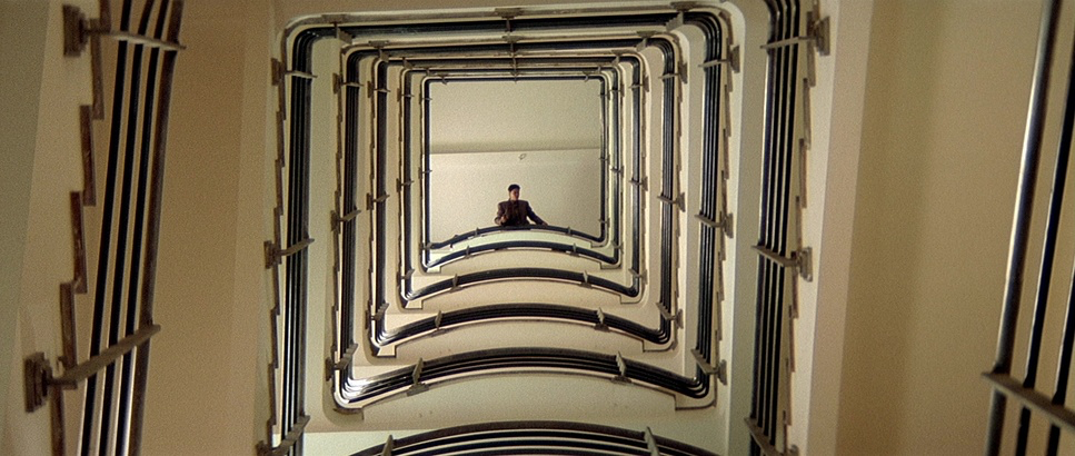
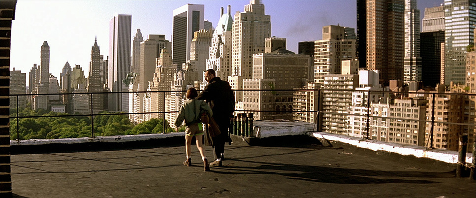
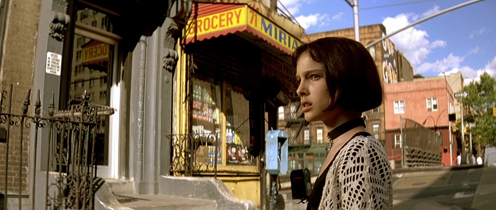
Crane shots are used sparingly to show the scale of the city, emphasizing how small and isolated the characters are. And the POV shots—often from Mathilda’s perspective—are masterfully done, forcing us to see this dangerous world through her eyes.
Compositions
The framing in Léon: The Professional is excellent. Arbogast and Besson use space and framing to tell us about power dynamics without needing dialogue.
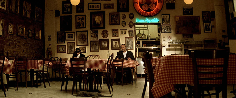
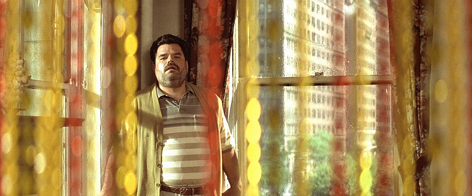
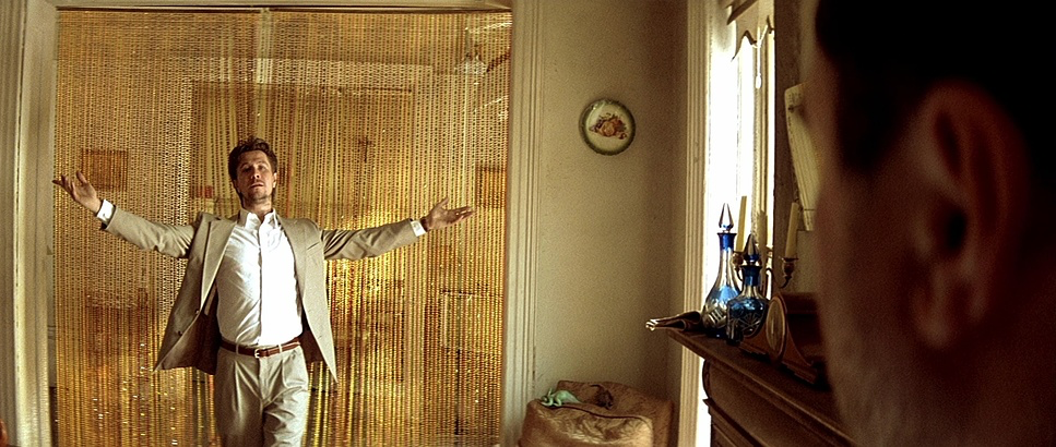
A huge part of this is architectural framing. Characters are constantly shot through doorways, windows, or trapped in narrow hallways. It’s not just for looks; it symbolizes entrapment. Léon is frequently framed in a way that highlights his isolation—he’s a prisoner in his own life, always hiding in the shadows or peeking around corners.
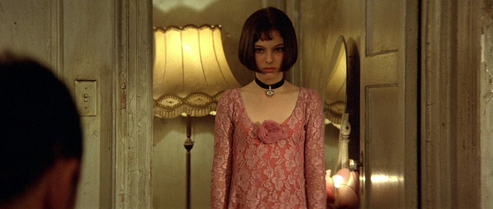
The close-ups are heavy hitters here. Since Léon doesn’t talk much, the camera has to do the work. Arbogast dwells on their eyes—Mathilda’s defiance, Léon’s intensity, or the absolute madness in Stan’s face. These tight shots force an intimacy that makes you connect with them instantly.
When Léon and Mathilda are in the frame together, the two-shots evolve with the story. Early on, they are physically distant or separated by height. As they get closer, the frames get tighter and more symmetrical.
Lighting Style
For a colorist, this is where the movie gets really interesting. Arbogast’s lighting oscillates between harsh realism and stylized drama.
The dominant look is high contrast, especially in the night scenes. We’re talking deep, rich shadows and bright highlights. It’s a nod to noir, but it also serves the characters. Léon is often kept in the shadows, fitting for his job, while Stan is lit with harsh, raking light that makes him look unhinged and theatrical.
Motivated lighting is everywhere. Arbogast uses practical sources—streetlights, neon signs, table lamps—to light the scenes. The cool, almost alien green/blue glow of the streetlights outside contrasts perfectly with the warm practical lamps inside Léon’s apartment.
That color temperature contrast is intentional. The outside world is cool (blue/green), feeling cold and detached. The inside, or moments of hope, are punctuated by warm, yellow/orange light. It creates visual tension and separates the “safe” spaces from the dangerous ones.
Lensing and Blocking
The choice of lenses and how the actors move (blocking) does a lot of heavy lifting for the story.
regarding lensing, Arbogast mixes it up. Wide-angle lenses make New York feel massive and overwhelming, which mirrors how vulnerable Mathilda feels. They also use wides close up on faces (like Stan’s) to distort features slightly and make him look even crazier. Conversely, longer lenses are used for those intimate moments, compressing the background and isolating the characters in a shallow depth of field. It creates a separation from the world around them.
Blocking is just as smart. Léon moves like a cat—cautious, hugging the walls. Mathilda is more direct but small. In the apartment scenes, watch how they move around the plant or share the space. It shows their relationship changing from protector/victim to partners. The environment dictates the movement—cramped hallways and stairwells force the action to feel claustrophobic.
Color Grading
Alright, putting my colorist hat on. Léon: The Professional obviously predates the modern Digital Intermediate (DI) workflow, meaning the “grade” was done photochemically (lab timing). But the intent is what matters.
The palette is defined by a desaturated, cool aesthetic. Blues, greens, and muted grays run the show, especially in exteriors. It sells the idea of a cold, lonely world. If I were grading this today, I’d be pulling saturation out of the mids and pushing teal into the shadows to replicate that vibe.
But then you have these deliberate pops of warmth. Mathilda’s yellow dress, the warm lamp in the apartment, the blood. These colors cut through the desaturation. The yellow dress specifically acts as a beacon of life in a drab city.
Technically, the skin tones are interesting—they often have a slightly cool bias but never look dead. They feel human. And the film grain adds a texture you just can’t perfectly replicate digitally. It grounds the movie in a raw reality.
Technical Aspects
| Genre | Action, Crime, Drama, Thriller, Vigilante, Detective |
| Director | Luc Besson |
| Cinematographer | Thierry Arbogast |
| Production Designer | Dan Weil |
| Costume Designer | Magali Guidasci |
| Editor | Sylvie Landra |
| Colorist | Bruno Patin |
| Time Period | 1990s |
| Color | Warm |
| Aspect Ratio | 2.35 – Anamorphic |
| Format | Film – 35mm |
| Lighting | Hard light, Backlight |
| Lighting Type | Daylight, Sunny |
| Story Location | New York > New York City |
| Filming Location | New York > New York City |
| Camera | Arriflex 35 BL4, Arriflex 35 III |
| Lens | Technovision 2x, Zeiss Super Speed, Angenieux HR 17-102mm T2.9 |
| Film Stock / Resolution | 5293/7293 EXR 200T, 5296/7296 EXR 500T |
A quick look at the tech specs helps explain the “look.”
Léon: The Professional was shot on 35mm film stock (Kodak). Given the era and the look, they likely used high-speed stocks like Kodak Vision 5296 or 5298 for the interiors to get that exposure in low light, which contributes to the grain structure. Exteriors were probably a slower, cleaner stock like 5248.
The aspect ratio is 2.39:1, shot with anamorphic lenses. That’s essential. It gives the film that cinematic width, the oval bokeh in the out-of-focus lights, and those horizontal flares. It makes the city feel sprawling.
And we can’t ignore production design. Jean-Jacques Caziot built environments that held light perfectly—the grime on the walls, the textures in the apartment. Cinematography doesn’t work if the set looks flat, and these sets were rich with texture.
- Also read: THE PRESTIGE (2006) – CINEMATOGRAPHY ANALYSIS
- Also read: LIFE IS BEAUTIFUL (1997) – CINEMATOGRAPHY ANALYSIS
Browse Our Cinematography Analysis Glossary
Explore directors, cinematographers, cameras, lenses, lighting styles, genres, and the visual techniques that shape iconic films.
Explore Glossary →