When Mathieu Kassovitz dropped La Haine in 1995, it landed like a bomb. It wasn’t just a movie; it was a snapshot of a fracture in French society that people were trying to ignore. Shot in stark black and white, it follows 24 hours in the lives of three friends Vinz, Hubert, and Saïd stuck in the housing projects (the banlieues) outside Paris the day after a massive riot.
From the opening montage which mixes real news footage of riots with Bob Marley’s “Burnin’ and Lootin'” you know exactly where you are. There’s no romanticism here. By stripping away the color, Kassovitz removed the distractions. This isn’t just a story about French suburbs; it’s a universal story about tension, boredom, and the ticking clock of violence. It resonates just as hard today in Gurgaon or New York as it did in 90s Paris.
About the Cinematographer

We need to give credit where it’s actually due. While Kassovitz had the raw vision, the look of La Haine belongs to cinematographer Pierre Aïm. (Note: Mathieu Vadepied was the Art Director, not the DP). Aïm was the one who had to translate Kassovitz’s restless, aggressive energy into a coherent visual language.
Kassovitz comes from an acting background, and as Jodie Foster once noted, he understands the “rhythm” of a scene. But a director’s rhythm needs a DP’s technical execution. Pierre Aïm’s challenge was massive: he had to capture the gritty realism of the projects without making it look like a cheap news report. He had to make it look cinematic. The result is a visual style that feels elevated but never fake. It mirrors the internal states of the characters Vinz’s rage, Hubert’s resignation, and Saïd’s confusion using light and movement rather than just dialogue.
Inspiration Behind the Cinematography
Kassovitz wasn’t trying to make a traditional French “New Wave” film. He was looking West. He was open about his influences: Steven Spielberg, Spike Lee, and Martin Scorsese. You can see the DNA of Do the Right Thing (1989) all over this movie the heat, the sweat, the racial tension simmering on a street corner.
And obviously, you can’t miss the Taxi Driver homage when Vinz talks to the mirror. But visually, the film pulls from the “American” style of dynamic camera work. It’s not a passive observer; the camera is aggressive. Kassovitz and Aïm took these Hollywood techniques typically reserved for big blockbusters and applied them to the bleak concrete reality of the French suburbs.
The choice to present it in black and white was partly aesthetic, but also political. Kassovitz felt that color made the poverty look “ugly” or depressing in the wrong way. Black and white abstracted it. It gave the crumbling architecture a sense of texture and dignity. It turned a current event into something that felt like a timeless tragedy, akin to Raging Bull.
Camera Movements

The camera in La Haine rarely sits still. It has a nervous energy, just like Vinz. The film oscillates between static, observant shots and sudden, kinetic bursts of movement.
The most famous technique used here is the “dolly zoom” (or the Vertigo effect). We see it when the trio is in Paris, looking over the city. A standard zoom magnifies the image, but a dolly zoom tracking back while zooming in warps the perspective. It makes the background feel like it’s crushing the characters. It visually explains their alienation: they are standing right in front of Paris, but the city feels like an impenetrable fortress closing in on them.
Beyond the tricks, there are those rapid dolly shots that rush toward characters. These aren’t just for style; they act as a visual alarm bell. They signal an internal shift, a realization, or a threat. It creates a propulsive rhythm—you feel physically pulled into their bad decisions.
Compositional Choices
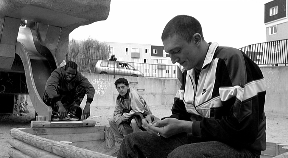
The framing in La Haine tells a story of “us vs. them” through focal lengths. When the boys are in their own neighborhood (the banlieue), Aïm mostly uses wide lenses. This keeps everything in focus the characters are visually attached to their environment. You see them and the graffiti walls as one unit. They fit there, even if they hate it.
But when they take the train into central Paris, the visual language flips. Aïm switches to long lenses. Long lenses compress the background, making distant objects look closer but flatter. Paris is shot to look crowded, shallow, and confusing. The shallow depth of field isolates the boys from the background. They are no longer part of the environment; they are foreign bodies floating in a hostile city. It’s a brilliant way to make the “City of Lights” look cold and uninviting without saying a word.
Lighting Style

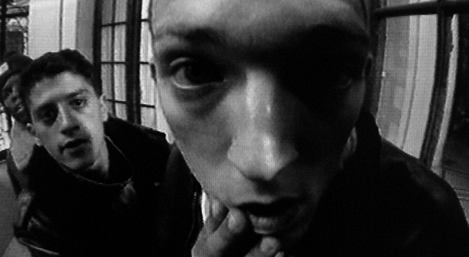
In black and white, you can’t use color contrast to separate a character from the wall. You only have luminance light and dark. La Haine relies on hard, high-contrast lighting.
It looks like “available light” streetlights, tube lights in hallways, harsh daylight but it’s carefully sculpted. This is hard lighting. There are no soft beauty dishes here. The light hits the actors’ faces aggressively, highlighting the sweat, the stubble, and the exhaustion.
The shadows are deep and inky. In color grading terms, the “toe” of the curve is crushed. The darkness often swallows the characters, symbolizing their lack of a future. But the highlights are sharp and piercing. It creates a metallic, cold texture that makes the environment feel physical like you could reach out and scrape your hand on the concrete.
Lensing and Blocking
The blocking where the actors stand relative to the camera is just as important as the lighting. There’s a scene where Hubert and Vinz are cornered by the police. The camera starts close, then swings around to reveal they are physically surrounded.
This is where the 35mm format shines. The spatial relationship between the lens and the actors creates a sense of claustrophobia. In the wide shots, the characters are often small, dwarfed by the brutalist architecture of the housing projects. They look like ants in a concrete maze. In the close-ups, the lens is almost uncomfortably tight, forcing us to confront their aggression. It’s a constant push-and-pull between being trapped by the city and being trapped inside their own heads.
Color Grading Approach
Now, this is my wheelhouse. A lot of people think La Haine was shot on black and white film. It wasn’t. Pierre Aïm actually shot it on color negative (Kodak 5293 and 5298) and they printed it to black and white later.
Why does that matter? Because it changes everything about the “grade.”
If you shoot on B&W stock, your contrast is baked in on set. If a guy wears a red shirt and stands against a blue wall of the same brightness, they will look identical in gray. But because Aïm shot on color, he retained the color channels. This allowed them to manipulate the channels before desaturating. They could darken the blue channel to make the sky look ominous, or brighten the red channel to change skin tones.
If I were grading La Haine today, I wouldn’t just hit “desaturate.” I’d use a channel mixer to create separation. I’d be looking at “spectral sensitivity” deciding how bright “red” should be in a grayscale world. The look of La Haine isn’t just gray; it’s a specific, punchy, high-contrast matrix that separates the actors from the background using color information that the audience never actually sees. That’s the secret sauce.
Technical Aspects & Tools
La Haine: Technical Specs
| Genre | Drama |
| Director | Mathieu Kassovitz |
| Cinematographer | Pierre A |
| Costume Designer | Virginie Montel |
| Editor | Mathieu Kassovitz, Scott Stevenson |
| Time Period | 1990s |
| Color | Desaturated, Black and White |
| Aspect Ratio | 1.85 – Spherical |
| Format | Film – 35mm |
| Lighting | Hard light, High contrast, Edge light |
| Lighting Type | Artificial light |
| Story Location | … France > Banlieue |
| Filming Location | … France > Paris |
| Camera | Arriflex |
The film was made on a budget of roughly $3 million tiny for a movie that looks this good. The decision to shoot on 35mm color stock was a risk, but the broadcaster, Canal+, demanded a color master for TV (ironically, they wanted the option to air it in color, though Kassovitz fought for the B&W release).
This technical constraint became an artistic weapon. The grain structure of the high-speed Kodak stock gives the film a gritty, tactile texture that digital cameras still struggle to replicate. It feels alive.
We also have to mention the sound design and the “time stamps.” The film cuts to a black screen with a ticking clock sound effect, showing the time advancing. It’s a simple editorial trick, but it acts like a metronome. It tells the audience: this is not going to end well. It turns a “day in the life” movie into a thriller.
- Also read: WILD TALES (2014) – CINEMATOGRAPHY ANALYSIS
- Also read: THE BRIDGE ON THE RIVER KWAI (1957) – CINEMATOGRAPHY ANALYSIS
Browse Our Cinematography Analysis Glossary
Explore directors, cinematographers, cameras, lenses, lighting styles, genres, and the visual techniques that shape iconic films.
Explore Glossary →