I spend a lot of time deconstructing the visual language of cinema. It’s rarely about just making “pretty pictures”; it’s about how specific technical choices from stock selection to printer lights serve the narrative. Curtis Hanson’s L.A. Confidential (1997) is a film I consistently return to. It’s a study in neo-noir that feels reverent to its lineage without getting bogged down in nostalgia. It resonates because of its discipline; the cinematography works with precise, often invisible, intention.
About the Cinematographer
Dante Spinotti ASC, AIC, is a heavyweight in our industry, and his work here highlights his adaptability. Just two years prior, Spinotti shot Michael Mann’s Heat a film defined by its cool, monochromatic blues and expansive, modern urban landscapes. With L.A. Confidential, he had to pivot entirely, crafting a visual identity for the city’s 1950s underbelly that felt equally distinct but visually opposite.
What stands out about Spinotti’s approach here is his restraint. He avoided the trap of over-stylizing the period. He wasn’t trying to reinvent the wheel, but rather to distill the essence of classic noir into something sharp enough for a modern audience. He understands that the most powerful images often aren’t the ones screaming for attention, but the ones that invite you to lean in and observe the details.
Inspiration Behind the Cinematography
Director Curtis Hanson had a clear mandate: tell a “grand scale story about Los Angeles.” This wasn’t just a crime thriller; it was a character study drenched in the moral ambiguity of the era. To communicate this, Hanson famously created a “pictorial pitch” for the studio a collection of period postcards and black-and-white photographs of 1950s L.A., ranging from idyllic orange groves to sordid crime scenes.
This research dictated the visual strategy. It wasn’t about a fantasy version of the 50s; it was about recreating a brutal reality. Hanson directed the cast, particularly Russell Crowe, to watch classic noirs like Stanley Kubrick’s The Killing. For the camera department, the challenge was balancing the tradition of old Hollywood with a “fresh and modern” neo-noir energy. They needed to capture the darkness of the genre without devolving into parody a “stripped down” minimalism that felt gritty and real rather than theatrical.
Camera Movements
Analyzing the camera work, the discipline is obvious. L.A. Confidential rarely relies on unmotivated movement. You won’t see aggressive handheld work or dizzying crane shots just for the sake of spectacle. The film operates within a controlled framework.
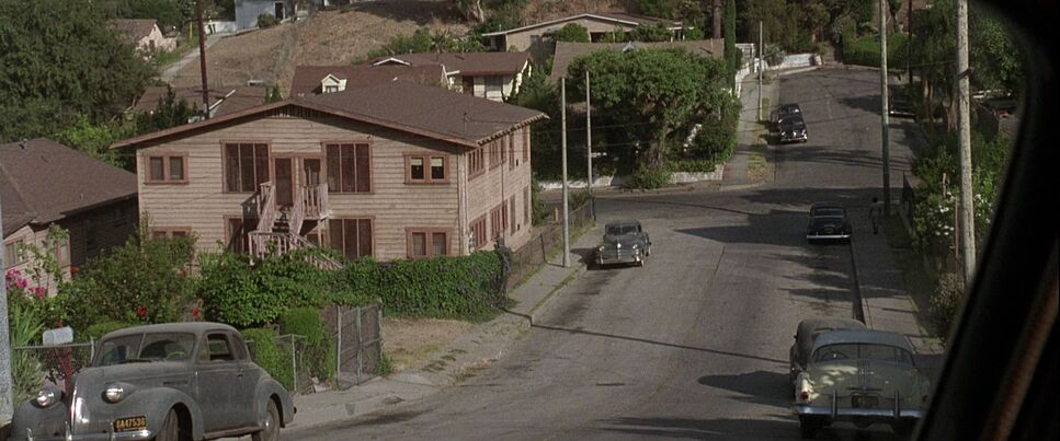
Spinotti utilizes precise, slow dollies that push into a character’s space, implying a mental shift or a realization. When characters like Exley or White confront a new piece of evidence, that subtle push-in does more work than a line of dialogue. Conversely, wider, more stable movements establish the layout of the city, juxtaposing the sunny facade with the corruption underneath.
Given that the production shot in over 80 locations in just 60 days, the camera work had to be efficient. The camera acts as a watchful, impartial observer. This stillness, punctuated only by necessary movement, adds to the film’s grounded texture. It’s not trying to impress you; it’s presenting the evidence.
Compositional Choices
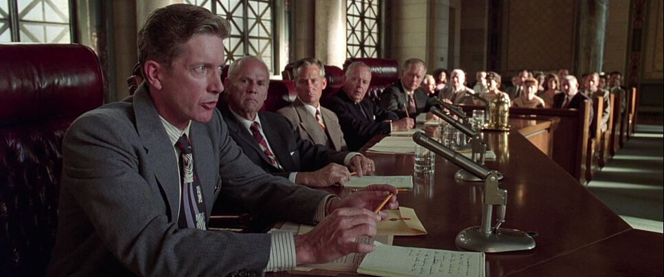
The compositions reflect the film’s themes of power and surveillance. Spinotti leverages the 2.39:1 aspect ratio to manage the ensemble cast, often using the width of the frame to isolate characters within their environments.
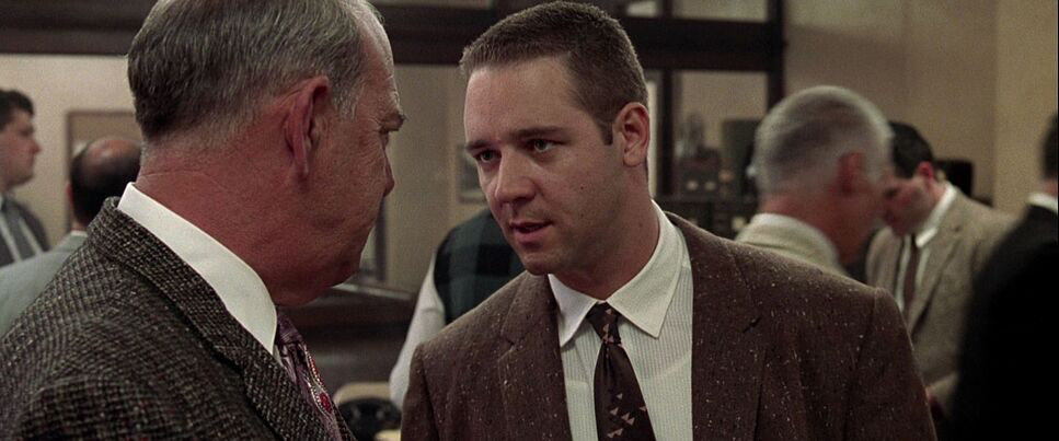
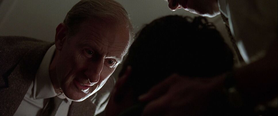
The introductions of Exley, White, and Vincennes use tight framing to establish their individual codes of honor before they collide in the larger narrative. But the most striking composition one that always sticks with me occurs during the interrogation of the young African American suspect in the Night Owl case.
He sits alone, facing a two-way mirror. We don’t just see him; we see the reflections of the white officers superimposed over him. The reflection is “big and dominant,” while the suspect appears physically diminished. It’s a brilliant use of depth cues to visualize systemic injustice. The layering of reflections creates a visceral sense of oppression without needing to over-light or over-act the scene. Throughout the film, framing characters against architectural elements doorways and windows reinforces this sense of entrapment.
Lighting Style
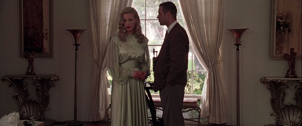
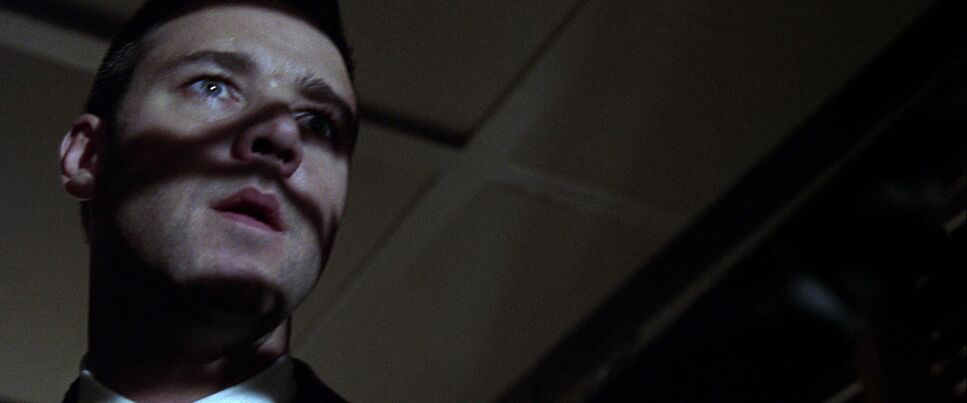
The lighting is the definition of “nuanced noir.” Spinotti achieves darkness and sophistication without the cliché Venetian blind shadows. He employs a naturalistic approach to motivated lighting. Light sources streetlights, office lamps, neon signs feel organic to the sets.
Spinotti allows large sections of the frame to fall into deep shadow, preserving detail in the mid-tones while maintaining a sense of foreboding. The contrast creates a tangible weight. For interiors, there’s often a warm, tungsten-heavy glow, giving the feeling of an era passed, while the shadows remain sharp. When Bud White operates in the darker corners of the city, the lighting ratio increases, often leaving half his face in shadow a visual externalization of his moral conflict.
Lensing and Blocking
The choices in lensing and blocking are tightly interwoven. Spinotti shot on Panavision Primo Primes, opting for spherical lenses rather than anamorphic. While anamorphic is the “classic” choice for widescreen, its optical characteristics like oval bokeh and heavy flares can feel too romanticized. The spherical glass offered a cleaner, distortion-free image that aligned with Hanson’s desire for a “realistic portrayal of the 50s.”
Because the plot is dense, the blocking had to be exceptionally clean. Characters are positioned to illustrate power dynamics. When the three leads share a frame, their physical proximity dictates their shifting alliances. The “focused” nature of these scenes is a direct result of meticulous blocking combined with the sharpness of the Primo lenses. It creates an almost theatrical sense of staging where every movement feels intentional.
Color Grading Approach
As a colorist, I appreciate that the film’s “timeless quality” comes from a photochemical foundation, not a digital one. In 1997, there was no Digital Intermediate (DI). The “grade” was achieved through printer lights and lab timing.
The look relies on a specific print-film sensibility: rich, dense blacks that hold texture, and a smooth highlight roll-off that digital sensors still struggle to emulate. The palette is controlled lots of saturated reds and whites, playing against dusty browns and grays. It avoids the sepia-toned nostalgia trap. Instead, the colors feel dense.
The contrast isn’t about crushing blacks to zero; it’s about density. The shadows have a “thick” quality you only get from printed film. Skin tones are kept natural, avoiding the teal/orange push of modern blockbusters. It’s a disciplined grade that relies on the interaction between the film stock and the lighting ratios on set, rather than post-production manipulation.
Technical Aspects & Tools
L.A. Confidential — Technical Specifications
| Genre | Crime, Detective, Drama, Film Noir, Police, Thriller, Neo-Noir |
|---|---|
| Director | Curtis Hanson |
| Cinematographer | Dante Spinotti |
| Production Designer | Jeannine Oppewall |
| Costume Designer | Ruth Myers |
| Editor | Peter Honess |
| Colorist | David Orr |
| Time Period | 1950s |
| Aspect Ratio | 2.39 – Spherical, Super 35 |
| Format | Film – 35mm |
| Lighting | Side light, Edge light |
| Lighting Type | Artificial light |
| Story Location | … California > Los Angeles |
| Filming Location | … California > Los Angeles |
| Camera | Panavision Gold / G2, Panavision Lightweight, Panavision Platinum |
| Lens | Panavision Primo Primes, Panavision Primo Zooms |
| Film Stock / Resolution | 5279/7279 Vision 500T, 5293/7293 EXR 200T |
The film’s texture is unmistakably 35mm. Spinotti utilized Kodak Vision 500T (5279) for the low-light interiors and night scenes, which provided the necessary speed while introducing a grain structure that added grit. For day exteriors, he likely balanced this with EXR 200T (5293) to maintain consistency.
Shooting with Panavision Gold and Platinum cameras, the decision to extract a 2.39:1 image from spherical lenses (Super 35 format) was crucial. It allowed for greater depth of field and sharper edge-to-edge clarity than anamorphic glass would have provided.
Lighting tools were a mix of practicals and tungsten units for that warm interior glow, with HMIs balancing the exterior daylight. The fact that they managed 80+ locations suggests a lighting package designed for speed and flexibility, focusing on enhancing existing architecture rather than building light from scratch.
- Also read: GREEN BOOK (2018) – CINEMATOGRAPHY ANALYSIS
- Also read: TOP GUN: MAVERICK (2022) – CINEMATOGRAPHY ANALYSIS
Browse Our Cinematography Analysis Glossary
Explore directors, cinematographers, cameras, lenses, lighting styles, genres, and the visual techniques that shape iconic films.
Explore Glossary →