When a film like Klaus (2019) comes along, it doesn’t just entertain me; it demands a forensic analysis. It’s a film that quietly reset the bar for what we thought was possible in 2D animation. From my vantage point at Color Culture, I see Klaus not just as a holiday staple, but as a technical masterclass. It effectively bridges the gap between hand-drawn charm and modern volumetric fidelity, delivering an image that makes you want to sit down and talk shop about exactly how they pulled it off.
About the Cinematographer
In animation, the role of the “cinematographer” is diffuse, shared among layout artists, lighters, and compositors. But for Klaus, the guiding visual architecture unequivocally came from Sergio Pablos, the director of Klaus. Pablos is an industry veteran with roots in the Disney Renaissance having worked on The Hunchback of Notre Dame, Tarzan, and Hercules so he understands the soul of traditional animation. But unlike many purists, he wasn’t interested in a nostalgia trip. His ambition was to evolve the medium using modern technology. He served as the ultimate visual director, overseeing how every “shot” was composed and lit, establishing Spa Animation specifically to realize a pipeline that could support this audacious visual goal.
Inspiration Behind the Cinematography

What resonates with me about Klaus is its foundational philosophy. Pablos asked a specific question: “What would 2D animation look like today if it hadn’t been largely superseded by 3D?” That hypothesis is filmmaking gold. In my own work, whether I’m grading a narrative short or a commercial, I often find myself pushing against the “safe” pipeline to find a unique look. It takes courage to go against the current in an industry that favors established workflows.
I remember seeing test animations for Klaus back in 2015. The buzz was palpable because they were attempting to blend hand-drawn artistry with physically based lighting. It felt like watching an artisan carve a masterpiece, then seeing them invent entirely new tools just to finish it. This isn’t just technical wizardry; it’s an artistic statement that there is still untapped potential in traditional methods. It reminds us that innovation often comes from a deep respect for the past coupled with an insatiable curiosity for the future.
Camera Movements
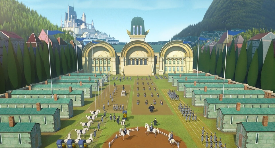
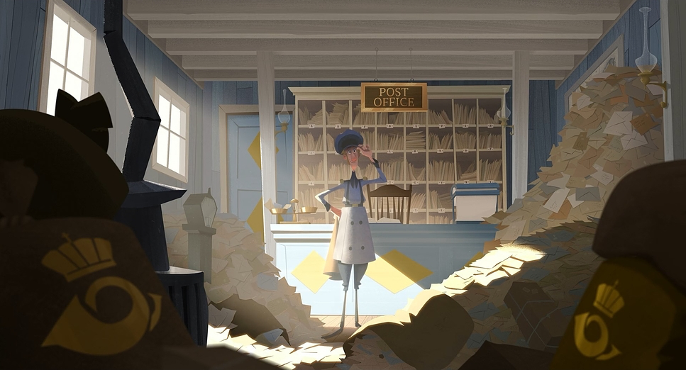
The camera movements in Klaus are incredibly sophisticated for a 2D workflow, achieving a fluidity that usually belongs to 3D production. They don’t just shift perspective; they actively participate in the storytelling, creating a sense of physical geography in Smyrensburg. We see elegant dolly shots that glide across the snow-covered landscapes and subtle push-ins that isolate Jesper in moments of self-doubt.
What’s particularly striking is how these movements enhance depth cues. The “virtual camera” uses parallax to reveal the intricacies of the environment foreground elements move faster than the background, creating a tactile experience. This is distinct from the “multiplane camera” effects of old; this feels like a camera moving through volumetric space. The sleigh chase sequence, for instance, relies heavily on this kinetic camera work to sell the speed and danger, making the viewer feel the environment’s vastness rather than just observing a flat painting.
Compositional Choices
The compositions in Klaus operate with a cinematic maturity. From wide establishing shots to intimate close-ups, the framing is meticulous. The artists frequently use leading lines stark rooftops, winding paths to direct the eye.
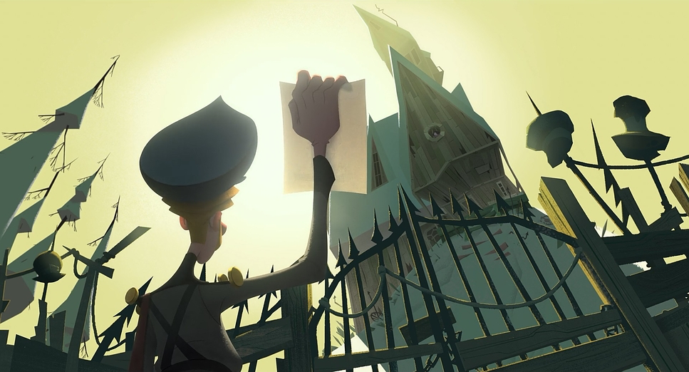
There is also a brilliant understanding of negative space. In the early scenes, the vast, empty landscapes emphasize Jesper’s isolation. When he first arrives, the compositions place him small within a grand, intimidating frame, visually underscoring his insignificance against the formidable environment. As the narrative warms up, the frames become more crowded, balanced, and layered. They excel at depth staging, placing elements in the extreme foreground to create an illusion of deep space. It’s a technique standard in live-action and 3D, but achieving it here with hand-drawn assets requires a level of planning that is staggering.
Lighting Style
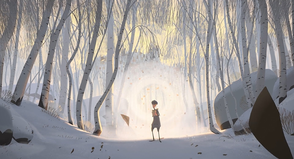
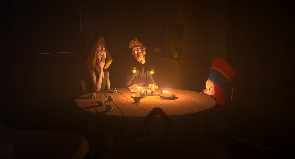
This is where the film truly creates its own lane. The lighting is the film’s hidden protagonist. It is expressive, dynamic, and surprisingly “motivated,” meaning every source feels like it has a real-world origin the diffused arctic sky, a crackling fire, or a storm lamp.
The use of volumetric lighting light shafts cutting through mist or windows adds a cinematic atmosphere often absent in traditional 2D. From a grading perspective, the control over contrast ratios is superb. Early scenes are bathed in cold, high-contrast light, while later scenes shift to a softer, warmer variance. I specifically noted the scene where Jesper’s initial selfish motives are revealed; he is the only character “lit up” in the scene. It’s a perfect example of lighting used to isolate character psychology, acting almost like a spotlight on a stage.
Lensing and Blocking
The choices regarding “virtual lensing” contribute significantly to the film’s texture. While there are no physical glass elements, the animators simulate focal length behaviors perfectly. We see the expansion of space with wide angles in establishing shots, and the compression of tighter lenses for intimate dialogue. The film also utilizes shallow depth of field to isolate characters, blurring backgrounds in a way that mimics organic optics rather than a simple Gaussian blur.
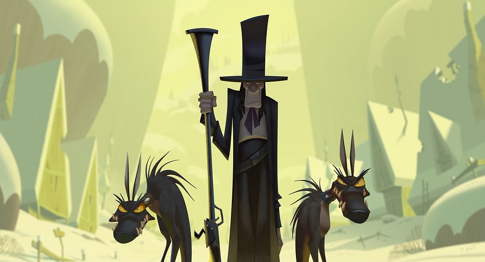
The blocking is equally deliberate. Klaus is often blocked as a monolithic figure, dominating the frame to reflect his withdrawn nature. The feuding families are positioned in aggressive, confrontational arrangements. As the town softens, the blocking opens up, allowing characters to share the space more collaboratively. Even the slapstick elements with the children use blocking to emphasize the absurdity of the feud.
Color Grading Approach
The grade of Klaus is a masterclass in dynamic range management. The palette is deliberately designed to mirror the narrative arc. Initially, Smyrensburg is crushed into cold, desaturated blues and greys. It feels like a film print on a bleak winter morning high density with a deliberate lack of warmth.
As the story progresses, we witness a tonal shift. Warm golden hues and rich reds begin to penetrate the image, usually emanating from practical sources like lanterns or toys. This isn’t just a saturation boost; it’s tonal sculpting. The highlight roll-off is what really sells the “film” look. In digital animation, it’s easy to clip the whites, resulting in a harsh, plastic look. Klaus avoids this entirely. The highlights roll off smoothly into the white point, mimicking the response of film emulsion. The hue separation is also distinct; even in the deep shadows, the cyans don’t get muddy, maintaining a clean color contrast against the warming mid-tones.
Technical Aspects & Tools
Klaus – Technical Specifications
| Genre | Adventure, Animation, Comedy, Family, CGI Animation, Satire, Holidays |
| Director | Sergio Pablos |
| Production Designer | Szymon Biernacki, Marcin Jakubowski |
| Editor | Pablo Garc |
| Time Period | 1800s |
| Color Palette | Cool, Red, Blue |
| Aspect Ratio | 1.85 |
| Lighting Type | Daylight |
The technical pipeline behind Klaus is what allows this style to flourish. It is a hybrid workflow: hand-drawn animation with computer-generated texturing and lighting. The artists drew the characters in 2D to maintain that expressive quality, but these 2D elements were then given “volume” information.
This allowed the lighting department to apply physically based rendering (PBR) to 2D assets. Imagine painting a character by hand, then having a 3D engine shine a virtual light on them, casting realistic self-shadows and rim lights. The texturing aspect is equally crucial; surfaces have grain and imperfection, interacting with the light to give materials (wood, cloth, snow) a tactile quality. The final compositing phase blends the 2D drawings with these 3D lighting passes, creating a cohesive image that feels illustrated yet tangible.
- Also read: THE SECRET IN THEIR EYES (2009) – CINEMATOGRAPHY ANALYSIS
- Also read: THE GREAT ESCAPE (1963) – CINEMATOGRAPHY ANALYSIS
Browse Our Cinematography Analysis Glossary
Explore directors, cinematographers, cameras, lenses, lighting styles, genres, and the visual techniques that shape iconic films.
Explore Glossary →