Kill Bill: Vol. 1 was a neon-drenched, blood-soaked spectacle pure adrenaline, a visual homage to anime and Tokyo drift. But Vol. 2? It’s a completely different beast. It’s a Western. It’s slower, more introspective, and it strips away the noise to focus on the Bride’s internal landscape. For me, that’s where the real juice is seeing how a director and cinematographer pivot their entire visual grammar to turn a revenge epic into a character study.
About the Cinematographer
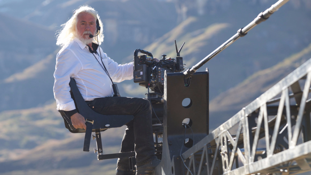
You can’t talk about the look of Kill Bill without talking about Robert Richardson, ASC. This partnership is legendary from Casino (with Scorsese) to Django Unchained and Once Upon a Time… in Hollywood, Richardson creates images that feel heavy and expensive. He is known for his aggressive use of top-light, his blown-out “halo” backlights, and a fearless approach to high contrast.
What’s fascinating here is how Richardson adapts that signature style. He’s not just a technician; he’s an interpreter. For Vol. 2, he moves away from the heightened, operatic lighting of the House of Blue Leaves scene in Vol. 1 and leans into something grounded. He channels the grit of 1970s cinema. It’s a testament to his skill that he can handle both the bombastic violence and the quiet, agonizing dialogue scenes within the same universe, making them feel cohesive.
Inspiration Behind the Cinematography
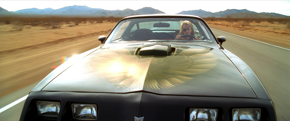
Tarantino’s films are always a mash-up of references, and while Vol. 1 was a love letter to Lady Snowblood and Shaw Brothers kung fu, Vol. 2 shifts gears into Spaghetti Western territory. You can feel the DNA of Sergio Leone in the wide-open spaces and the extreme close-ups.
The influence of David Carradine is palpable here. His history in the Kung Fu series clearly nudged the visual team toward a “West-meets-East” aesthetic. We aren’t looking at the kinetic energy of a thousand cuts anymore; we are looking at simmering tension. The dusty exteriors and the hard sunlight create a texture that feels earned. It’s not just about copying a style; it’s about internalizing the feeling of those classic films the isolation of the desert and the heat of the standoff.
Camera Movements
In Vol. 1, the camera was a hyperactive participant whip pans and rapid dollying to match the chaos. In Vol. 2, the camera takes a breath. It becomes observational. Using the Panavision Millennium XL, Richardson and Tarantino opt for slow, controlled pushes that feel like they are revealing information rather than chasing action.
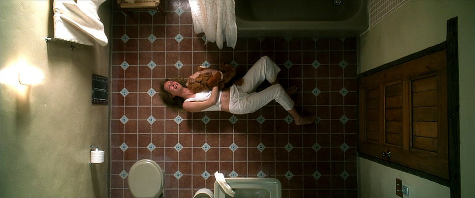
Take the introduction of Bill. When we finally see him playing his flute, the camera movement is gentle, almost reverent. It subverts the expectation of a “Big Bad” entrance. Contrast that with the “buried alive” sequence. The camera work there is a masterclass in claustrophobia. It starts stable, but as the situation devolves, the framing tightens, suffocating the audience along with Beatrix. It proves that you don’t need a technocrane to create tension; sometimes you just need to lock off the shot and let the actor work.
Compositional Choices
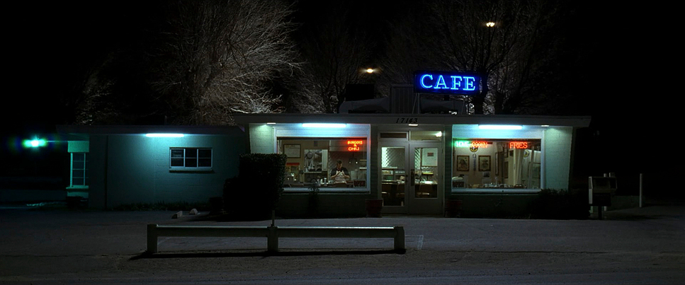
The composition in Vol. 2 leans heavily into character isolation. Gone are the sprawling wide shots filled with the Crazy 88s. Instead, we get tight “clean singles” (shots of one actor with no over-the-shoulder foreground) that force us to look into their eyes.
When Bill and Beatrix are finally together, the framing is striking in its normalcy. Bill is often framed comfortably, exuding a calm, unsettling confidence. Beatrix, conversely, is frequently framed to emphasize her vulnerability or her coiled rage. In the final confrontation the “deliberate anti-climax” they cross blades while seated. The composition becomes incredibly tight and focused, eliminating all distractions. The frame shrinks, echoing the stripping away of theatricality, leaving only the raw emotion of a breakup conversation that just happens to involve swords.
Lighting Style
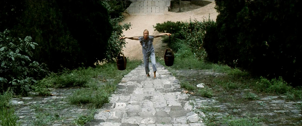
Robert Richardson’s lighting here is motivated and harsh. Shooting primarily in exterior daylight for the desert scenes, he embraces the hard light of the sun. This creates high-contrast images with deep, defined shadows. It’s a sharp pivot from the studio-lit gloss of the first film.
In the interiors, like Esteban Vihaio’s hacienda or Bill’s study, the lighting feels source-driven emanating from windows or practical lamps creating pools of warmth and expansive shadows. The black levels are crucial here. In the coffin scene, the darkness isn’t just a lack of light; it’s a heavy, crushing density. Richardson isn’t afraid to let things fall into total black, which gives the image a dramatic weight that modern digital productions often try to “fix” by lifting the shadows.
Lensing and Blocking
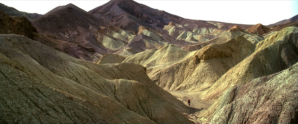
Richardson utilized Panavision Primo Primes for this film, and you can see the distinct optical quality. He balances the Western trope of using wide lenses for landscapes with longer focal lengths for intimate portraits.
Consider the “Superman speech.” The blocking is simple two people sitting across from each other but the lens choice does the heavy lifting. A longer lens flattens the background, isolating Beatrix in her emotional landscape, while a slightly wider lens on Bill connects him more to his environment, hinting at his control over the world around him. The lenses aren’t static tools; they shape our psychological perception of the characters.
Color Grading Approach
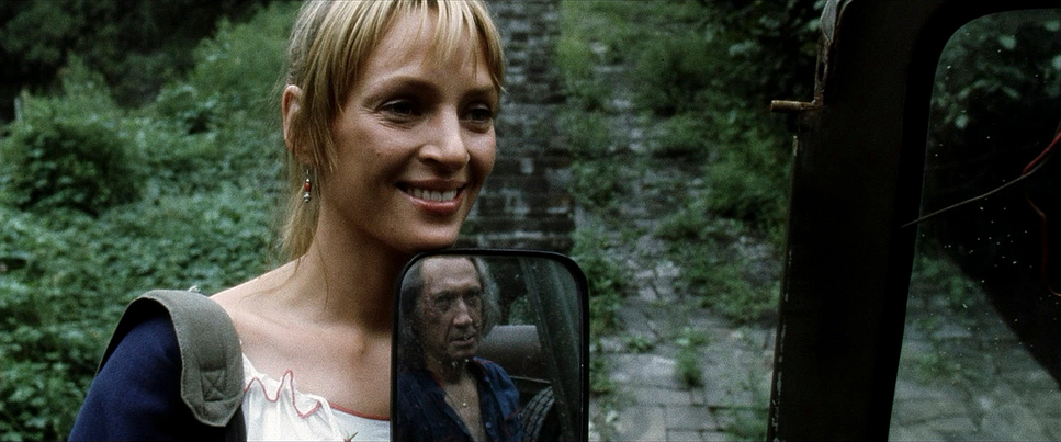
As a colorist, this is where I really pay attention. The grade for Vol. 2 is defined by Stephen Nakamura, and it’s a brilliant example of print emulation. We move from the primary yellows and reds of Vol. 1 to a desaturated, “earthy” palette.
If I were grading this, I’d be focusing on a subtractive color model. We are seeing richer greens, warmer browns, and muted yellows. The goal isn’t “pop”; it’s density. The skin tones need to hold up against the harsh daylight without looking thin. The contrast curve plays a huge role here keeping those blacks deep (no “milky” shadows) while ensuring the highlights roll off smoothly, which is a hallmark of the Kodak 5248 and 5293 stocks used on set.
Nakamura’s work ensures that even in a muted palette, key elements like the Bride’s yellow dirt-stained jacket still separate from the background. But it’s done through luminance and contrast, not just pumping up the saturation knob. The reported “subtle boost” in recent HDR transfers is the right call; this film shouldn’t look like a neon sign. It should look like celluloid.
Technical Aspects & Tools
Kill Bill: Vol. 2 – Technical Specifications
| Genre | Action, Crime, Thriller, Martial Arts, Revenge |
| Director | Quentin Tarantino |
| Cinematographer | Robert Richardson |
| Production Designer | Yohei Taneda, David Wasco |
| Costume Designer | Kumiko Ogawa, Catherine Marie Thomas |
| Editor | Sally Menke |
| Colorist | Stephen Nakamura |
| Time Period | 1990s |
| Color | Desaturated, Black and White |
| Aspect Ratio | 2.39 – Spherical, Super 35 |
| Format | Film – 35mm |
| Lighting | Hard light, High contrast |
| Lighting Type | Daylight |
| Story Location | … Earth > North America |
| Filming Location | … United States of America > California |
| Camera | Panavision Millennium / Millenium XL / XL2, Panavision Platinum |
| Lens | Panavision Primo Primes |
| Film Stock / Resolution | 5248/7248 EXR 100T, 5293/7293 EXR 200T |
The texture of Kill Bill: Vol. 2 is undeniably photochemical. It was shot on 35mm film (specifically Kodak EXR 100T and 200T stocks) using Panavision cameras. That visible grain structure isn’t digital noise; it’s the organic chaos of film emulsion. It gives the image a tactile quality that digital sensors still struggle to replicate perfectly.
While early 2000s films often went through 2K Digital Intermediates, a high-quality upscale or a rescan from the negative preserves that grain structure beautifully. The 4K presentation allows that grain to breathe. And the audio the DTS mix does a lot of spatial heavy lifting, especially in the coffin scene where the soundscape expands beyond the frame. But visually, the “blotchiness” or inconsistencies some reviewers note are often just the nature of pushed film stock. It’s raw, and it fits the movie perfectly.
- Also read: THE IMITATION GAME (2014) – CINEMATOGRAPHY ANALYSIS
- Also read: DONNIE DARKO (2001) – CINEMATOGRAPHY ANALYSIS
Browse Our Cinematography Analysis Glossary
Explore directors, cinematographers, cameras, lenses, lighting styles, genres, and the visual techniques that shape iconic films.
Explore Glossary →