Let’s be real about Kill Bill: Vol. 1. For those of us who stare at waveforms and vectorscopes all day, this movie is a headache in the best possible way. It’s a visual manifesto that refuses to pick a lane. Quentin Tarantino and DP Robert Richardson didn’t just make a movie; they threw every genre they loved into a blender and hit “pulse.”
When you watch it now, especially in an era of clean, clinical digital sensors, it hits you differently. It’s messy. It’s aggressive. It borrows visuals shamelessly and amplifies them until they break reality. As a colorist, I look at this film and see a masterclass in how to manage chaos. It’s bombastic and cartoony, sure, but the technical precision required to make that chaos look cohesive is what makes it a benchmark.
About the Cinematographer
Robert Richardson isn’t known for being subtle. The guy loves a hard backlight and isn’t afraid to blow out a highlight if it serves the mood. Before Kill Bill, he was Oliver Stone’s go-to guy, known for high-contrast, almost hallucinogenic imagery. This film kicked off his long collaboration with Tarantino, and frankly, it makes sense. Tarantino needed someone who could translate his encyclopedic film knowledge into actual light and shadow.
Richardson brings a rock-and-roll energy to the set. His style here is defined by “hot” top-lighting and deep, crushed shadows. He treats the frame with a tactile texture that you just don’t get with soft lighting. It’s not about making the actors look “pretty” in the conventional sense; it’s about making them look iconic. It’s a perfect match for Tarantino—Richardson provides the visual volume to match the director’s dialogue.
Inspiration Behind the Cinematography
Tarantino’s films are mixtapes, but Kill Bill is a full-on sample frenzy. The cinematography shifts gears so fast it should give you whiplash, yet it works. You have the obvious Spaghetti Western influence—wide, dusty compositions and extreme close-ups that scream Sergio Leone. Then, barely a scene later, you’re in the kinetic, snap-zoom world of Hong Kong cinema, pulling directly from the Shaw Brothers’ playbook.
There’s a gritty layer of ’70s exploitation here too, reminiscent of films like Coffy, which influences the raw, unpolished feel of certain setups. And obviously, Lady Snowblood is the blueprint. It’s not just an homage; it’s a structural guide for the lighting and the blood-spatter aesthetic. The brilliance here isn’t the references themselves, but how Richardson lights them to feel like part of the same universe. He stitches a Japanese revenge flick and a Western together using contrast and color as the thread.
Camera Movements
The camera in Vol. 1 is aggressive. It doesn’t just observe the action; it initiates it. Richardson rarely leaves the camera on a stick when punches are flying.
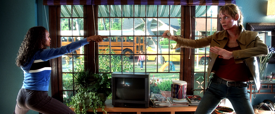
Take the opening fight between The Bride and Vernita Green. It’s brutal, and the camera reflects that physicality with whip pans and handheld work that feels reactive, not rehearsed. You feel the operator struggling to keep up, which adds to the urgency.
Then you have the signature “Ironside” crash zooms. It’s a gimmick, but a glorious one. The camera punches in rapidly on Uma Thurman’s eyes, serving as visual punctuation. It’s cartoony, but it focuses the viewer’s attention instantly.
Contrast that with the House of Blue Leaves. Before the bloodbath, the camera glides. It’s smooth, almost operatic. Richardson uses these sweeping crane shots to establish the scale of the set, giving us a breather before the chaos. It’s a rhythmic dance—tension, release, then absolute bedlam.
Compositional Choices
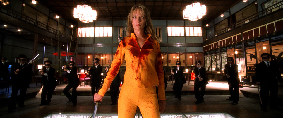
Tarantino and Richardson favor graphic, poster-ready framing. They use the frame to isolate characters, turning them into mythic figures. The Bride is frequently center-punched in the frame, symmetrical and dominant. It visualizes her singular focus.
But they flip the script with Dutch angles during moments of psychological breaks or villain reveals. They aren’t afraid to push characters to the extreme edges of the 2.39:1 aspect ratio, using negative space to create vulnerability.
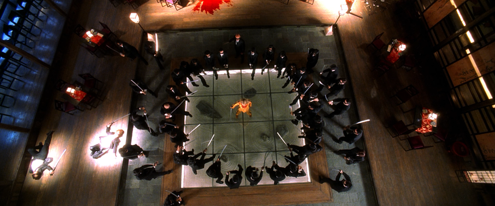
Depth is the other major tool here. In the fight sequences, the composition is layered—foreground swords, midground fighters, background chaos. It makes the House of Blue Leaves feel massive and populated, even though it’s a soundstage. It guides your eye through the carnage so you never lose track of where The Bride is, despite the body count.
Lighting Style
Lighting here is all about motivation—but not realistic motivation. It’s emotional motivation. Richardson creates a graphic novel look by letting shadows go completely black.
Look at the Tokyo sequence. The House of Blue Leaves is a nightmare of mixed lighting sources. You have practicals, neon signs, and moody sidelights all working together. The silhouette fight against the blue screen is pure theater—it creates a stage for the violence. The lighting shifts with the narrative beat; when the mood turns bloody, the light often turns red or warm; when it’s tense and cold, we shift to cyans and greens.
He uses color temperature as a weapon. The cool, detached blues of the exterior snow scene contrast violently with the warm tungsten interiors. It’s artificial, and that’s the point. It elevates the film from a crime thriller to a fable.
Lensing and Blocking
Richardson uses a Spherical lens package (Panavision Primes) to navigate the genre jumps. He leans on wide angles to exaggerate perspective—making limbs look longer in a kick or a room feel cavernous. It grounds the characters in the environment.
Then, he snaps to telephoto for those Sergio Leone eyes. The compression flattens the background, isolating the emotion on the actor’s face. It’s a simple technique, but effective.
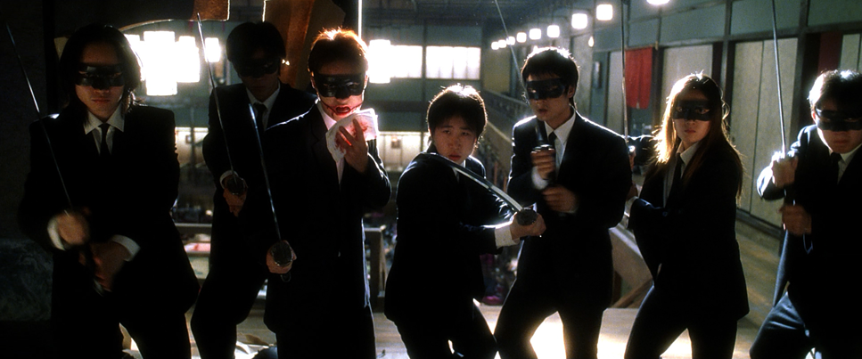
The blocking deserves credit for saving the edit. In the Crazy 88 fight, the sheer number of extras could have turned the scene into visual soup. Instead, the blocking moves The Bride through zones. She fights in the open, then on a railing, then in a room. It breaks the massive fight into digestible mini-scenes, ensuring the action remains readable.
Color Grading Approach
This is where the movie really flexes its muscles. Grading in the early 2000s wasn’t the precise, laser-surgery process we have now with tools like DaVinci Resolve. This was the era of the Digital Intermediate (DI) finding its footing, and Kill Bill pushed the limits of what print film could emulate.
First, let’s talk Hue Separation. The Bride’s yellow tracksuit is the anchor. In a colorist’s suite, isolating that specific yellow against the warm wood tones of the dojo or the cool blues of the night exteriors is critical. It’s not just saturated; it’s dense. It pops because the surrounding colors are often pushed into complementary zones.
Contrast Shaping is heavy-handed here. Richardson shot on Kodak Vision 500T and 800T stocks—high-speed films with significant grain structures. The grade embraces this. The blacks are crushed, often burying shadow detail to create a stark, noir-ish look. But unlike digital clipping, the Highlight Roll-off on the skin tones remains creamy. You can blast a face with hard light on film and it still looks organic; try that on a modern digital sensor and it looks plastic.
The palette is essentially a mood ring. Hong Kong scenes are punchy, saturated, and full of primary colors (RGB). Flashbacks get a desaturated, sepia treatment, mimicking aged film. And then there’s the black-and-white switch in the massacre scene. While famously done to dodge the NC-17 rating, visually, it works. It turns the blood into black ink, shifting the texture from gore to graphic art.
Technical Aspects & Tools
Kill Bill: Vol. 1 — Technical Specifications
| Genre | Action, Crime, Martial Arts, Revenge |
| Director | Quentin Tarantino |
| Cinematographer | Robert Richardson |
| Production Designer | Yohei Taneda, David Wasco |
| Costume Designer | Kumiko Ogawa, Catherine Marie Thomas, Mark Zunino, Alexander AD |
| Editor | Sally Menke |
| Colorist | Stephen Nakamura |
| Time Period | 2000s |
| Color | Warm, Saturated, Yellow, Green |
| Aspect Ratio | 2.39 – Spherical, 3 perf |
| Format | Film – 35mm |
| Lighting | Soft light, Hard light, Backlight |
| Lighting Type | Daylight |
| Story Location | California > Los Angeles |
| Filming Location | Los Angeles > 5506 E Atlas St |
| Camera | Panavision Millennium / Millenium XL / XL2, Panavision Platinum |
| Lens | Panavision Primo Primes |
| Film Stock / Resolution | 5279/7279 Vision 500T, 5289/7289 Vision 800T, 5248/7248 EXR 100T, 5293/7293 EXR 200T, 5222/7222 Kodak Double X |
We have to mention the practical effects. There is no CGI blood here. It’s condoms filled with fake blood and pressurized squibs. When you shoot 450 gallons of red liquid on 35mm film, light reacts to it differently than it does to digital pixels. It has specularity; it has weight.
Richardson shot this on Super 35mm (3-perf), using a mix of stocks like 5279 (500T) and 5289 (800T). These are grainy stocks. They love low light, but they bring a noise floor that gives the image grit. That texture is part of the “grindhouse” feel. You can’t fake that grain structure perfectly with a plugin; it’s baked into the chemical emulsion.
And the Anime sequence by Production I.G.? It’s a jarring medium shift that shouldn’t work, but does. It allows for a level of violence and backstory exposition that would have been clumsy in live-action. It serves as a palate cleanser for the eyes before the final act.
- Also read: THE TRUMAN SHOW (1998) – CINEMATOGRAPHY ANALYSIS
- Also read: BATMAN BEGINS (2005) – CINEMATOGRAPHY ANALYSIS
Browse Our Cinematography Analysis Glossary
Explore directors, cinematographers, cameras, lenses, lighting styles, genres, and the visual techniques that shape iconic films.
Explore Glossary →