JFK (1991) isn’t just a movie it’s a three-hour sensory assault. It’s a whirlwind of theories and a relentless chase for some version of the truth. I recently sat down with the Shout Factory 4K restoration, and honestly, it felt like I was seeing the film for the first time. It’s the kind of edit that demands your full attention; my three-hour runtime usually turns into five because I’m constantly pausing to Google some obscure CIA figure. Even when the script is “virtually all talk,” as some critics complained, the visuals are screaming. The cinematography is furious and kinetic. It moves with the same frantic, desperate energy as Jim Garrison himself.
About the Cinematographer
To talk about the look of JFK, you have to talk about Robert Richardson. The man is a titan. His run with Oliver Stone in the late 80s and early 90s Platoon, Wall Street, The Doors is basically a masterclass in evolving style. By the time he got to JFK, he wasn’t just observing the story; he was attacking it. Richardson’s camera feels like a physical presence in the room, sculpting light and shadow with a kind of brutal honesty. He’s got three Oscars for a reason: he knows how to make the camera feel as anxious and paranoid as the characters on screen.
Inspiration Behind the Cinematography
The core of this film is Garrison’s descent into a labyrinth. It’s that classic Joe Pesci line: “a mystery wrapped in a riddle inside an enigma.” That’s the visual blueprint. Stone wasn’t trying to make a dry history book; he wanted to create a “counter-myth” to the Warren Commission. The cinematography had to reflect that fractured reality.
It’s a cinematic argument. As Ebert pointed out, Stone blurred the lines between real archival footage and speculative fiction. This created a massive challenge for the camera: how do you navigate the audience through different layers of “truth”? The visual goal was disorientation. Richardson had to make us feel that “white is black and black is white” sensation, forcing the viewer to start thinking on a different level the CIA level.
Camera Movements
The movement in JFK is relentless. It’s caffeinated. It’s paranoid. This is not a film that ever settles into a comfortable rhythm.
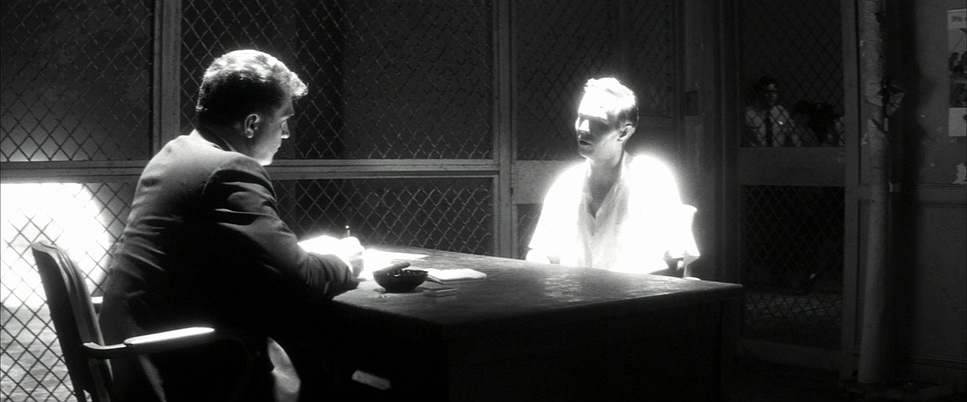
For the chaos the assassination itself or the capture of Oswald Richardson goes heavy on the handheld work. It’s raw, journalistic, and strips away all the Hollywood polish. It puts you right in the crosshairs. But then, Stone pivots. To show the crushing weight of the “establishment,” the camera shifts into these elegant, sweeping dolly and crane shots. They feel institutional and cold. The Steadicam work bridges the gap, tracking characters through hallways with a motion that feels almost eery. The camera is constantly probing and searching, never giving the viewer a moment to catch their breath.
Compositional Choices
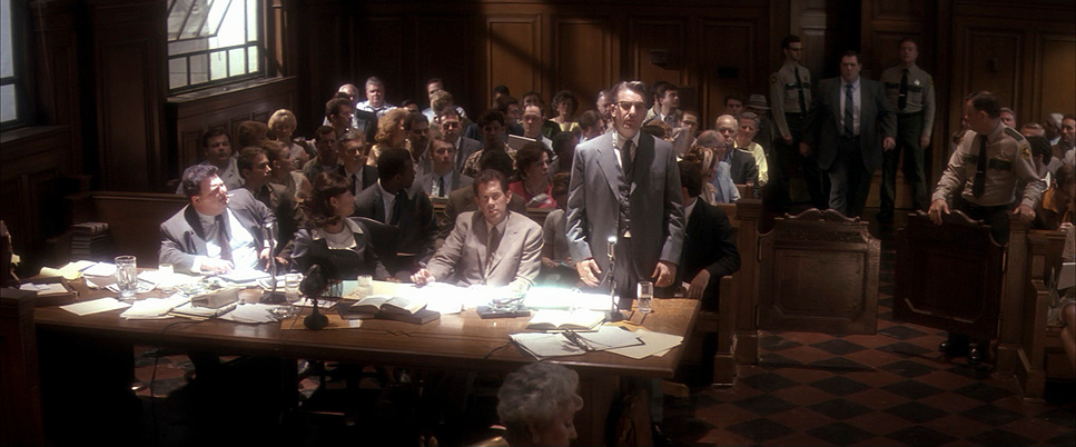
Richardson uses the frame like a weapon. He’ll hit you with a massive wide shot to show how tiny and overwhelmed Garrison is against the backdrop of the government, then cut instantly to a suffocatingly tight close-up a sweaty brow, a shaking hand, a redacted document.
The most “human” touch here is the Dutch angle. The horizons are constantly skewed, just enough to make you feel like the world is sliding off its axis. It’s a perfect visual metaphor for a narrative where nothing is stable. He also leans heavily into deep focus, keeping every layer of the frame sharp. It forces your eyes to work, scanning the background for clues just like an investigator. It turns the act of watching the movie into an act of surveillance.
Lighting Style
This is pure noir, but updated for the 90s. Richardson’s lighting is iconic for its high contrast. Shadows aren’t just dark spots; they are active characters. They shroud secrets and suggest that the “real” story is happening just out of sight.
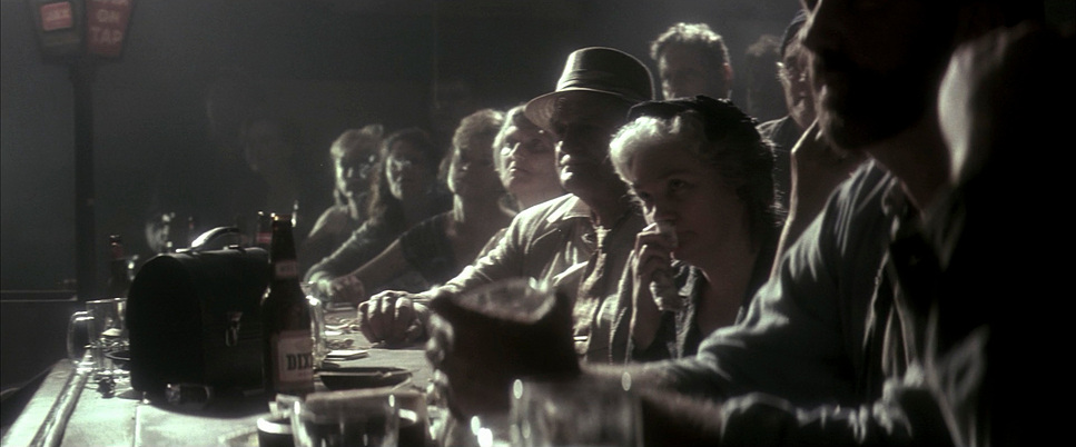
The lighting changes based on the “vibe” of the truth being told. Domestic scenes feel warm and intimate, but the moment we step into a government office or an interrogation room, the light turns clinical and harsh. He uses practicals lamps and streetlights to anchor things in reality, but he pushes the contrast so far that it feels hyper-real. It’s a beautiful, textural richness that makes the conspiracy feel tangible.
Lensing and Blocking
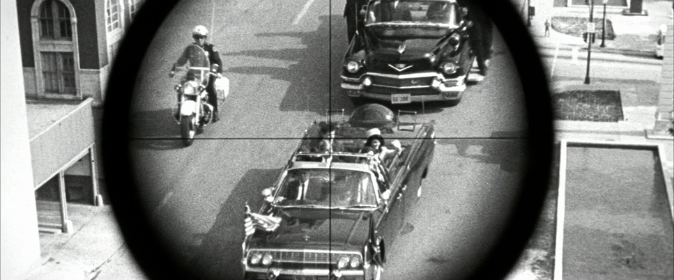
The choice of glass here is brilliant. Richardson bounces between wide-angle lenses that distort the environment and telephoto lenses that compress space. Those long lenses are especially effective they make you feel like you’re eavesdropping, watching through a sniper scope or a hidden camera.
The blocking is just as dense. Stone loves to fill the frame with people, reflecting the noise and chaos of the investigation. Garrison is usually the anchor in the center of the frame, but he’s often surrounded by a sea of faces or trapped behind architectural barriers like doorways and windows. It’s visual claustrophobia.
Color Grading Approach
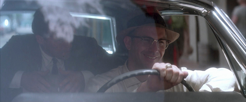
As a colorist, this is the part of the film that really hits home for me. JFK is a love letter to the organic texture of film. The 4K restoration highlights that beautiful print-film sensibility those deep, ink-like blacks and the subtle roll-off in the highlights that you just can’t replicate perfectly in digital.
The grading is the “GPS” for the audience. We use color to separate the layers of history. The “present-day” 60s scenes are grittier, leaning into cooler blues and institutional greens. But when we hit the flashbacks or the “speculative” recreations, the palette shifts into monochromatic tones, sepias, or grain-heavy stocks. It’s a visual shorthand. My job when looking at a restoration like this is to protect that filmic soul. You want the grain to be part of the experience, not something to be cleaned up. It provides the period authenticity that makes the whole conspiracy feel like a recovered memory.
Technical Aspects & Tools
JFK (1991)
Technical Specifications & Production Credits
| Genre | Drama, History, Thriller, Courtroom Drama, Documentary, Political, Conspiracy, Docudrama |
| Director | Oliver Stone |
| Cinematographer | Robert Richardson |
| Production Designer | Victor Kempster |
| Costume Designer | Marlene Stewart |
| Editor | Joe Hutshing, Pietro Scalia |
| Colorist | David Orr |
| Time Period | 1960s |
| Aspect Ratio | 2.39 – Anamorphic |
| Format | Film – 35mm |
| Lighting | High contrast |
| Lighting Type | Daylight, Artificial light |
| Story Location | Texas > Dallas |
| Filming Location | United States of America > Texas |
| Camera | Panavision Panaflex |
| Lens | Panavision E series |
| Film Stock / Resolution | 5245/7245 EXR 50D, 5248/7248 EXR 100T, 5296/7296 EXR 500T, 5297/7297 EXR 250D |
To get this look, Richardson pulled out every tool in the shed. He used a mix of Kodak EXR stocks 50D for those crisp day exteriors and 500T to dig into the shadows of the night scenes. They even used different processing techniques and reversal film to mimic the look of 8mm home movies.
But the real magic happened in the edit suite with Joe Hutshing and Pietro Scalia. The pacing is legendary. They’d jump from a 35mm anamorphic dramatic shot to a grainy 16mm newsreel in a heartbeat. It’s a technical jigsaw puzzle. The fact that the film feels cohesive despite having a dozen different visual formats is nothing short of a miracle. It’s a masterclass in using “messy” media to tell a focused story.
- Also read: ONE BATTLE AFTER ANOTHER (2025) – CINEMATOGRAPHY ANALYSIS
- Also read: CODA (2021) – CINEMATOGRAPHY ANALYSIS
Browse Our Cinematography Analysis Glossary
Explore directors, cinematographers, cameras, lenses, lighting styles, genres, and the visual techniques that shape iconic films.
Explore Glossary →