There’s a distinct pleasure in revisiting foundational texts like Frank Capra’s It Happened One Night (1934) It’s less like watching a movie and more like an archaeological dig into the bedrock of our craft. For me, dissecting Joseph Walker’s cinematography isn’t just an academic exercise; it’s a way to connect with the artisans who, almost 90 years ago, defined the visual language I still use in the grading suite every day.
About the Cinematographer

Joseph Walker was the visual architect here, and while he might not have the household name recognition of Capra, his impact on early Hollywood is massive. He was Capra’s go-to guy, collaborating on over twenty films. That kind of partnership is rare; it implies a shorthand where the DP knows exactly how to amplify the director’s narrative beats without being told.
Walker was an innovator, but his work on It Happened One Night is characterized by a deceptive simplicity. He understood a philosophy I try to live by: the best cinematography often functions as an invisible framework. It shouldn’t scream “look at me.” Instead, it should quietly elevate the performances and the emotional truth of the scene.
Inspiration Behind the Cinematography

The real creative crucible for this film was the Hays Code. 1934 was the first year of its strict enforcement, which basically neutered what filmmakers could explicitly show on screen. It’s why the “screwball comedy” exists it was a clever, frantic push against censorship, forcing filmmakers to get ingenious with innuendo and metaphor.
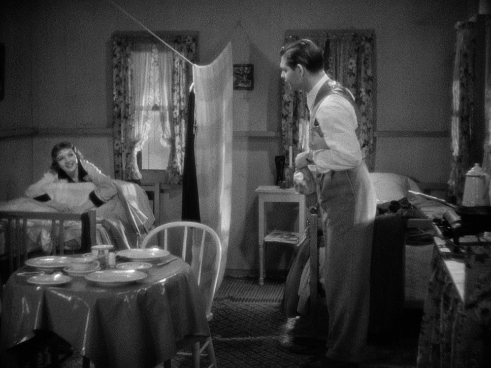
When I’m on set or in a session, I’m constantly dealing with my own “codes” tight budgets, uncooperative weather, or impossible delivery schedules. But limitations are often where the best ideas live. Because Capra and Walker couldn’t show Ellie and Peter in a state of physical intimacy, they leaned into visual symbolism. The “Walls of Jericho” that simple bed sheet hung between the beds is the perfect metaphor for moral decency and mounting sexual tension. It’s brilliant visual blocking. The sheet is a physical barrier, sure, but it’s really a psychological one that the audience is dying to see torn down.
Camera Movements
In an era when cinematic language was still finding its feet, the camera movements here are incredibly purposeful. You won’t find the sweeping, ostentatious tracking shots that became popular later. Instead, Walker uses an observational approach static frames, gentle pans, and tilts that follow the rapid-fire dialogue.
The fluidity isn’t in the gear; it’s in the staging. During those heated exchanges between Ellie and Peter, the camera just stays present. It trusts the actors. When the camera does move, it’s motivated. A subtle pan to catch a reaction or a dolly to emphasize the closing distance between the leads. This restraint is a power move. It ensures the audience is tracking the emotional beats rather than the equipment.
Compositional Choices

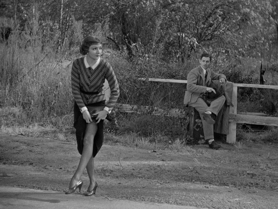
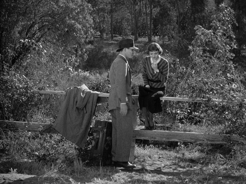
Walker’s composition is a masterclass in visual economy. He uses the frame to underscore class disparity and personal friction without needing a line of dialogue to explain it. Early on, Ellie and Peter are often framed in two-shots, but there’s always something separating them a table, a bus seat, or just a lot of negative space.
The “Walls of Jericho” scene is the peak of this. That bed sheet literally bisects the frame, creating two distinct worlds. As the film progresses and their relationship softens, those divisions vanish. Walker starts bringing them into the same visual plane or using tighter over-the-shoulder shots to create a sense of connection. The compositions are precise and psychological.
Lighting Style
In black and white, lighting is everything. It’s your color, your texture, and your depth all rolled into one. Despite Columbia’s reputation as a “poverty-row” studio at the time, Walker’s lighting is incredibly expressive. He didn’t have the budget of a major studio, but he had a mastery of contrast.
Take the night scenes, like the river crossing around the 52-minute mark. Walker uses a classic high-contrast approach hard backlight to separate the actors from the dark background and soft, directional “moonlight” to sculpt their faces. You see beautiful highlight roll-off on the skin tones that specific “silver screen” glow that speaks to the quality of the light. He’s using shadows strategically to create intrigue and a sense of vulnerability, proving you don’t need a massive lighting package to create a rich, vibrant image.
Lensing and Blocking
Lensing in 1934 was limited, but Walker knew how to maximize the glass he had. He primarily used “normal” to slightly wider lenses, which kept the perspective natural and grounded. This was crucial for a screwball comedy; if the lenses felt too distorted or “showy,” it would have pulled the audience out of the farce.
The real magic happens in the blocking. The witty, fast-paced dialogue requires dynamic staging. Capra and Walker choreograph the actors like a dance, using their physical proximity to punctuate the power dynamics. They might start a scene physically separated and converge as they find common ground. It’s a nuanced psychological dance where every position on the floor reflects a shift in the characters’ hearts.
Color Grading Approach
As a colorist, I can’t help but look at a film like this as a tonal challenge. If I were grading a remaster of It Happened One Night today, I wouldn’t be looking at hues, but at the shoulder and toe of the film curve.
First, I’d focus on tonal sculpting. I’d want deep, ink-black shadows that don’t feel “crushed” or muddy, and sparkling whites that still hold detail in the highlights. The mid-tones would be my priority making sure the skin tones have that luminous quality while keeping the grit of the bus seats and the textures of the period clothing.
I’d also likely use a print-film emulation (PFE) to bring back some of that organic grain and density. Digital transfers can often feel too clinical; a subtle PFE would give it that rich, cinematic density of a 35mm projection print. It’s about making the monochrome feel as vibrant as a HDR color grade by mastering the art of the “grey scale.”
Technical Aspects & Tools
It Happened One Night
Technical Specifications & Metadata
| Genre | Comedy, Romance, Road Trip, Rom-Com, Screwball |
| Director | Frank Capra |
| Cinematographer | Joseph Walker |
| Production Designer | Stephen Goosson |
| Costume Designer | Robert Kalloch |
| Editor | Gene Havlick |
| Time Period | 1930s |
| Color | Desaturated, Black and White |
| Aspect Ratio | 1.33 – Spherical |
| Format | Film – 35mm |
| Lighting | Soft light, Hard light, High contrast, Backlight |
| Lighting Type | Moonlight |
| Story Location | United States of America > Florida |
| Filming Location | California > Los Angeles |
The tech Walker used Mitchell Standard cameras and heavy incandescent fixtures was bulky and unforgiving. Unlike the portable rigs we use today, these cameras were studio-bound beasts. Furthermore, the film stocks were finicky, requiring a ton of light to get a decent exposure.
Walker was a tinkerer; he often invented his own gear to get the shots he wanted. He didn’t have a massive budget, so he had to be resourceful. The lack of a constant musical score in the film puts even more weight on the visuals. Every lens choice and every flag used to shape an arc lamp was a deliberate move to ensure the story landed. It’s a great reminder that creativity usually flourishes when you’re forced to work within tight constraints.
- Also read: DO THE RIGHT THING (1989) – CINEMATOGRAPHY ANALYSIS
- Also read: BOWLING FOR COLUMBINE (2002) – CINEMATOGRAPHY ANALYSIS
Browse Our Cinematography Analysis Glossary
Explore directors, cinematographers, cameras, lenses, lighting styles, genres, and the visual techniques that shape iconic films.
Explore Glossary →