Sitting down to revisit Iron Man (2008) for a cinematography analysis was a genuine treat. It’s easy to forget that before the MCU became the massive machine it is today, this was just a movie and a risky one at that.
There is a raw, almost accidental genius to Iron Man that feels incredibly refreshing compared to modern comic book movies. It doesn’t look like “content”; it looks like cinema. It has grain, texture, and a grounded reality that supports the CGI rather than being replaced by it. That visual foundation is exactly why this film still holds up nearly two decades later.
About the Cinematographer

The man responsible for the look is Matthew Libatique, ASC. He’s a DP I’ve always admired because he refuses to have a single “style.” If you look at his work with Darren Aronofsky from the gritty, 16mm restlessness of Requiem for a Dream to the psychological grain of Black Swan you see someone who adapts the medium to the message.
For Iron Man, Libatique had to walk a tightrope. He needed to capture the polished, high-tech sheen of Tony Stark’s wealth while getting his hands dirty in the dust and chaos of the Afghanistan sequences. The fact that he managed to make both worlds feel like they belong in the same movie is the real achievement here.
Inspiration Behind the Cinematography
The visual philosophy here was simple: make it real. Jon Favreau and Libatique clearly wanted to ground the fantastical elements in a tangible reality. Remember, Iron Man wasn’t a household name in 2008; if the movie looked too cartoony, it would have failed.
They leaned heavily on location shooting and practical sets. One specific choice I love is the “found footage” aesthetic used in the opening. When Tony is captured, we don’t get a glossy wide shot; we see his first arc reactor installation through the fuzzy, low-dynamic-range perspective of a security camera on a CRT monitor. It’s a brilliant choice. It strips away the superhero glamour and emphasizes the horror of the situation. It tells the audience immediately that the camera isn’t just there to capture action; it’s there to document a man’s survival.
Camera Movements
The camera language evolves perfectly alongside Tony’s character arc. In the Afghanistan sequences specifically the convoy ambush Libatique goes handheld. But it’s not the “shaky cam” confusion we see in a lot of modern action; it’s reactive. The camera feels like a war photographer trying to keep up, jostling with the soldiers, reacting to explosions. It puts us strictly in Tony’s headspace: confused, terrified, and out of control.
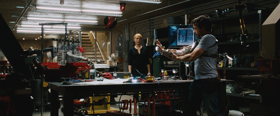
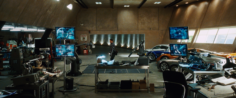
Contrast that with Malibu. Once Tony is back in his lab, the camera settles down. We get deliberate tracking shots, slow push-ins, and fluid dolly moves. It mirrors the control Tony thinks he has over his environment. But even here, Libatique resists the urge to be boring. Instead of static coverage for dialogue, he often uses slow, creeping zooms or slight parallax shifts. It adds a layer of psychological energy to the scene Tony’s body might be still, but his mind is racing, and the camera reflects that subtle tension.
Compositional Choices
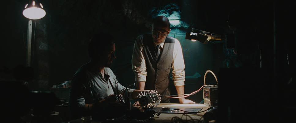
Libatique’s framing tells the story of isolation. In the cave, the compositions are tight and fragmented. He uses the low ceilings and cramped walls to physically box Tony in. When he’s building the Mark I, the shots are often obstructed by tools or sparks, emphasizing the desperate, clandestine nature of his work.
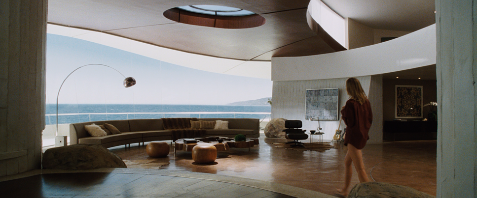
Back in the States, the frame opens up, but the isolation remains. There are these wide shots in the workshop where Tony is surrounded by millions of dollars of tech, yet he looks small in the frame. He is visually isolated by his own genius. Even with Pepper Potts in the room, the blocking and framing often keep them at a distance, emphasizing that Tony occupies his own visual island. It’s a great example of using negative space to convey character depth.
Lighting Style
The lighting in Iron Man is a masterclass in contrast ratios. In the cave scenes, Libatique isn’t afraid of the dark. He lights with practicals bare bulbs and firelight letting the shadows fall off into deep, crushed blacks. It’s gritty and high-contrast, likely leaning on the latitude of the Kodak Vision2 500T (5218) stock to hold information in those dim corners without introducing digital noise.
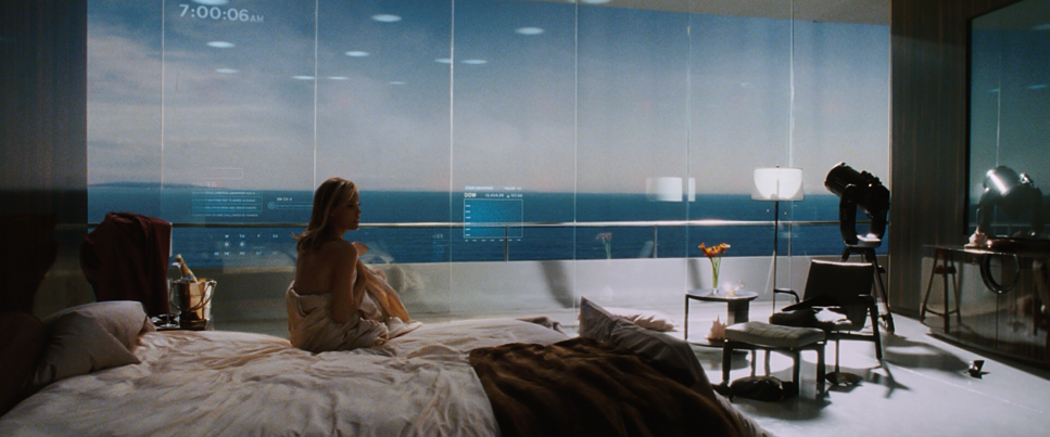
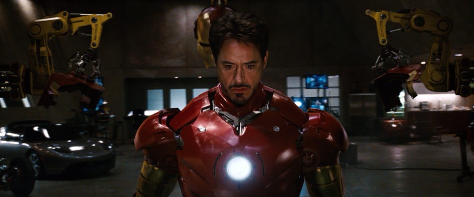
Then you have the lab. The lighting shifts to something cleaner, but it’s never “flat.” A lesser DP would have lit the lab like a grocery store, but Libatique mixes color temperatures. You have the cool, daylight-balanced light coming from the ocean-facing windows mixing with the warmer tungsten practicals of the workshop. This mixed-lighting approach creates color separation naturally, sculpting Downey’s face and giving the metal of the suits a rich, reflective surface to play with. It feels expensive, but lived-in.
Lensing and Blocking
There is a common misconception that “cinematic” means Anamorphic, but Iron Man proves otherwise. Libatique shot this on Super 35mm (3-perf) using spherical lenses primarily Panavision Primes and Angenieux zooms.
This was a crucial decision. Anamorphic lenses would have introduced heavy horizontal flares and distortion that might have felt too “sci-fi” or distracted from the realism. By shooting spherical and cropping to 2.39:1, he got a cleaner, sharper image with natural bokeh. It feels more like a 70s political thriller than a comic book movie.
The blocking also deserves a mention. Favreau and RDJ relied heavily on improvisation, which meant Libatique couldn’t light for perfect, rigid marks. He had to light spaces, not just faces, allowing the actors to move freely. You can feel this energy in the scenes; the camera often has to “find” the actor, which adds to that documentary-style authenticity.
Color Grading Approach
From a colorist’s perspective, the grade on Iron Man is refreshingly disciplined. It was the era before the heavy-handed “Teal and Orange” look completely took over Hollywood.
The Afghanistan scenes rely on an Earth-tone palette desaturated greens, sandy beiges, and dusty browns. The grade emphasizes grit; the highlights are allowed to blow out slightly in the desert sun, mimicking the harshness of the environment.
In the lab, the palette expands. We see cooler blues and cyans in the holograms and glass, but they are balanced by healthy, rich skin tones. The highlight roll-off is particularly beautiful here likely a result of the 35mm origination. When the arc reactor glows or a repulsor fires, the white point doesn’t “clip” harshly like digital; it rolls off into a soft, blooming white. The blacks are dense but retain texture. It’s a look that prioritizes “density” that thick, rich feeling you get from a well-exposed film negative over flashy, oversaturated colors.
Technical Aspects & Tools
Iron Man (2008)
Technical Specifications| Genre | Action, Adventure, Science Fiction, Superhero, Technology, Science-Fiction |
| Director | Jon Favreau |
| Cinematographer | Matthew Libatique |
| Production Designer | J. Michael Riva |
| Costume Designer | Rebecca Bentjen, Laura Jean Shannon |
| Editor | Dan Lebental |
| Colorist | Steven J. Scott |
| Time Period | 2010s |
| Color | Blue |
| Aspect Ratio | 2.39 – Spherical |
| Format | Film – 35mm |
| Lighting | Hard light |
| Lighting Type | Daylight |
| Story Location | … Asia > Afghanistan |
| Filming Location | … Lone Pine > Alabama Hills |
| Camera | Arriflex 235, Panavision Millennium / Millenium XL / XL2 |
| Lens | Cooke CXX Lenses, Angenieux Optimo Zooms, Panavision Primo Primes |
| Film Stock / Resolution | 5217/7217 Vision 2 200T, 5218/7218 Vision 2 500T |
The soul of this movie’s look comes from the format: 35mm film. Specifically, they used the Arriflex 235 for the handheld action work and Panavision Millennium cameras for the studio work.
Shooting on Vision2 200T (5217) and 500T (5218) gave the film a natural grain structure that helped integrate the CGI. In 2008, CGI was good, but not perfect. The random grain of the film stock acted as a “blending layer,” knitting the digital Iron Man suit into the live-action plate. It gave the CGI a texture that matched the environment. If they had shot this on the digital cameras available in 2008 (like the early Genesis or D-20), the suit likely would have looked like a video game character. Film provided the organic glue the VFX needed.
- Also read: AVATAR (2009) – CINEMATOGRAPHY ANALYSIS
- Also read: BARAKA (1992) – CINEMATOGRAPHY ANALYSIS
Browse Our Cinematography Analysis Glossary
Explore directors, cinematographers, cameras, lenses, lighting styles, genres, and the visual techniques that shape iconic films.
Explore Glossary →