Inside Job (2010) is one of those documentaries that doesn’t just age well; it gets sharper. Revisiting it now, I’m struck by how it handles the tension between raw data and visual experience. Most docs struggle here, oscillating awkwardly between talking heads and B-roll. But what Charles Ferguson achieved here isn’t just a documentation of the financial crisis it is an interrogation of it. The cinematography doesn’t just capture the interviews; it traps the subjects.
Mark Kermode’s review famously highlighted how the film makes people “squirm.” He’s right, but the squirming isn’t just because of the questions. It’s because of the visual strategy. The camera frames the evasive responses and catches the light hitting the sweat on a forehead. It’s about accountability, and the lens acts as a silent, unblinking witness.
About the Cinematographer
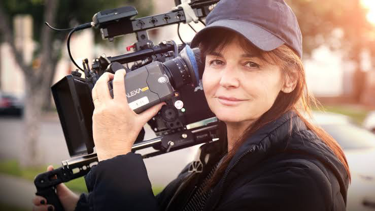
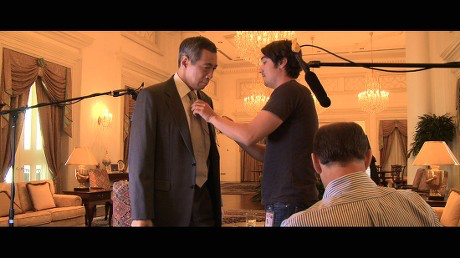
Shooting a project like this is a nightmare of logistics. You aren’t on a soundstage with controlled grids; you’re running gun-and-gun through lobbies, boardrooms, and windy streets, dealing with mixed color temperatures and unpredictable subjects. The film credits a team Kaleo La Belle, Svetlana Cvetko, and Gini Reticker which usually spells disaster for visual consistency. But here, they managed to unify their footage into a single, cohesive voice.
Their job wasn’t about “pretty pictures.” It was about functional elegance. When you’re dealing with credit default swaps and deregulation, the visuals have to ground that abstraction. The cinematography serves as a steady hand, guiding us through the labyrinth of corruption. Whether it’s the “potted history of Iceland” or the canyons of Wall Street, the camera work lends a tangible weight to Ferguson’s research. It feels less like artistic flair and more like evidence gathering.
Inspiration Behind the Cinematography
The visual inspiration here feels rooted in forensic clarity. If the director’s goal was, as he stated, “restoring honesty and stability,” the visuals had to match that. You can’t shoot a film about truth with soft, dreamy, ambiguous visuals.
I get a strong sense of 1970s political thrillers in the DNA of this film think All the President’s Men but updated with the crispness of modern HD. It’s clinical, authoritative, and almost cold. The aesthetic avoids the “hyper-reality” of the phantom money it critiques, opting instead for clean lines and unambiguous compositions. The camera strips away the pretense of the interviewees’ suits and titles, forcing a direct confrontation. It’s not trying to glamorize the subject; it’s trying to expose it.
Camera Movements
You won’t find flashy crane shots or gimbal work here. That kind of movement suggests a “production,” and Inside Jobwants to feel like a deposition. The camera language is defined by what it doesn’t do.
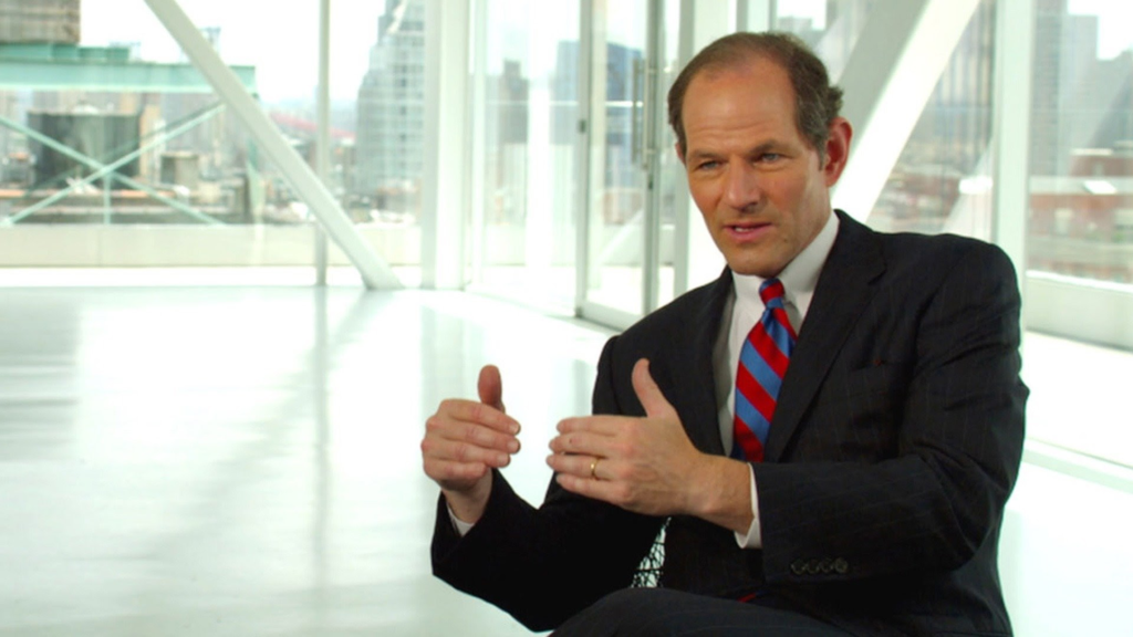
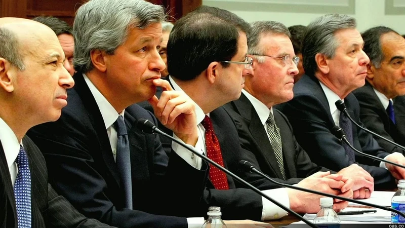
For the interviews, the camera is locked off. Static. This is crucial. When you put a subject on “sticks” (a tripod) and refuse to move, the frame becomes a cage. There is no visual escape for the interviewee. The static frame emphasizes every micro-movement they make the shifting in the chair, the nervous water sipping. Occasionally, you feel a very slow, deliberate push-in not a dramatic zoom, but a creeping optical push that subtly heightens the tension during a damning admission.
In contrast, the location work in New York or Iceland uses a controlled handheld feel. It adds a layer of immediacy, reminding us that these abstract crimes happened on real streets. But even then, it’s never shaky or chaotic; it’s the stable hand of an observer walking through the wreckage.
Compositional Choices
The framing in this film is a masterclass in psychological pressure. For the backbone interviews, the DPs favored tight to medium close-ups. This intimacy forces us to engage with the emotional response of the subject. You see the hesitation in the eyes before you hear it in the voice.
What I love is the use of the background. They didn’t blow out the backgrounds into a creamy, indistinct bokeh mess. You can still see the shapes of the corporate environment the glass walls, the abstract art, the empty boardrooms. It places the individual firmly inside the machine they serve. The framing is balanced, almost judicial, often center-punching the subject or giving them very little “lead room” (space to look into). It implies they are backed into a corner, with nowhere to look but at the facts.
Lighting Style
As someone who spends his life staring at waveforms, the lighting in Inside Job is fascinating because of its discipline. It’s “motivated naturalism.” They aren’t trying to make these guys look like villains with spooky up-lighting, nor are they making them look like heroes with halos.
The key light is almost always soft and large likely a chimera or a diffusion frame wrapping around the face just enough to define features without being dramatic. But the real skill is in the fill ratios. They keep the fill conservative. There is shadow on the face. There is depth. It’s not flat, broad-broadcast lighting.
The biggest challenge they likely faced was dynamic range. Shooting in offices with massive windows behind the subject is a colorist’s nightmare if not shot right. You have to expose for the subject while keeping the city outside from blowing out into a nuclear white mess. The team here managed the highlights beautifully, retaining detail in those windows. It grounds the interview in a real time and place, rather than a black void.
Lensing and Blocking
The lens choice feels like it sits comfortably in the portrait range 50mm to 85mm. These focal lengths are honest. They don’t distort facial features like a wide angle, and they don’t compress the background as artificially as a long telephoto. It feels like the natural human field of view, which subconsciously tells the viewer: “This is exactly what it looked like.”
The blocking is simple but devastating. The subject is isolated. You rarely see them interacting with others; they are alone in the frame, often surrounded by the empty trappings of their wealth massive desks, empty chairs, expansive views. The negative space around them speaks volumes about their isolation and the enormity of their responsibility.
Color Grading Approach
This is where the rubber meets the road for me. The grade in Inside Job is deceptively simple. A lot of people think “good color” means stylized looks, but for a doc like this, the goal is trust. If the grade looks too “cooked,” the audience subconsciously feels manipulated.
The colorist went for a dense, print-film sensibility. The contrast curve is strong there’s weight in the shadows but the toe of the curve isn’t crushed. You can still see into the dark suits. The highlight roll-off is the star here; it’s smooth and organic, avoiding that harsh “video clip” that early digital cameras were prone to.
In terms of palette, there’s a subtle split-toning happening. The shadows often sit in a cooler, steel-blue range evoking the cold, metallic nature of the financial industry while the skin tones are kept fiercely neutral and accurate. Consistency is the hardest part of a job like this, matching a RED camera interview with archive news footage and DSLR B-roll. The grade unifies it all, making the disparate sources feel like one single, undeniable narrative.
Technical Aspects & Tools
Considering this dropped in 2010, we were right in the middle of the transition from tape to file-based workflows. The dynamic range suggests they were using top-tier digital cinema cameras of the time, perhaps the early RED One or the ARRI D-21/Alexa, paired with high-end glass.
To get those window exposures right while keeping the faces properly exposed, they had to be shooting in a high-bitrate format, likely RAW or Log, to give the post-house enough latitude to pull that information back. You can’t get that kind of highlight retention with standard broadcast camcorders of that era. The integration of the motion graphics is also worth noting they aren’t just overlays; they are composited into the depth of the frame, moving with the camera, which helps digest the complex data without breaking the visual immersion.
- Also read: THE PERKS OF BEING A WALLFLOWER (2012) – CINEMATOGRAPHY ANALYSIS
- Also read: STAR TREK (2009) – CINEMATOGRAPHY ANALYSIS
Browse Our Cinematography Analysis Glossary
Explore directors, cinematographers, cameras, lenses, lighting styles, genres, and the visual techniques that shape iconic films.
Explore Glossary →