Indiana Jones and the Last Crusade is often remembered as the “fun” one the apology for the darker, grittier Temple of Doom. But revisiting it now as a filmmaker and colorist running Color Culture, I’m struck by how visually sophisticated it actually is. It doesn’t just rely on the script for its lighter tone; that warmth is baked into the emulsion itself. It’s a film that manages to be sweeping and intimate at the same time, and for anyone obsessed with the craft of visual storytelling, it’s a goldmine of practical techniques that we just don’t see enough of today.
About the Cinematographer
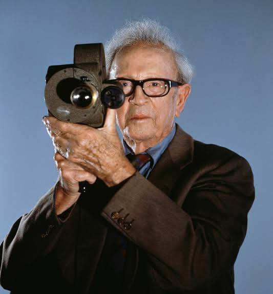
Douglas Slocombe, BSC, was the eye behind the entire original trilogy, and by the time he shot Indiana Jones and the Last Crusade, he was a true veteran of the industry. What’s fascinating and often forgotten is that Slocombe was reportedly struggling with his eyesight during this production, yet his intuition for lighting was so sharp he could practically light a set by feel and experience. Coming from a background that stretched back to the Ealing Comedies, Slocombe knew how to make an image look “glossy” without feeling plastic. He understood that Indiana Jones required a specific blend of grit and glamour a look that felt like the serials of the 30s but with the fidelity of modern cinema. This was his swan song (he retired after this film), and he went out swinging, delivering some of the most cohesive imagery of his career.
Inspiration Behind the Cinematography
If Temple of Doom was a descent into hellish reds and deep shadows, Indiana Jones and the Last Crusade was the journey back into the light. Spielberg and Slocombe clearly aimed for a visual “course correction.” The inspiration here leans heavily on the romanticized aesthetic of the late 1930s sun-drenched deserts, warm interiors, and a color palette that feels inviting rather than oppressive.
The visual approach also had to serve the film’s new dynamic: the father-son relationship. Because the banter between Indy and Henry Sr. is the heart of the movie, the cinematography gives them room to breathe. The lighting is often more high-key than the previous installments, ensuring that the comedy plays clearly on the actors’ faces. It’s a shift from “gothic horror” to “classic adventure,” moving away from heavy mood lighting and toward a style that emphasizes clarity, geography, and the golden hues of a treasure hunt.
Camera Movements
Spielberg is the master of the “oner” long takes that don’t draw attention to themselves and Indiana Jones and the Last Crusade is full of them. But unlike modern action movies where the camera shakes to simulate energy, the camera here is precise and deliberate. It acts as an invisible observer that always knows exactly where to be.
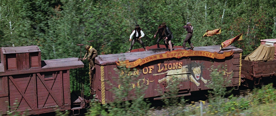
Look at the tank chase sequence. The camera isn’t just capturing action; it’s clarifying geography. We always know where Indy is in relation to the tank, the cliff, and his father. The movement tracks the momentum of the scene perfectly. Spielberg and Slocombe favor wide, fluid tracking shots that allow the stunt work to play out in real-time within the frame. There’s a distinct lack of rapid-fire cutting; instead, they let the camera movement provide the kinetic energy. It’s a lesson in blocking: if you put the camera in the right place, you don’t need to fix the energy in the edit.
Compositional Choices
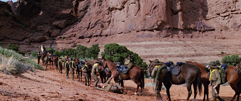
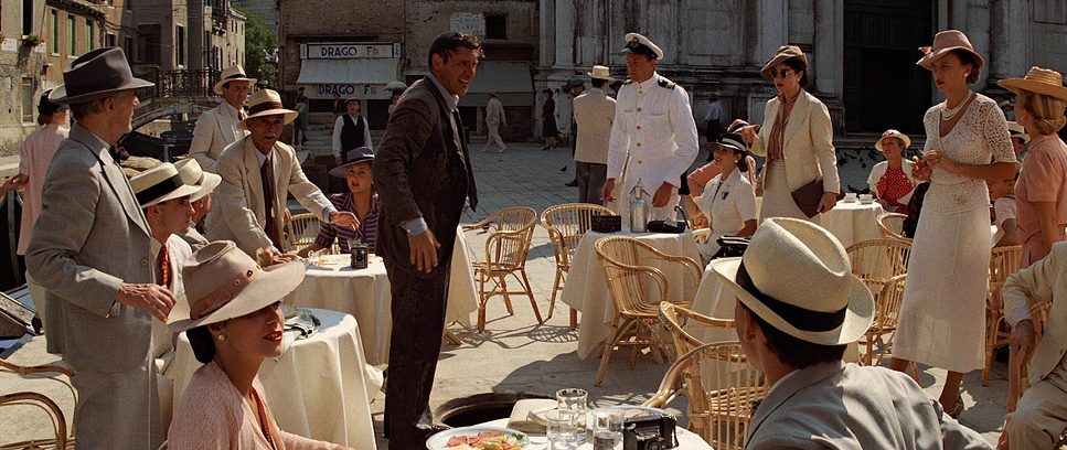
Slocombe’s framing in this film is a textbook example of classical staging. He makes excellent use of depth, constantly layering the foreground, midground, and background to create a 3D feel on a 2D screen. This is crucial in the location work whether it’s the canyons of Petra or the canals of Venice, the environment is always dominating the characters, emphasizing the scale of their quest.
However, the real magic is in the two-shots. Notice how often Ford and Connery are framed together in the same shot rather than isolated in singles. This isn’t just efficient filmmaking; it’s narrative framing. It forces the characters to share the space, visually reinforcing their cramped, friction-filled relationship. When they are separated by cutting, it usually signals an emotional disconnect; when they are in the frame together, even if they are bickering, visually they are a unit.
Lighting Style
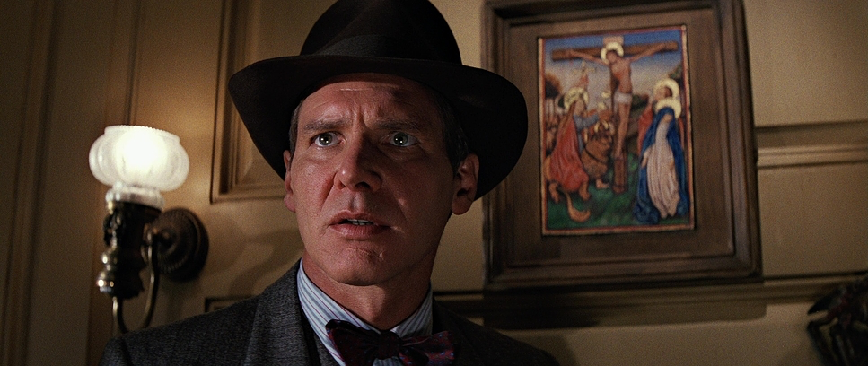
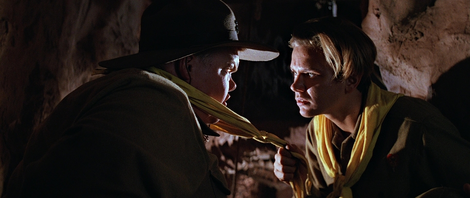
Lighting in the late 80s was a different beast compared to today’s soft-light LED panels. Slocombe favored “hard” light sources Fresnels that could punch a beam across a massive set. You can see this in the distinct shadows and the way the light sculpts the actors’ faces. It gives the film a crisp, heroic quality that is very hard to replicate with modern soft lighting.
The interiors, particularly the castle and the zeppelin, have a richness to them that comes from this motivated hard lighting. Slocombe wasn’t afraid of contrast, but unlike the crushed blacks of Temple, the shadows here are “open” meaning there is still detail in the darkness. He uses backlighting extensively to separate Indy and Henry from the background, creating that iconic halo effect on their hats and shoulders. It’s a heightened reality—nobody looks that good in a dusty tomb by accident but it fits the romantic adventure genre perfectly.
Lensing and Blocking
Contrary to some misconceptions about the series, the distinct “Indy look” is heavily defined by Panavision Anamorphic lenses (specifically the C and E Series). You can tell by the way the background blurs that distinct oval bokeh and the horizontal flares are dead giveaways. Anamorphic glass has a way of bowing vertical lines and creating a unique barrel distortion that makes the world feel wider and more epic.
Slocombe used this format to great effect. The widescreen aspect ratio (2.39:1) allowed Spielberg to pack multiple points of interest into a single frame. In terms of blocking, watch the scene where Indy and his dad are tied up in the burning chair. The blocking is intricate physical comedy, requiring the actors to rotate and move in sync with the camera. Because they shot anamorphic, they didn’t have to cut away; the wide field of view captured the entire physical gag in a way that spherical lenses would have likely cropped too tightly.
Color Grading Approach
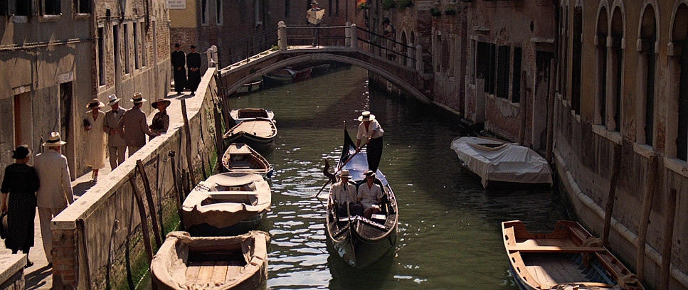
As a colorist, looking at Last Crusade is a study in photochemical timing. This was before the era of the Digital Intermediate (DI), so the “grade” was achieved through film stock choices, exposure, and printer lights at the lab. The palette is dominated by earth tones rich ochres, dusty browns, and deep greens punctuated by the vibrant red of the Nazi flags or the deep blue of the Venetian night.
The skin tones are where this film really shines. They have that characteristic Kodak yellow-red bias that looks incredibly healthy and robust. Modern digital grading often pushes for the “teal and orange” look, separating skin from background by shifting hues artificially. Here, the separation comes from lighting temperature and production design. The warmth feels organic, not like a digital overlay. The highlight roll-off is creamy and gradual, something we still fight to emulate with digital sensors today. The blacks are dense but retain a certain texture, grounded in the physical properties of the film print.
Technical Aspects & Tools
Indiana Jones and the Last Crusade – Technical Specifications
| Genre | Action, Adventure, Crime, Epic, Heist |
| Director | Steven Spielberg |
| Cinematographer | Douglas Slocombe |
| Production Designer | Elliot Scott |
| Costume Designer | Joanna Johnston, Anthony Powell |
| Editor | Michael Kahn, George Lucas |
| Colorist | Jim Passon, Jim Schurmann |
| Color | Warm, Green |
| Aspect Ratio | 2.35 |
| Lighting | Hard light, Top light |
| Lighting Type | Daylight, Sunny |
| Story Location | … Moab > Arches National Park |
| Filming Location | … Moab > Arches National Park |
| Camera | Panavision Panaflex Gold |
| Lens | Panavision C series |
| Film Stock / Resolution | 5247/7247 Vision 125T, Eastnab 400T 5295 |
From a technical standpoint, this film is a testament to the high-speed film stocks of the late 80s, likely Eastman Color High Speed Negative 5294 for interiors and night scenes, and 5247 for day exteriors. These stocks had a distinct grain structure that gave the image a tactile grit essential for an adventure movie. You can feel the texture of the stone, the sweat, and the dust.
The cameras were the industry workhorses: Panavision PSRs and Panaflex Gold IIs. But the real “tech” here is the practical effects. Almost everything we see is in-camera. When the tank goes over the cliff, a model really went over a cliff. When the boat gets chopped up, it’s really happening. Slocombe had to light for these one-take events knowing he wouldn’t get a second chance. This reliance on practicals grounds the cinematography; the light interacts with real dust, real smoke, and real surfaces, creating a complexity of reflection and refraction that CGI still struggles to match perfectly.
- Also read: PRISONERS (2013) – CINEMATOGRAPHY ANALYSIS
- Also read: SNATCH (2000) – CINEMATOGRAPHY ANALYSIS
Browse Our Cinematography Analysis Glossary
Explore directors, cinematographers, cameras, lenses, lighting styles, genres, and the visual techniques that shape iconic films.
Explore Glossary →