There are certain films that act as a litmus test for visual storytelling. Denis Villeneuve’s Incendies (2010) is one of them. While the narrative is famous for its gut-wrenching plot twist—often cited as one of the most horrifying in cinema history—I find myself constantly returning to it for its visual discipline. It’s a dramatic masterpiece that uses cinematography not to “dazzle” in the traditional sense, but to create a suffocating, immersive reality. Every frame, color choice, and lens flare contributes to the weight of the characters’ burdens.
About the Cinematographer
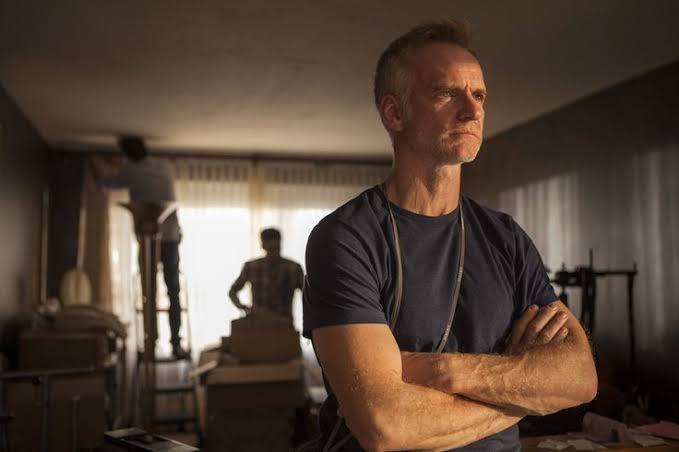
The visual architect behind Incendies is André Turpin, a Canadian cinematographer whose collaboration with Villeneuve marked a shift for both filmmakers. Turpin isn’t a DP who chases flares or excessive bokeh for the sake of a “reel shot.” His brilliance lies in subtraction. For Incendies, he balanced two distinct visual worlds: the raw, almost documentary-style immediacy of the Middle Eastern flashbacks, and the sterile, composed dread of the present-day investigation in Canada. This duality is the film’s visual engine. It allows us to feel viscerally connected to Nawal’s trauma in the past while sharing the cold, mounting tension of her children, Jean and Simon, in the present. It’s less about style and more about an unflinching witness to history.
Inspiration Behind the Cinematography
The core inspiration for the look stems from the film’s geographical duality. You have the stark, sun-baked landscapes of the Middle East juxtaposed against the rain-slicked, ordered environments of Montreal. The story chronicles a journey into a “grueling and violent past,” and Turpin knew this didn’t call for a glossy Hollywood treatment.
The team leaned heavily into the aesthetic of war photojournalism and early Neorealism to ground the flashbacks. The goal was to show the consequences of conflict etched onto faces and landscapes. The environment in the Middle Eastern sequences feels oppressive—the heat is palpable, the dust is constant. Turpin achieves this by letting the landscape dominate the frame, often dwarfing the characters to emphasize their vulnerability against uncontrollable political forces. The visuals aren’t just a backdrop; they are a projection of the internal turmoil Nawal endures.
Camera Movements
Turpin’s camera movement is a study in precision. It creates a specific rhythm that distinguishes the two timelines. In the flashback sequences—particularly during the harrowing bus attack scene—Turpin utilizes a handheld approach. This lends a raw, kinetic energy to the violence. It feels unpolished and terrifyingly immediate, putting the viewer right inside the chaos where safety is non-existent.
Conversely, the present-day narrative following the twins is defined by stability. We see steadier, more observational camera work—slow pans and tracking shots that mirror a procedural investigation. However, Turpin breaks this rule carefully. As the twins get closer to the horrific truth, the camera begins to drift, subtly destabilizing the frame even in the “safe” timeline. It’s a dynamic interplay that weaves the two eras together, signaling that the chaos of the past is bleeding into the present.
Compositional Choices
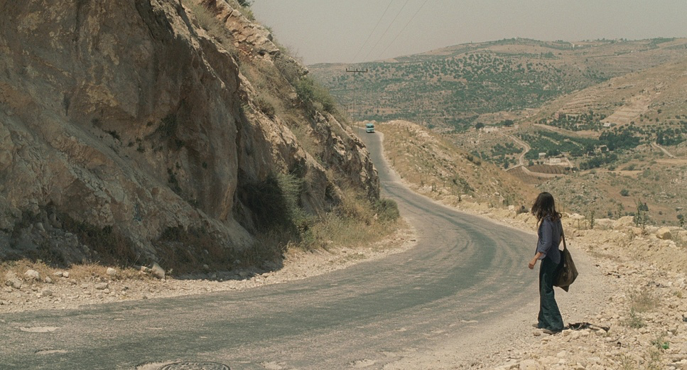
The composition in Incendies is rigorous, often utilizing a 1.85:1 aspect ratio to keep the focus tight on the characters. Villeneuve and Turpin frequently employ center-framed composition, particularly in the wide shots. This emphasizes the isolation of the characters against the indifferent, massive landscapes of the desert. It reinforces the idea of a pilgrimage—a lone figure searching for a needle in a haystack of history.
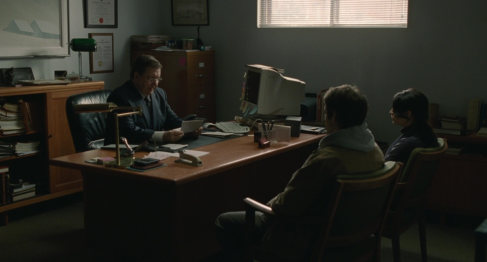
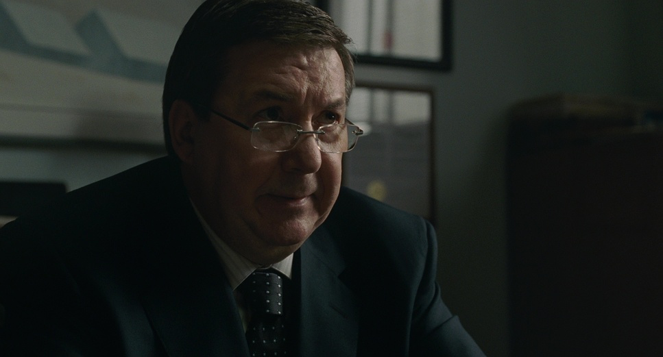
In scenes of confinement, such as the notary’s office or the prison cells, the framing becomes claustrophobic. The “File Room” scene is a great example of this: the walls are lined with boxes, compressing the characters into a small slice of the frame, visually representing the weight of the secrets surrounding them. The use of depth is also key; Turpin often layers characters in the background or foreground to suggest hidden information. The final shot of the brother at the grave, isolated in the frame, perfectly encapsulates the film’s theme of the lonely burden of truth.
Lighting Style
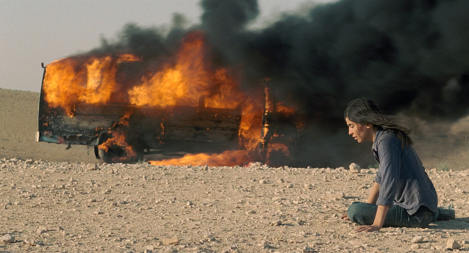
The lighting strategy is defined by motivated, often harsh, sources. Turpin avoids “beauty lighting” entirely. In the Middle Eastern sequences, he embraces the top-light of the midday sun. This creates deep shadows in the eye sockets and high contrast on the skin, stripping away glamour to reveal exhaustion and grit. It’s “honest” light—unforgiving and intense.
Inside the prison (Kfaryat), the lighting shifts to a low-key, artificial style. We see single, weak sources that create deep pools of black. This darkness mirrors Nawal’s psychological state during her time as “The Woman Who Sings.” The contrast between the overexposed exteriors and the gloomy interiors helps the audience navigate the complex timeline intuitively. Turpin isn’t afraid to let the blacks crush or the highlights bloom; he prioritizes the feeling of the environment over technical perfection.
Lensing and Blocking
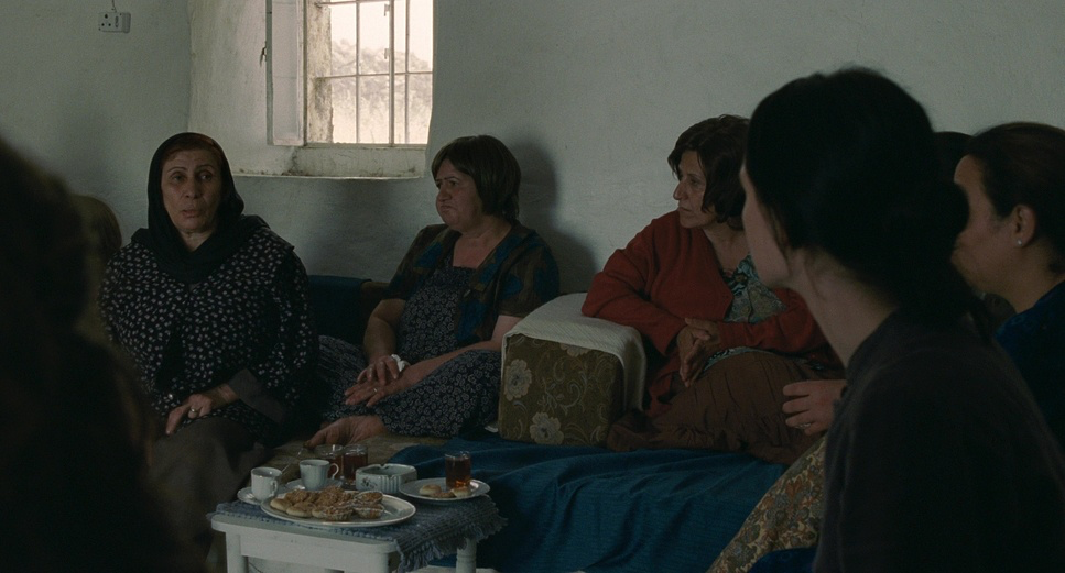
Technically, the lensing choices are fascinating. Turpin and Villeneuve paired the Arricam ST and Arriflex 535Bcameras with Zeiss Master Primes. Master Primes are known for being clinical, fast, and incredibly sharp. By using such modern, high-performance glass, the team ensured that the image remained crisp and immediate, avoiding the “vintage” softness that sometimes plagues period pieces. They favored medium focal lengths, which offer a natural field of view that feels human and relatable.
Blocking is where Villeneuve’s direction truly shines. Characters are often positioned to reveal power dynamics without dialogue. In the notary’s office scene, the physical distance between Jean and Simon—and their separation from the notary—speaks volumes about their strained relationship and their skepticism. The reveal of the “three dots” tattoo is handled with careful blocking and close-ups, acting as a visual anchor that connects the disparate timelines. The camera rarely moves without a character motivating it, adhering to a “show, don’t tell” philosophy that trusts the audience to piece the puzzle together.
Color Grading Approach
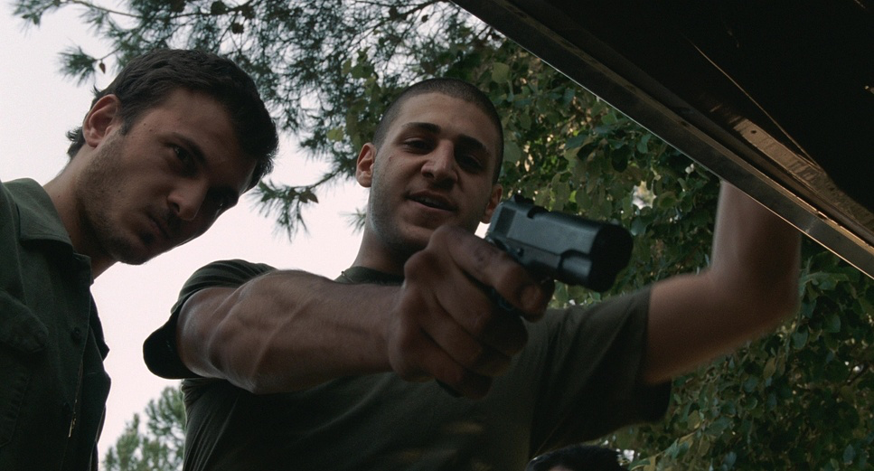
For a colorist, Incendies is a masterclass in tonal control. The DI (Digital Intermediate) was handled by colorists Eric Gaudry and Charlotte Mazzinghi, who did an incredible job of separating the two worlds. The film’s palette is desaturated but distinct. The Middle East is defined by reddish-browns, dust, and scorched earth tones—a “baked-in” look that suggests heat and age.
In contrast, the Canadian sequences lean into cooler tones—blues, greys, and sterile greens. This visual coding helps the audience instantly orient themselves in the timeline. The “Blue” note in the film’s color palette is particularly effective in the night scenes and the rain-soaked exteriors, providing a sombre counterpoint to the blazing sun of the desert.
Crucially, the grading respects the source format. The highlights roll off smoothly, and the shadows carry the specific texture of the film stock. It’s a grade that values emotional weight over digital cleanliness, allowing the grain to add a layer of grit that ties the whole aesthetic together.
Technical Aspects & Tools
Incendies (2010) — Technical Specifications
| Genre | Civil War, Drama, Mystery, Political, War, Murder Mystery, History, Thriller |
| Director | Denis Villeneuve |
| Cinematographer | André Turpin |
| Production Designer | André-Line Beauparlant |
| Costume Designer | Sophie Lefebvre |
| Editor | Monique Dartonne |
| Colorist | Eric Gaudry, Charlotte Mazzinghi |
| Time Period | 2000s |
| Color | Desaturated |
| Aspect Ratio | 1.85 – Spherical |
| Format | Film – 35mm |
| Lighting | Top light |
| Lighting Type | Daylight |
| Story Location | … North America > Canada |
| Filming Location | … Quebéc > Montréal |
| Camera | Arricam ST, Arriflex 535B |
| Lens | Zeiss Master Primes |
| Film Stock / Resolution | 5219/7219 Vision 3 500T |
What gives Incendies its timeless texture is the decision to shoot on 35mm film. Villeneuve and Turpin utilized Kodak Vision3 500T (5219/7219). This is a high-speed tungsten stock, known for its distinct grain structure and latitude.
The choice of 500T is significant. It introduces a noticeable grain that prevents the image from looking too sterile or “video-like,” which fits the gritty subject matter perfectly. Pairing this grainy, high-speed stock with the ultra-sharp Zeiss Master Primes creates a unique visual tension: you get the organic, living texture of the film grain, but the optical performance is flawless. This combination allows for a 1.85:1 image that is both texturally rich and surgically precise. It’s a testament to the idea that the medium itself—celluloid—is a storytelling tool, adding a layer of subconscious reality that digital sensors in 2010 struggled to replicate.
- Also Read: TO KILL A MOCKINGBIRD (1962) – CINEMATOGRAPHY ANALYSIS
- Also Read: ONCE UPON A TIME IN AMERICA (1984) – CINEMATOGRAPHY ANALYSIS
Browse Our Cinematography Analysis Glossary
Explore directors, cinematographers, cameras, lenses, lighting styles, genres, and the visual techniques that shape iconic films.
Explore Glossary →