There are certain films where the craft and the narrative hit a sweet spot so perfect that you can’t tell where the script ends and the image begins. In Bruges (2008) is unequivocally one of them. Martin McDonagh’s debut feature isn’t just a dark crime thriller; it’s a morality tale wrapped in a visual tapestry that feels tactile, heavy, and incredibly precise. It stays with you not just for the dialogue, but for the way the city of Bruges is rendered not as a backdrop, but as a purgatorial holding cell for our two leads, Ken and Ray.
McDonagh described Bruges in the script as “otherworldly.” That simple descriptor set the stage for a visual language that had to balance the story’s “fairy tale” elements with its grim, violent reality. For a cinematographer, that’s the ultimate challenge: how do you shoot a location so it feels inextricably linked to the characters’ spiritual state? You don’t just point the camera; you sculpt the world.
About the Cinematographer
The visual architect here was Eigil Bryld, a Danish cinematographer known for his ability to mix raw naturalism with a painterly touch. Bryld’s approach to In Bruges is fascinating because he resists the urge to over-glamorize. He captures the city’s gothic grandeur, sure, but he grounds it in a reality that feels gritty and lived-in.
Bryld had to walk a tightrope. The film is funny, but it’s also deeply tragic. A lesser DP might have played up the comedy with high-key lighting, or gone full noir for the tragedy. Bryld found a middle ground a visual thread that underscores the religiously charged narrative without becoming heavy-handed. He treats the ambient light and the depth of the city’s architecture as characters in themselves, mirroring the souls of the hitmen inhabiting them.
Inspiration Behind the Cinematography
The primary inspiration comes directly from the duality of Bruges itself: one of the world’s best-preserved medieval towns, filled with gothic churches, yet serving as a hiding spot for murderers. It’s Christmas, which adds a layer of festive veneer over a dark core.
The film explicitly leans on medieval art. When Ken and Ray visit the Groeningemuseum to view Hieronymus Bosch’s The Last Judgment, it’s a direct visual prompt. Those paintings saturated with depictions of sin and retribution are the visual mood board for the film. The challenge was to infuse that ancient dread into modern frames. It reminds me of the way Vienna dominates The Third Man; the location imposes its atmosphere on the characters. Bryld manages to make Bruges feel timeless, a place where traditional morality still looms large, even for men carrying modern firearms.
Camera Movements
In terms of movement, Bryld and McDonagh exercise a refined restraint. This isn’t a film of flashy gimbal moves or unnecessary crane shots. The camera movement is deliberate, often utilizing tracked dolly shots to observe or gently guide us through the cobblestone labyrinth.
We see a lot of steady tracking shots following Ken and Ray. These establish the geography, but they also hint at the claustrophobia Ray is feeling. The camera acts as a silent observer, peeking from behind ancient brickwork or pulling back to minimize the characters against the towering architecture.
However, the language shifts when the tension spikes. In the final sequence, as Ray stumbles through the film set in the square, the camera switches to a more urgent, handheld energy (likely using the lightweight Arriflex 235). The stable, observational gaze dissolves into a subjective, visceral experience, mirroring Ray’s disorientation. It’s a masterclass in saving your kinetic energy for the moment the story actually demands it.
Compositional Choices
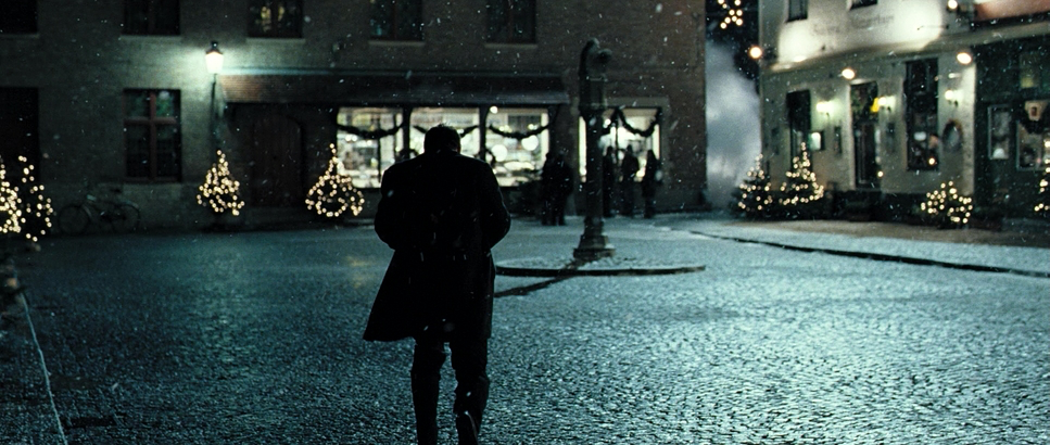
The composition leverages the Super 35mm format (2.35:1 aspect ratio) to great effect. Bryld often uses wide shots to showcase the scale of the city, framing Ken and Ray as small, insignificant figures against the gothic spires. It emphasizes their isolation and the weight of their predicament.
The use of “two-shots” is also notable. Ken and Ray are often framed together, bound by their shared situation, yet separated by their differing worldviews. The depth cues are masterful; the narrow streets and canals provide natural leading lines that draw the eye deep into the frame. It creates immersion, but also entrapment.
Conversely, the close-ups are reserved for moments of vulnerability Ray’s guilt-ridden face or Ken’s conflicted resolve. The compositions in the museum scene are particularly potent, framing the characters in a way that echoes the stark judgment on the canvases behind them. The past is literally composed into the present.
Lighting Style
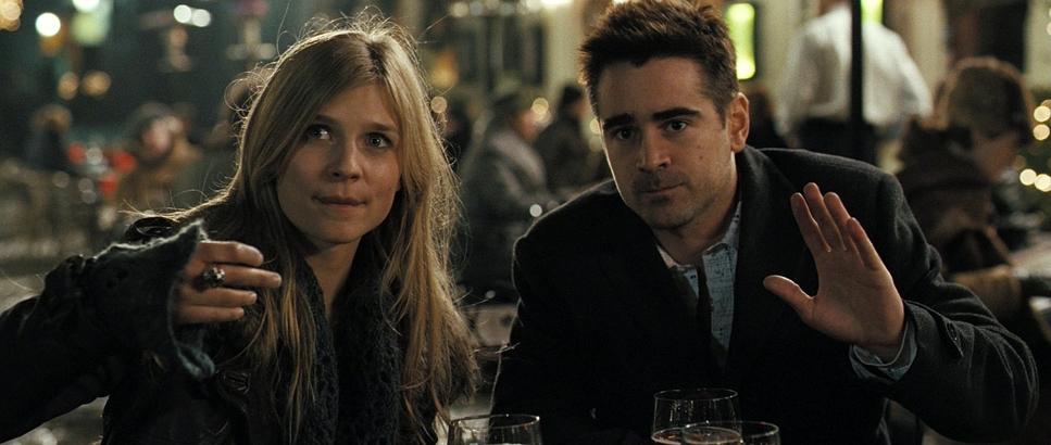
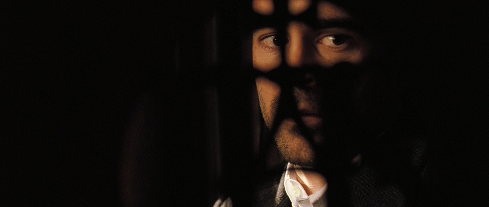
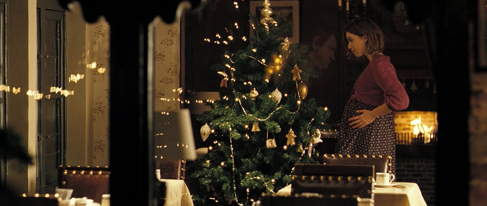
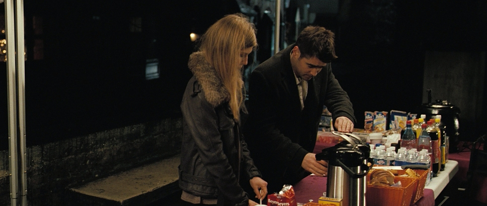
The lighting is where the film’s atmosphere truly lives. Bryld utilizes a mix of soft, top-down artificial light and motivated practicals. Because it’s set at Christmas, he blends the warm, inviting glow of practical sources (pub windows, streetlamps) against the cold, winter gloom of the exteriors.
The night scenes are particularly effective. They are high-contrast, bathing the frame in deep shadows fitting for a “dark, deep shadowy place.” Characters are often half-hidden in gloom, their moral ambiguity reflected in the lighting ratios. There’s a tactile quality to the way highlights fall on the wet cobblestones or glint off the canal water.
As Ray’s journey darkens, the lighting shifts from the diffused, dreamlike quality of the early tourist scenes to something harsher and starker. It’s a sophisticated use of light that doesn’t just illuminate the set but participates in the emotional arc.
Lensing and Blocking

Here is where the technical choices get interesting. While one might expect vintage glass for a medieval city, Bryld actually shot this on Zeiss Master Primes. These are incredibly sharp, high-contrast, modern lenses.
It’s a brilliant choice. By pairing the clinical sharpness of Master Primes with the organic grain of the film stock, the image avoids looking like a soft, nostalgic “period piece.” Instead, it feels immediate and present. The wide-angle lenses (likely at the wider end of the Master Prime set) capture the scale of the architecture without the distortion you’d get from cheaper glass.
For the blocking, the dynamic between Ken and Ray dictates their position in the frame. Initially, Ray is restless, often pushing against the edges of the frame, while Ken is planted, stable. As the film progresses, their blocking brings them closer, often side-by-side in shared misery.
Color Grading Approach
The color grade, handled by colorist Adam Glasman, is paramount to the film’s identity. Contrary to the modern trend of desaturated, bleach-bypassed crime thrillers, In Bruges actually leans into a Warm, Saturated, and Magentapalette.
This is characteristic of the Kodak Vision 2 stocks used (specifically the 500T 5218 for night/interiors). The grade embraces the magenta bias in the skin tones rather than neutralizing it, which gives the characters a flushed, almost feverish look. The interiors pubs, hotel rooms are pushed warm, creating pockets of safety that contrast violently with the cyan-tinted daylight exteriors.
The shadows are rich and deep, but they hold color. It’s a “print-film sensibility” that offers a density you rarely see in digital acquisition. The highlight roll-off is smooth a clear benefit of the film acquisition allowing the practical lights in the background to bloom naturally without clipping harsh white.
Technical Aspects & Tools
| In Bruges – Technical Specifications | |
|---|---|
| Genre | Comedy, Crime, Drama, Murder Mystery, Dark Comedy, Mystery, Gangster, Thriller, Travel |
| Director | Martin McDonagh |
| Cinematographer | Eigil Bryld |
| Production Designer | Michael Carlin |
| Costume Designer | Jany Temime |
| Editor | Jon Gregory |
| Colorist | Adam Glasman |
| Time Period | 2000s |
| Color Palette | Warm, Saturated, Magenta |
| Aspect Ratio | 2.35 – Super 35, 3 perf |
| Format | Film – 35mm |
| Lighting Style | Soft light, Top light |
| Lighting Type | Artificial light |
| Story Location | England > London |
| Filming Location | Belgium > Bruges |
| Camera | Arricam LT, Arricam ST, Arriflex 235 |
| Lenses | Angenieux Optimo Zooms, Zeiss Master Primes |
| Film Stock / Resolution | 5205/7205 Vision 2 250D, 5218/7218 Vision 2 500T |
Understanding the gear is crucial to understanding the look. In Bruges was a 3-perf Super 35mm production, shot primarily on the Arricam LT and ST, with the Arriflex 235 likely used for the handheld work.
The film stocks were Kodak Vision 2 250D (5205) for the day exteriors and Vision 2 500T (5218) for the night and interiors. The 500T is a key player here; its grain structure gives the night scenes that thick, textured feeling that digital sensors struggle to replicate. It captures the nuance of light on stone with an organic fidelity that feels timeless.
The use of Angenieux Optimo Zooms alongside the Master Primes provided flexibility, but the visual language remains consistent: sharp, high-resolution optics capturing a grainy, organic medium. The post-production workflow would have involved a high-res scan for a Digital Intermediate (DI), where Glasman could refine that specific warm-magenta look that defines the film.
- Also read: DALLAS BUYERS CLUB (2013) – CINEMATOGRAPHY ANALYSIS
- Also read: DEAR ZACHARY: A LETTER TO A SON ABOUT HIS FATHER (2008) – CINEMATOGRAPHY ANALYSIS
Browse Our Cinematography Analysis Glossary
Explore directors, cinematographers, cameras, lenses, lighting styles, genres, and the visual techniques that shape iconic films.
Explore Glossary →