I rarely watch a film without mentally breaking down the node graph. But I’m Still Here (2024) is different. Walter Salles’ drama didn’t just impress me technically; it disarmed me.
While the industry is buzzing about the Oscar nods and Fernanda Torres’ performance, for someone who lives and breathes image craft, the real story is the cinematography. It’s not just “beautiful” we see beautiful movies every day. This film is a lesson in visual empathy. It shows how choices in grain, shutter angle, and color density can articulate a history that words can’t quite reach.
About the Cinematographer
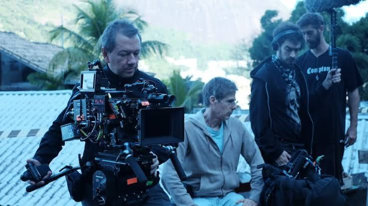
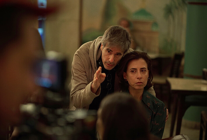
The visual identity of I’m Still Here is the result of a deep mind-meld between director Walter Salles and cinematographer Leonardo Bittencourt. Often, you can feel when a DP is just executing a shot list, but here, the collaboration feels practically telepathic.
Salles has spoken about his personal memories of the Pival family home in 1970, and Bittencourt had to translate those memories into light. He isn’t just recording a scene; he’s documenting a feeling. The camera observes the family with a familiarity that suggests the lens itself has been in that room for years. It’s a cinematography of memory subjective, imperfect, and deeply human.
Inspiration Behind the Cinematography
The “look” here isn’t an aesthetic overlay; it’s a restoration of time. Salles and Bittencourt committed to the texture of the 1970s, not through costumes, but through the medium itself: grainy 35mm film and Super 8.
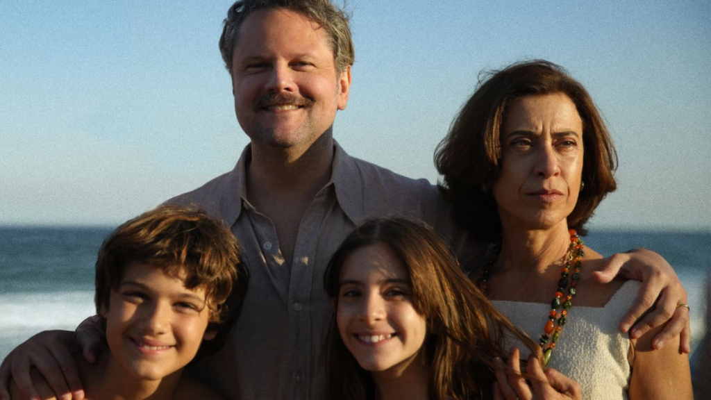
The Pival house serves as the visual anchor. Salles described the real home as having “open doors” and a “free spirit,” a sanctuary of the Tropicalia movement and Cinema Novo. The visual strategy mirrors this. Before the tragedy hits, the cinematography is loose and breathable, reflecting a home “glowing with artistic freedom.” Bittencourt captures the energy of a Brazil that was still dreaming of the future, using the organic, chemical chaos of film stock to represent a life that refused to be sterile.
Camera Movements
Bittencourt’s camera movement is deceptive. It looks documentary-style, but the precision is staggering. The film relies heavily on continuous takes, wandering through the house, passing the baton from one family member to another without cutting.
This effectively dissolves the “fourth wall.” We aren’t watching the Pival family; we are living with them. The camera drifts like a houseguest, picking up on the chaos of breakfast or a passing conversation. It’s an immersion strategy. By refusing to cut, the filmmakers force us to settle into the family’s rhythm, making the eventual disruption of that rhythm feel physically jarring.
Then there are the slow pans. There is a specific shot that pans across the walls of the home, lingering on textures and patterns. It’s a quiet visual cue connecting the space to the time passed. The camera isn’t just moving; it’s remembering.
Compositional Choices
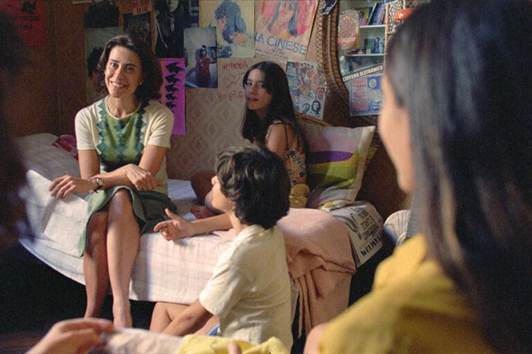
What strikes me most about the framing is the refusal to isolate characters. Modern cinema loves shallow depth of field and tight close-ups that separate a hero from their background. Here, the composition is communal. The frame is often wide enough to catch “small mannerisms and facial expressions from all that were around.” It captures the collective emotion of the family unit rather than just individual grief.
Crucially, the composition handles the political context through depth. The dictatorship isn’t always center stage; it’s in the background. Military trucks or the nervous glances of passersby exist in the periphery. It’s a masterful use of deep staging keeping the threat constant but often out of focus, a low-frequency hum of danger that eventually swallows the foreground.
Lighting Style
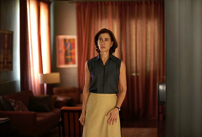
Lighting is the film’s primary narrative clock. The first act is defined by what I’d call “unapologetic exposure.” It’s sun-splashed and vibrant. The highlights are blown out in the windows, wrapping the characters in a warm, halated glow. It feels like a Kodachrome slide of a fond memory high-key, natural, and safe.
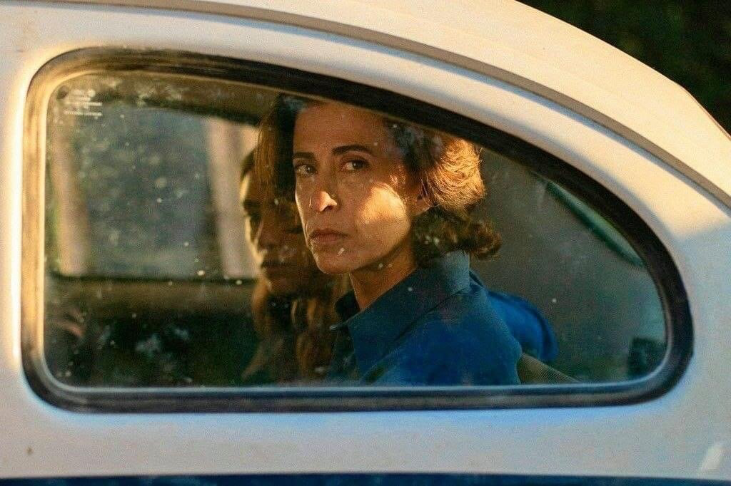
Then comes the shift. The sequence where the military shuts the curtains is a masterclass in motivated lighting. As the physical light is blocked, the film’s visual language turns claustrophobic. The dynamic range seems to compress. We go from that open, airy bounce light to deeper, muddier shadows. It’s not just that the scene gets darker; the quality of light becomes harder and more restrictive. The soft roll-off of the sunlight is replaced by the harsh reality of artificial sources and shadow.
Lensing and Blocking
Shooting on 35mm dictates the lensing. You can see they favored glass that has character likely older spherical lenses that allow for organic flares and a gentle fall-off at the edges. This prevents the image from looking “clinical,” which is the enemy of period pieces. The lenses soften the digital sharpness, blending skin tones into the environment rather than cutting them out.
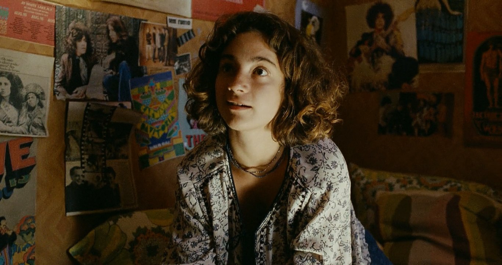
The blocking is where the technical difficulty really spikes. Because of the long takes, the actors and camera engage in a complex dance. In the early scenes, the blocking is chaotic and overlapping people crossing frames, obstructing views, feeling alive. As the political noose tightens, the blocking becomes more static. Characters are often framed in doorways or corridors, physically constrained by the architecture of their own home.
Color Grading Approach
This is where I put on my colorist hat. Watching this, it’s clear the grade is built on a robust print film emulation. You can’t fake this density with a simple LUT.
In the opening act, the grade leans into a subtractive color model. The yellows and oranges in the highlights are rich and dense, not washed out. There’s likely a warm shift in the white point to mimic the golden hour sun, with skin tones that feel flush and blood-rich. The highlight roll-off is incredibly creamy classic celluloid behavior where the whites don’t clip harshly but taper off gently.
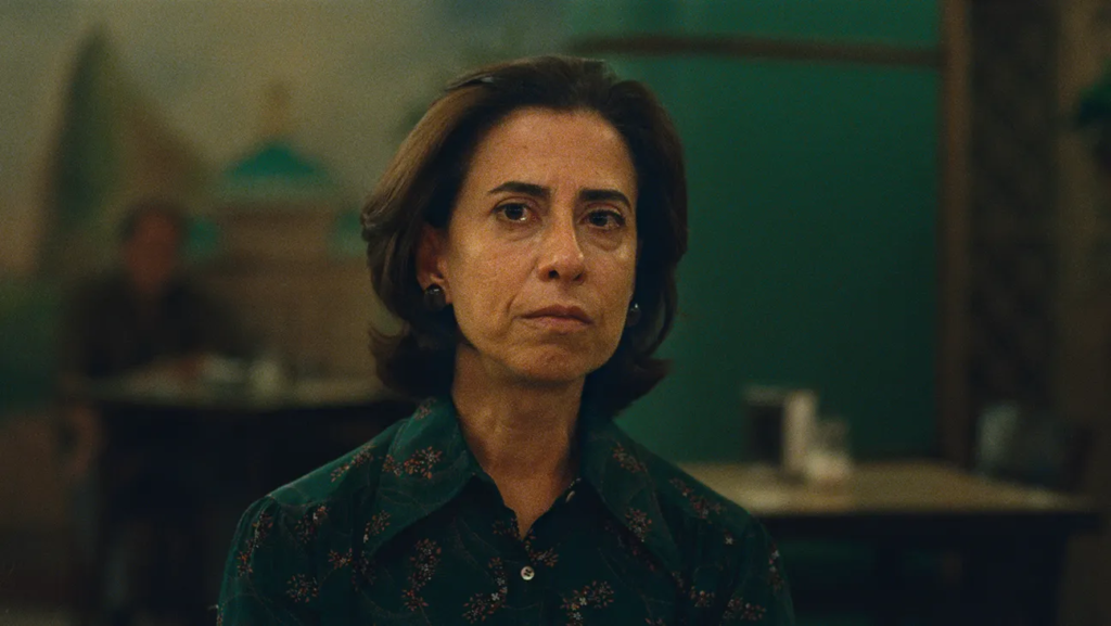
As the mood shifts, the grade pivots. We lose that golden warmth. The mid-tones get desaturated, and the shadows likely pick up a cooler, teal-cyan push a classic technique to introduce visual unease. But it’s subtle. A novice colorist might crush the blacks to make it look “gritty,” but here, the shadows retain detail. This is crucial. We need to see into the dark corners of the house. The grade uses power windows not to glamorize, but to shape the viewer’s eye toward Eunice’s stoicism. The colors don’t shout; they whisper the emotional context.
Technical Aspects & Tools
The decision to shoot 35mm film is the technical backbone of the entire project. It creates a floor for the image quality that digital can emulate but rarely matches perfectly.
The grain structure is the first thing you notice. It’s alive. It dances. This adds a layer of texture that sits between the audience and the subject, subconsciously signaling “history.” Furthermore, film negative has a massive dynamic range, particularly in the highlights. When you shoot a bright Brazilian sky on digital, it often clips to pure white. On film, you retain data in those highlights, allowing for that dreamy, overexposed look that doesn’t feel broken.
The workflow likely involved a high-resolution scan to a Digital Intermediate (DI), where the colorist had to be careful not to “clean up” the image too much. The goal was to preserve the imperfections the gate weave, the grain, the softness because those imperfections are what make the film feel true.
- Also read: MR. SMITH GOES TO WASHINGTON (1939) – CINEMATOGRAPHY ANALYSIS
- Also read: A SILENT VOICE: THE MOVIE (2016) – CINEMATOGRAPHY ANALYSIS
Browse Our Cinematography Analysis Glossary
Explore directors, cinematographers, cameras, lenses, lighting styles, genres, and the visual techniques that shape iconic films.
Explore Glossary →