How to Train Your Dragon 2 (2014) is that film. When I first saw it, I wasn’t just watching a “cartoon” I was witnessing a masterclass in digital cinematography. I saw a review that said, “Oh my god the summer is so awesome! How to train your dragon too!” and while that’s a bit hyperbolic, I get the sentiment. This isn’t just a sequel; it’s a massive leap in how animation can rival, and sometimes beat, live-action for pure cinematic scale.
About the “Cinematographers”
In animation, “cinematography” is a team sport, but for HTTYD2, we have to talk about the heavy hitters. While Gil Zimmerman led the layout team as the Head of Layout, you can’t discuss this film’s look without mentioning Roger Deakins. He acted as a visual consultant, and you can see his DNA everywhere the way the camera sits, the way the light feels “natural” rather than “default digital.”
The heavy lifting of what we see as “camerawork” falls to the Head of Layout and the Lighting Supervisor (like David Jessup). These are the unsung DPs. They aren’t just clicking buttons; they’re choosing focal lengths, blocking characters in 3D space, and deciding where the “virtual” sun sits. They make the camera an active participant, not just a witness.
Lighting Style: Where the Magic Happens
As a colorist, this is where I start getting jealous. The lighting in this film is nothing short of exceptional. “Lighting effects were stunning in the first, still stunning in the second,” as one reviewer put it, but I’d argue they’re even better here because they’re more motivated.
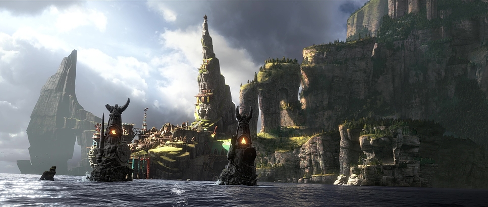
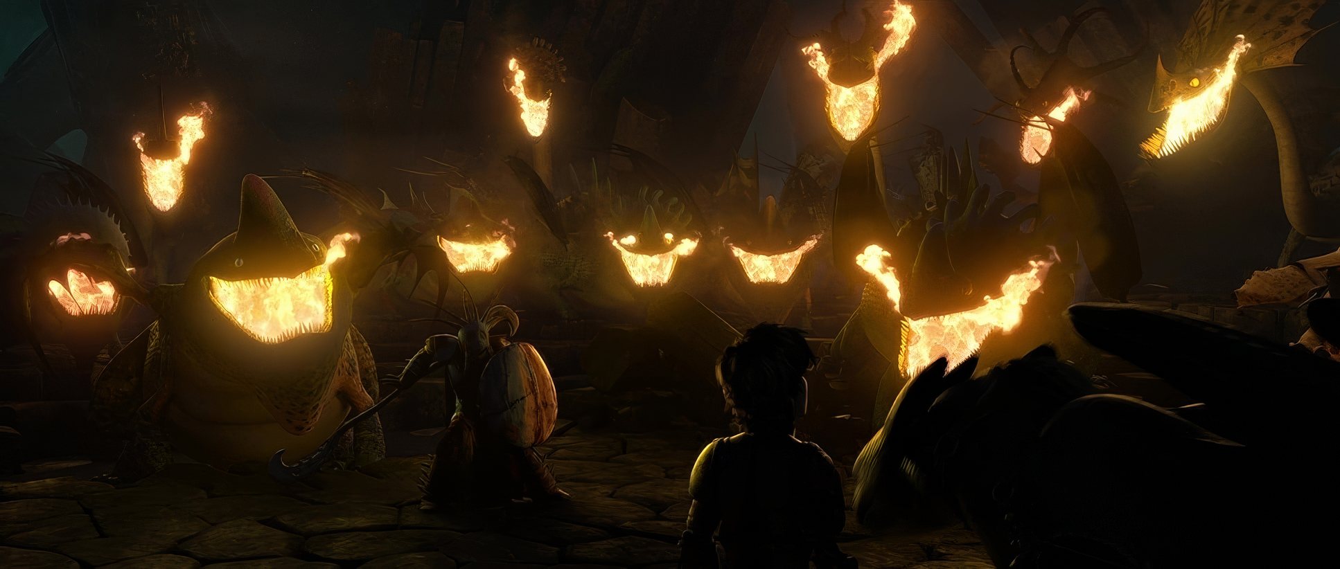
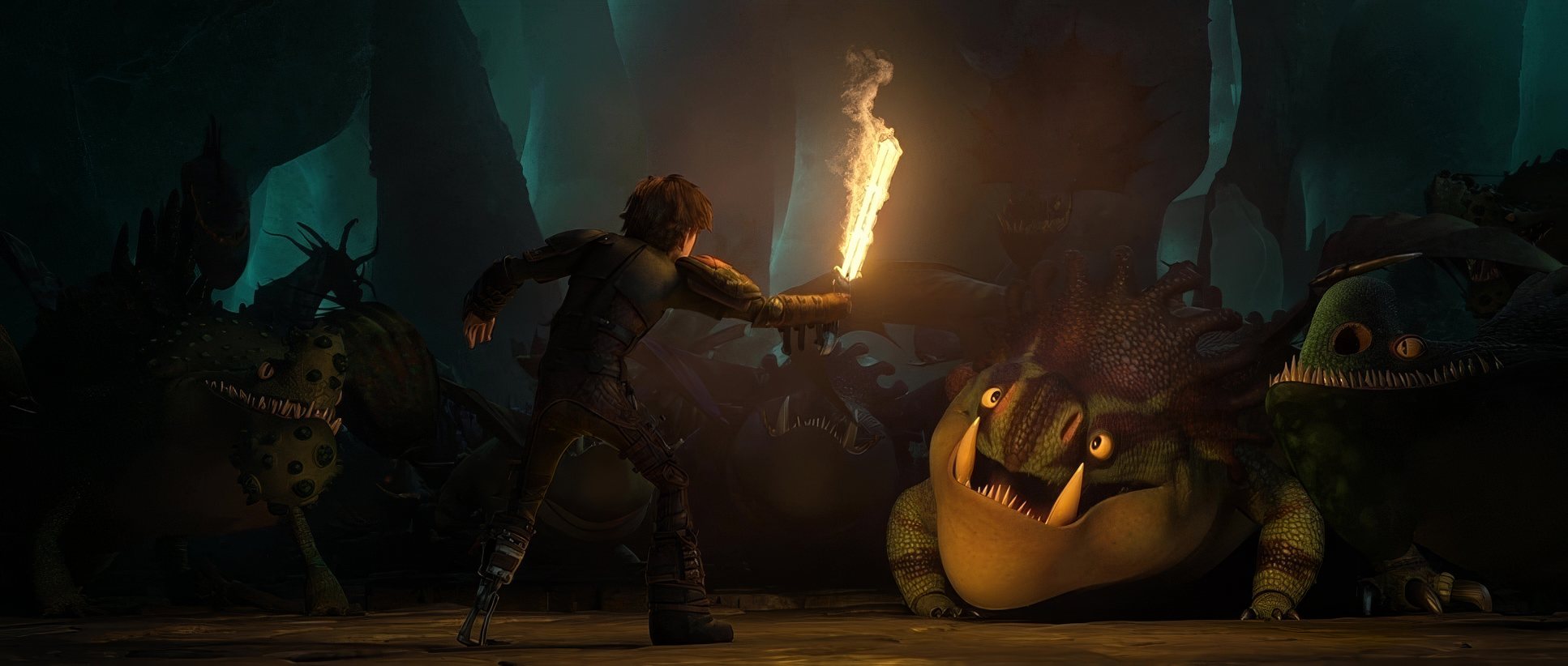
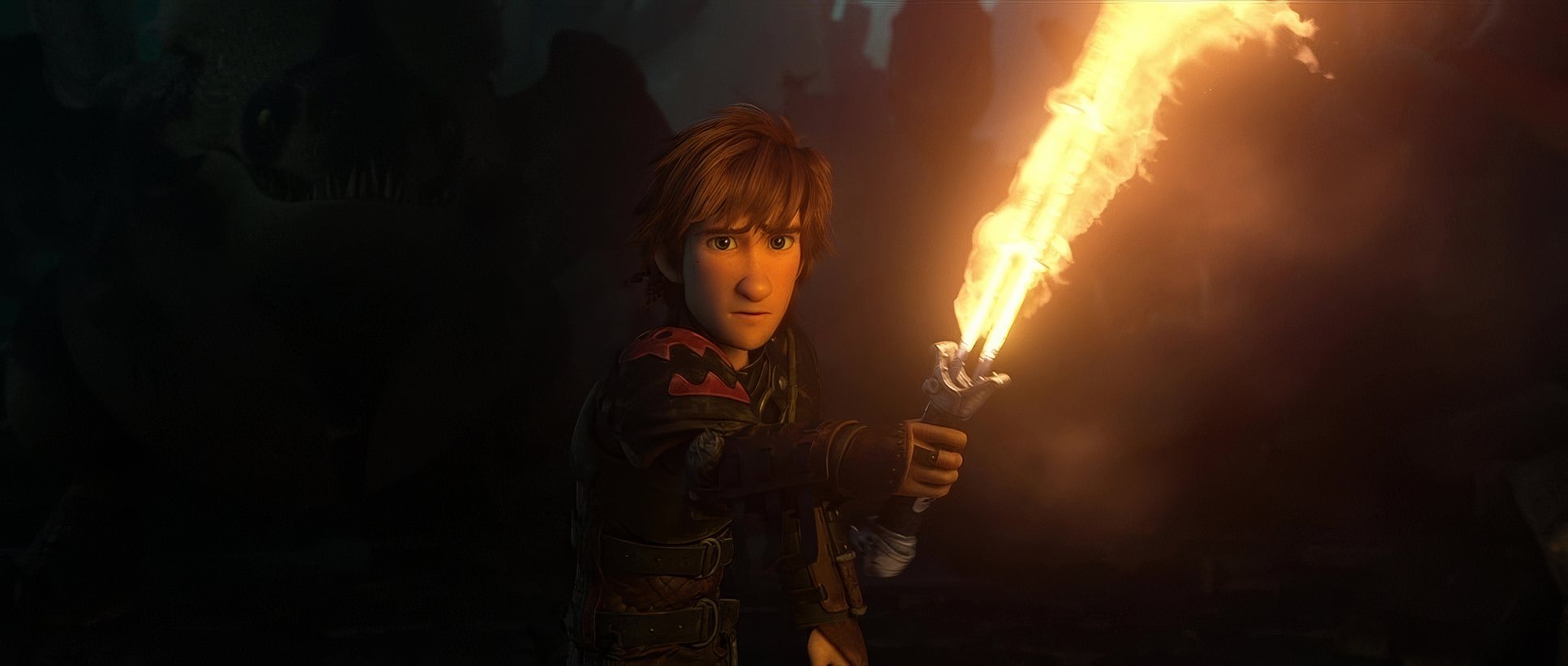
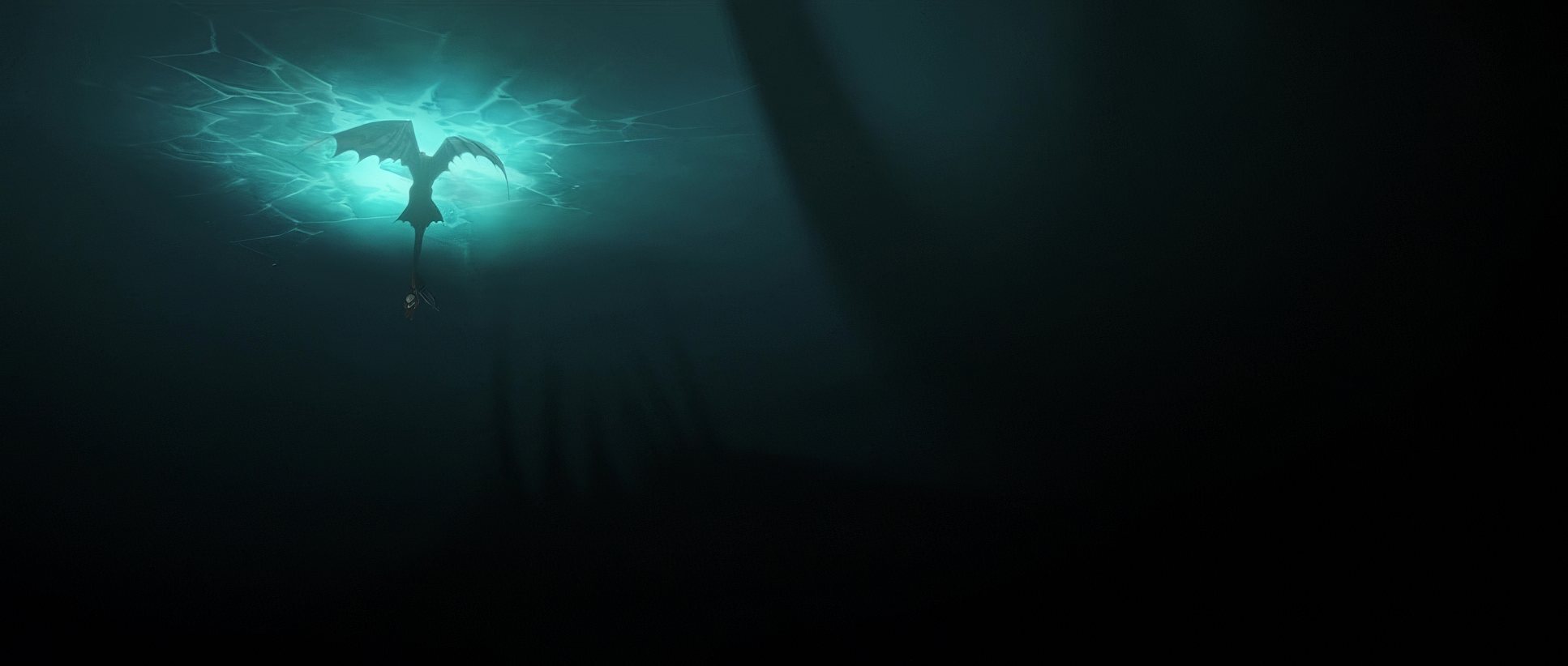
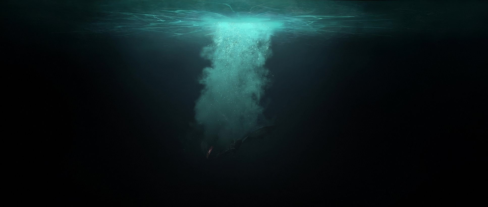
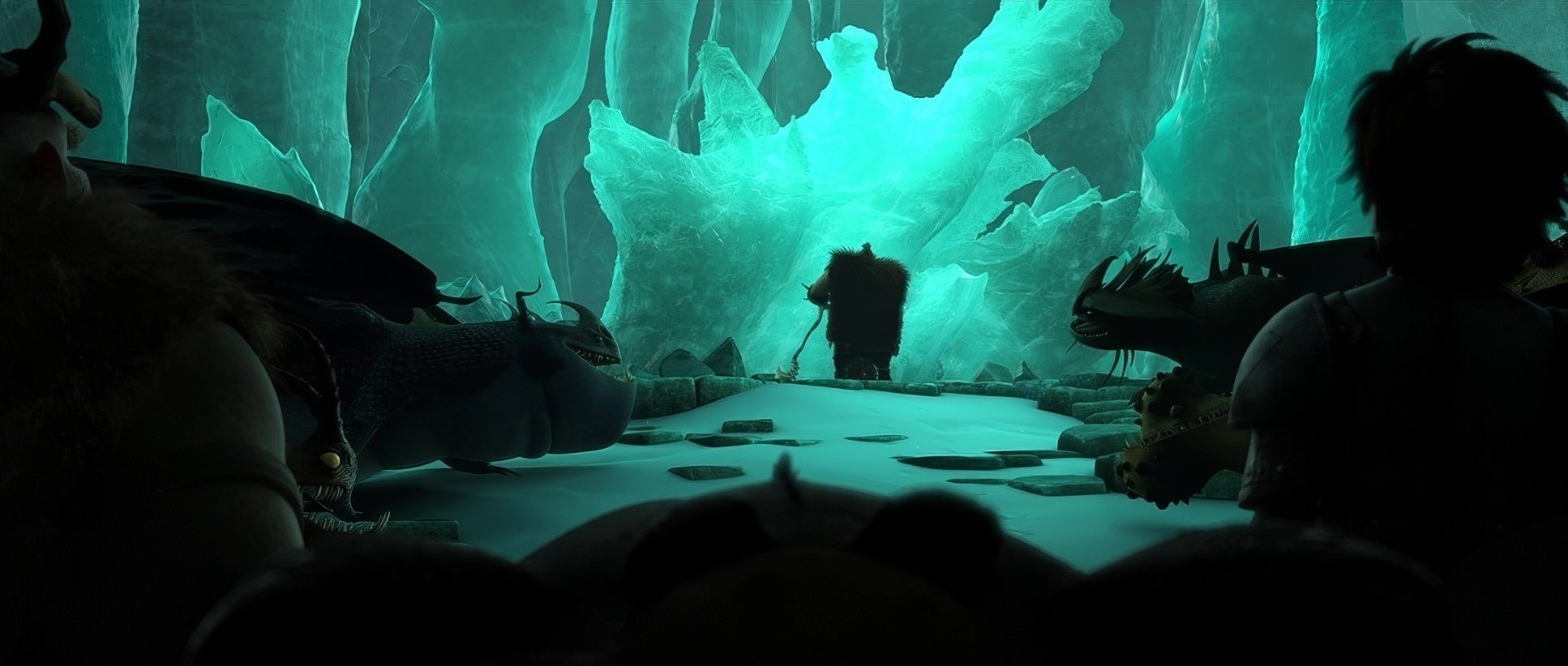
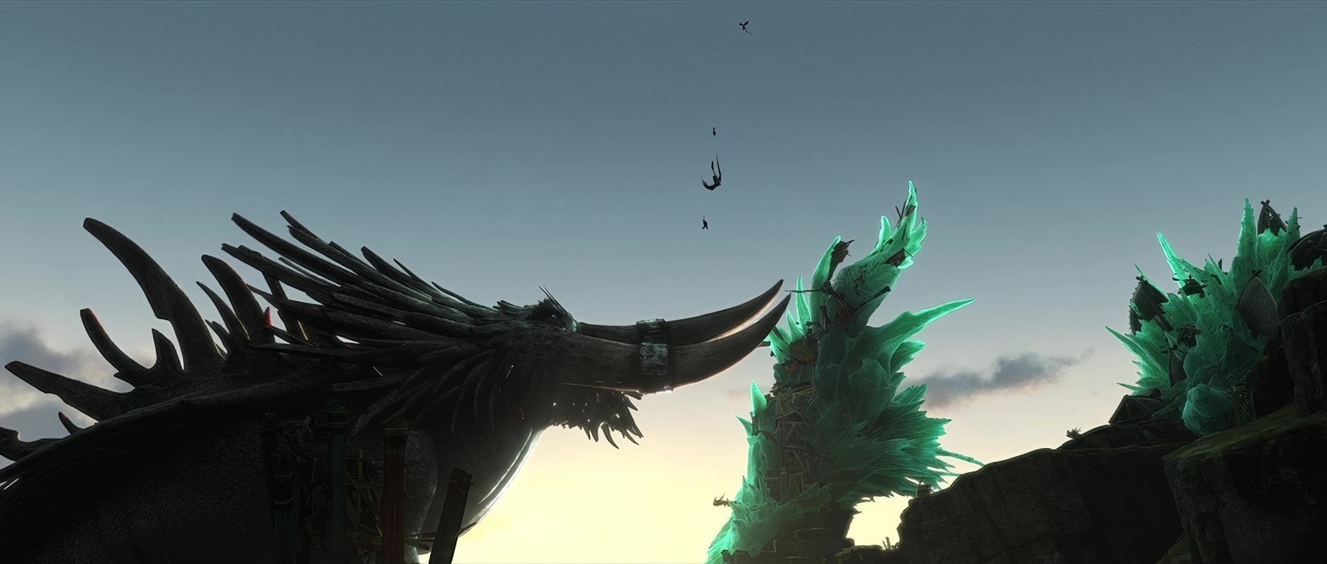
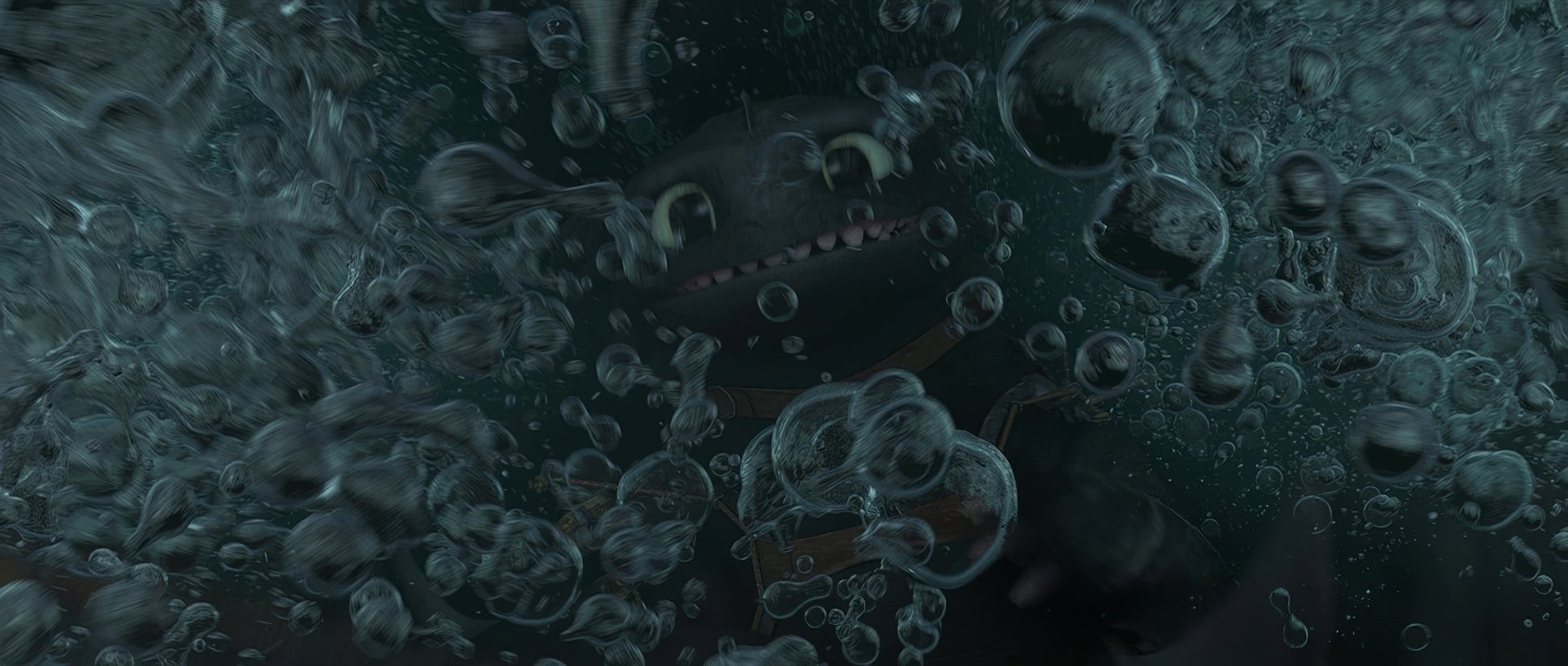
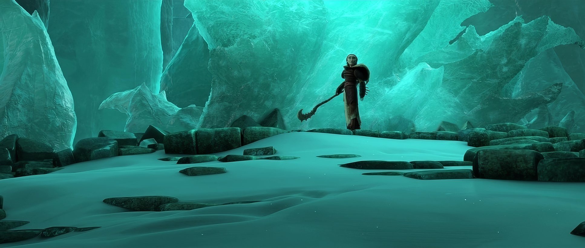
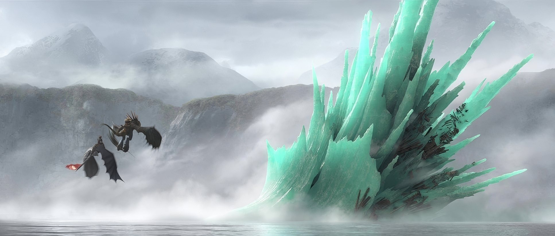
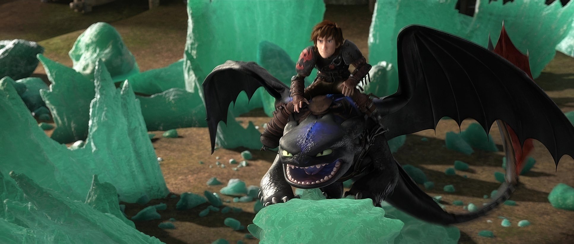
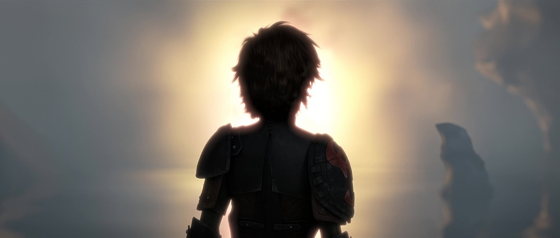
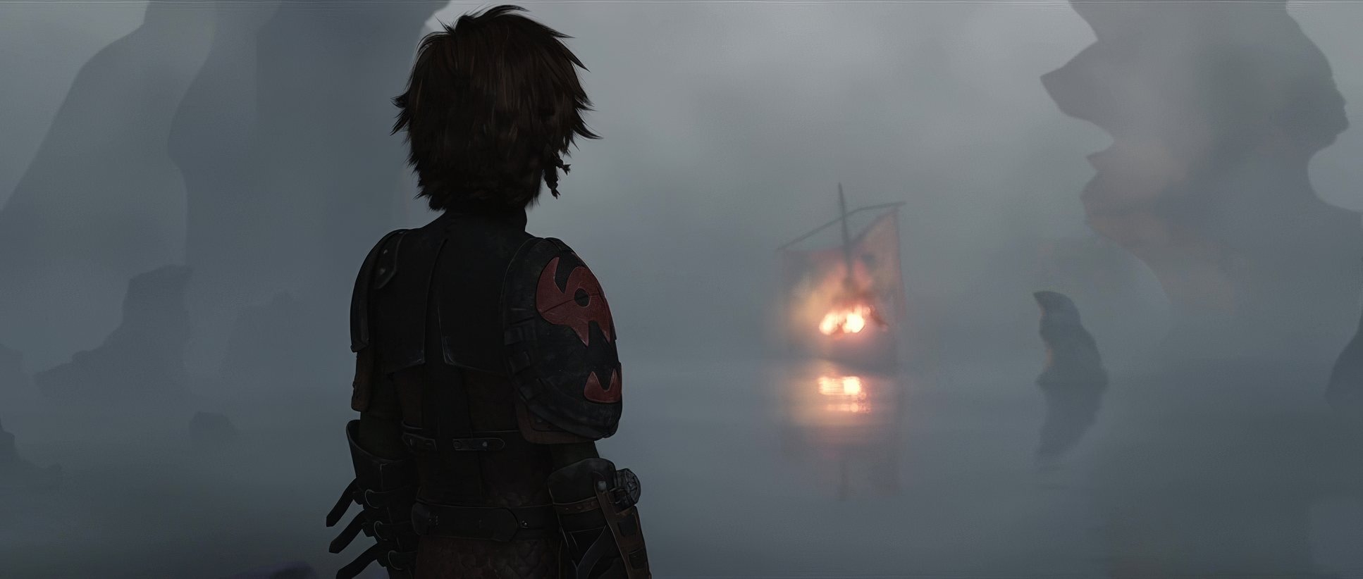
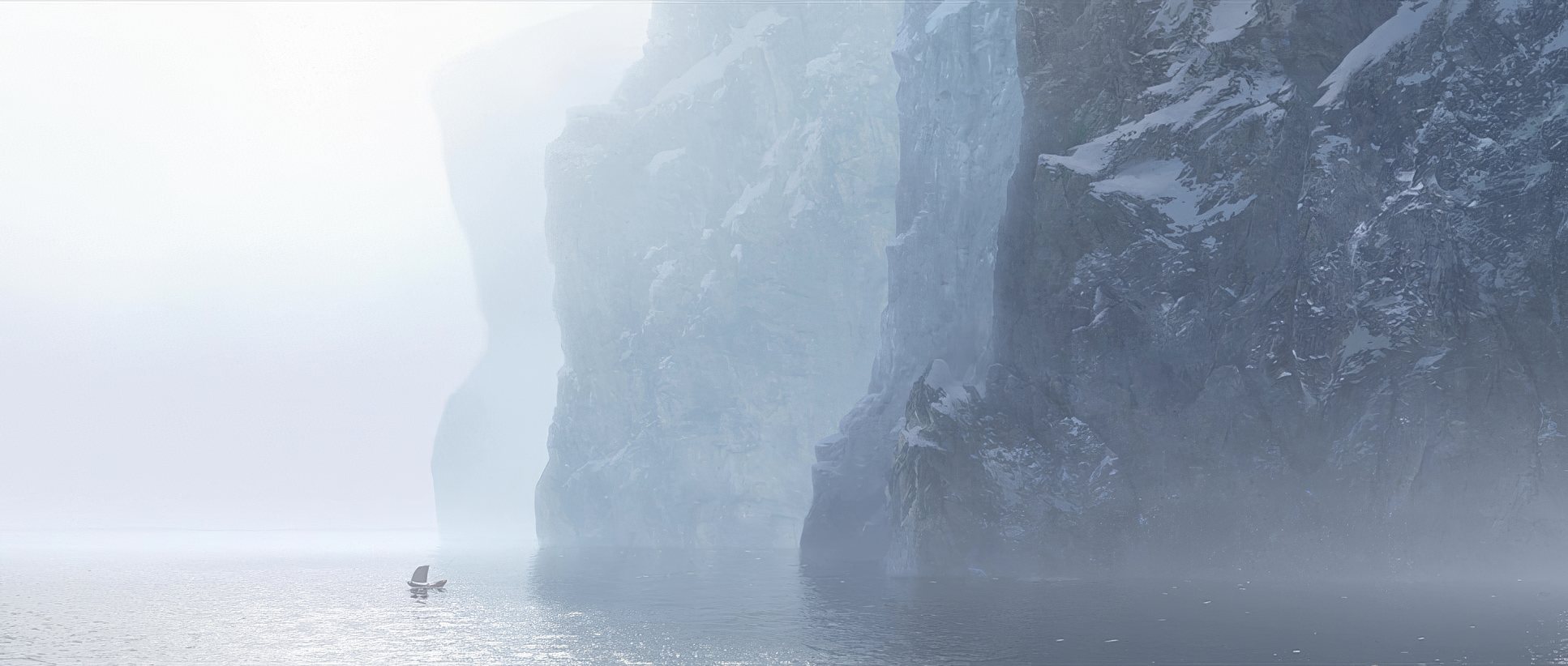
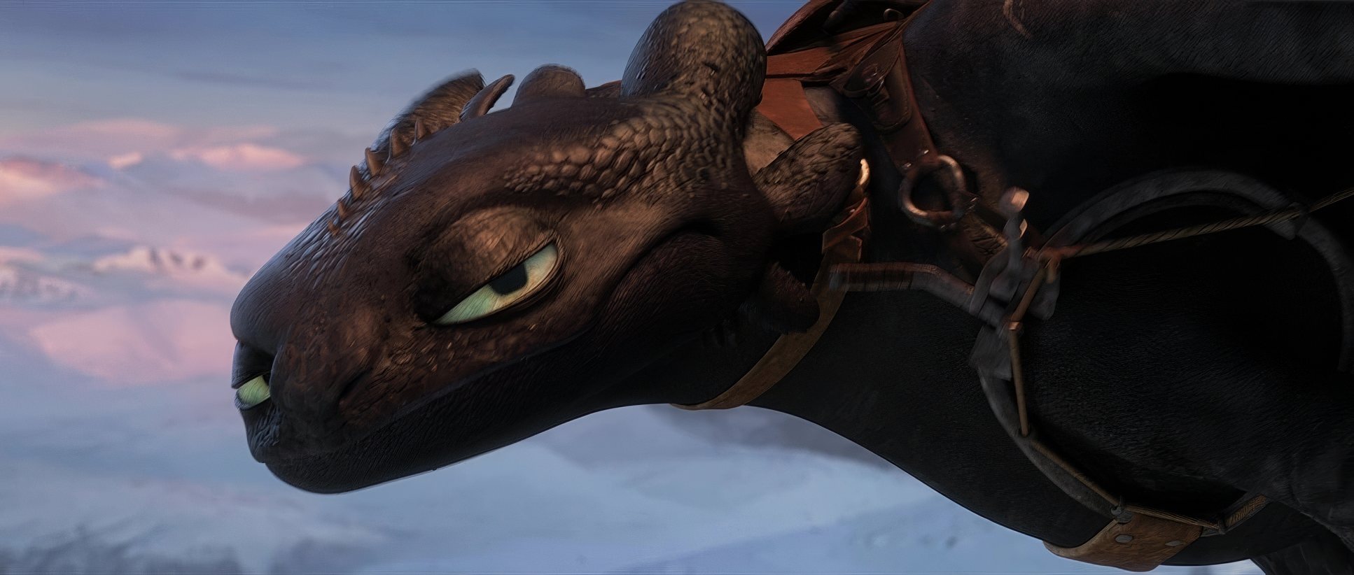
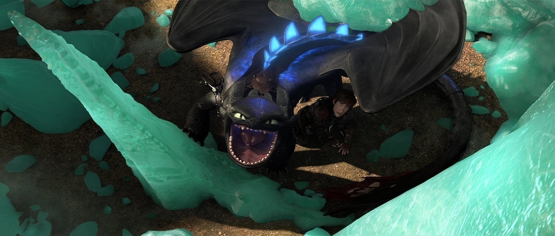
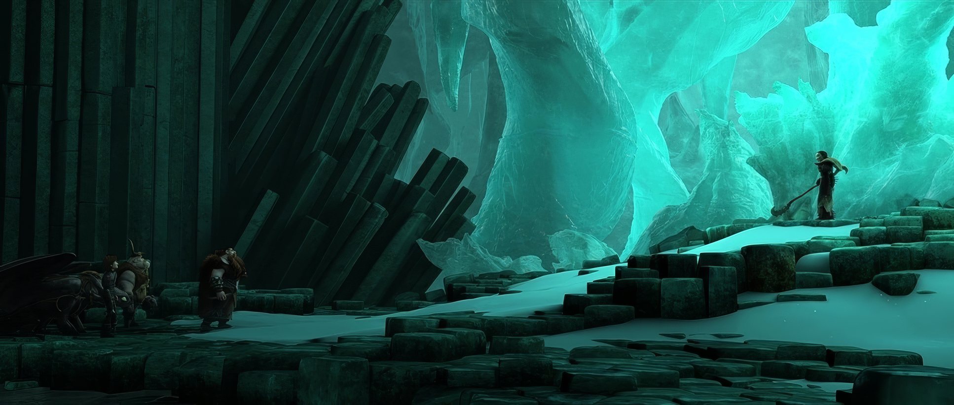
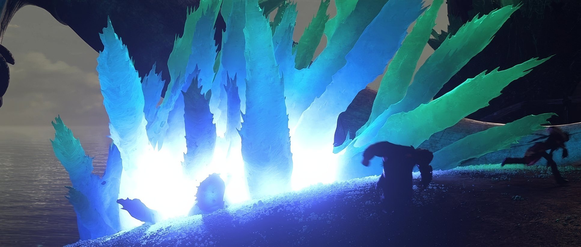
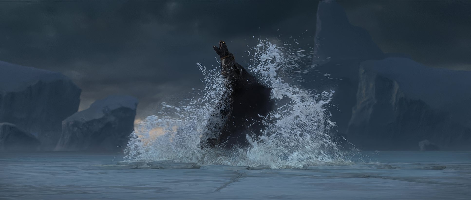
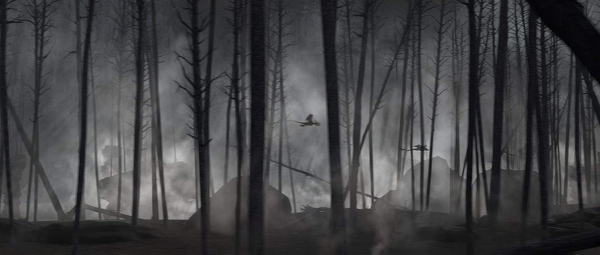
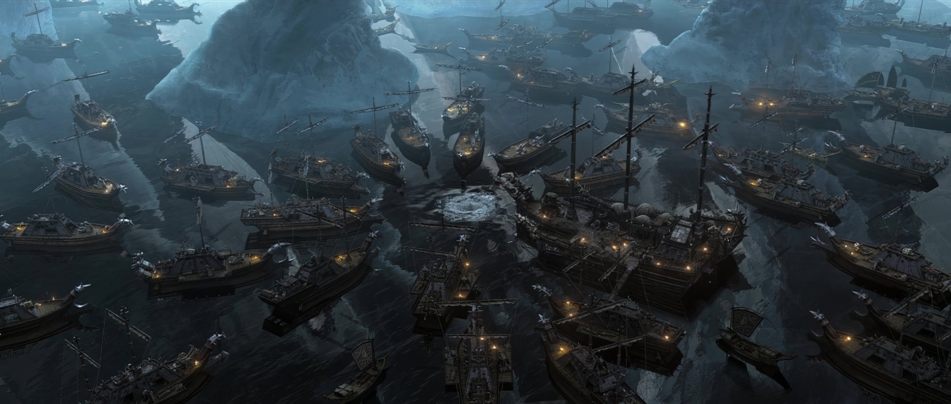
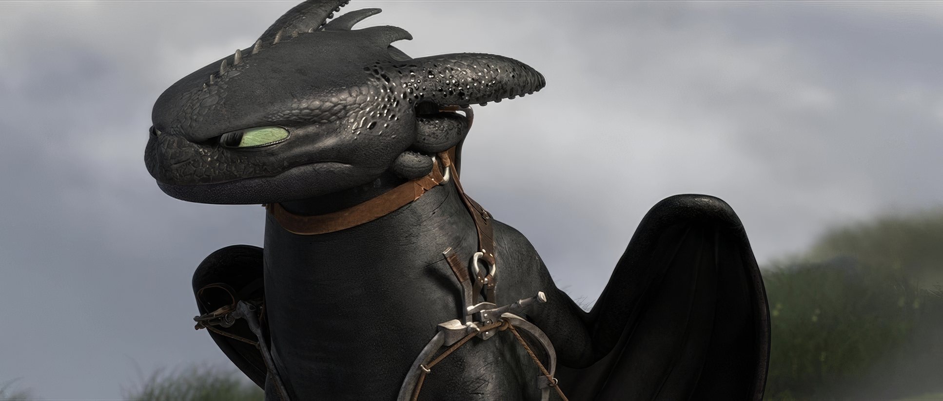
Every light source feels like it has a reason to exist. In Valka’s ice sanctuary, we get the “coolest mood lighting ever” a bioluminescent glow that creates a unique microclimate. It’s a visual poem. But look at the technical side: the dynamic range is insane. In the shadowy depths of Drago’s ships, we see deep, rich blacks that hold detail without feeling “muddy.” Conversely, the highlight roll-off on the dragon scales in the sun is buttery smooth. It doesn’t look like a 2014 render; it looks like it was shot on high-end glass with a massive sensor.
Color Grading: The Soul of the Image
This is my bread and butter. The color grade in HTTYD2 isn’t just a filter; it’s the narrative engine. The film leans into a sophisticated hue separation strategy that I find myself referencing in my own work.
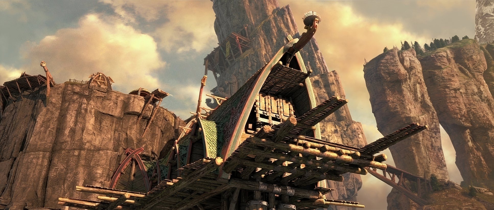
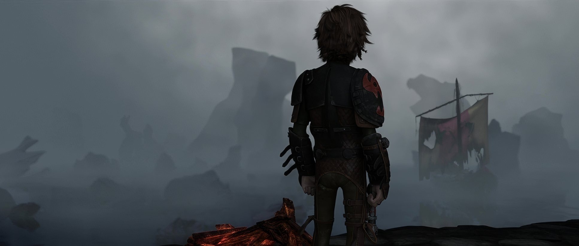
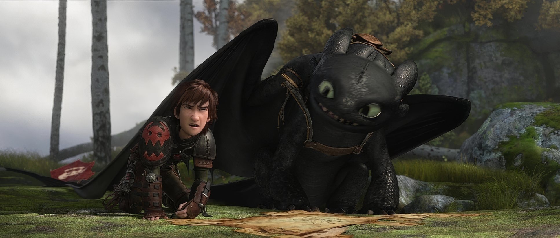
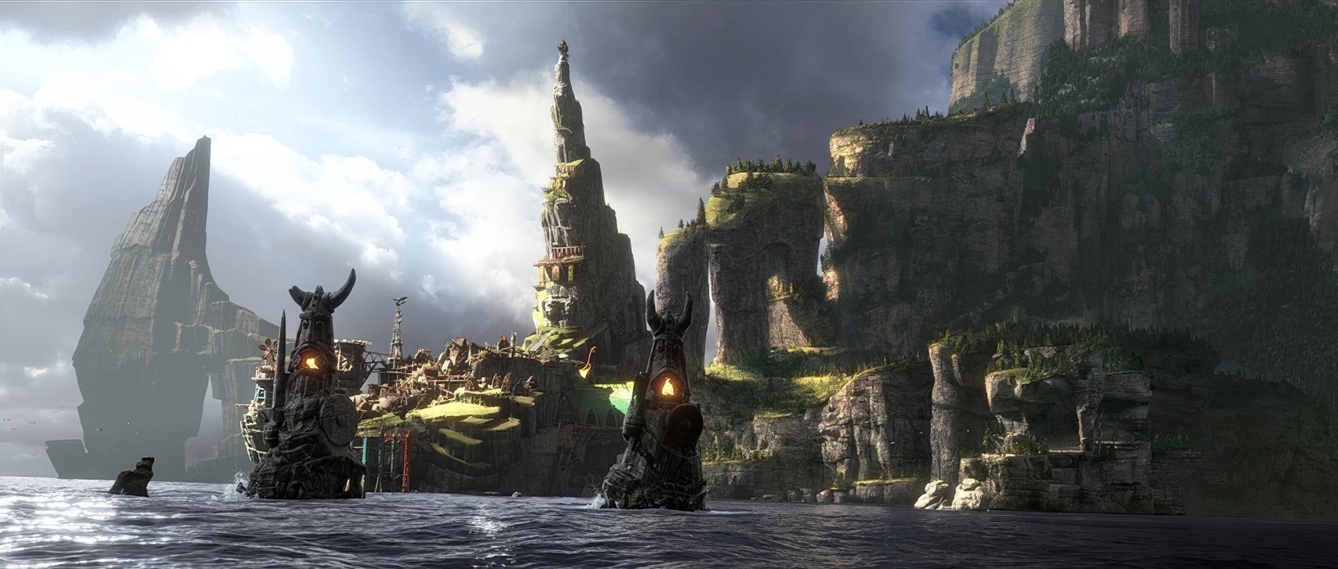
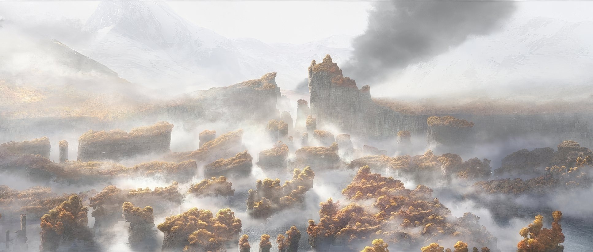
Berk is all about “home” warm oranges, earthy browns, and greens. But when we hit Drago’s domain, the palette shifts to “grey metal and wood,” creating a “visual contrast of freedom and oppression.” One observer asked, “Did they not hold back on vibrant colors to showcase the dragons?” and the answer is a resounding no. They used every bit of the gamut to distinguish these worlds.
What I appreciate most is the tonal sculpting. These aren’t “crushed” blacks; they have that print-film sensibilitywhere you feel the weight of the shadows. It’s a relentless pursuit of emotional resonance through color, from the heroic golds of flight to the chilling, desaturated blues of the finale.
Camera Movements

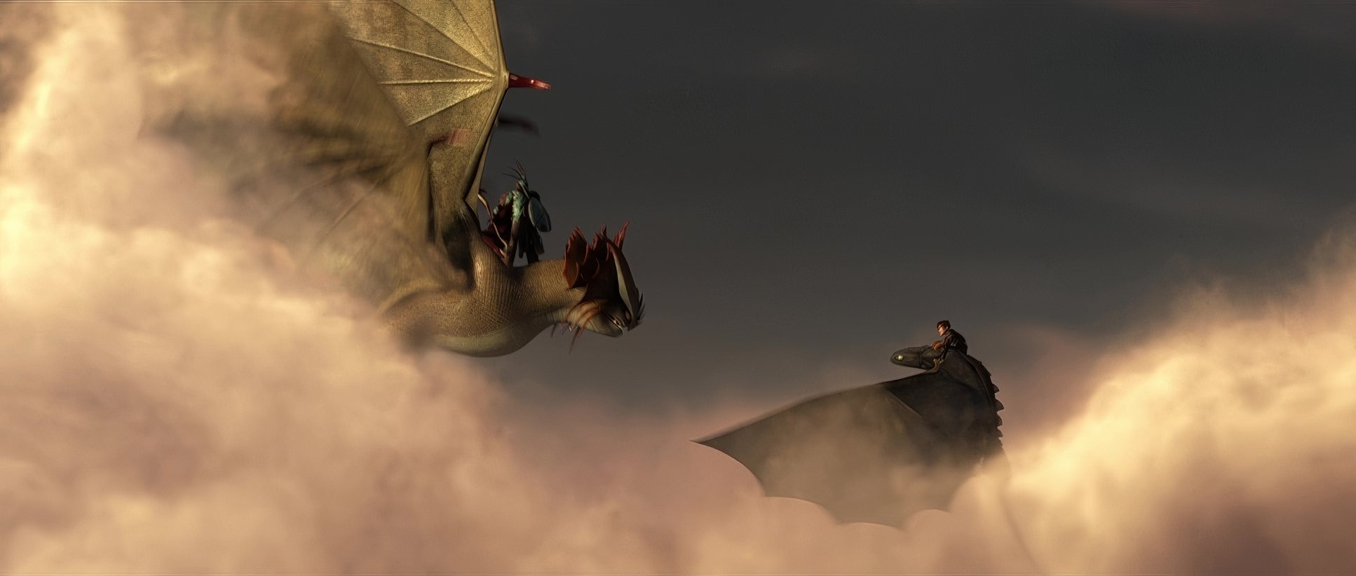
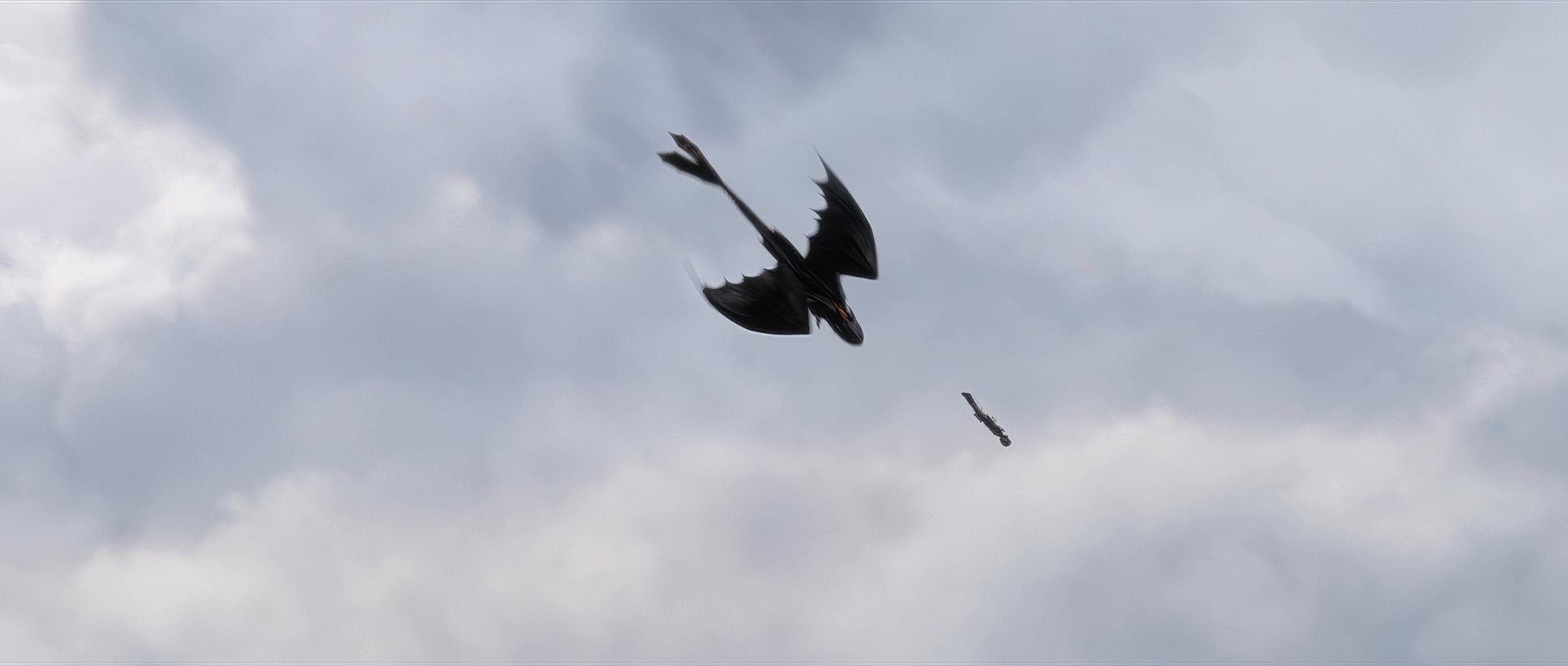
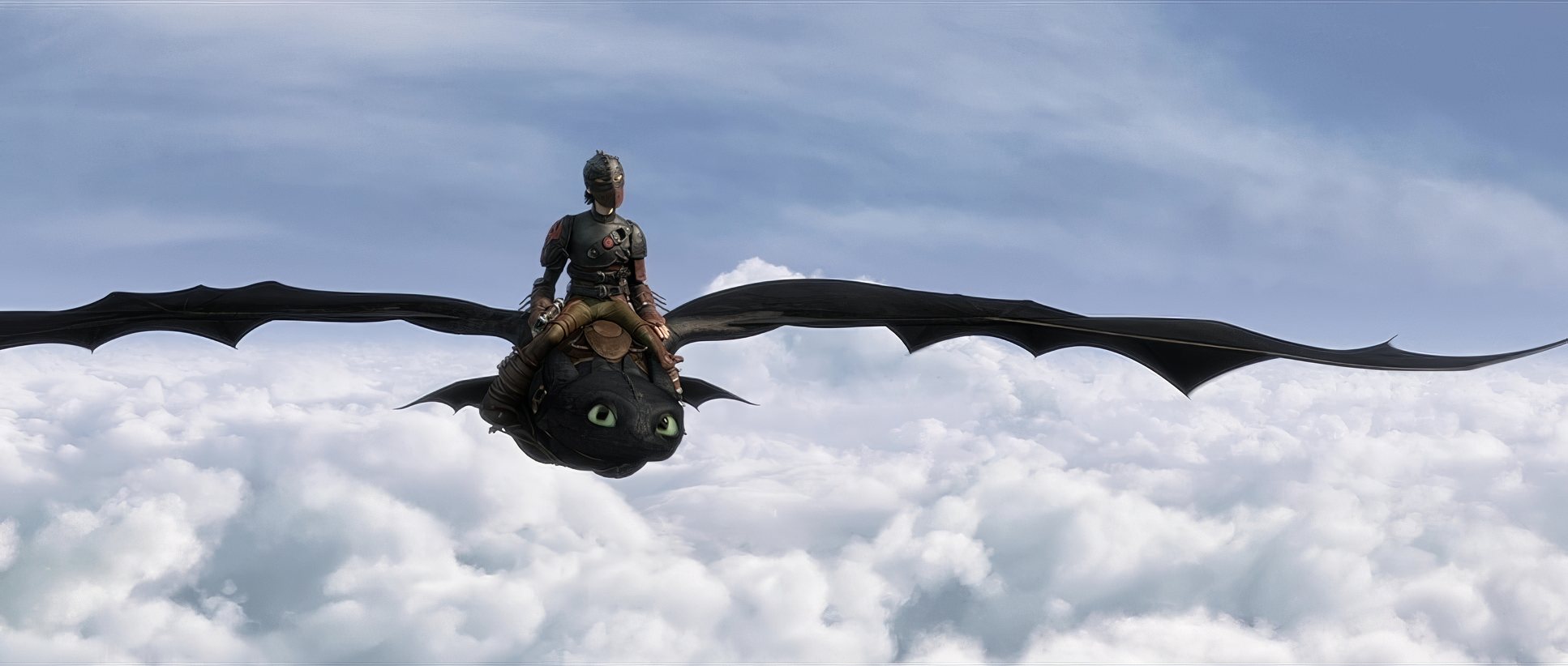
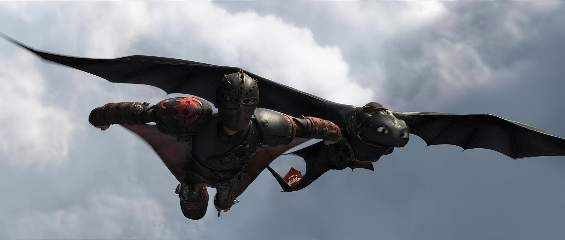
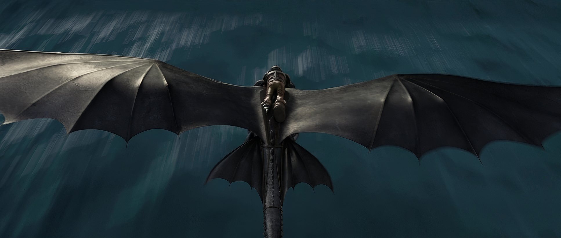
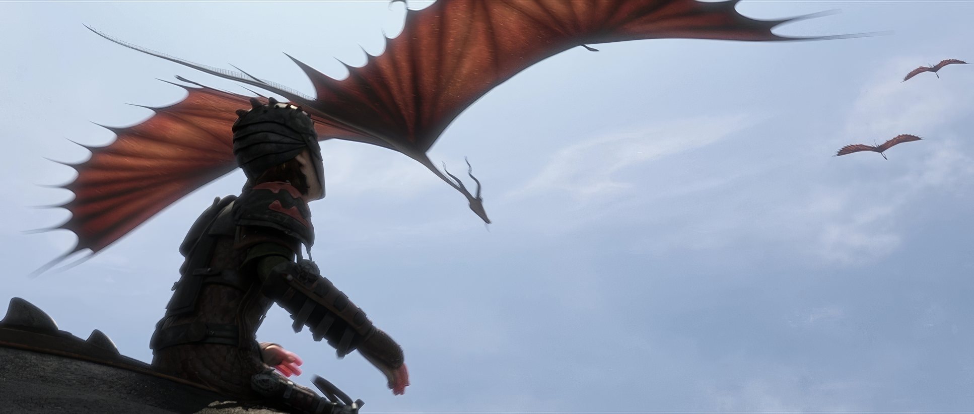
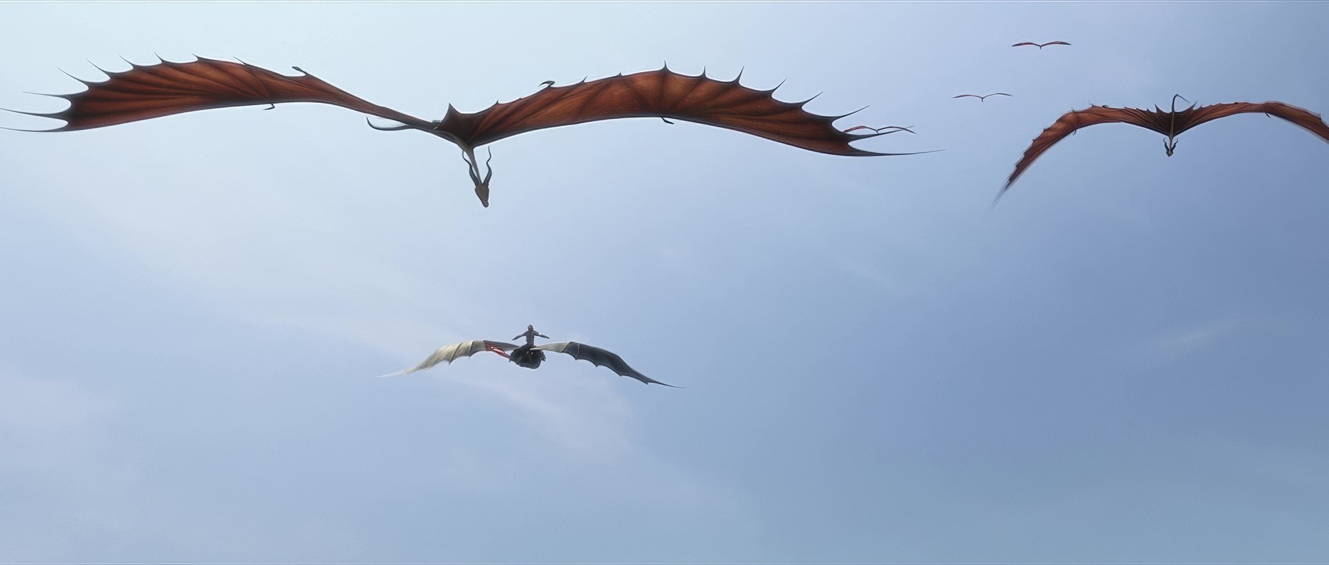
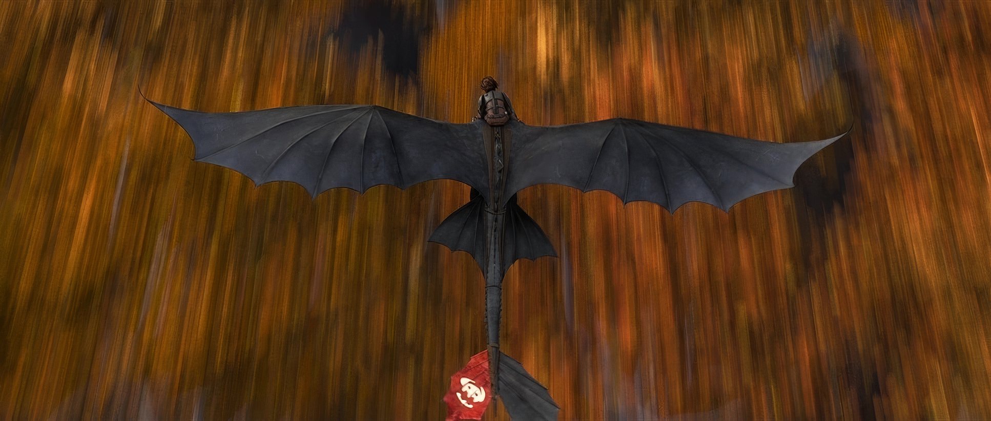
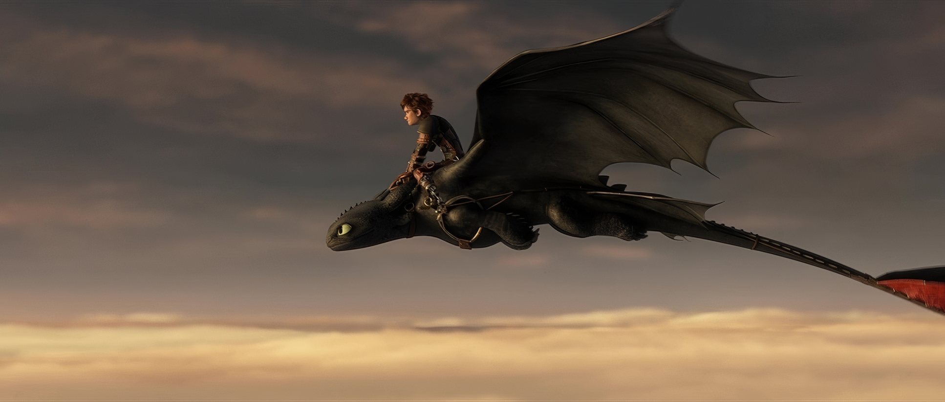
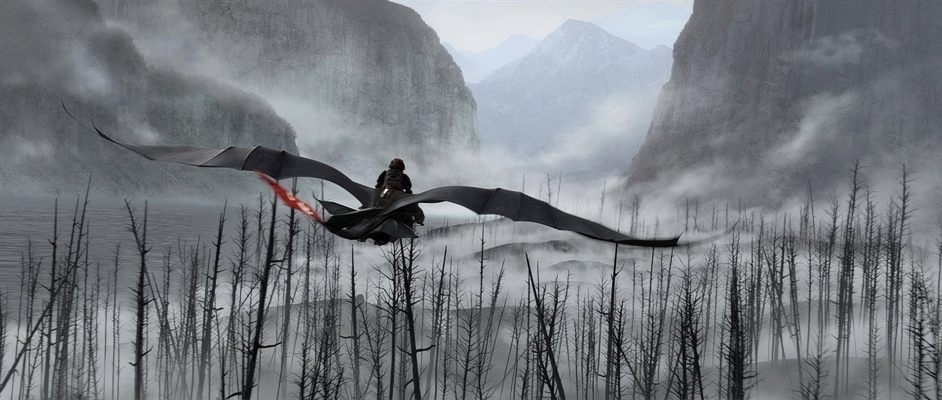
This is where the film truly sings to me. The camera is rarely static, but it’s never “floaty” for the sake of it. During the flying sequences, it feels like there’s a highly skilled, incredibly fast drone operator chasing Hiccup.
There’s one specific detail I love: when the camera passes a statue, it has its own “realistic turbulent flying movements.” That tiny bit of “imperfection” is what sells the realism. It’s not a perfect digital path; it’s a camera fighting the wind. That “handheld” feel in the grounded scenes adds an immediacy that makes you forget you’re looking at pixels.
Compositional Choices

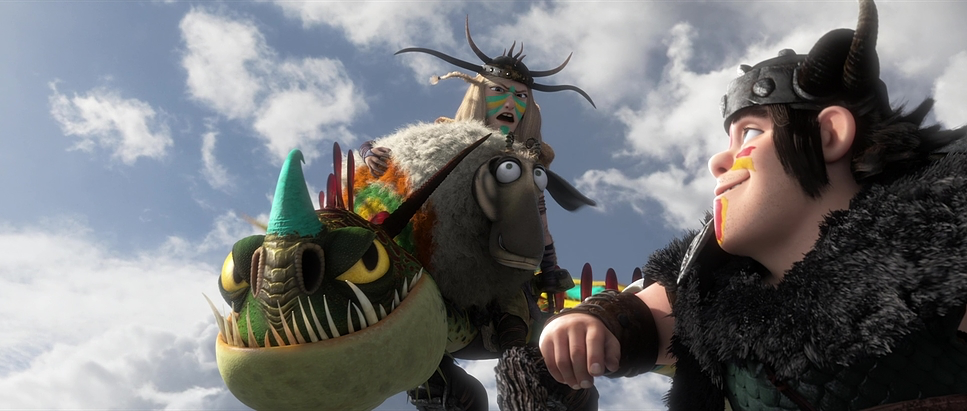
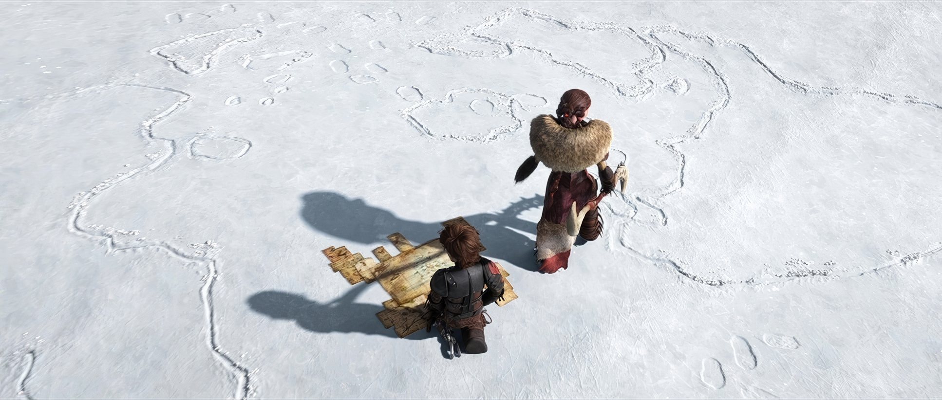
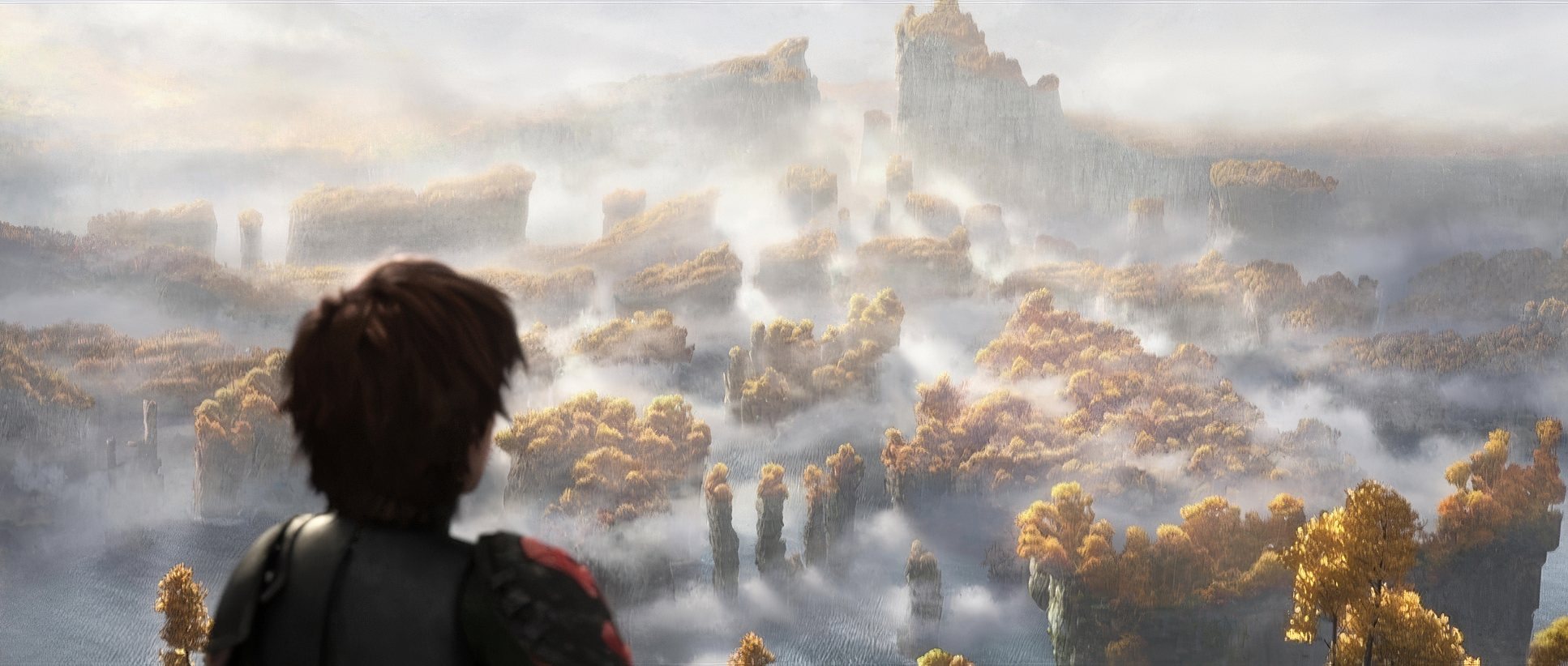
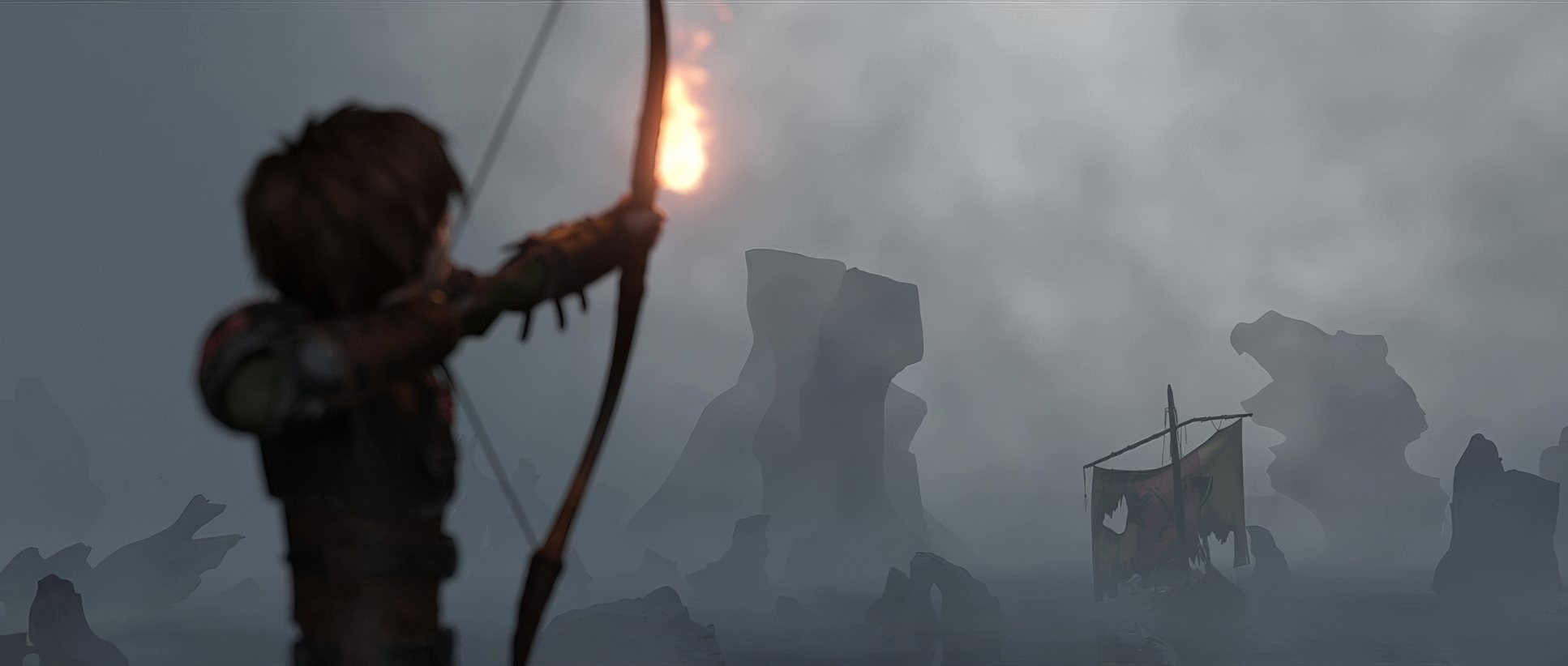
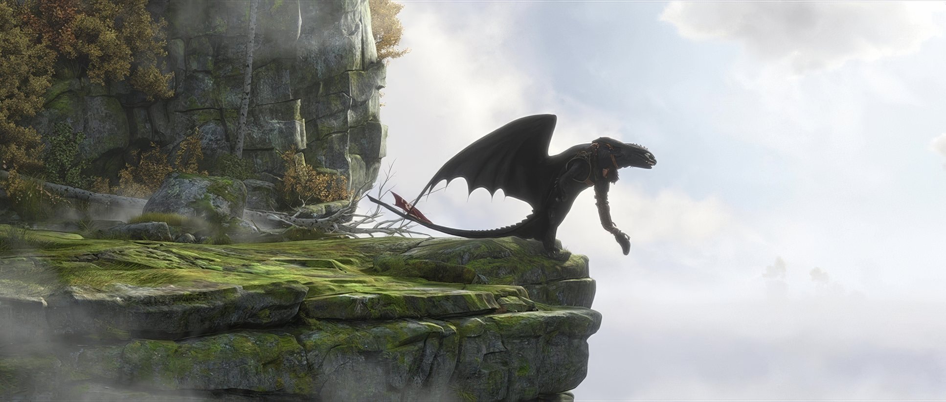
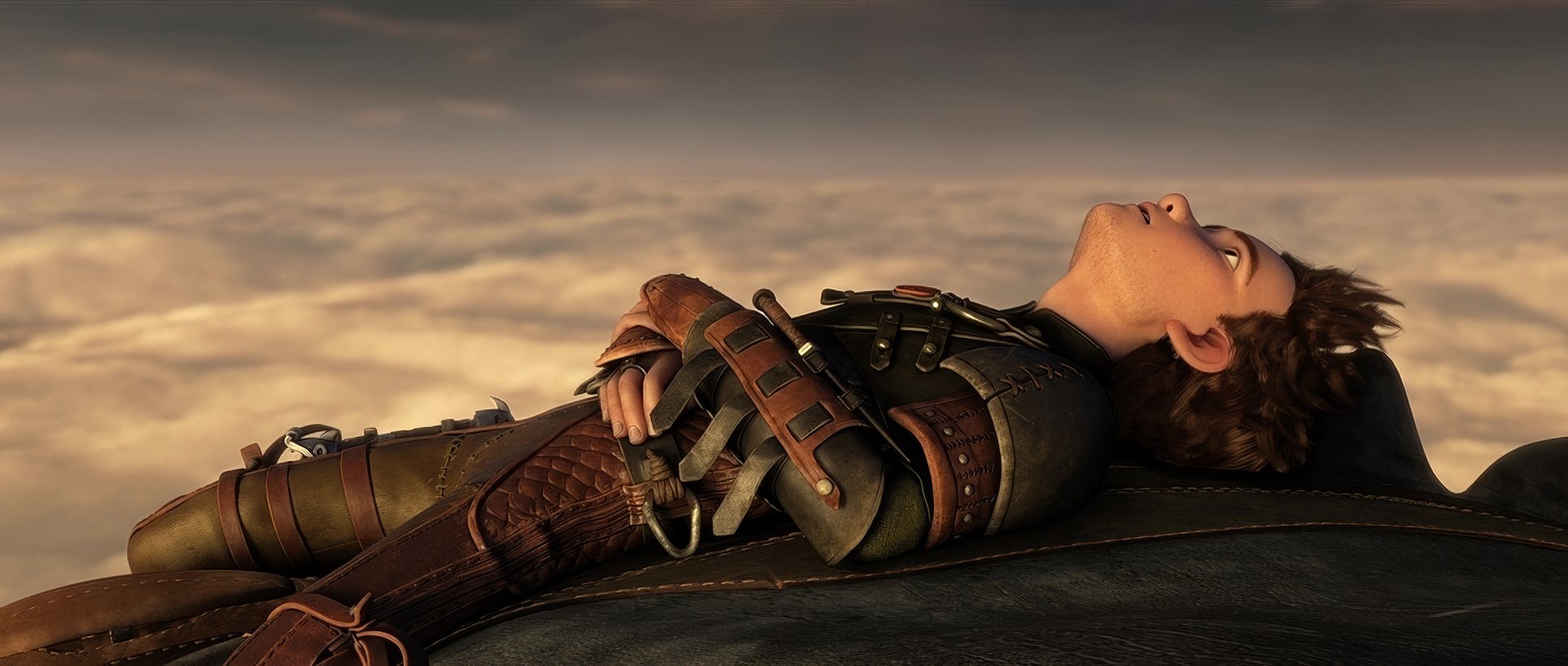
The compositions are gorgeous. Whether it’s a tight close-up of Hiccup’s face or a “far away shot” of a ship near a massive piece of land, the scale is handled with mastery. That wide shot actually made me think, “that looks like live action.”
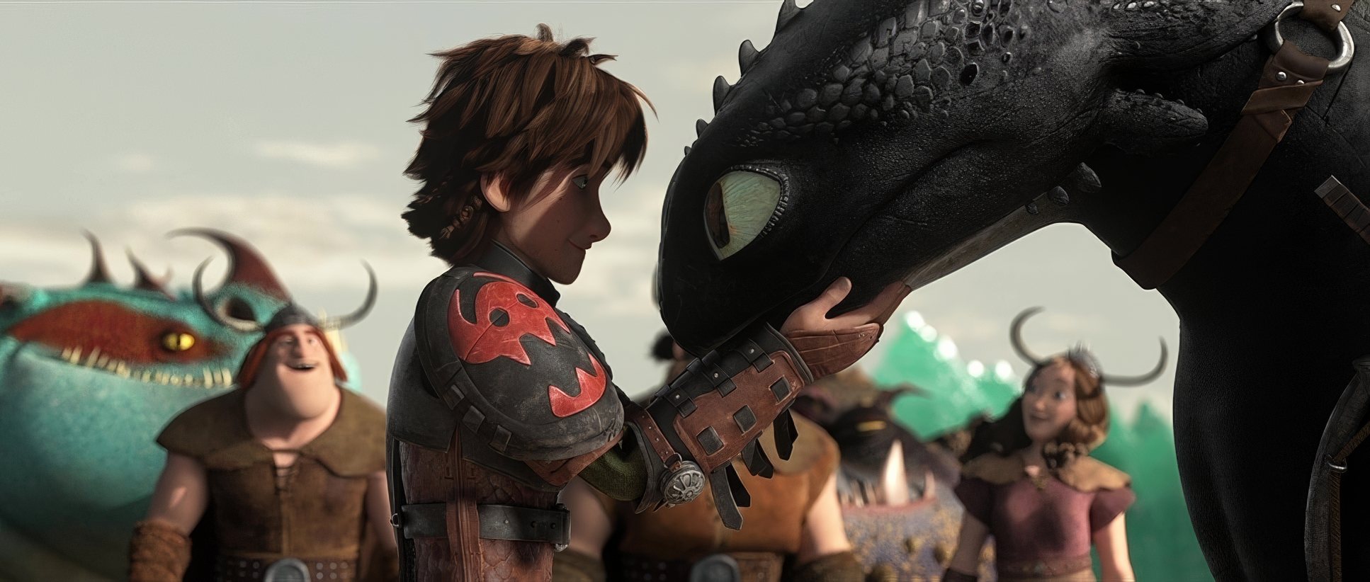
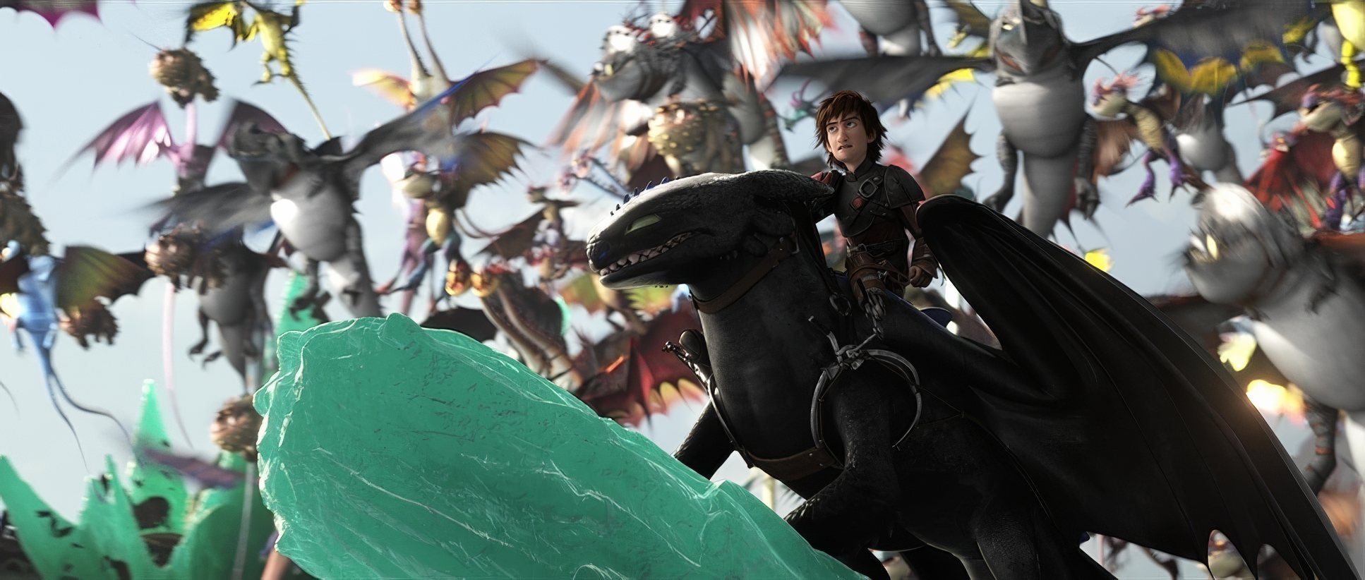
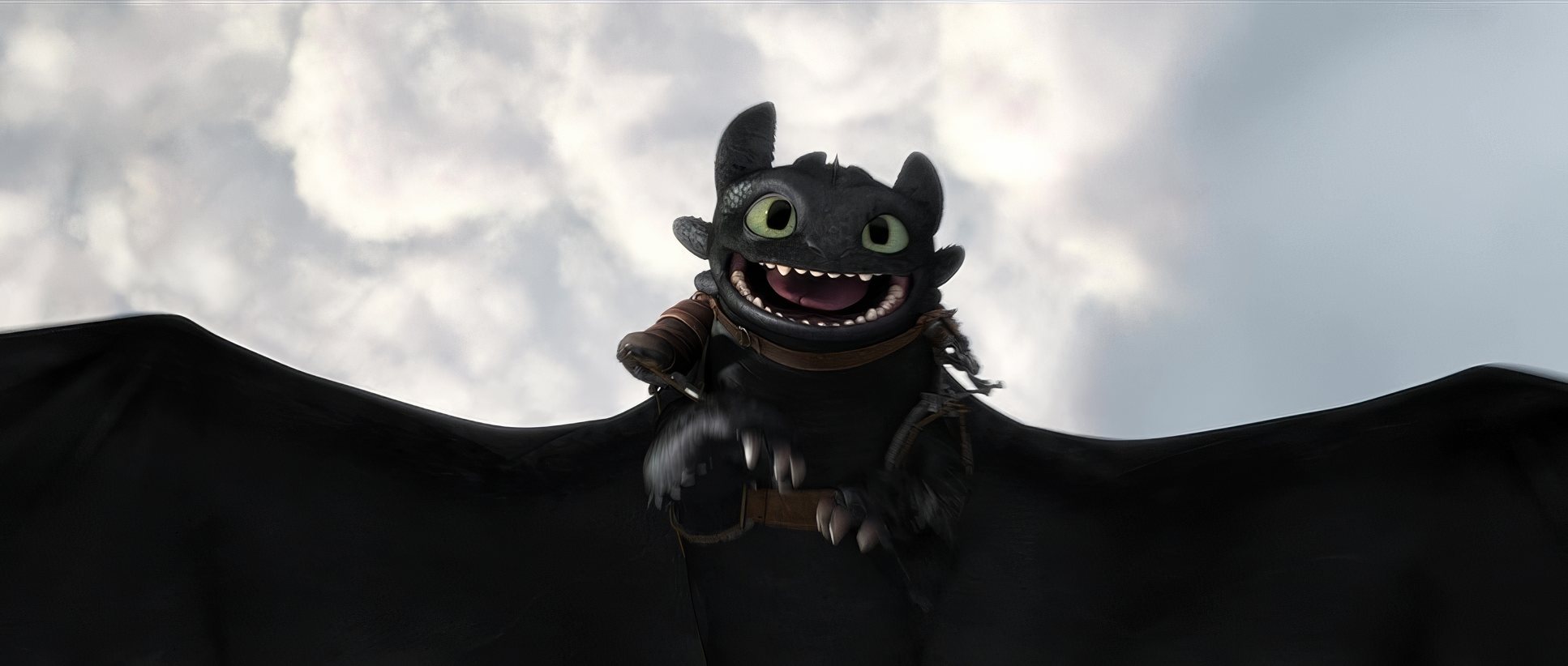
They use every trick negative space during the ocean flights to show how small our heroes are, and depth cues like atmospheric haze to push the background away. Even the “classic” move of putting reflections in the pupils adds a layer of depth that makes the characters feel alive. They’re using the “rule of thirds” and “leading lines” not because it’s a textbook, but because it works to guide the eye in a chaotic world of thousands of dragons.
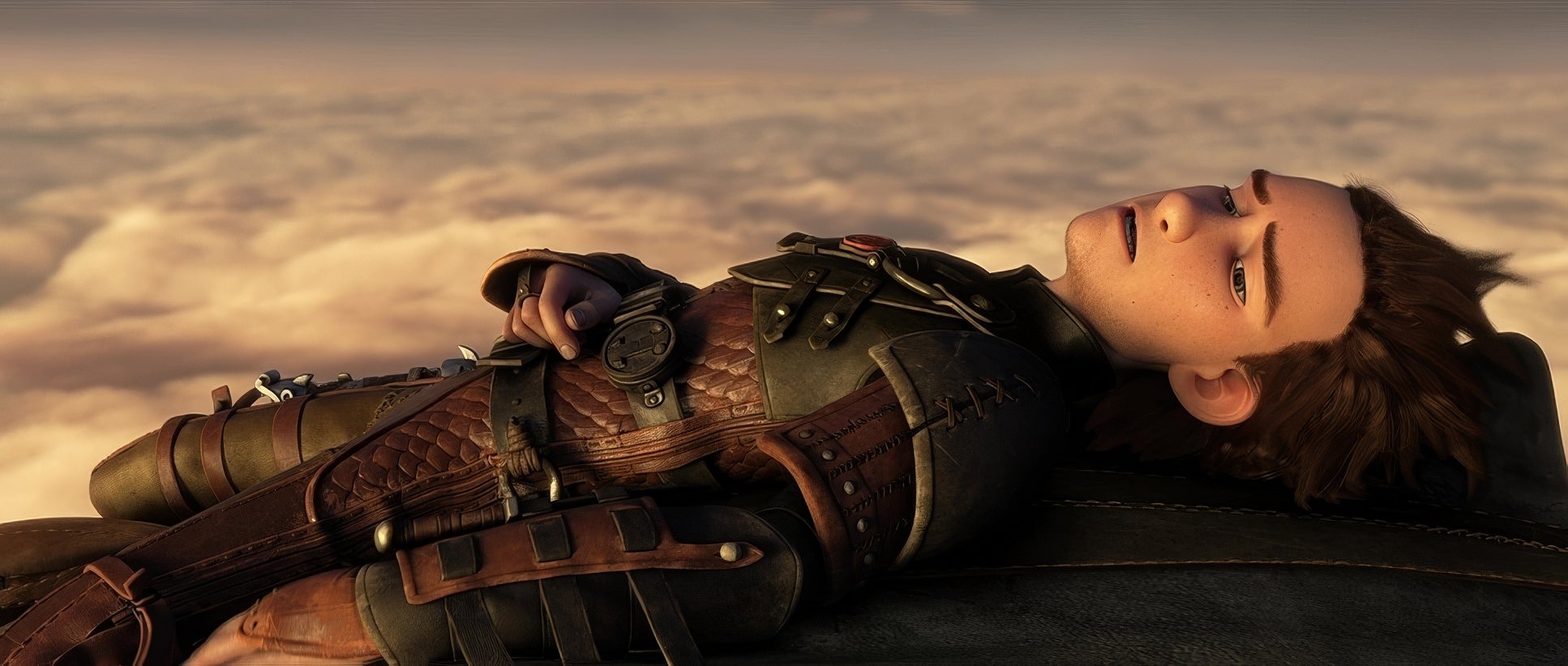
Lensing and Blocking
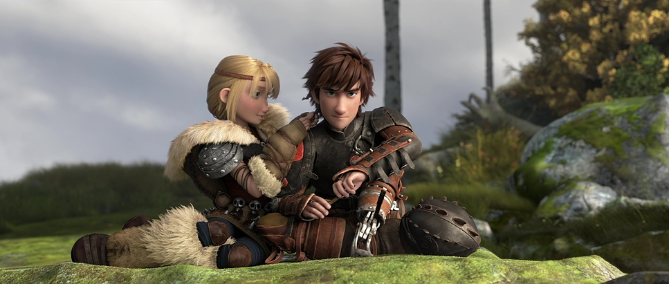
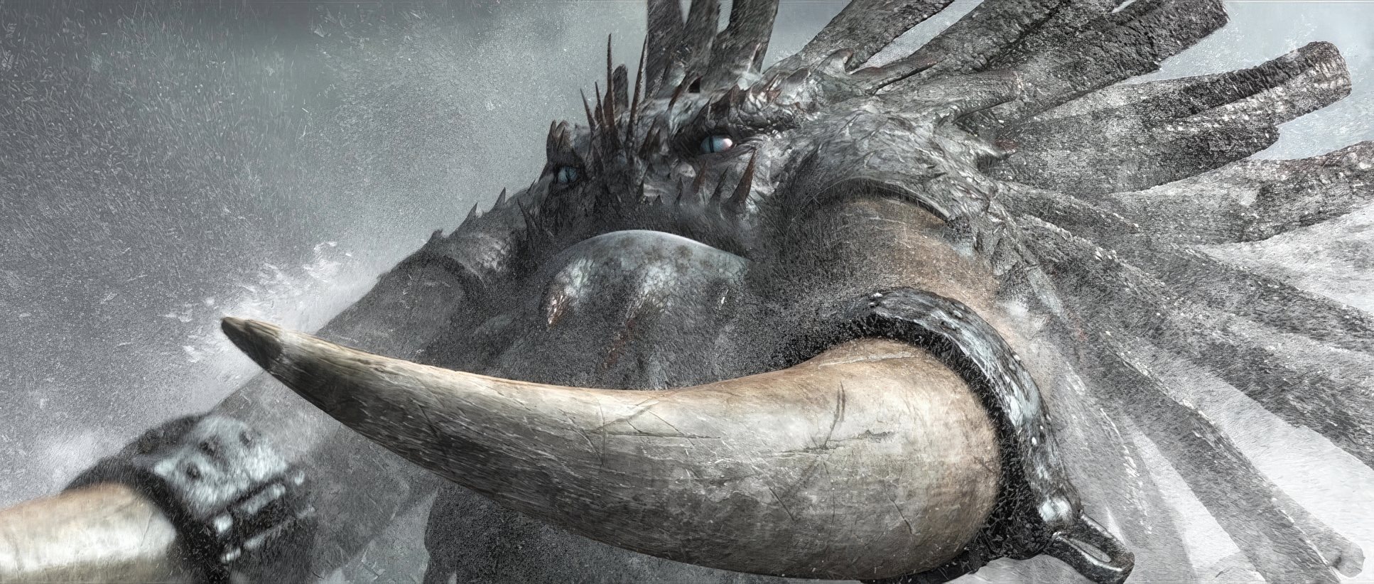
In animation, “lensing” is about psychology. We see wider virtual lenses for the “big” moments to give us that sense of freedom and vulnerability. But when things get heavy like Hiccup confronting Drago the “lens” gets longer. It compresses the space and ratchets up the tension.
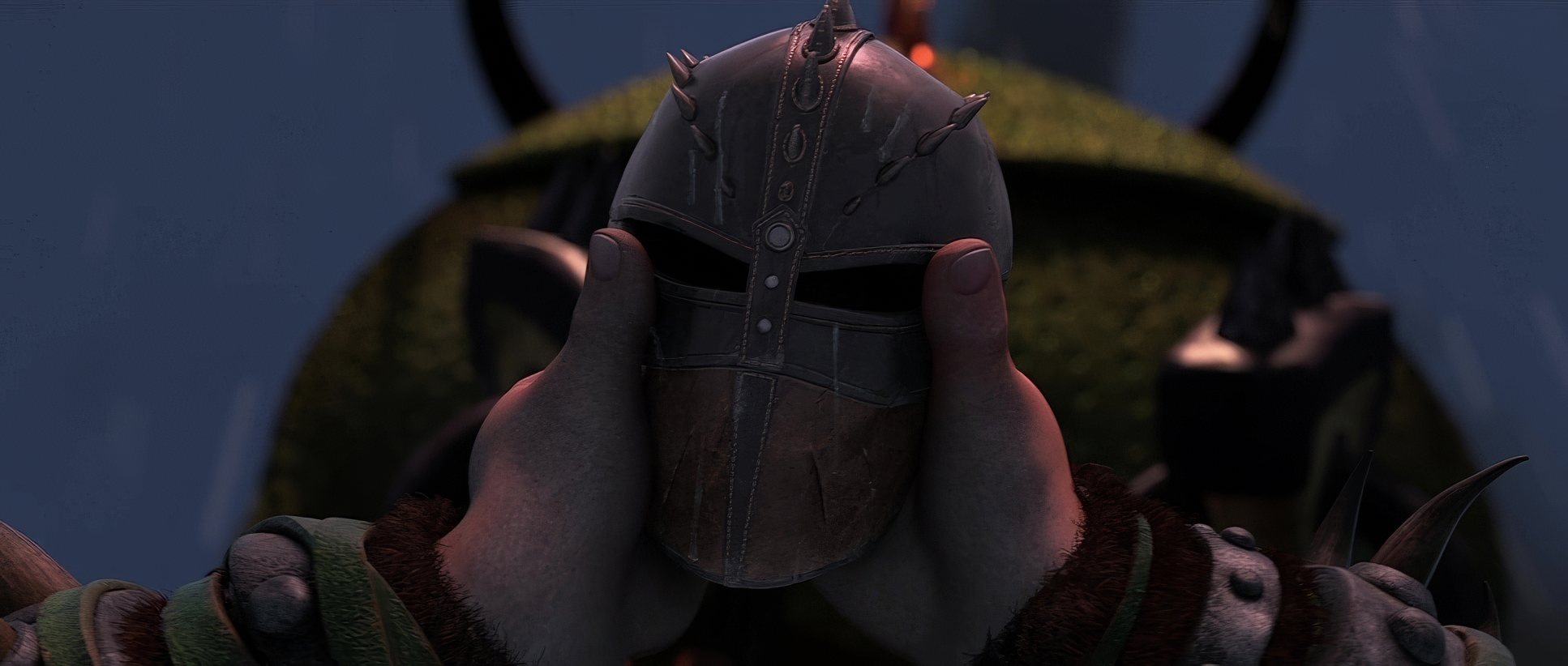
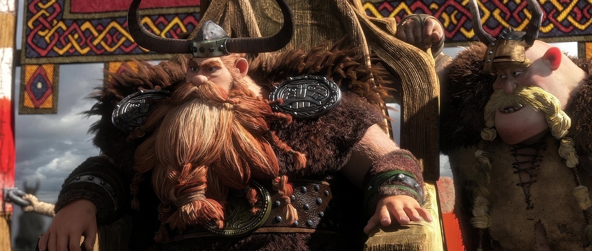
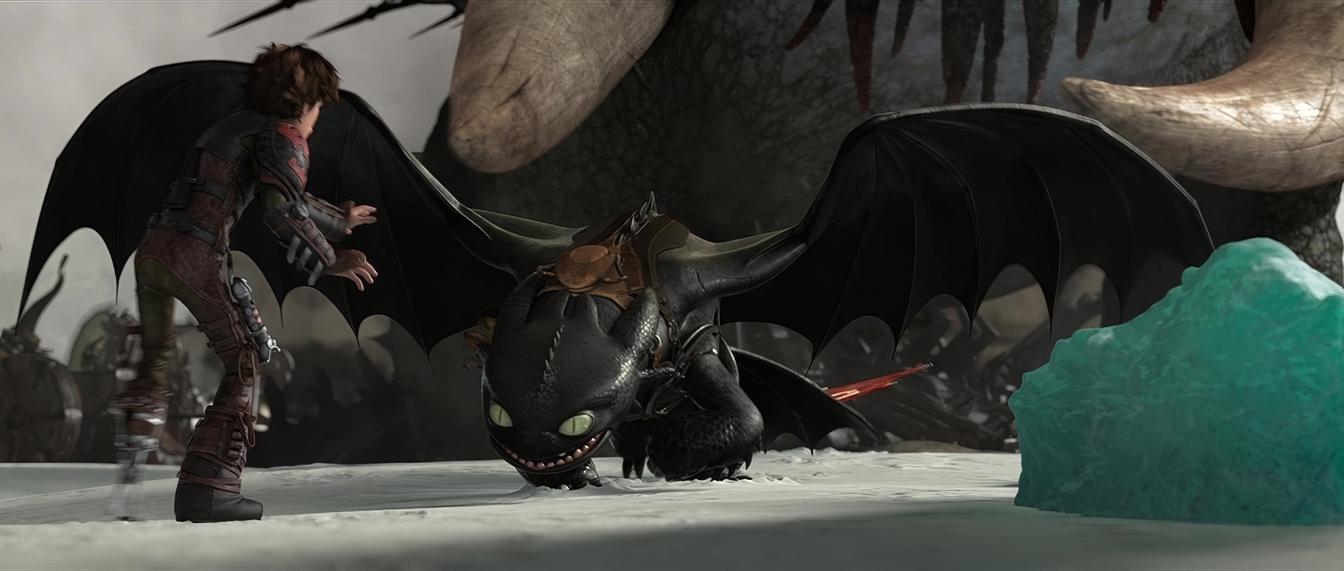
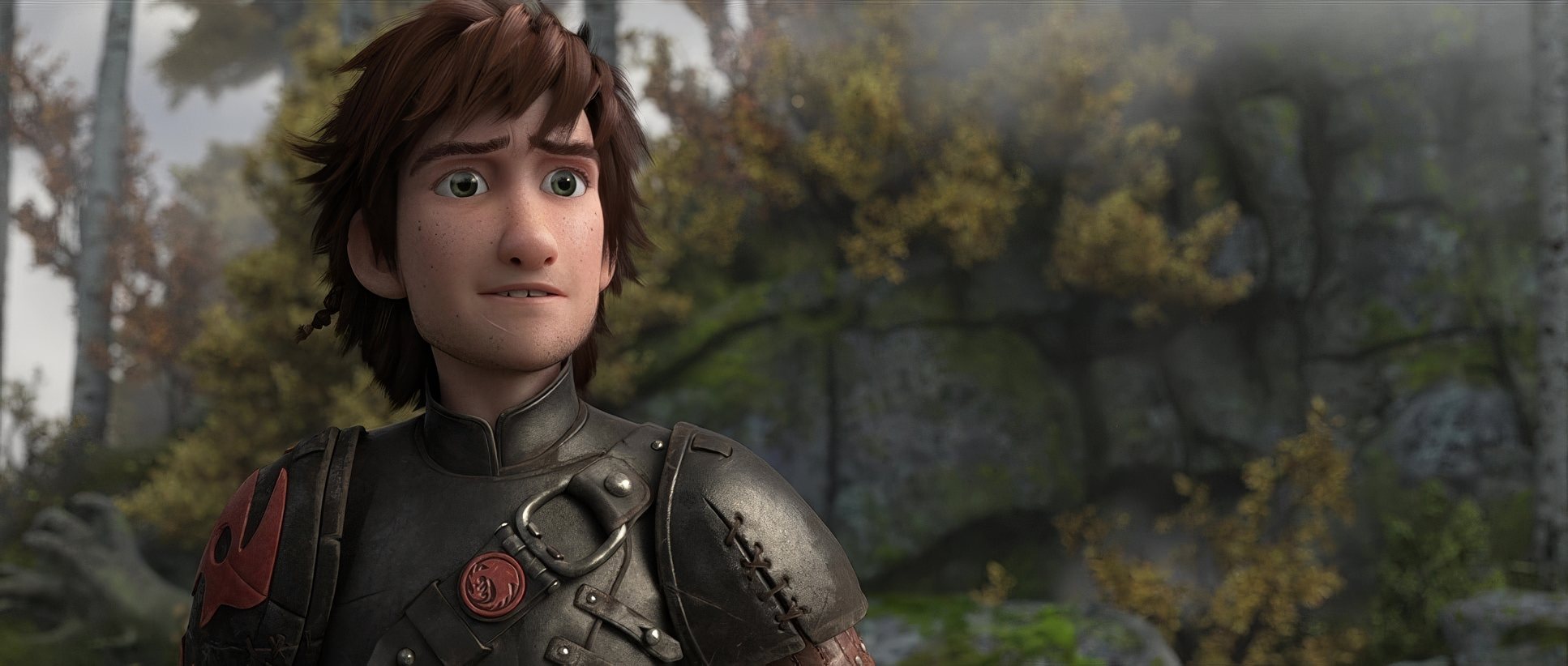
The blocking is just as smart. Look at the “alpha shadowing” how Toothless reacts to the threat of a bigger dragon. The way characters are positioned to show power dynamics (Drago being centrally framed and dominant) is classic filmmaking. It’s about who owns the frame and who is being pushed out of it.
Inspiration Behind the Look
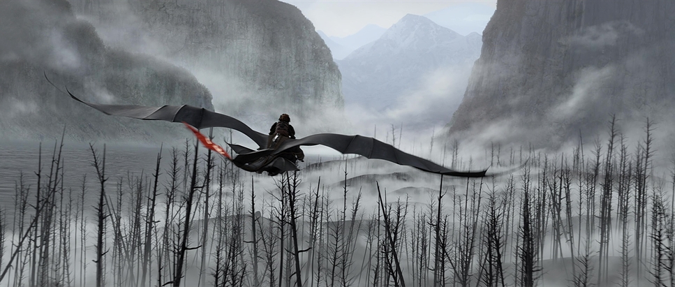
The core of this look is the “exhilaration of flight.” If the first film was an indie drama about a boy and his dog, this is the “Lion King of this generation” an epic with a massive horizon. I see echoes of nature documentaries here that sweeping grandeur of a camera gliding alongside migrating birds. It’s not just spectacle; it’s a visual metaphor for Hiccup’s growth. The landscapes expand as his responsibilities do.
Technical Aspects & Tools
How to Train Your Dragon 2 | Technical Specifications
| Genre | Action, Adventure, Animation, Comedy, Family, Fantasy, Monster, CGI Animation, Horror, Drama, Coming-of-Age, High Fantasy |
| Director | Dean DeBlois |
| Cinematographer | Gil Zimmerman |
| Production Designer | Pierre-Olivier Vincent |
| Editor | John K. Carr |
| Colorist | Gregory Creaser |
| Time Period | Ancient: 2000BC-500AD |
| Color | Cyan |
| Aspect Ratio | 2.35 |
| Format | Animation |
| Lighting Type | Daylight, Sunny |
| Story Location | … Arctic Circle > Isle of Berk |
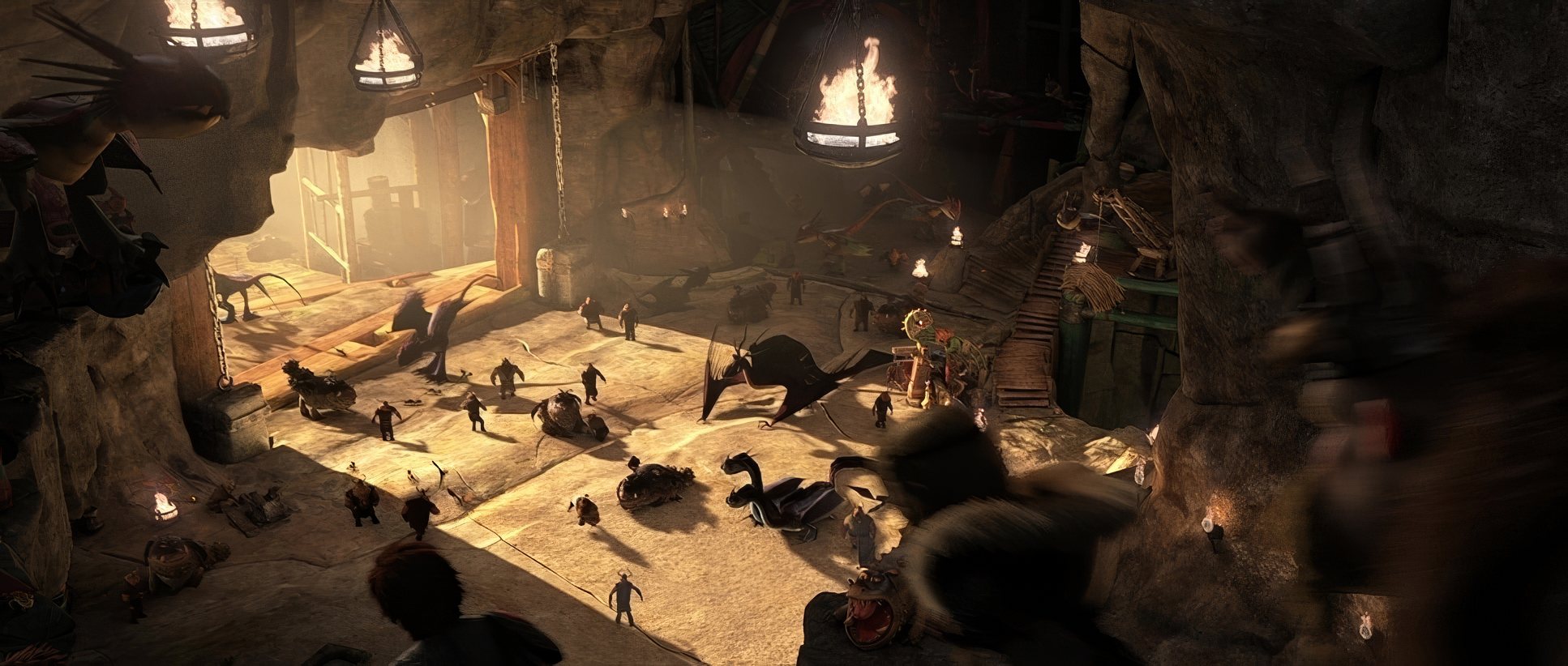
Look, we know the tools: Autodesk Maya for animation, ZBrush for sculpting, and some very beefy proprietary rendering engines. But the “how” matters less than the “result.” The “detail in the blacksmith shop” and the “sweet new interchangeable leg attachments” show the sheer man-hours put into asset creation.
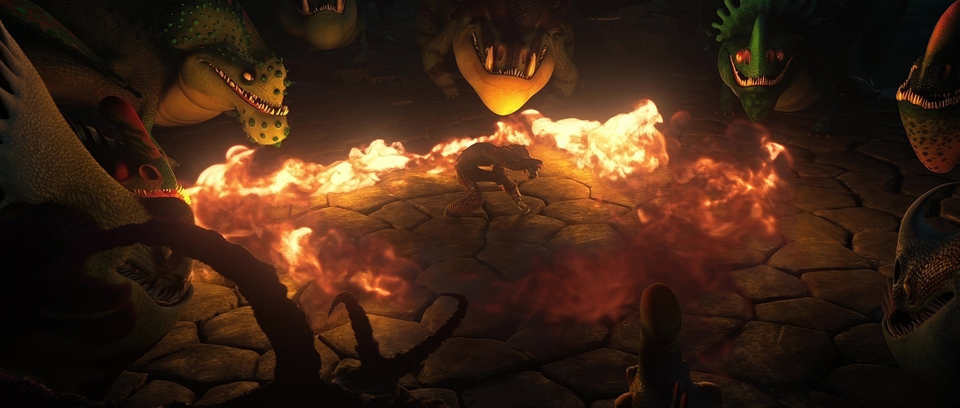
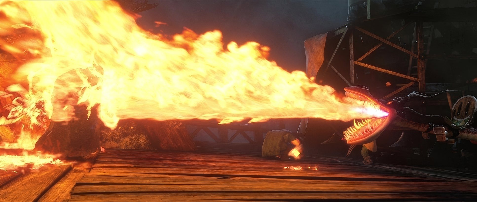
The fire effects? “I don’t get tired of these,” and neither should you. That’s complex fluid dynamics mixed with top-tier lighting. It’s a delicate dance between technological might and artistic finesse.
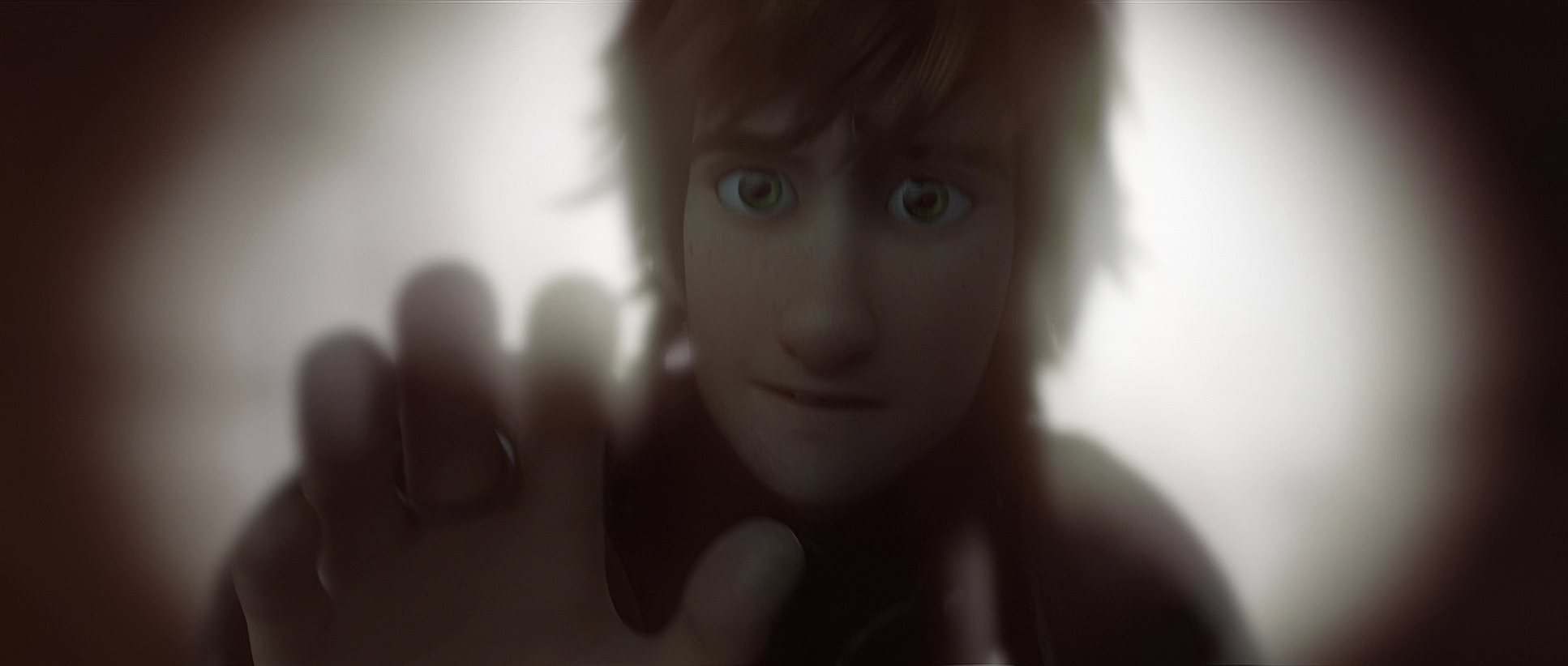
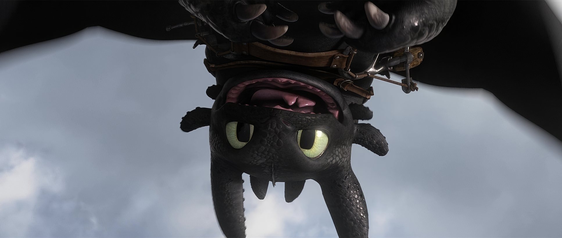
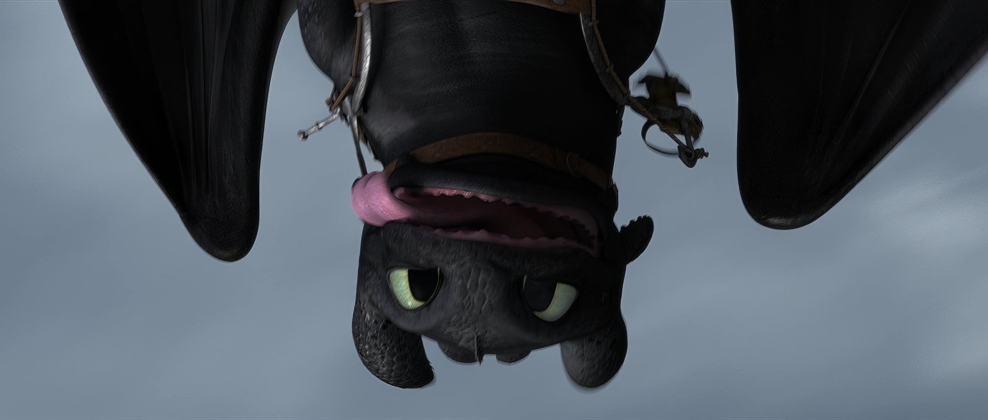
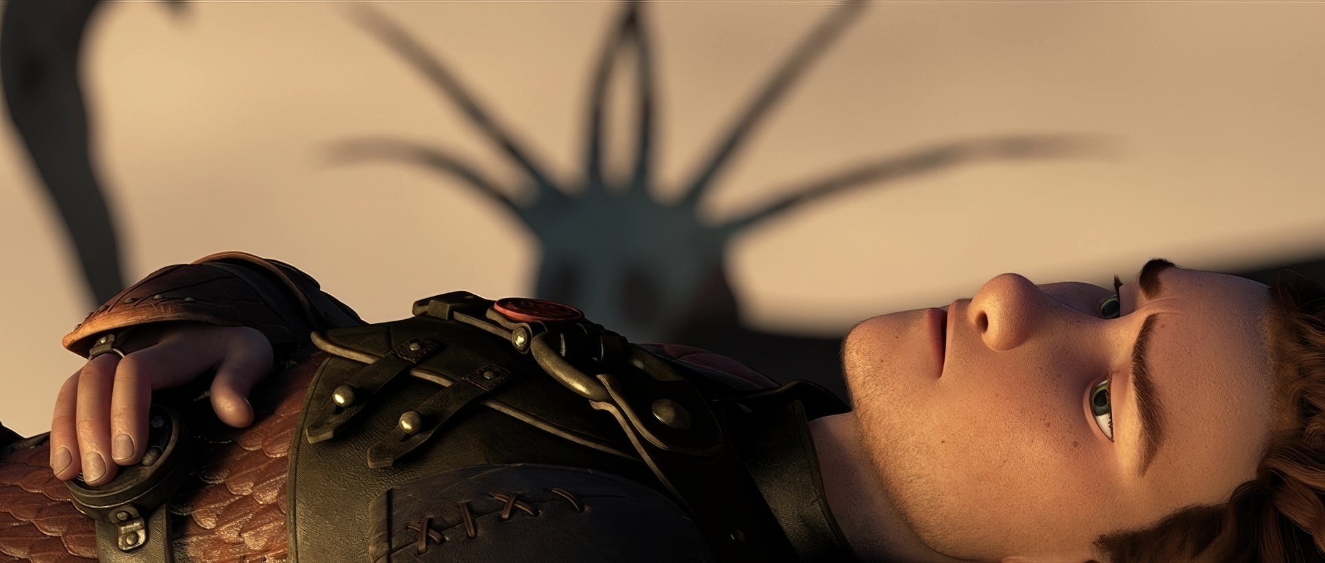
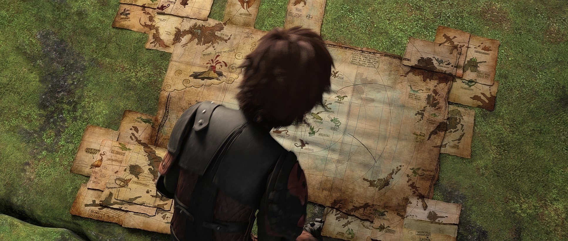
How to Train Your Dragon 2 (2014) Film Stills
A curated reference archive of cinematography stills from How to Train Your Dragon 2 (2014). Study the lighting, color grading, and composition.


- Also read: THE FIGHTER (2010) – CINEMATOGRAPHY ANALYSIS
- Also read: EDWARD SCISSORHANDS (1990) – CINEMATOGRAPHY ANALYSIS
Browse Our Cinematography Analysis Glossary
Explore directors, cinematographers, cameras, lenses, lighting styles, genres, and the visual techniques that shape iconic films.
Explore Glossary →