Revisiting How the Grinch Stole Christmas! (1966) is always a trip. For a colorist and filmmaker, this isn’t just holiday nostalgia; it’s a masterclass in visual aggression and storytelling economy. My office at Color Culture is full of what I call “dark twisted cartoons” films that aren’t afraid to scare kids a little and the Grinch is the grandfather of that aesthetic.
Watching it now, I don’t just see a Christmas special; I see a brilliant exercise in limited animation. The creators managed to build a gritty, coherent world with deceptive simplicity. I want to break down the visual alchemy specifically the color and layout choices that makes this 25-minute short hold up as a legitimate piece of cinema.
About the Cinematographer
In traditional hand-drawn animation, the “cinematographer” is effectively a two-headed beast: the director and the background designer. Here, we have the legendary Chuck Jones and the incredible Maurice Noble. Jones, fresh from his Looney Tunes era, brought that specific comedic timing and elastic character movement. But it was Noble who acted as the architect of the world.
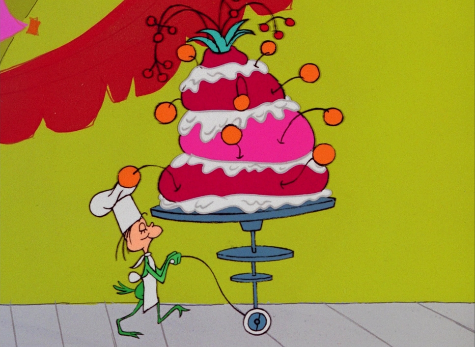
Noble’s approach was distinct: he used simple shapes but filled them with aggressive, prominent primary colors that pop off the screen. His backgrounds are rarely straight; they are curvy, crooked, and exaggerated, stretching to fit the Dr. Seuss aesthetic. It was a perfect collaboration Jones’s dynamic character acting needed a stage that was just as warped as the characters themselves. They didn’t just draw scenes; they shaped the frame with the intent of a DP lighting a set.
Inspiration Behind the Cinematography
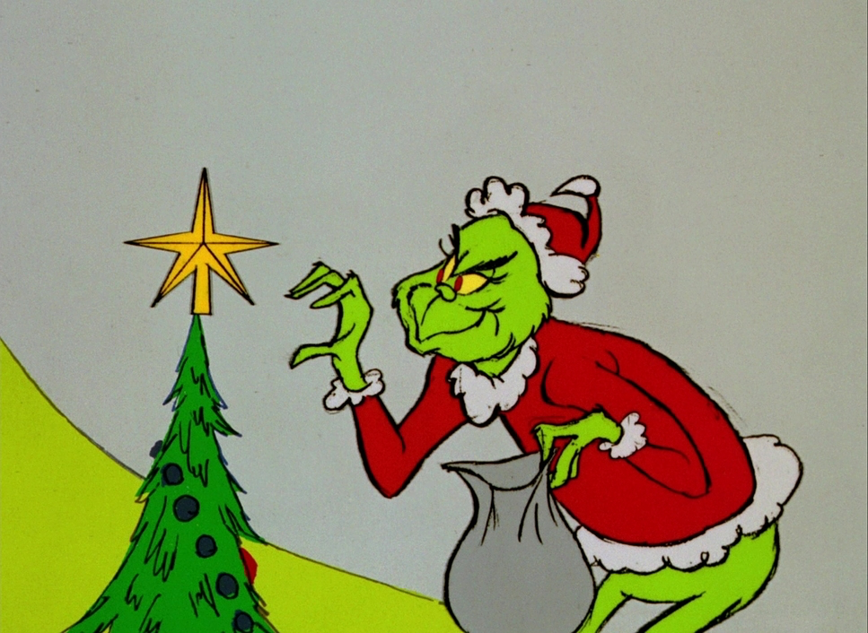
The primary challenge was adapting Dr. Seuss’s book, which due to printing limitations of the time was mostly black, white, and red. This left the visual identity wide open. Chuck Jones made the now-iconic decision to make the Grinch green. The reasoning was practical and hilarious: it was an unnatural color for a furry animal, instantly marking him as an “other,” and it supposedly reminded Jones of the ugly rental cars he used to drive. That specific shade of green isn’t just a design choice; it’s a character statement.
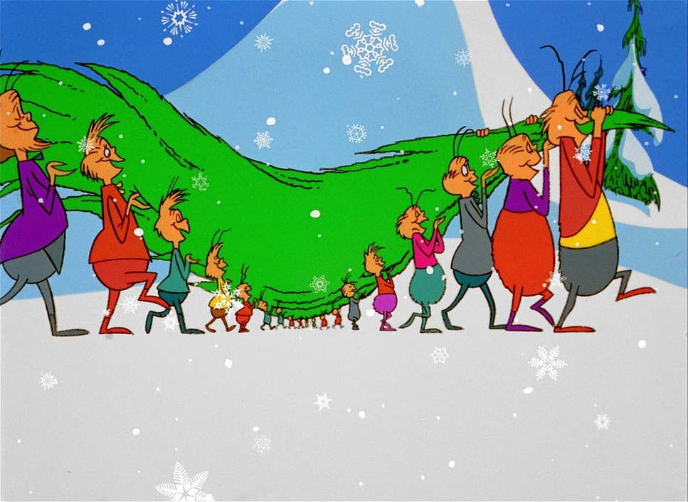
Because the book is short, the team had to expand the visual narrative to fill the TV slot. This led to giving Max the dog a much larger role. The extended sequences of Max struggling with the sleigh aren’t just filler; they are visual feasts of physical comedy that deepen the relationship between the tyrant and his servant. The dark, twisted tone wasn’t an accident it was a deliberate contrast strategy. You can’t feel the warmth of the ending unless you’ve truly sat in the cold, damp darkness of the cave first.
Camera Movements
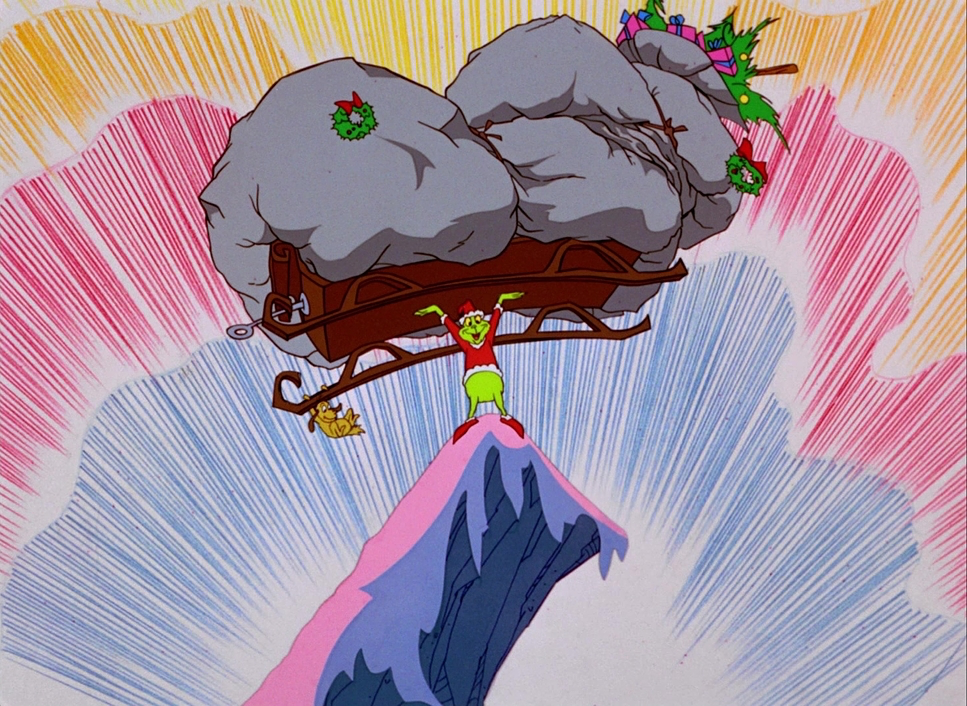
In live-action, we move the camera; in animation, we move the world. The Grinch executes this with surprising depth. The team used extreme low and high angles to sell the scale of Mount Crumpit. When we see the Grinch’s cave, the perspective is often dizzying, emphasizing his isolation and the physical drop down to Whoville.
There is a specific shot where the Grinch glares down at the town, and we get a slow, deliberate optical “dolly-in” on the lit windows. It creates a palpable sense of voyeurism and disdain. During the heist sequence, Jones’s “Coyote and Road Runner” DNA shows up. The frantic movement of the sleigh and the dynamic tracking shots speeding down the mountain use exaggerated gravity and motion blur to create kinetic energy. Even the simple pans across the crooked architecture of Whoville feel alive because the layouts themselves suggest motion.
Compositional Choices
Maurice Noble’s influence is clearest in the composition. He utilized what’s often called the “Noble Ladder” a visual language of distortion where lines lead the eye in whimsical, unsettling directions. This crookedness reflects the Grinch’s own skewed worldview.
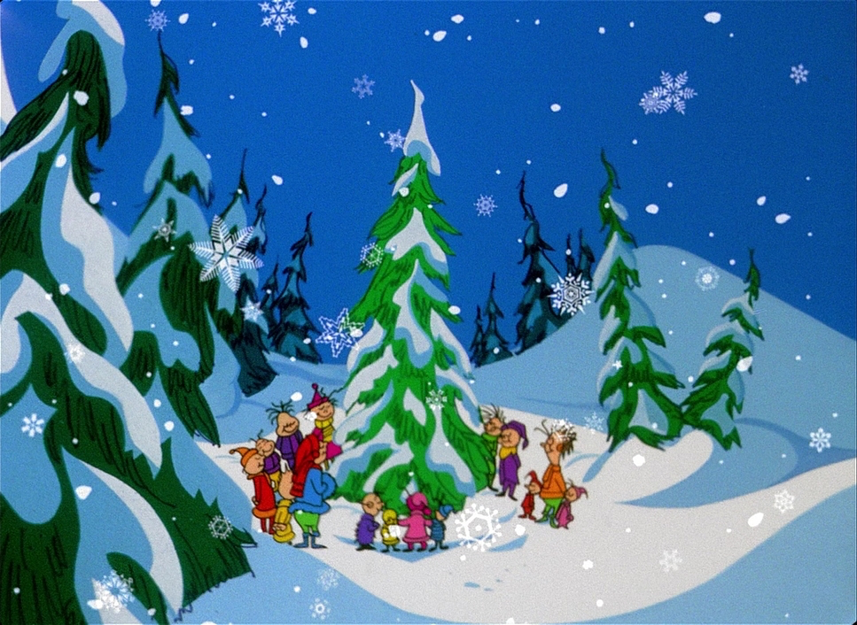
The film also masters contrast in scale. Cindy Lou Who is designed with intricate detail extra wrinkles in the hair, chubby cheeks which acts as a visual anchor of innocence against the simpler designs of the other Whos. Her tiny size is dramatically juxtaposed against the Grinch, often framing him as a looming, massive shadow. The Grinch himself is a marvel of compositional flexibility. His silhouette is unmistakable, but his form is “squishy.” He stretches and contorts, his teeth changing shape to fit his mood. Noble often placed heavy foreground elements in the layouts to create deep staging, making a flat 2D medium feel rich and layered.
Lighting Style
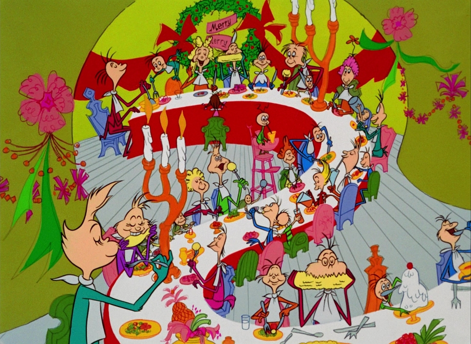
In 2D animation, lighting is purely a pigment choice. It’s about value management. The Grinch employs a strict motivated lighting logic. The cave is painted in cool blues, purples, and stark grays, often using sharp, angular shapes to represent shadows. This underscores the coldness of the Grinch’s life. Conversely, Whoville is bathed in warmth. The windows glow with inviting yellows and oranges, signaling comfort and community.
The rendering of the Grinch’s fur is particularly interesting. It has a “pencil-y,” smeared paintbrush look. It creates a texture that catches the “light” differently than the smooth surfaces of the Whos. It’s a form of visual modeling that gives him a grimy, tactile presence. They also used highlights and deep shadows on his face to sculpt his expressions the thick eyebrows and the deep frown lines do the work of a key light, shaping his face and amplifying the emotion without needing a literal light source.
Lensing and Blocking
While there are no physical lenses here, the drawing style mimics wide-angle distortion. This is evident in the Grinch’s close-ups; his smile wraps all the way around his head, and his features bulge outward. It’s the animation equivalent of shooting with a 14mm lens close to an actor’s face it feels intrusive and grotesque, which is perfect for the character.
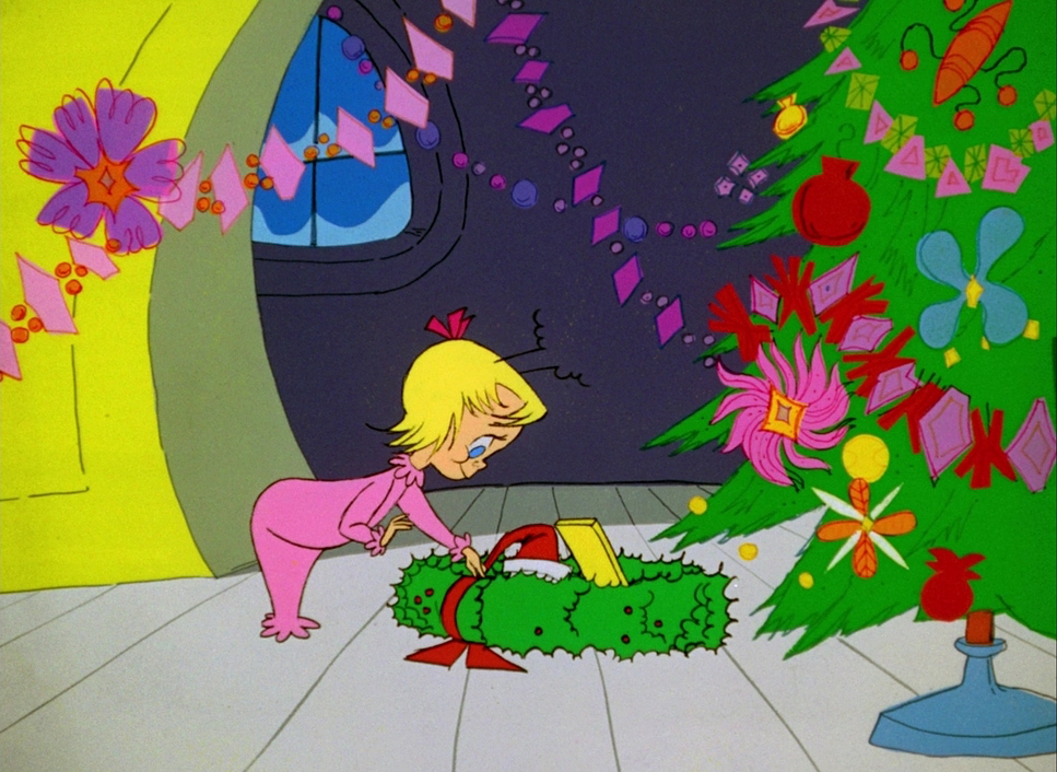
The blocking where characters are placed in the frame is equally purposeful. The Grinch is rarely static; he is a morphing, fluid shape. His interactions with Max are blocked to show dominance, with Max often positioned precariously on the edge of the frame or crushed under weight. In contrast, Cindy Lou Who “glides” rather than walks (a clever way to save on animating feet), which gives her an ethereal, ghost-like quality that cuts through the Grinch’s heavy, clunky physical presence.
Color Grading Approach
As a colorist, this is the part of the film I respect the most. In 1966, “grading” wasn’t a digital process; it was chemical and physical. It was about paint selection and film stock. The decision to make the Grinch that specific, bile-green was the first major grade decision it’s a hue separation that immediately isolates him from the rosy, warm palette of the Whos.
The film uses color contrast to drive the narrative arc. We have the cool, desaturated cyan tones of the mountain acting as the “shadows” of the story, while the vibrant reds and greens of the Christmas decorations serve as the “highlights.” There is a brilliant sequence during the Grinch’s transformation where the background dissolves through a spectrum from purple to orange to yellow. It’s a literal emotional grade, shifting the temperature of the scene from cold to warm in real-time.
They were working with print-film sensibilities. They knew how certain paints would react when photographed onto technicolor stock. The saturation is bold and primary, ensuring that the storytelling remains clear. It’s a reminder that we don’t always need power windows and curves; sometimes a strong, simple palette is the most effective tool we have.
Technical Aspects & Tools
How the Grinch Stole Christmas! (1966) — Technical Specs
| Genre | Animation, Comedy, Family, Music, Musical, Traditional Animation |
|---|---|
| Director | Chuck Jones, Ben Washam |
| Production Designer | Maurice Noble |
| Editor | Lovell Norman, John O. Young |
| Time Period | 1960s |
| Color | Mixed, Saturated, Red, Green, Blue, Magenta, Pink, White |
| Aspect Ratio | 1.37 |
| Original Aspect Ratio | 1.33 |
| Format | Film – 35mm |
| Lighting | Soft light |
| Lighting Type | Daylight |
| Story Location | … Whoville |
| Filming Location | … Los Angeles > MGM Studios |
The execution here is a testament to the “limitations breed creativity” ethos. This was cel animation, where characters were painted on transparent acetate and laid over backgrounds. Budget constraints meant they couldn’t animate everything on ones (24 drawings per second), so they relied on efficient loops and repeated cycles like the Grinch climbing the mountain or the sleigh ride.
But these shortcuts became stylistic choices. The line work carries the “fingerprints” of the artists. It’s not the clean, vector perfection of modern flash animation; you can see the brushstrokes in the Grinch’s fur. Watching it on high-definition formats today, you can sometimes spot physical smudges or dust on the cels. To me, that’s not a flaw; it’s texture. It reminds you that human hands built this thing. The 25-minute runtime forced a tight editing pace, stripping away any fat and leaving only the essential visual beats.
- Also read: CHILDREN OF HEAVEN (1997) – CINEMATOGRAPHY ANALYSIS
- Also read: MY FATHER AND MY SON (2005) – CINEMATOGRAPHY ANALYSIS
Browse Our Cinematography Analysis Glossary
Explore directors, cinematographers, cameras, lenses, lighting styles, genres, and the visual techniques that shape iconic films.
Explore Glossary →