Hotel Rwanda (2004) requires a different mindset it’s a study in restraint.This film presents a terrifying challenge for any visual storyteller: how do you balance historical gravitas with cinematic accessibility? How do you visualize one of the darkest chapters of human history without being gratuitous? It is not just an academic exercise; it’s a look at how cinematography can shape our understanding of profound human experiences.
The 1994 Rwandan genocide was an event of staggering horror an estimated 800,000 lives lost in just a few months. It was a period defined by neighbors killing neighbors and the systematic slaughter of Tutsi men, women, and children. But director Terry George and his team had a specific mandate: to make a film that was visually honest about the atrocity but still “palatable” enough for a Western audience to actually sit through. This places immense pressure on the cinematography. The camera has to communicate the horror without exploiting it, evoking empathy rather than just shock. My job here is to break down how those visual decisions ultimately serve this impossible narrative tightrope.
About the Cinematographer
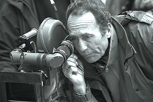
The visual architect behind Hotel Rwanda was Robert Fraisse, AFC. A French cinematographer with a serious pedigree, Fraisse is known for his work on Ronin (1998) and The Lover (1992). His filmography shows a DP who is comfortable with both high-octane action and intimate, atmospheric drama. If you look at Ronin, you see his ability to capture gritty realism; in The Lover, you see a mastery of sensual, texture-rich lighting.
Fraisse’s approach leans towards a naturalistic yet controlled aesthetic, making him the ideal choice here. He possesses the ability to imbue images with authenticity without losing the cinematic gloss required for a feature film. For a story rooted in such stark realism, you need a cinematographer who prioritizes human scale over overt stylization. You want the audience to feel the weight of the situation, not the presence of the camera.
Inspiration Behind the Cinematography
The visual philosophy of Hotel Rwanda stems from the need to translate unimaginable horror into a digestible narrative. The production team, including Production Designer Johnny Breedt, has spoken about the need to reach a broad audience. This isn’t a criticism; it’s a pragmatic strategy to ensure the story of Paul Rusesabagina (Don Cheadle) reached the world.
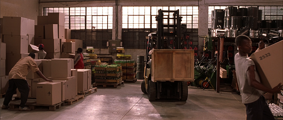
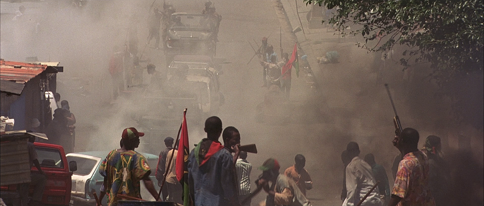
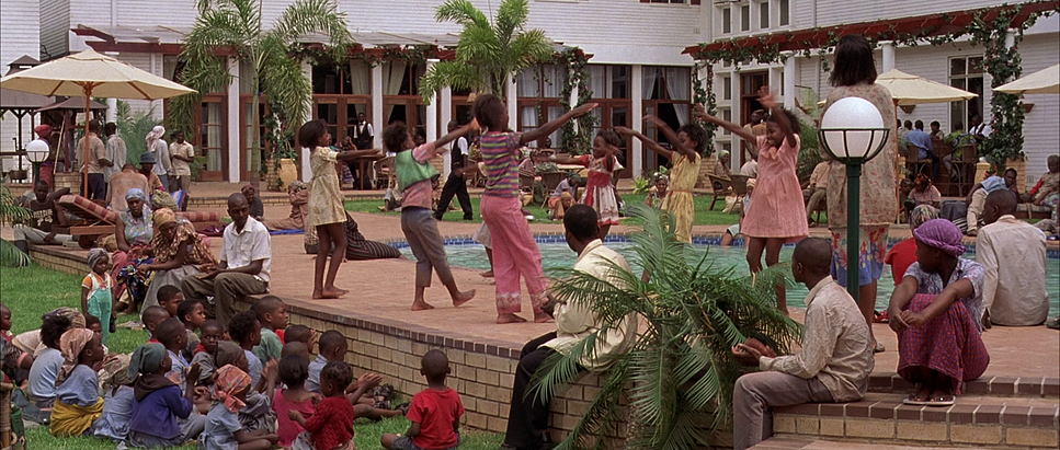
The core inspiration appears to be a balance between documentary texture and poetic restraint. The visuals convey the chaos the checkpoints, the mobs, the sheer scale of the displacement while juxtaposing it against the relative (and shrinking) sanctuary of the Hotel des Mille Collines. There is an intrinsic visual tension: the warmth Paul tries to maintain inside versus the sun-baked, violent reality outside.
The team likely referenced documentary footage and photojournalism from 1994, not to replicate it frame-for-frame, but to capture the texture of the conflict. The intent was to make the film feel immediate and visceral almost like witnessing history unfold but without the desensitizing gaze of a raw documentary. It’s about selective vision.
Camera Movements
Camera movement in Hotel Rwanda is the emotional pulse of the film, shifting from stability to instability as the situation deteriorates. Early scenes use steady, deliberate work smooth dollies and pans that establish Paul’s composed, professional demeanor. It reflects his initial faith in diplomatic order.
As the genocide erupts, the camera language breaks down. We see a shift to handheld work, particularly when the characters are forced outside the hotel gates. This isn’t just a stylistic flair; the slight operator wobble mirrors the unraveling of society. It strips away the cinematic “fourth wall,” placing us directly into the disorienting reality of the refugees.
Consider the scene where Paul and his family encounter the militia on the road. The camera stays low, at eye-level with the terrified occupants of the van. The movements aren’t flashy; they are functional and reactive. Even within the hotel, as the number of refugees swells to over 1,200, the camera movements become constrained. We feel the walls closing in. The camera doesn’t just observe the crowding; it participates in it, pushing in on moments of quiet despair or swaying with the uncertainty of the mob.
Compositional Choices
Fraisse’s framing underscores the themes of confinement and vulnerability. He masterfully uses composition to contrast the failing order inside the hotel against the anarchy outside.
Inside, the frames are often crowded. These aren’t breathable wide shots; they are tightly packed medium shots that emphasize the lack of personal space. The hotel corridors, once symbols of luxury, are visually rendered as bottlenecks of desperation. The use of deep focus often allows us to see layers of faces extending into the background, a visual reminder of the sheer number of lives Paul is trying to protect.
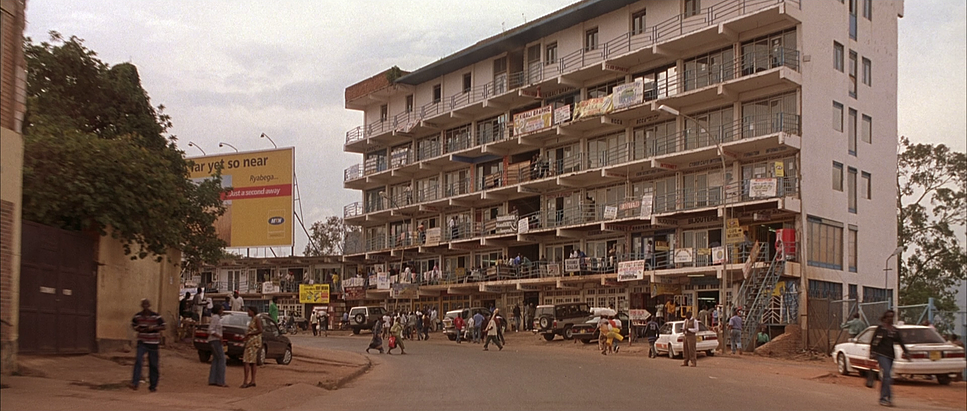
Conversely, the exterior shots often feature sweeping views of desolate roads or landscapes littered with the aftermath of violence. Paul is frequently framed as a small, solitary figure against these immense backdrops, highlighting his insignificance against the scale of the genocide.
There is also a brilliant use of off-screen space. We often see characters reacting to something just out of frame a massacre, a threat forcing the audience to imagine the atrocities. This aligns perfectly with the film’s “soft telling” strategy. It respects the audience’s imagination and avoids turning violence into a spectacle.
Lighting Style
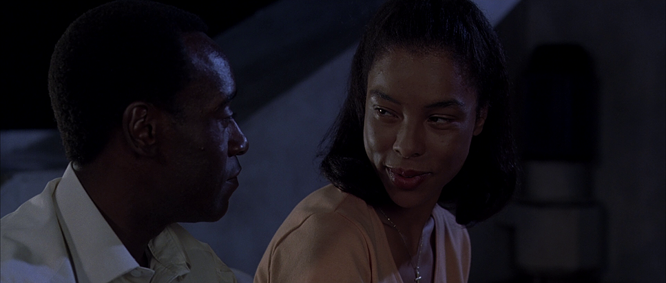
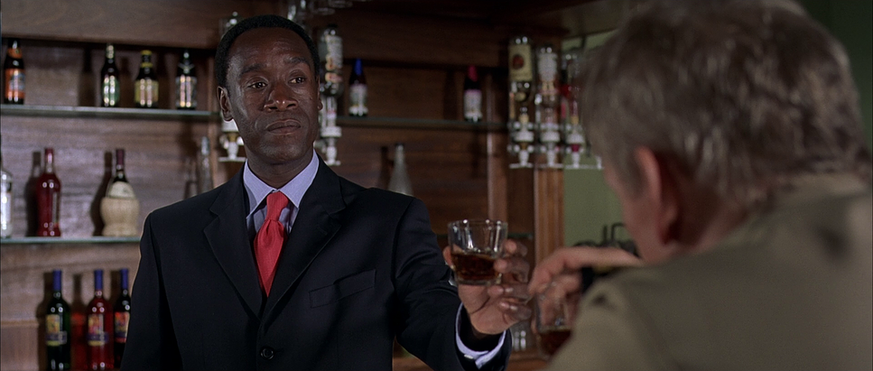
The lighting is an exercise in motivated realism. Initially, the hotel is lit with a warm, inviting glow practical lamps and softened sunlight. It establishes a normalcy that quickly becomes a tragic memory.
As the crisis deepens, the lighting turns stark. Interiors begin to rely on ambient, diffused light filtering through dusty windows or emergency power. This creates a desaturated, shadowy environment that communicates the dwindling resources. There is a distinct absence of “beauty lighting”; faces are often side-lit or in shadow, revealing the sweat and exhaustion on Don Cheadle’s face.
Exteriors leverage the harsh African sun. Fraisse uses this hard light to create a sense of exposure. Shadows are sharp and unforgiving. When characters are outside, there is nowhere to hide. This high-contrast lighting amplifies the tension. During night scenes, the sources are sparse headlights, distant fires, or a flickering flashlight. It’s never theatrical; it grounds the emotional truth in a believable physical space.
Lensing and Blocking
The choice of lensing is particularly interesting here. The technical data indicates a 2.35:1 aspect ratio shot with spherical lenses. This likely means the film was shot on Super 35mm and cropped.
Why does this matter? Anamorphic lenses (the traditional way to get widescreen) introduce distortions, flares, and a “movie star” glamour. By shooting spherical and cropping, Fraisse achieves the cinematic widescreen scope but keeps the optics clean and distortion-free. It feels more like a high-end documentary. It’s a subtle technical choice that subconsciously tells the viewer: this is real.
He uses wider focal lengths for the exteriors to capture the desolation, but as the story moves inside, the focal lengths tighten. Telephoto lenses compress the space, visually stacking the refugees on top of one another. This compression creates claustrophobia.
Blocking the choreography of the actors is paramount when you have 1,200 extras in a confined space. The camera often follows Paul navigating through throngs of people, a visual metaphor for his burden. The blocking of the militia, conversely, is erratic and unpredictable, disrupting the frame’s balance and heightening the sense of danger.
Color Grading Approach
As a colorist, this is where I look closest. The grade for Hotel Rwanda walks a fine line. It needs to look like 1994, it needs to look hot and dusty, but it cannot look “graded” in the modern sense.
The palette leans towards desaturated, earthy tones. The reds of the Rwandan soil and the muted greens of the vegetation are present but subdued. This prevents the landscape from feeling romanticized. Skin tones are the priority they are rendered with a “print film” density. There is a tonal sculpting at play where highlights have a gentle roll-off, avoiding harsh digital clipping. It feels organic.
Contrast is used to define emotional beats. Moments of danger feature crushed blacks, swallowing detail in the shadows. However, the grade never pushes into a gritty, “bleach bypass” extreme, which would have felt too stylized for a mainstream audience. It’s a controlled, photochemical look.
Hue separation is vital. The blues of the UN helmets stand out just enough to symbolize the (failed) hope of intervention. The grade does the heavy lifting of setting the temperature you can practically feel the heat and the dust in the mid-tones. It’s a testament to the power of subtle color work to navigate a narrative that could easily become unwatchable.
Technical Aspects & Tools
Hotel Rwanda — Technical Specs
| Genre | War, Drama, History, Survival, Political, Biopic, Docudrama |
|---|---|
| Director | Terry George |
| Cinematographer | Robert Fraisse |
| Production Designer | Johnny Breedt, Tony Burrough |
| Costume Designer | Ruy Filipe |
| Editor | Naomi Geraghty |
| Colorist | Kenny Becker |
| Time Period | 1990s |
| Aspect Ratio | 2.35 – Spherical |
| Format | Film – 35mm |
| Lighting | Soft light, Top light |
| Lighting Type | Daylight |
| Story Location | … Rwanda > Kigali |
| Filming Location | … Africa > Rwanda |
Released in 2004, Hotel Rwanda was a product of the photochemical era, shot on 35mm film. This choice is foundational to the look. Film has a natural grain structure and a non-linear response to light that digital sensors of that era couldn’t touch.
The dynamic range of the film stock allowed Fraisse to hold detail in the bright exterior skies while still seeing into the shadows of the hotel lobby. The finish would have likely been a Digital Intermediate (DI) or a high-end telecine transfer (like a Spirit Datacine), allowing for the nuanced color shaping we see. But the core “look” that organic softness is baked into the negative.
- Also read: SOUL (2020) – CINEMATOGRAPHY ANALYSIS
- Also read: MONTY PYTHON’S LIFE OF BRIAN (1979) – CINEMATOGRAPHY ANALYSIS
Browse Our Cinematography Analysis Glossary
Explore directors, cinematographers, cameras, lenses, lighting styles, genres, and the visual techniques that shape iconic films.
Explore Glossary →