Home Alone (1990), It’s a Christmas staple that, as one reviewer put it, is “one of my favorite movies of all time” and just a “great movie” through and through.While most people remember it for the slapstick and Macaulay Culkin’s legendary performance, what actually elevates Home Alone is its incredibly thoughtful cinematography. It’s easy to dismiss a family comedy as purely “plot-driven,” but this film is a masterclass in how visuals can articulate a story and build genuine emotional resonance. Home Alone, the execution is as precise as one of Kevin’s booby traps. So, grab a coffee, and let’s pull apart why this film looks as good as it feels.
About the Cinematographer
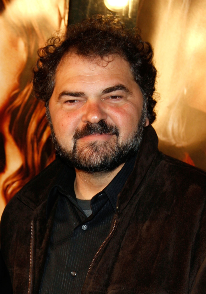
The visual architect behind the McCallister house was Julio Macat. He’s a DP with a real knack for commercial comedies films designed to be widely loved but technically polished. Before Home Alone, he was already carving out a niche, but this was the project that really put him on the map.
Macat is known for a clean, accessible, and vibrant style that fits this world perfectly. He understands how to make light and composition serve the story without drawing “look at me” attention to the camera. His collaboration with director Chris Columbus is a prime example of a director-DP pairing finding a sweet spot. It’s a skill that’s often undervalued in the industry making something look effortless when it’s actually incredibly complex to execute.
Inspiration Behind the Cinematography
From what I gather, and looking at the final product, Macat’s inspiration leaned on two main pillars: capturing a child’s perspective and creating a heightened, almost “fairy-tale” Christmas atmosphere to contrast with the threat of the Wet Bandits.
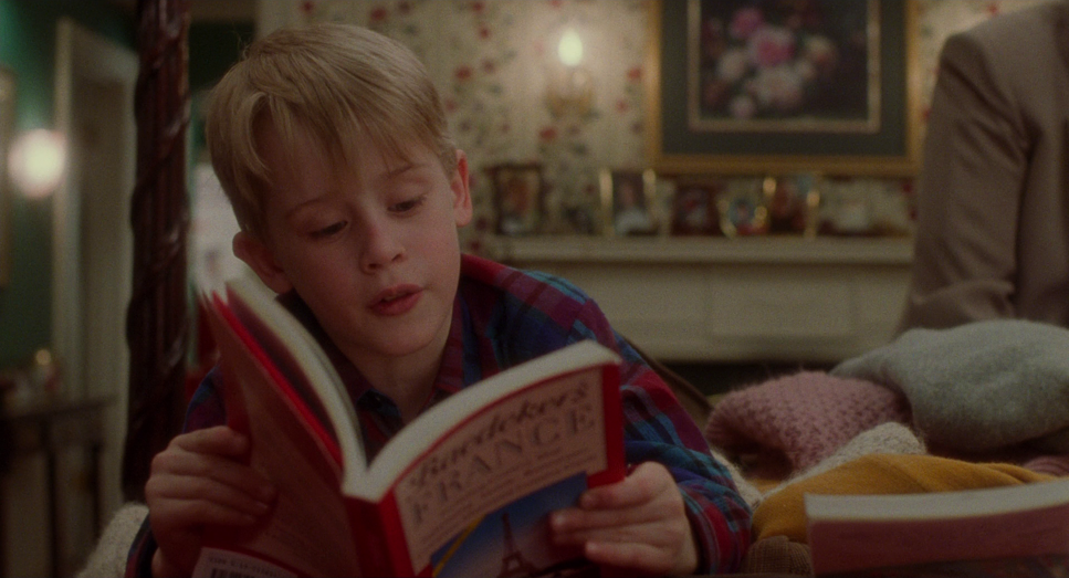
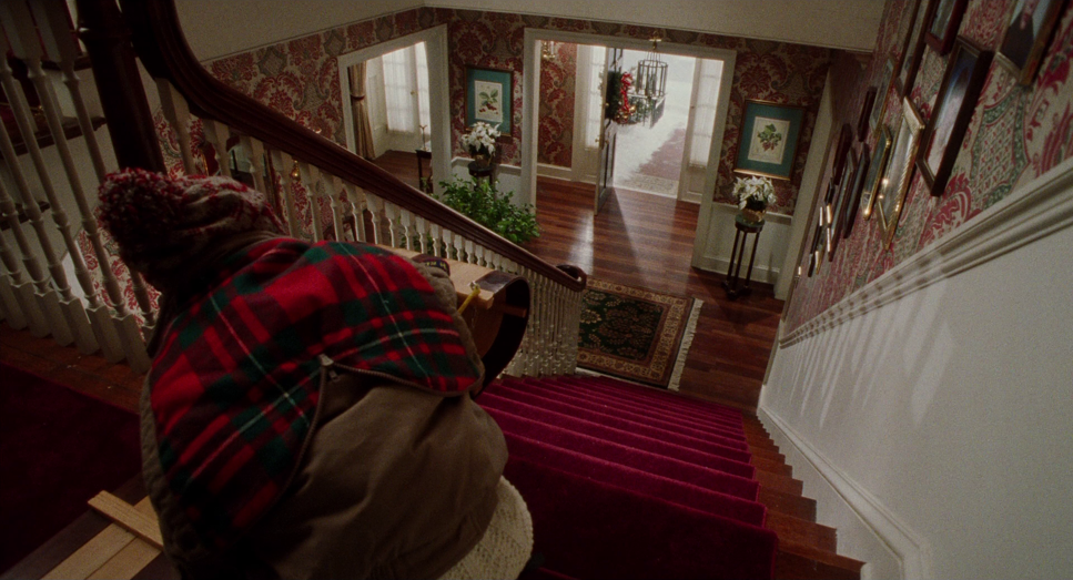
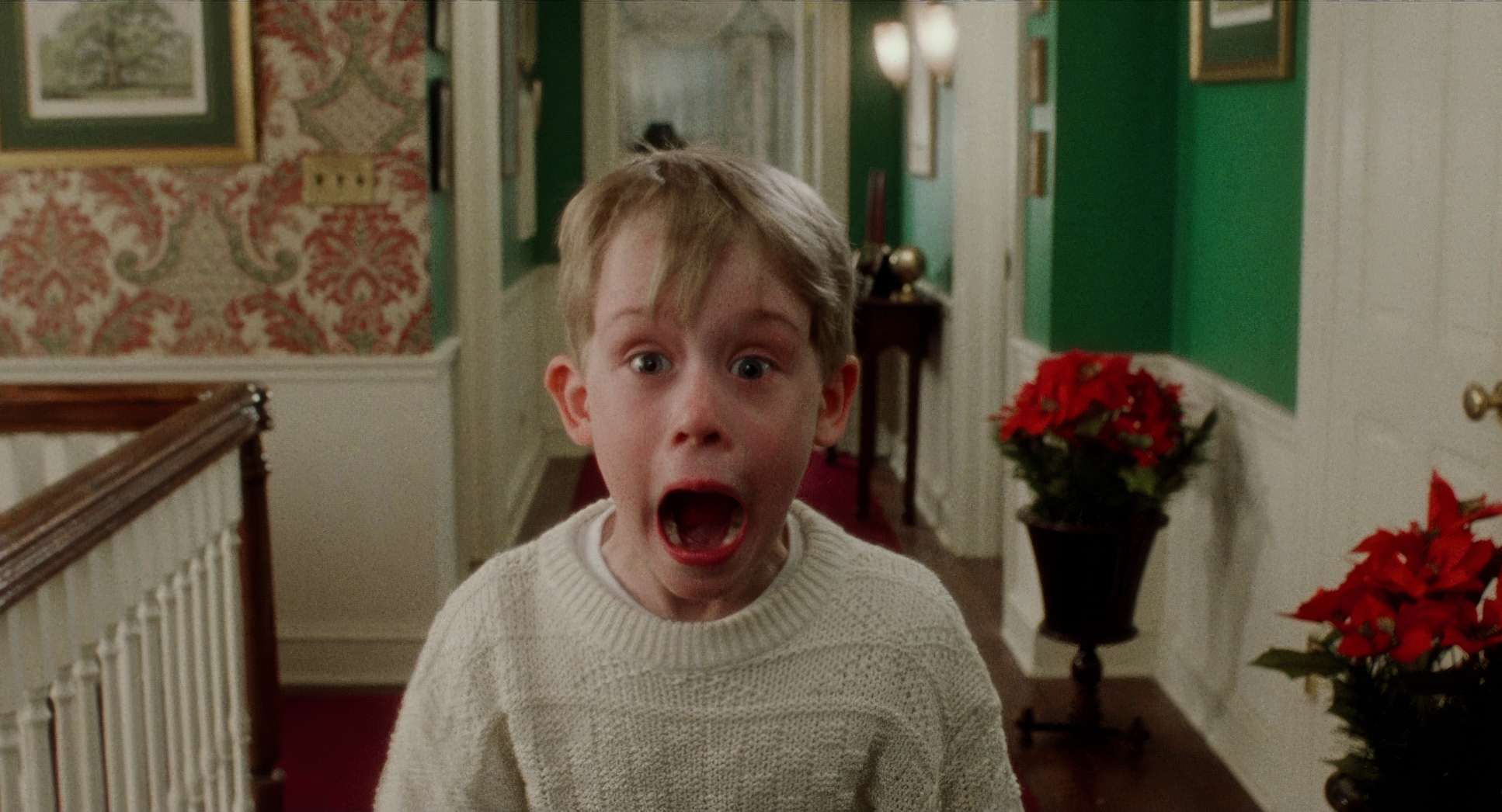
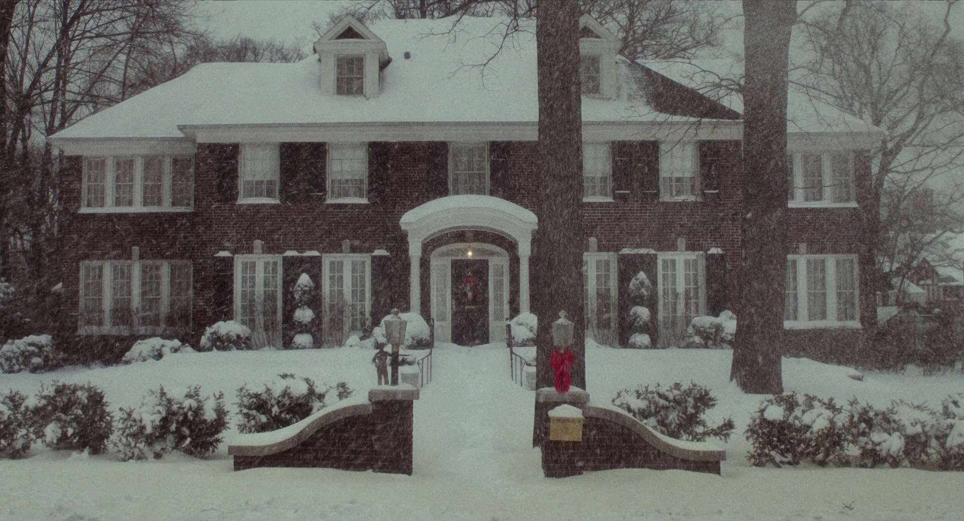
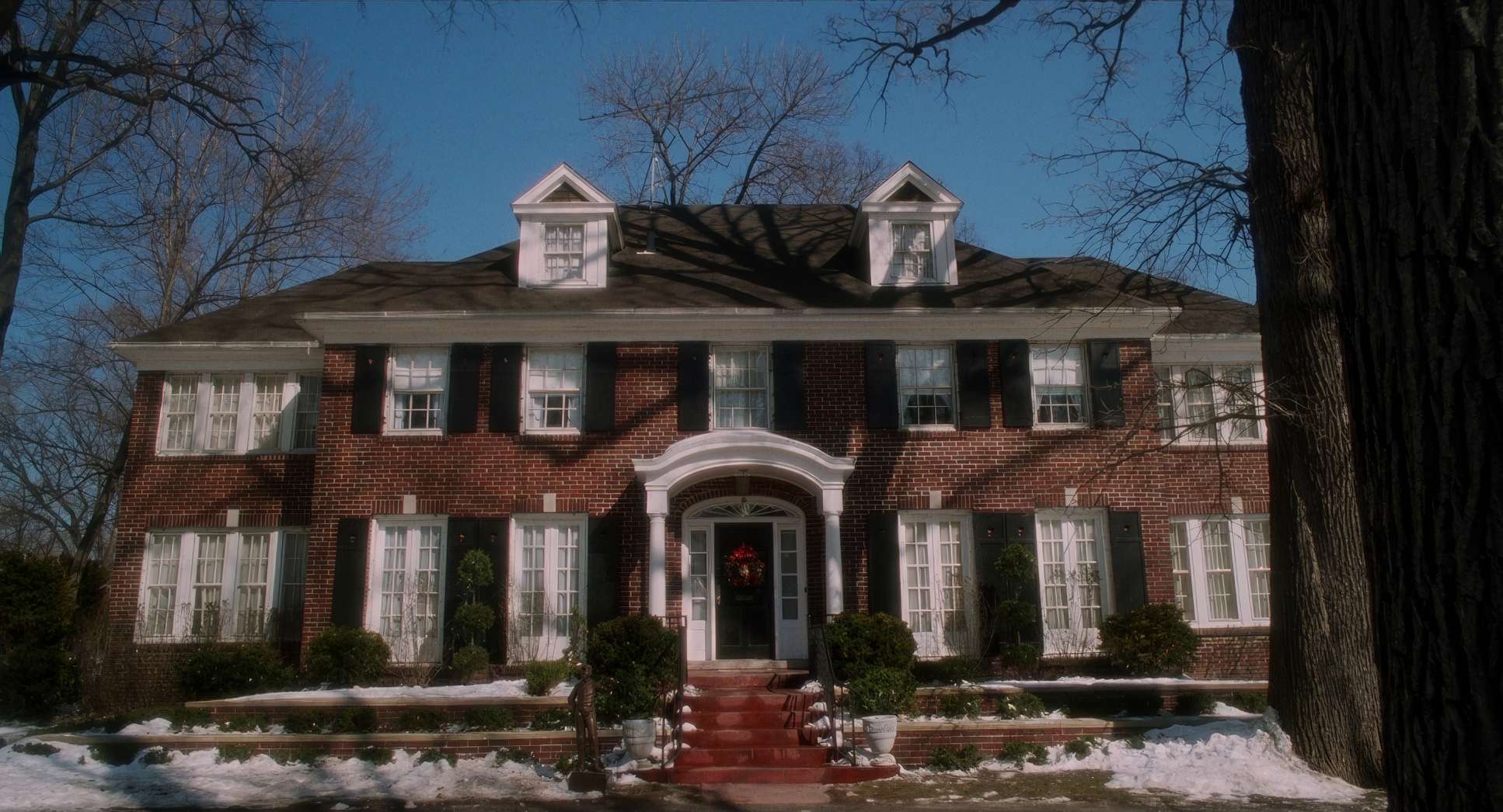
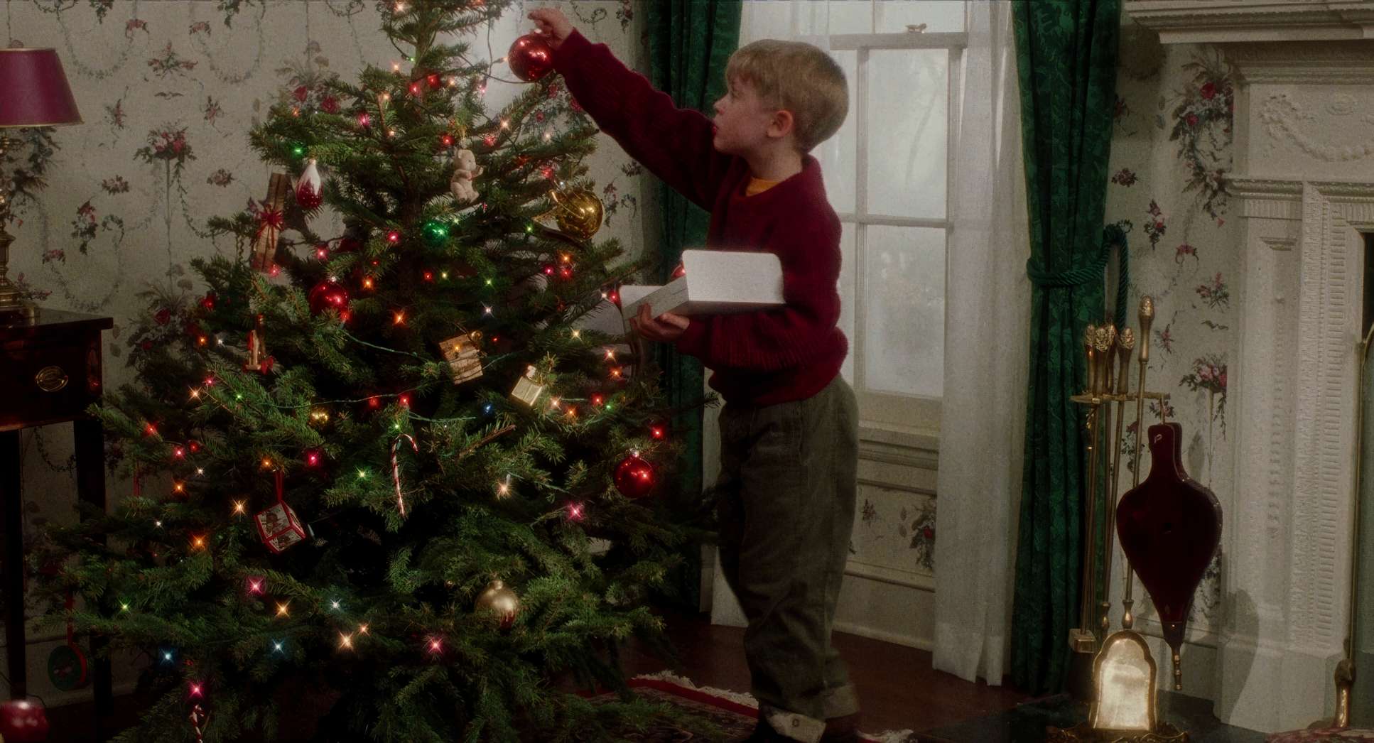
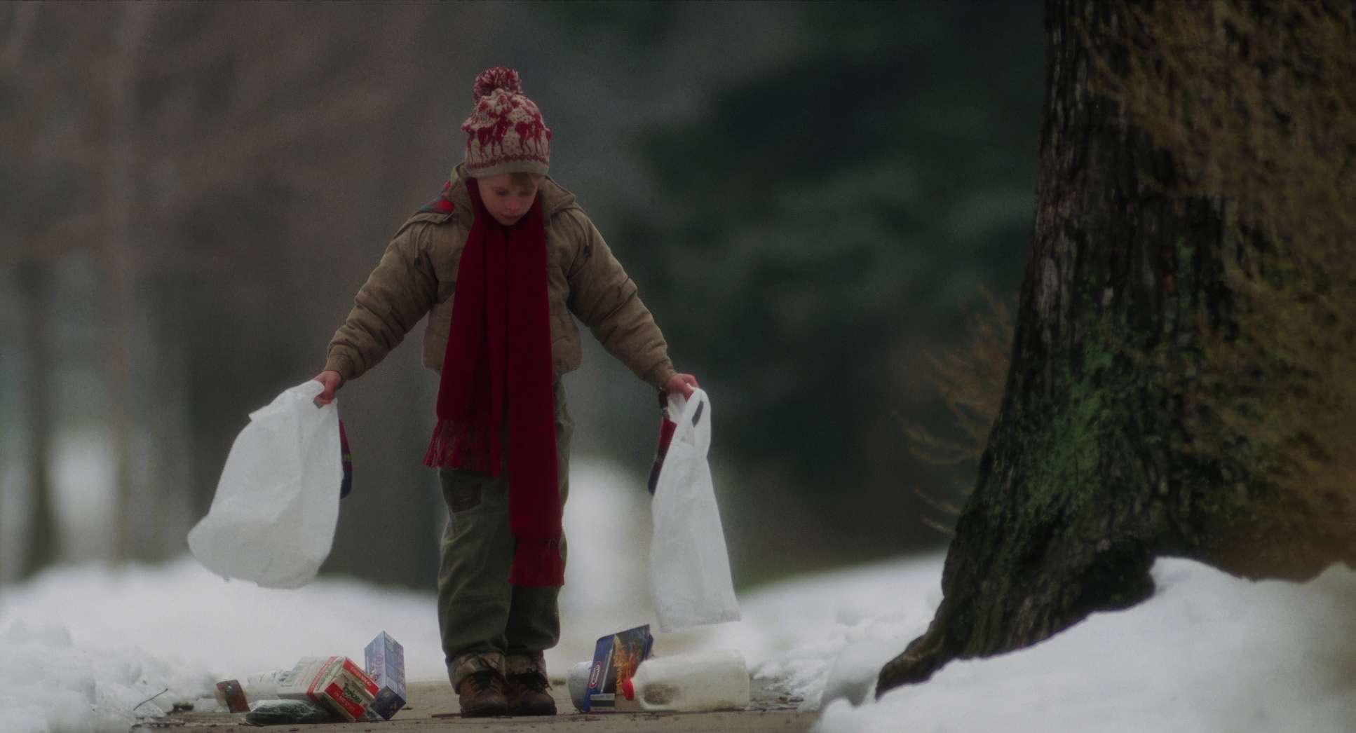
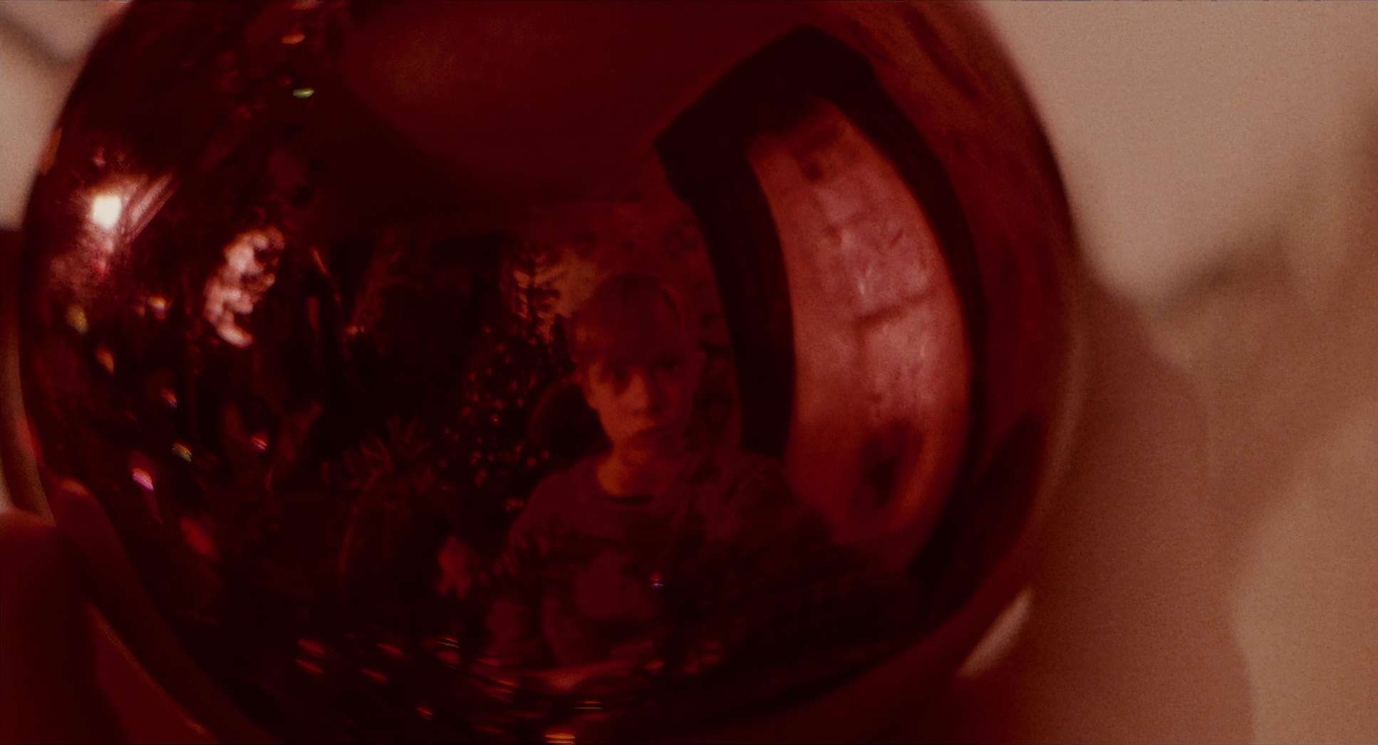
Think about it: Kevin is a young boy left “Home Alone” (clue’s in the title, right?). The camera adopts his viewpoint, making the expansive house feel massive and overwhelming when he’s first abandoned, then transforming it into his strategic playground. The initial shots emphasize these wide, sprawling spaces a testament to the McCallister home’s grandeur, but also its emptiness.
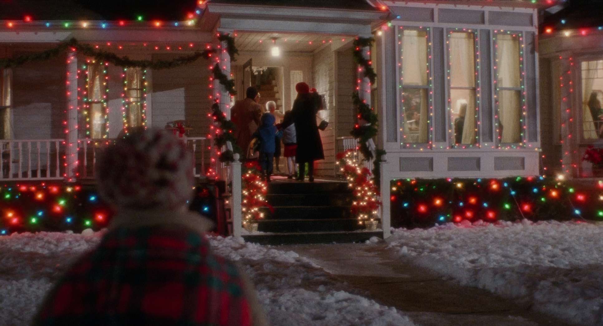
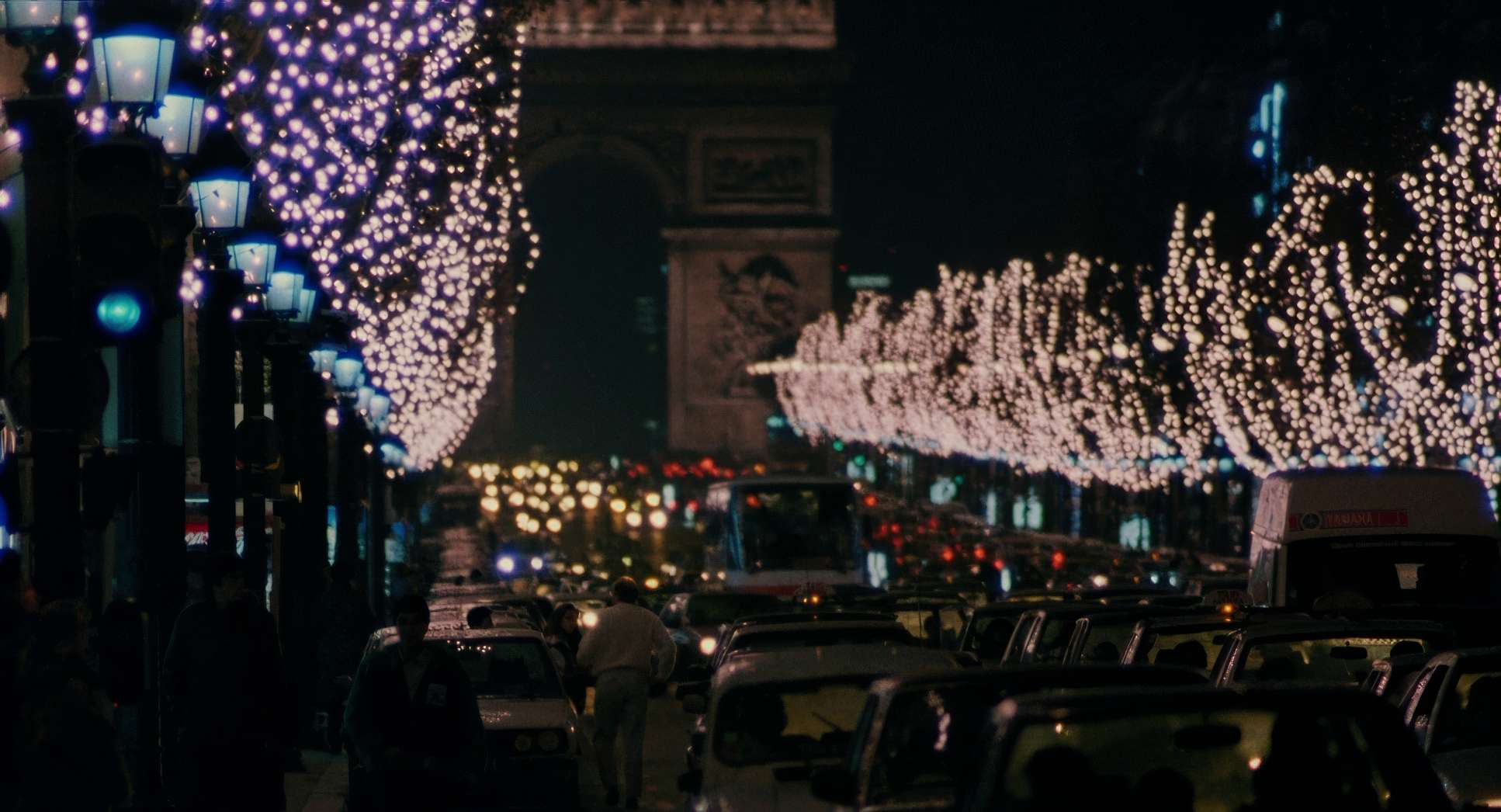
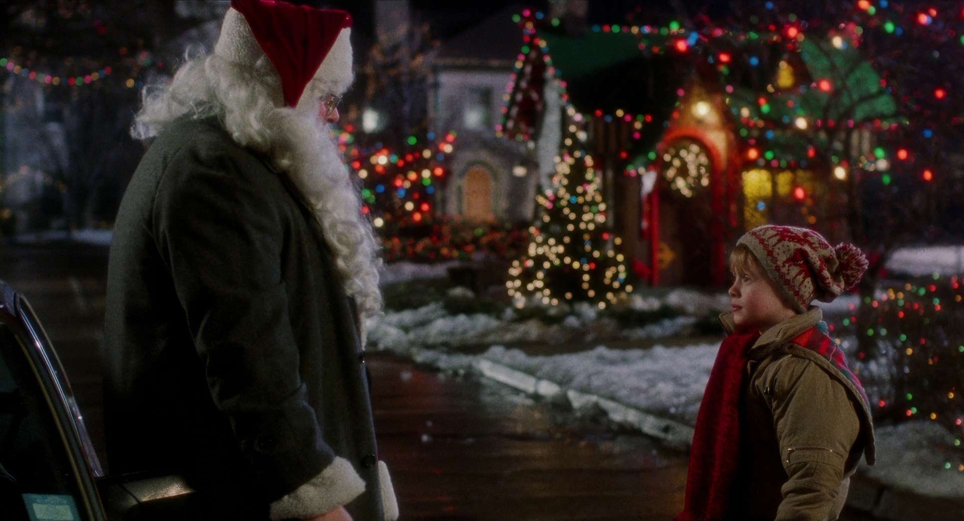
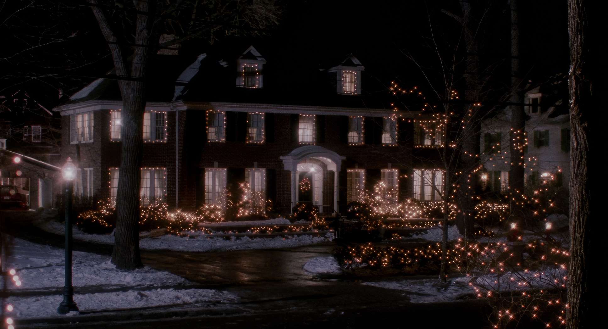
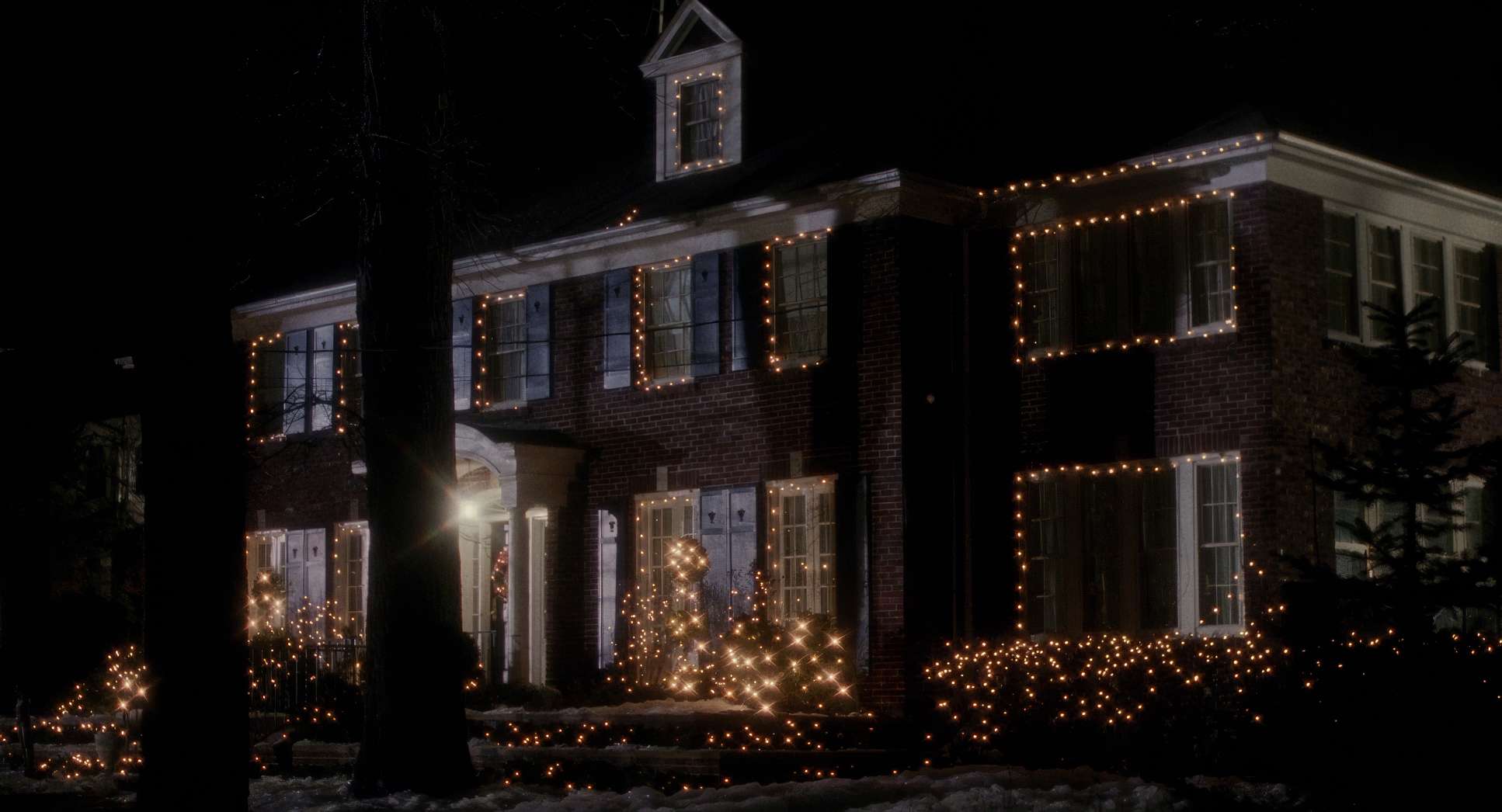
There’s also a clear aim to blend festive warmth with comedic chaos. The Christmas setting isn’t just a backdrop; it’s woven into the visual fabric. The twinkling lights and the snow outside aren’t just props they’re integral to the lighting design, providing motivated light sources and that pervasive “holiday magic” feel. The camera work consistently reinforces this duality: the joyous warmth of the season versus the chilling thrill of Kevin facing off against Harry and Marv. It’s a tricky balance, but Macat pulled it off beautifully.
Compositional Choices
Composition in Home Alone is a lesson in visual storytelling, specifically regarding Kevin’s journey from “forgotten” to “fortified.”
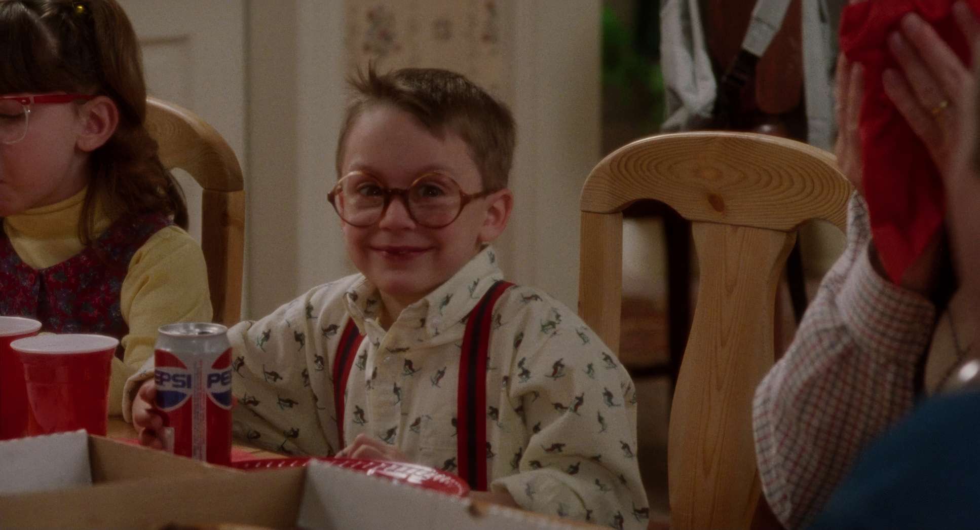
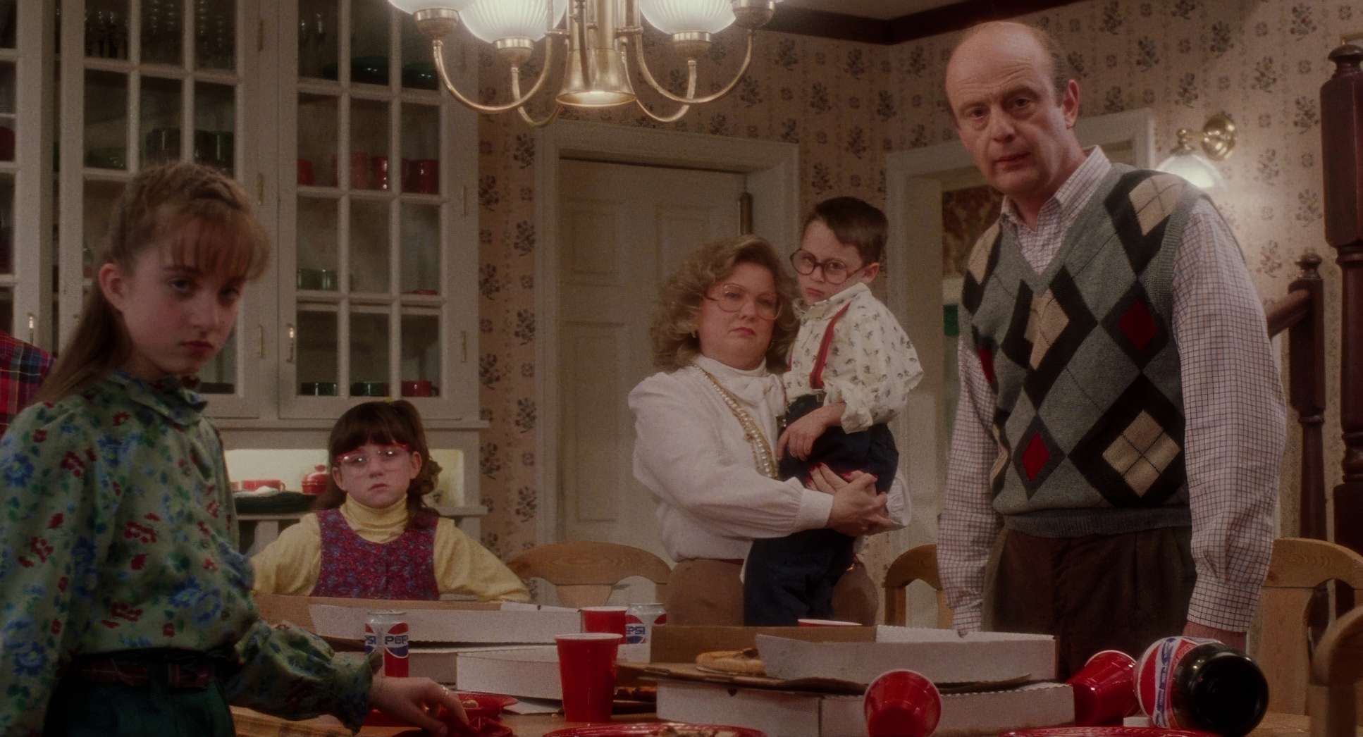
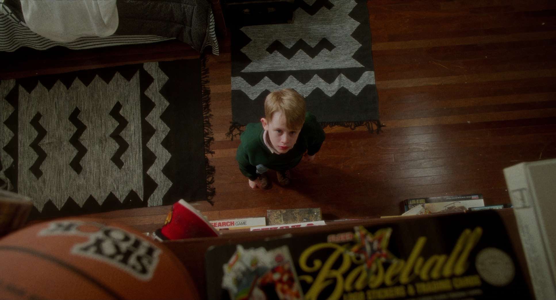
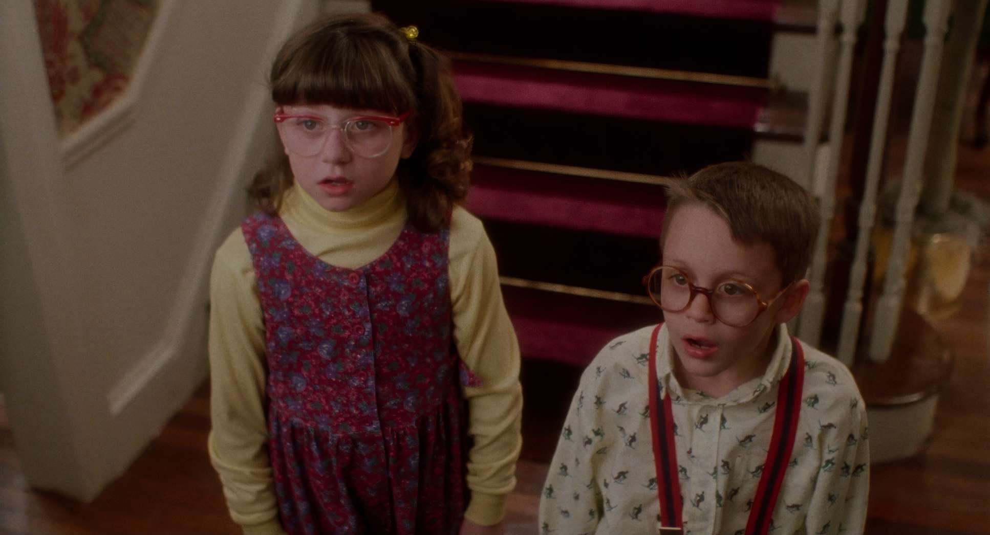
Initially, when Kevin feels marginalized, Macat frames him within larger groups. He’s often slightly out of focus or pushed to the edge of the frame, visually representing his outsider status. The sheer number of siblings and cousins fills the frame, leaving him no “breathing room.” It’s a smart use of depth cues layering figures in the foreground and midground to sell that chaotic family dynamic.
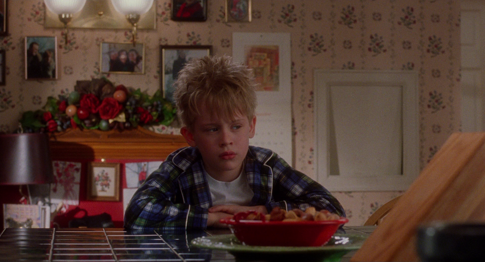
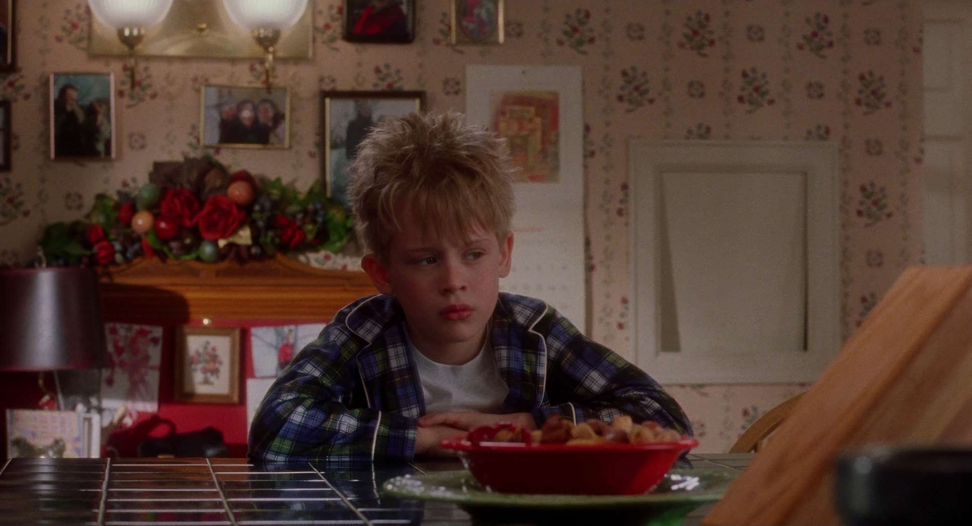
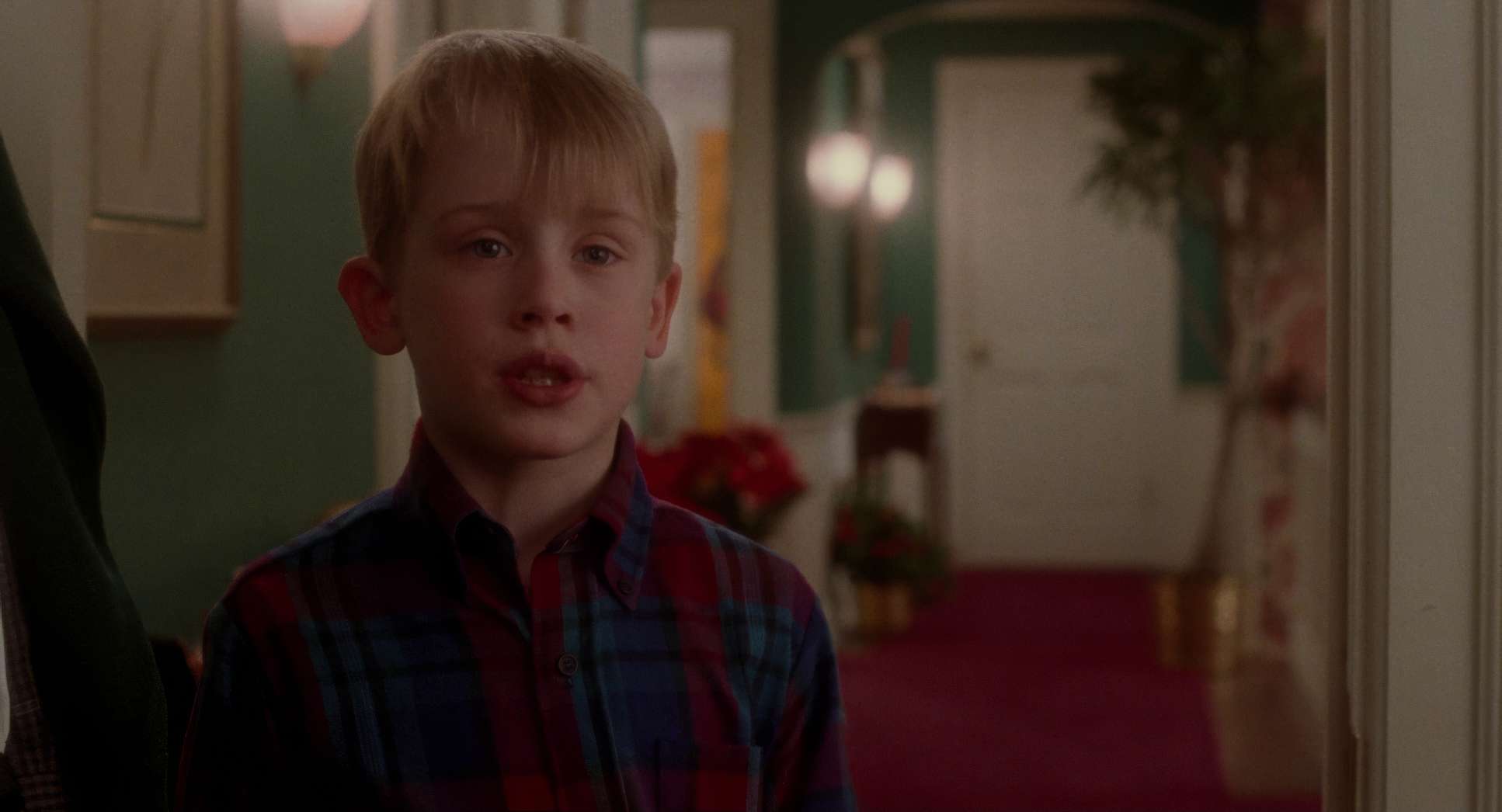
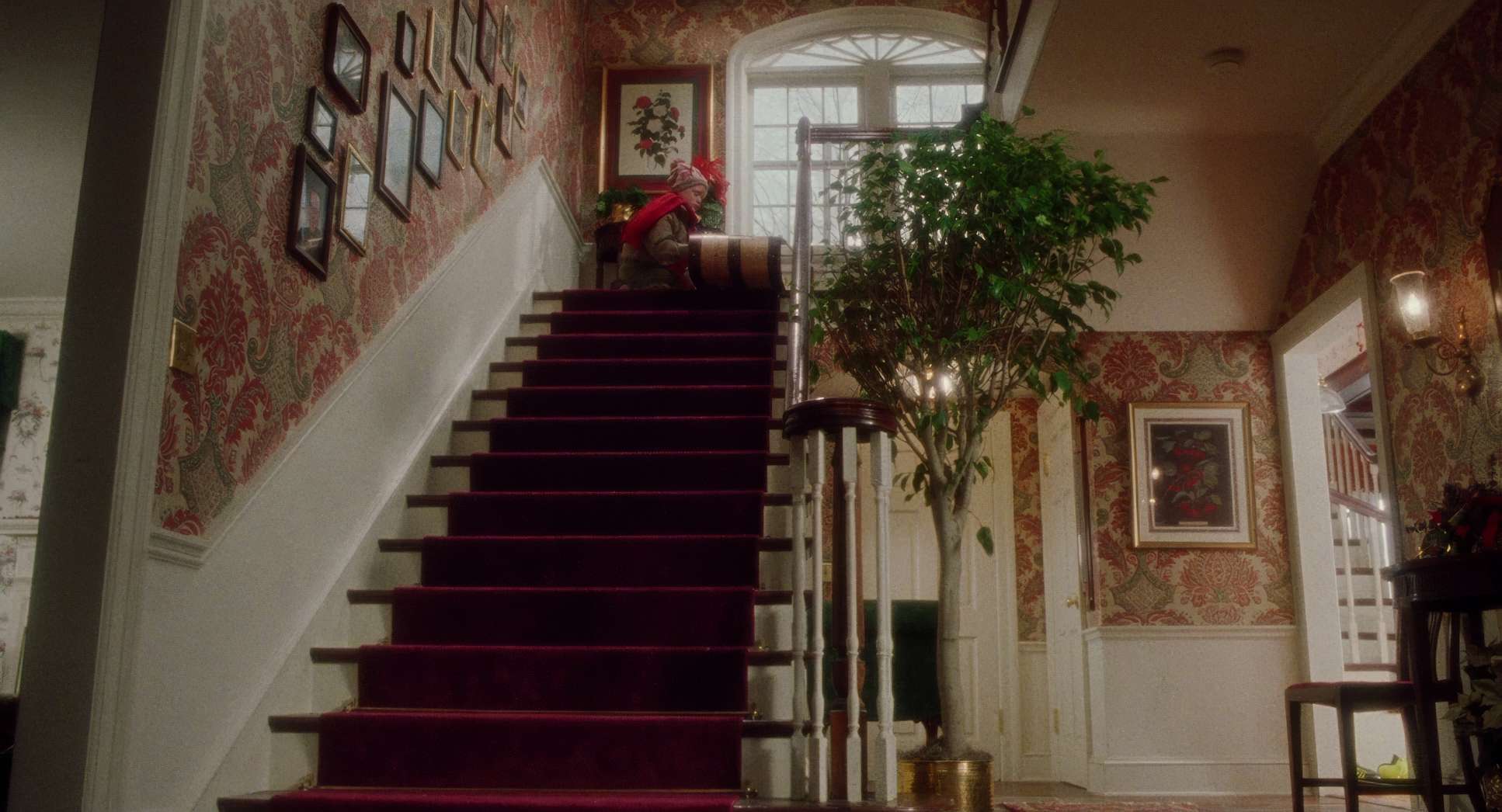
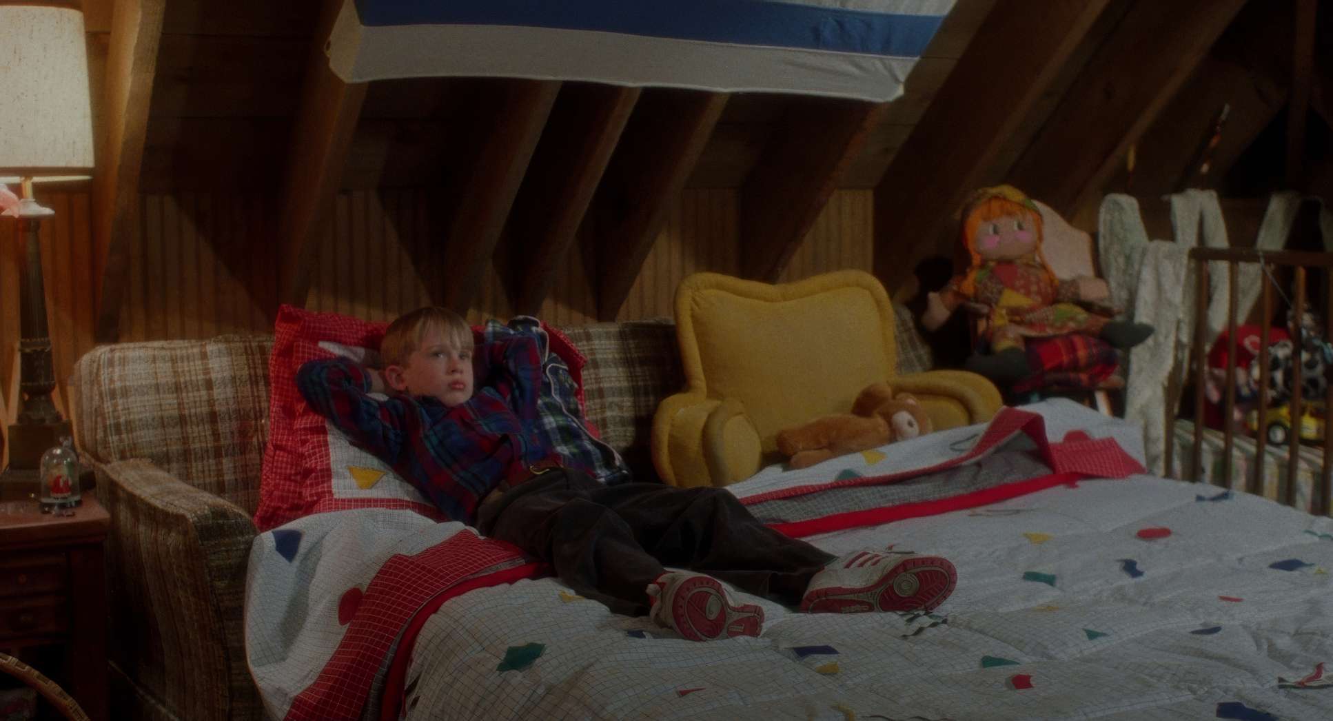
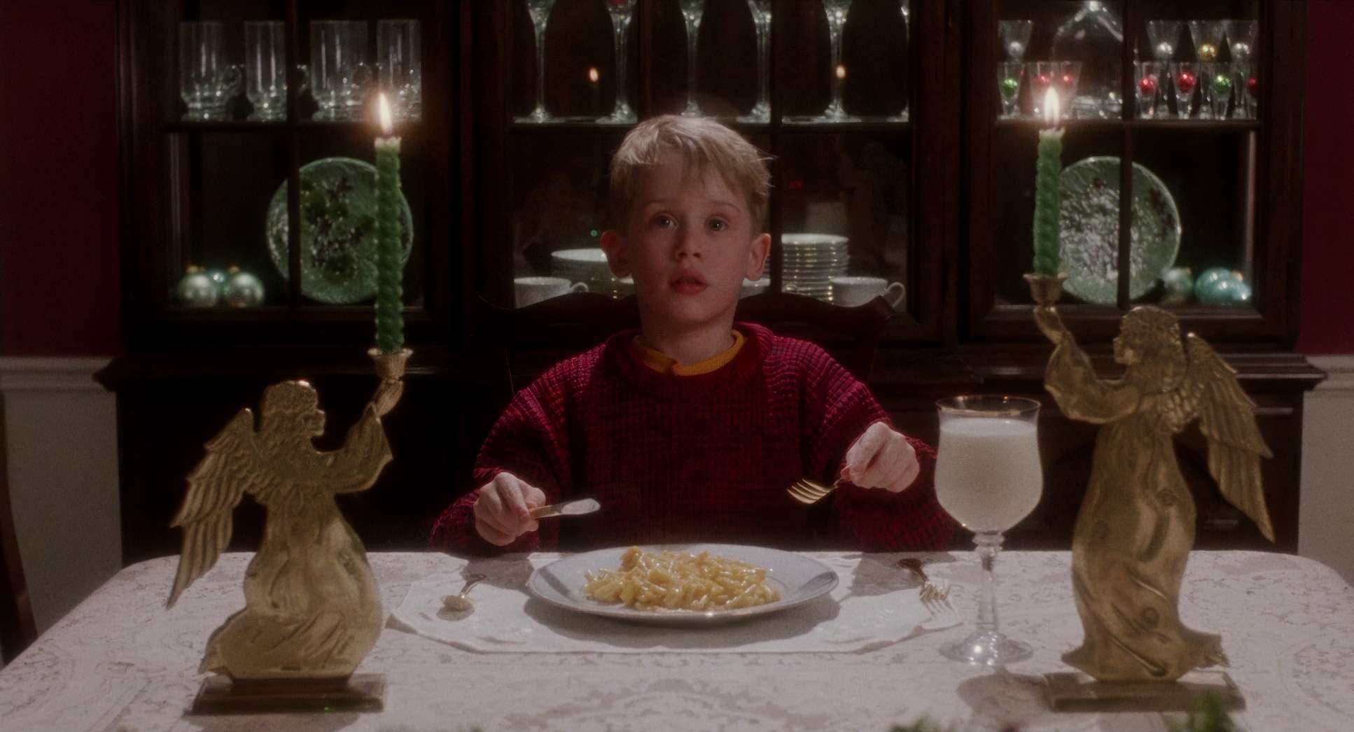
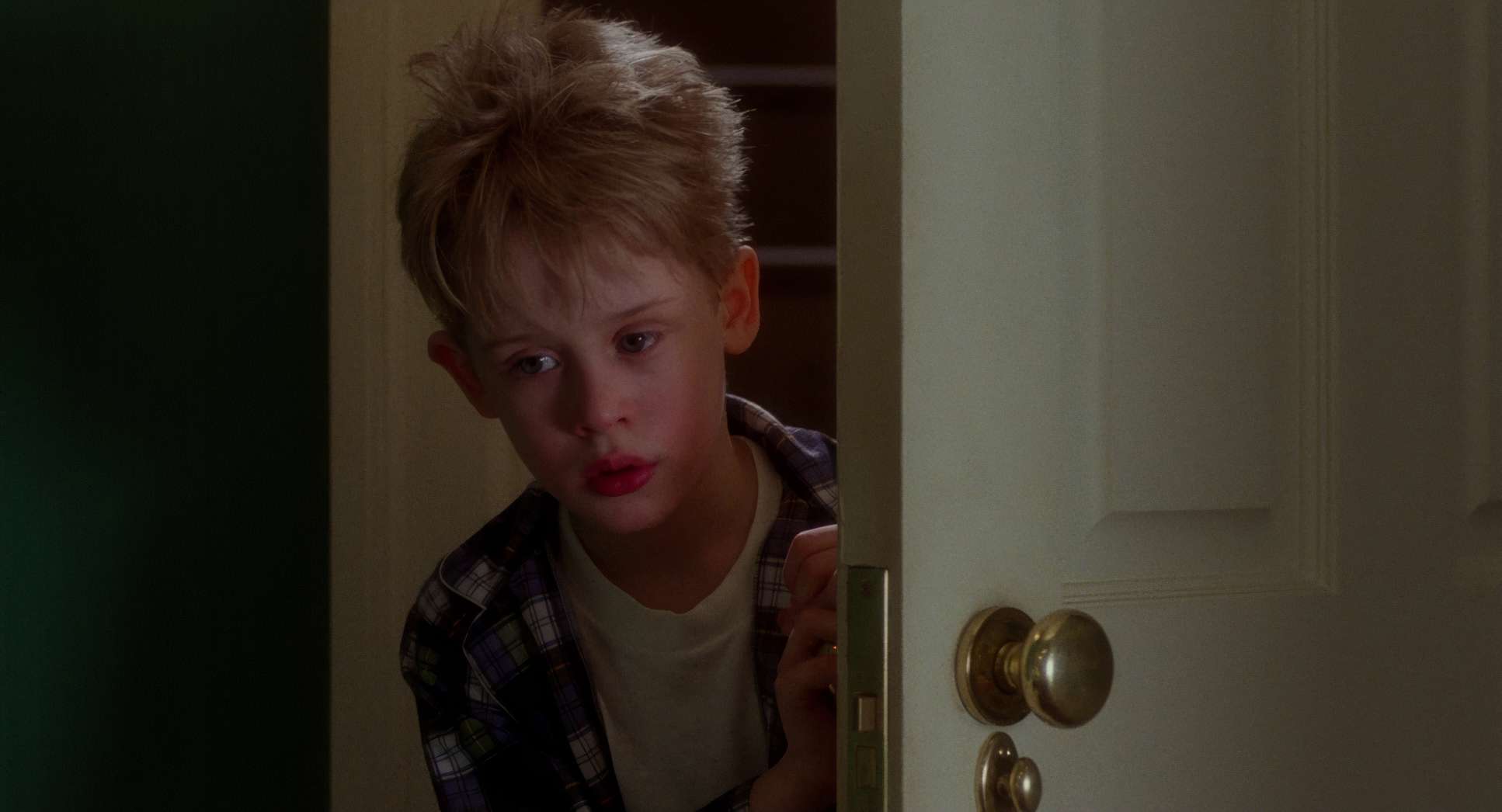
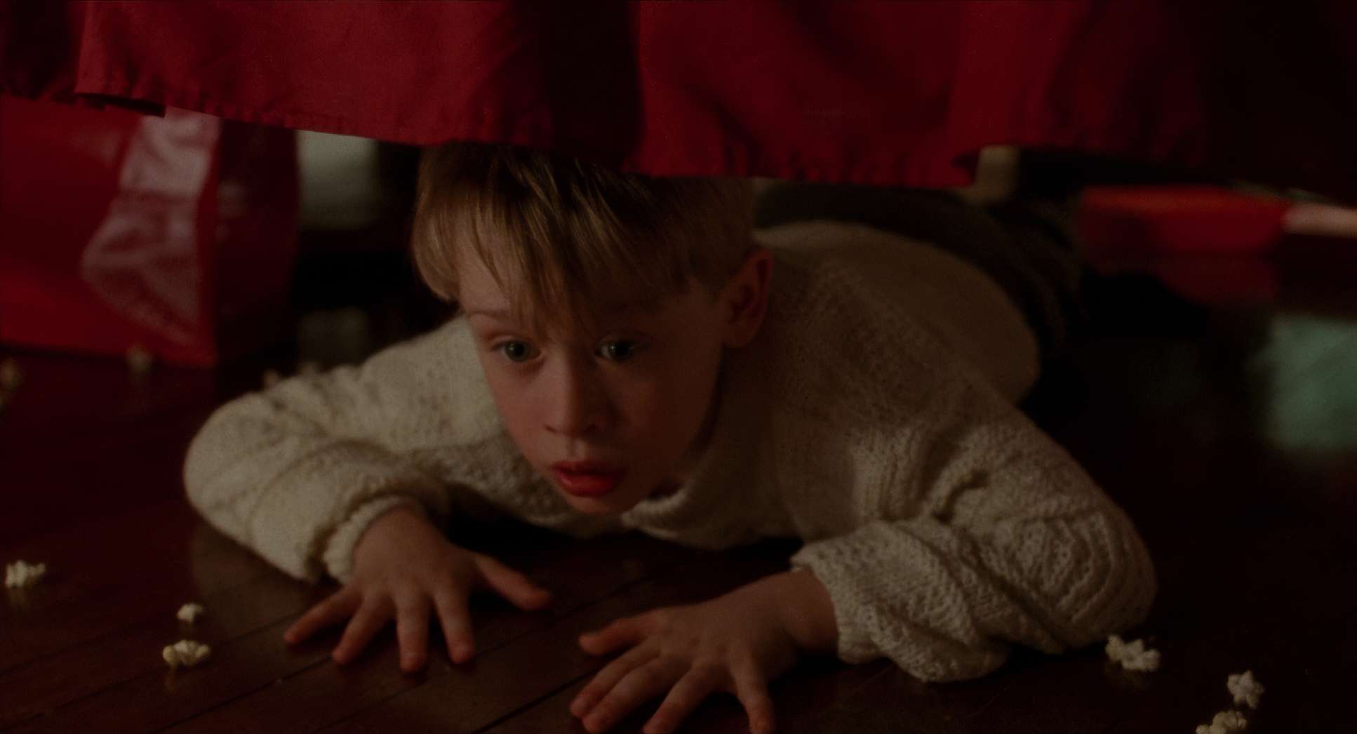
Once he’s alone, the composition shifts. We see these wide-angle shots of Kevin in expansive rooms, using heavy negative space to highlight his solitude. He becomes a small, central figure in a grand, empty environment. This makes the house feel like a character first an oppressive force, then a sanctuary, and finally, a fortress.
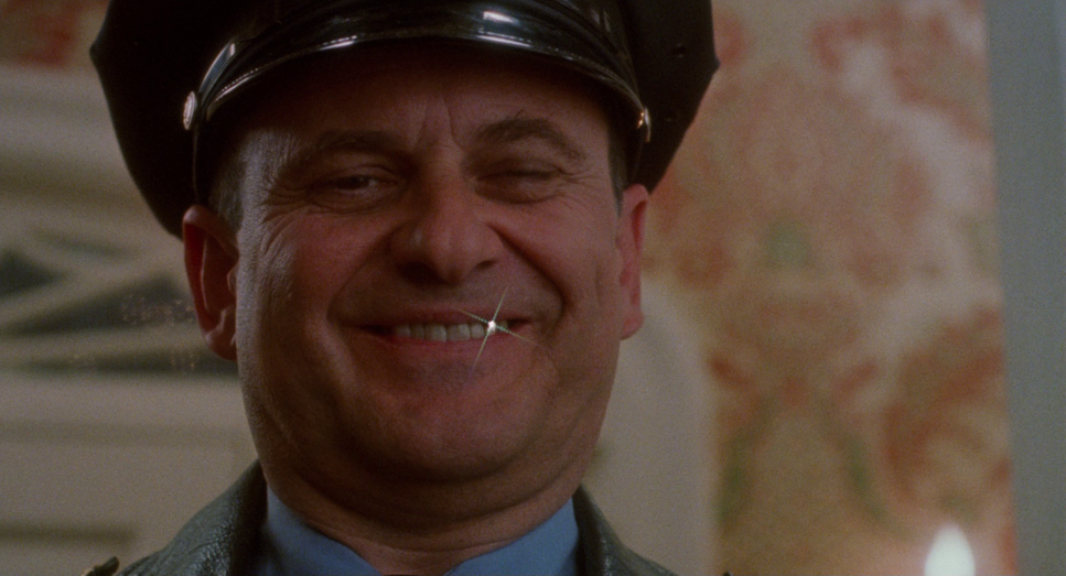
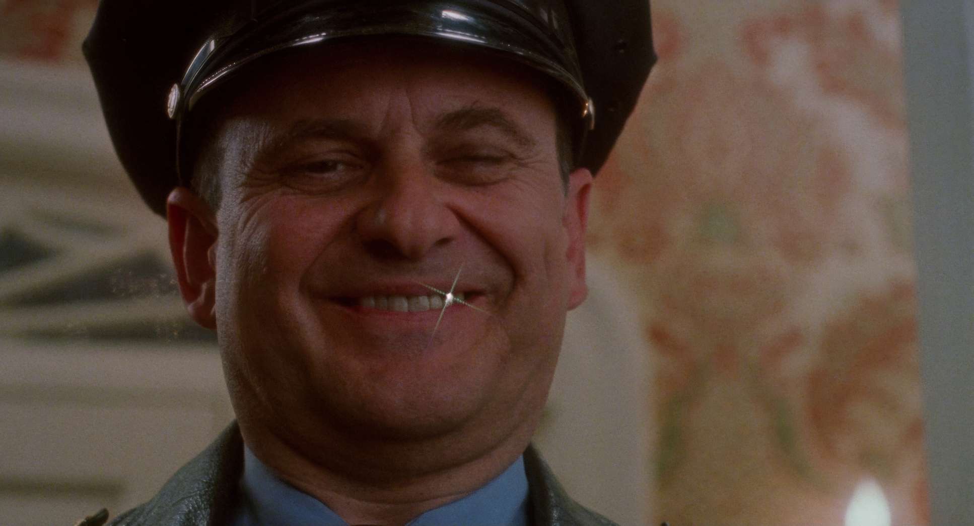
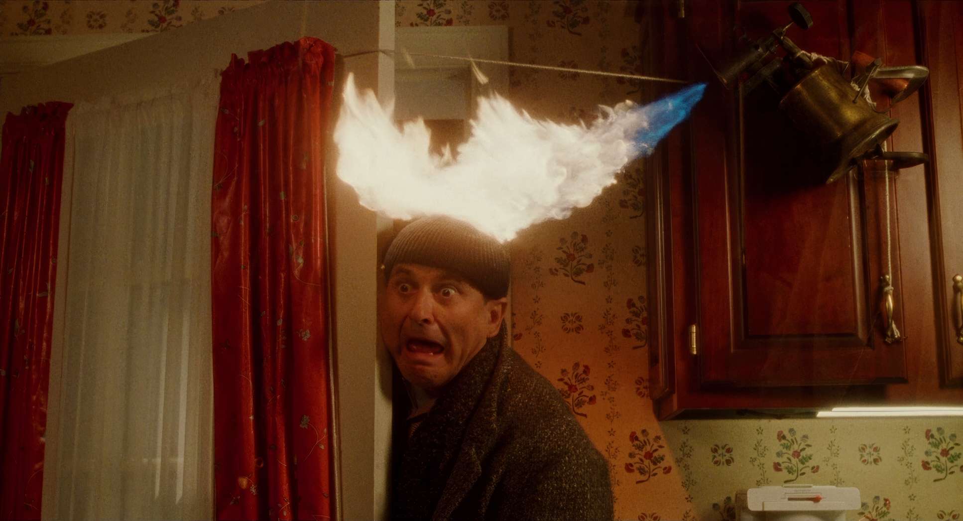
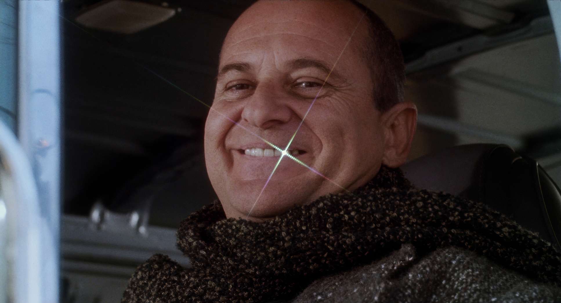
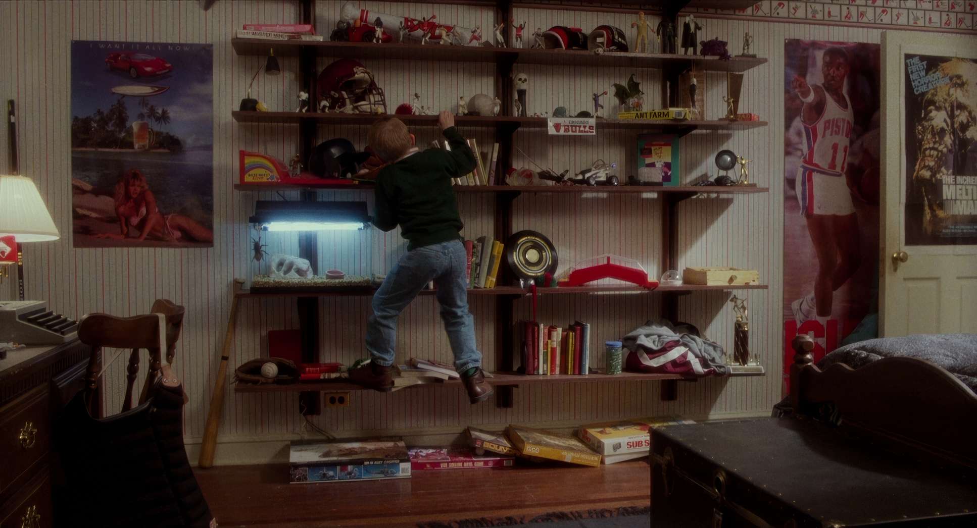
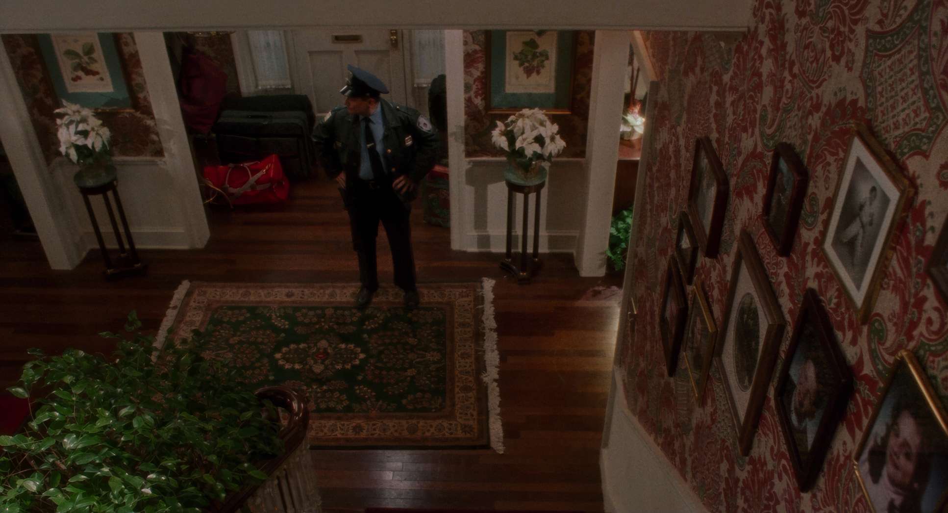
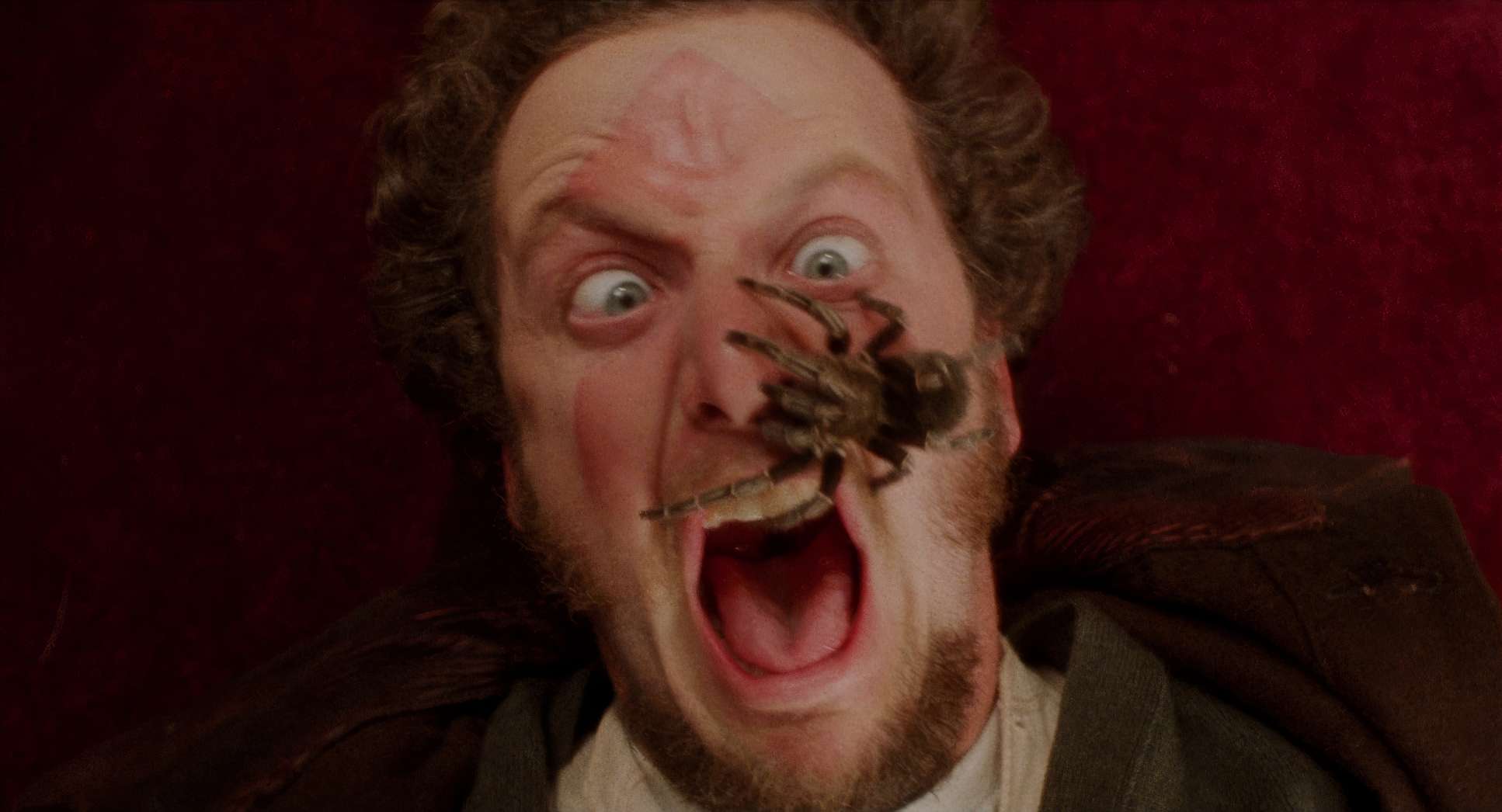
When the Wet Bandits show up, the compositions get more dynamic. Macat uses low-angle shots on Kevin when he’s strategizing, subtly giving him a sense of power that his small stature lacks. Conversely, Harry and Marv are often caught in Dutch angles or awkward frames as they hit the traps, visually signaling their disorientation. The camera doesn’t just watch them; it embraces the absurdity of their suffering.
Camera Movements
The camera movements here are incredibly deliberate. It’s far from a static comedy.
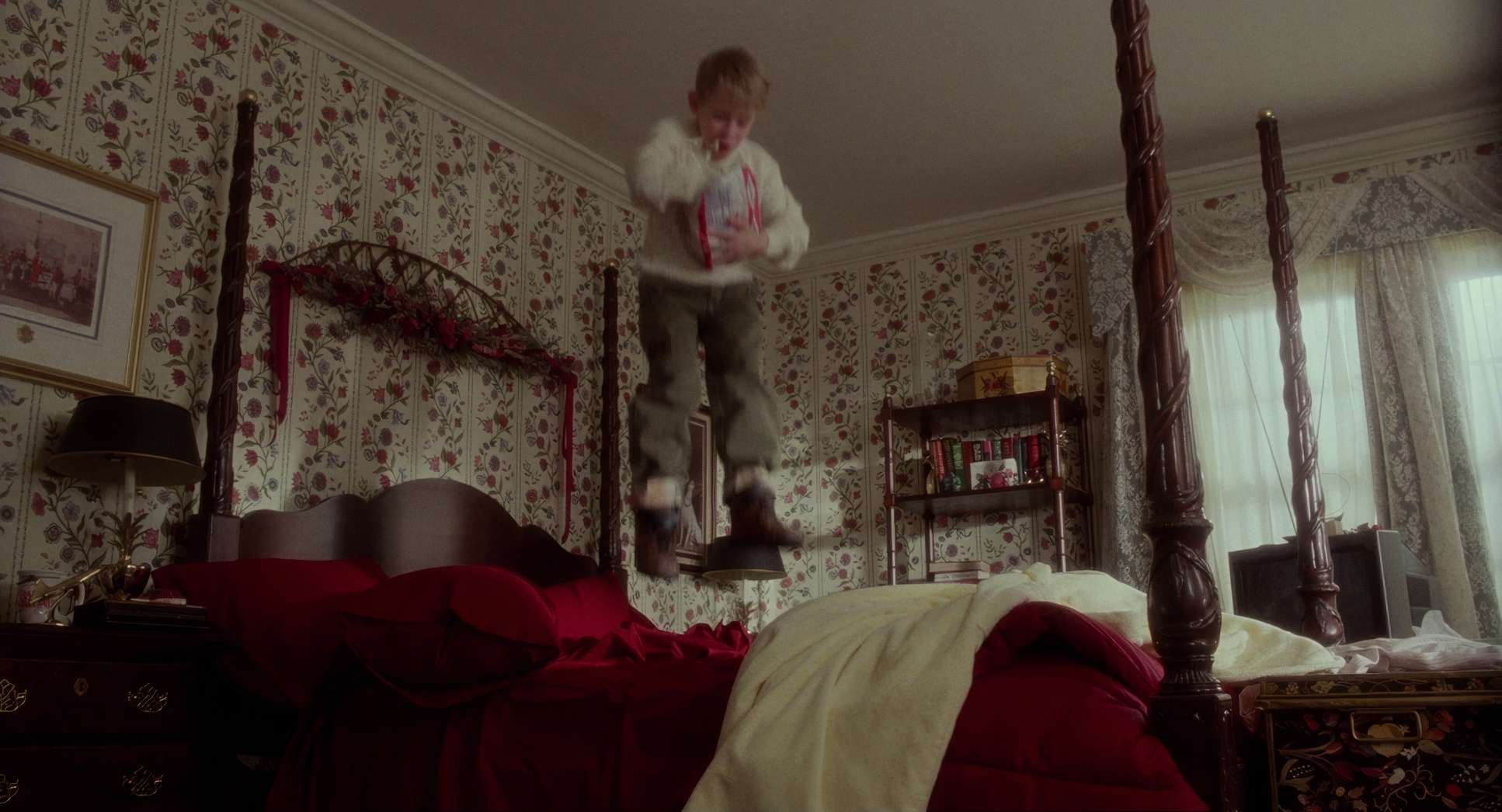
Early on, when the house is bustling, Macat employs fluid tracking shots and Steadicam moves to follow the pre-vacation frenzy. It feels like you’re caught in a swirling current. Once Kevin is alone, the “vibe” changes. We see more dolly shots and careful pans that underscore his isolation. The camera will sometimes linger on him, small in a vast frame, mimicking a child’s mix of wonder and apprehension.
During the booby trap sequences, the camera becomes a co-conspirator. It’s agile. It sets up the gag by showing the trap, then quickly pans to Harry or Marv as they walk into it. We get energetic handheld shots to immerse us in the Bandits’ pain, providing that kinetic impact for the physical comedy. Then come the snap zooms or quick cuts to punctuate a punchline like a paint can swinging through the air. The camera isn’t just recording the action; it’s participating in the timing. It’s exactly why that reviewer found it so “funny” when the Bandits were “falling through the booby traps.”
Lighting Style
The lighting is arguably the film’s most defining characteristic. Macat uses a masterful blend of motivated lighting that feels natural for a home, but with a “magical” quality.
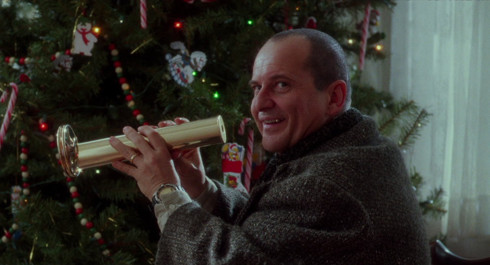
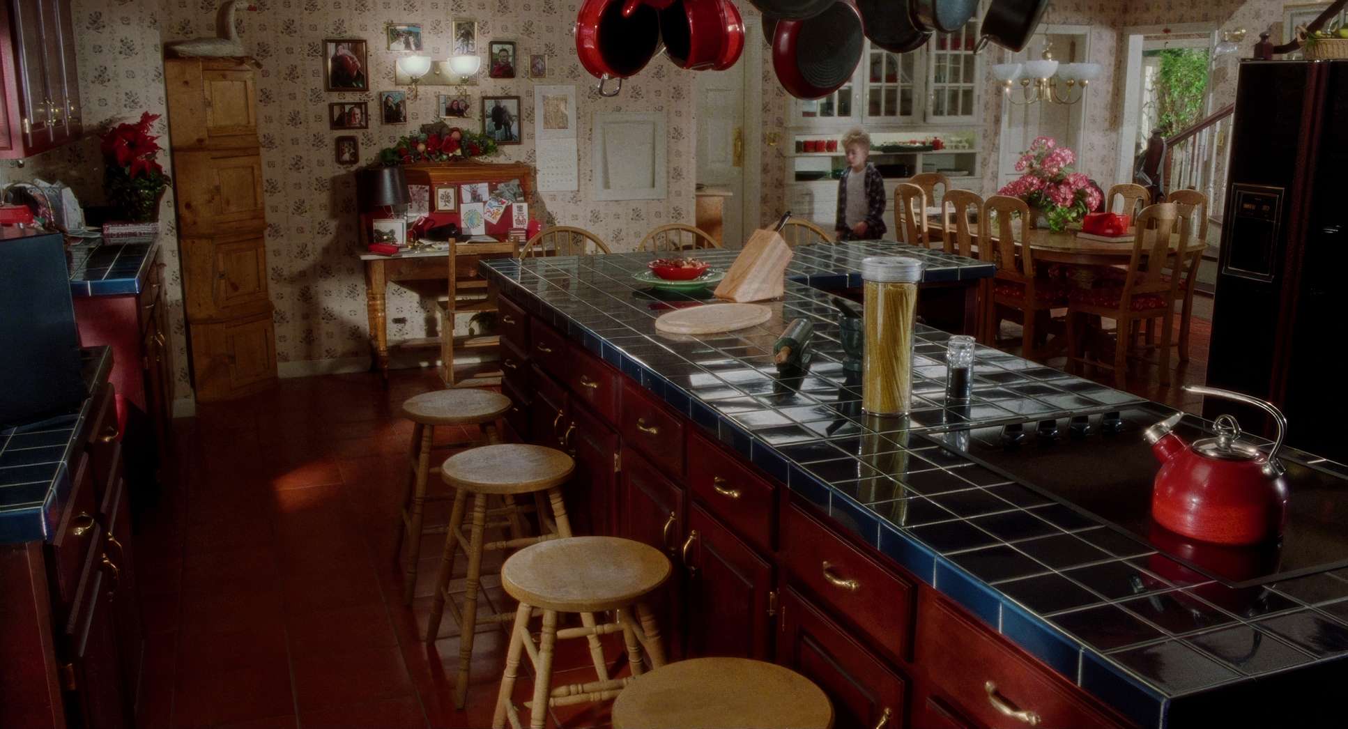
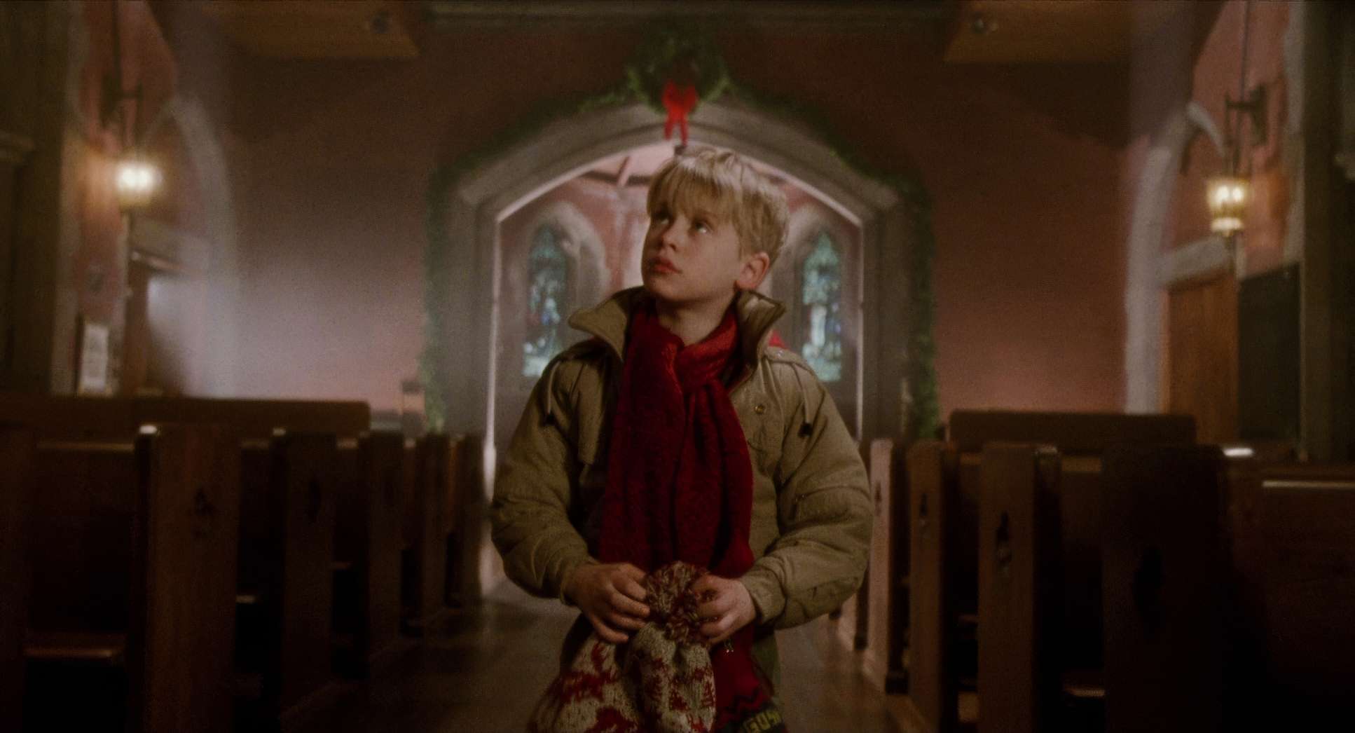
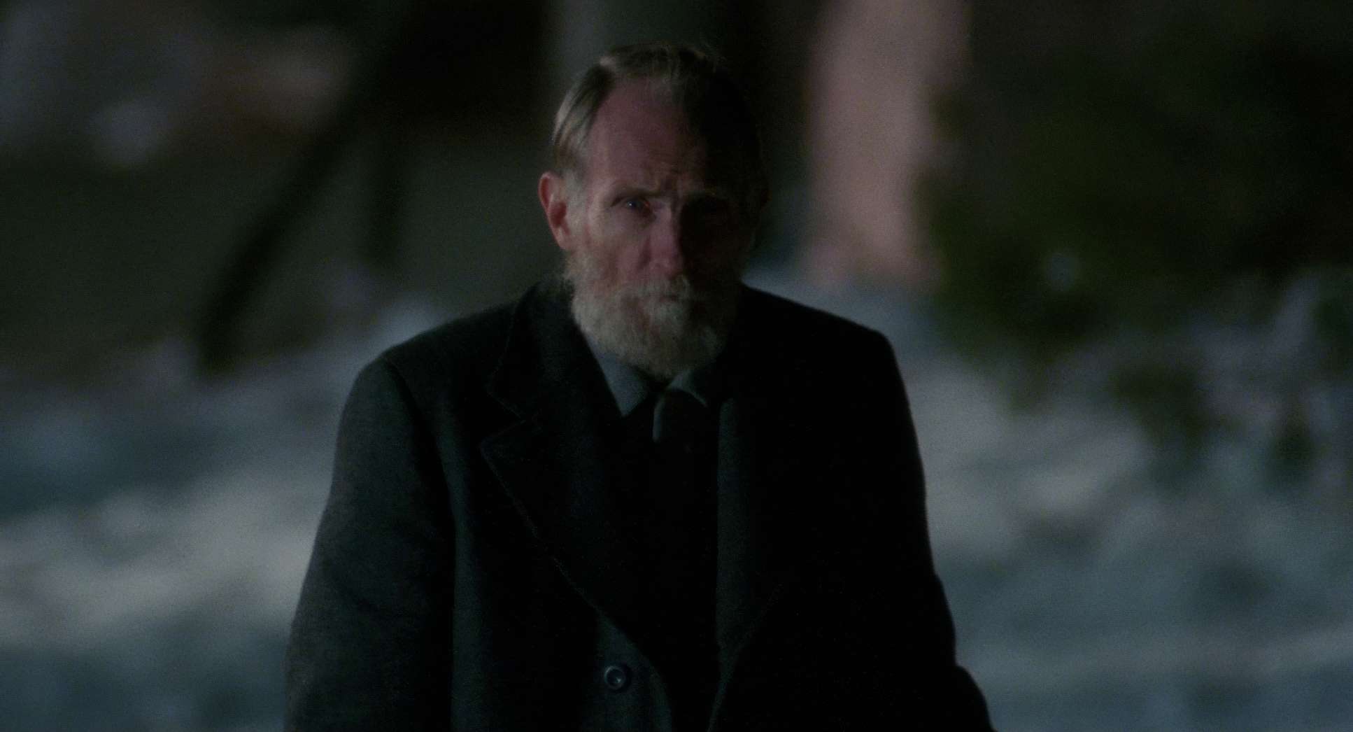
The primary sources are practicals: the warm glow of Christmas tree lights, lamps, and the soft blue ambient light spilling in from the windows. This “warm vs. cool” (tungsten vs. moonlight) contrast is a classic technique to create a cozy interior that feels safe compared to the cold world outside.
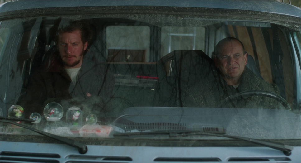
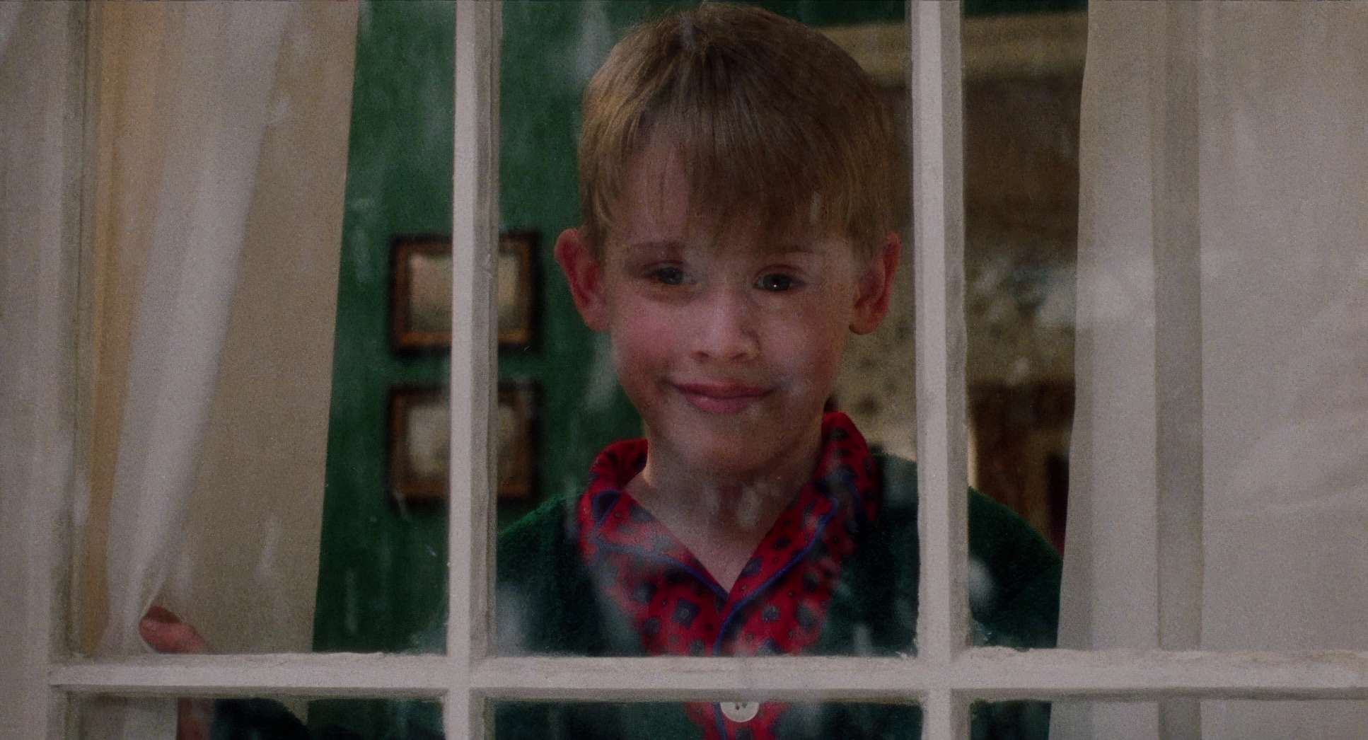
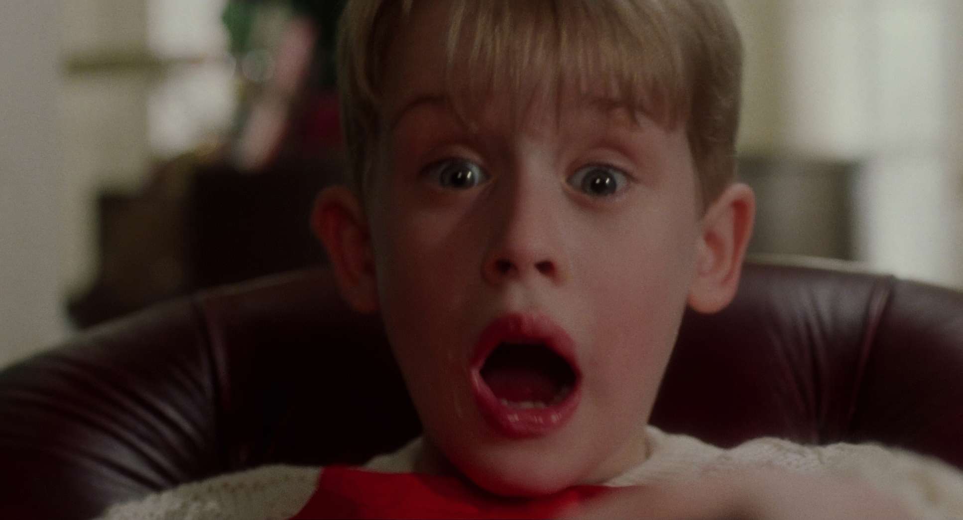
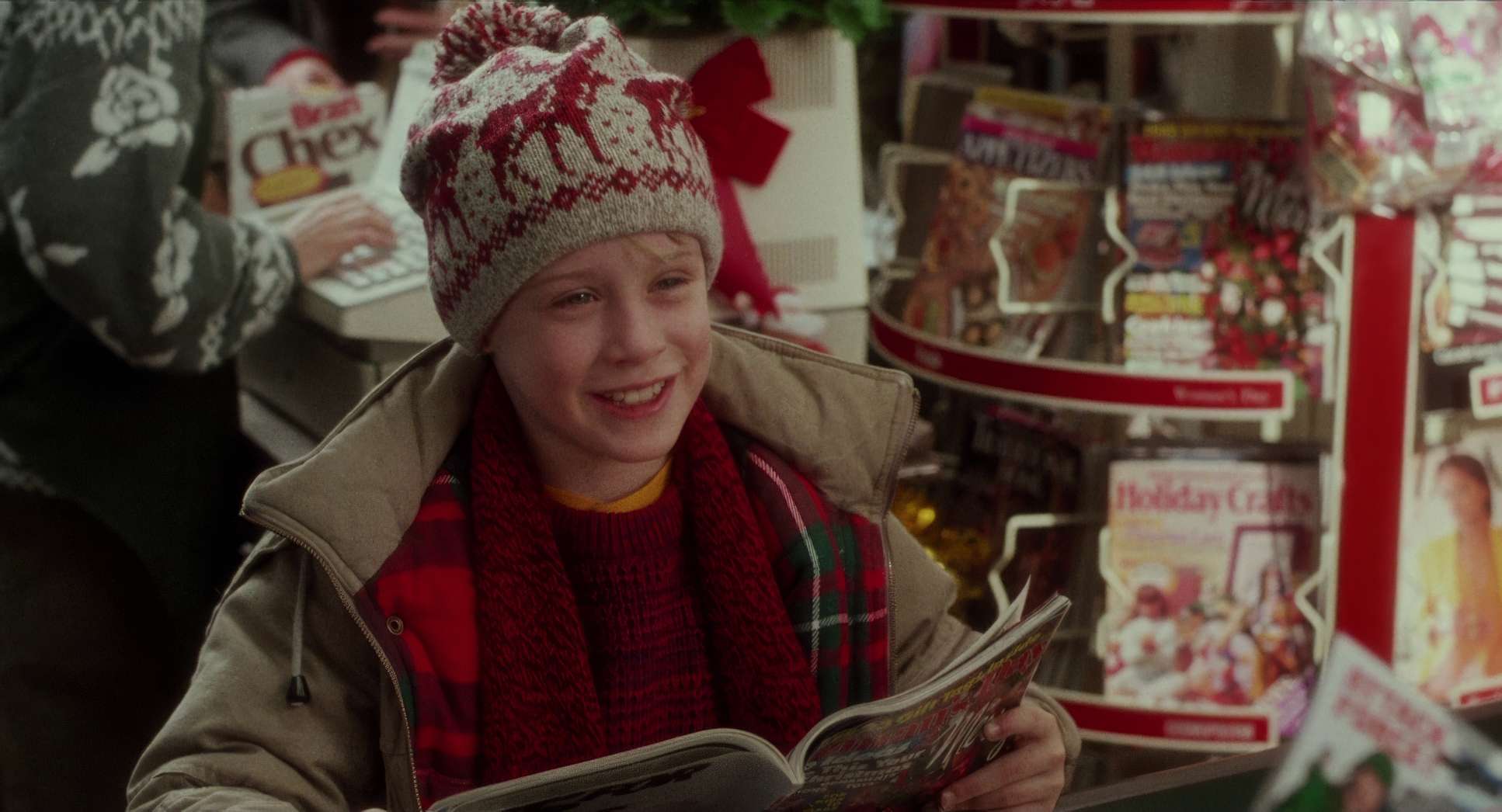
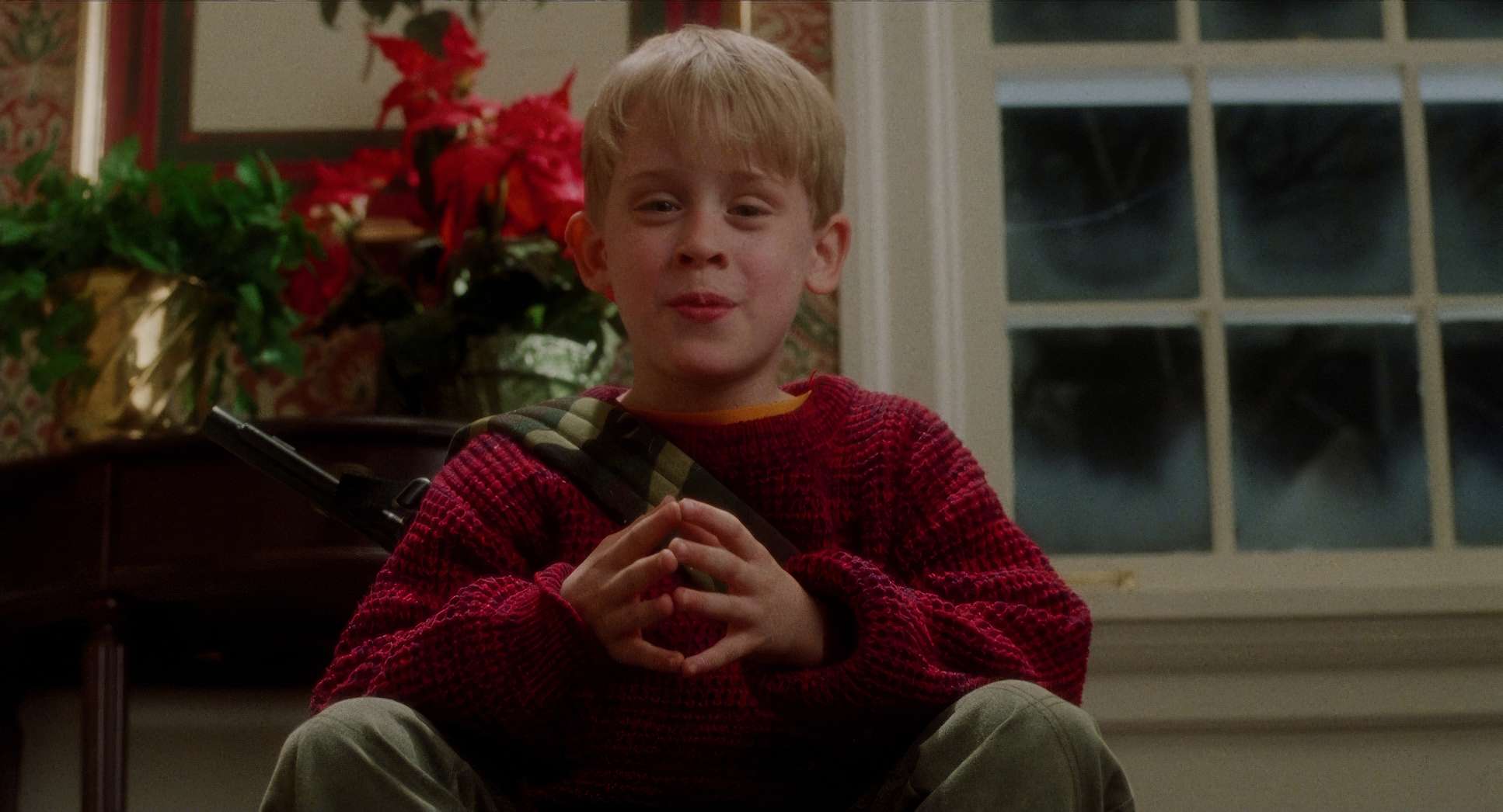
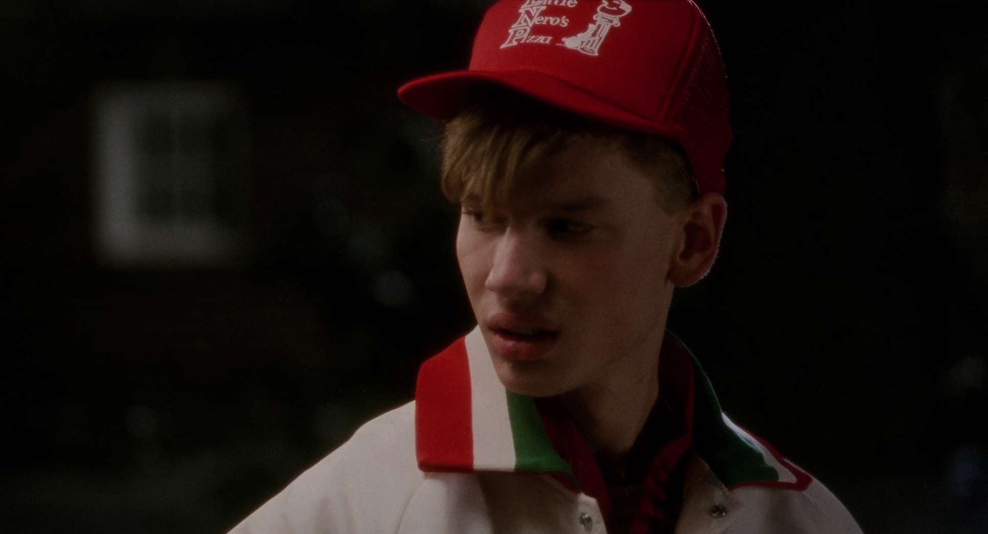
Early scenes use high-key lighting bright, festive, and welcoming. But when Kevin is alone, it gets more nuanced. In his quiet moments, we see softer, diffused light with careful backlighting to give Kevin a bit of a “halo,” emphasizing his innocence. As the threat of the Bandits looms, the contrast ratios tighten. We see deeper shadows, and when Harry and Marv sneak around, they’re often lit from below to make them look menacing even in a comedy. The night scenes are the real stars here; those multi-colored glows across the frame make the house feel alive.
Lensing and Blocking
Lensing and blocking are where the comedic precision lives. Macat generally favors wide to medium lenses living on 24mm or 35mm glass to convey the scale of the house. These lenses provide a deep depth of field, keeping Kevin and his elaborate setups in focus simultaneously.
However, for the emotional beats, he’ll switch to medium telephotos (50mm–85mm). These compress the depth and isolate Kevin, drawing us right into his reactions.
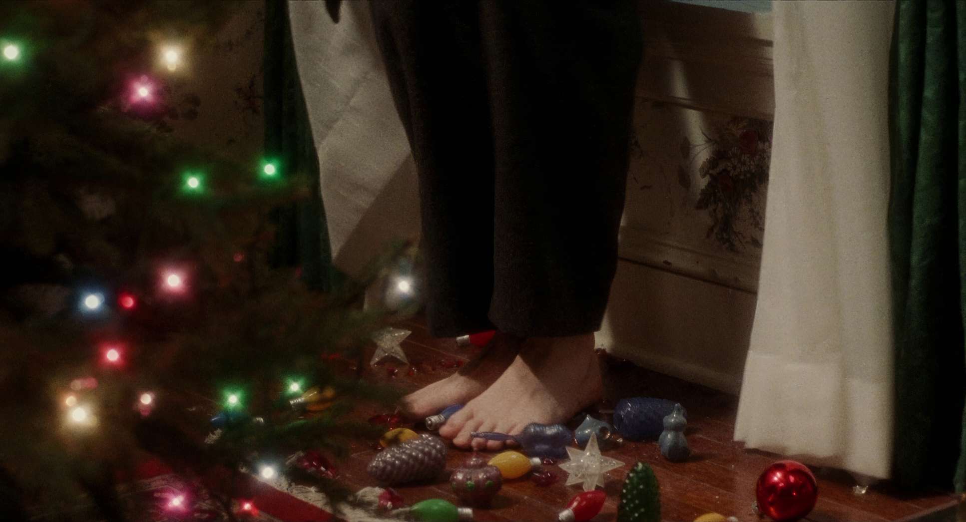
The blocking is almost like a slapstick ballet. Chris Columbus and Macat orchestrated the movement of the actors to maximize the pay-off. Think about the scene with Marv and the ornaments: the blocking places the ornament clearly in the mid-ground, Marv’s foot directly above it, and then his reaction fills the frame. The spatial relationship between the characters and the props is the engine of the humor.
Color Grading Approach
As a colorist, this is my favorite part. The grade in Home Alone is a beautiful example of early 90s print-film sensibilities. The look is inherently warm, revolving around a classic Christmas palette: rich reds, deep greens, and golden oranges.
There’s fantastic hue separation here. The reds in Kevin’s sweater “pop” without bleeding into the skin tones or making the rest of the frame look muddy. The contrast shaping is gentle you won’t find crushed blacks or blown-out highlights. Instead, the film maintains great shadow detail, which is vital for the “hide-and-seek” sequences.
The skin tones are rendered beautifully natural, warm, and relatable. The tonal sculpting guides the eye; for example, a scorching doorknob or a bright paint can is made to stand out visually, signaling its role in the coming chaos. It’s a grade that holds up remarkably well today, proving that a thoughtful film-stock-based approach is timeless.
Technical Aspects & Tools
Home Alone (1990) — Technical Specifications: Arriflex BL4, 35mm Film
| Genre | Comedy, Family, Satire, Drama, Slapstick, Suburbia, Holidays |
| Director | Chris Columbus |
| Cinematographer | Julio Macat |
| Production Designer | John Muto |
| Costume Designer | Jay Hurley |
| Editor | Raja Gosnell |
| Colorist | Mike Milliken |
| Time Period | 1990s |
| Aspect Ratio | 1.85 – Spherical |
| Format | Film – 35mm |
| Lighting | Soft light |
| Lighting Type | Practical light |
| Story Location | Winnetka, Illinois |
| Filming Location | Winnetka, Illinois |
| Camera | Arriflex BL4 |
| Lens | Zeiss Super Speed 35mm |
| Film Stock | 5296/7296 EXR 500T |
Home Alone was shot on 35mm film specifically the Kodak EXR 500T (5296) stock, which was known for its great latitude and fine grain. They used Arriflex BL4 cameras paired with Zeiss Super Speed lenses. This setup is why the film has that creamy, organic “90s look” with such smooth highlight roll-off.
Because this was 1990, the “grade” was done in a lab through traditional film timing. A color timer worked on the physical negative to adjust exposure and balance. There was no “fixing it in post” like we do digitally today; every lighting decision had to be spot-on on the day of the shoot. The practical effects, like the burning doorknob, had to be lit and framed perfectly to look “hot” without digital enhancement. It’s a discipline that really tests a DP’s mettle.
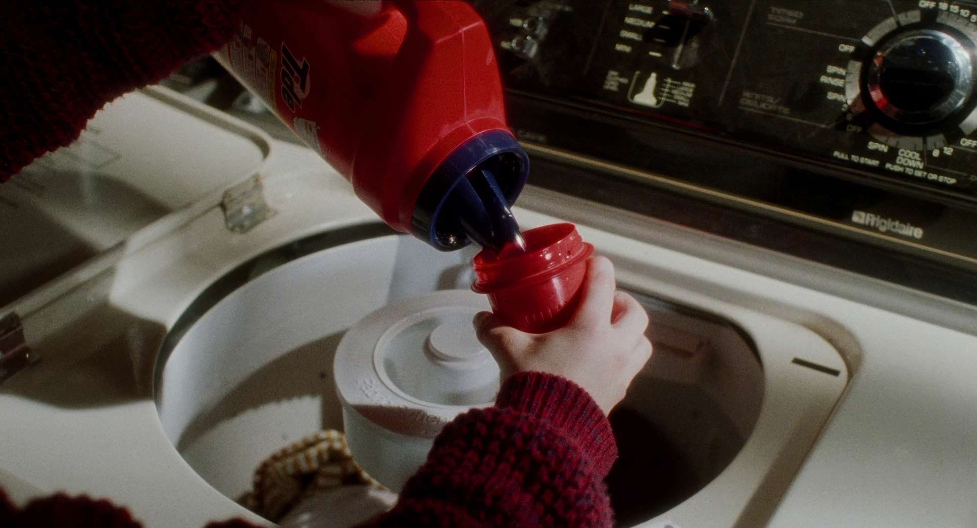
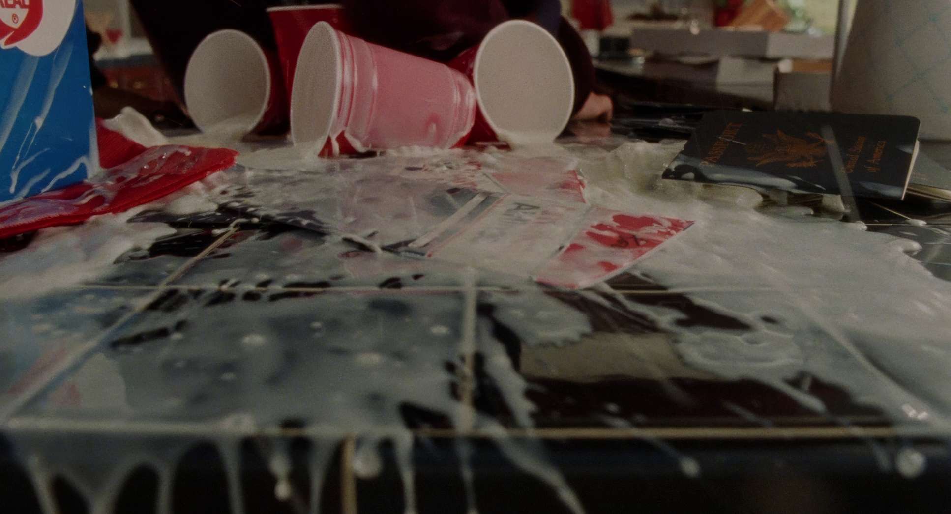
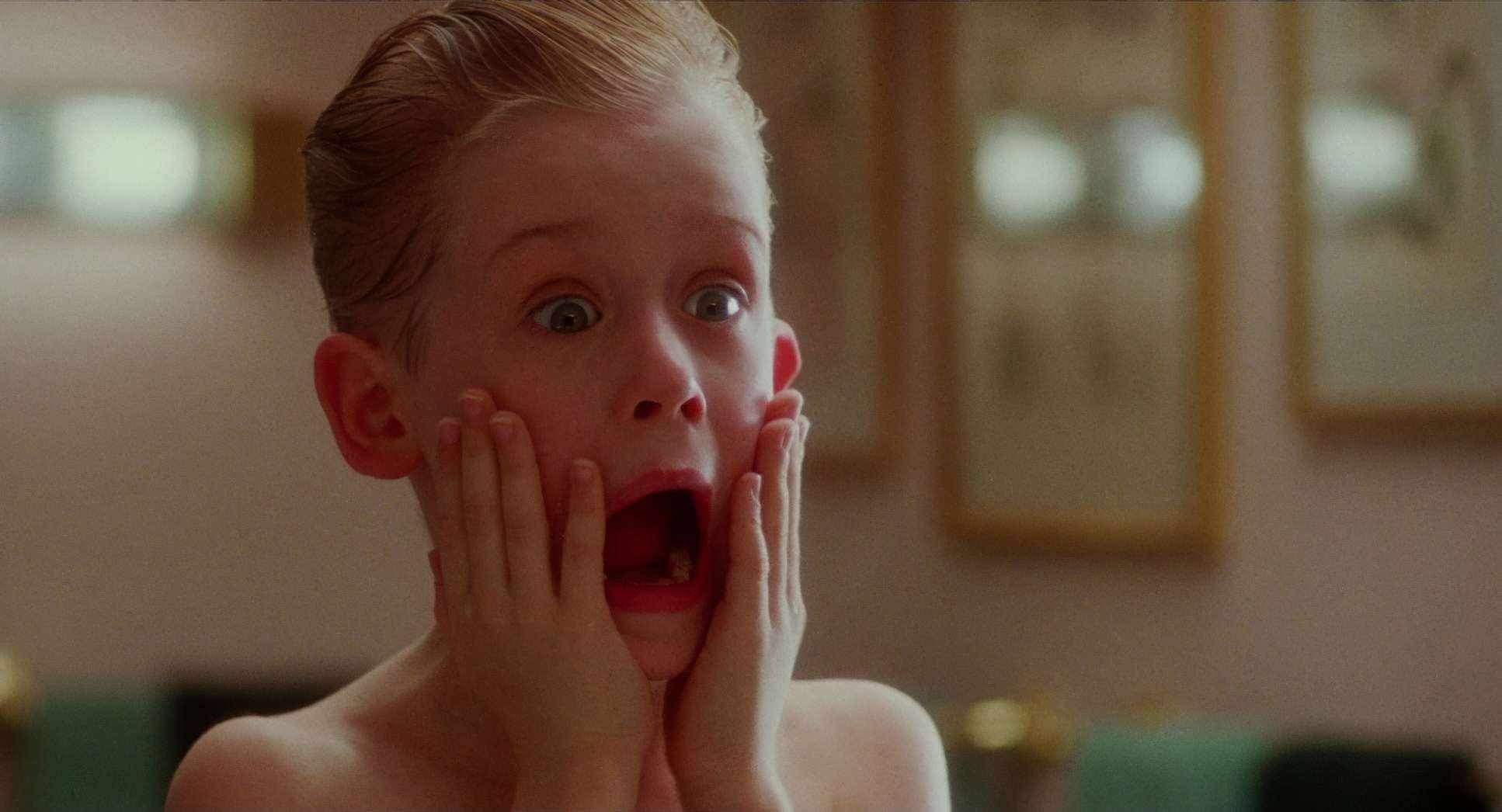
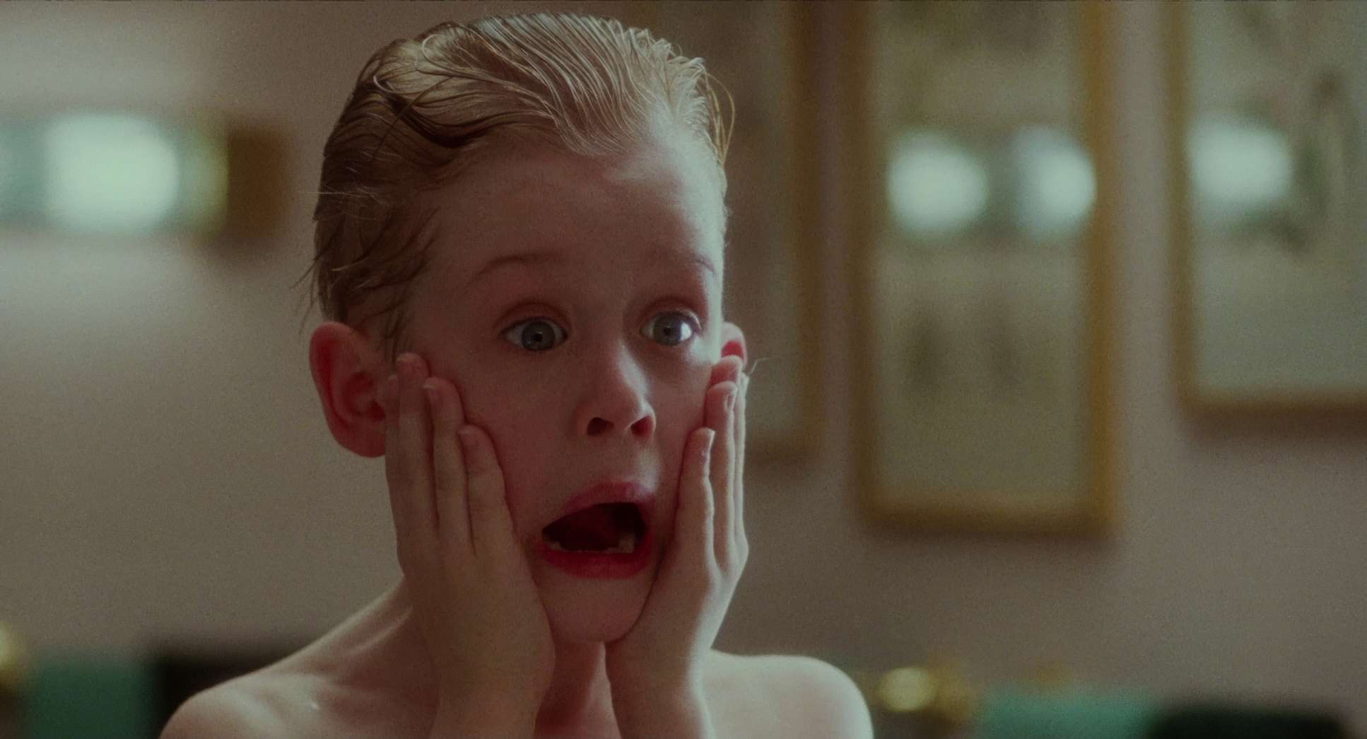
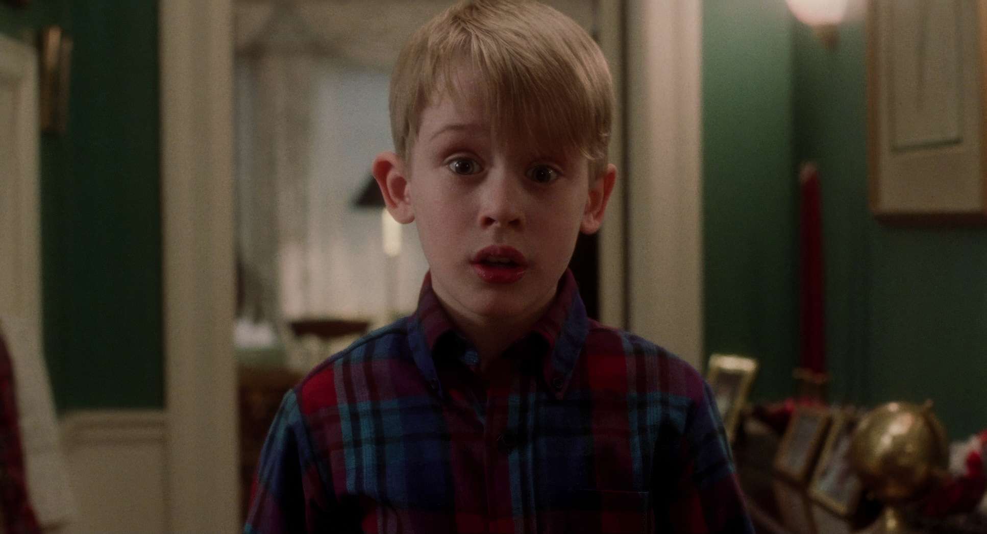
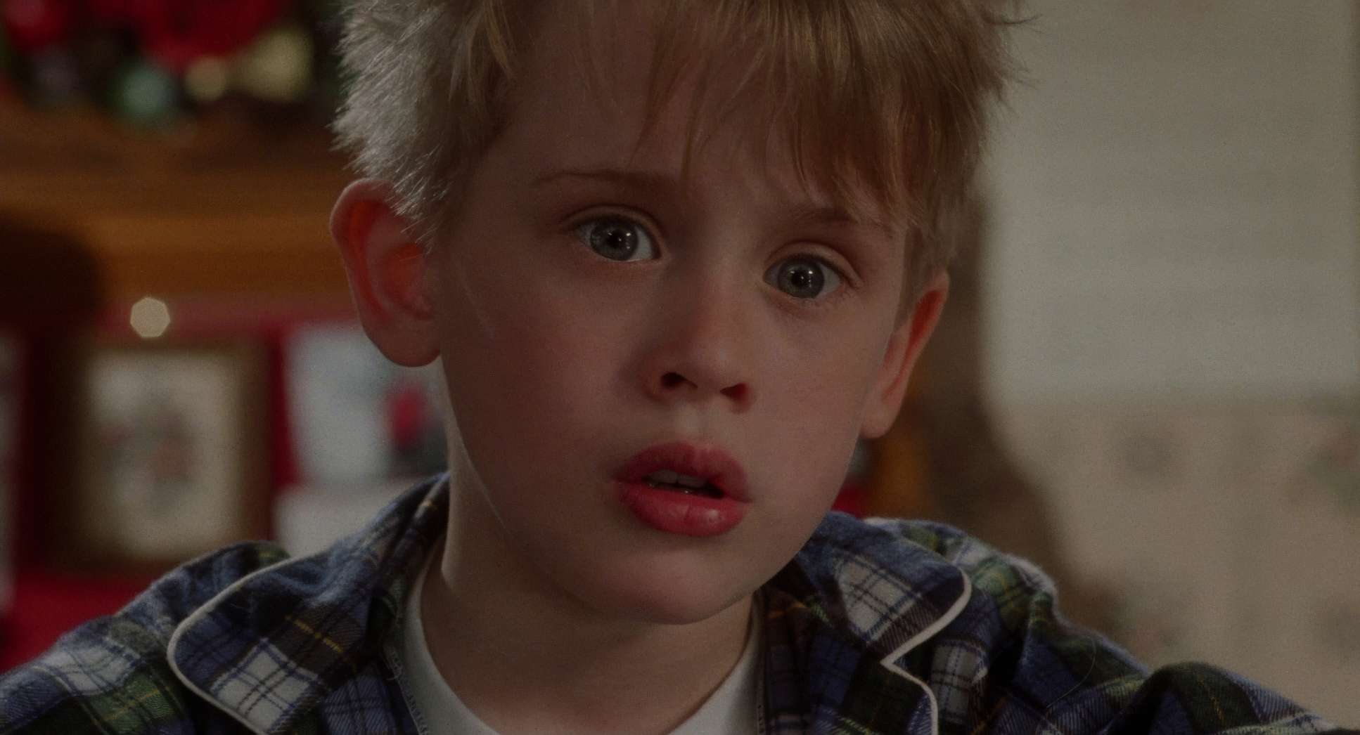
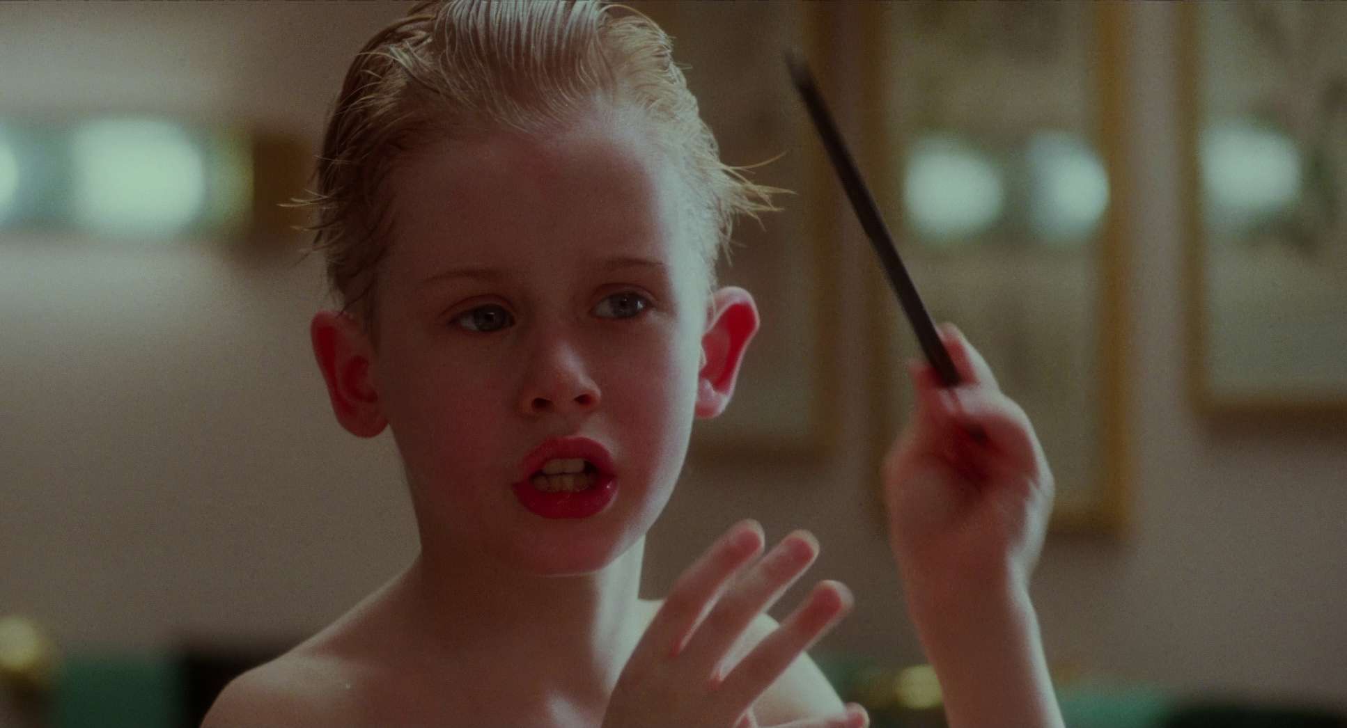
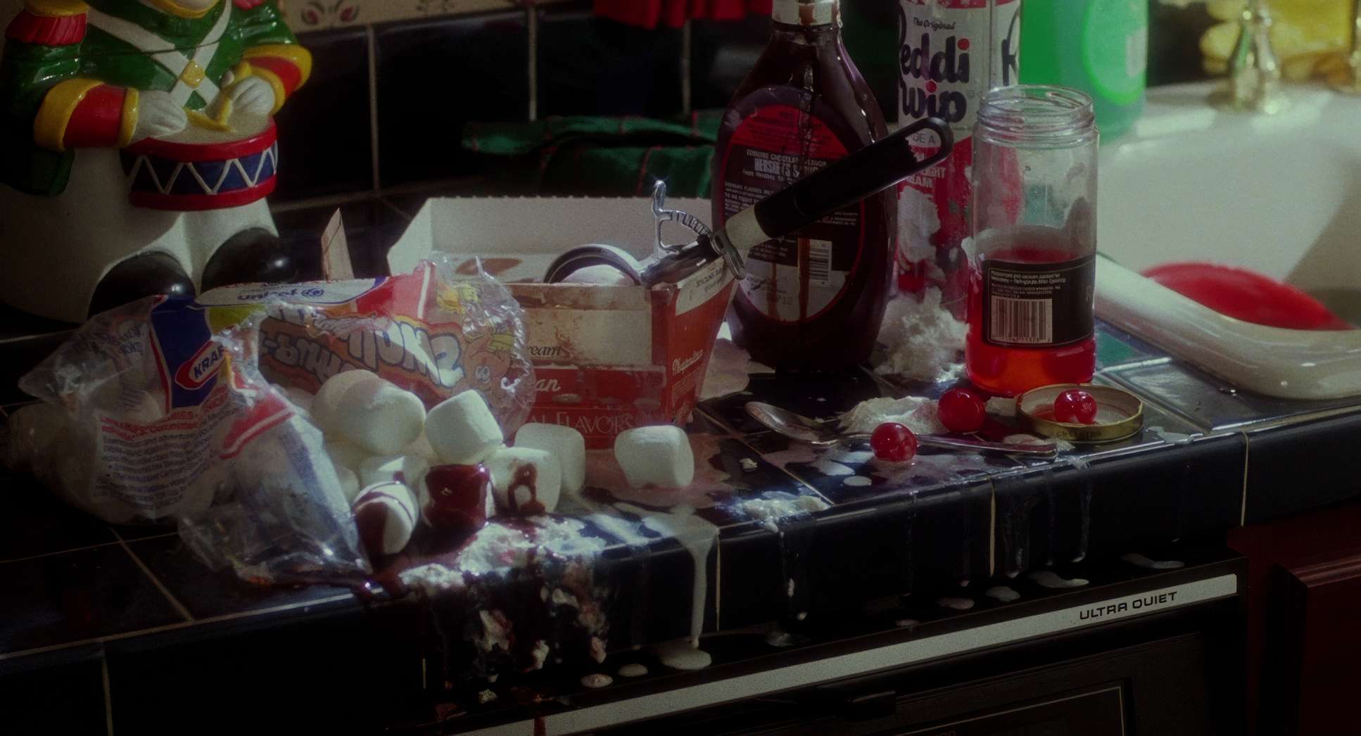
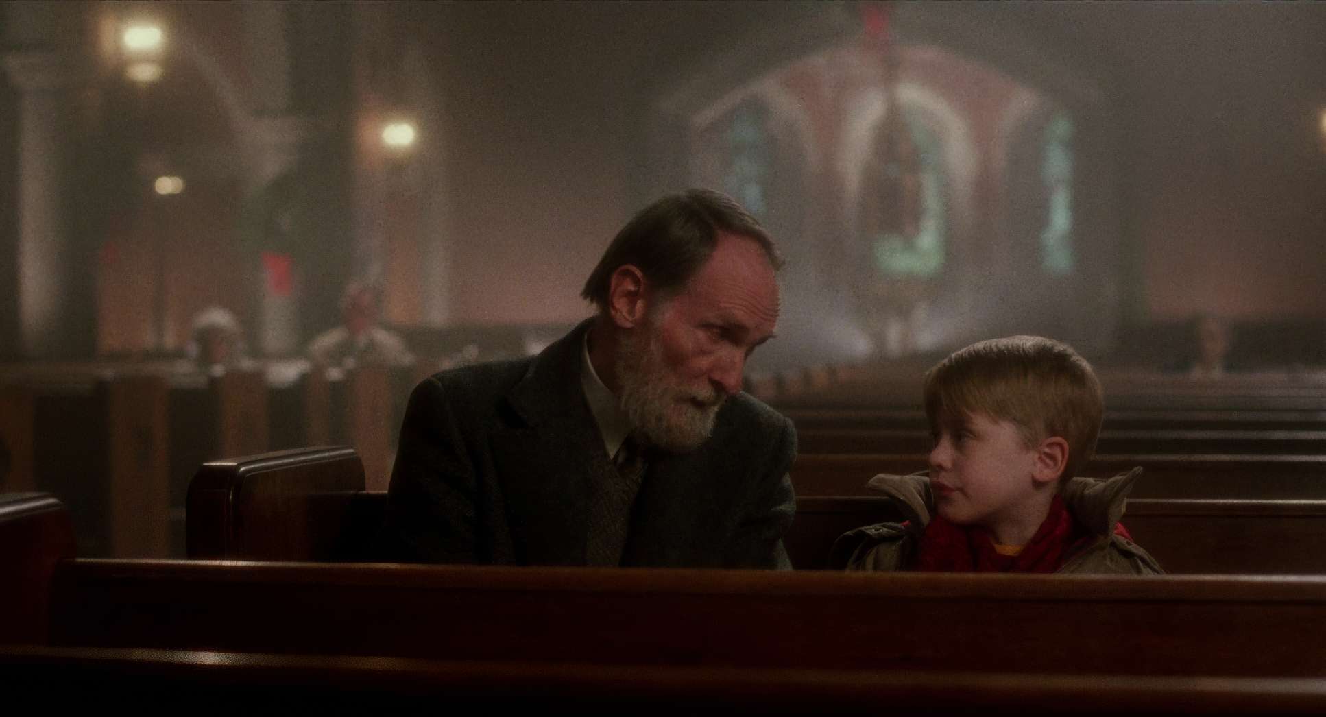
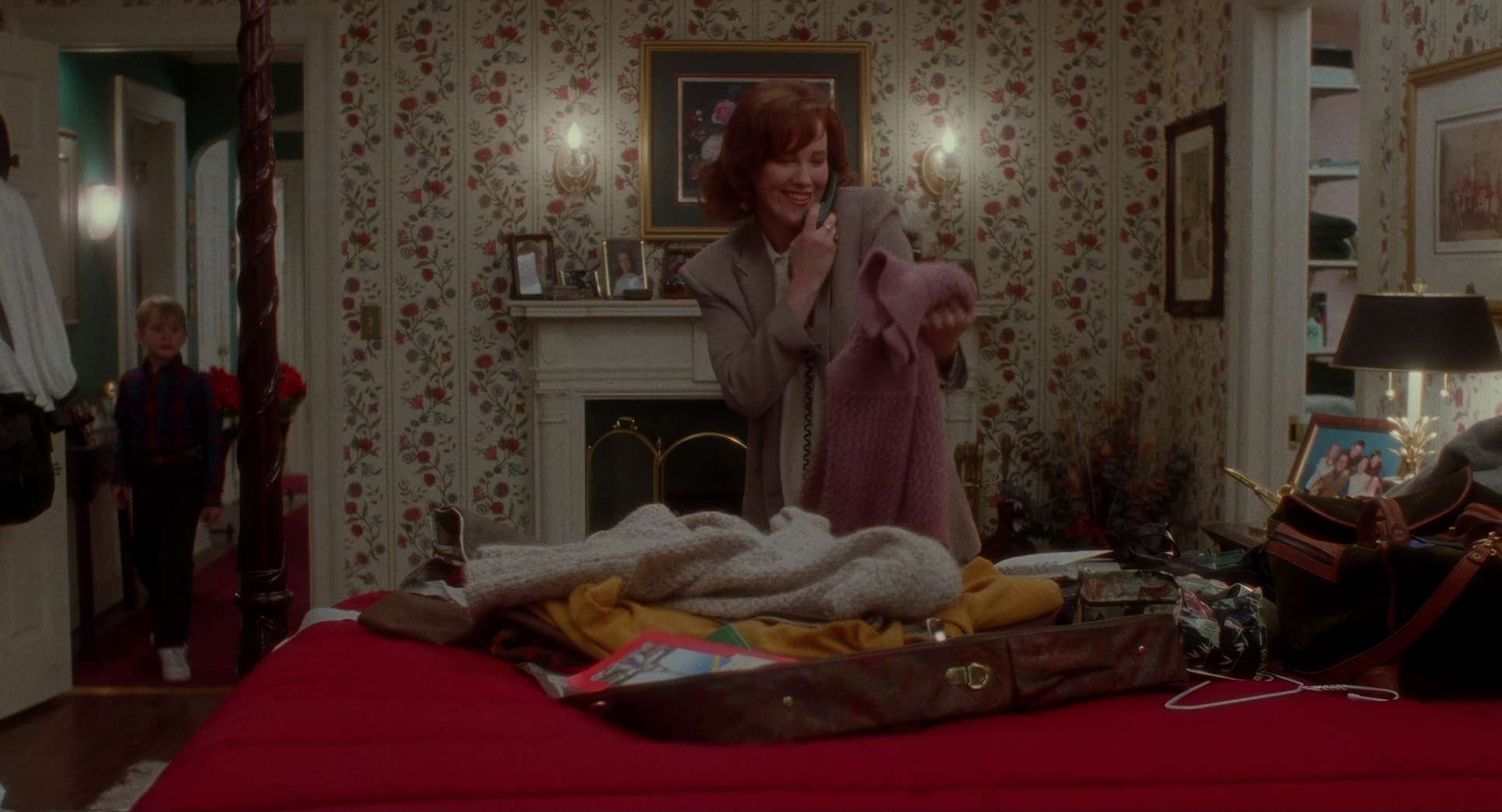
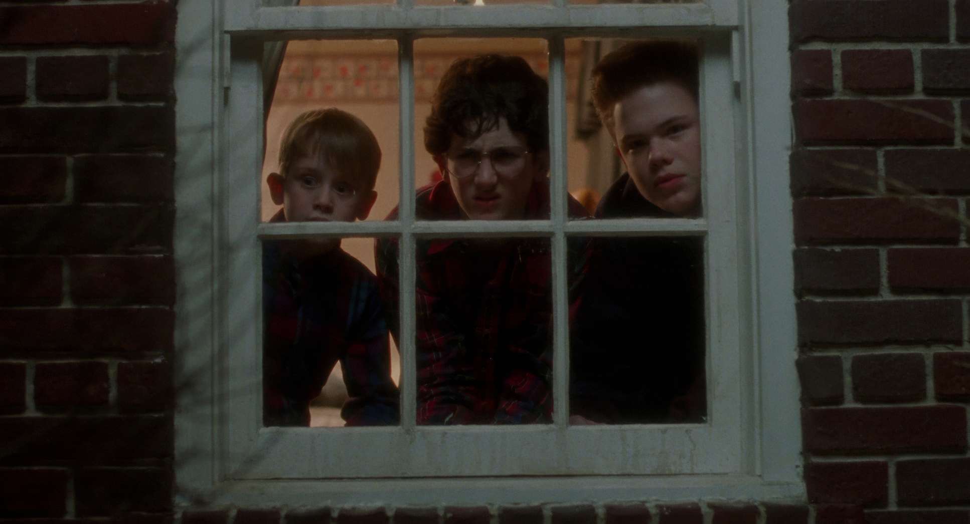
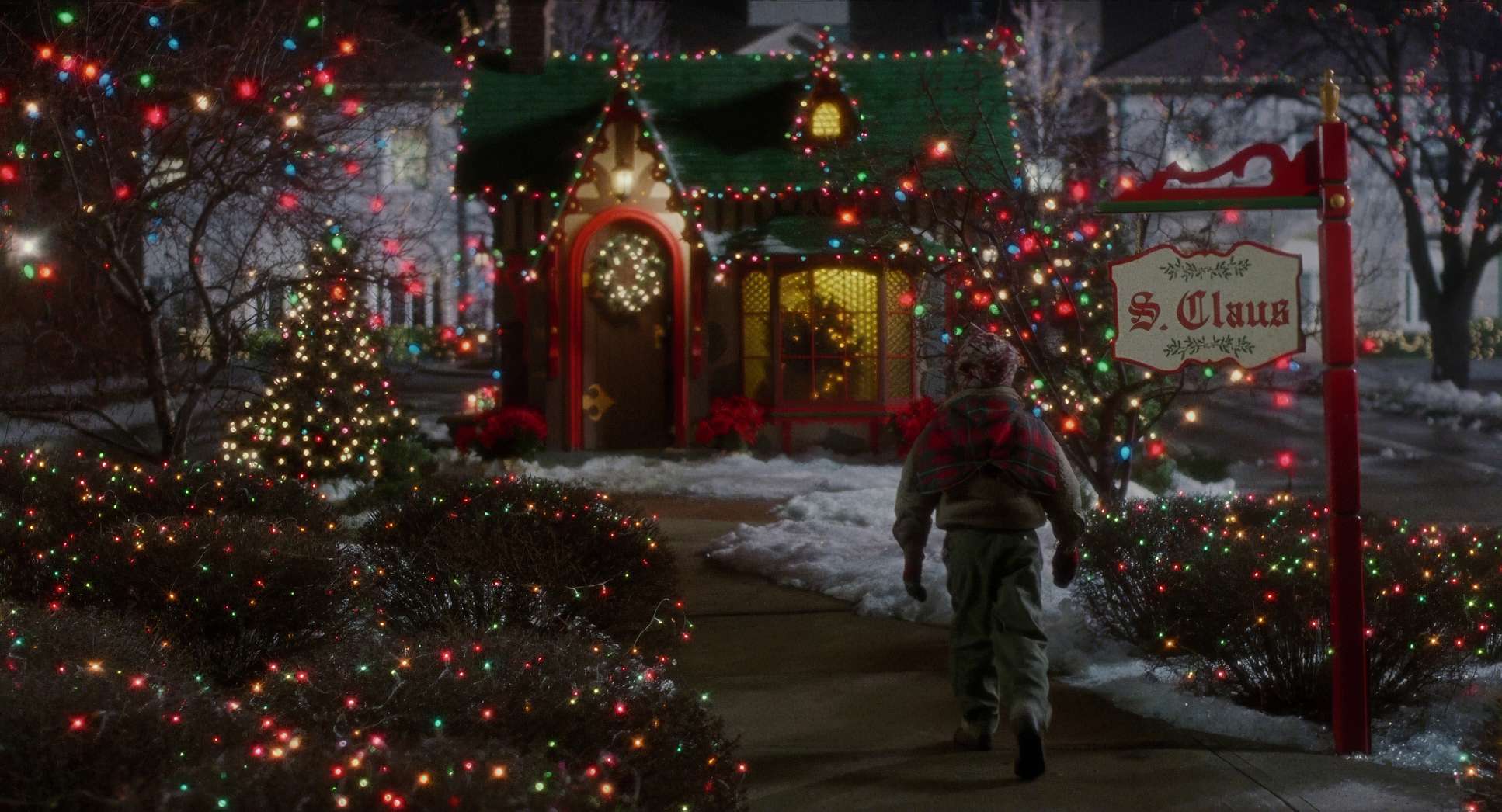
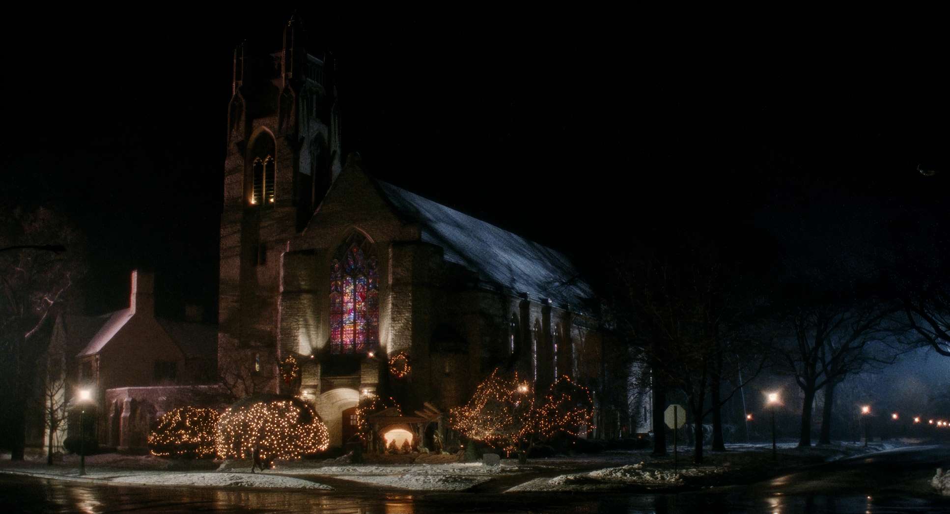
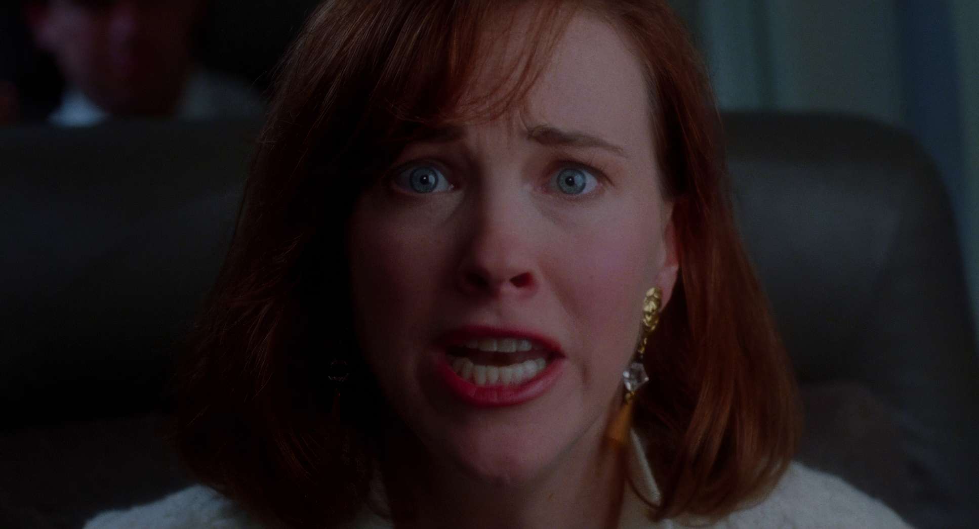
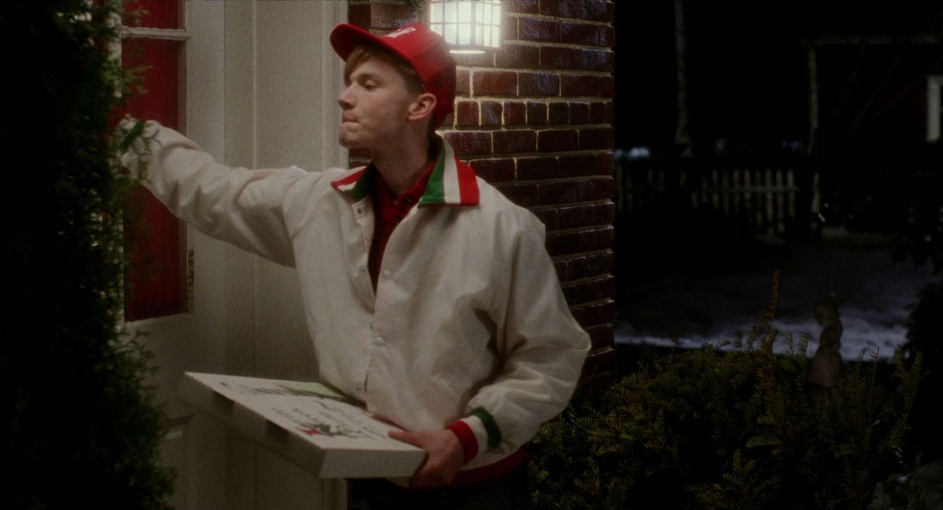
Home Alone (1990) Film Stills
A curated reference archive of cinematography stills from Home Alone (1990). Study the lighting, color grading, and composition.


- Also read: HARRY POTTER AND THE GOBLET OF FIRE (2005) – CINEMATOGRAPHY ANALYSIS
- Also read: X-MEN: FIRST CLASS (2011) – CINEMATOGRAPHY ANALYSIS
Browse Our Cinematography Analysis Glossary
Explore directors, cinematographers, cameras, lenses, lighting styles, genres, and the visual techniques that shape iconic films.
Explore Glossary →