Hidden Figures (2016) isn’t just a “feel-good” biopic; it’s a masterclass in using the image to elevate a script, and from my perspective, the craft here is doing some heavy lifting that the average viewer might not even consciously notice.
When I’m sitting in the suite, looking at raw frames and deciding how to shape a look, I’m constantly looking for the “cinematographic blueprint.” With Hidden Figures, that blueprint is all about duality. It’s a film that demands your attention to its intellectual core the math, the science, the sheer brainpower while simultaneously navigating a deeply human story of prejudice and perseverance. It’s not just about the race to space; it’s about the “hidden” bodies and minds that the camera finally chooses to see.
About the Cinematographer
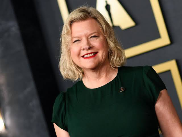
The lens behind this look belongs to Mandy Walker ASC, ACS. Now, Mandy is someone whose work I’ve followed closely; she has this rare ability to craft images that feel grounded and authentic without ever feeling “muddy.” Her filmography shows a consistent eye for character, allowing the actors to breathe within the frame rather than being swallowed by over-stylization.
In Hidden Figures, her touch is everywhere. She manages to balance the claustrophobic intimacy of Catherine’s calculations with the grand, futuristic scale of 1960s NASA. She isn’t interested in flashy camera tricks for the sake of a reel. Instead, she makes deliberate, considered choices that serve the emotional beats. For a “layered biopic” that has to juggle three distinct character arcs, you need a DP who can maintain a cohesive visual world while letting each woman’s story have its own textural nuance. Mandy Walker brings that blend of technical precision and empathetic vision that is, frankly, the reason this film feels so genuine.
Technical Aspects & Tools
I need to correct a common assumption here: while many 2016 biopics went for the convenience of the ARRI Alexa, Mandy Walker actually went “old school” with 35mm film. Looking at the final image, you can see the soul of the Kodak Vision3 emulsion (specifically the 50D and 500T stocks). As a colorist, that changes the entire conversation. You aren’t just adding a grain overlay in post; you’re managing the organic roll-off and the chemical richness that only celluloid provides.
She utilized Panavision Panaflex cameras paired with some legendary glass E-series and T-series Anamorphics. This choice is vital. The 2.39:1 aspect ratio gives the NASA hallways a sense of endless, intimidating scale, while the Panavision primes offer a gentle, vintage character that softens the digital DI (Digital Intermediate) process. It’s a setup that captures the “NASA-sharp” details of the math without losing the human warmth of the 1960s setting.
Inspiration Behind the Cinematography
To me, the core inspiration here is the bridge between historical accuracy and an uplifting narrative. The film opens in the 1920s (shot on 16mm for that tighter, more textured feel) before landing in the starkly segregated 1961. The visual language had to reflect both the stifling limitations of the era and the boundless potential of the human mind.
The team leaned into what I call a “period-plus” aesthetic. It’s not a dusty, sepia-toned archive piece. It’s a delicate dance: evoking the era through institutional greens and desaturated tones without bogging down the “feel-good” nature that makes the film accessible. The lighting and color subtly acknowledge the mid-century setting, but they never let the past overwhelm the vibrancy of the characters’ intellect. It’s as if the film itself says, “Yes, this was the past, but look at the brilliance that shone through.”
Camera Movements
When you’re telling a story about internal struggle and brilliant minds, the camera has to become a psychological tool. In Hidden Figures, the movement is understated and purposeful mirroring the meticulous nature of the math on screen.
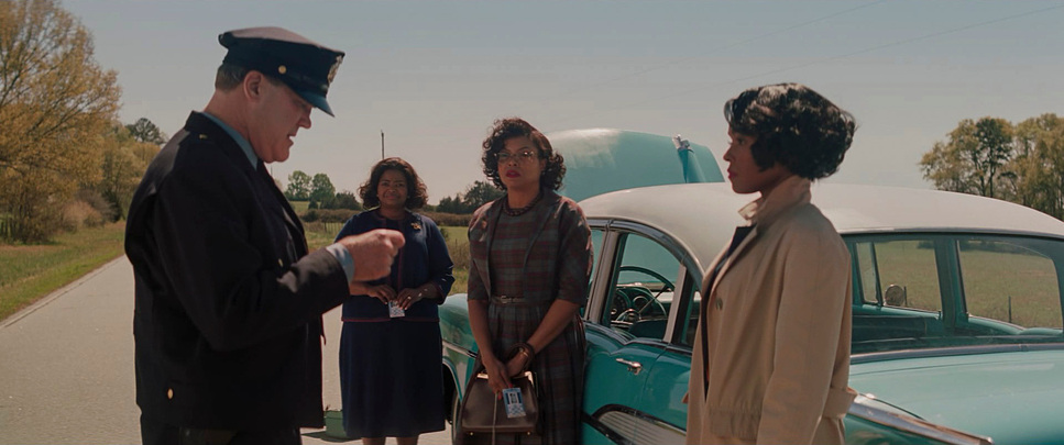
We see a lot of steady, observational tracking shots. Think of Catherine’s daily trek to the “colored” restroom. The camera tracks her, emphasizing the physical and emotional distance, acting as a visual meter of the indignity she endures. These aren’t just “walk and talks”; they are measurements of space and time. Then, there are the subtle, deliberate pushes-in. When a character is on the cusp of a breakthrough, the camera glides closer, inviting empathy and highlighting the intensity of their labor. The camera becomes a supportive observer, allowing the performance to take center stage without unnecessary “fluff.”
Compositional Choices
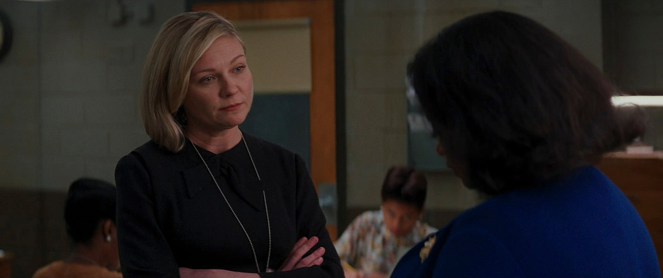
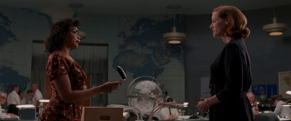
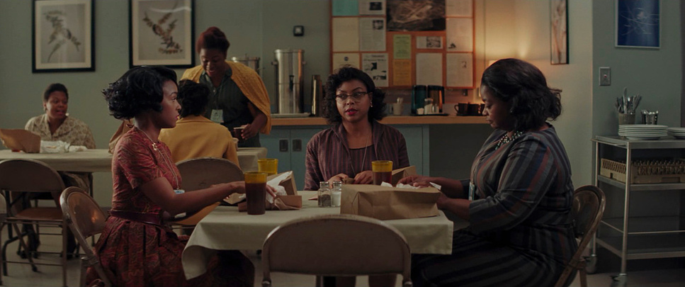
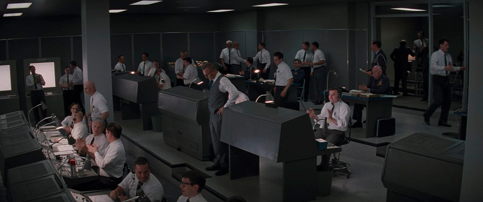
Composition here is a masterclass in visual subtext. Mandy Walker frequently uses the frame to emphasize isolation and segregation. Early on, Catherine is often framed as an outsider the only woman and the only person of color in a sea of white shirts.
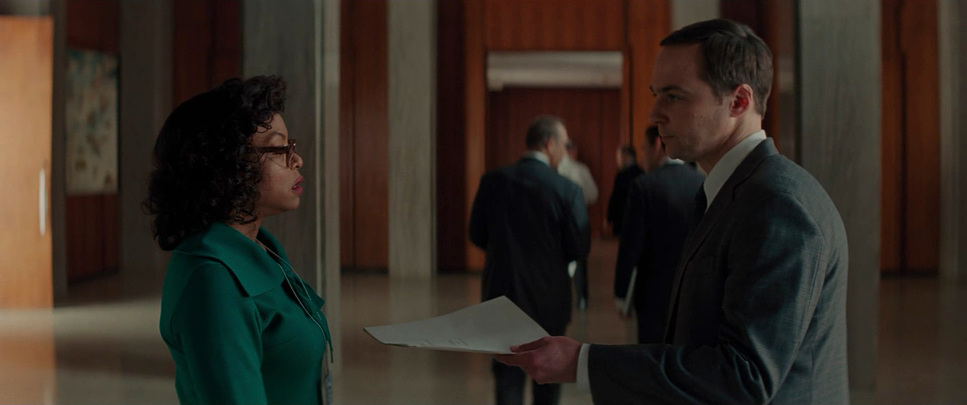
The compositions place her in vast, sterile spaces, using negative space to represent the professional distance she has to overcome. She’s often small in the frame, surrounded by the enormity of NASA’s machinery. Conversely, when our three leads Catherine, Mary, and Dorothy are together, the compositions shift. They are framed tighter, in strong, balanced frames that create a sense of solidarity. They occupy the frame with equal weight, visually reinforcing their bond. It’s a very intentional use of blocking to tell a story of collective strength.
Lighting Style
The lighting is deeply motivated, rooted in a period-appropriate naturalism. We’re at NASA, so you have the cool, clinical glow of fluorescent tubes and high-key illumination in the control rooms. This highlights the precision of the work.
But look closer at the tonal sculpting. For Catherine, in the early days at the Space Task Group, the lighting feels a bit harder, a bit more isolating. As she begins to break through those barriers, the light softens. There’s a gentle introduction of warmer practicals in her personal spaces. From my seat, I’m looking at how the highlights are handled. The highlight roll-off on the film stock is beautiful; it allows the bright light of a window or a desk lamp to feel authentic without “clipping” or looking like a flat digital file. It gives the image depth and dimensionality, much like the characters themselves.
Lensing and Blocking
Mandy Walker’s choice of focal lengths offers a balanced, observational quality. She avoids overly wide, distorting lenses, opting instead for medium lengths that feel natural. This makes us feel present in the room without the lens dictating our emotional response.
Blocking is where the power dynamics really play out. Consider the scene where Mr. Harrison (Kevin Costner) tears down the restroom sign. His purposeful movement through the space is amplified by the camera’s perspective. Similarly, the consistent blocking of the three women together especially in moments of camaraderie is a clear visual echo of their “parallel arcs.” They move as a unit, a visual representation of their unbreakable reliance on one another.
Color Grading Approach
This is where I really sink my teeth in. The color grade by Natasha Leonnet is one of the film’s unsung heroes. It isn’t a wildly stylized grade, but it is historically empathetic.
There’s a palpable warmth in the overall palette, especially in the skin tones. Even against the cool, institutional blues of NASA, the characters feel vibrant. This warmth acts as an emotional counterpoint to the racism they endure. The contrast shaping is thoughtful never too harsh, which would feel aggressive, but with enough “pop” to ensure clarity in the equations on the blackboards.
As a colorist, I’m particularly impressed by the hue separation. Ensuring that the skin tones of three Black leads remain rich and varied against those clinical green and blue backgrounds is no small feat. It’s about letting those complexions sing without feeling artificial. It’s a grade that provides that final, emotional layer, making you feel connected to their struggle and, ultimately, their joy.
- Also read: ANNIE HALL (1977) – CINEMATOGRAPHY ANALYSIS
- Also read: CROUCHING TIGER, HIDDEN DRAGON (2000) – CINEMATOGRAPHY ANALYSIS
Browse Our Cinematography Analysis Glossary
Explore directors, cinematographers, cameras, lenses, lighting styles, genres, and the visual techniques that shape iconic films.
Explore Glossary →