Spike Jonze’s 2013 masterpiece Her shuts that part of my brain off. It isn’t just a film I admire; it’s a benchmark. It’s a testament to how visual craft can merge to create something utterly unique and profoundly human, even when the central romance is with an operating system.
When a film like Her comes along, it’s a refreshing reminder that original ideas still exist. Sure, the concept twists around tropes we’ve seen before AI, isolation, the future but the execution avoids every single cliché. It delves into themes of loneliness and connection without the cold, metallic look of standard sci-fi. And the “wonderfully shot” quality? That’s not just a passing comment; it’s the bedrock that makes this seemingly impossible love story feel so achingly real.
About the Cinematographer
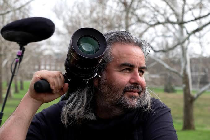
The visual architect behind Her is none other than Hoyte van Hoytema. For many of us in the industry, that name carries serious weight. We know him now for shooting massive IMAX behemoths like Interstellar, Dunkirk, and Oppenheimer. But if you look at his broader work, you know his versatility is where the real magic lies.
What strikes me about Her is how it contrasts with those grandiose projects. Here, Hoytema’s genius isn’t in the spectacle; it’s in the intimacy. He frames Theodore’s internal world with delicate precision, proving that cinematography must always serve the story first. He’s not just making pretty pictures; he’s building a psychological landscape.
Inspiration Behind the Cinematography

Spike Jonze’s vision was clear: create a “lo-fi sci-fi” world. It’s a future that feels advanced yet utterly mundane. There are no flying cars or holograms; instead, we have a world of comfortable, high-waisted pants and pastel colors. The central emotional pillar is that despite technology solving our basic needs, the “loneliness and longing” persist. It’s not a dystopian future, but a subtly melancholic one.
The aesthetic is “practical” with minimal design. This foundation of retro-futuristic simplicity meant the cinematography couldn’t be flashy. It had to feel organic and lived-in. Hoytema translates Theodore’s “post-break-up depression” into a soft, warm visual language. It’s an optimistic future on the surface, but one steeped in quiet emotional yearning.
Camera Movements
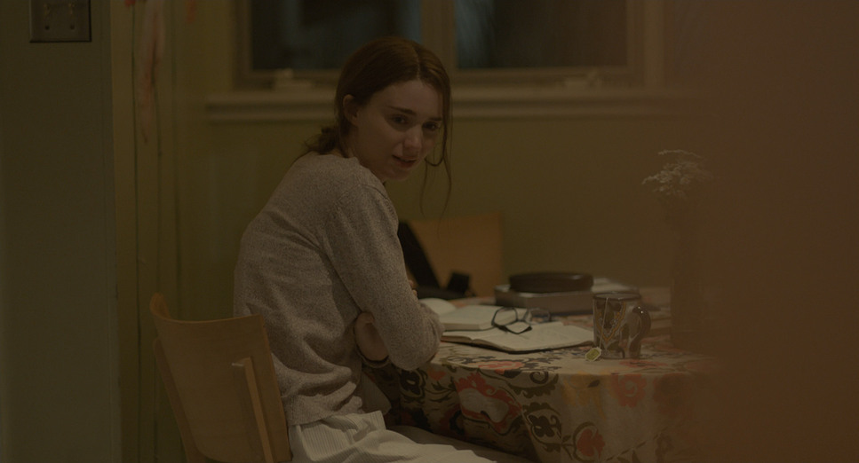
When I watch Her, I’m struck by the discipline of the camera. The movement is meditative. Hoytema avoids the “shaky cam” realism that was popular at the time and instead employs subtle, slow pushes and pulls. It’s invisible cinematography at its finest.
These slow movements mirror Theodore’s own internal stasis. There are smooth, steady tracking shots as he navigates the city, but they often emphasize his isolation within crowded spaces. The camera doesn’t rush; it observes. It lingers. This deliberate rhythm creates a sense of quiet melancholy, a visual echo of Theodore’s unwillingness to move on from his past.
Compositional Choices
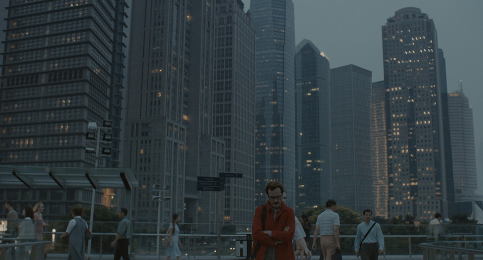
Composition in Her is a masterclass in using negative space. Theodore is frequently framed in the center (Center composition), but with ample empty space around him. In a standard romance, that space would be filled by a partner. Here, the emptiness is palpable.
The most fascinating challenge, of course, is depicting Samantha. Since she has no body, Hoytema focuses on Theodore’s reactions or simply the empty air next to him. In shot-reverse-shot sequences, we often cut from Theodore to a beautiful, slightly out-of-focus backdrop with an implied empty space. This forces us, the audience, to mentally project Samantha into that void. We become active participants in building the relationship.
Lighting Style
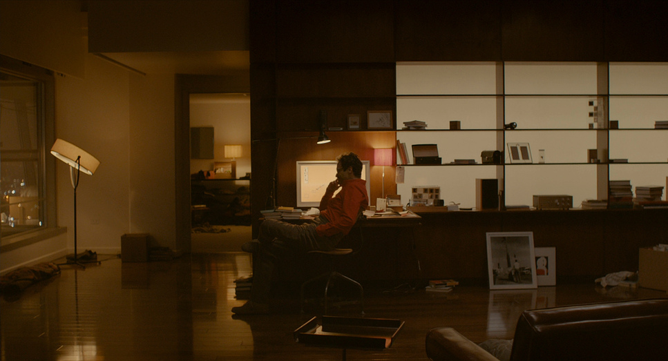
The lighting feels remarkably naturalistic, almost like a warm embrace, yet it never shies away from reflecting the underlying sadness. Hoytema’s approach uses “soft light” and is heavily motivated by practical sources—table lamps, computer screens, and the warm glow of the city.
The overall ambience leans towards warmth, often with rich amber and orange hues. However, this warmth is tempered by soft, diffused light (low contrast), preventing it from feeling like a sitcom. It creates a gentle, wistful glow that highlights Joaquin Phoenix’s face with exquisite detail. From a colorist’s perspective, this lighting is a dream it provides a beautiful base where the highlight roll-off is smooth and the skin tones retain their organic quality.
Lensing and Blocking
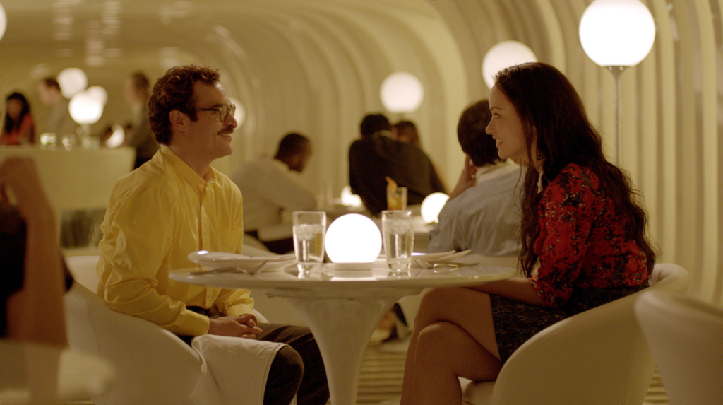
This is where the technical choices really define the film’s soul. Hoytema didn’t just grab the sharpest, newest glass. He chose Canon K35s and Zeiss Super Speeds. These are vintage, high-speed lenses known for their unique character and lower contrast.
By using these specific spherical lenses, Hoytema softened the digital image optically before it even hit the sensor. The Canon K35s are famous for their beautiful flaring and “accidents,” which give the film a dreamlike haze. The shallow depth of field isolates Theodore, blurring the bustling city into soft abstraction. It visually emphasizes that Theodore is trapped in his own head.
In terms of blocking, the challenge of the “invisible character” is constant. Theodore’s interactions with Samantha are blocked to imply a physical presence. He leaves space for her on the bed or the couch. The film subtly directs our gaze to where she “is,” making us acutely aware of her absence and presence simultaneously.
Color Grading Approach
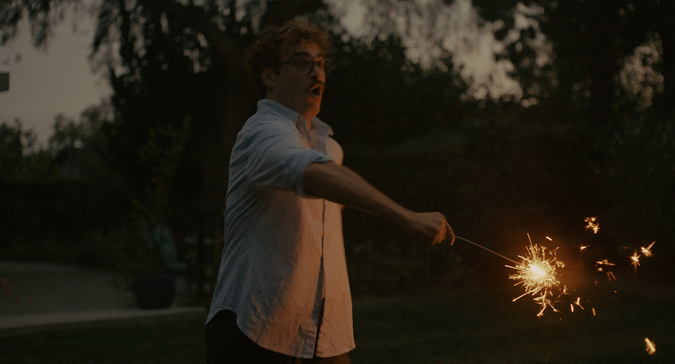
Ah, the color. This is where my world truly intersects with Hoytema’s vision. The color grading in Her, executed by the brilliant colorist Mats Holmgren, is an emotional narrative in itself. The palette is strictly controllednotice the almost complete absence of the color blue (usually the default for “sci-fi”). Instead, we get warm, saturated reds, oranges, and pastels.
The grade is meticulously sculpted. The contrast is soft; you rarely see a “true black” (0 IRE) in this film. The shadows are lifted, sitting in a dark grey range that emulates the feel of low-contrast print film. This contributes to that gentle, ethereal feel. I always look for the highlight roll-off, and Her is exquisite in this regard it’s smooth and organic.
Throughout the film, the color shifts subtly. The vibrant reds often accompany moments of connection with Samantha (passion), while muted tones creep in during moments of isolation. It’s a masterful demonstration of how color can be deeply emotional rather than just a stylistic veneer.
Technical Aspects & Tools
Her (2013) – Technical Specifications
| Genre | Drama, Romance, Science Fiction, Lo-Fi Sci-Fi |
|---|---|
| Director | Spike Jonze |
| Cinematographer | Hoyte van Hoytema |
| Production Designer | K.K. Barrett |
| Costume Designer | Casey Storm |
| Editor | Jeff Buchanan, Eric Zumbrunnen |
| Colorist | Mats Holmgren |
| Color | Warm, Saturated |
| Aspect Ratio | 1.85 |
| Format | Digital |
| Lighting | Soft light, Low contrast, Side light |
| Lighting Type | Artificial light |
| Story Location | California > Los Angeles |
| Camera | ARRI ALEXA XT / XTplus |
| Lens | Canon K35, Zeiss Super Speed |
While Her feels timeless, the execution relied on a specific blend of digital and analog tech. Hoytema shot this on the ARRI ALEXA XT. In 2013, this was the camera proving that digital could finally capture the dynamic range needed for a filmic look.
The choice to pair the Alexa’s digital sensor with Canon K35 and Zeiss Super Speed lenses was the secret sauce. If they had used modern, clinically sharp lenses, the 1.85:1 digital image might have felt too sterile for such a human story. The vintage glass softened the “digital edge,” creating a texture that feels almost like 35mm film.
In post-production, Mats Holmgren likely worked in a system like Baselight or DaVinci Resolve to dial in that specific film emulation, ensuring the skin tones remained creamy despite the heavy warm wash a notoriously difficult thing to balance.
- Also read: THE KING’S SPEECH (2010) – CINEMATOGRAPHY ANALYSIS
- Also read: GROUNDHOG DAY (1993) – CINEMATOGRAPHY ANALYSIS
Browse Our Cinematography Analysis Glossary
Explore directors, cinematographers, cameras, lenses, lighting styles, genres, and the visual techniques that shape iconic films.
Explore Glossary →