While my personal favorite Harry Potter film might lean towards Order of the Phoenix for its emotional beats, I hold a profound, almost reverent respect for Harry Potter and the Prisoner of Azkaban (2004) from a technical standpoint. It is the pivot point of the franchise the moment it stopped being a polished blockbuster and became a piece of cinema. Having studied this film’s waveform and blocking meticulously, I can attest to its impact on my own understanding of visual storytelling. It speaks in a sophisticated dialect of light, shadow, and movement, and I’m excited to break down why it continues to serve as a reference point for my work today.
About the Cinematographer
To truly appreciate Harry Potter and the Prisoner of Azkaban, we have to look at the massive shift in personnel. Director Alfonso Cuarón brought in cinematographer Michael Seresin, and together they completely discarded the rulebook established by the first two films. Seresin, known for gritty, naturalistic work like Midnight Express, didn’t treat Hogwarts like a glossy high-budget set; he lit it like a location. Cuarón was an unconventional choice coming off Y Tu Mamá También, and Warner Bros. took a significant creative gamble that paid off. Seresin’s approach moved away from the high-key, television-friendly lighting of the Columbus era. Instead, he introduced a naturalistic, source-driven lighting scheme that grounded the magic in a tangible, sometimes unsettling reality. It wasn’t about making things look “pretty”; it was about using the camera to reflect the internal anxiety of the characters.
Inspiration Behind the Cinematography
Cuarón’s intent was clear: Harry Potter and the Prisoner of Azkaban had to stand on its own. The narrative was shifting toward adolescence, bringing with it themes of depression (Dementors), betrayal, and genuine danger. A “candy-colored” palette simply wouldn’t work anymore. Cuarón and Seresin leaned into a horror-adjacent aesthetic. The film deals with dark creatures and the looming threat of Sirius Black, so the visual language had to mature alongside Harry. This wasn’t just a cosmetic shift; it was a fundamental recalibration. The resulting tone is moody, anxious, and textured everything the first two films were not. This film signaled to the audience that the safety rails were off.
Camera Movements
If there’s one hallmark of Cuarón’s direction here, it’s his mastery of the “oner” the long take. But this isn’t just a technical flex; it is about immersion and geography. The Leaky Cauldron sequence is the prime example. It begins wide, absorbing the chaos of the magical environment, then physically pushes in to isolate Harry and Mr. Weasley. It’s a masterclass in blocking: the camera choreographically reveals the “Wanted” poster, using it as a foreground element to visually weigh down the conversation. By the end of the shot, the world has shrunk from a bustling pub to a dark, isolated corner.
Beyond the long takes, the camera is perpetually restless. Cuarón insisted on linking the geography of Hogwarts, and the moving camera is the glue that holds it together. Whether it’s a subtle track on a dolly or a Steadicam weaving through the courtyard, the constant motion creates a “breathing” quality. It feels like the walls are closing in, mirroring Harry’s paranoia. The camera often sits right at Harry’s eye level, forcing us to inhabit his perspective rather than observing him from a detached, objective distance.
Compositional Choices
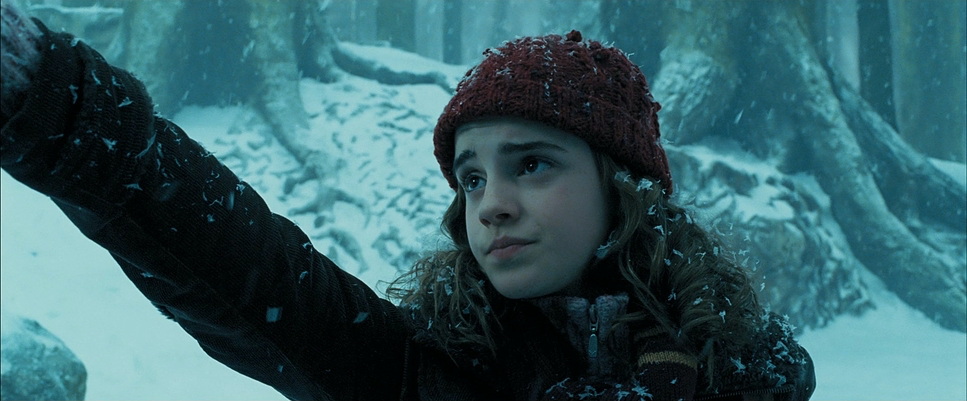
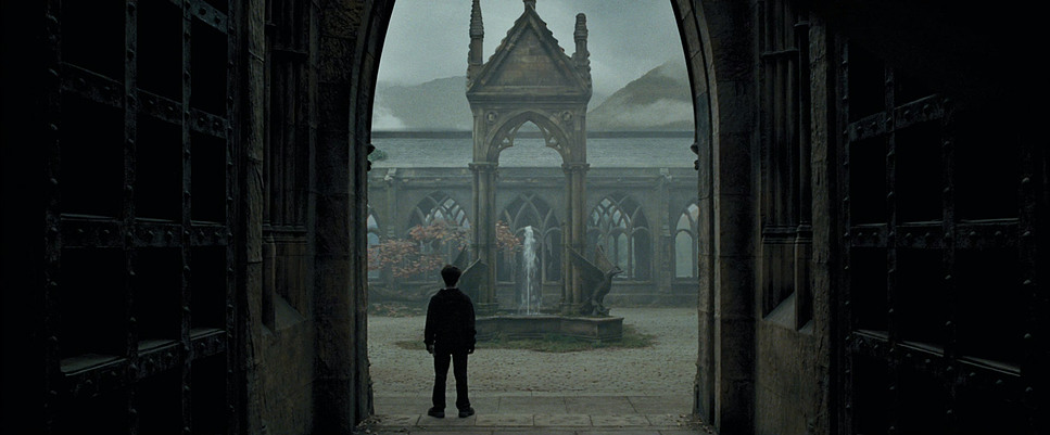
Cuarón and Seresin’s framing is deliberate and often stark. One major shift is the use of wide angles to diminish the characters. They frequently frame Harry, Ron, and Hermione small within the vast, brutalist architecture of Hogwarts. This makes the environment feel heavy, giving the castle the same narrative weight as the actors. The Clock Tower, for instance, isn’t just background dressing; it’s a recurring motif framed to remind us that time is literally running out.
A specific composition I always reference is the use of “frames within frames,” particularly regarding Harry’s isolation. We often see Harry physically separated from Ron and Hermione by a window pane, a doorframe, or negative space, reinforcing his burden as the “Chosen One.” The camera’s journey through glass—specifically the mirror in the Boggart scene is another stroke of genius. It suggests a duality: looking through a window is seeing the world, but looking into a mirror is facing oneself.
Lighting Style
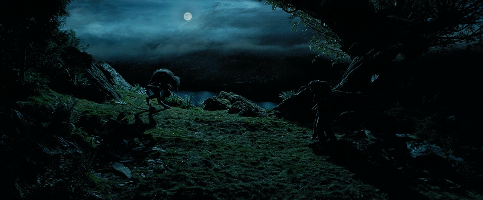
The transition to Azkaban‘s lighting is where the film finds its soul. Seresin embraced a high-contrast, chiaroscuro style. He wasn’t afraid to let faces fall into shadow or to let a scene play out in near-darkness. The lighting is strictly motivated if there is a candle, that is the key light. If there is a window, the light falls off rapidly as you move away from it.
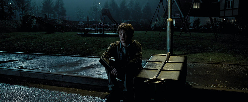
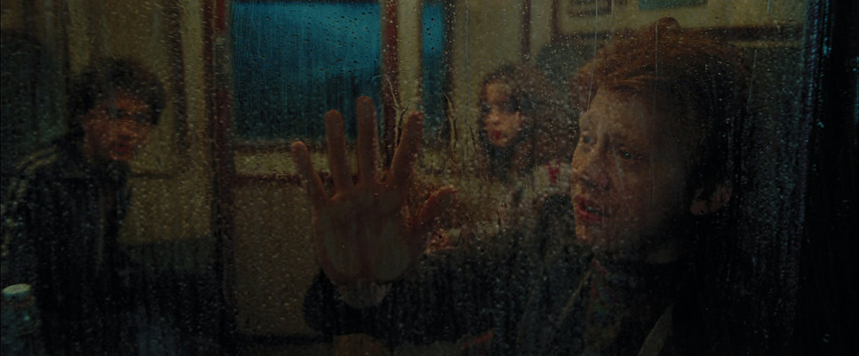
The train sequence introduces this perfectly. The warm, safe tungsten glow of the cabin is extinguished, replaced by a frigid, desaturated cyan light as the Dementors board. The visual of water freezing on the windowpane and Harry’s breath visible in the air externalizes the coldness of the Dementors in a way dialogue never could. It turns the genre from fantasy to psychological horror effectively, using light (and the absence of it) to signal that nowhere is safe.
Lensing and Blocking
Technically, the choice of glass here is fascinating. Seresin shot Azkaban primarily on Cooke S4/i prime lenses. Cookes are famous for the “Cooke Look” a warmth and roundness that renders skin tones beautifully and offers a gentle focus fall-off. Using such romantic, “human” lenses on a film that is color-graded to be so cold and harsh creates a brilliant visual tension. They also utilized wider focal lengths to exaggerate the depth of the corridors and the height of the ceilings.
The blocking is equally precise. In the scenes between Harry and Lupin, physical objects are often placed between them a bridge railing, a candle representing the secrets Lupin is keeping. As their relationship deepens, those barriers are removed. Furthermore, the practical effects team built the Shrieking Shack set on hydraulics to physically tilt and move. This allowed the camera to capture genuine disorientation and imbalance in the actors’ performances, something that green screen simply cannot replicate.
Color Grading Approach
As a colorist, this is where I geek out. Azkaban was graded by the legendary Peter Doyle, and it is a textbook example of early, aggressive Digital Intermediate work. They moved away from the primary colors of the first two films into a palette that is cool, desaturated, and heavy on cyan and blues.
However, the “grit” doesn’t just come from the grade; it comes from the stock. The film was shot on Kodak Vision2 500T (5218). That “500T” designation means it’s a high-speed tungsten stock with a very distinct grain structure. In the grading suite, we often try to emulate this look, but Azkaban has the real thing. The shadows aren’t crushed to a digital zero; they have texture and density, holding onto that organic grain.
The look mimics a Bleach Bypass process a chemical technique where the silver is retained in the film negative, resulting in high contrast and reduced saturation. Doyle’s grade leans into this, stripping the vibrancy out of the skin tones but leaving the structural contrast intact. It evokes a “print film” sensibility that feels dangerous and somber. By pushing cool tones into the shadows while maintaining just enough separation in the mid-tones, Doyle ensures the image feels magical, but in a melancholy, wintery way.
Technical Aspects & Tools
Harry Potter and the Prisoner of Azkaban — Technical Specs
| Genre | Adventure, Family, Fantasy, Time Travel |
| Director | Alfonso Cuarón |
| Cinematographer | Michael Seresin |
| Production Designer | Stuart Craig |
| Costume Designer | Jany Temime |
| Editor | Steven Weisberg |
| Colorist | Peter Doyle |
| Time Period | 1990s |
| Color Palette | Cool, Desaturated, Cyan, Blue |
| Aspect Ratio | 2.39 – Anamorphic |
| Format | Film – 35mm |
| Lighting Style | High contrast |
| Lighting Type | Moonlight |
| Story Location | United Kingdom, England |
| Filming Location | Scotland, Highland |
| Camera | Arricam LT, Arricam ST, Arriflex 435 |
| Lens | Cooke S4/ i |
| Film Stock / Resolution | 5218/7218 Vision 2 500T, 5274/7274 Vision 200T |
The technical execution in Azkaban was years ahead of its time. The integration of CGI like the Hippogriff Buckbeak with natural light and handheld camera work helps the VFX hold up remarkably well even two decades later. The film was shot on Arricam cameras, blending the reliability of 35mm film with modern visual effects.
The “Quidditch in the rain” sequence is a testament to this blend. Instead of a clean, bright sports match, it’s a visceral, muddy, chaotic scene. The decision to embrace rain, darkness, and obscuring weather elements masked the CGI edges while heightening the realism. It’s a perfect marriage of cinematography and visual effects, where the technology serves the mood, not the other way around.
- Also read: X-MEN: DAYS OF FUTURE PAST (2014) – CINEMATOGRAPHY ANALYSIS
- Also read: EDGE OF TOMORROW (2014) – CINEMATOGRAPHY ANALYSIS
Browse Our Cinematography Analysis Glossary
Explore directors, cinematographers, cameras, lenses, lighting styles, genres, and the visual techniques that shape iconic films.
Explore Glossary →