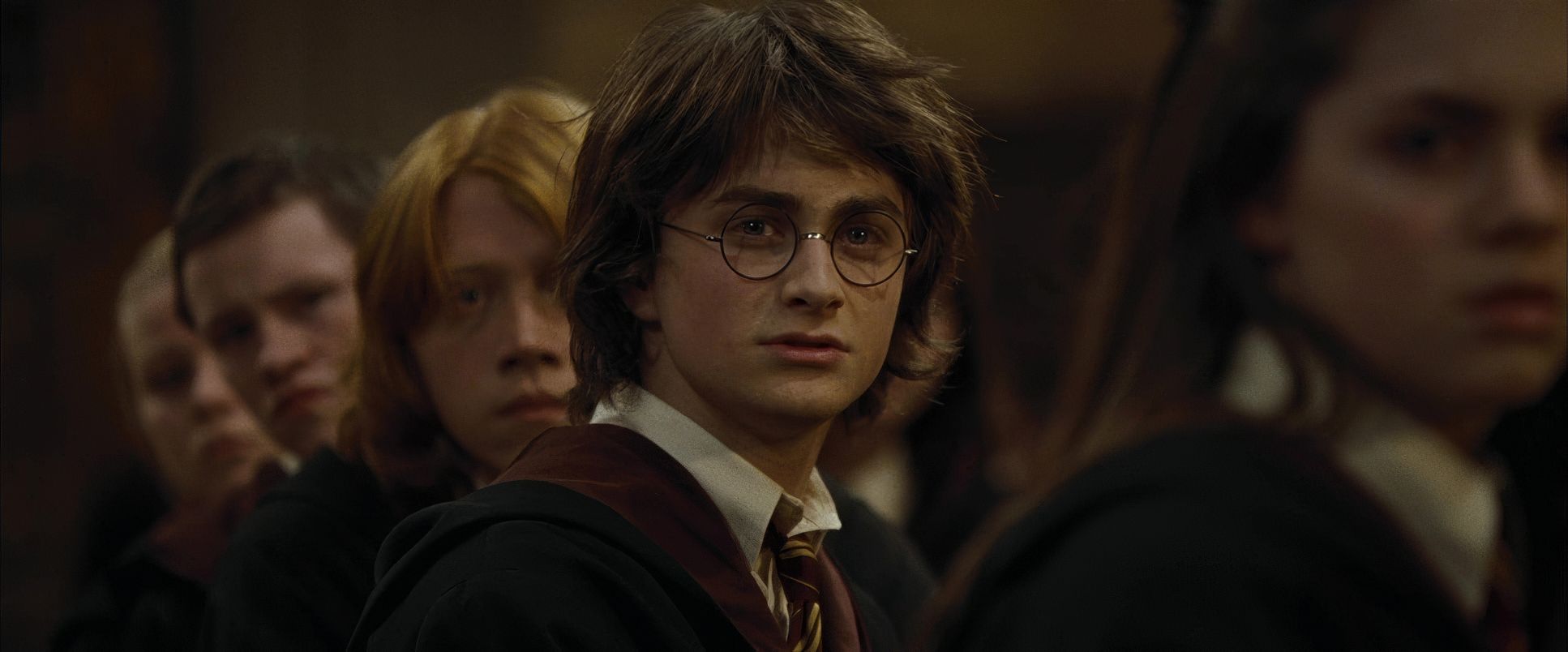
I’ve always found Harry Potter and the Goblet of Fire to be a massive turning point in the series from a visual perspective. It’s the moment the training wheels really come off not just for Harry, Ron, and Hermione, but for the franchise itself. The shift to a PG-13 rating wasn’t just an MPAA classification; it was a license to explore genuinely darker themes, and director Mike Newell, alongside cinematographer Roger Pratt, embraced that opportunity entirely. This film isn’t just about a wizard tournament; it’s about innocence lost, the terrifying return of real evil, and the first time we see a student actually die onscreen. My analysis here aims to unpack how the visual language didn’t just support this dramatic maturation it drove it, pushing the series into a much grittier, dangerous realm.
About the Cinematographer

The man behind the lens for Harry Potter and the Goblet of Fire was Roger Pratt, BSC. He stepped into a fascinating situation, following Michael Seresin, who had already begun pushing the aesthetic away from the Chris Columbus brightly-lit era and toward something more atmospheric in Prisoner of Azkaban. Pratt’s task wasn’t just to continue that progression, but to intensify it without making it feel stylized to the point of distraction. Pratt is known for a certain grounded realism, even when dealing with high fantasy. That sensibility was crucial here. You need to believe in the physical weight of these magical dangers, and Pratt delivered that believability craft. He knew how to make the stakes feel consequential through lighting and framing.
Inspiration Behind the Cinematography

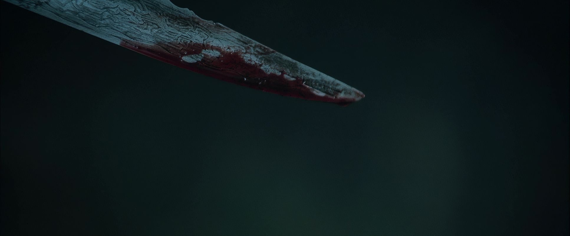
The narrative itself was the primary inspiration, dictating every visual decision on set. The simple fact that the characters are getting older and the story is progressing meant the visuals had to darken literally and metaphorically. This isn’t a subtle shift; it’s a monumental one, culminating in the tragic death of Cedric Diggory. That moment is the anchor; it meant the whimsical aesthetic of the earlier films had to give way to something undeniably foreboding.
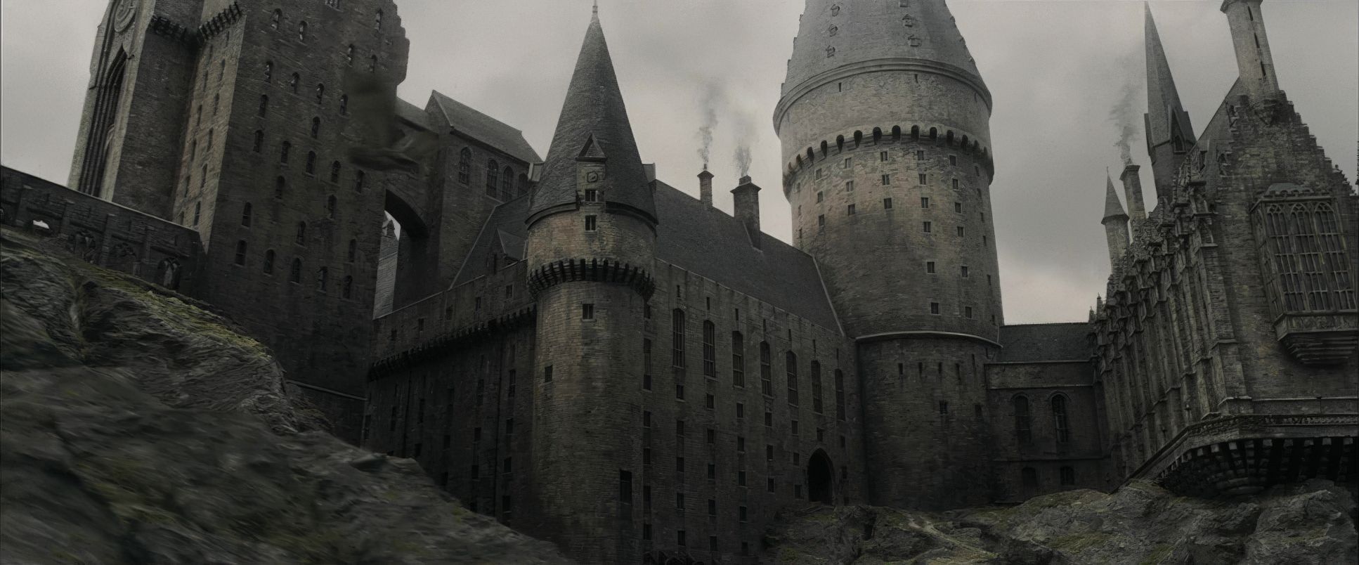
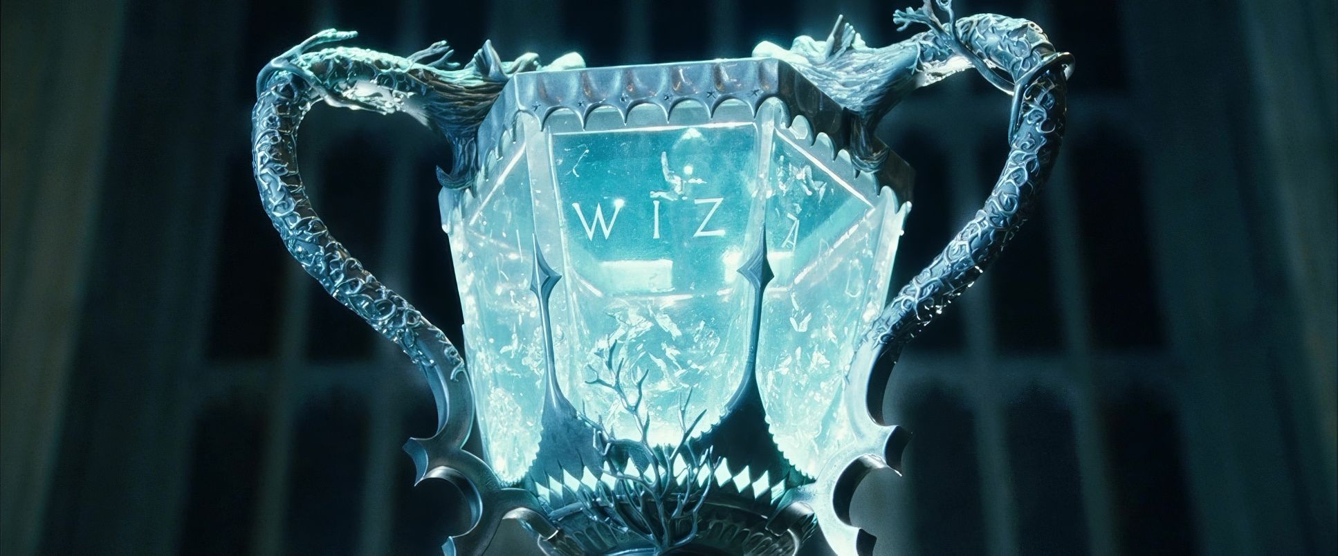
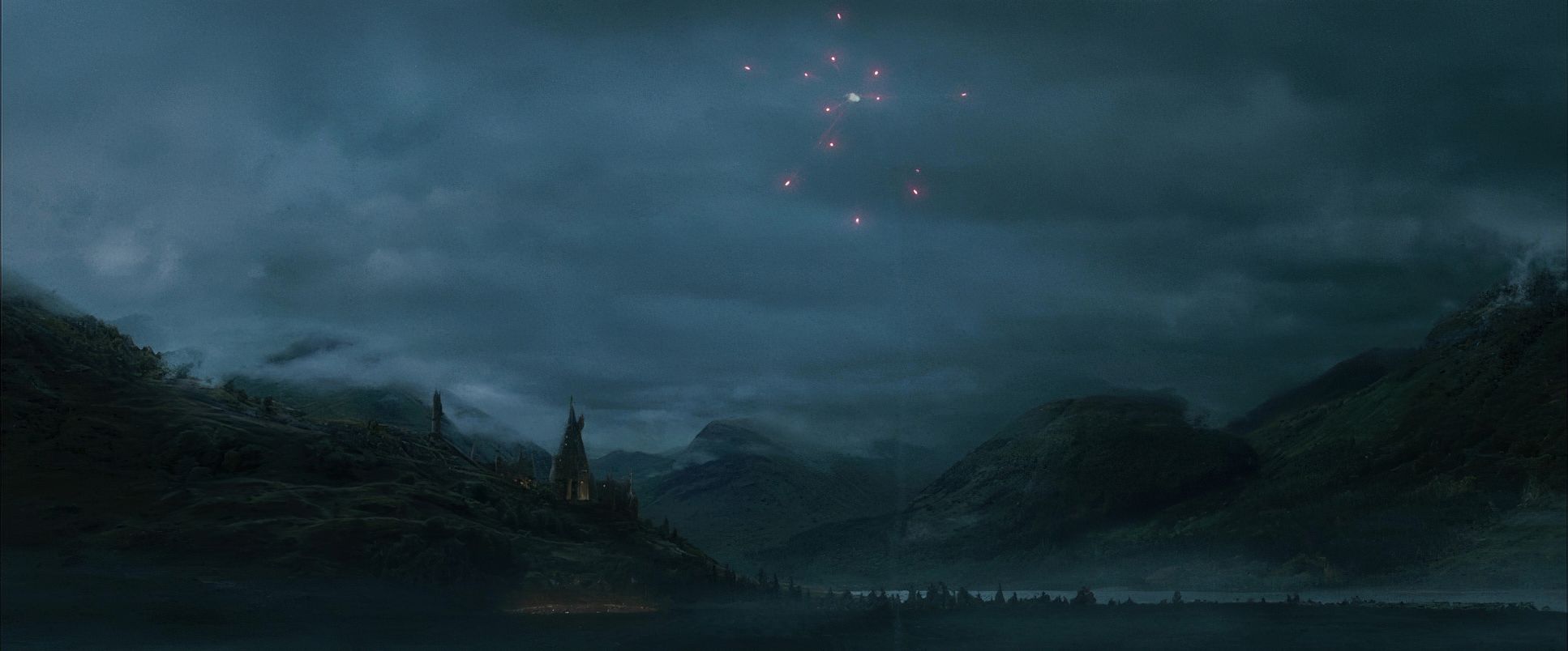
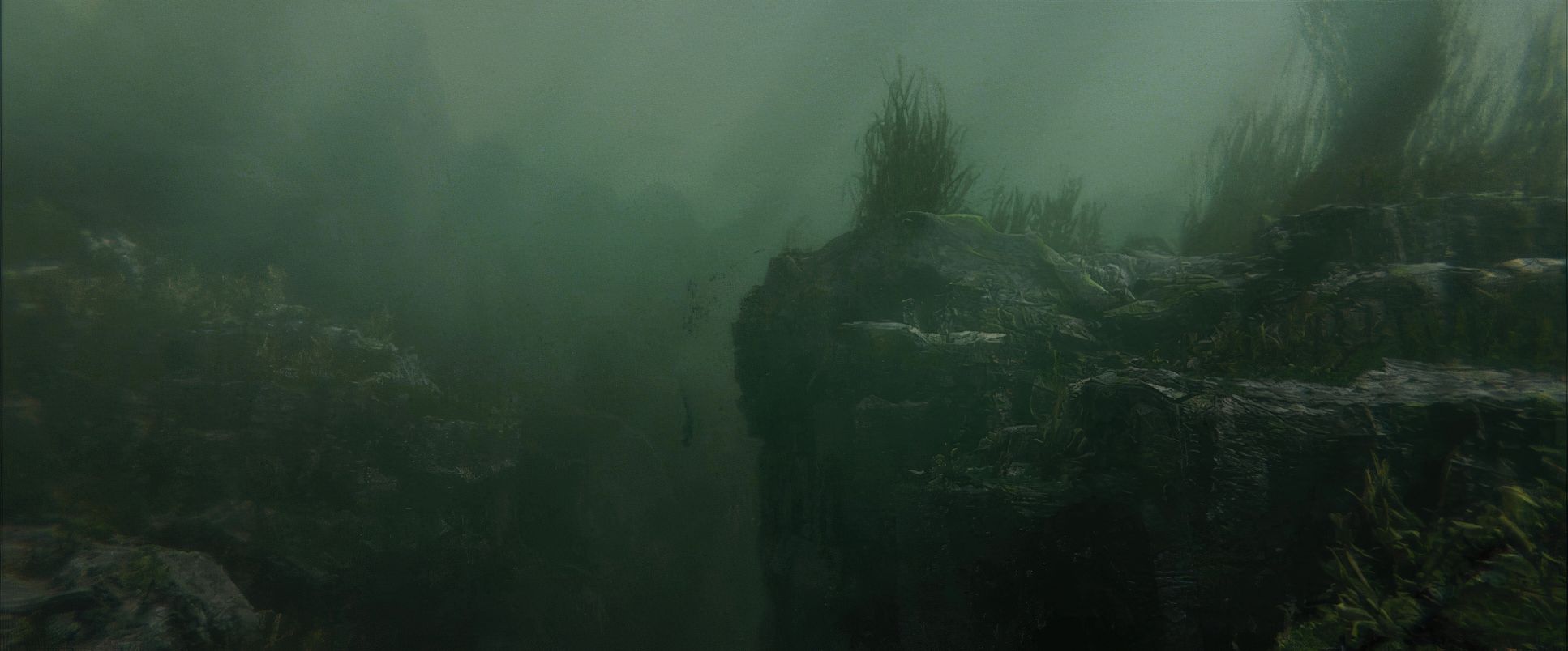
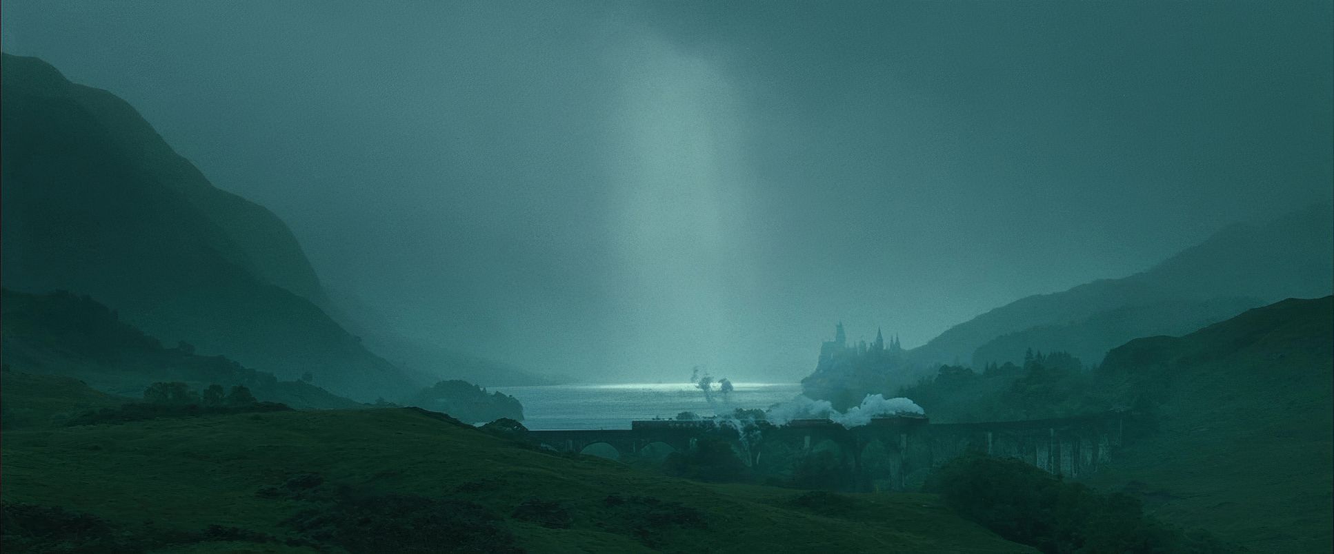
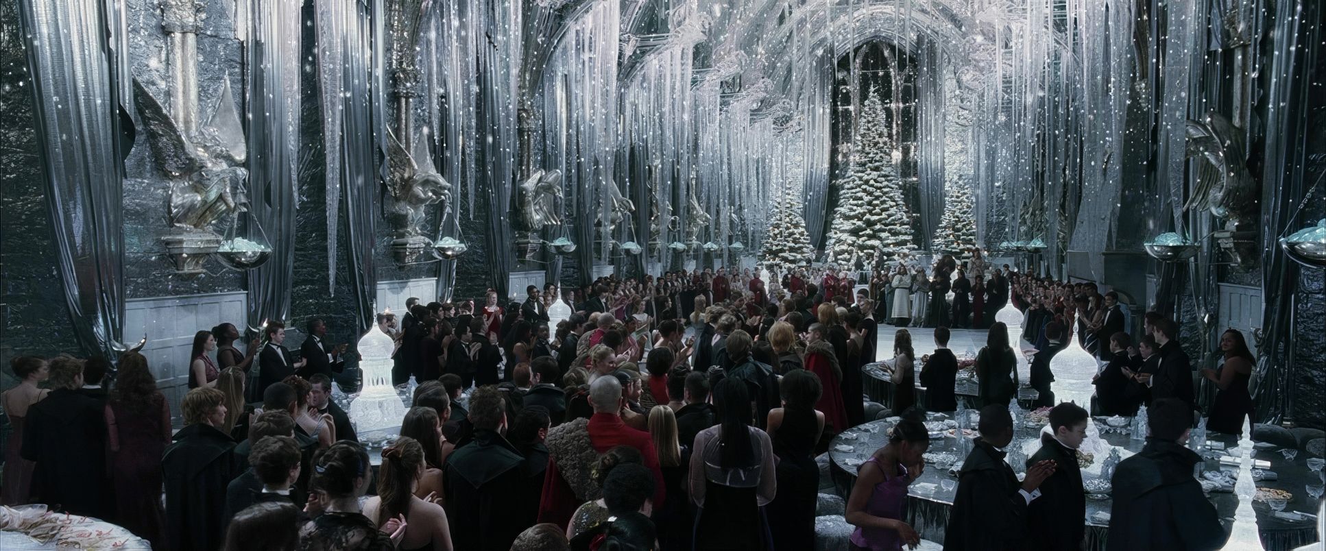
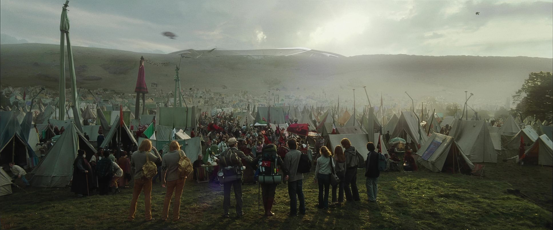
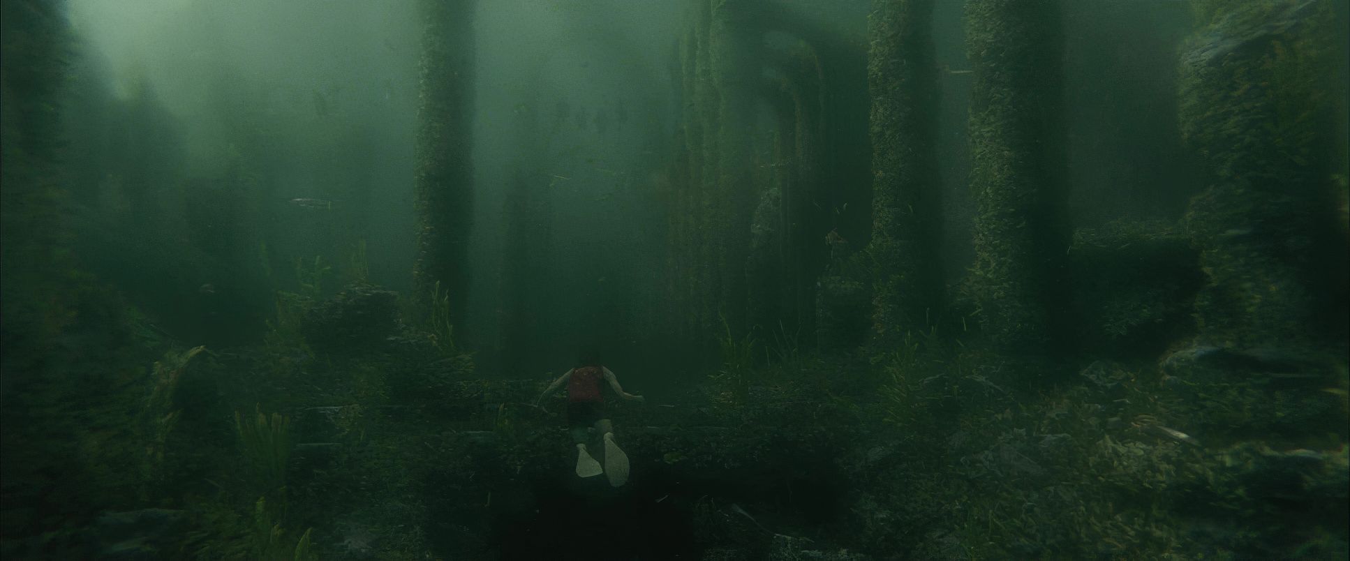
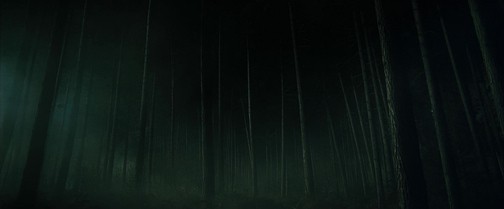
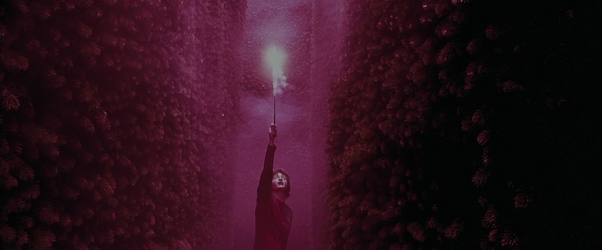
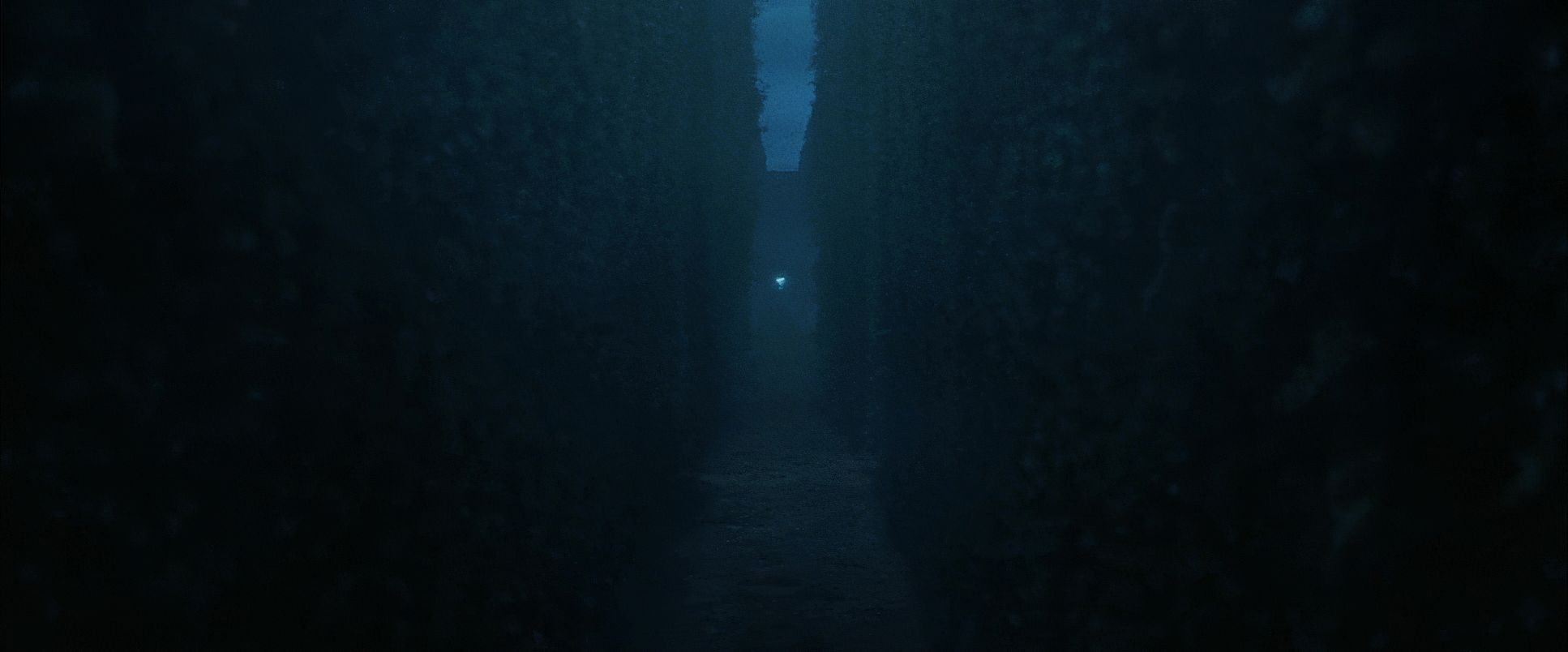
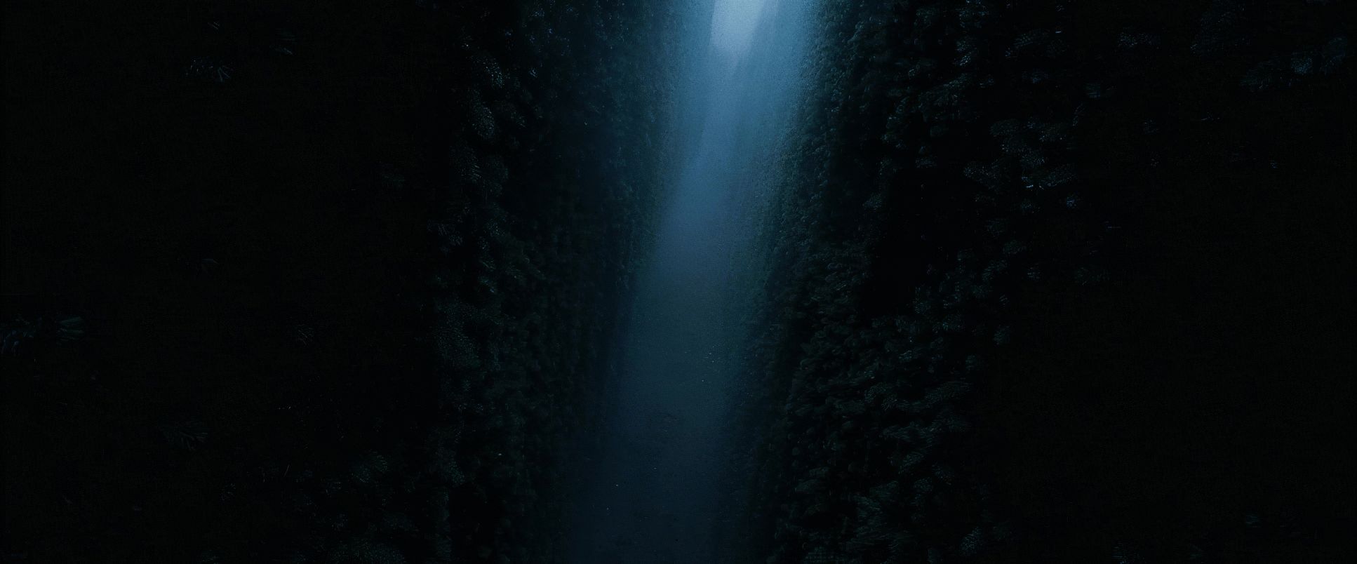
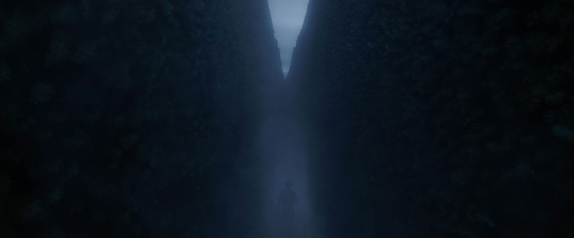
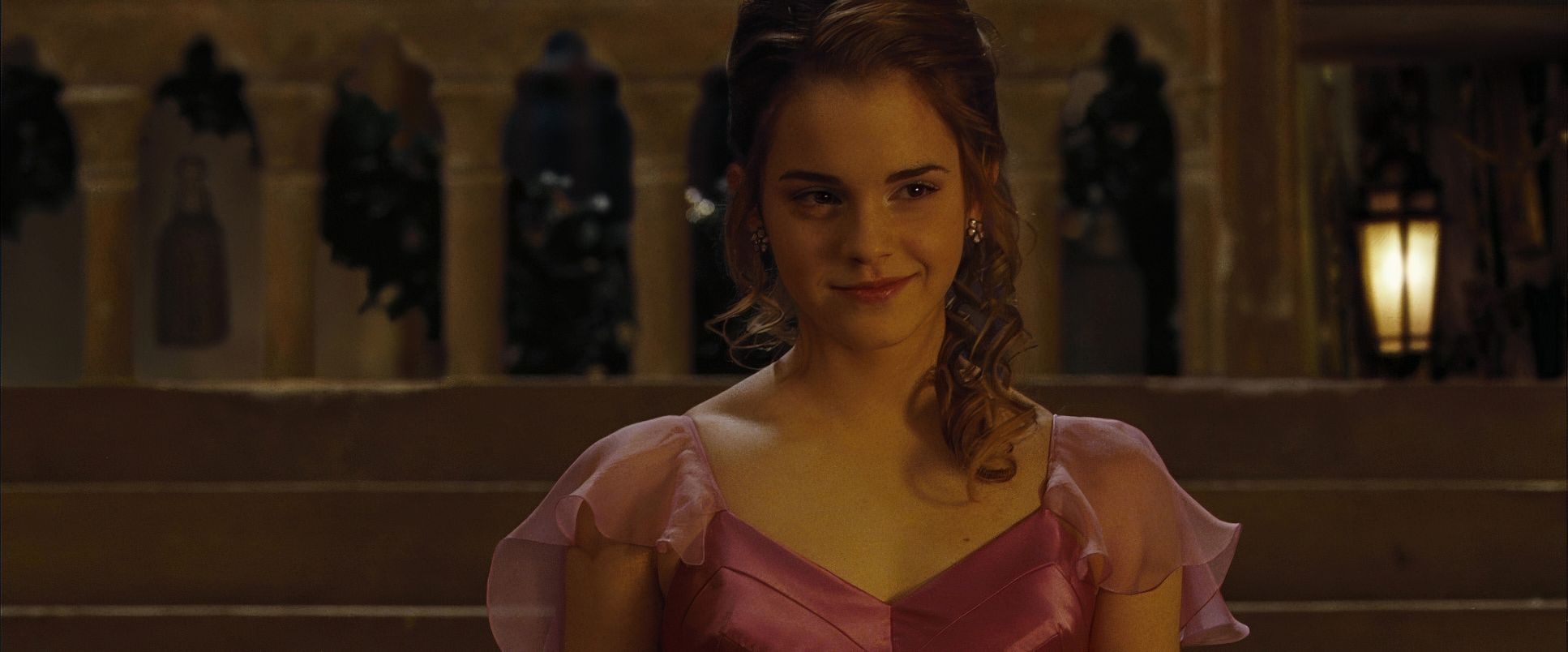
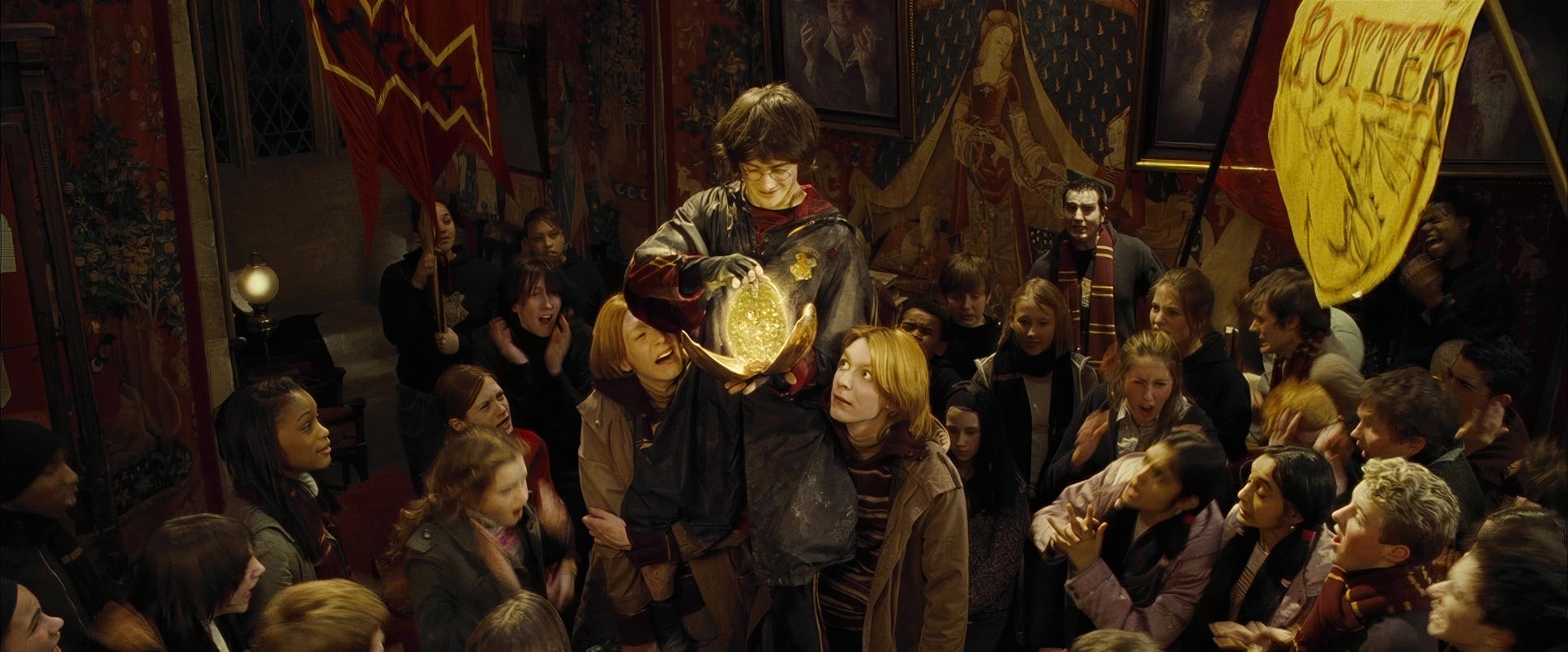
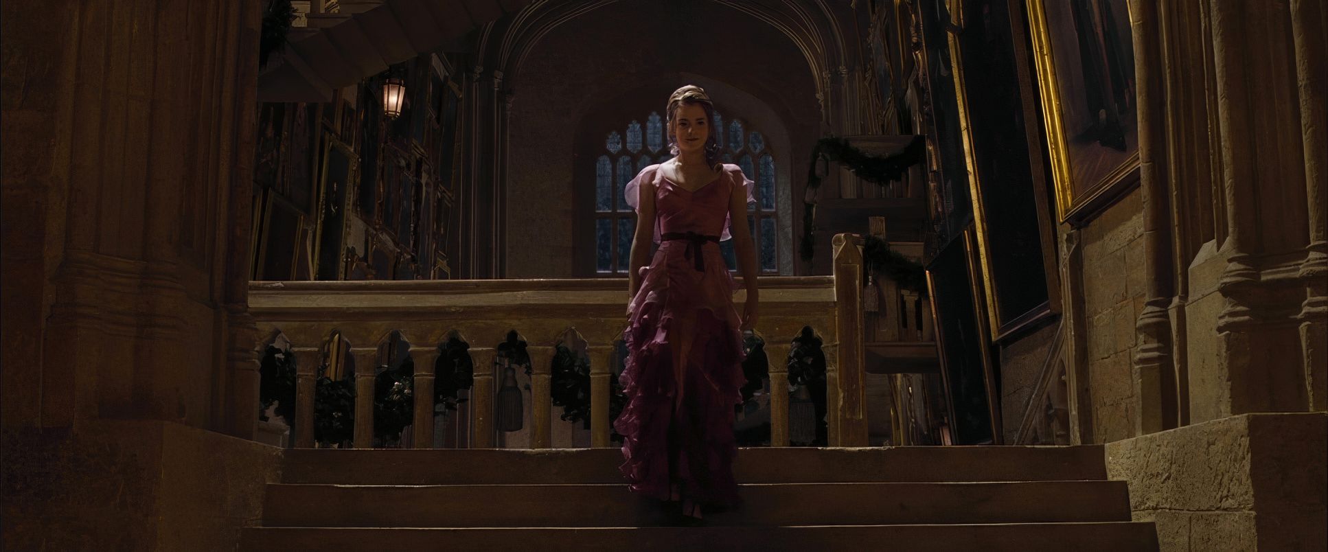
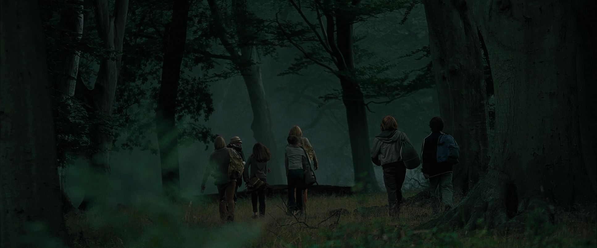
Visually, this darkness manifests early. The opening dream sequence, followed by the terrifying chaos of the Death Eaters at the Quidditch World Cup and the Dark Mark staining the sky these moments established a new baseline of threat. Pratt had the difficult job of contrasting occasional fleeting joy, like the Yule Ball, with a pervasive sense of dread. Even in celebration, there’s underlying tension. The Tri-Wizard Tournament challenges are escalating visual spectacles designed to push Harry further into an unpredictable world. The hedge maze for the final task is a perfect example: a visual concept directly born from the narrative’s need for immense suspense and disorientation.
Camera Movements

As the narrative became heavier, the camera movements followed suit, becoming more deliberate and immersive. We see far fewer of those sweeping, almost balletic crane shots that defined the innocent “wow factor” of early Hogwarts. Instead, Pratt opted for purposeful, grounded tracking shots and pushes, particularly during moments of tension.
Consider the Tri-Wizard tasks. For the first task with the dragon, the camera is agile, almost reactive, darting right alongside Harry as he maneuvers around the Hungarian Horntail. It creates a wonderful sense of urgency, putting us right in his shoes as he’s clearly ill-equipped to deal with this monster. It’s not about showcasing the spectacle from a safe distance; it’s about conveying Harry’s visceral fear.
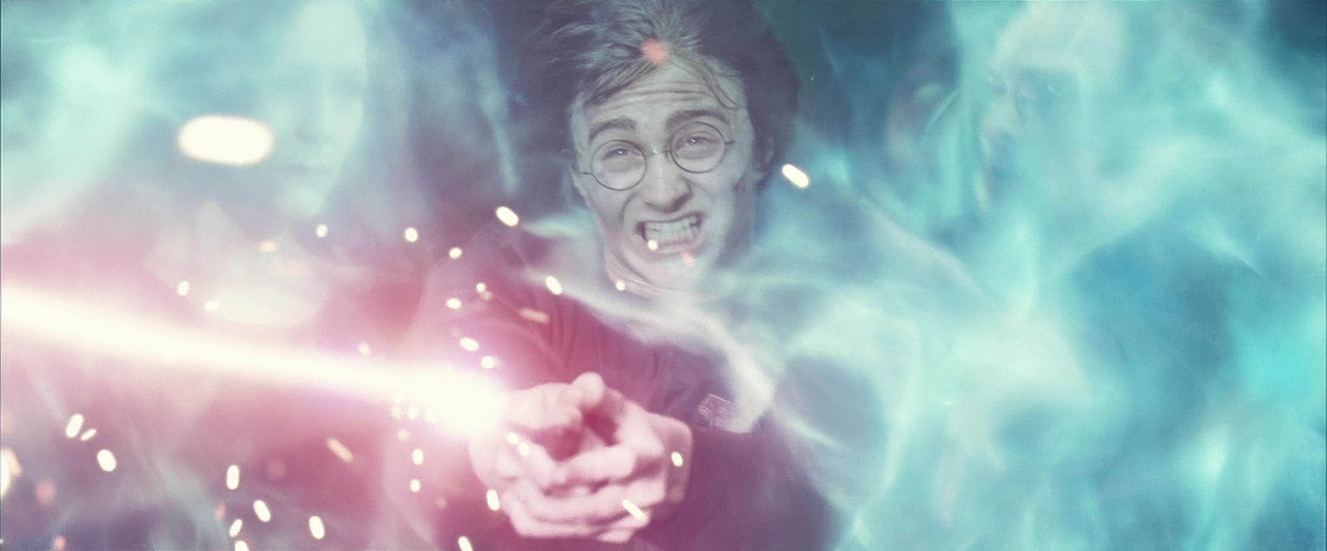
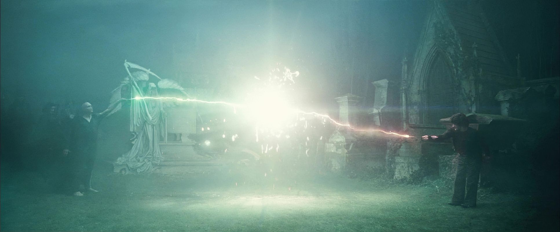
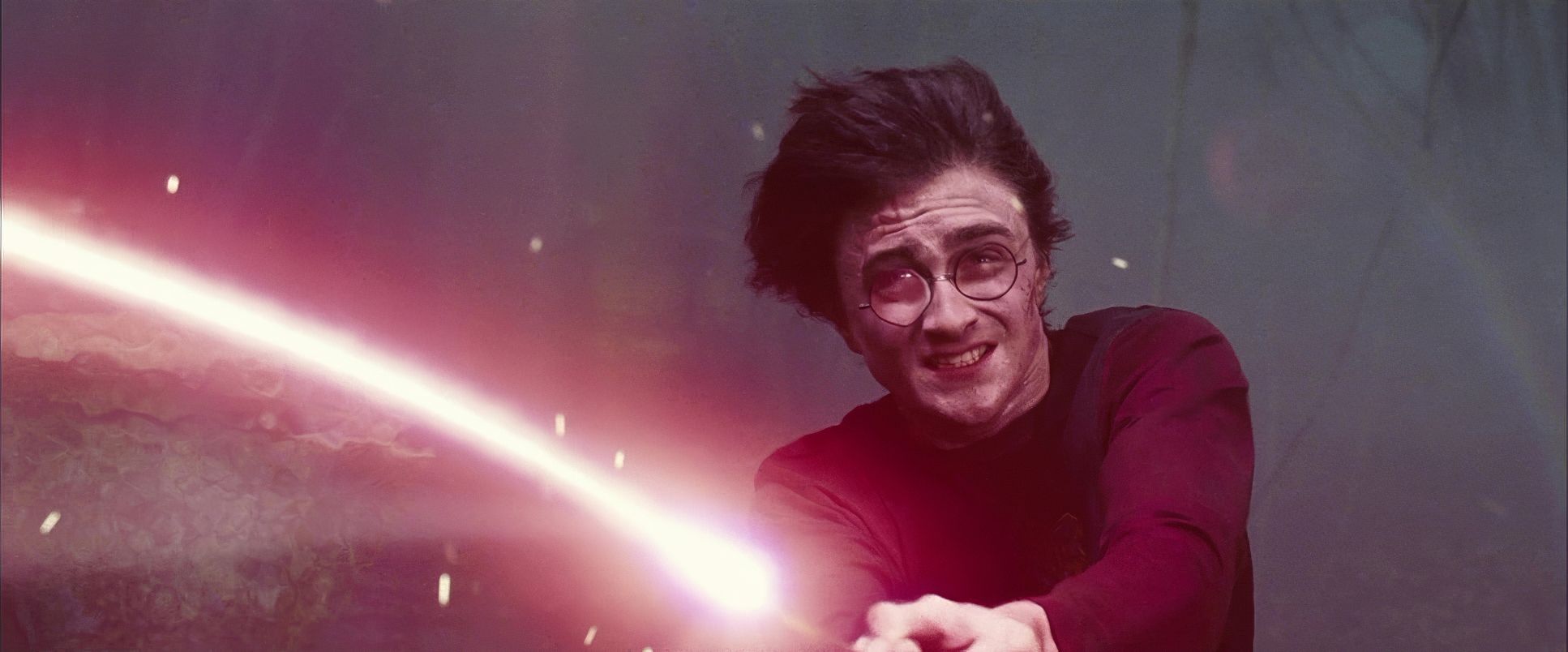
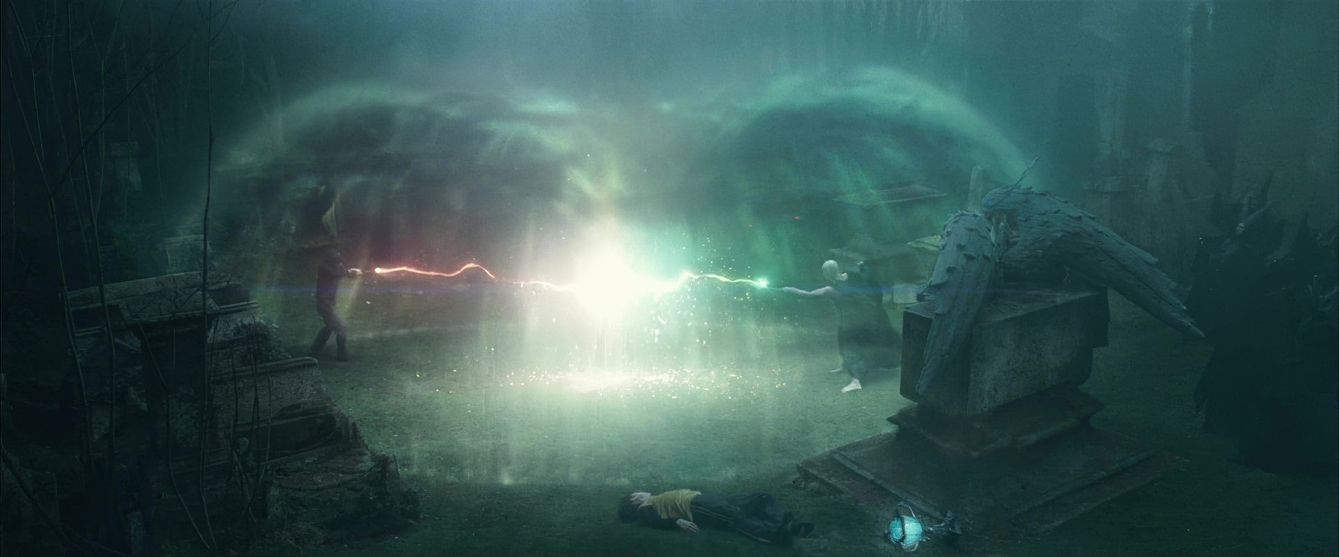
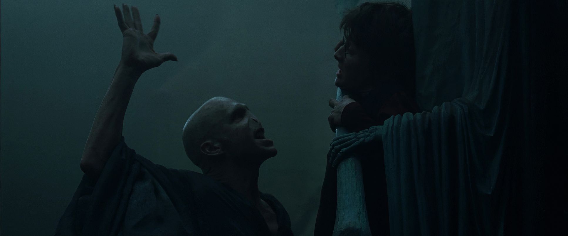
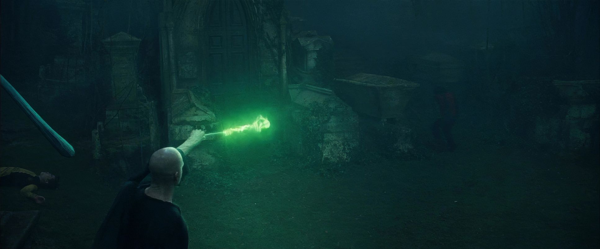
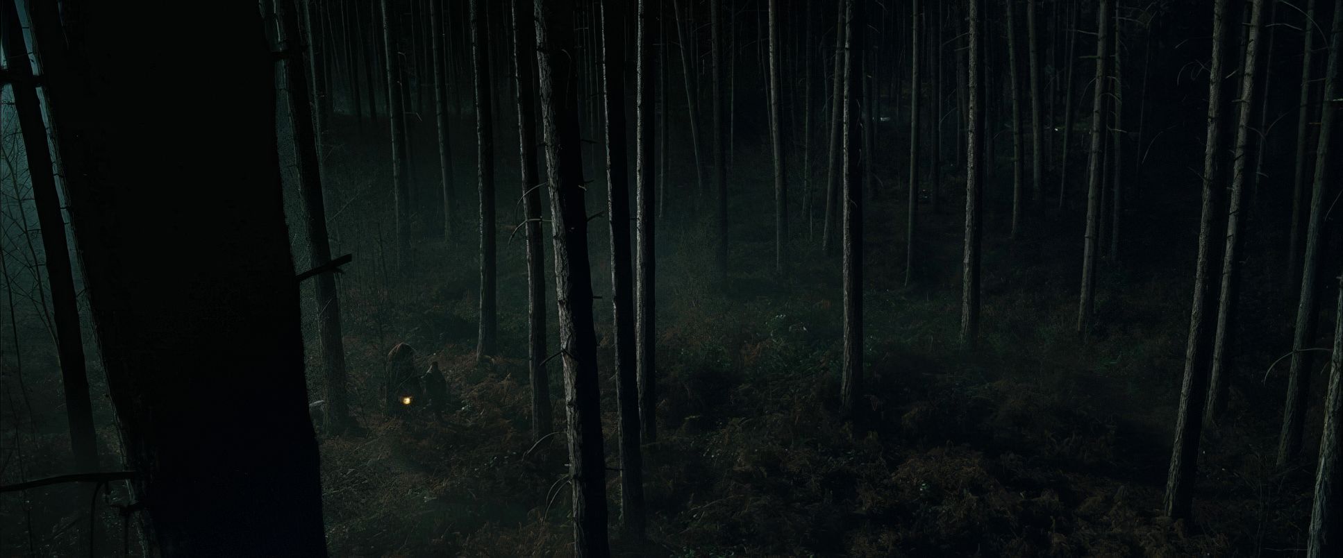
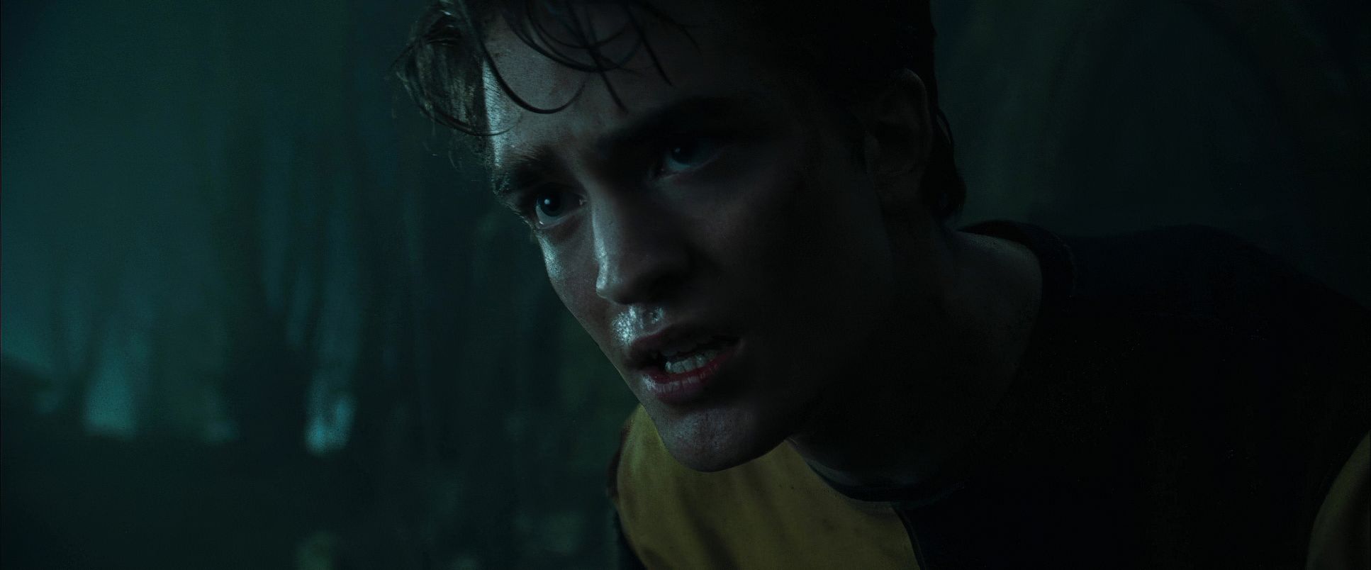
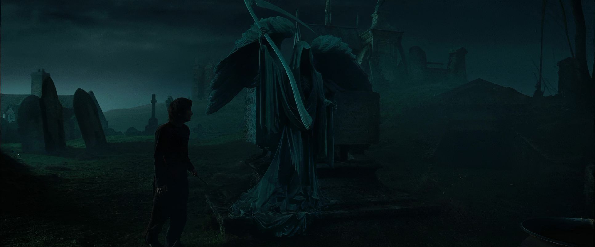
Conversely, during the Death Eater attack, the camerawork feels looser perhaps handheld or Steadicam pushed to its limit reflecting sheer chaos. Then, in the graveyard, the movements become almost reverent, slowing down to build the horror of Voldemort’s resurrection, only to erupt into aggressive, rapid motions during the final duel. It’s a calculated dance between stillness and explosive energy.
Compositional Choices

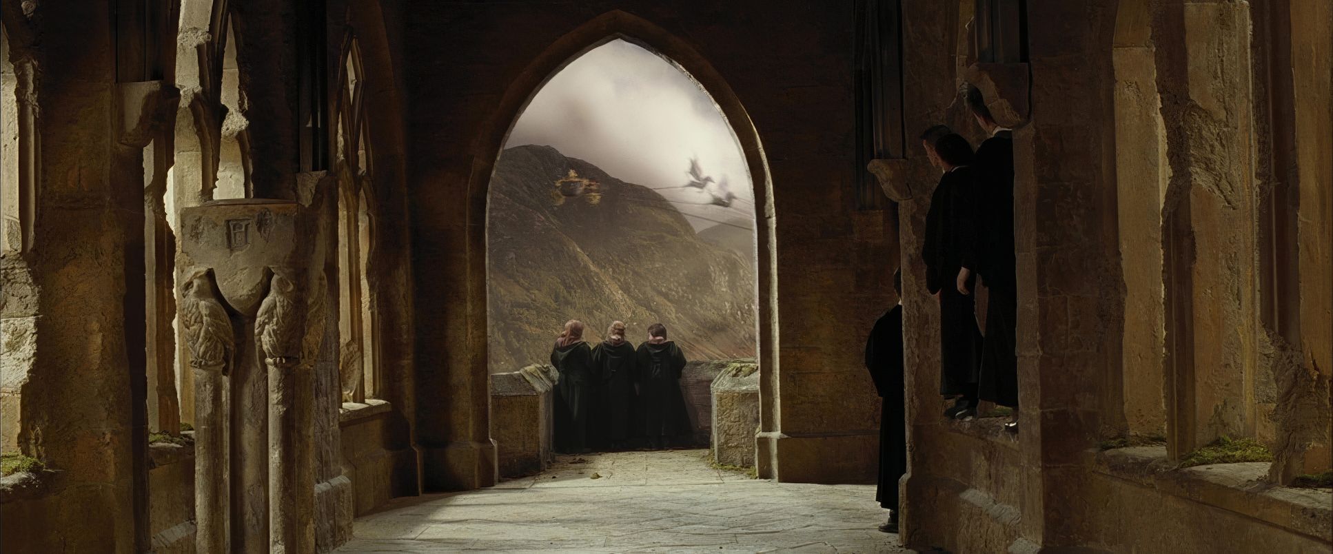
Pratt’s compositional choices were key to enhancing the film’s isolated tone. He masterfully balanced grand, wide establishing shots that showcased the epic scale of the arenas with tighter, more intimate framing that underscored Harry’s anxiety. When Harry faces the dragon, the compositions emphasize his minuscule size against the beast, making him seem truly vulnerable.
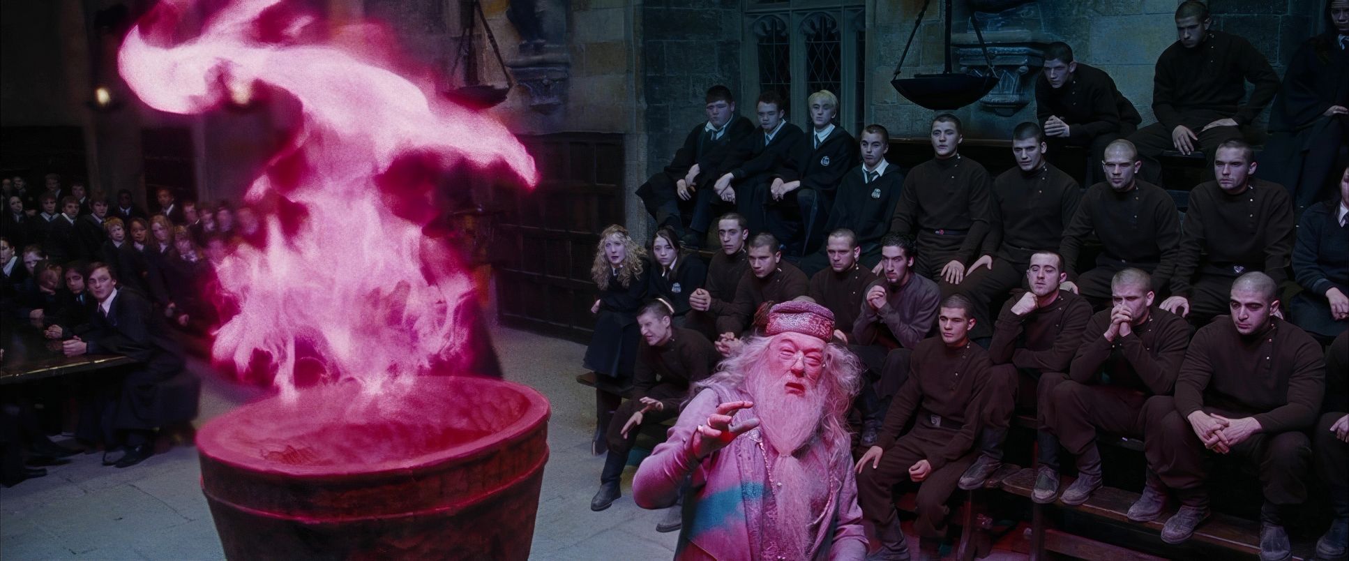
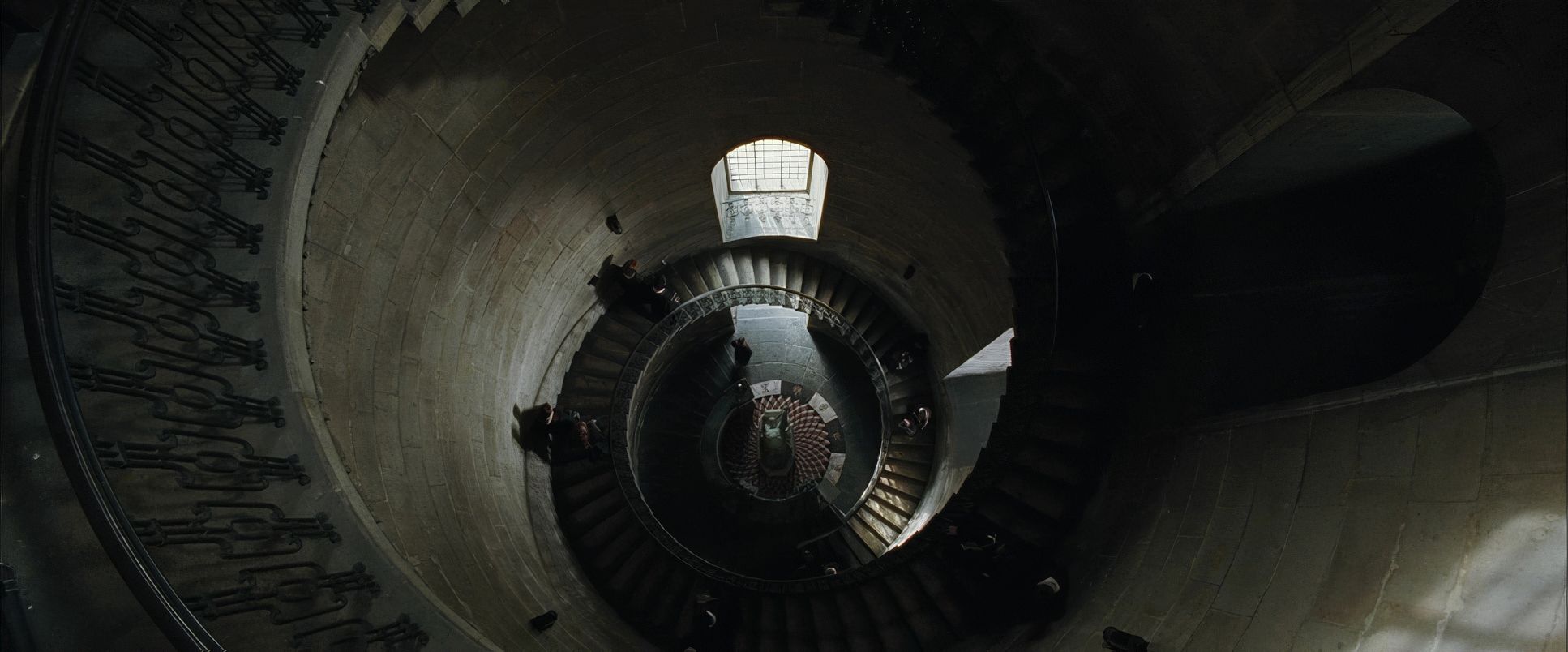
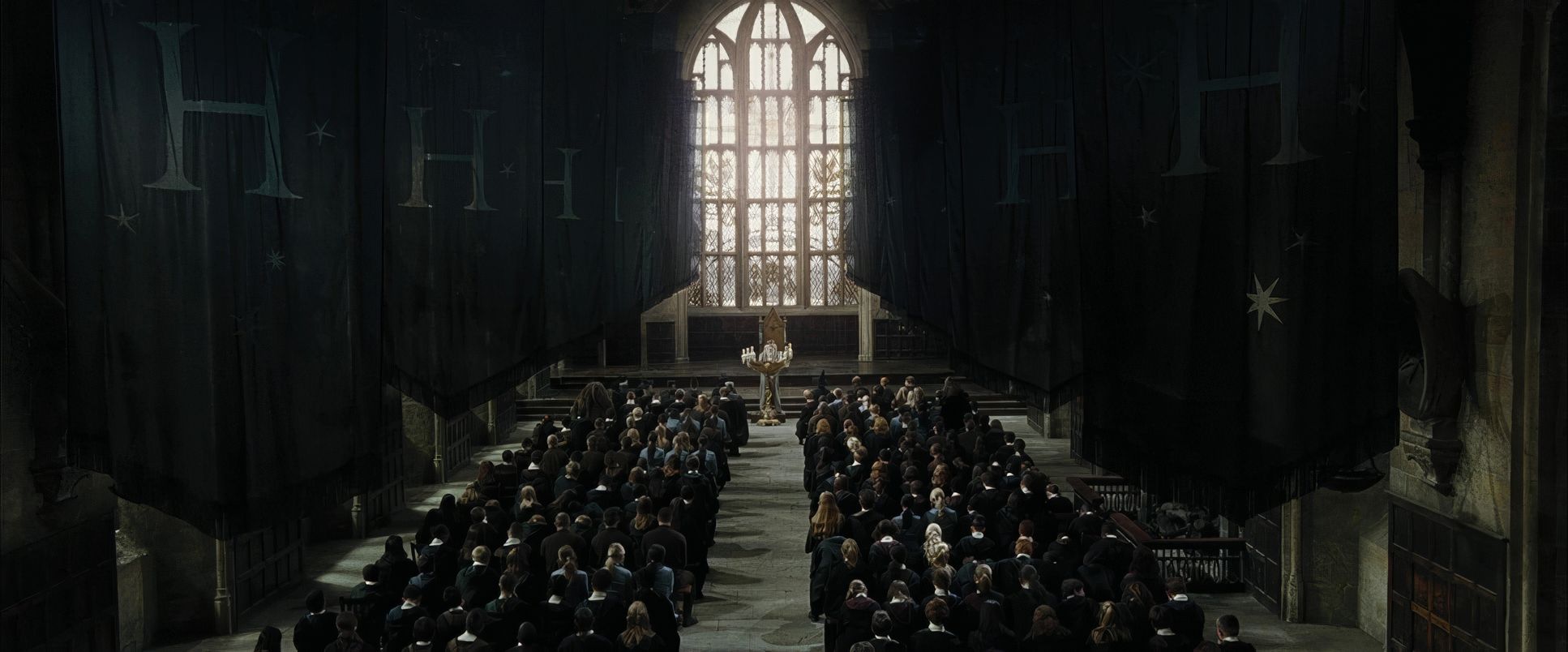
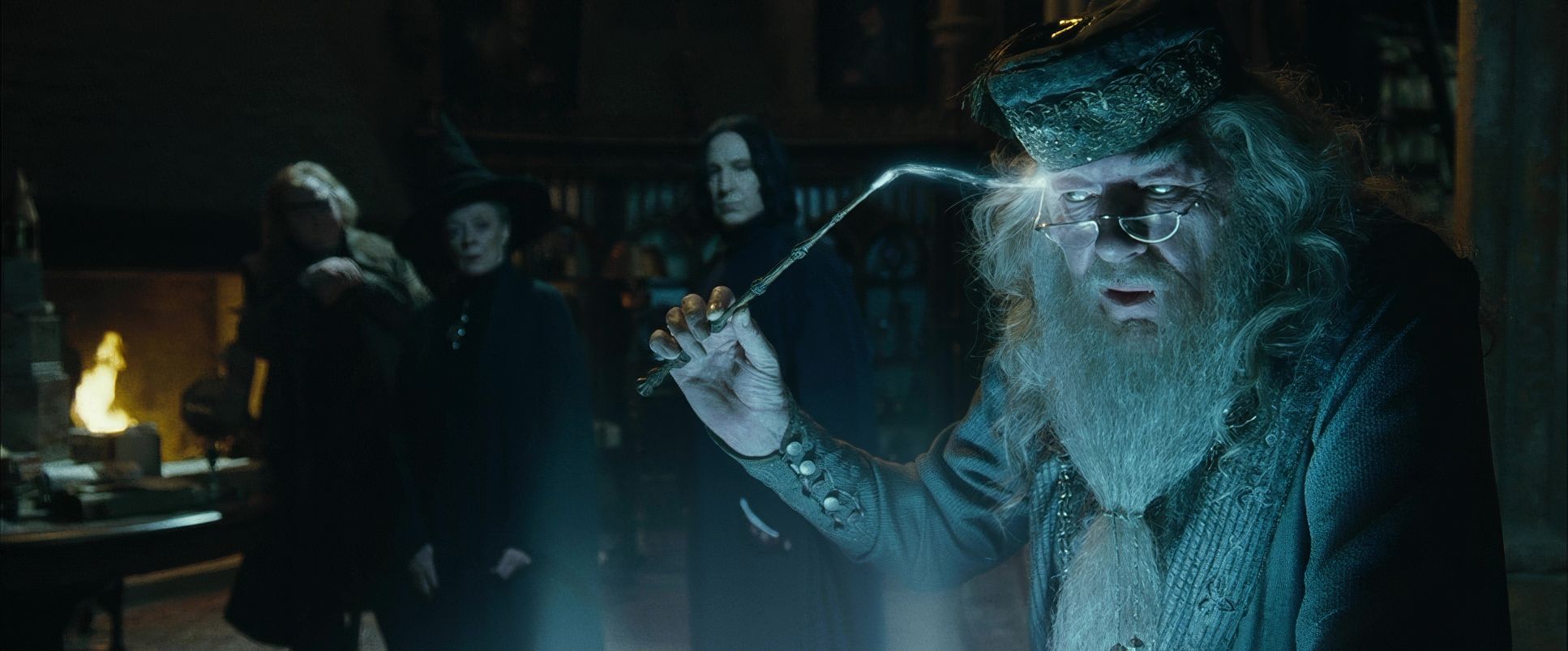
The maze sequence is a compositional triumph in depicting claustrophobia. Pratt utilized intricate depth cues, layering twisting hedges and obscuring views with foliage to create a constant sense of unseen threats. The frames are often tight, denying the audience a clear escape path. It’s not just about showing a maze; it’s about making us feel trapped within it. Even during announcements or ceremonies, Pratt often employs symmetrical compositions that provide a visual sense of order, but it feels like an order that is increasingly fragile and about to shatter.
Lighting Style

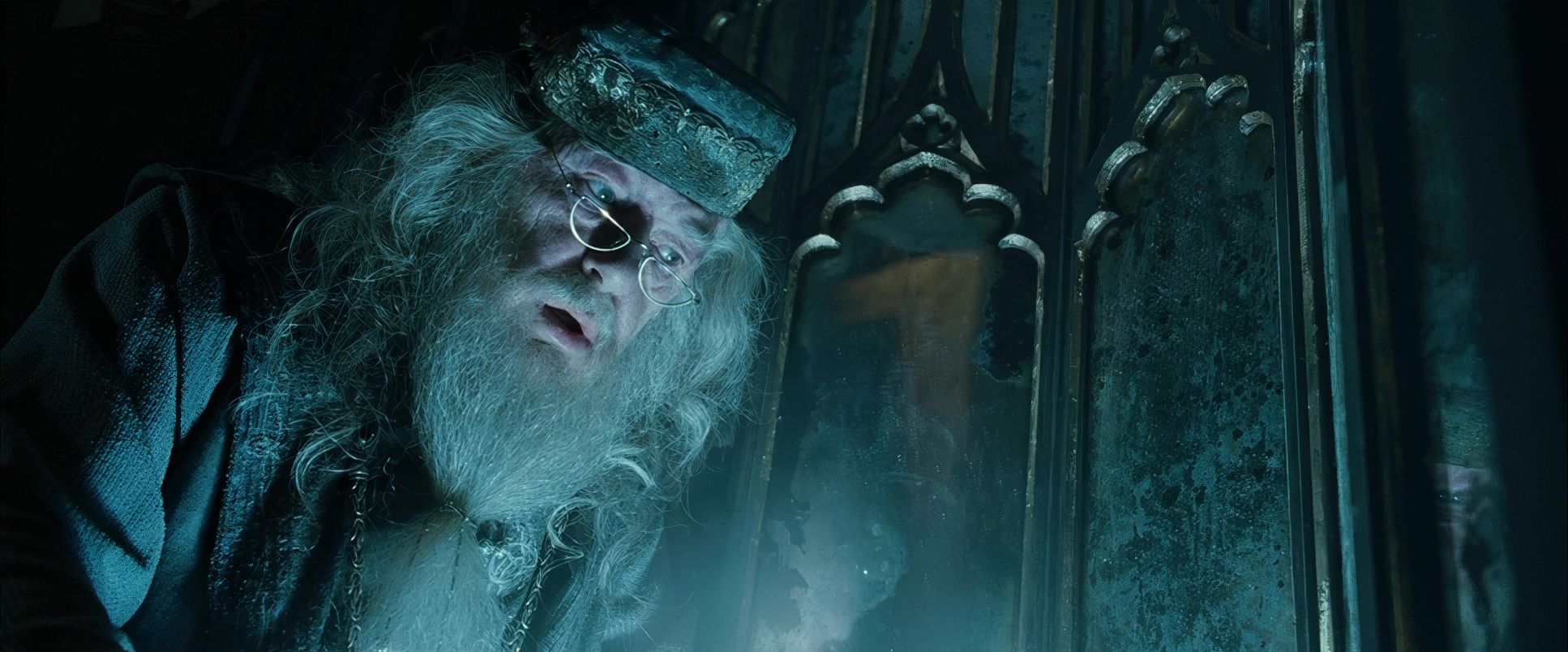
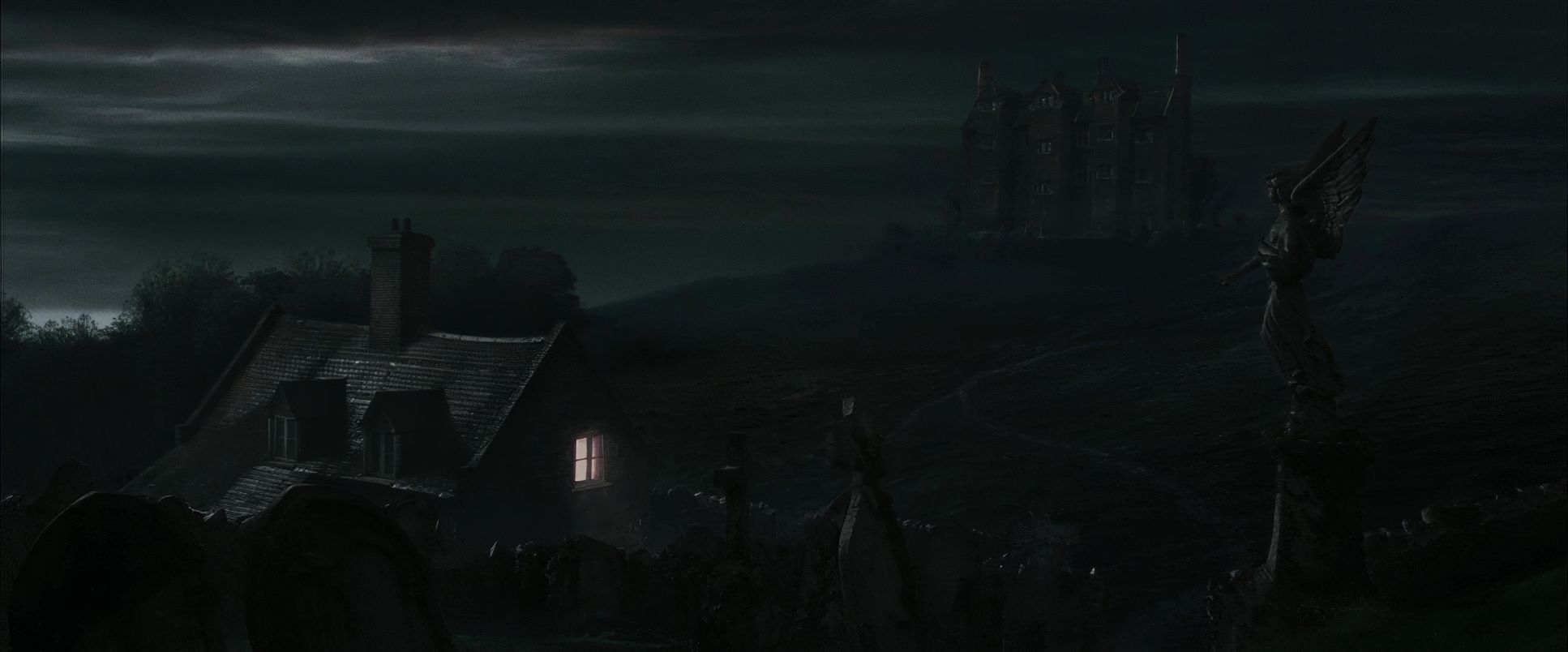
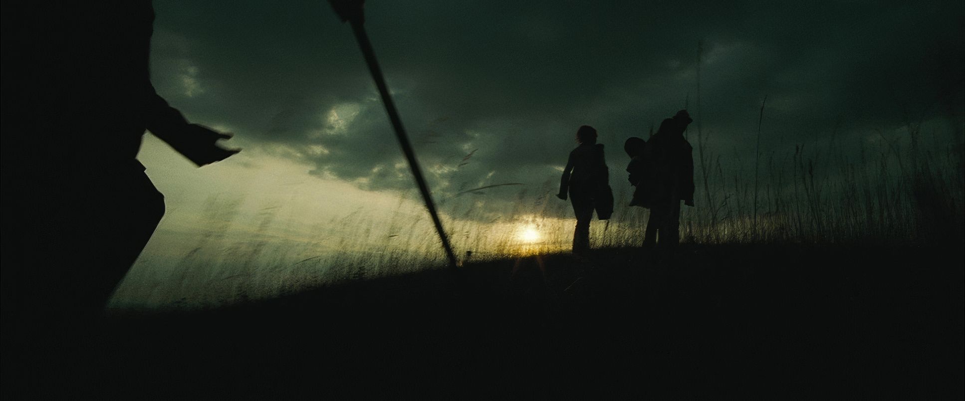
Now, this is where the “darker story” requirement really starts to sing. Pratt leaned heavily into lower-key lighting, immediately establishing a higher level of drama. Gone are the ethereal, warm glows of the early common room scenes; in their place are deeper shadows and much more pronounced contrast ratios.
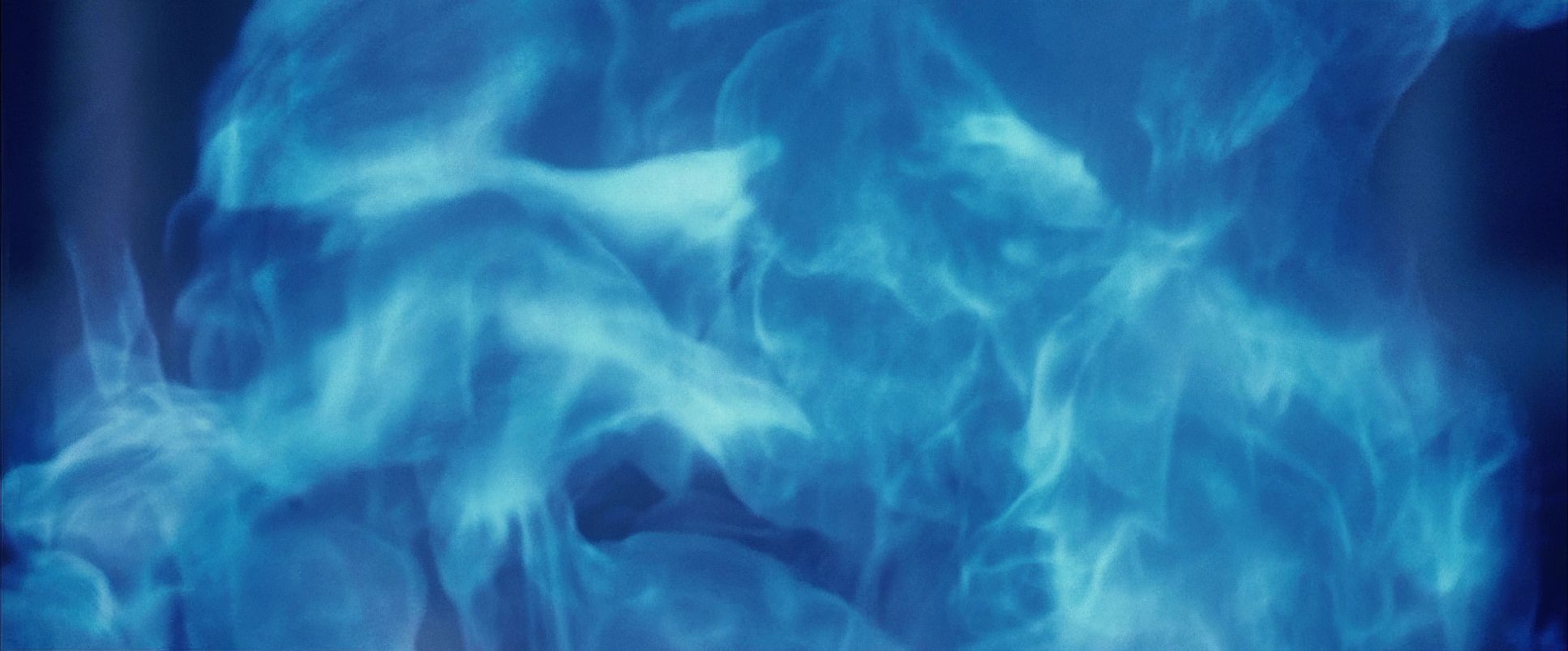
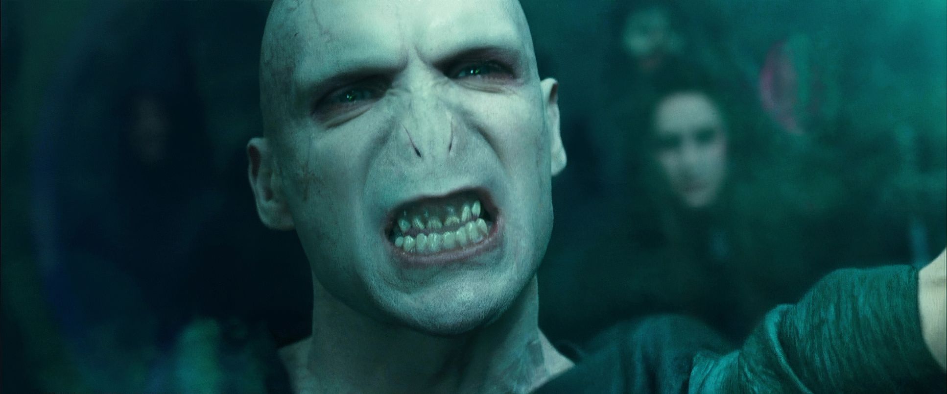
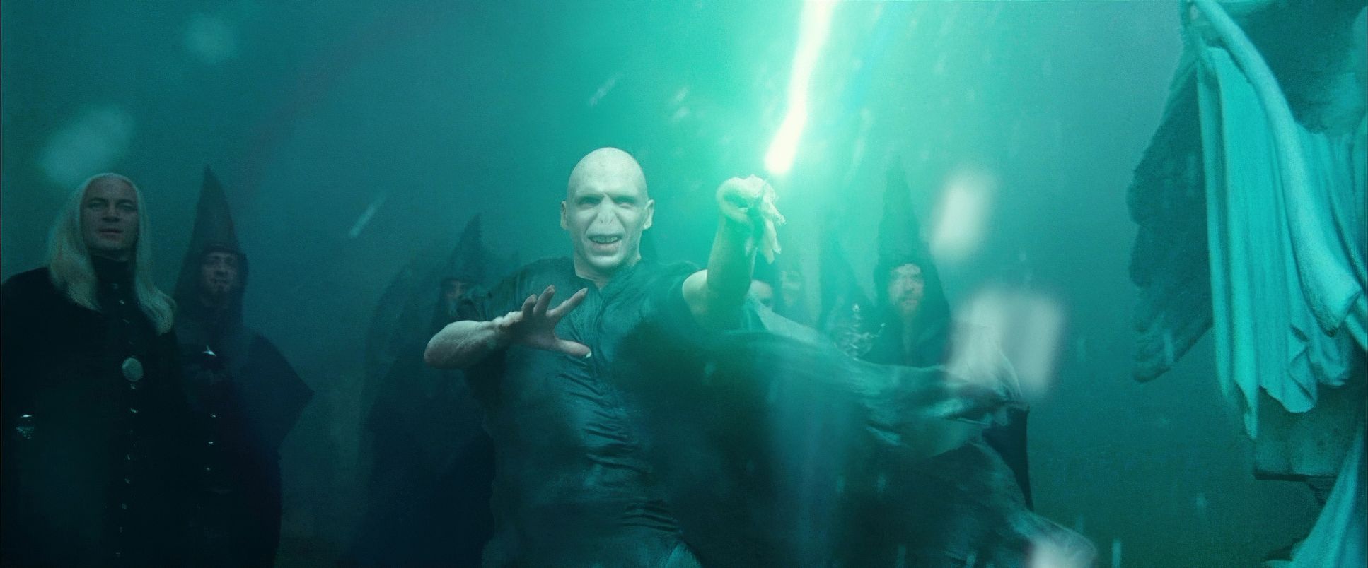
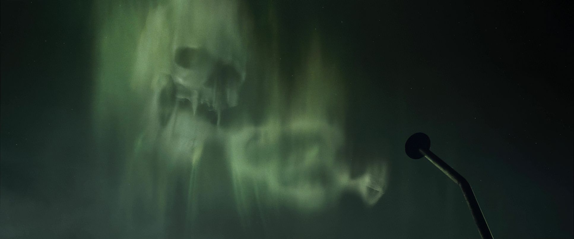
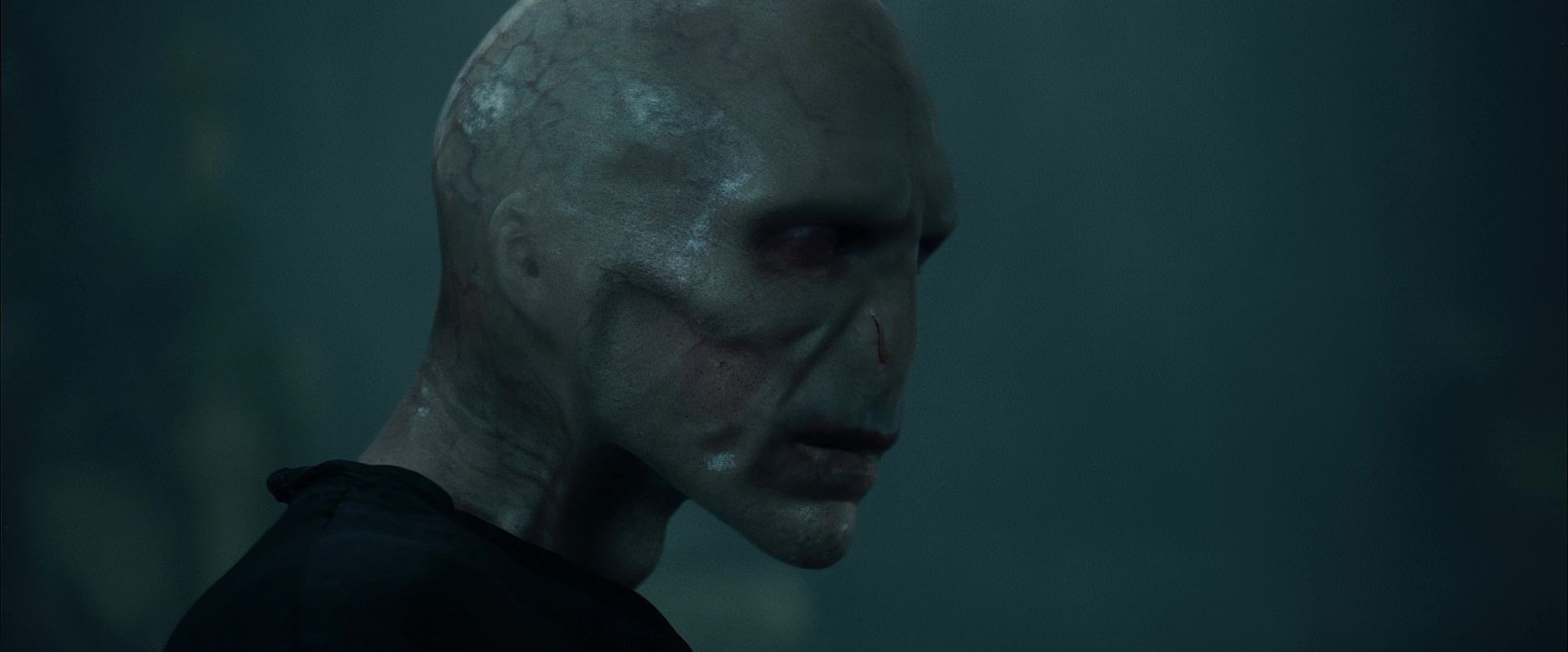
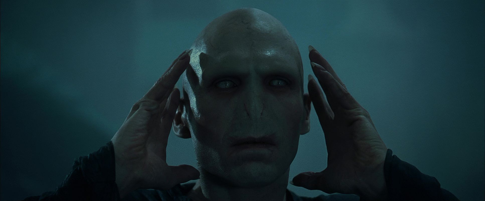
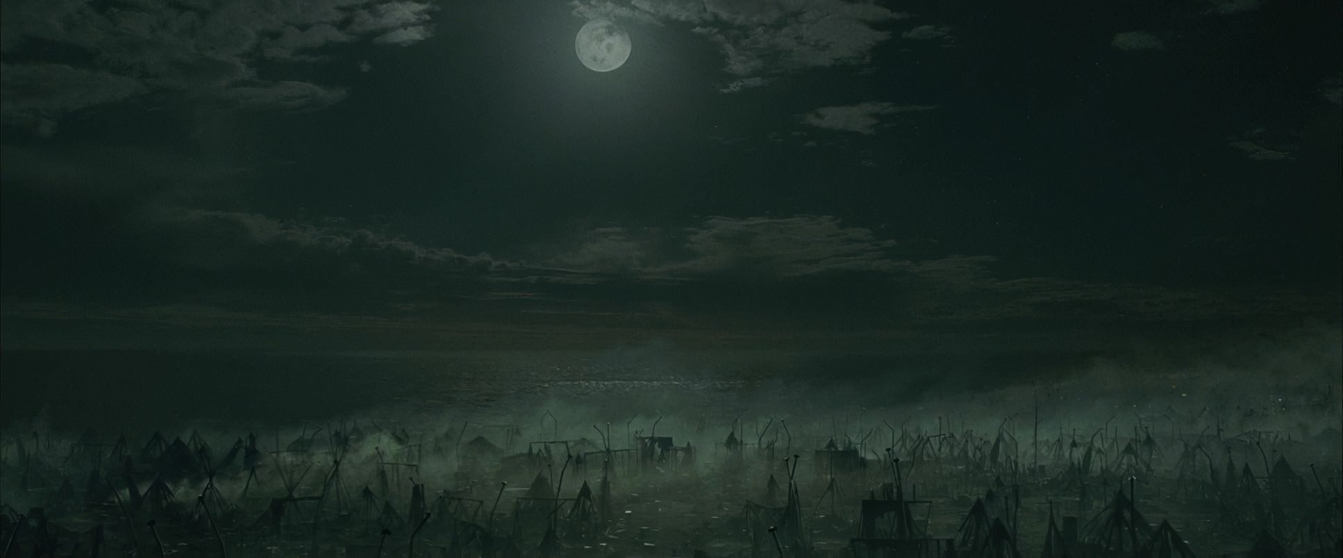
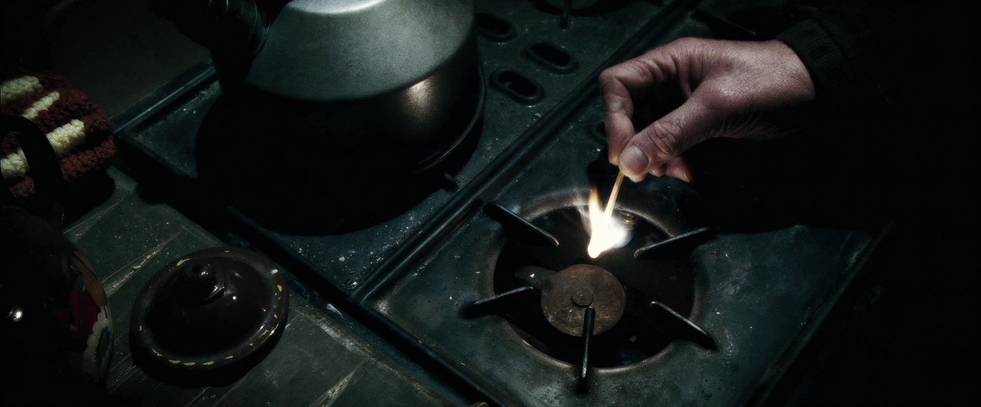
Motivated lighting becomes crucial here, but often with a sinister twist. Flickering torches in dungeons, the cold light of the moon, or the harsh, unnatural glows from dark magic these aren’t just practical sources to get an exposure; they actively shape the mood. The resurrection scene in the graveyard is a masterclass in this, utilizing stark, hard lighting to carve out Voldemort’s newly restored form from the oppressive darkness. It’s not just scary; it’s ugly in its depiction of evil. Pratt truly understood that in this film, shadows aren’t just the absence of light; they’re the presence of dread.
Lensing and Blocking

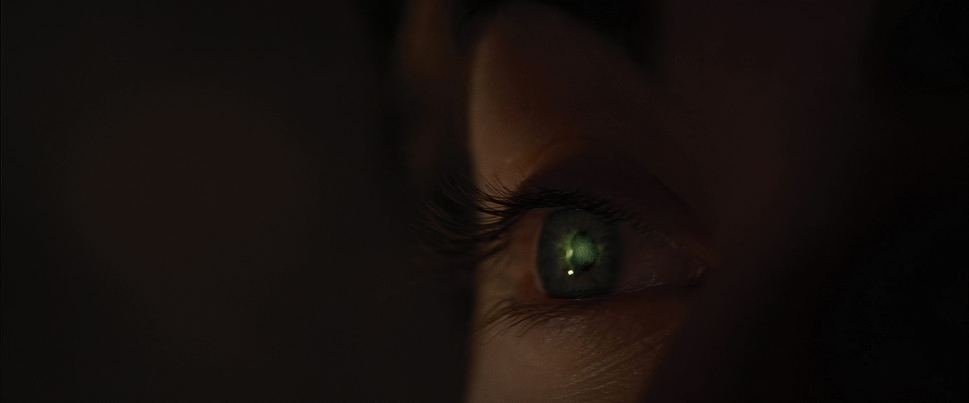
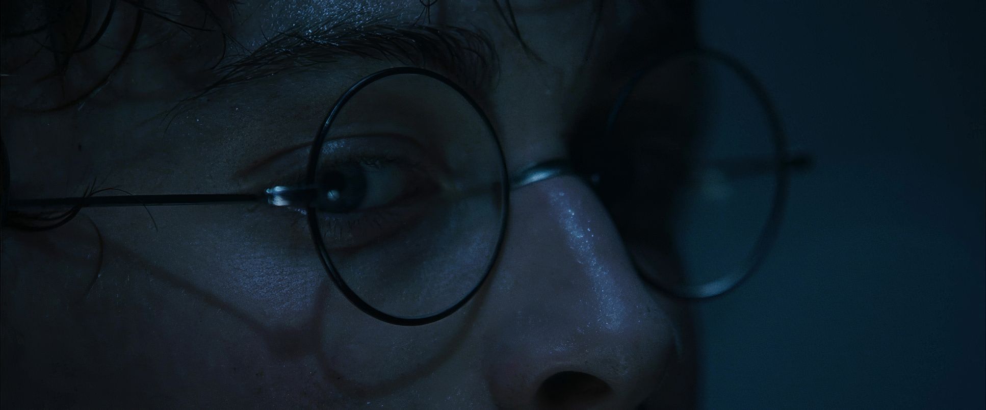
Pratt’s choice of lenses played a significant role in establishing the film’s new aesthetic. While wide lenses were still necessary for the epic scale of the Quidditch camp, there was a noticeable move towards telephoto lenses (“long glass”) for psychologically charged moments. A telephoto lens compresses perspective, making backgrounds feel uncomfortably close and isolating subjects in a shallow depth of field perfect for conveying Harry’s increasing burden.
There’s also a subtle but palpable increase in slight optical imperfections a bit more lens flare, a touch less clinical sharpness than in earlier installments which gives the film a grittier texture. Blocking, too, became more sophisticated with larger set pieces. In the graveyard, the blocking of Harry against the re-formed Voldemort felt meticulously designed to emphasize vulnerability, often placing Harry deep in the background, surrounded by Death Eaters, before bringing him forward for the direct confrontation. It uses the entire space to tell the story of his isolation.
Color Grading Approach

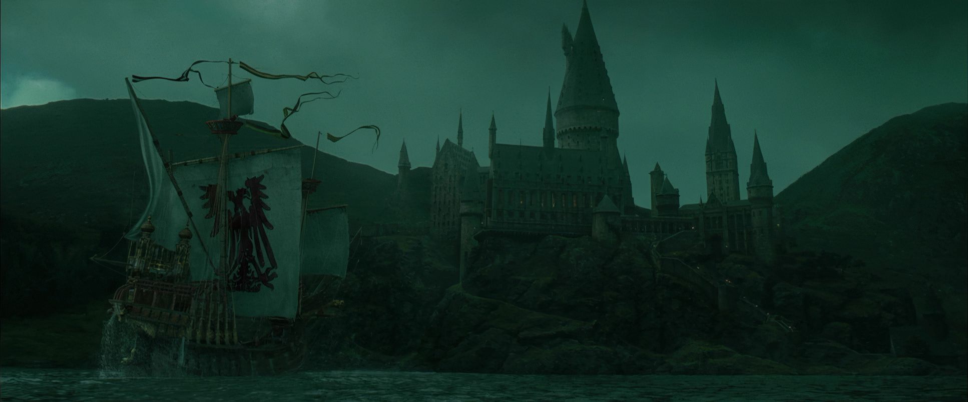
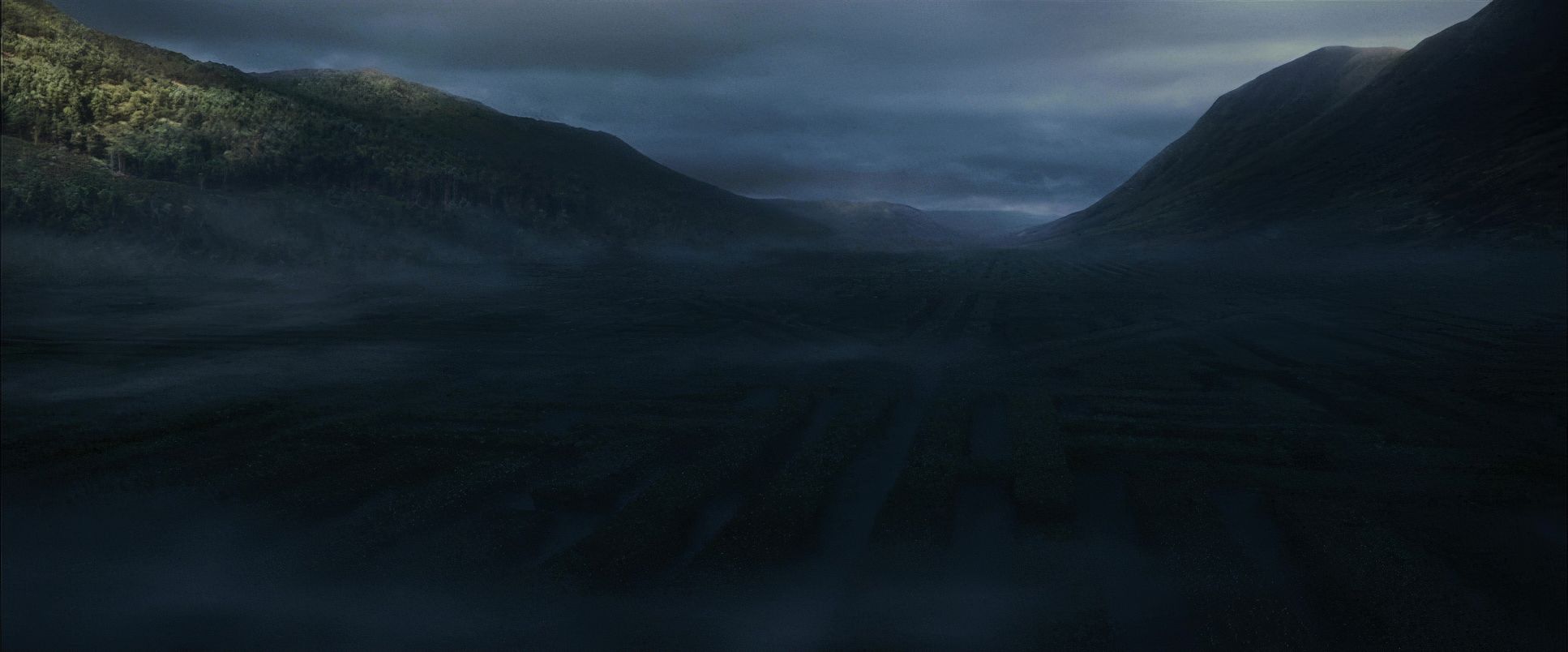
Ah, my favorite part. As a colorist, the grade of Goblet of Fire, executed by Maxine Gervais, is a feast. It’s where the narrative truly solidifies visually. Compared to the vibrant, almost primary color palettes of the first two films, this movie immediately feels muted, desaturated, and significantly cooler.
The contrast shaping here is robust. The team pushed for deeper, richer blacks, giving a sense of weight and oppression without completely crushing shadow detail into mud. There’s still information in those depths, but it’s earned. Highlights are carefully contained, avoiding harsh, digital blowouts, allowing for a dramatic chiaroscuro effect.
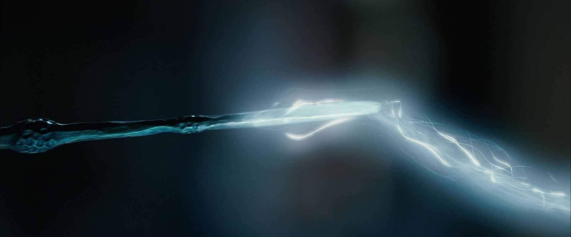
Hue separation becomes incredibly precise here. Greens are often nudged towards cyan, and reds towards a more desaturated, blood-orange tone. Skin tones often lean cooler, contributing to the sense of a world under strain rather than a perpetually healthy outlook. Tonal sculpting the art of shaping specific areas with power windows is evident. Elements like the green glow of the Killing Curse against the cool graveyard are meticulously separated in the grade to maximize impact. The filmic highlight roll-off feels organic, preventing magical effects from looking harsh. It’s all about creating an image with a rich, print-film sensibility that breathes life into the shadows, even when the mood is dark.
Technical Aspects & Tools
Harry Potter and the Goblet of Fire | Technical Specifications
| Genre | Adventure, Family, Fantasy |
| Director | Mike Newell |
| Cinematographer | Roger Pratt |
| Production Designer | Stuart Craig |
| Costume Designer | Jany Temime |
| Editor | Mick Audsley |
| Colorist | Maxine Gervais |
| Time Period | 2000s |
| Aspect Ratio | 2.39 – 3D |
| Format | Film – 35mm |
| Lighting | Backlight |
| Lighting Type | Daylight |
| Story Location | United Kingdom > Scotland |
| Filming Location | United Kingdom > Scotland |
| Camera | Arricam LT, Arricam ST, Arriflex 435 |
| Lens | Angenieux Optimo, Canon Cinema Primes, Zeiss Variable Prime |
It’s important to remember that in 2005, film was still king. Goblet of Fire was shot on 35mm film, using reliable workhorses like Arricam ST and LT cameras. This inherent choice brought a beautiful organic grain structure and dynamic range that digital cameras of that specific era struggled to match. This film medium provided the robust foundation needed for the aggressive color grading that followed.
The lighting package would have been extensive to combat the low sensitivity of film stock compared to modern digital sensors powerful HMIs for simulating sunlight on location, and a massive array of tungsten fixtures for interiors, leaning heavily on practical lanterns and torches for motivation.
Crucially, this was the pivotal era of the Digital Intermediate (DI). The 35mm negative was scanned into the digital realm, and the film clearly leveraged the newfound control DI offered. The grade would have been executed on high-end systems, allowing Pratt and Gervais to meticulously craft the film’s distinct look, pushing the boundaries far beyond what traditional photochemical timing could have achieved in previous films.
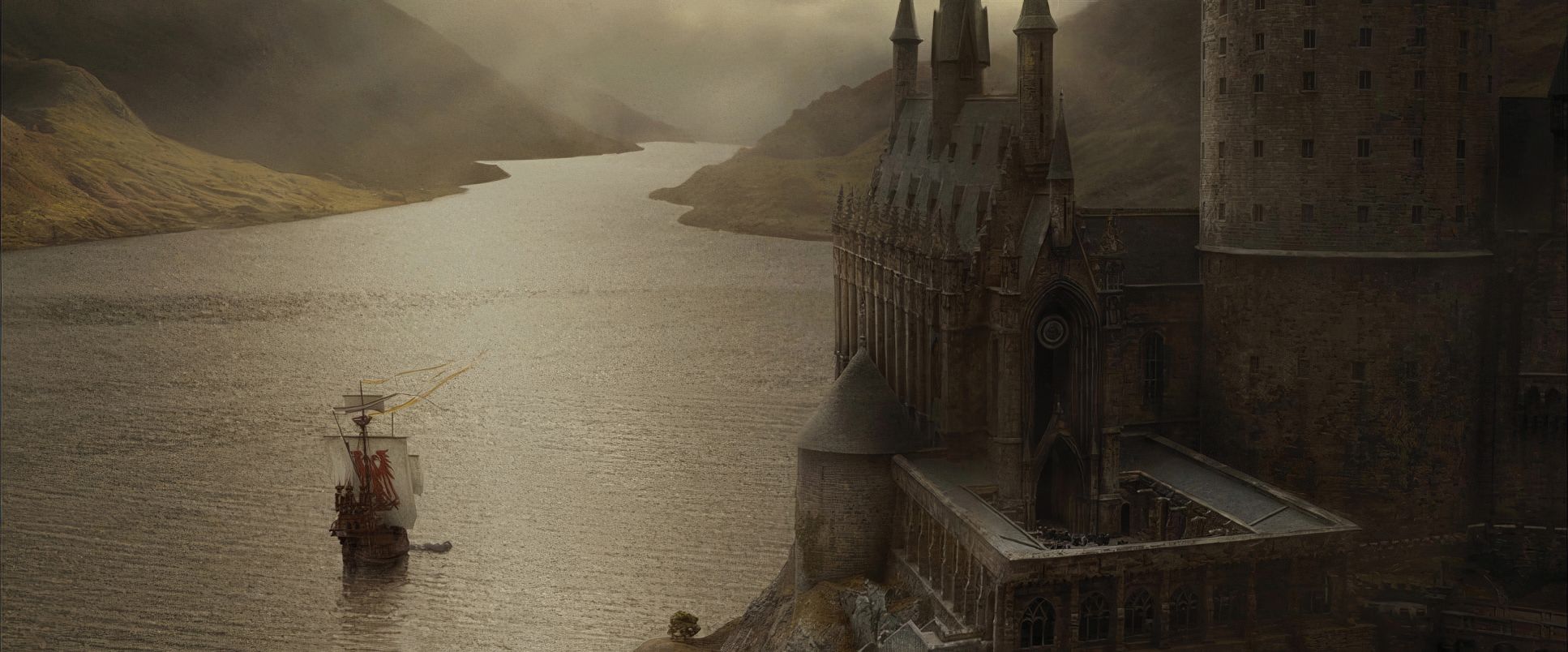
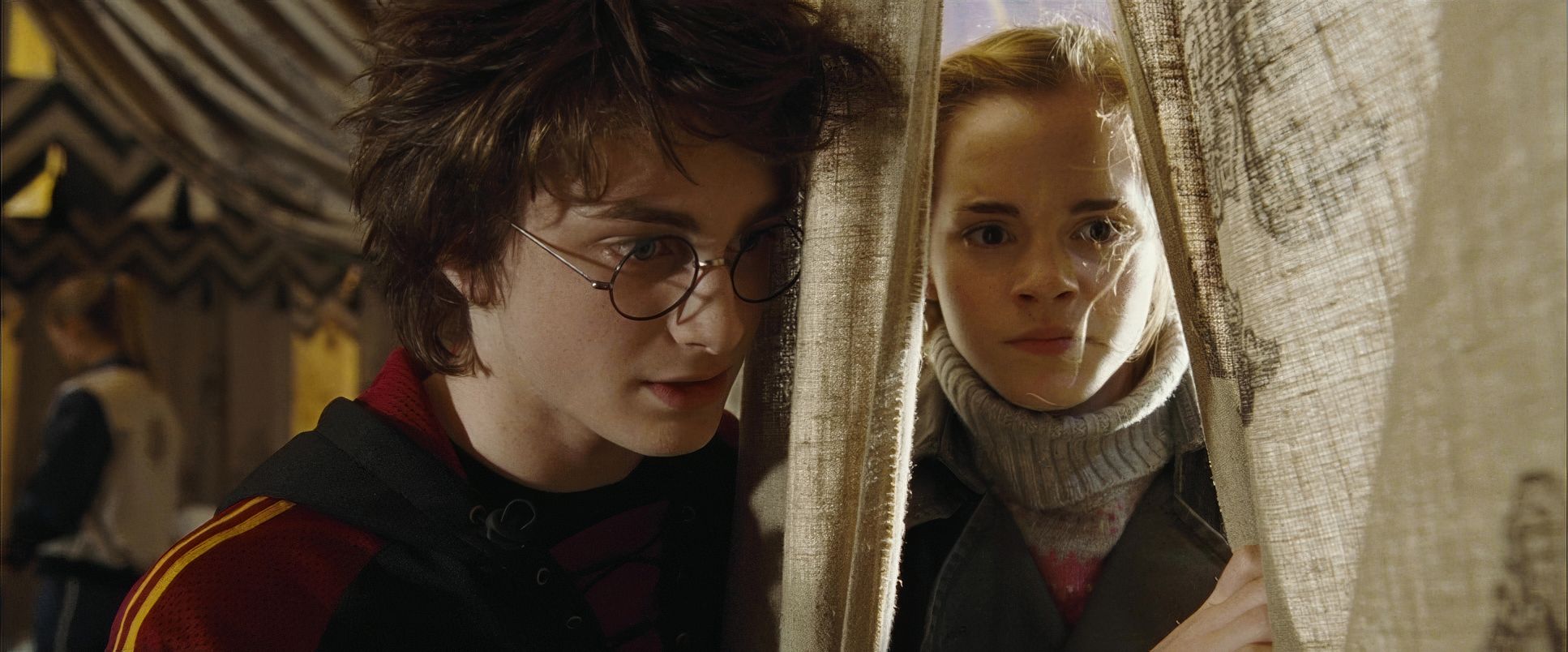
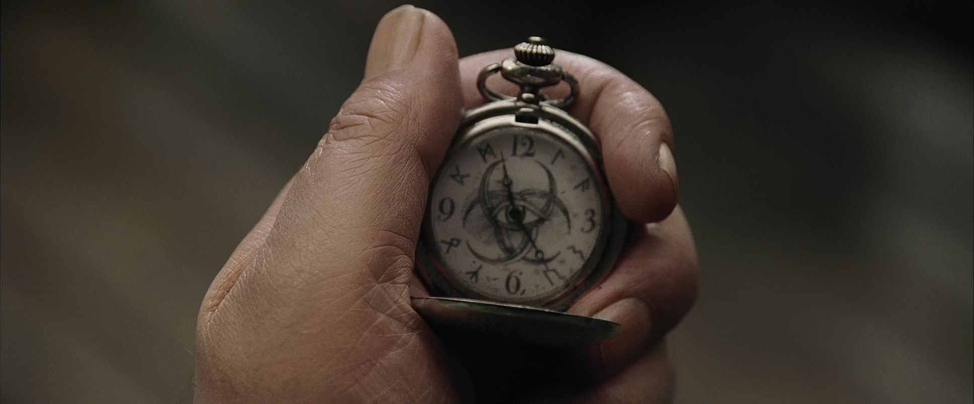
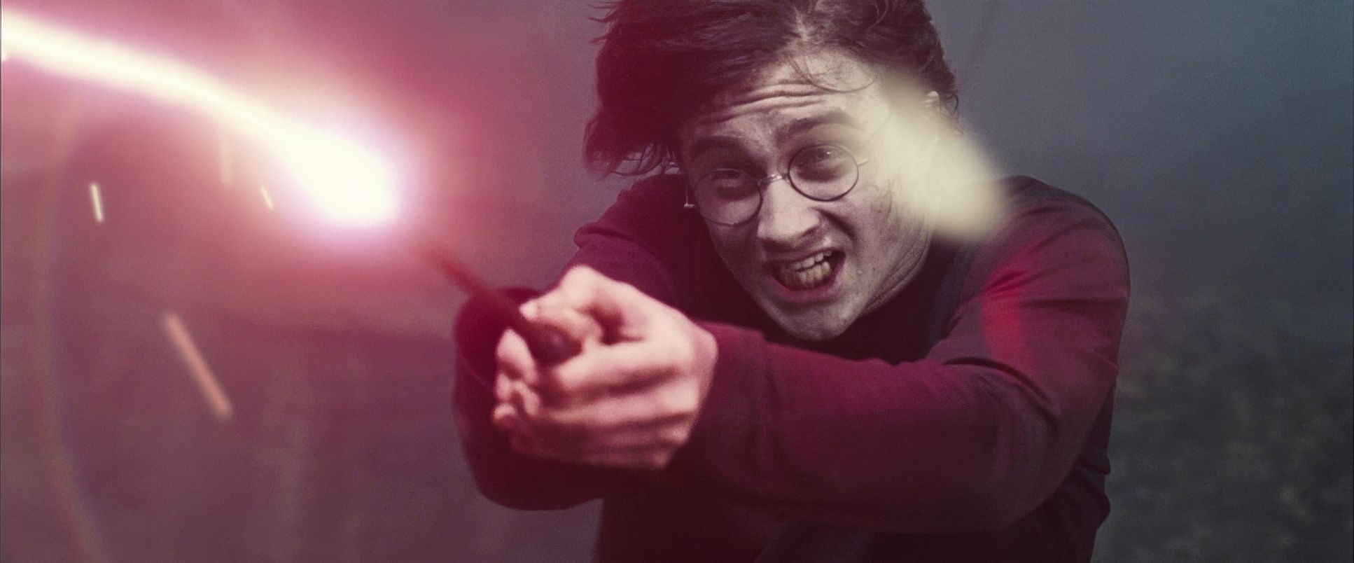
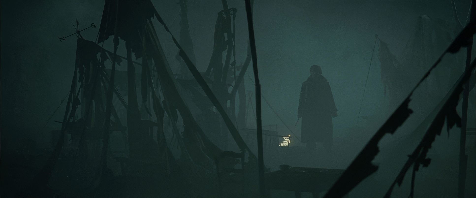
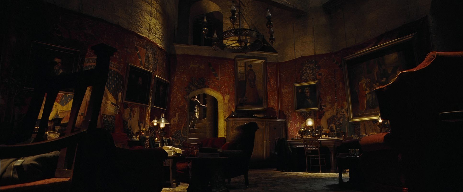
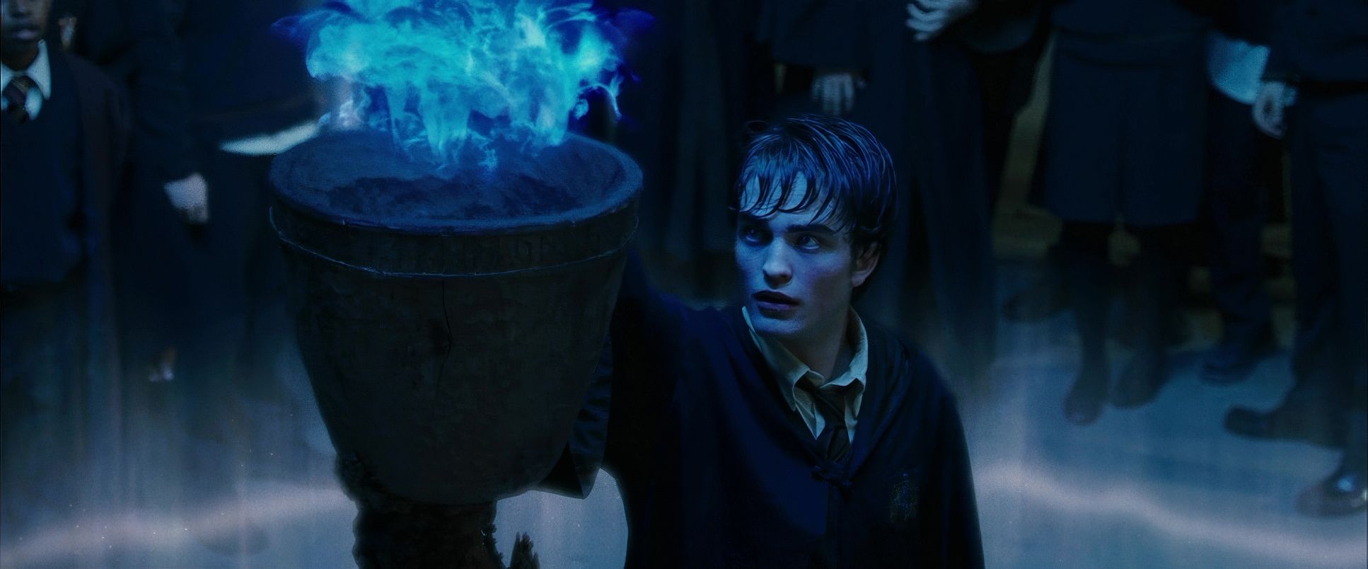
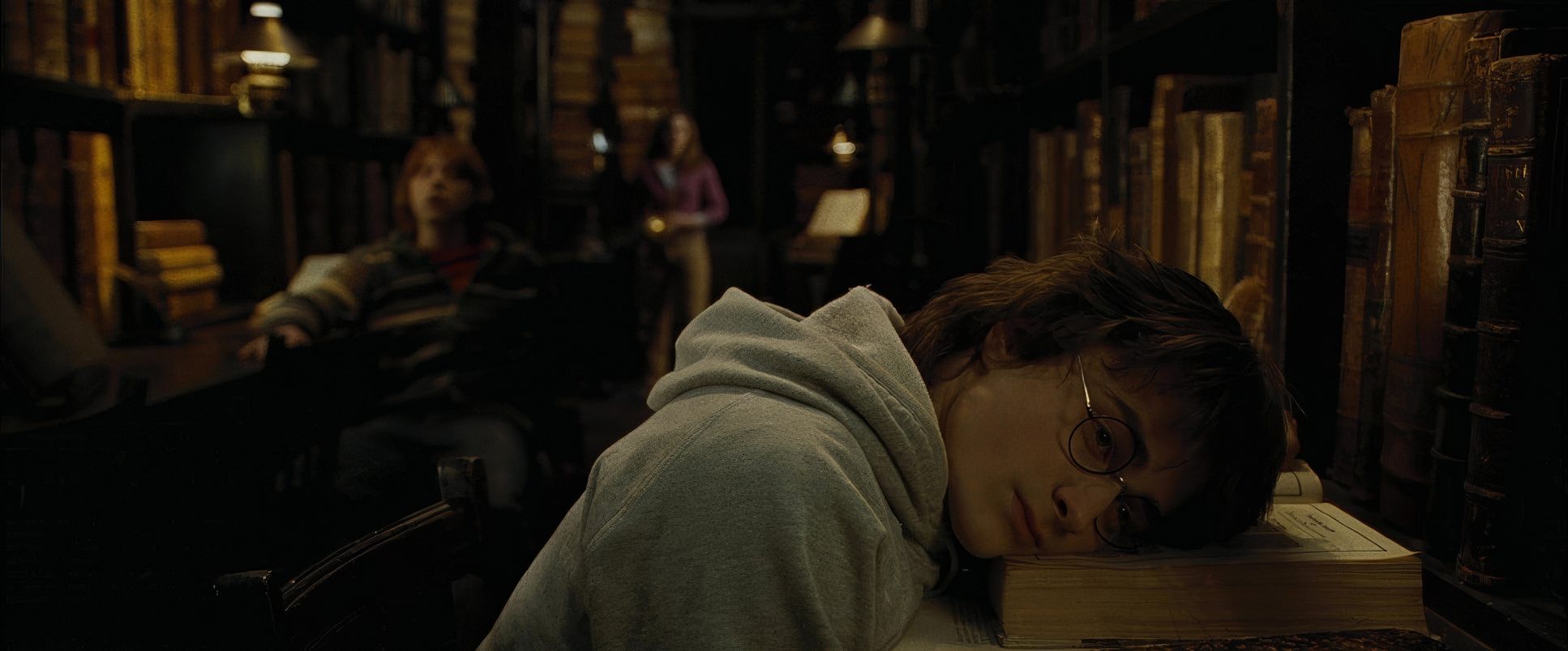
Harry Potter and the Goblet of Fire (2005) Film Stills
A curated reference archive of cinematography stills from Harry Potter and the Goblet of Fire (2005). Study the lighting, color grading, and composition.


- Also read: X-MEN: FIRST CLASS (2011) – CINEMATOGRAPHY ANALYSIS
- Also read: KINGSMAN: THE SECRET SERVICE (2015) – CINEMATOGRAPHY ANALYSIS
Browse Our Cinematography Analysis Glossary
Explore directors, cinematographers, cameras, lenses, lighting styles, genres, and the visual techniques that shape iconic films.
Explore Glossary →