Deathly Hallows: Part 1. It’s the one people love to call the “slow” movie or the “bridge” film. Some fans felt unsatisfied because it doesn’t give you that big, traditional narrative payoff. But for me? The cinematography in Part 1 isn’t just good it’s the whole point. It’s the visual anchor that keeps the story grounded once you strip away the safety of Hogwarts. This isn’t a movie about Quidditch and cozy common rooms; it’s a desperate, lonely journey. The camera work, the lighting, and the grade aren’t just background they are the story.
About the Cinematographer
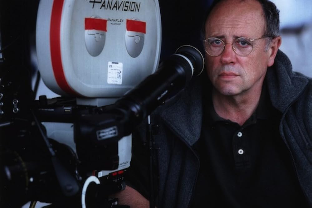
Enter Eduardo Serra. Bringing a Portuguese cinematographer known for “elegant grit” was a masterstroke by David Yates. Serra has this incredible knack for making images feel grand but intimately human at the same time look at Girl with a Pearl Earring or Blood Diamond and you’ll see what I mean. He’s a master of the “painterly” style, someone who truly understands the subtle dance of shadow. For Part 1, his sensibilities were a perfect match for Yates’s vision of a more mature, starkly realistic wizarding world. It was a total departure from the vibrant, “magical” aesthetics of the earlier films. Serra grounded the magic in a reality that felt palpable and, frankly, dangerous.
Inspiration Behind the Cinematography
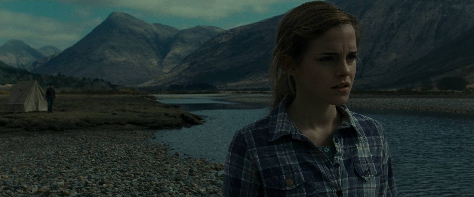
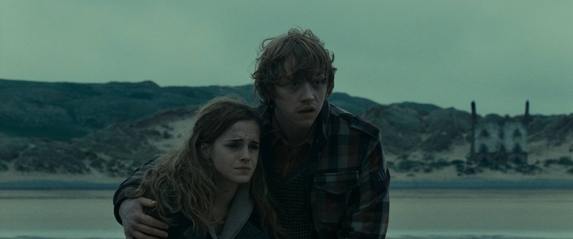
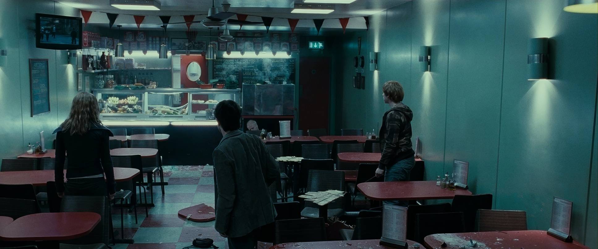
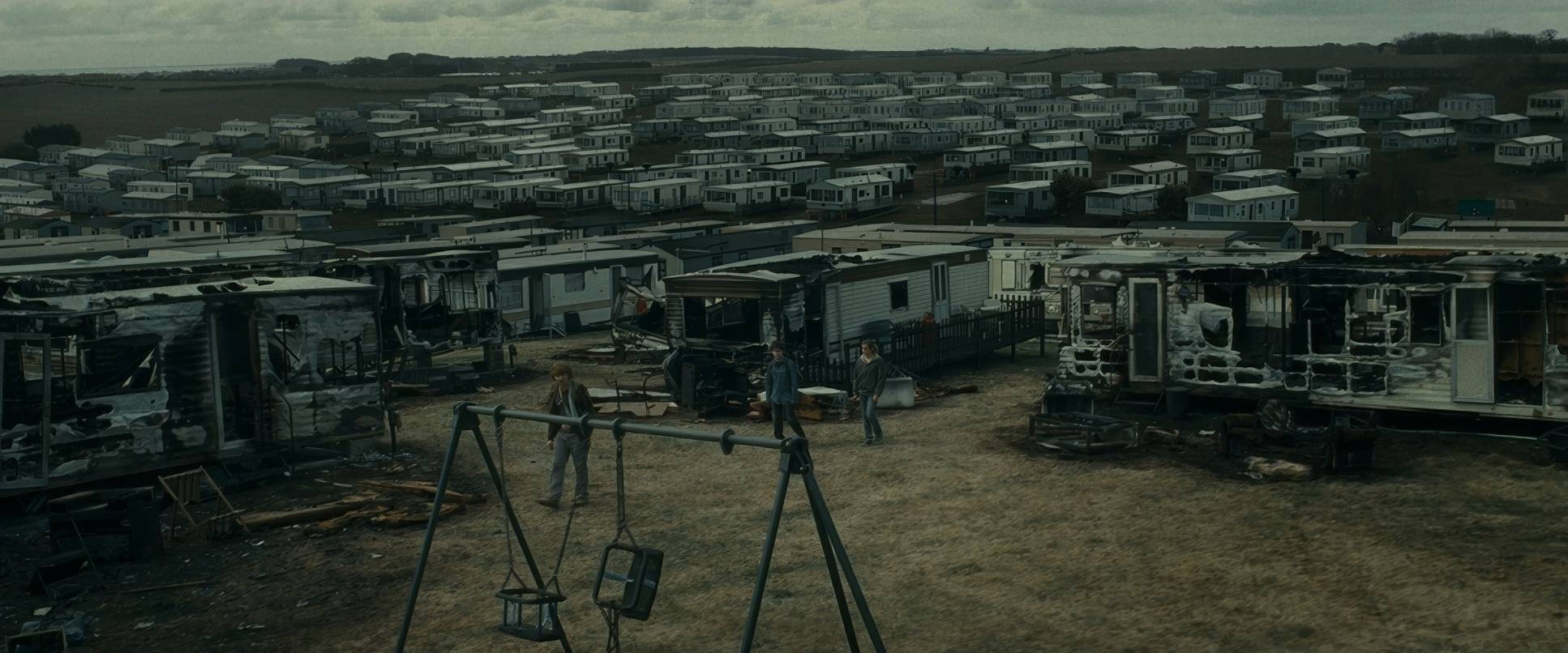
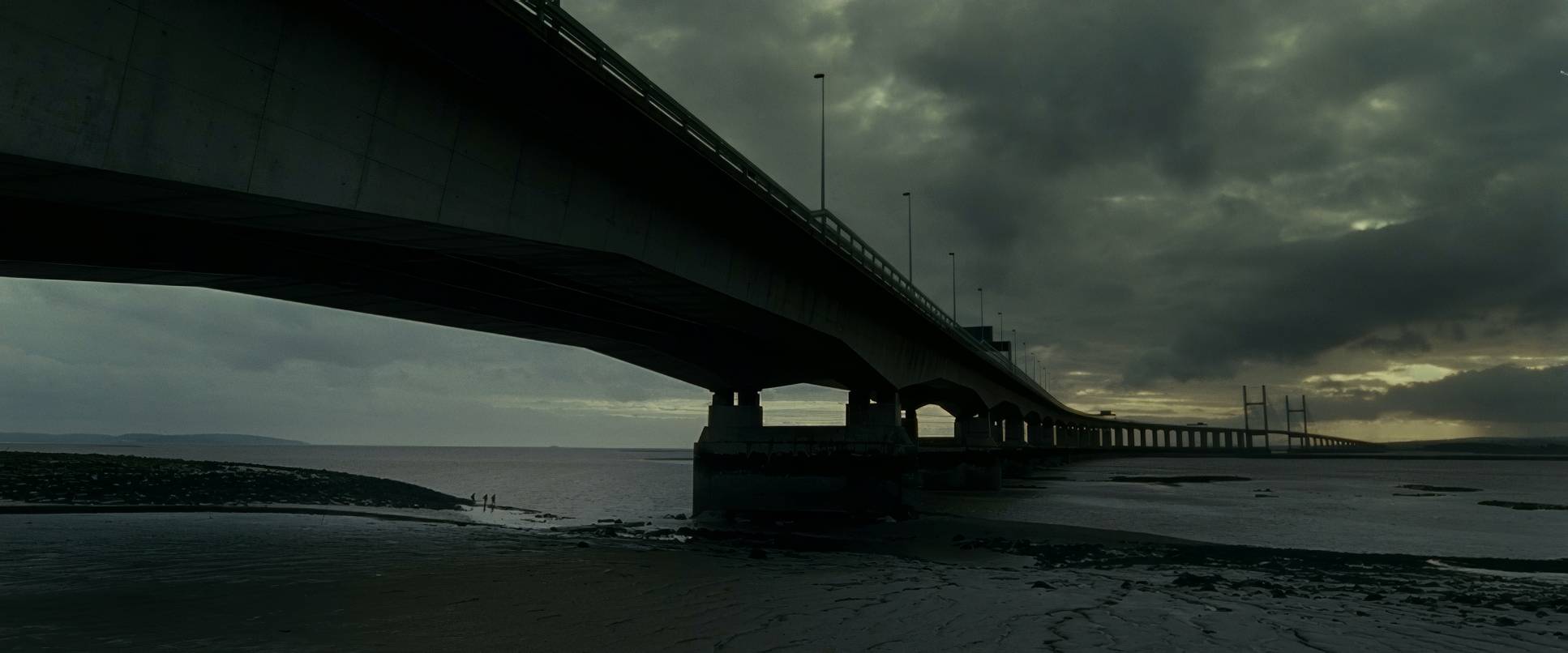
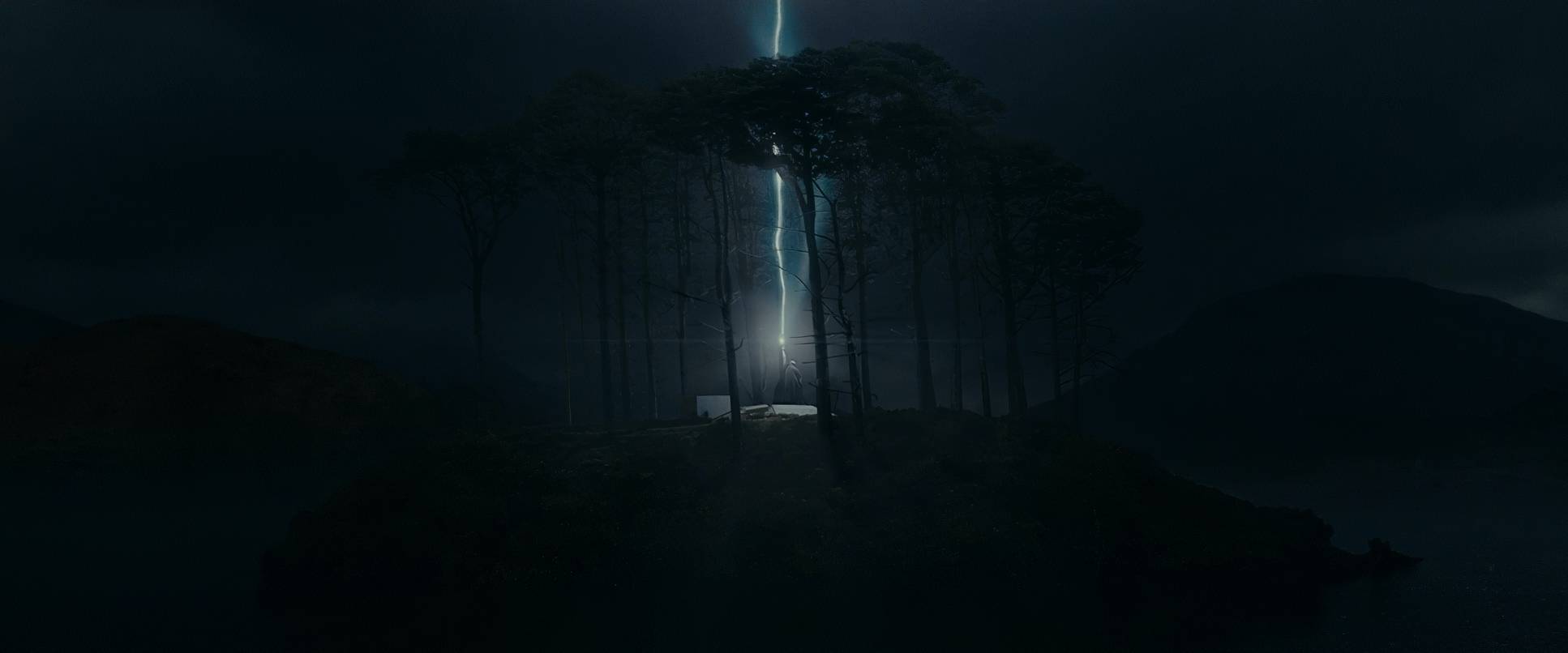
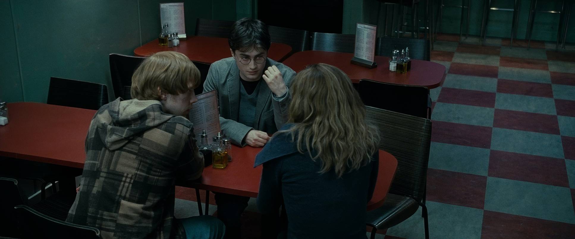
The inspiration here was simple: the trio is isolated, hunted, and completely out of their depth. While the Ministry is busy lying, saying things “remain strong,” we’re watching Voldemort’s shadow grow. Our heroes have been kicked out of their “Ordinary World” and thrust into a cold, unforgiving wilderness. Serra and Yates didn’t look at other fantasy films for inspiration; they looked at war movies and classic road-trip narratives. They wanted the landscape to feel like a hostile character vast and indifferent. It was about capturing that feeling of being constantly exposed with nowhere to hide, mirroring the emotional weight Harry, Ron, and Hermione were carrying. Even a simple diner starts to feel like a battlefield.
Camera Movements
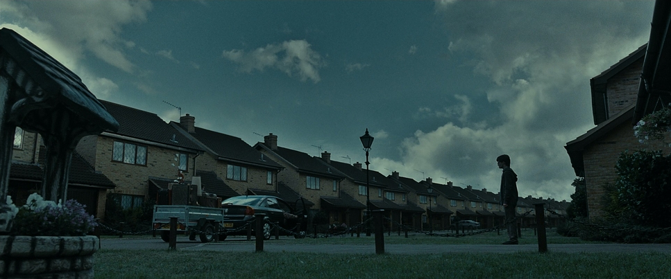
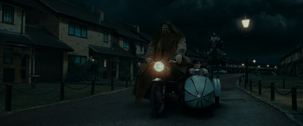
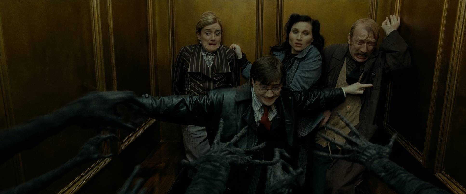
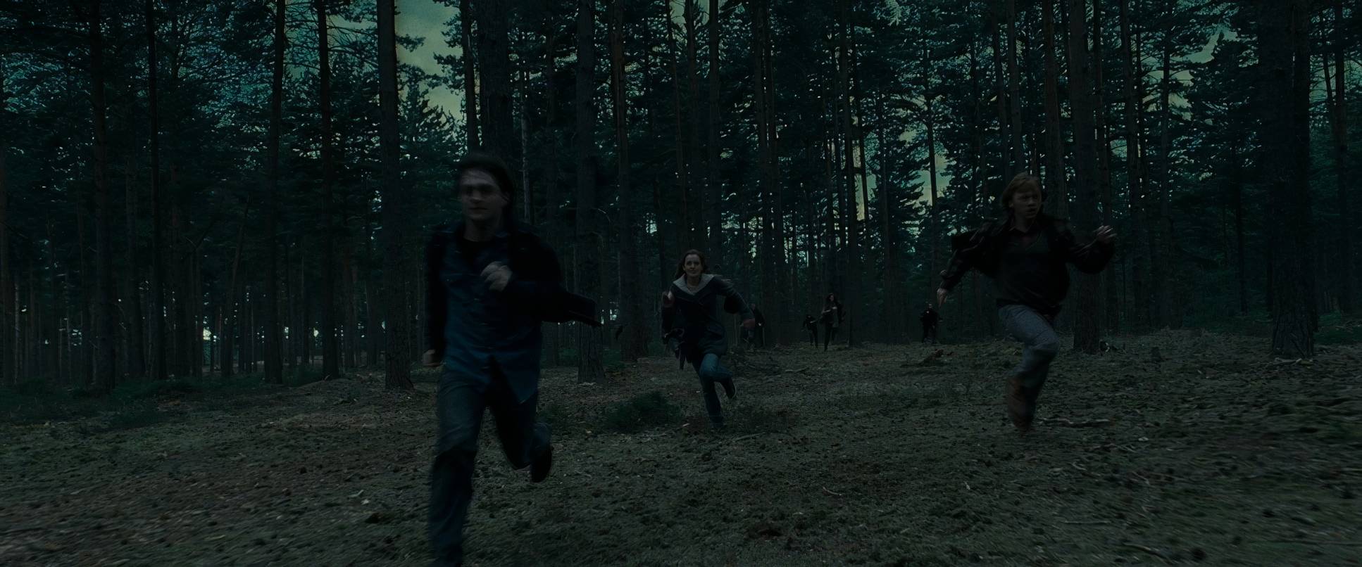
The camera work in Part 1 is all about tension. I love the way Serra balances raw handheld movement with these long, isolating dolly shots. Early on, during the escape from Privet Drive, the camera is frantic. It’s shaky, it’s chaotic, and it plunges you right into the middle of that ambush. It’s not “clean” action, and it shouldn’t be it reflects the total disarray of the Order’s plan.
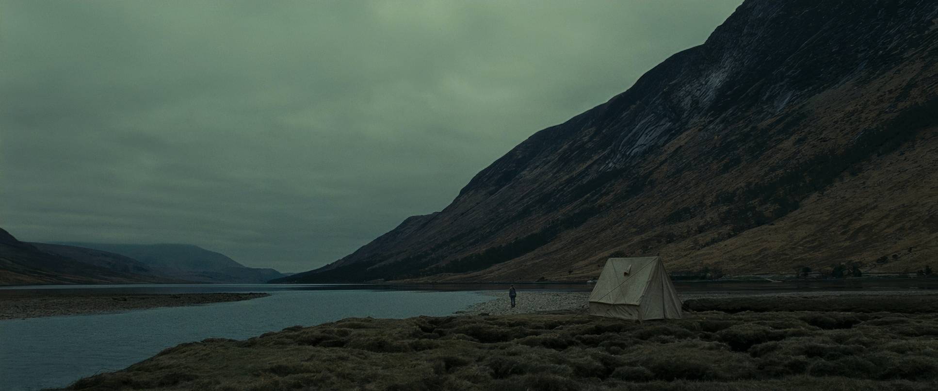
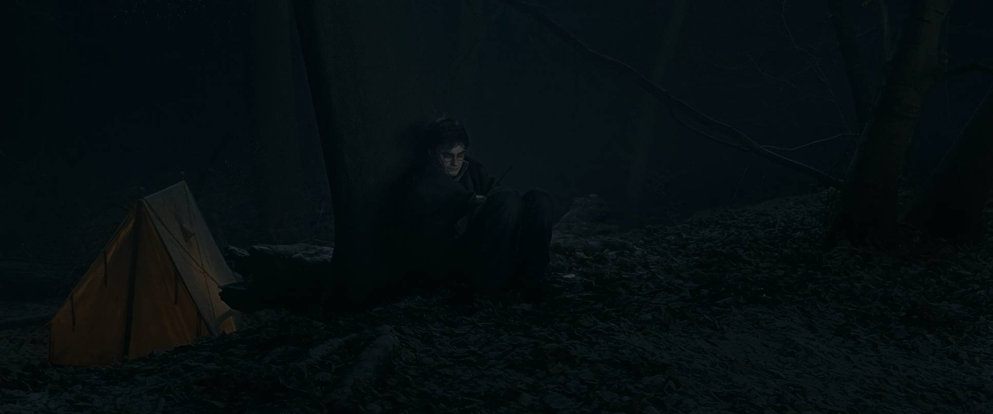
Now, I know some critics complained that the forest chase was “horribly filmed” or that the “shaky cam” was too much. I get it if you want a stable frame, but from a craft perspective, that disorientation is the goal. You’re supposed to feel the panic. It makes those quiet, static moments in the tent feel even heavier by comparison. The camera becomes a quiet, lonely observer when they’re camping, emphasizing just how small they are in that massive landscape.
Compositional Choices
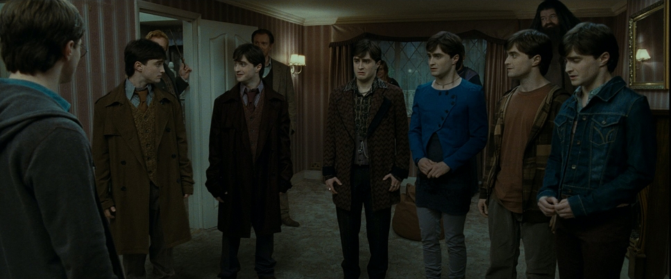
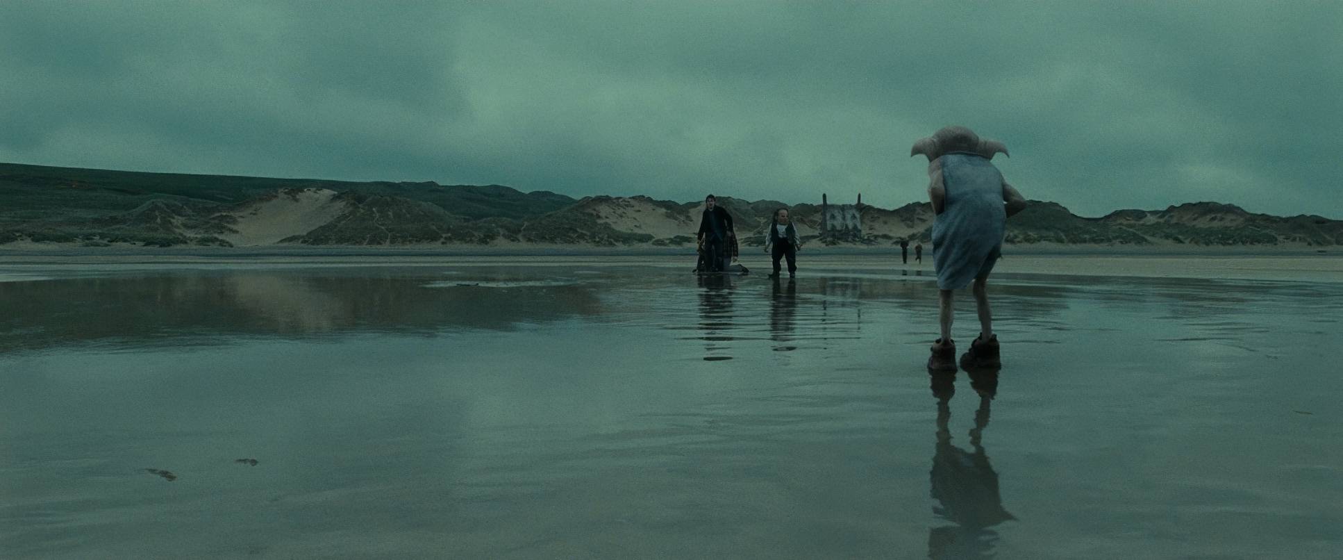
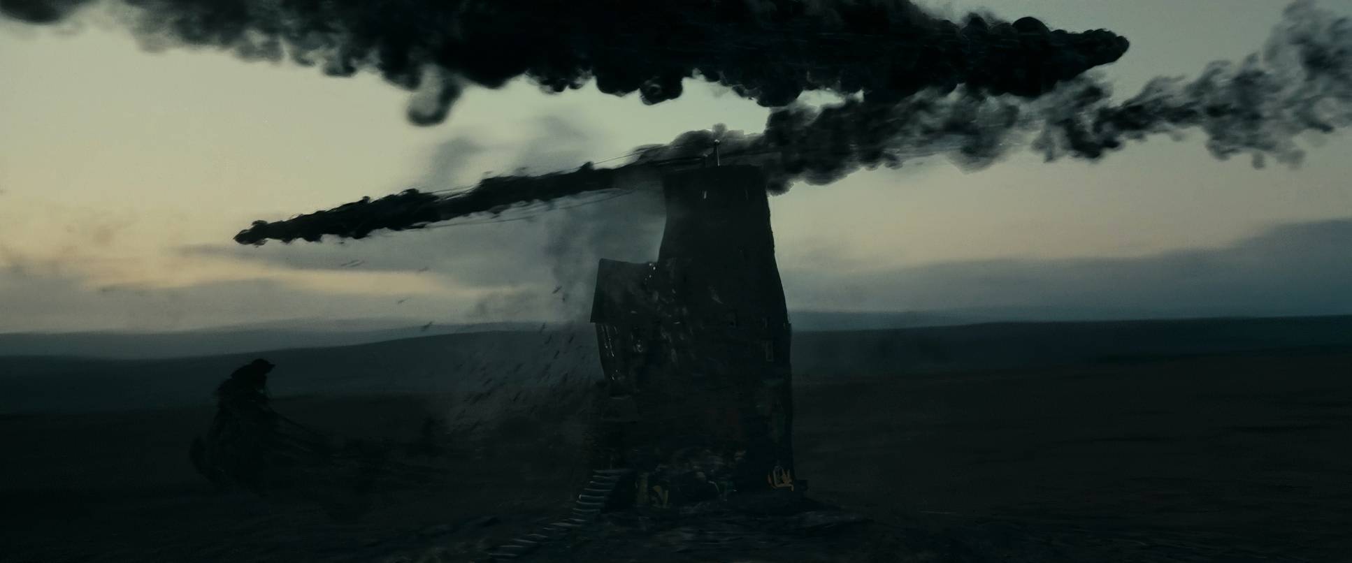
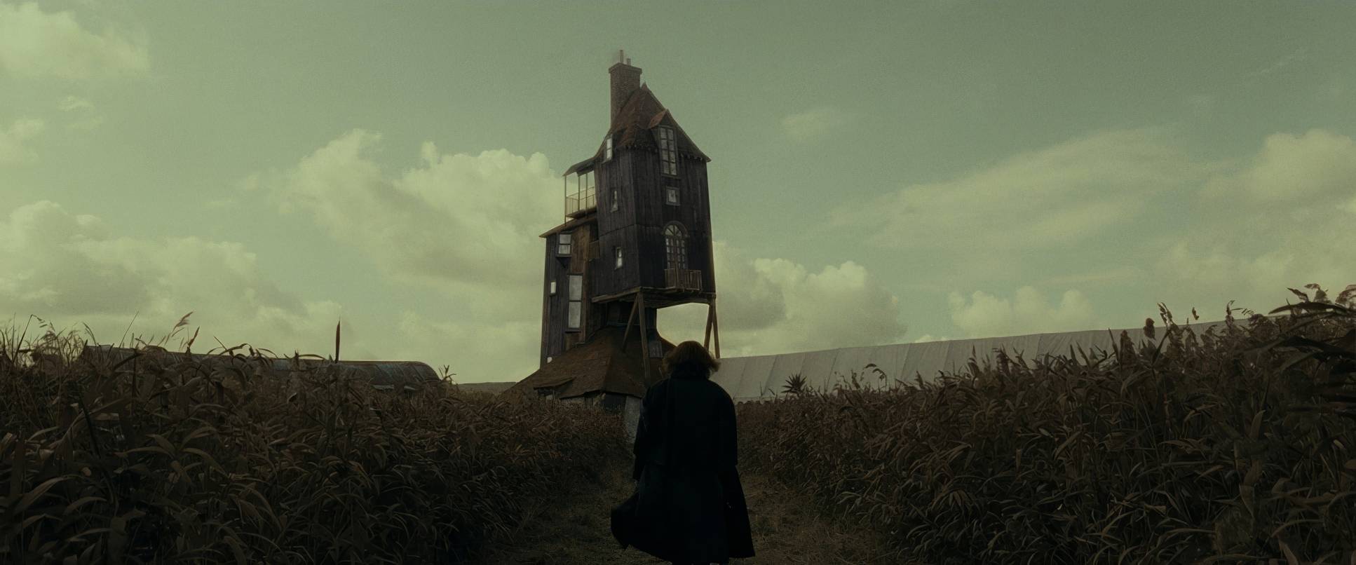
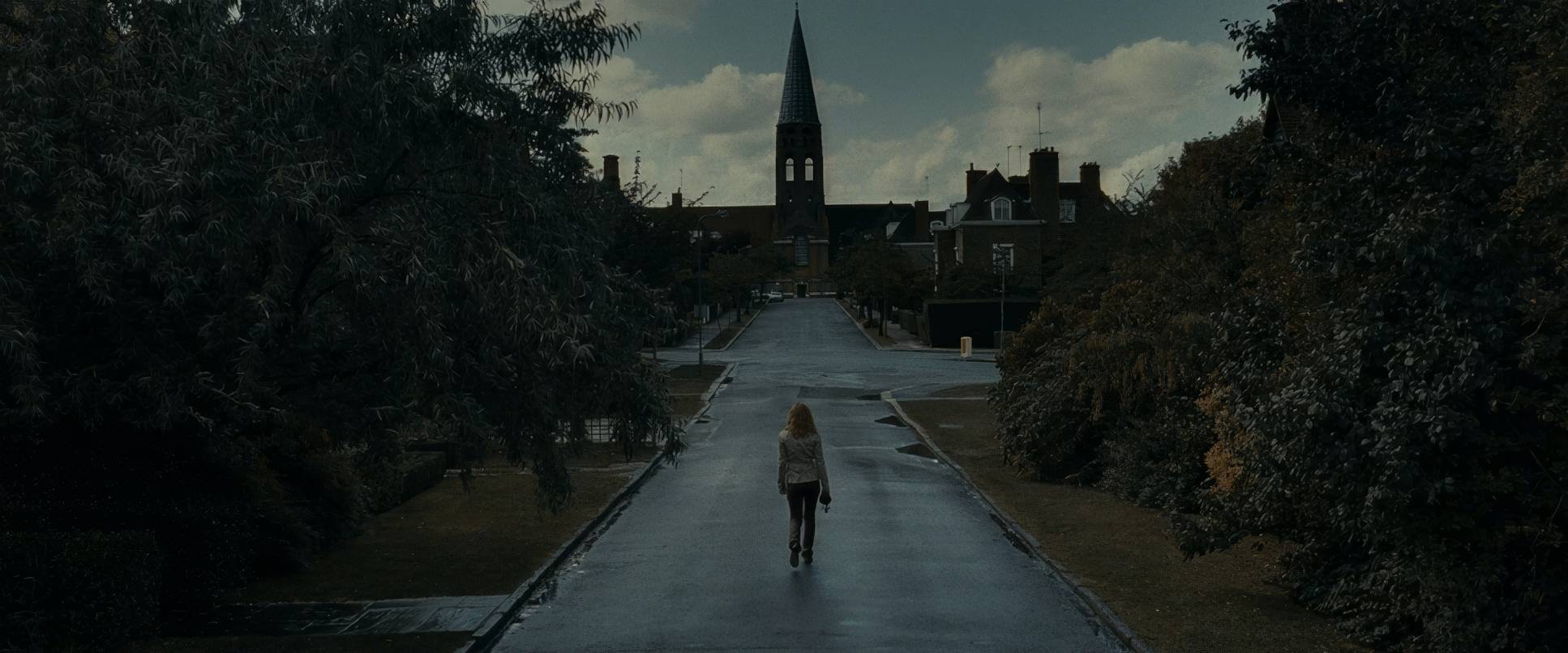
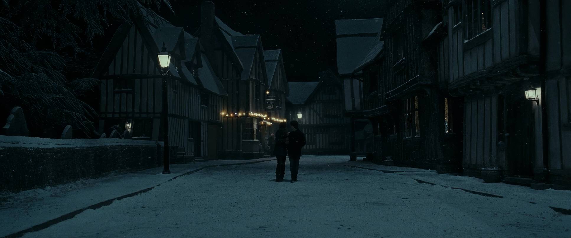
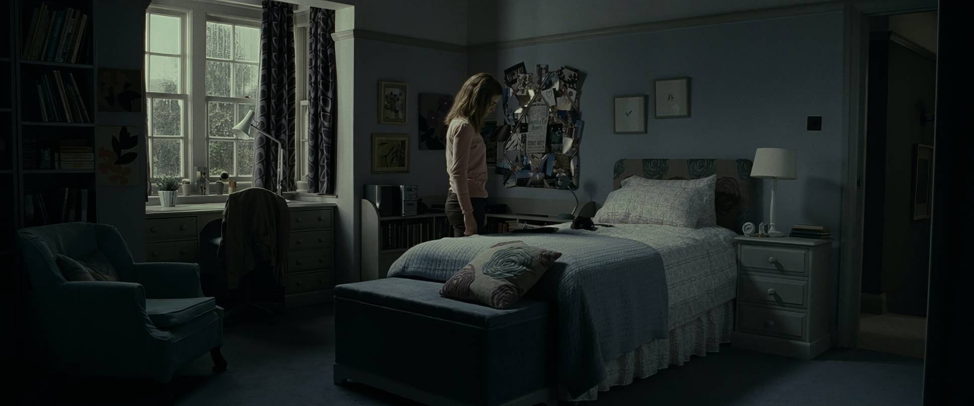
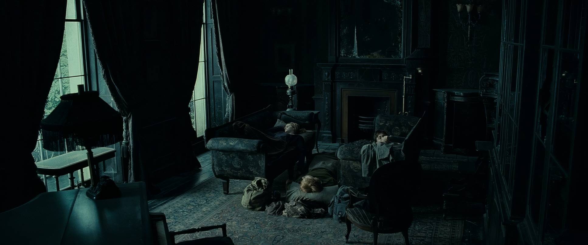
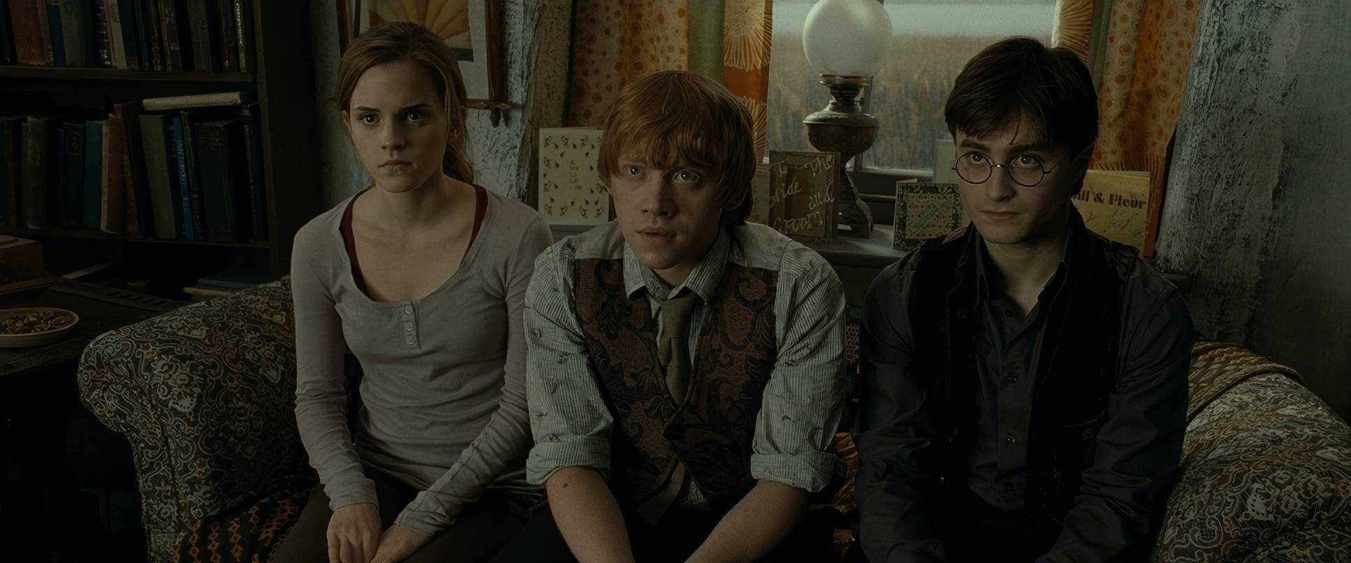
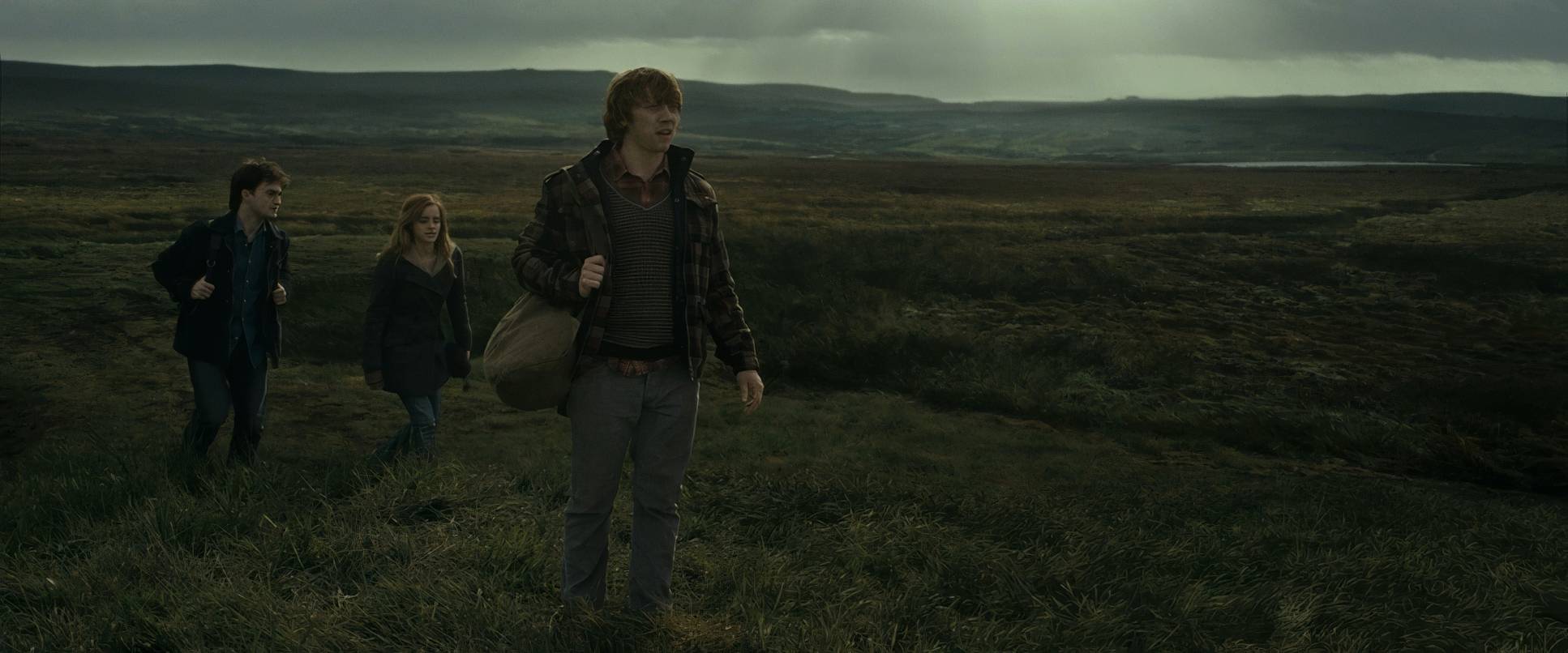
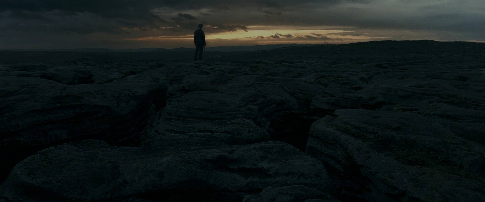
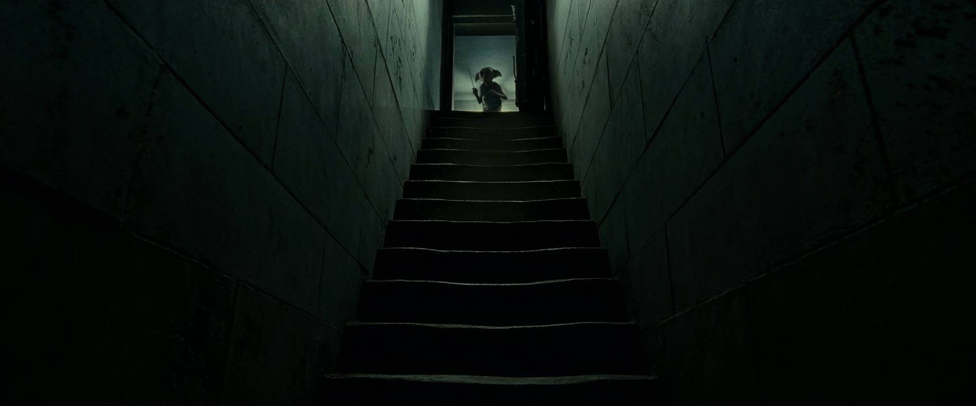
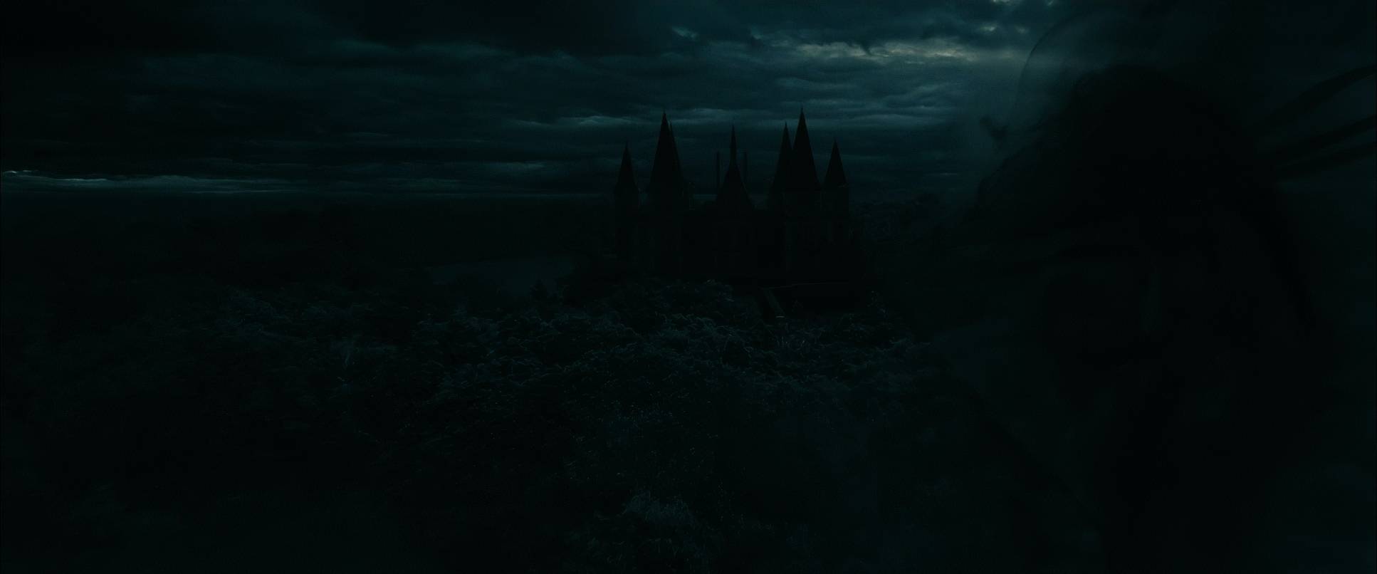
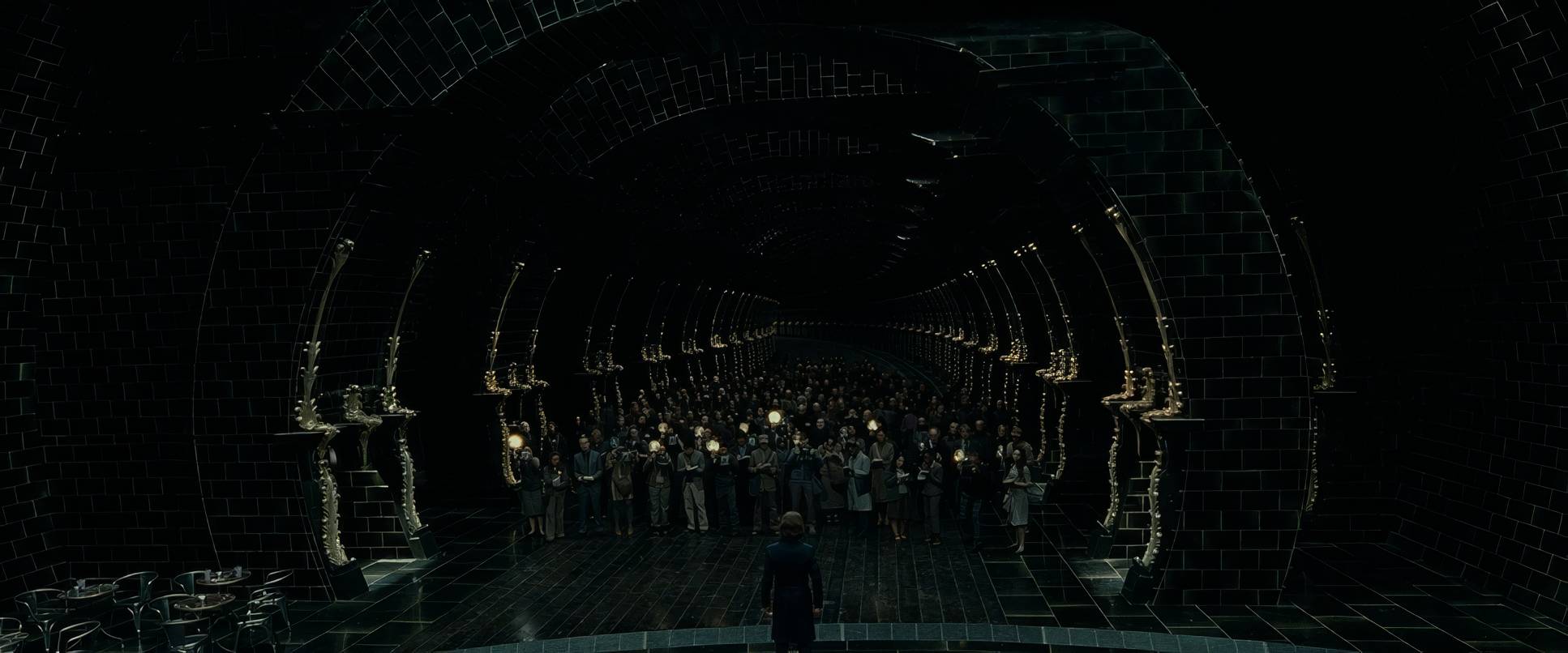
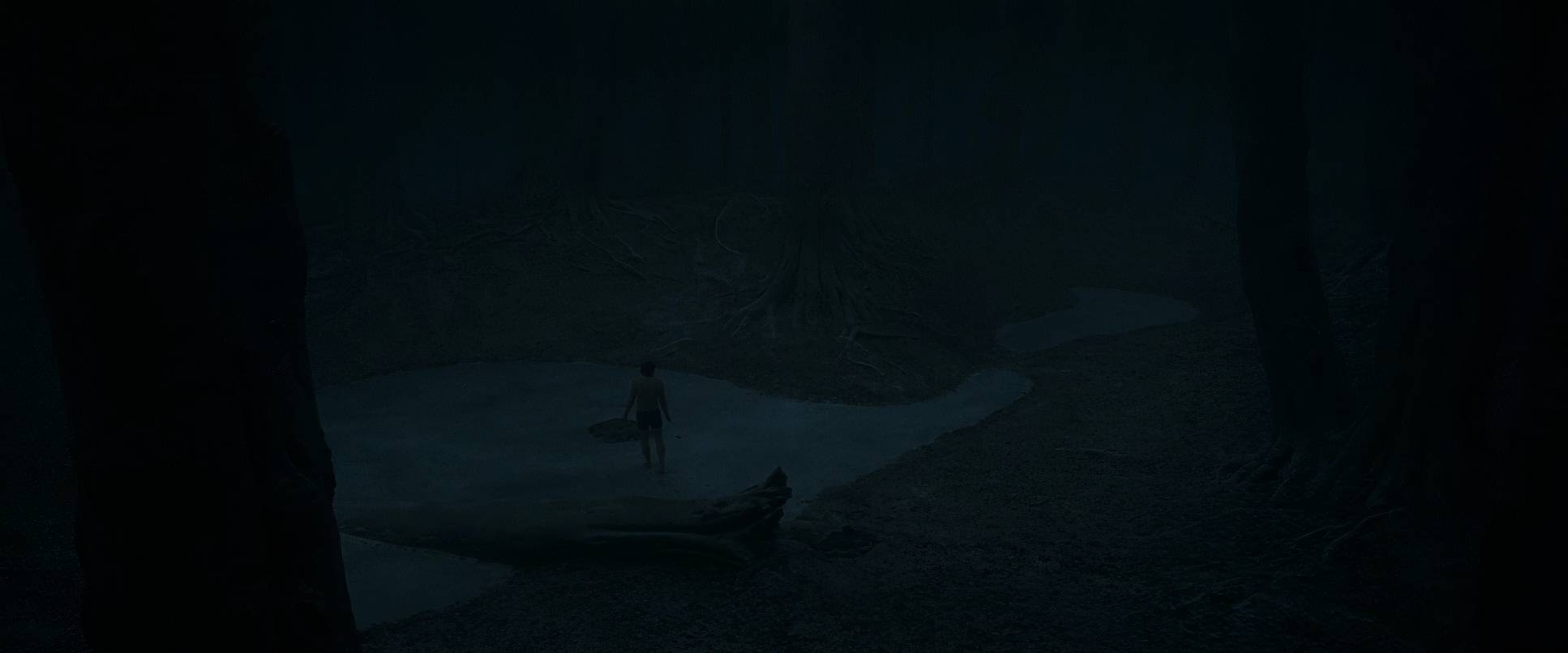
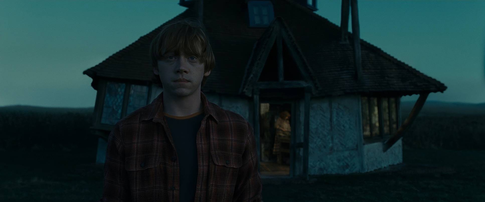
Serra’s compositions are a masterclass in visual isolation. We’ve lost the bustling corridors of Hogwarts, and in their place, we get these huge, empty frames where Harry, Ron, and Hermione look tiny. This use of negative space is a massive depth cue it visually hammers home how high the odds are stacked against them.
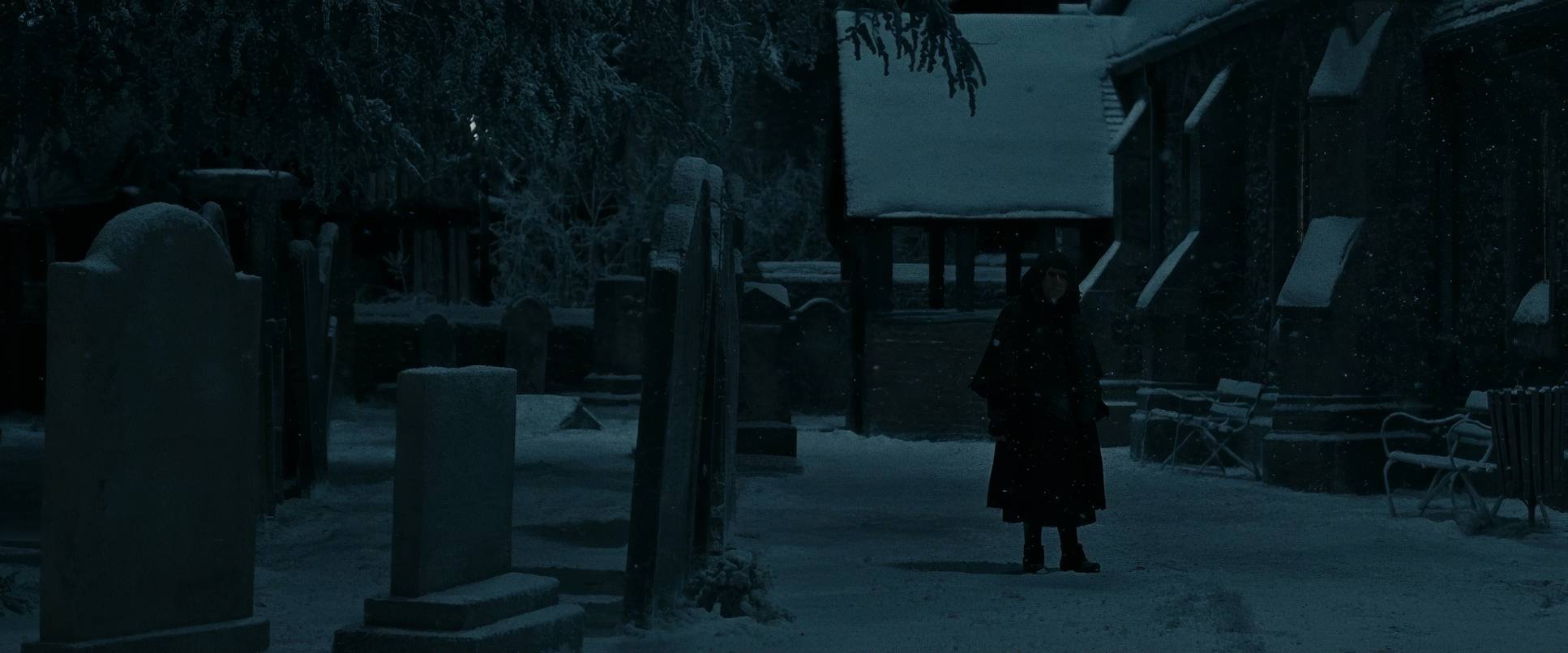
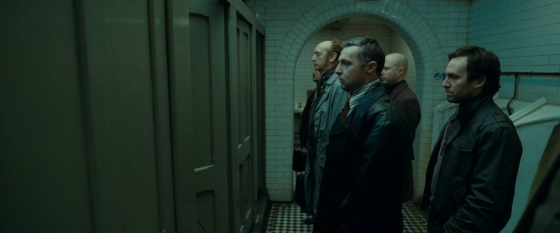
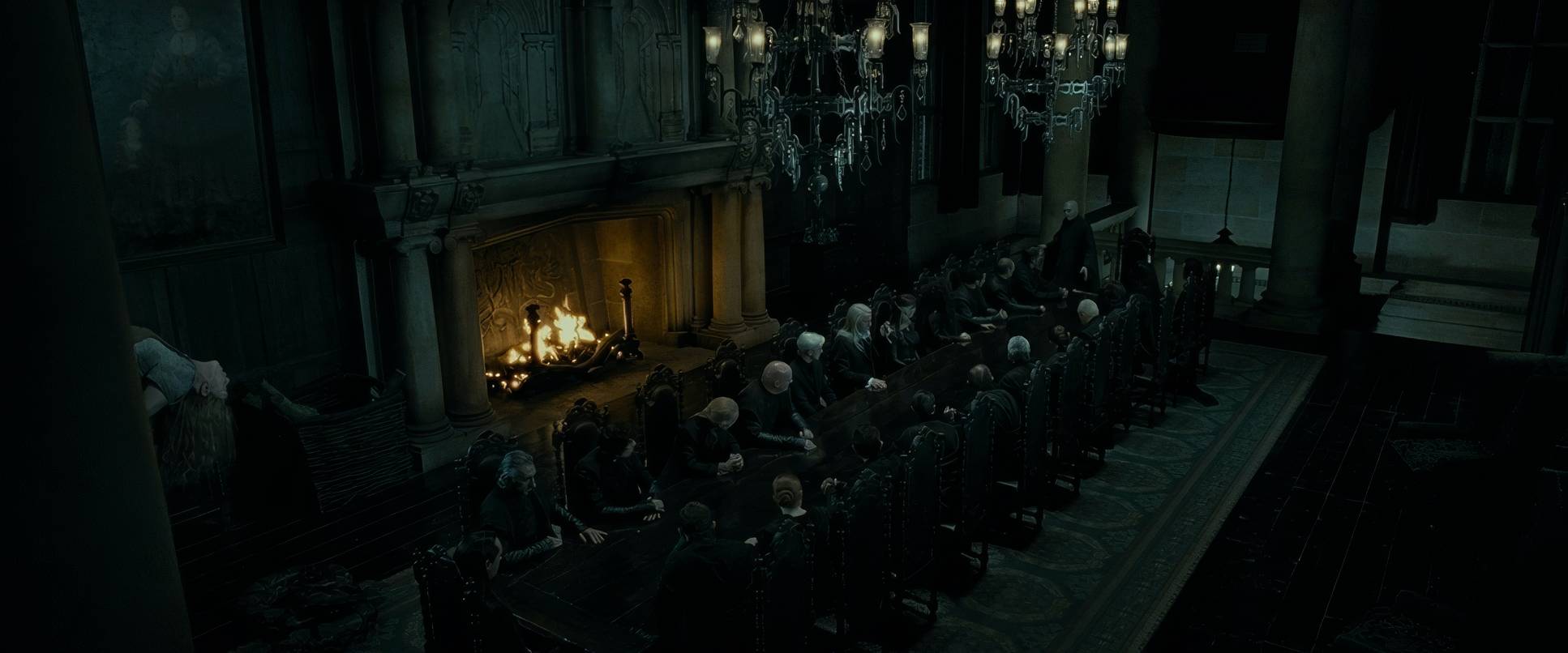
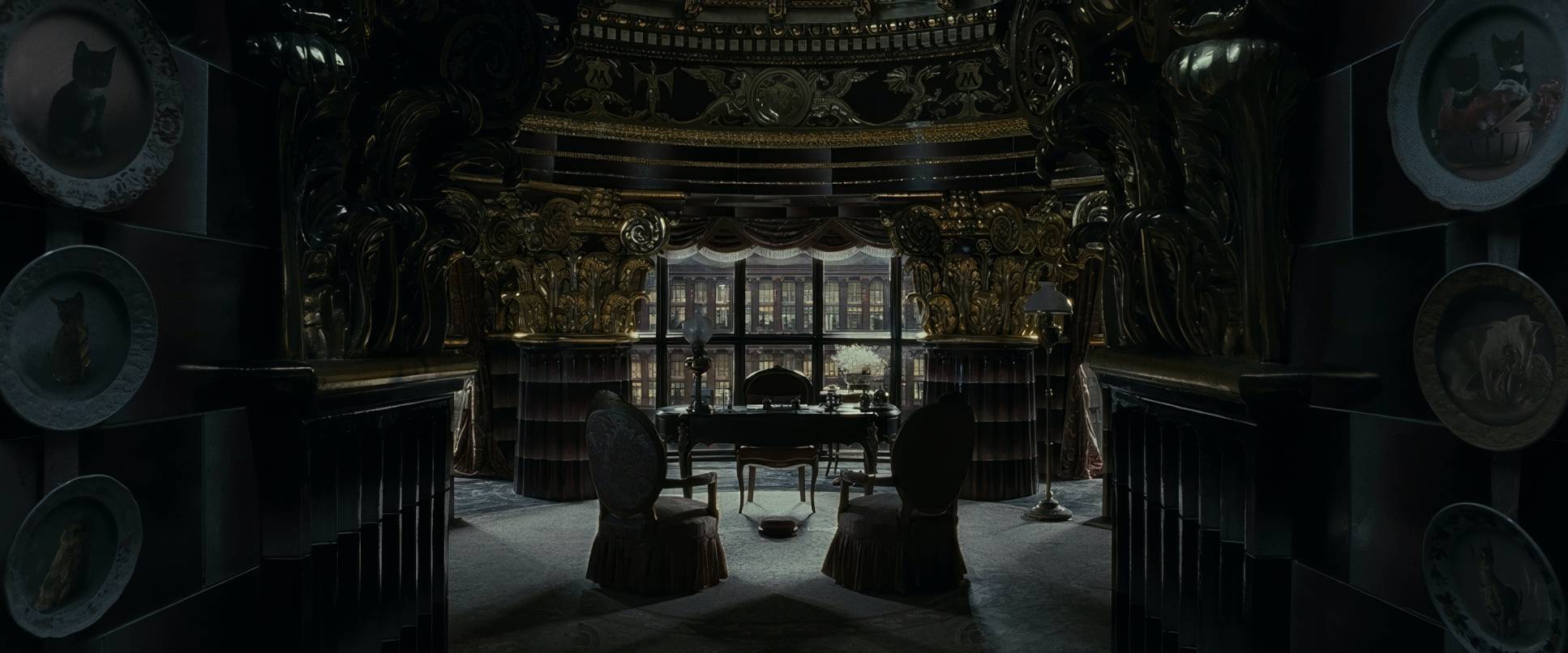
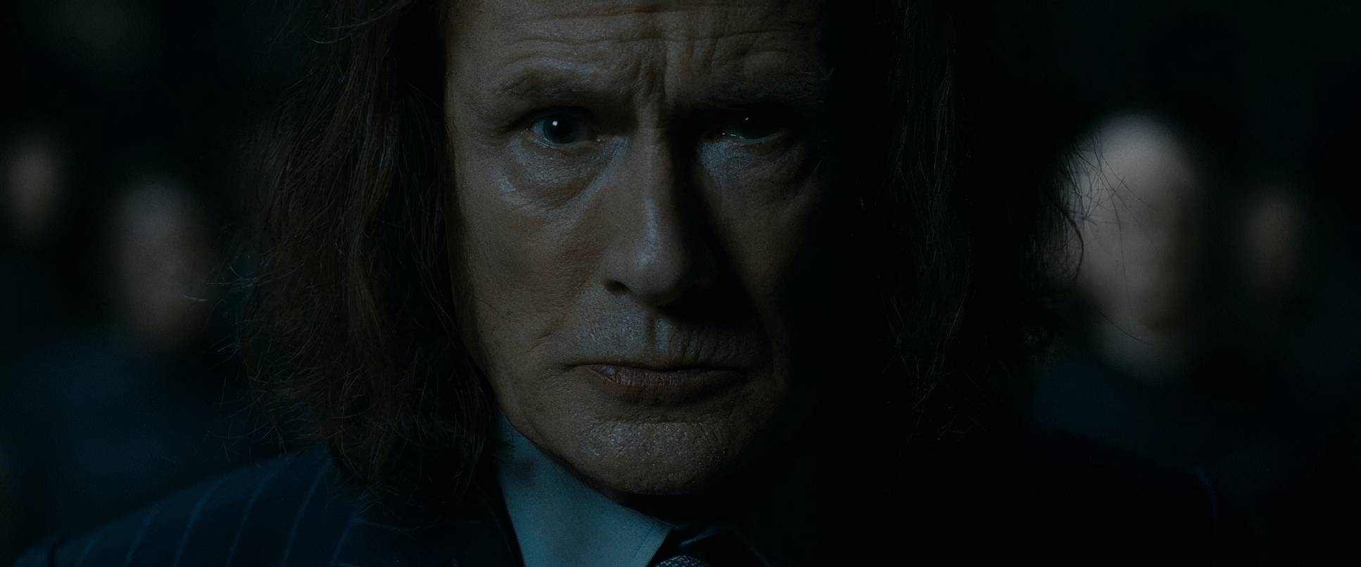
Then you have Godric’s Hollow. The way the gravestone scene is framed is just haunting. It’s beautiful, dark, and deeply reflective. Even when they head to the Ministry, the compositions shift to feel oppressive. Characters are trapped by harsh architectural lines, framed in tight mid-shots that make you feel the institutional dread of a corrupted system. These aren’t “hero shots”; they’re compositions of vulnerability. Everything is falling apart, and the framing lets you know it.
Lighting Style
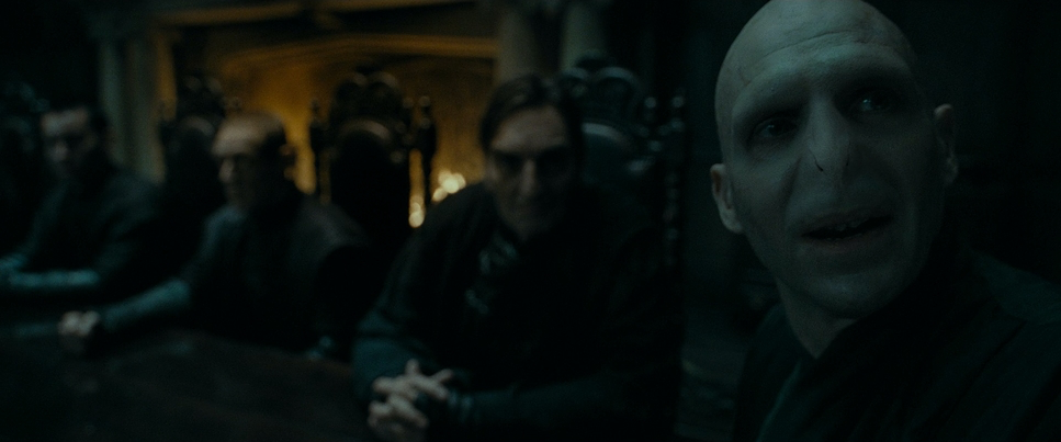
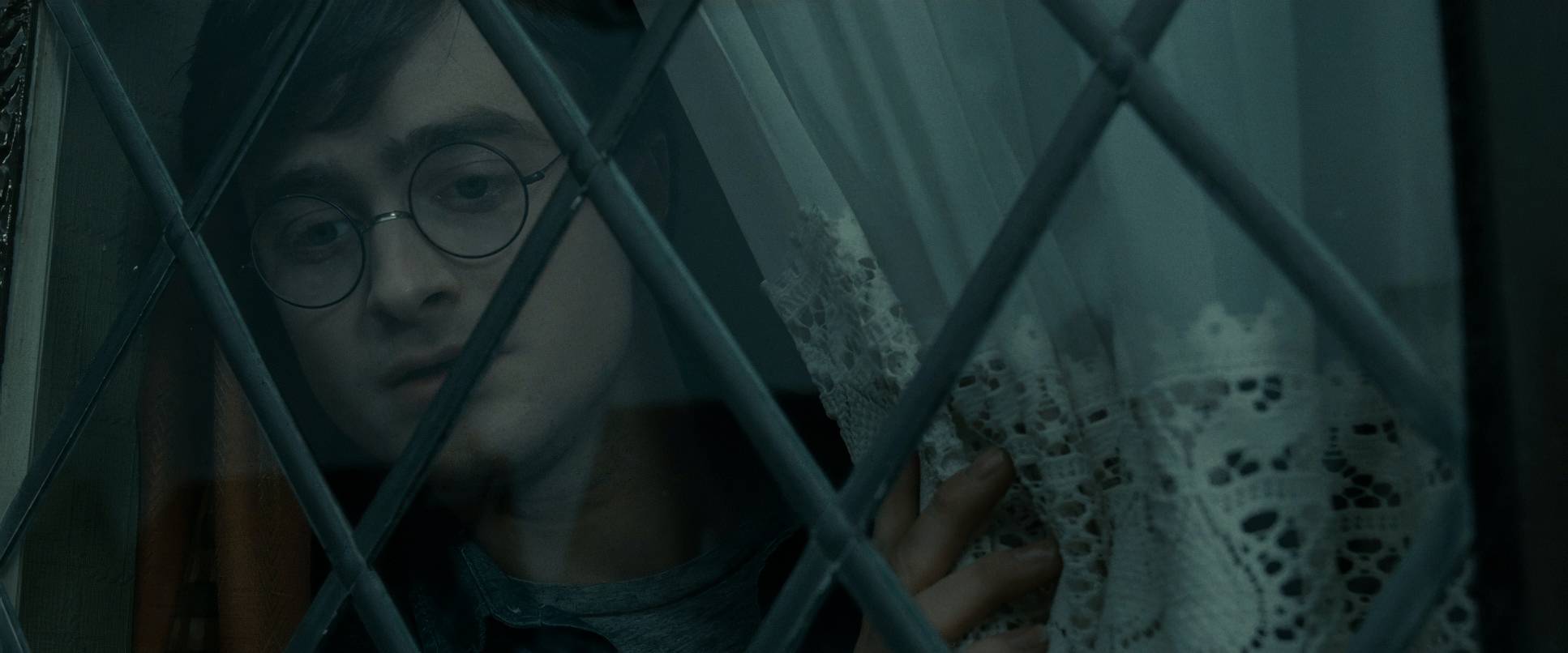
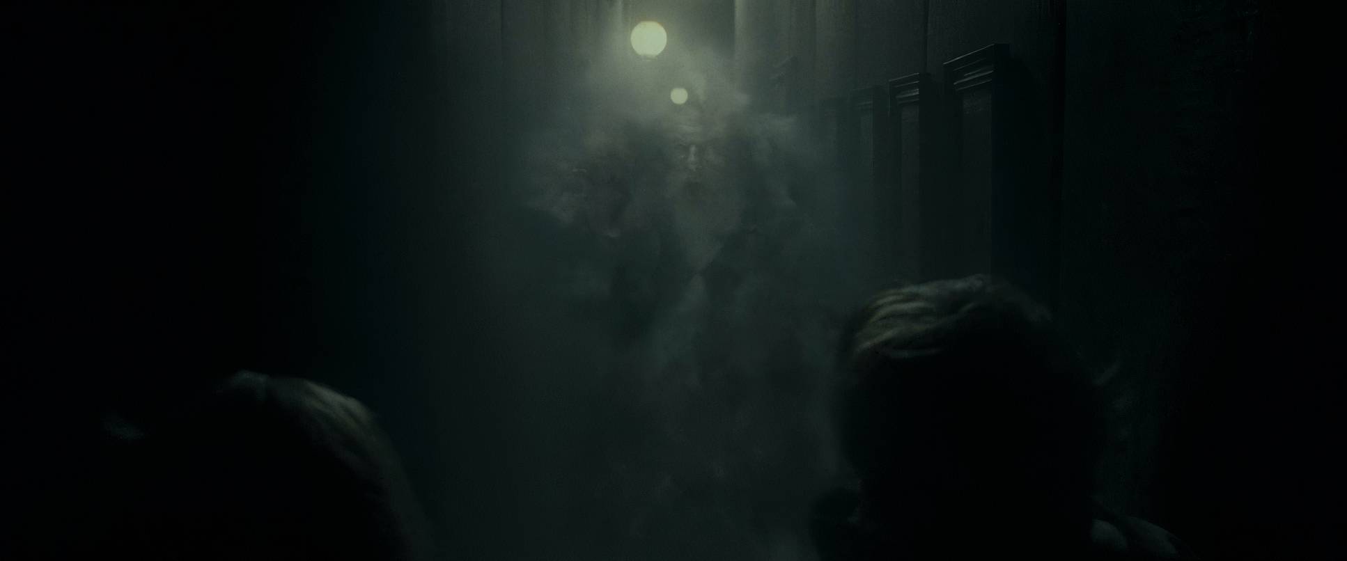
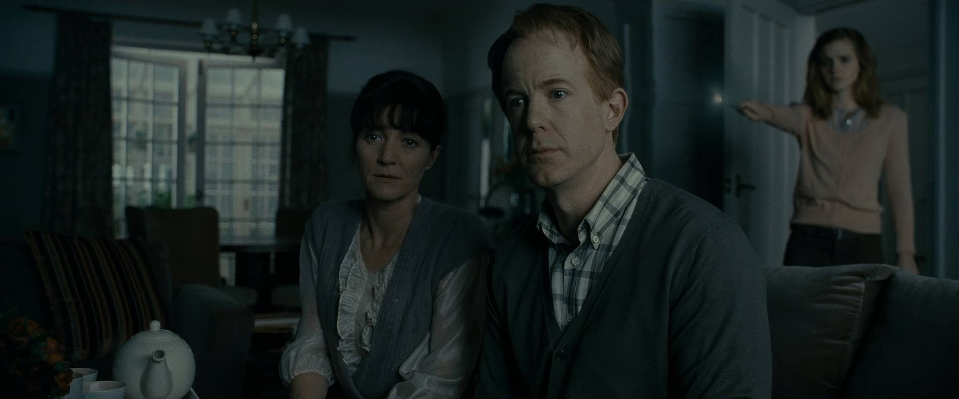
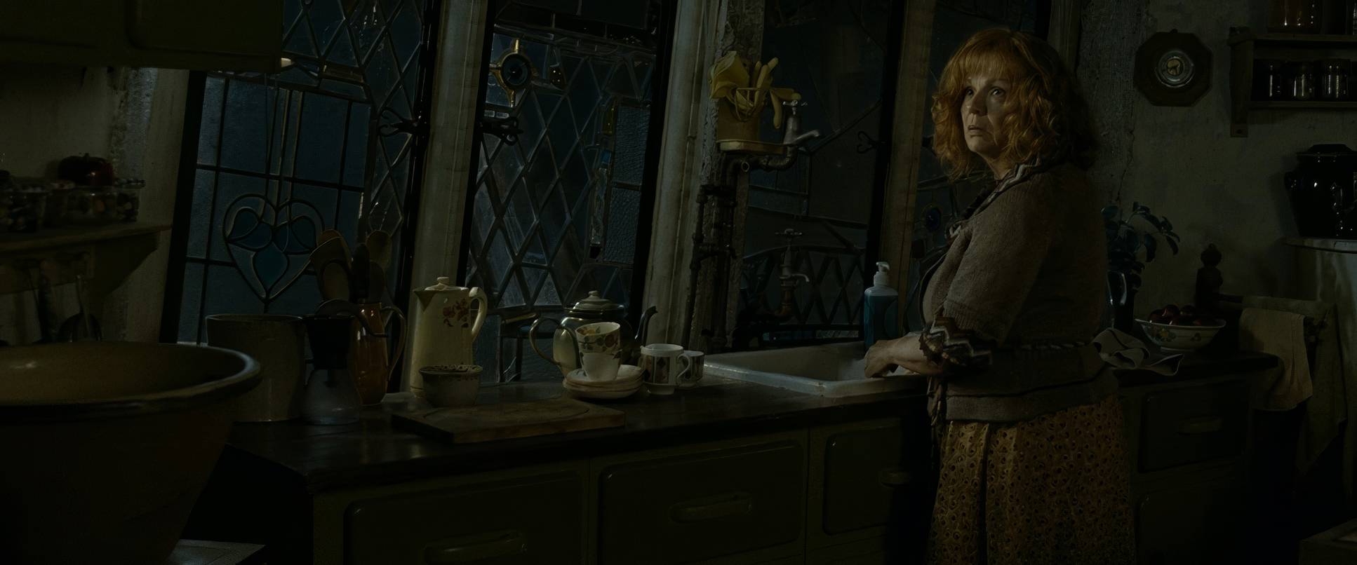
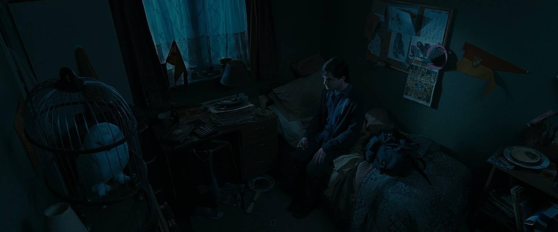
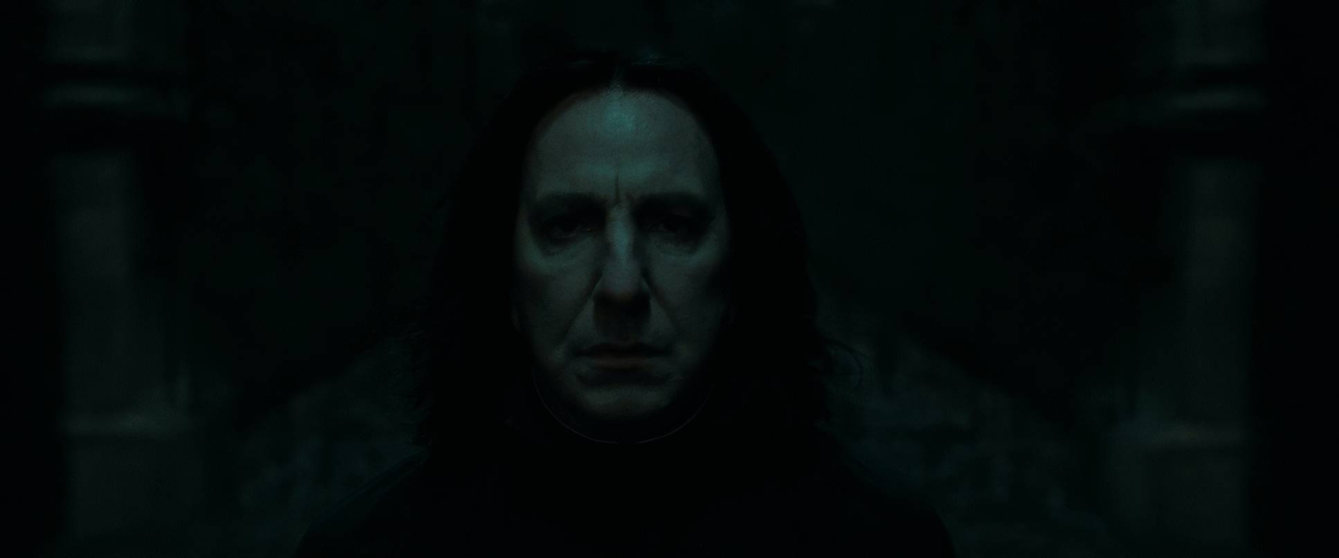
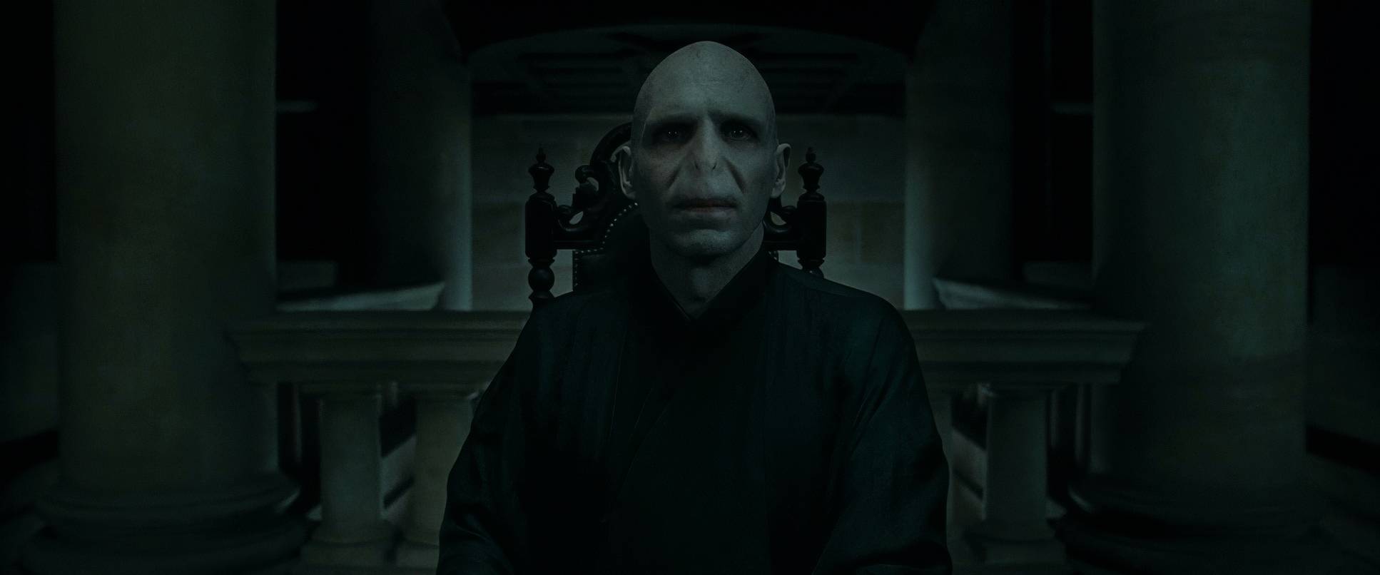
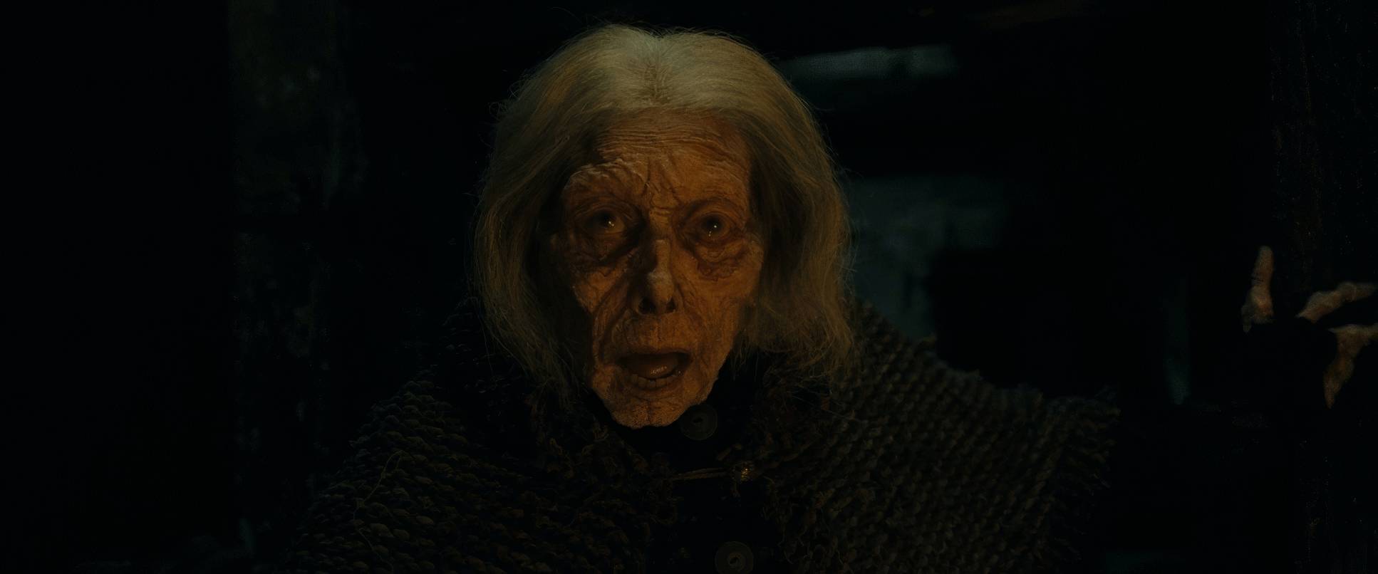
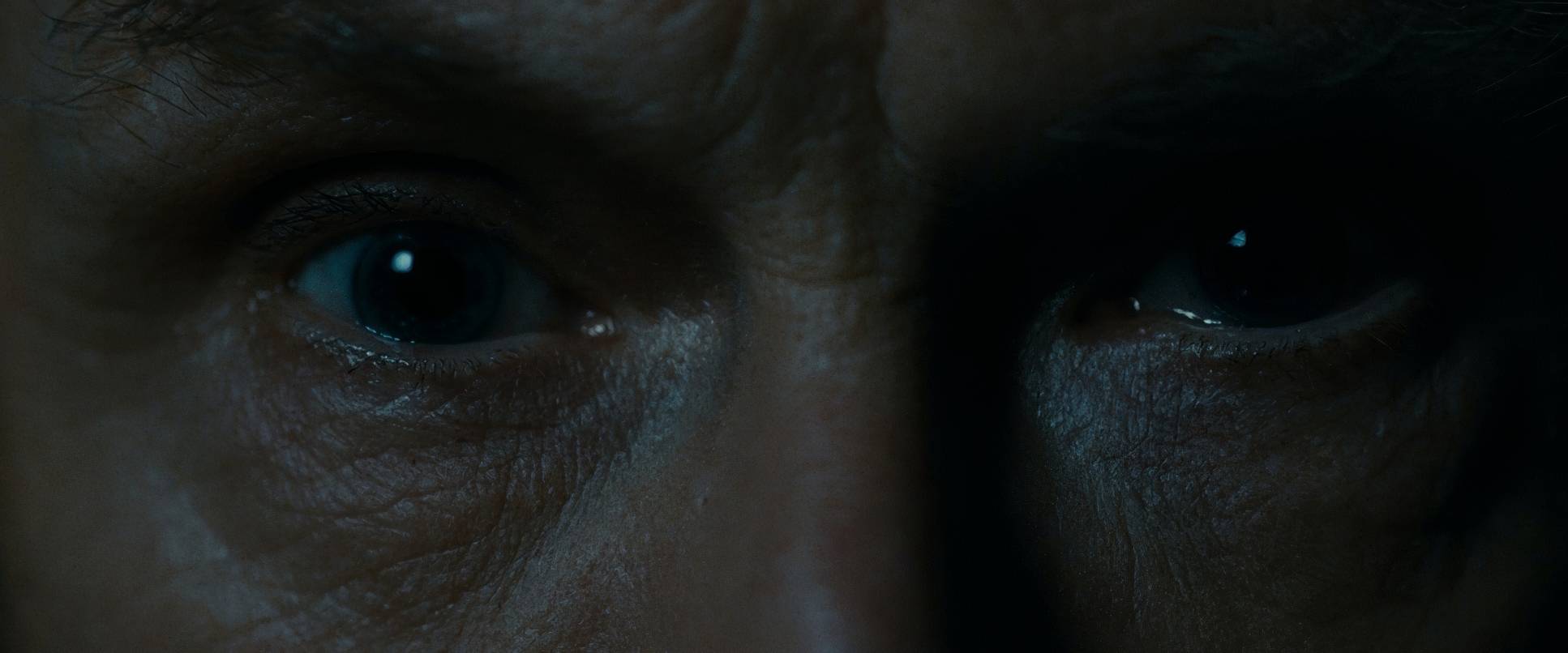
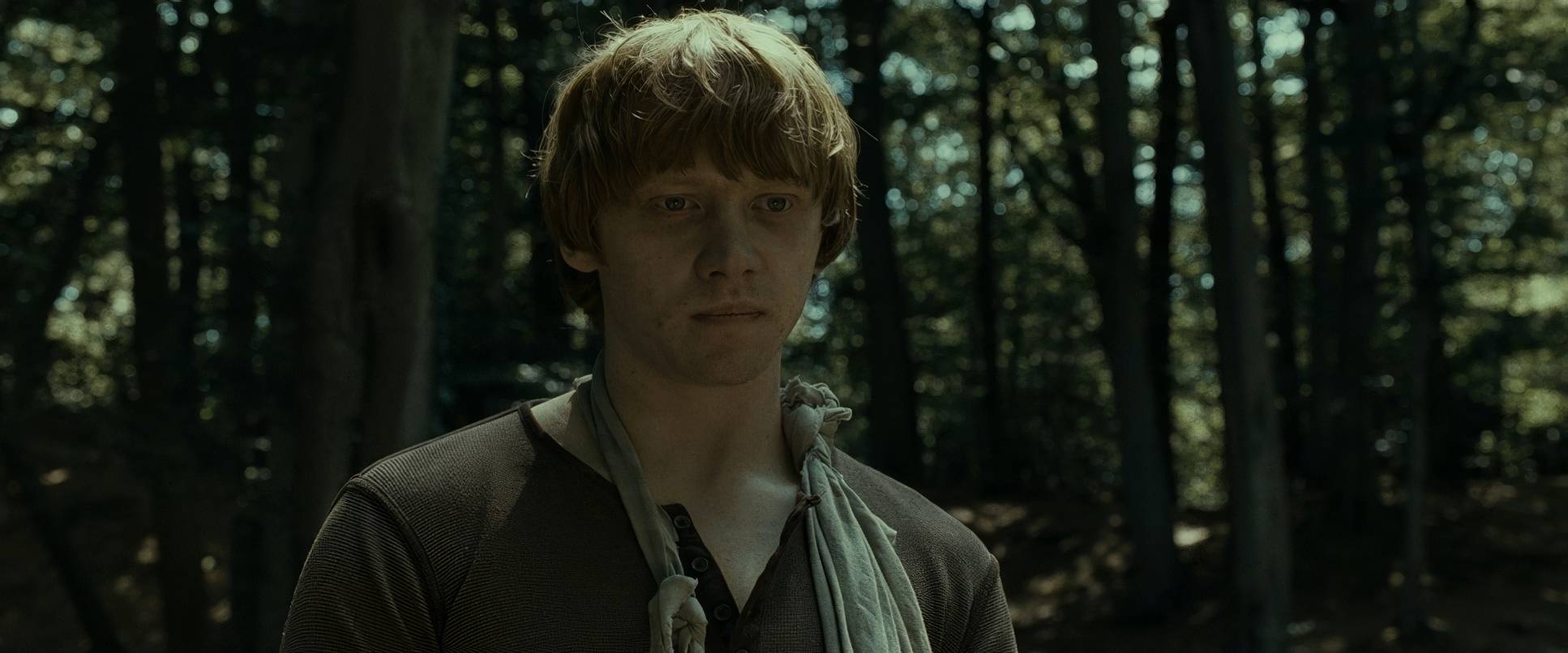
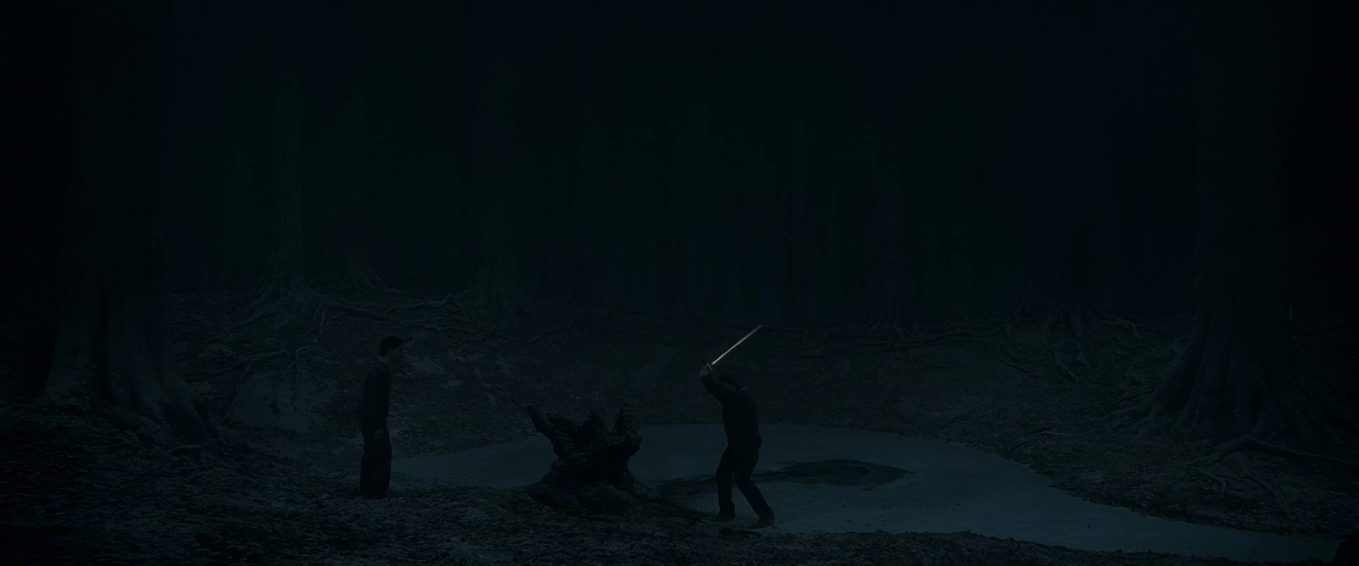
The lighting in Part 1 is probably its most controversial feature. It’s dark. Like, “is my monitor calibrated?” dark. Some people find it frustrating, but as a colorist, I’ll defend this choice to the end. This is low-key lighting pushed to its absolute limit. The world is darkening, and the film reflects that literally.
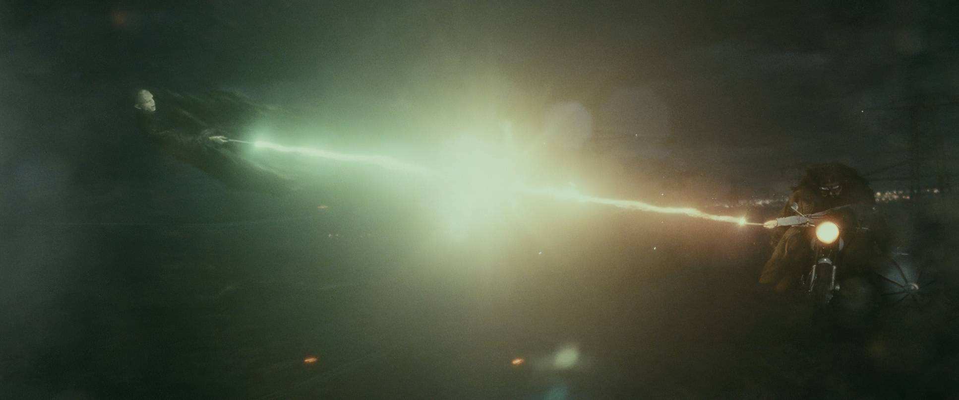
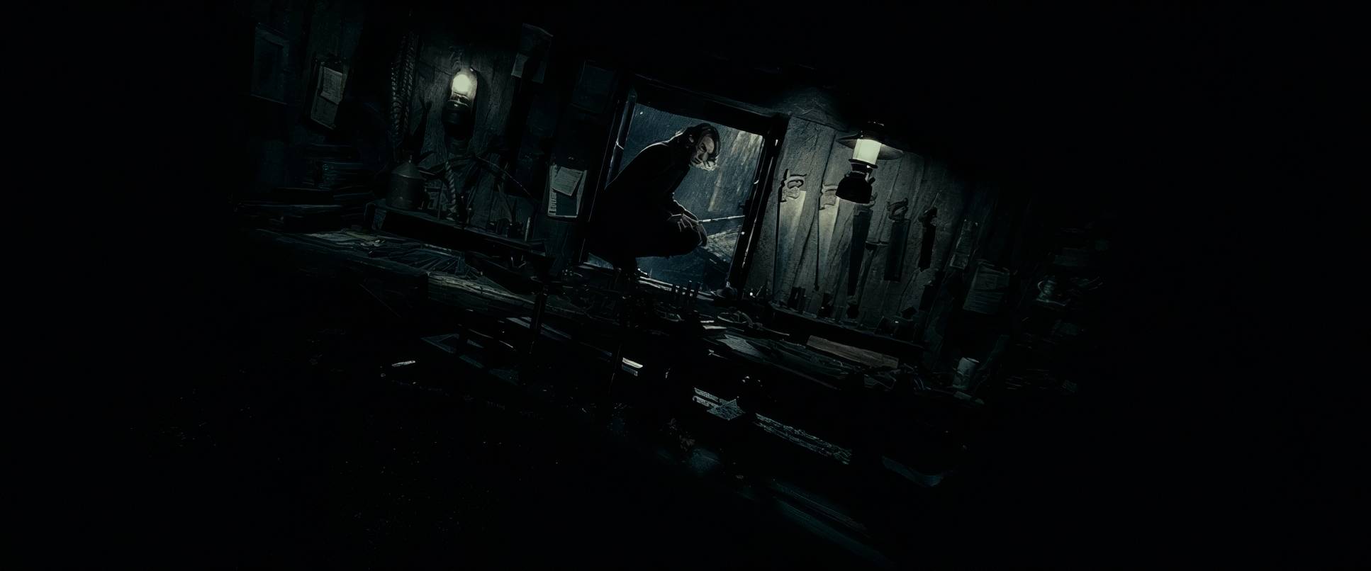
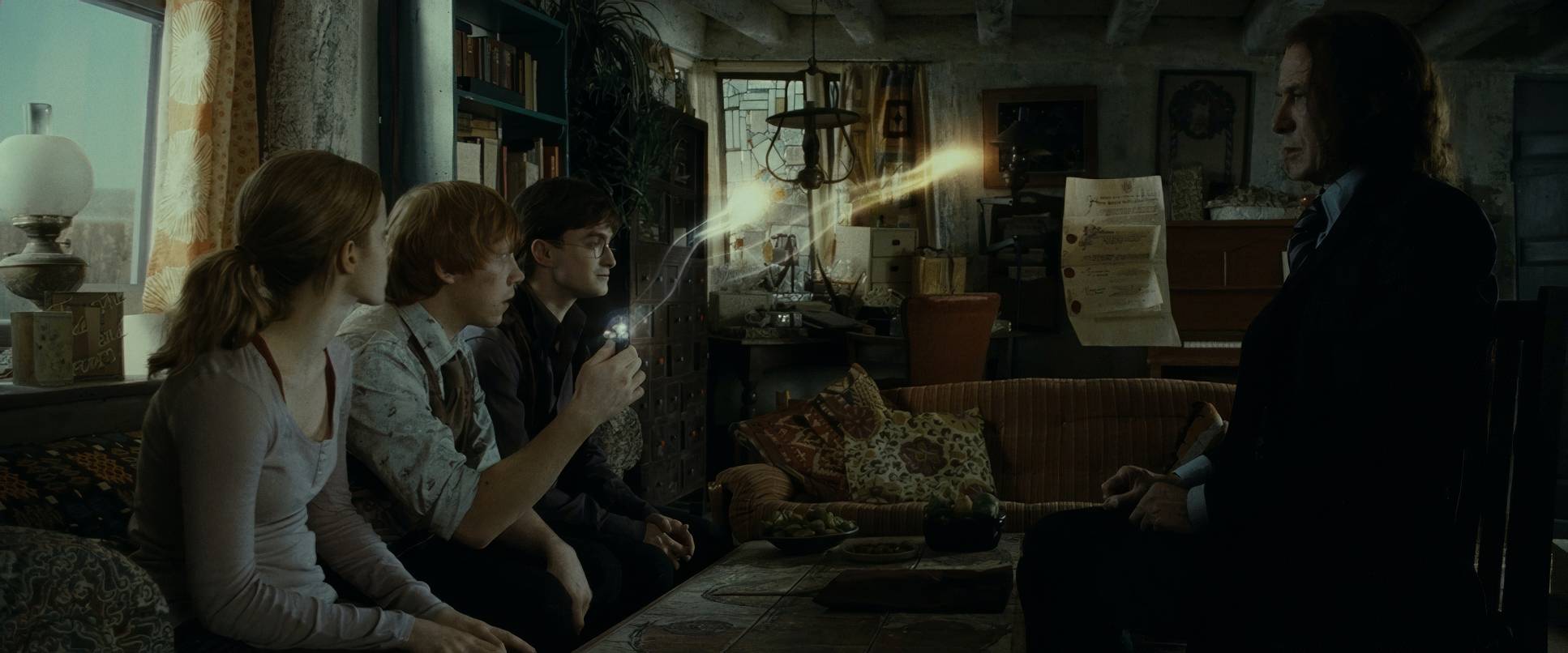
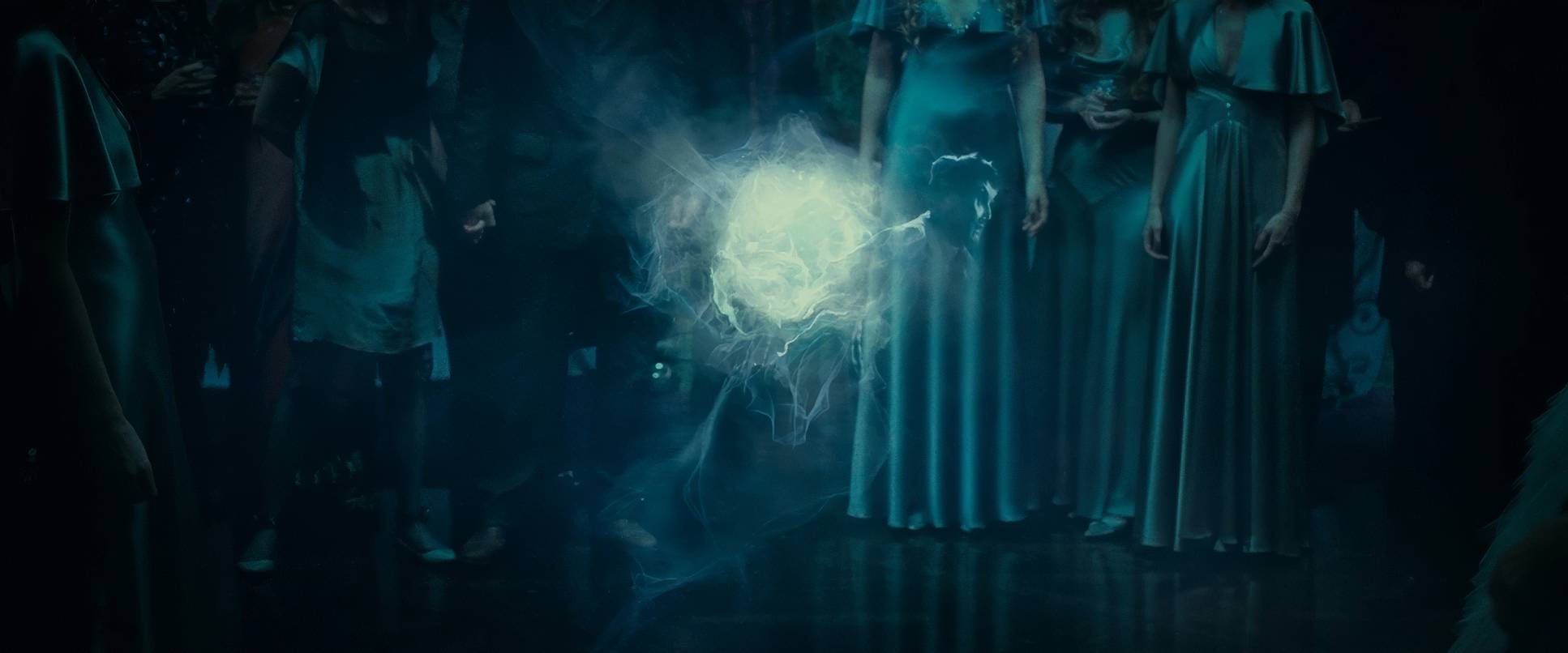
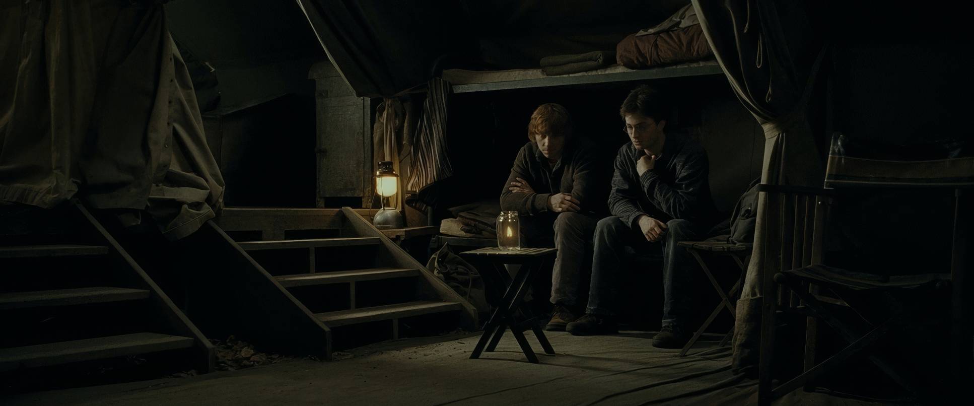
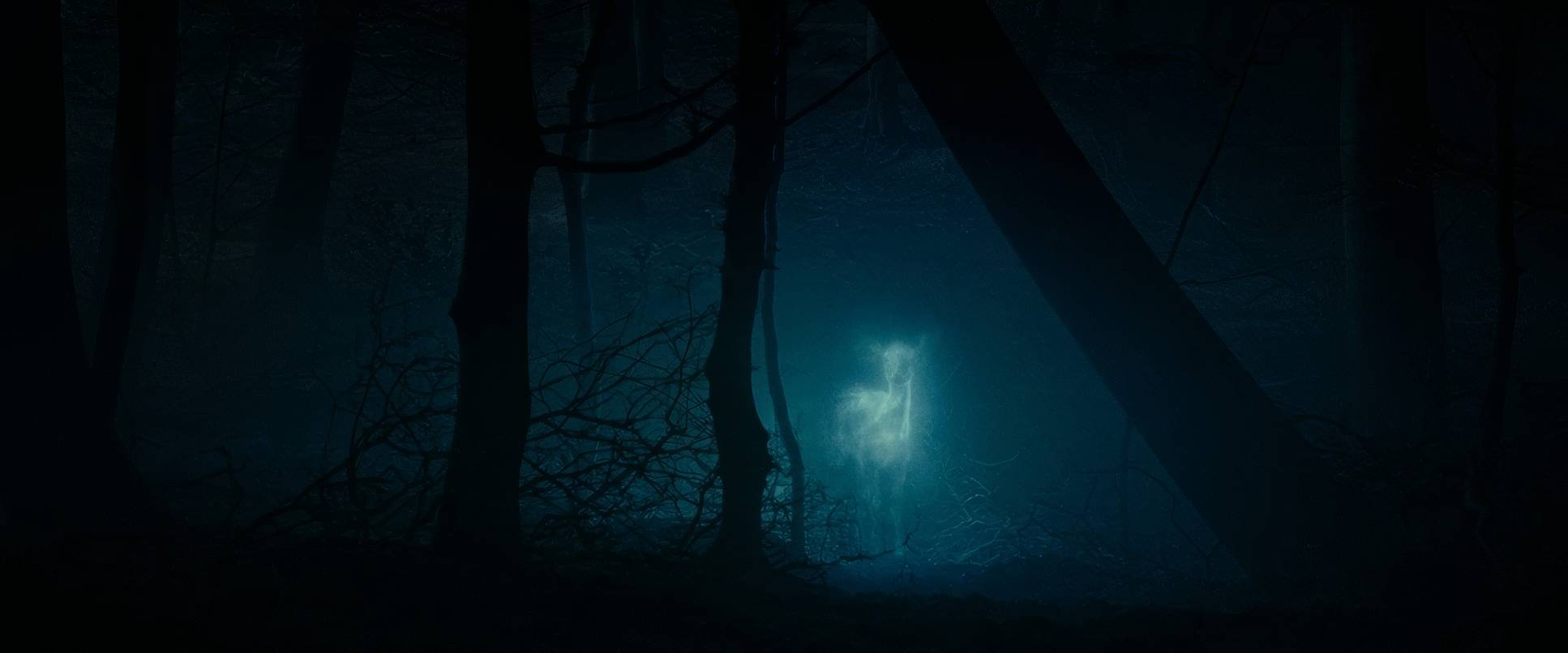
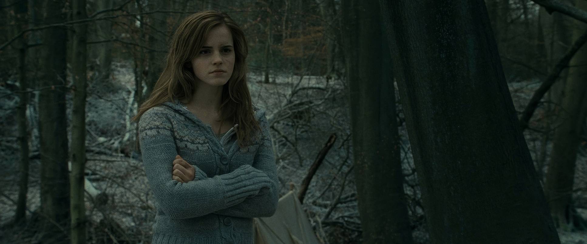
Most of the light is “motivated” meaning it comes from a single lantern or a small fire in the tent. This creates these tiny pockets of warmth surrounded by an ocean of cold, desaturated grays and blues. There’s almost no fill light, leaving faces half-obscured in shadow. It builds suspicion and reflects the internal struggle, especially when Ron starts to turn. It’s a bold dynamic range decision: Serra is intentionally pushing detail into the shadows to evoke mystery and fear. He’s making us lean in, just like the trio, trying to see what’s hiding in the gloom.
Lensing and Blocking
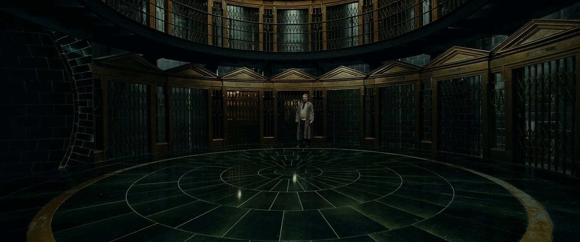
The lens choices here really do the heavy lifting for the film’s psychological weight. Serra uses wide lenses for those exterior shots to make the wilderness feel endless. It swallows the characters. You really feel that they are “without any support from anyone.”
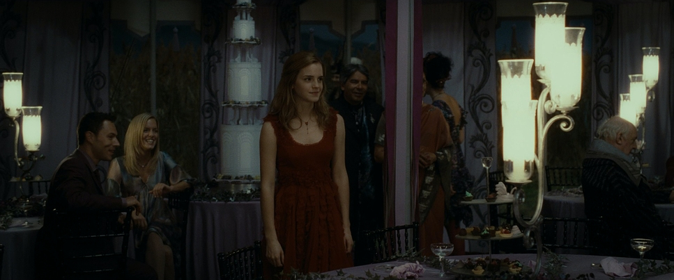
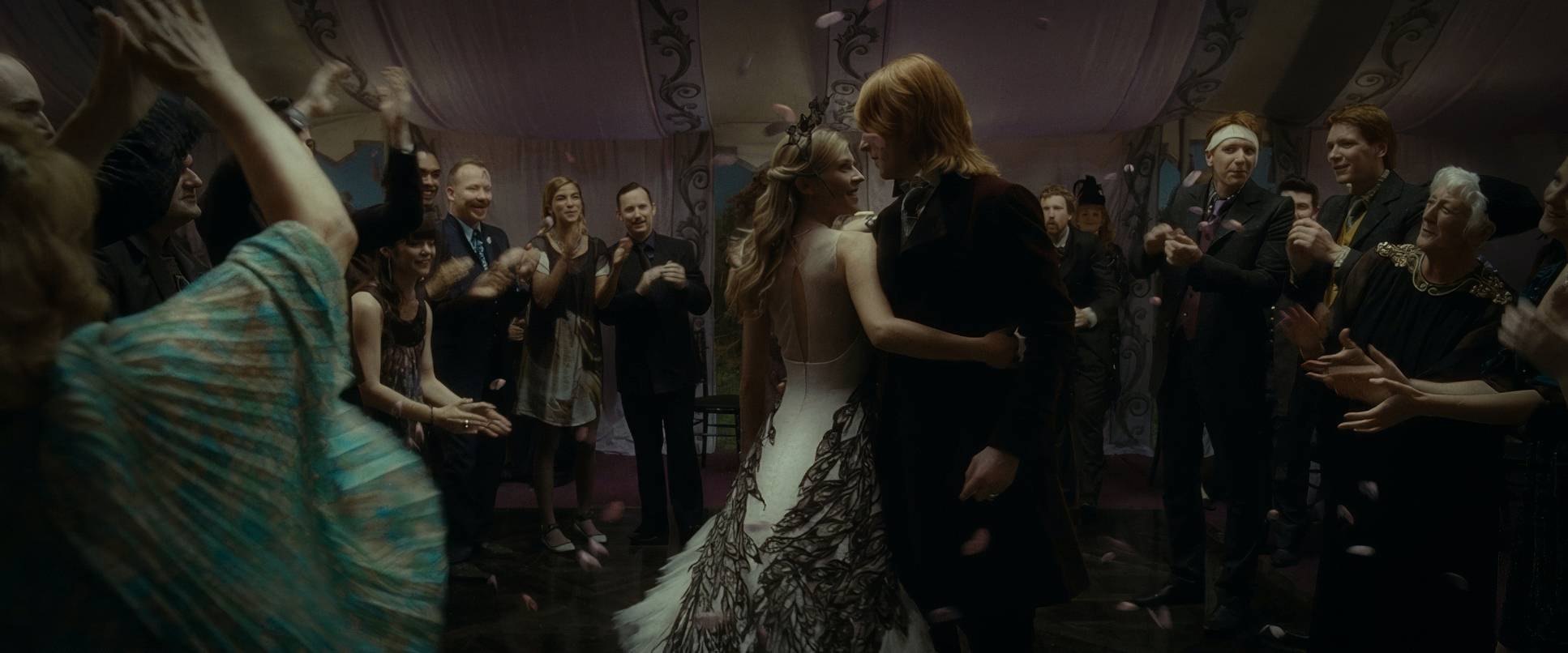
When things get tense, the lenses get longer. This compresses the space, making everything feel claustrophobic perfect for the interrogation at Malfoy Manor or the friction inside the tent. And let’s talk about the blocking. It’s masterful. Look at how often the characters are physically separated or pushed to the edges of the frame to show the growing emotional distance. Even that “Harry and Hermione dancing” scene which I personally love uses physical proximity and distance to tell a story that words couldn’t. It’s a beautifully choreographed moment that uses space to explore their platonic bond.
Color Grading Approach

This is my favorite part: the grade. People complain about it being “super dark,” but as a professional, I see an incredible amount of tonal sculpting. This isn’t just underexposed footage; it’s a sophisticated grade by Peter Doyle. He crunched the blacks to an inky depth that gives the film a physical weight. The mid-tones are pulled down, draining the life out of the environment so that only the highlights pierce through.
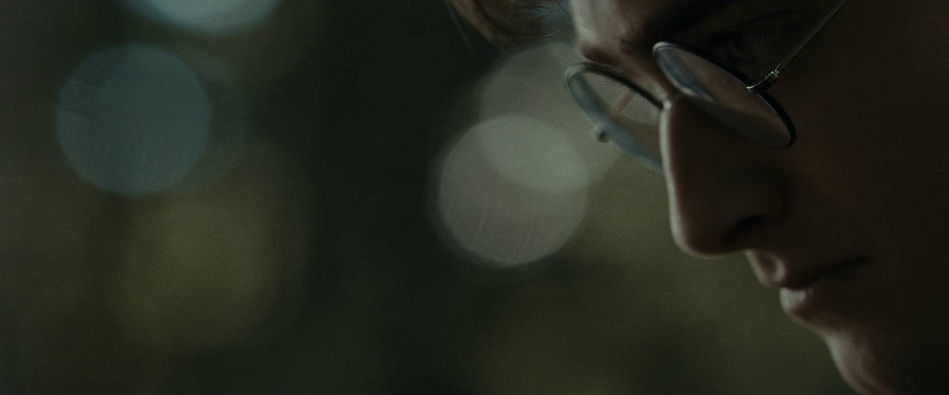
The hue separation is aggressive. All the warmth has been sucked out of the world, replaced by teals, cold blues, and earthy grays. Even the greens look sickly. When you do see warmth like a flickering candle it feels precious and fleeting. Doyle used a soft highlight roll-off that gives the whole thing a print-film sensibility. Even the digital pick-up shots feel organic, like 35mm film. It’s not about “seeing everything”; it’s about mood. The absence of light is a character in itself.
Technical Aspects & Tools
| Genre | Adventure, Fantasy |
| Director | David Yates |
| Cinematographer | Eduardo Serra |
| Production Designer | Stuart Craig |
| Costume Designer | Jany Temime |
| Editor | Mark Day |
| Colorist | Peter Doyle |
| Time Period | 1990s |
| Color | Cool, Desaturated |
| Aspect Ratio | 2.39 – Anamorphic, Super 35 |
| Format | Film – 35mm |
| Lighting | Soft light, Low contrast |
| Lighting Type | Daylight, Overcast |
| Story Location | United Kingdom > England |
| Filming Location | Europe > United Kingdom |
| Camera | Arricam LT, Arricam ST, Panavision Cameras |
| Lens | Cooke S4/ i, Panavision Lenses |
| Film Stock / Resolution | 5205/7205 Vision 2 250D, 5219/7219 Vision 3 500T |
Achieving this look required a mix of classic film and what was then “new” digital tech. They primarily shot on ARRIFLEX 435 and 235 cameras 35mm film is what gives the movie that gorgeous, organic texture. However, they also utilized the ARRI Alexa (which was brand new at the time) for certain low-light sequences. Matching that early digital sensor to the 35mm stock in the grade is a feat in itself, and it’s a testament to Peter Doyle’s skill.
The lenses were mostly Panavision anamorphics. Anamorphic glass is the reason for those beautiful oval bokeh shapes and the characteristic flares. It gives the film a widescreen, cinematic “breathe” that spherical lenses just can’t replicate. It adds a layer of elegant grit to the sweeping landscapes. It’s a hybrid approach that used the best tools available to serve a very specific, dark visual language.
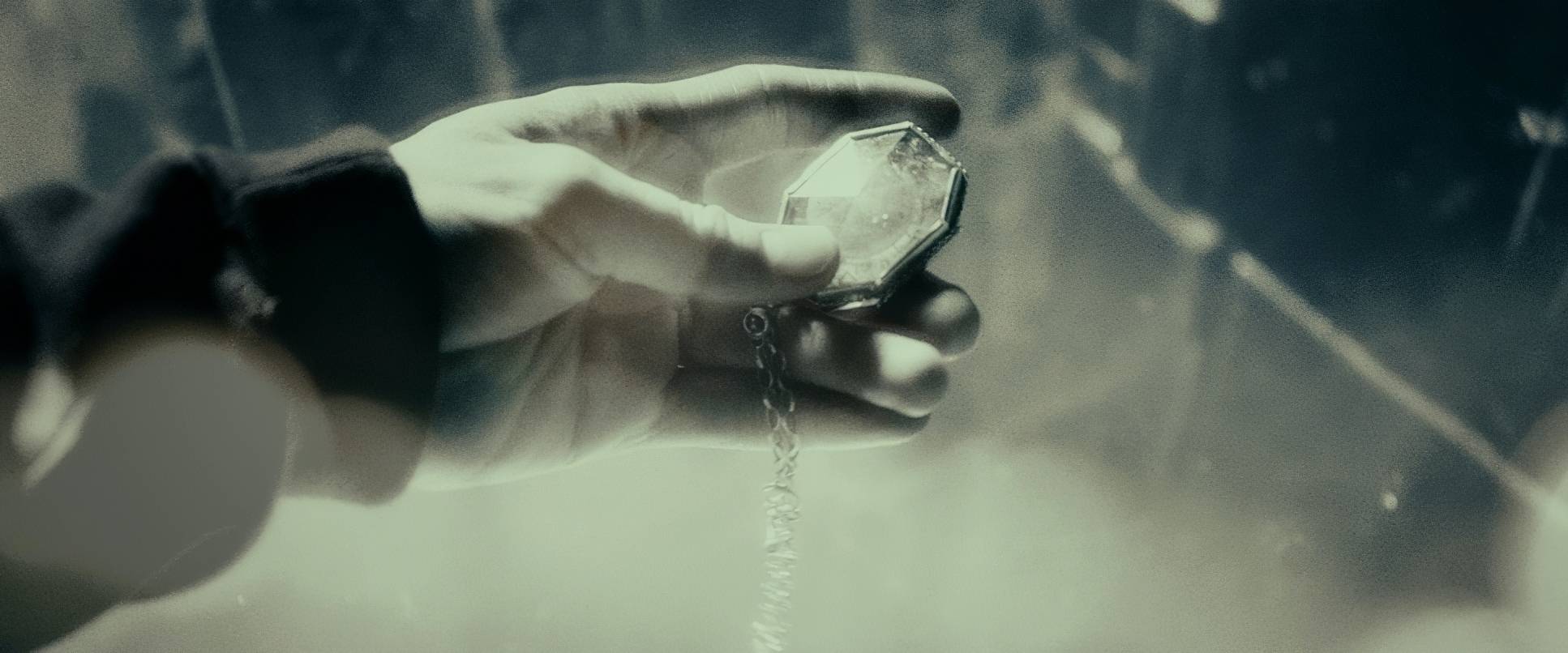
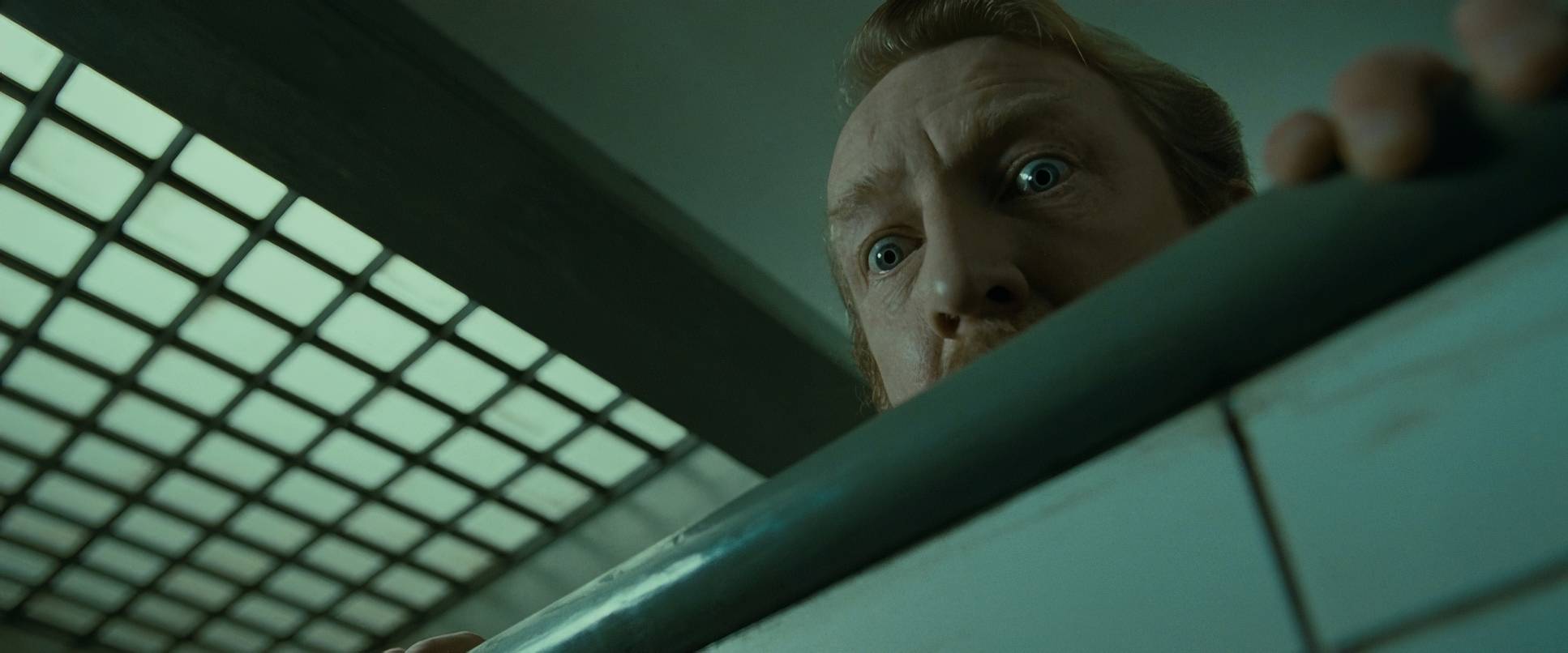
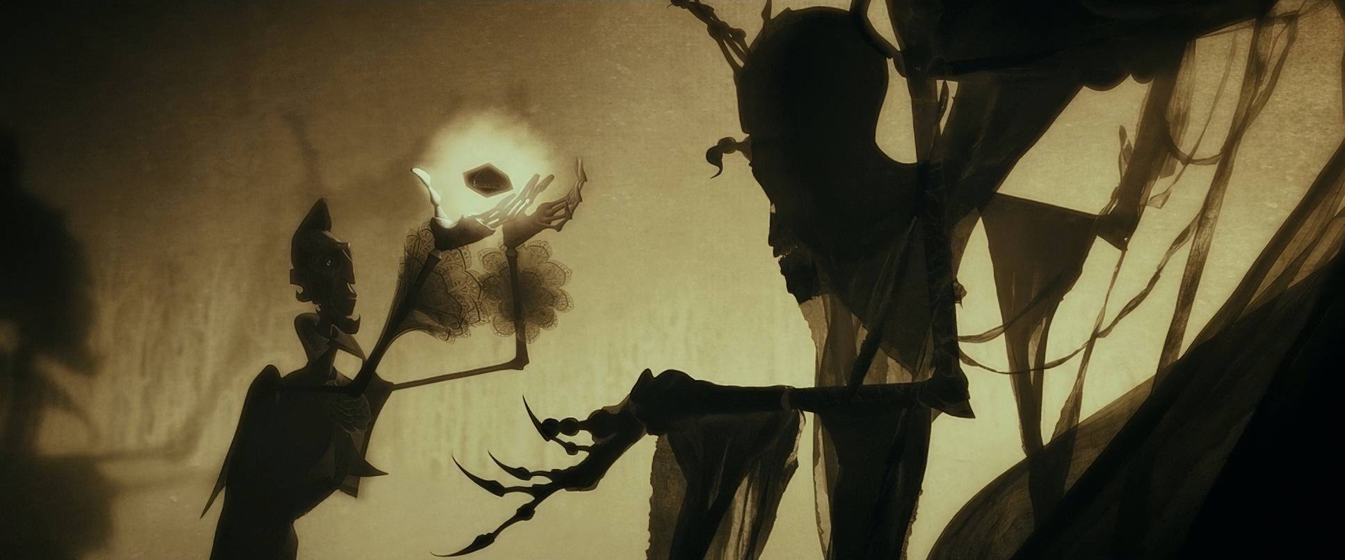
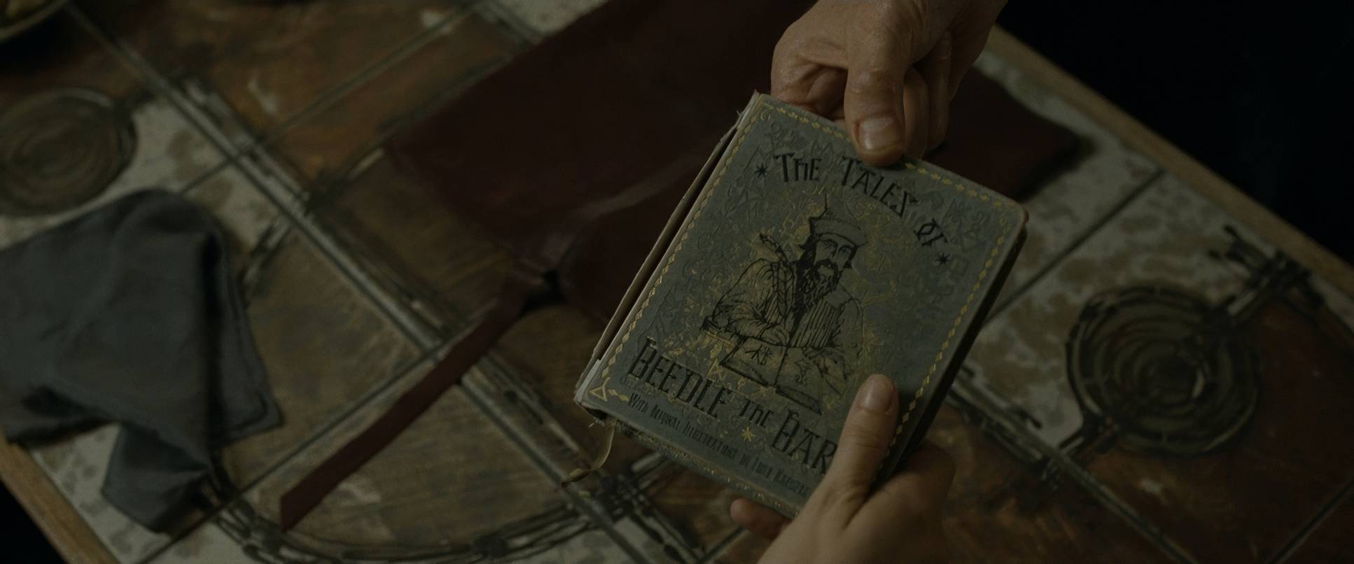
Harry Potter and the Deathly Hallows: Part 1 (2010) Film Stills
A curated reference archive of cinematography stills from HARRY POTTER AND THE DEATHLY HALLOWS: PART 1 (2010). Study the lighting, color grading, and composition.


- Also read: ZODIAC (2007) – CINEMATOGRAPHY ANALYSIS
- Also read: ARGO (2012) – CINEMATOGRAPHY ANALYSIS
Browse Our Cinematography Analysis Glossary
Explore directors, cinematographers, cameras, lenses, lighting styles, genres, and the visual techniques that shape iconic films.
Explore Glossary →