As a colorist, I spend most of my waking hours in a dark room staring at high-end displays, tweaking curves, and obsessed with the “emotional logic” of an image. We often talk about color science and DCTLs, but sometimes a film comes along that reminds you that the best tools we have are composition and contrast. Masaki Kobayashi’s 1962 masterpiece, Harakiri, is exactly that kind of film.
It’s a masterclass in visual storytelling. The story follows Tsugumo Hanchiro, a grizzled veteran exposing the hypocrisy of the samurai code, but the way it’s told is what keeps me up at night. From my vantage point in the grading suite, analyzing how light hits a face or how a camera move dictates the audience’s heartbeat, Harakiri isn’t just a movie. It is a meticulously crafted visual argument—a slow burn that leverages black and white cinematography to create something terrifyingly tense.
About the Cinematographer
The visual architect behind this stark beauty is Yoshio Miyajima. He was a frequent collaborator with Kobayashi, and frankly, he doesn’t get enough credit compared to some of his contemporaries. His work here (and on Kwaidan) shows a complete mastery of the monochrome format.
Miyajima wasn’t just capturing events; he was sculpting atmosphere. To me, a great cinematographer understands the psychology of luminance—where to put the eye and where to hide the truth in the shadows. Miyajima was a virtuoso at this. He managed to create a world that feels visually rich and immersive using a palette restricted entirely to greyscale. That is something I constantly study when I’m trying to create depth in a flat digital image.
Inspiration Behind the Cinematography
Harakiri acts as an anti-samurai film. It critiques the brutal, repressive Tokugawa Shogunate, and that critical stance is baked right into the cinematography. You don’t see the romanticized, golden-hour warrior culture here. Miyajima’s camera observes the samurai with a cold, almost clinical detachment. It emphasizes the suffocating formality of their lives.
The choice of black and white wasn’t just a technological limitation of 1962; it feels like a thematic declaration. By stripping away the distraction of color, we are forced to confront the form, texture, and tonal contrast. It elevates the film’s atmosphere to something truly harrowing. The absence of color underscores the moral ambiguity—the world is literally grey. It creates a timeless quality, making the historical setting feel immediate, as if we are seeing the raw, unvarnished truth of the era without any “technicolor” grandeur to soften the blow.
Camera Movements
When I watch Harakiri, I’m struck by the discipline of the camera. The movement is never gratuitous. There’s a pervasive sense of observational calm, even when violence is looming. Often, the camera is dead static, holding on compositions that let the actors’ micro-expressions do the heavy lifting.
But when it moves, it means something. The film utilizes these incredibly controlled, slow-paced zooms that are easy to miss if you aren’t looking for them. A slow, almost imperceptible push-in on Hanchiro’s face as he speaks amplifies the psychological tension, drawing us into his resolve. Conversely, a measured pull-out underscores the isolation of a character against the massive, indifferent architecture of the E clan’s mansion. The movements are like a controlled breath. Even in the explosive action of the third act, the camera maintains its gravitas. It refuses to descend into shaky-cam chaos, holding its ground so the brutal impact of every sword strike registers with unblinking clarity.
Compositional Choices
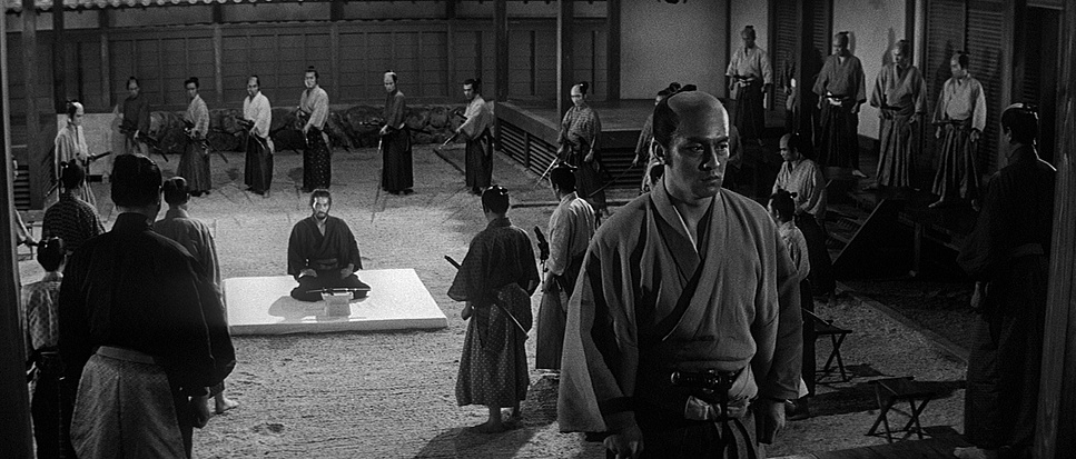
The framing in this film is what film students should be studying instead of just memorizing the Rule of Thirds. Having spent years framing shots myself, I can feel the intentionality here. Miyajima and Kobayashi utilize deep focus masterfully, allowing multiple planes of action to exist simultaneously. It’s narratively crucial—often highlighting the contrast between a lie being told in the foreground and a reaction in the background.
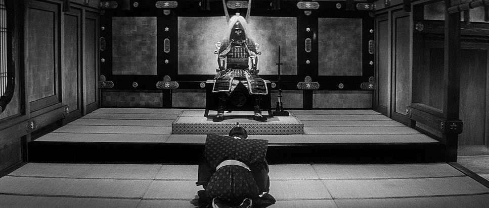
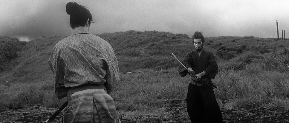
There’s also a powerful use of negative space, particularly in the E clan’s courtyard. It’s a vast, austere arena where “honor” is performed. The characters are framed small within these massive spaces, underscoring how vulnerable they are against the system. One specific shot that always stands out to me is the wide-angle view of the forest leading up to the final fight. The geometry of the trees and the wind acting as a participant in the scene creates this feeling that the natural world is holding its breath. The framing constantly reinforces the theme: the individual versus the institution.
Lighting Style
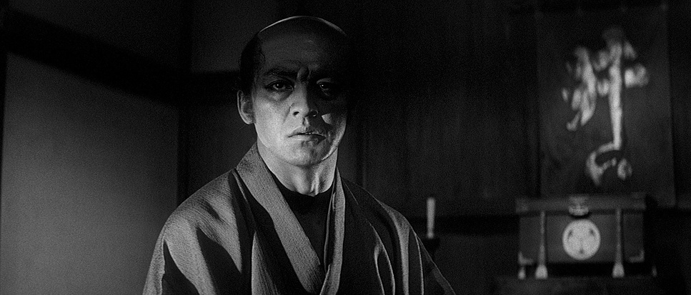
In black and white, you can’t use color contrast to separate a subject; you have to use value contrast. Harakiri’s lighting is extraordinary at this. It’s not just about exposure; it’s about shaping the mood. We see stark, high-contrast lighting that throws deep shadows, often engulfing characters in darkness to mirror the moral murkiness of the story.
Consider the interior shots within the mansion. The lighting is motivated by practical sources like shoji screens, but Miyajima manipulates it for drama. He uses pools of light to highlight power dynamics—who is in the light, and who is obscured? There are moments of directional, almost Chiaroscuro lighting on faces, and then there are scenes—like the brutal seppuku of Motome—where the lighting is punishingly flat. It exposes every agonizing detail without artistic embellishment. It makes the scene feel visceral and ugly, which is exactly the point.
Lensing and Blocking
The lens choice in Harakiri does a lot of the heavy lifting regarding power dynamics. There’s a clear preference for wider lenses in the E clan’s compound. This creates deep focus and spatial realism, but the slight distortion of the wide angle emphasizes the weight of the architecture pressing down on the characters.
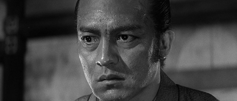
On the flip side, they switch to telephoto focal lengths for intimate moments. This compresses the space and isolates the character, blurring out the background so we are forced to confront their emotional state. As a filmmaker, this relationship between lensing and blocking is the fun part. Do I use a 35mm to show the environment, or an 85mm to isolate the panic? Harakiri uses deep staging—blocking actors at different distances—to create complex visual layers. It allows for a reaction in the background to inform the dialogue in the foreground without cutting. It’s an economy of storytelling I try to replicate in my own work.
Color Grading Approach

While this is a black and white film, as a colorist, I still look at it in terms of “grading.” It’s just tonal sculpting rather than hue manipulation. The film’s dynamic range management is incredible. The blacks are rich and deep—giving the image a solid floor—but they aren’t crushed. If you look closely at the shadows in the kimonos, there is still texture there.
The mid-tones are where the film really lives. There is a massive separation in the greys that gives the image tactility—you can feel the wood, the fabric, the dirt. And the highlights? They have that beautiful, chemical “rolloff” you only get with film emulsion. They rarely clip to pure white; they retain a soft detail that feels organic. This control of the tone curve creates a visual richness that transcends the lack of color. The resulting image feels heavy and deliberate, enhancing the tragic weight of Hanchiro’s story.
Technical Aspects & Tools
Harakiri: Technical Specs
| Genre | Action, Drama, History, Costume Drama, Samurai, Costume |
|---|---|
| Director | Masaki Kobayashi |
| Cinematographer | Yoshio Miyajima |
| Production Designer | Junpei Oosumi, Shigemasa Toda |
| Costume Designer | Mitsuzô Ueda |
| Editor | Hisashi Sagara |
| Time Period | Renaissance: 1400-1700 |
| Color | Desaturated, Black and White |
| Aspect Ratio | 2.35 – Anamorphic |
| Format | Film – 35mm |
| Lighting | Soft light, High contrast |
| Lighting Type | Daylight, Sunny |
| Story Location | Japan > Edo |
Shot in 1962, Harakiri was likely captured on a standard black and white negative stock of the era, possibly something with a slower ASA given the amount of light they seem to be using. The sharpness is incredible, which speaks to the quality of the prime glass—likely older spherical lenses that have distinct characteristics compared to modern zooms.
The camera was probably a heavy studio model, locked off on a tripod or a dolly, which reinforces that deliberate, observational style. I also notice the grain structure is beautifully managed. It implies they nailed their exposure ratios on set. They pushed the medium to its limits, proving that craft and artistic intent matter far more than resolution or raw specs. It’s a reminder that even with “limited” technology, true visionaries can create images that look better than 90% of what we shoot on digital today.
Harakiri is more than a history lesson; it’s a statement. As a visual artist, I find endless inspiration in its depth. Every element—from the blocking to the density of the blacks—serves the story. It reminds me why I fell in love with this craft: the ability to transcend mere recording and sculpt an experience that burns itself into the viewer’s memory.
- Also Read: DAS BOOT (1981) – CINEMATOGRAPHY ANALYSIS
- Also Read: YOUR NAME. (2016) – CINEMATOGRAPHY ANALYSIS
Browse Our Cinematography Analysis Glossary
Explore directors, cinematographers, cameras, lenses, lighting styles, genres, and the visual techniques that shape iconic films.
Explore Glossary →