Halloween (1978) And every year, life just… happens. But this year, as Salik Waquas from Color Culture, I’m finally making it a priority. And honestly? It feels right. John Carpenter’s Halloween isn’t just a movie to me; it’s a seasonal ritual. It’s wild to think that a film with a measly $300,000 budget managed to rake in $47 million in the US alone. It became this timeless, profitable artifact that basically built the slasher blueprint and crawled into our collective nightmares.
When I watch it now, I’m not just looking for the jump scares. I’m obsessing over why it still works. Why does a simple story about a guy in a mask stalking a suburb still feel so heavy? For me, living in the world of visual storytelling, the answer is all in the cinematography. It’s a total clinic on how to build dread and atmosphere through pure visuals proving that a lack of money usually forces the best creative pivots.
About the Cinematographer
We (rightly) praise John Carpenter for the direction, the score, and the vision. As the saying goes, he “directed the shit out of this movie.” But you can’t talk about the look of Halloween without Dean Cundey. Cundey was Carpenter’s secret weapon. They’d already sharpened their teeth together on Assault on Precinct 13, but here, the synergy is next-level. Carpenter brought the blueprint of suspense that lean, minimalist horror and Cundey figured out how to photograph it. This wasn’t just a DP executing shots; it was a partnership where abstract “evil” was turned into tangible lighting choices. It’s the perfect reminder that two focused minds will always beat a bloated budget.
Lensing and Blocking
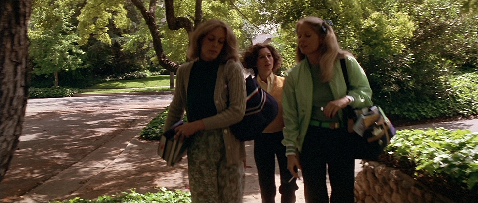
The choice of glass here is everything. They shot on Panavision C-Series anamorphic lenses, which gives the film that wide, cinematic 2.35:1 aspect ratio. Those lenses have so much character the way the edges of the frame fall off and how Michael is blocked within that wide space is genius.
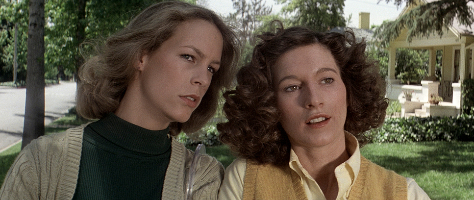
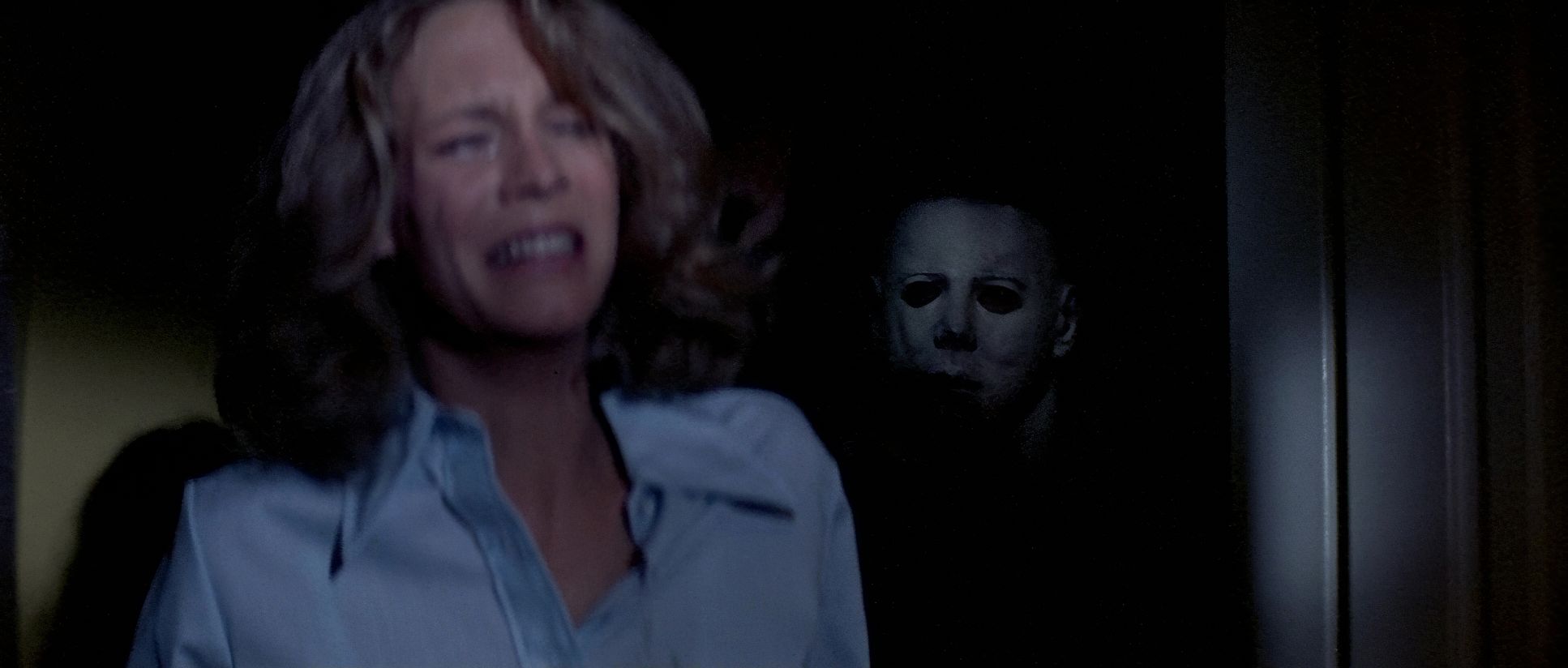
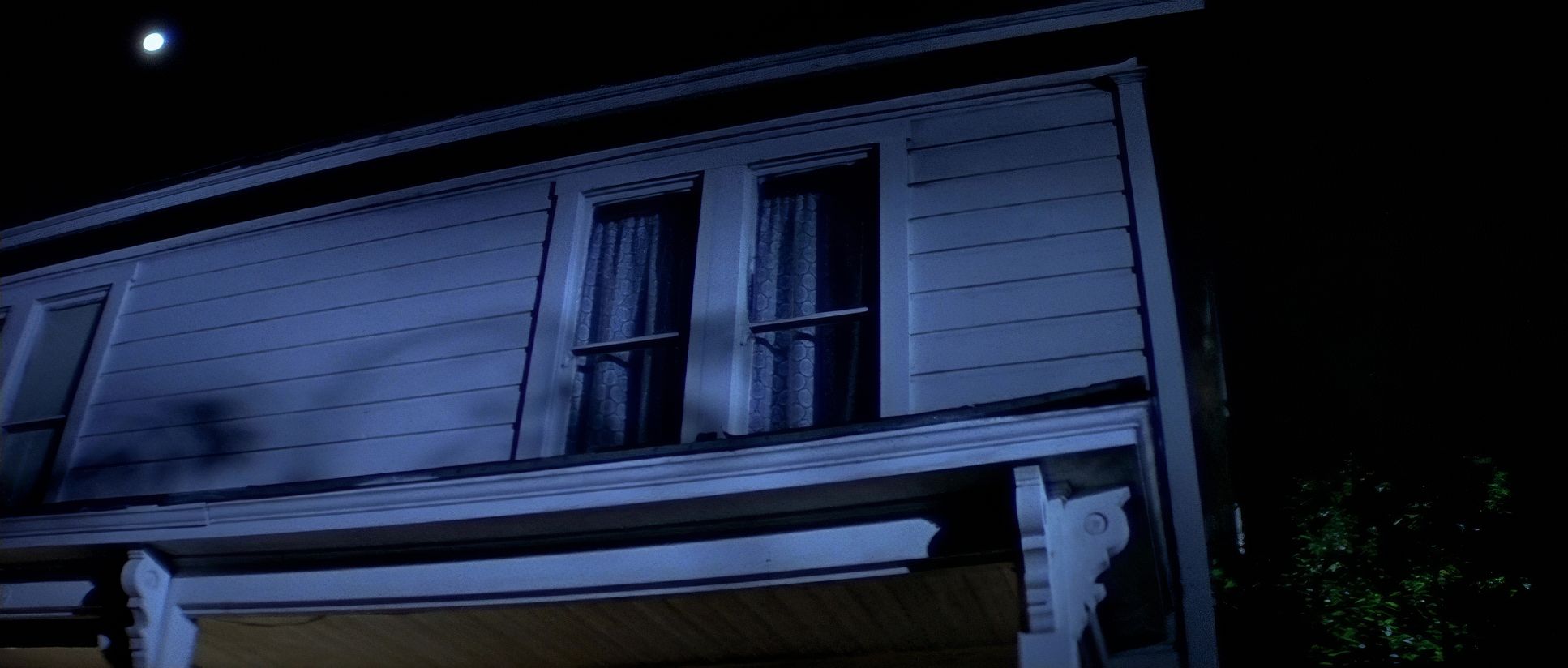
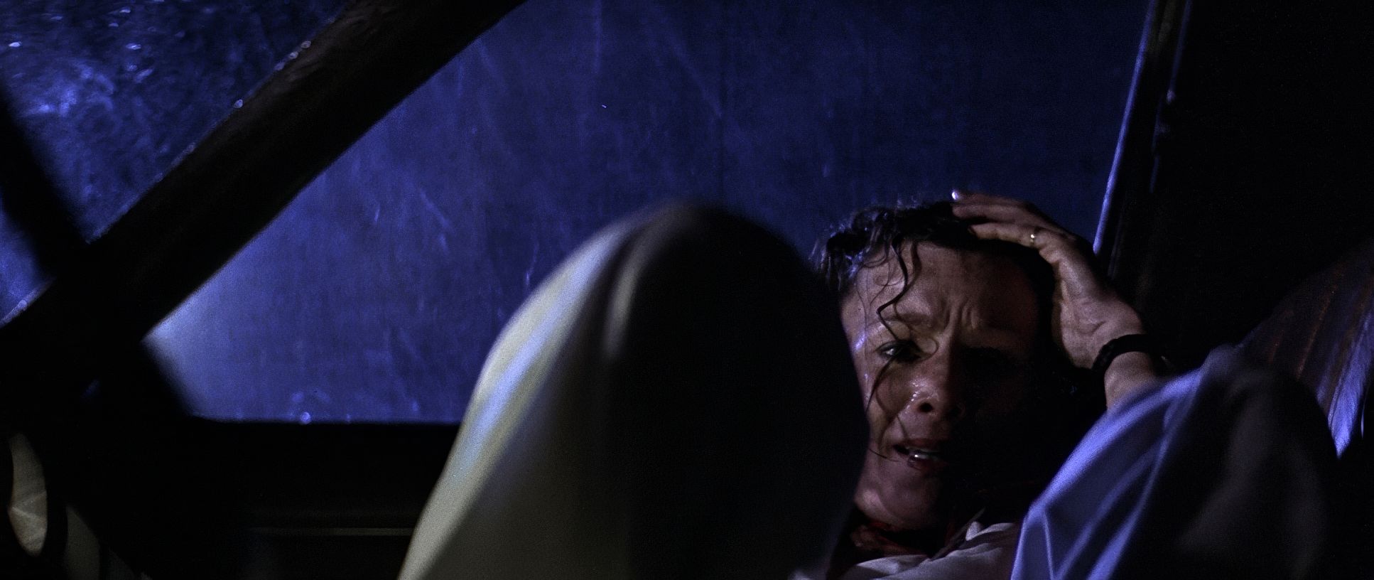
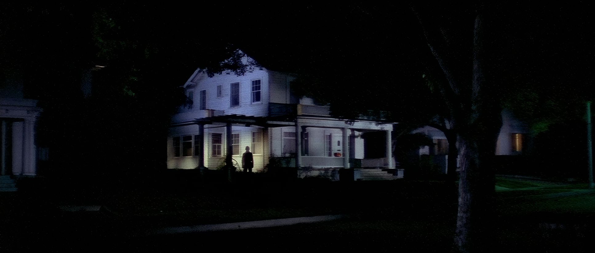
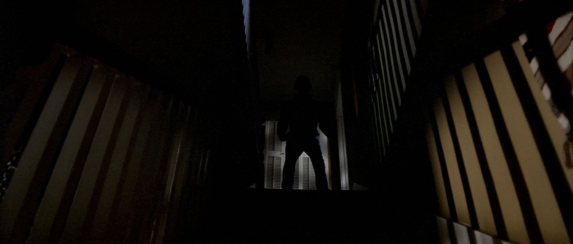
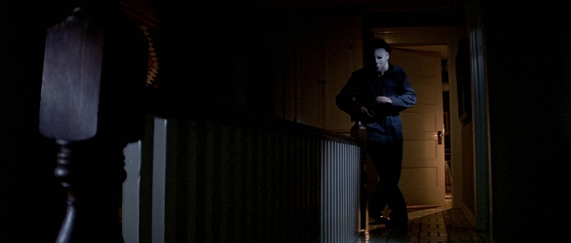
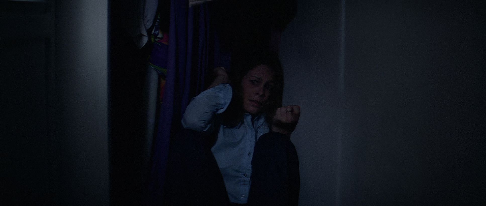
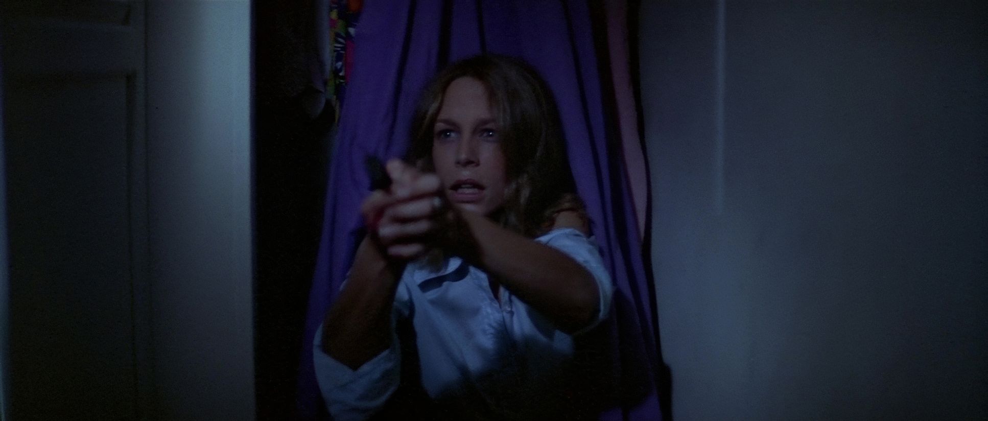
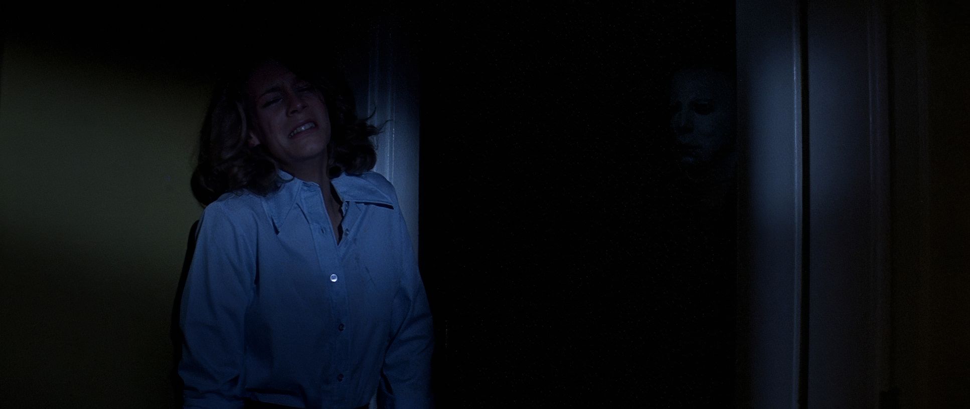
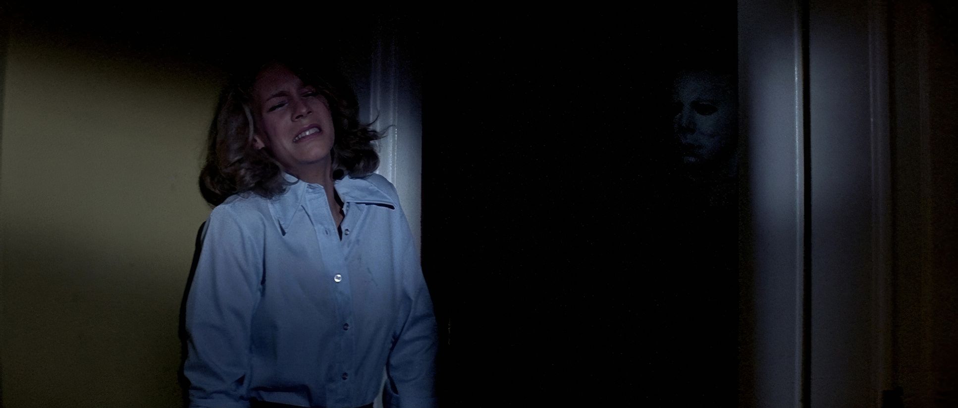
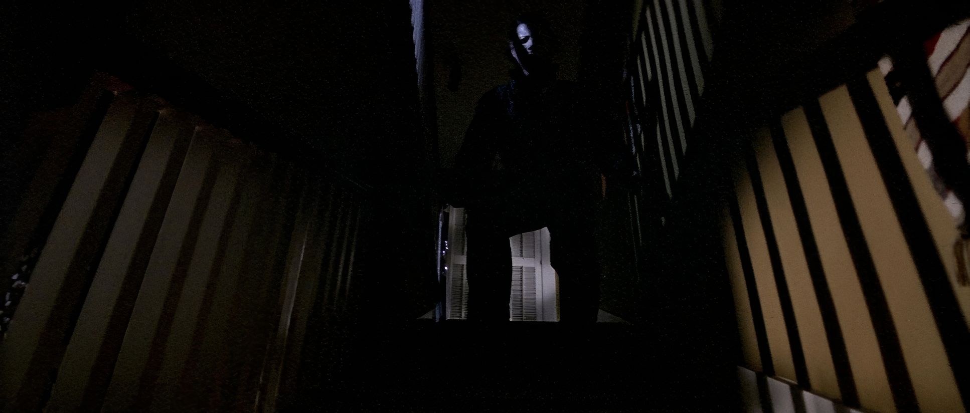
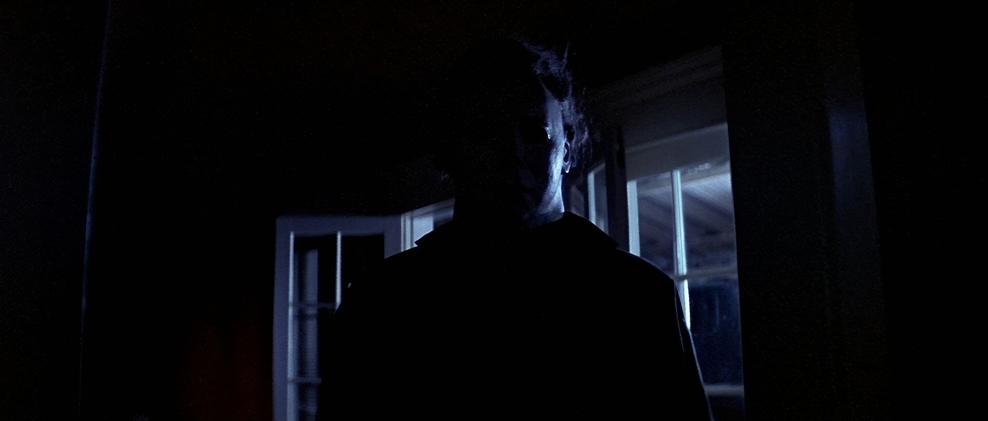
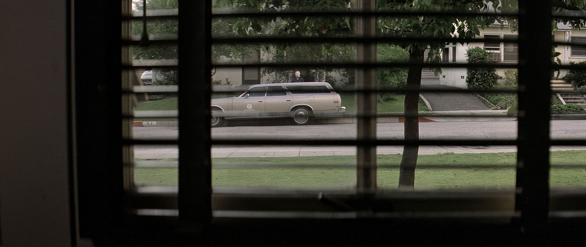
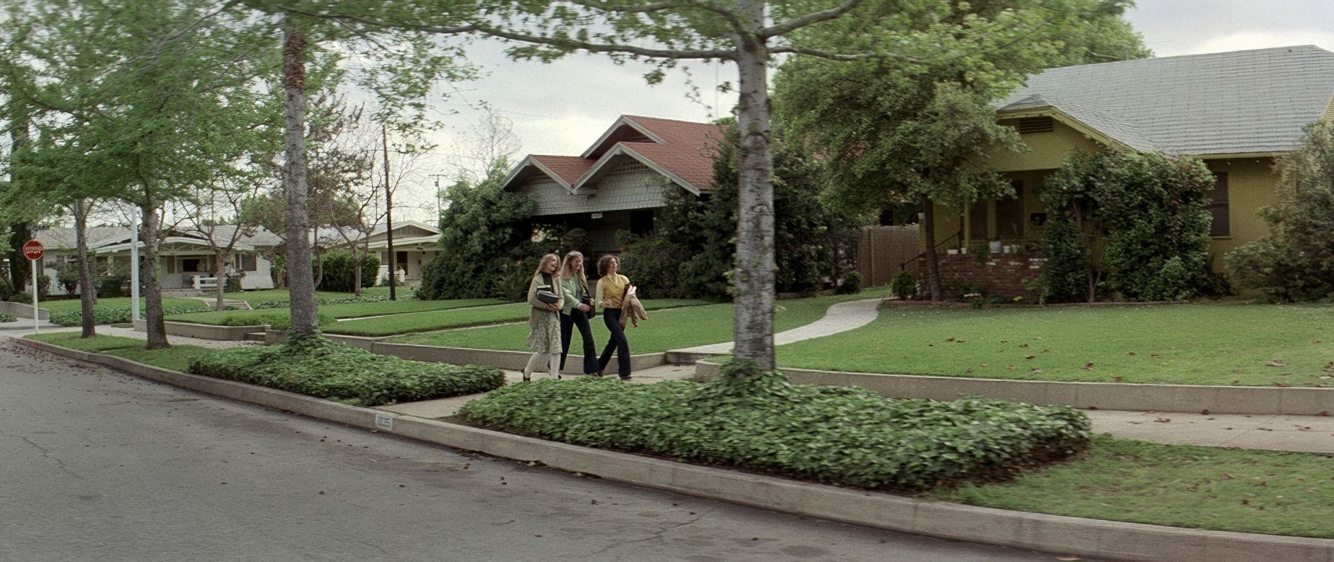
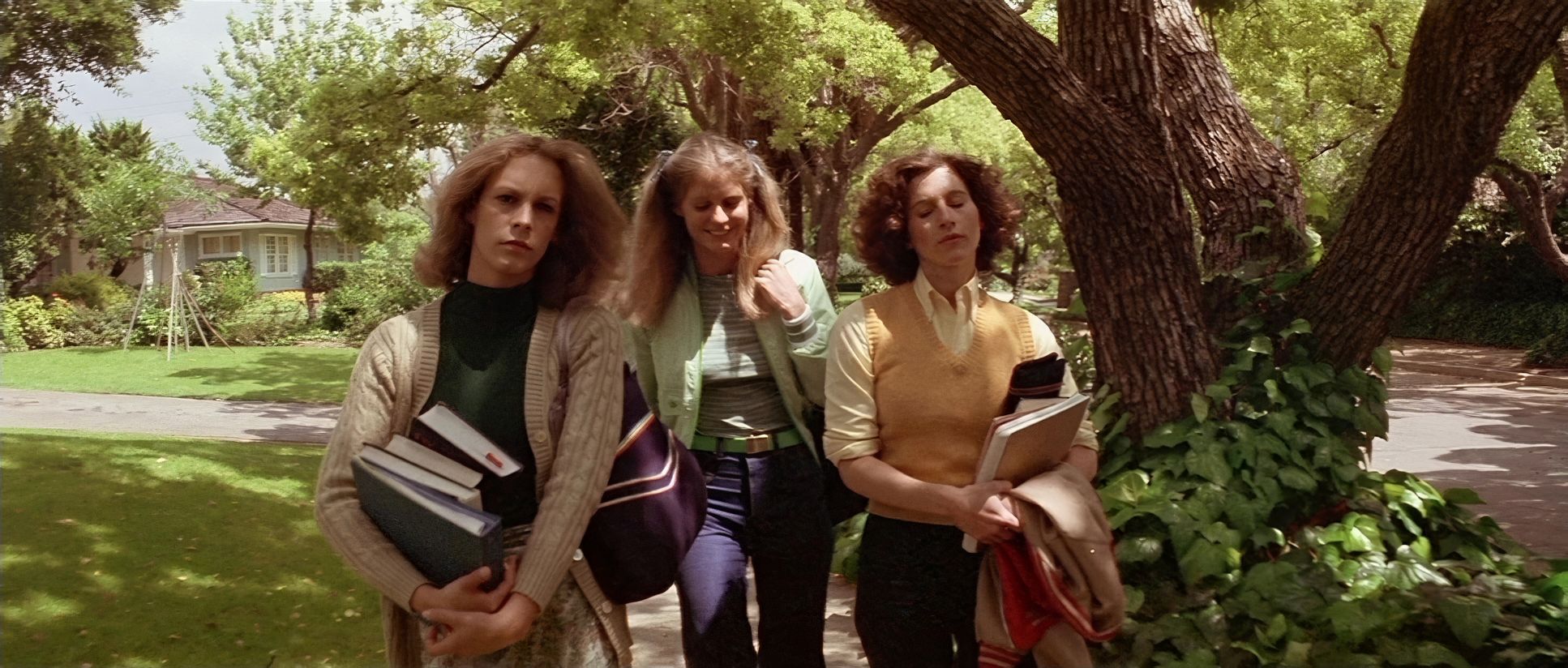
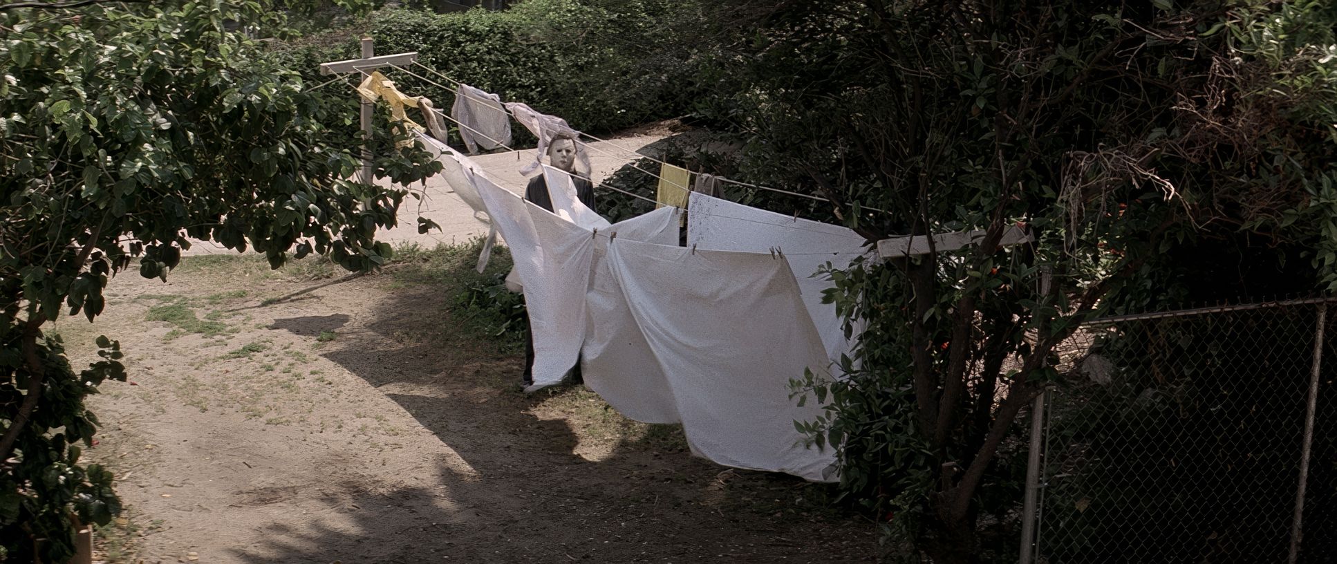
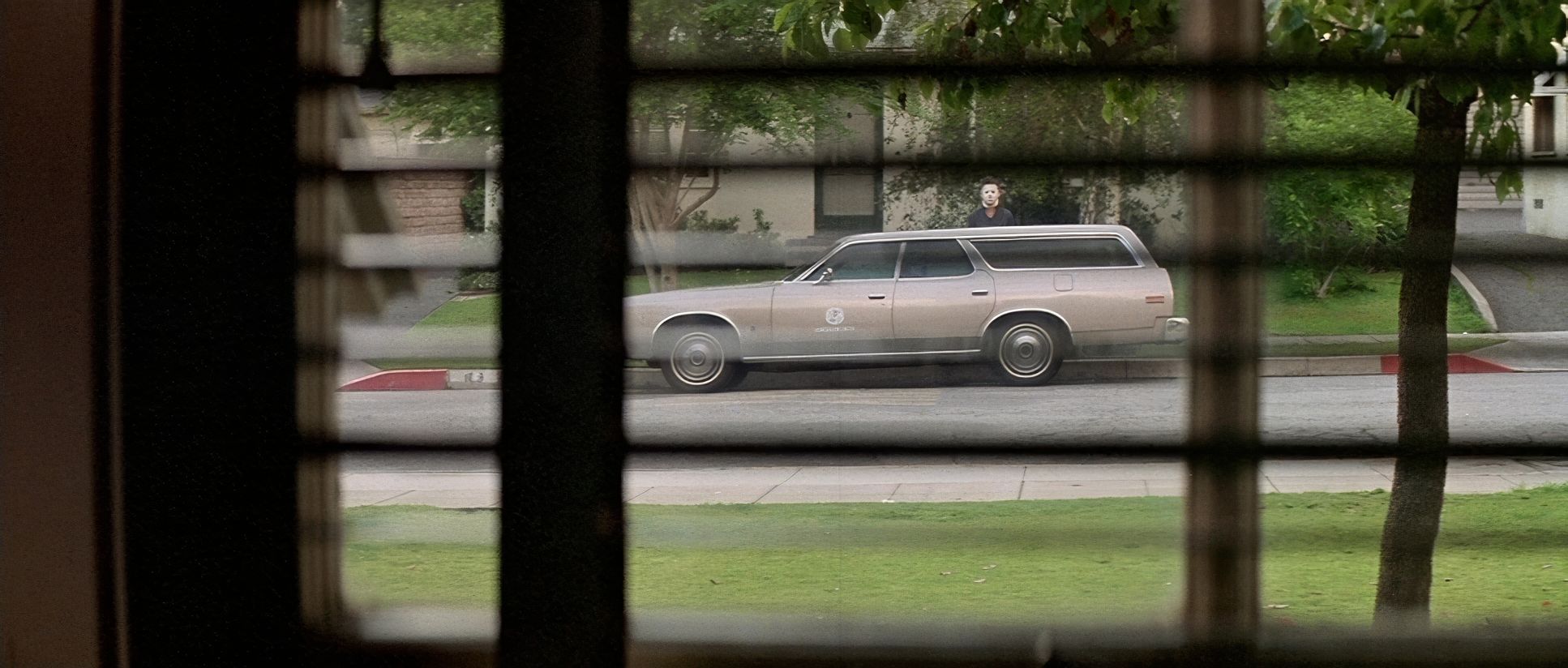
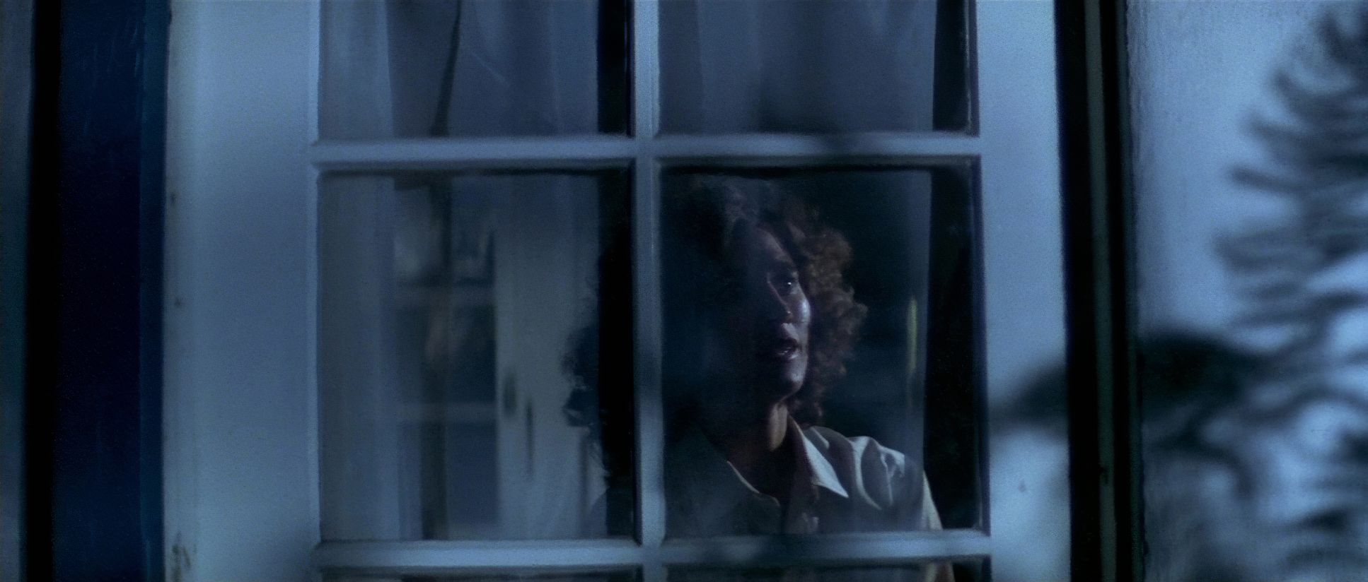
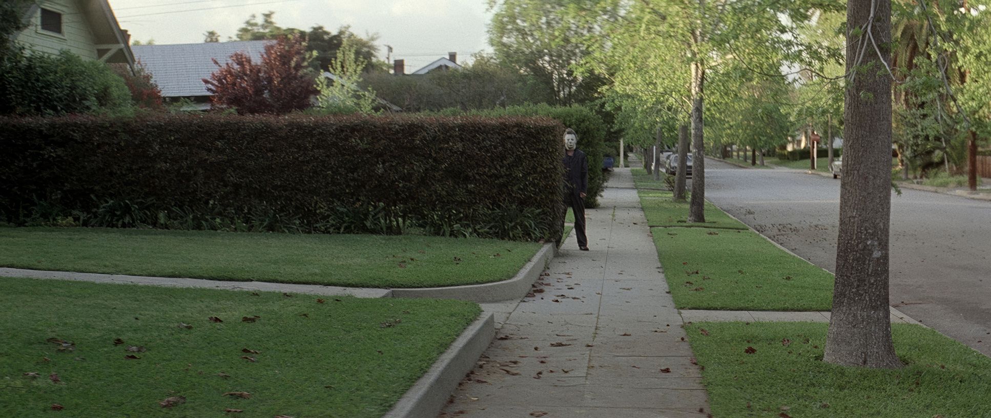
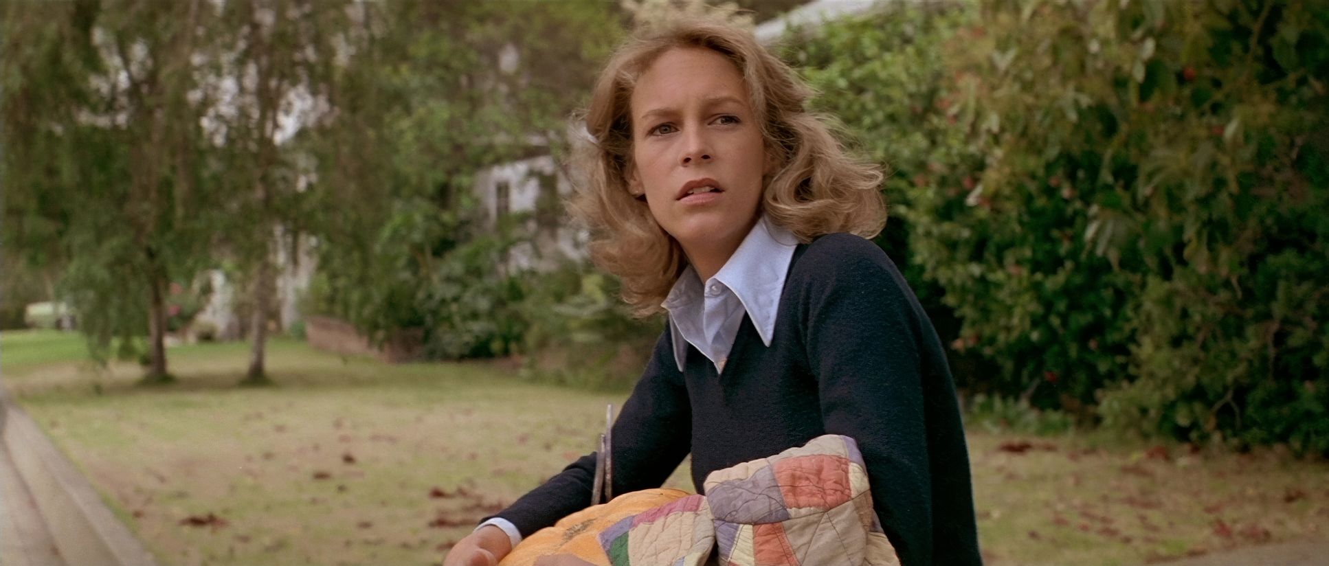
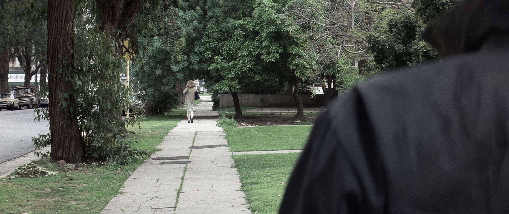
Michael often just… exists in the deep background. He’s standing still. Observing. That stillness is what makes him terrifying. He’s not sprinting; he’s encroaching. There’s a famous “six feet apart” vibe to his stalking (long before that was a thing). The contrast between Michael’s methodical, slow-motion movement and the victims’ frantic, high-energy panic creates this really unsettling rhythm. And because they used wider lenses even for the “stalker” shots, you see the whole environment. You see that Laurie is trapped by the geography of her own neighborhood.
Color Grading Approach
Okay, my favorite part. Even though “color grading” as we know it today didn’t exist in 1978, the aesthetic was baked into the 35mm film stock and the lab work. Halloween has this cool, moody, autumnal palette that just feels like October.
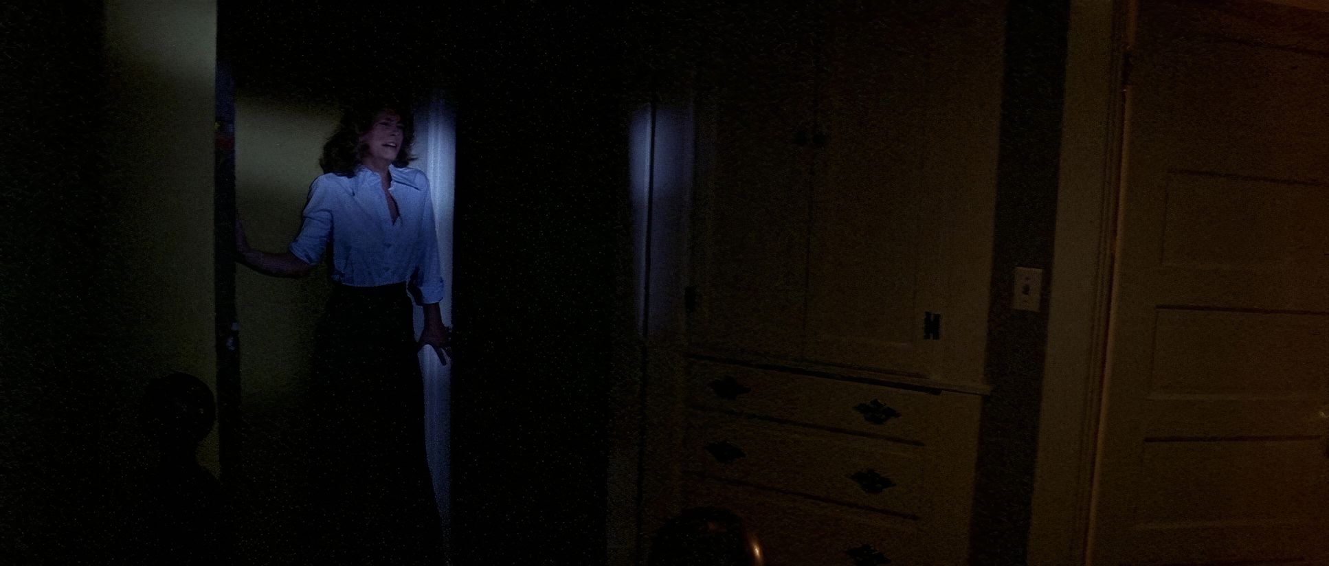
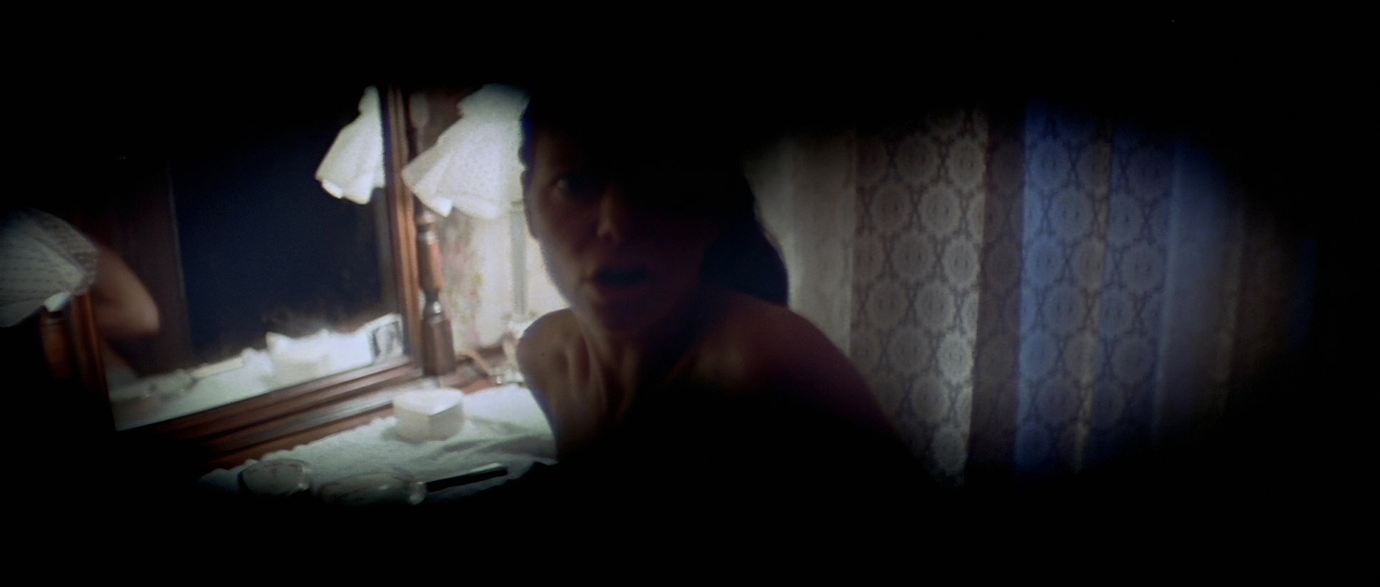
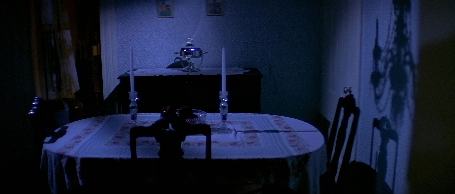
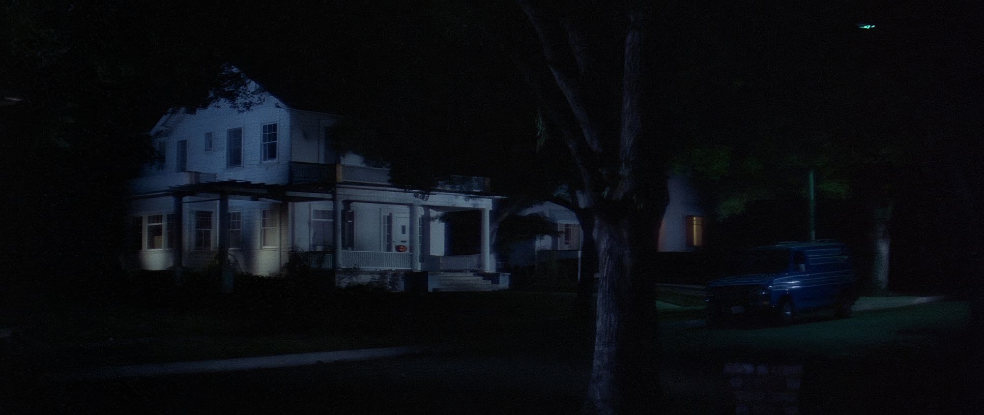
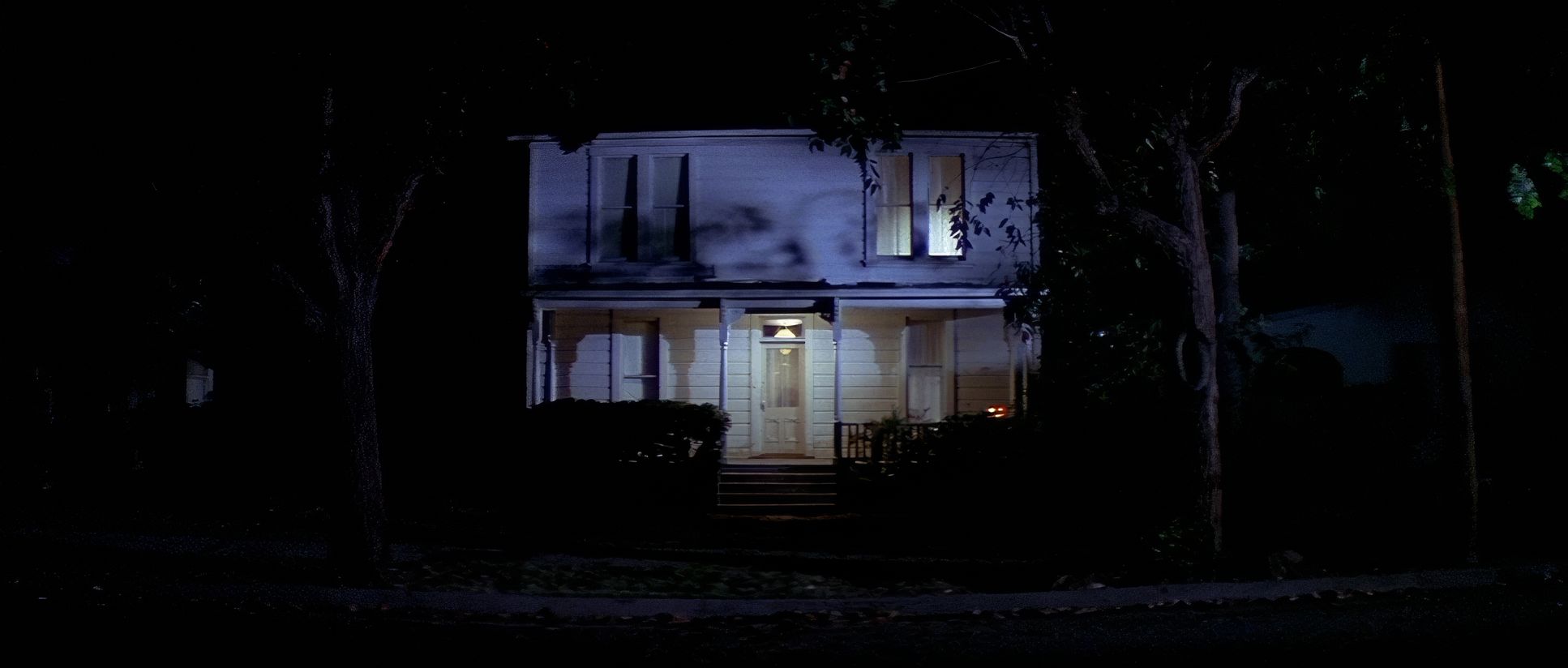
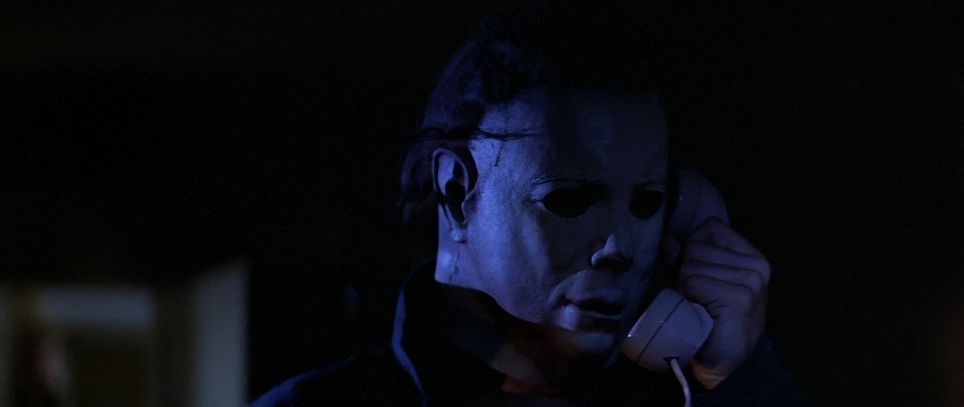
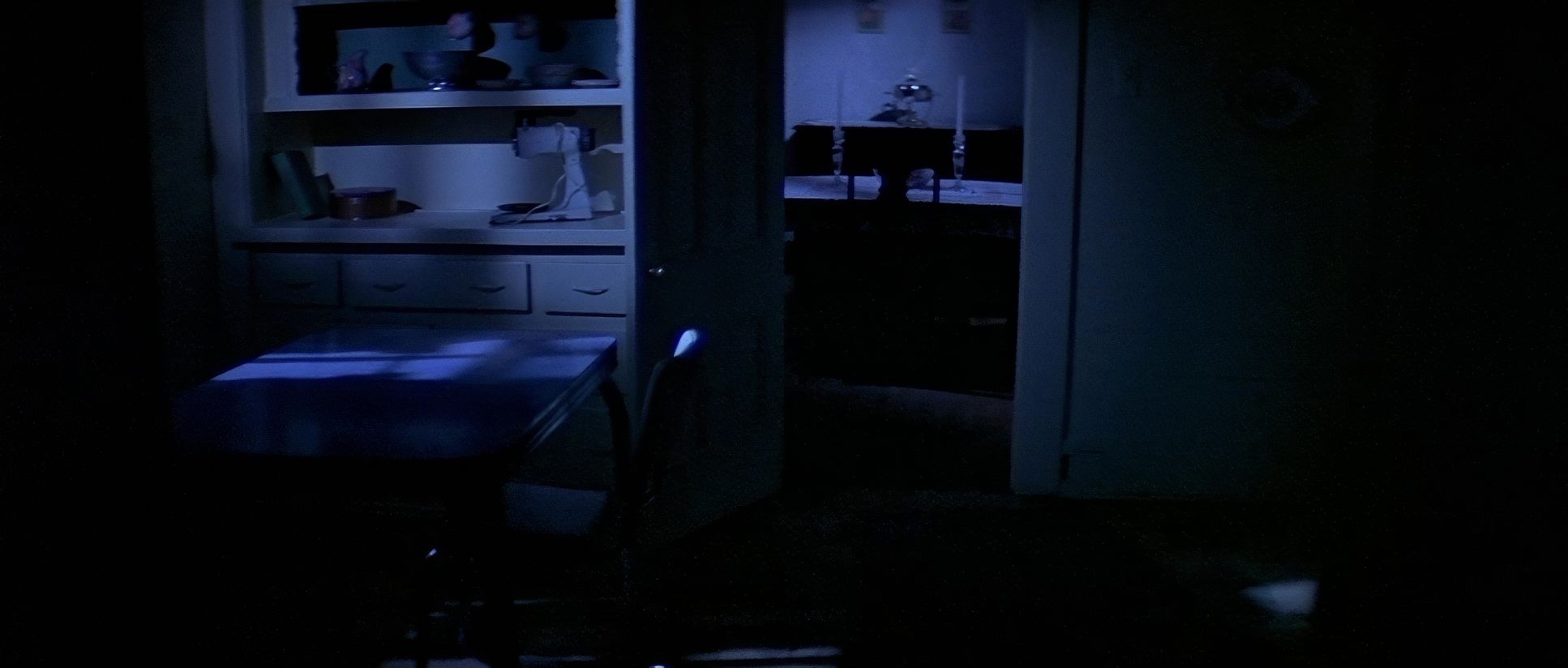
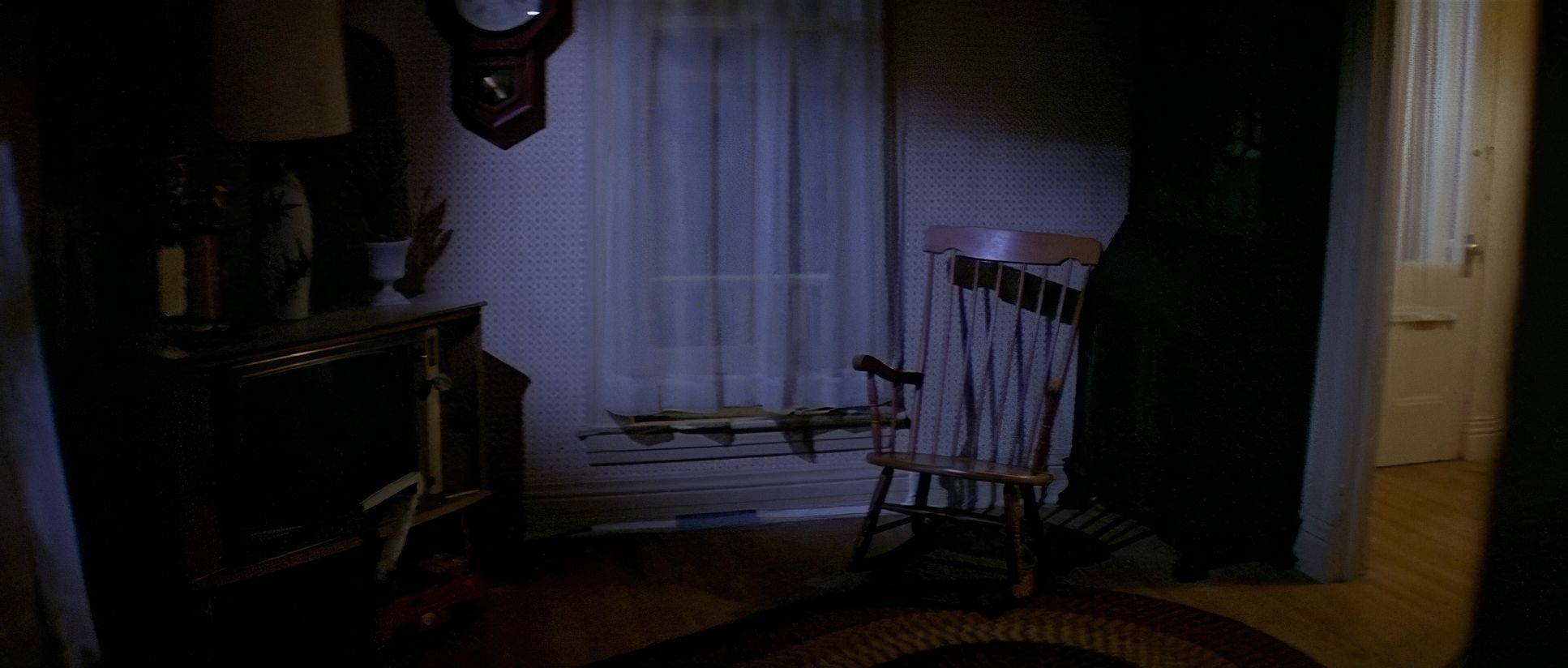
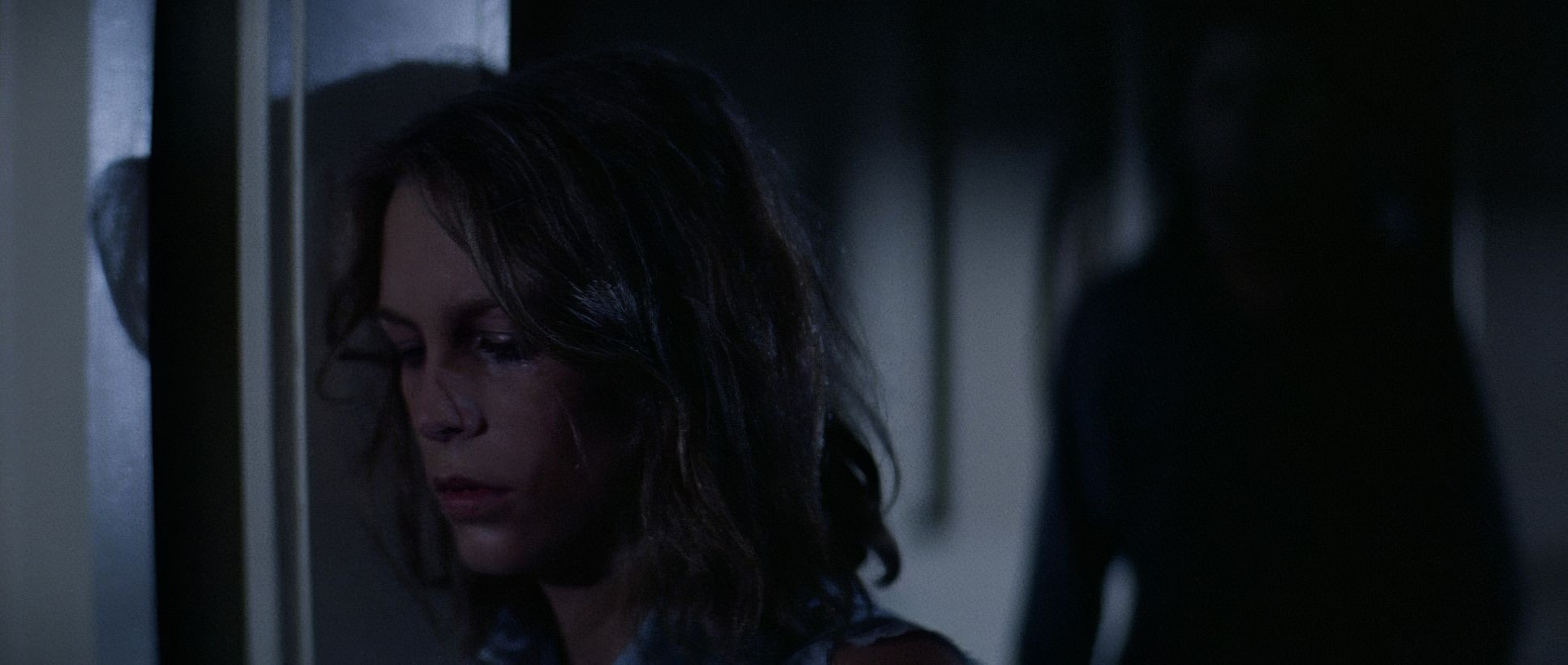
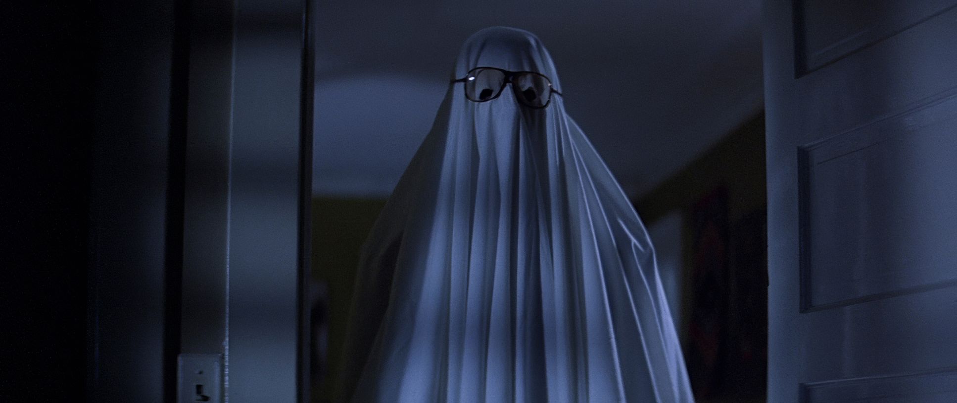
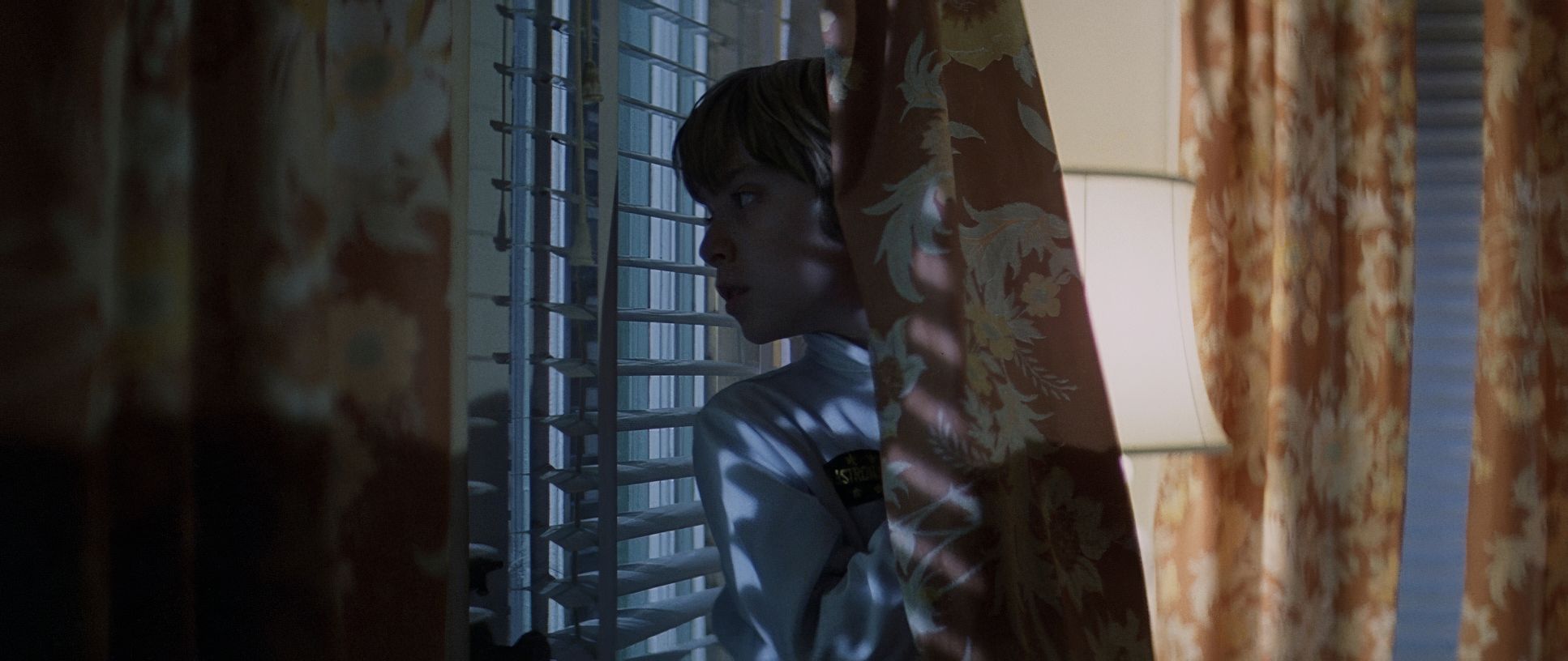
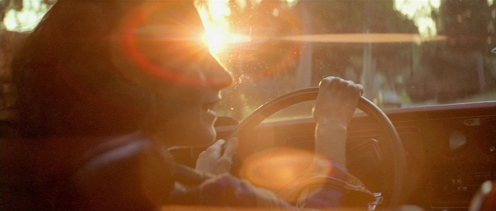
If I were grading this today, I’d be chasing that specific 70s highlight roll-off. On film, the transition from the bright streetlights to the dark shadows is so creamy and organic you don’t get that harsh digital clipping. The shadows aren’t just “black blobs”; they have texture and a subtle blue-green cast in the night exteriors. The contrast shaping is elite. They pushed the blacks deep, but they kept just enough detail so you’re constantly squinting at the screen, wondering if that shadow just moved. I’d use heavy print-film emulation to keep that visceral, celluloid feel the slightly lifted blacks and that nuanced color density that makes the orange of a pumpkin really pop against the cold blue night.
Lighting Style
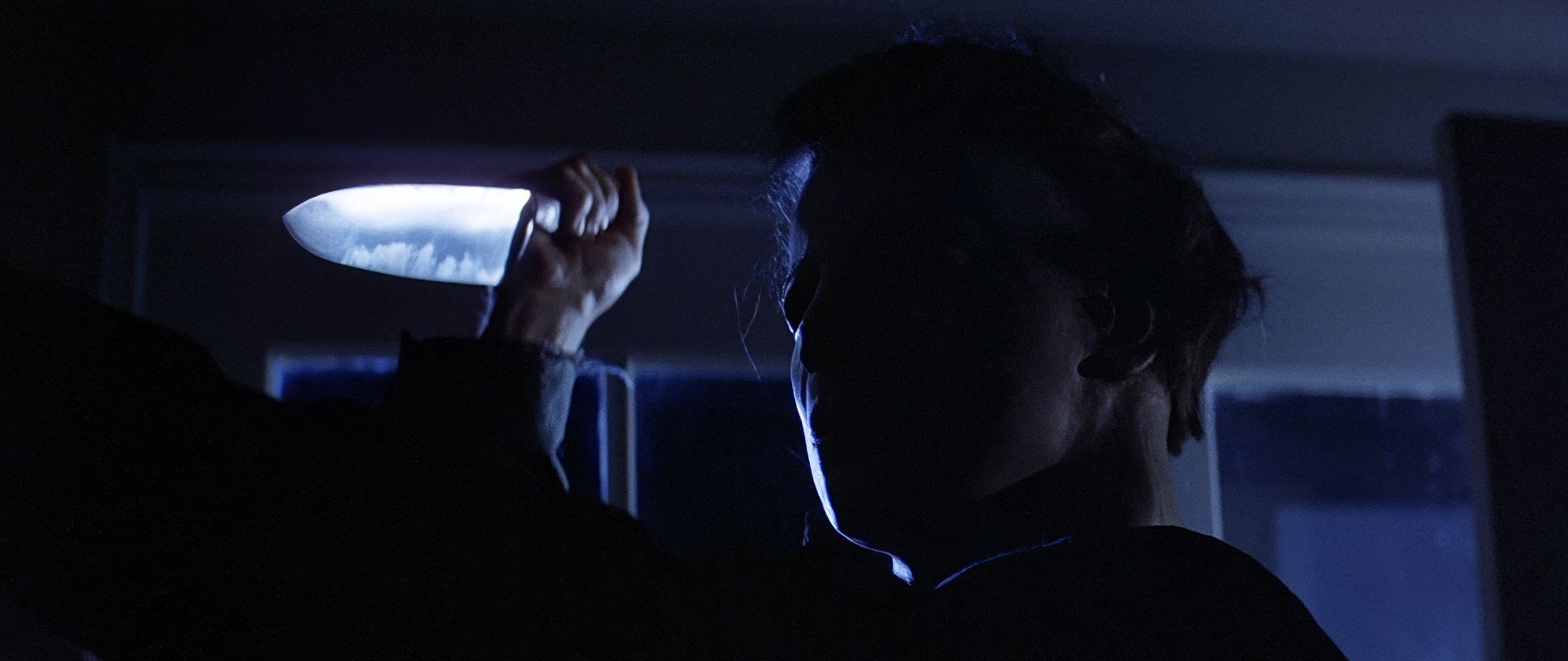
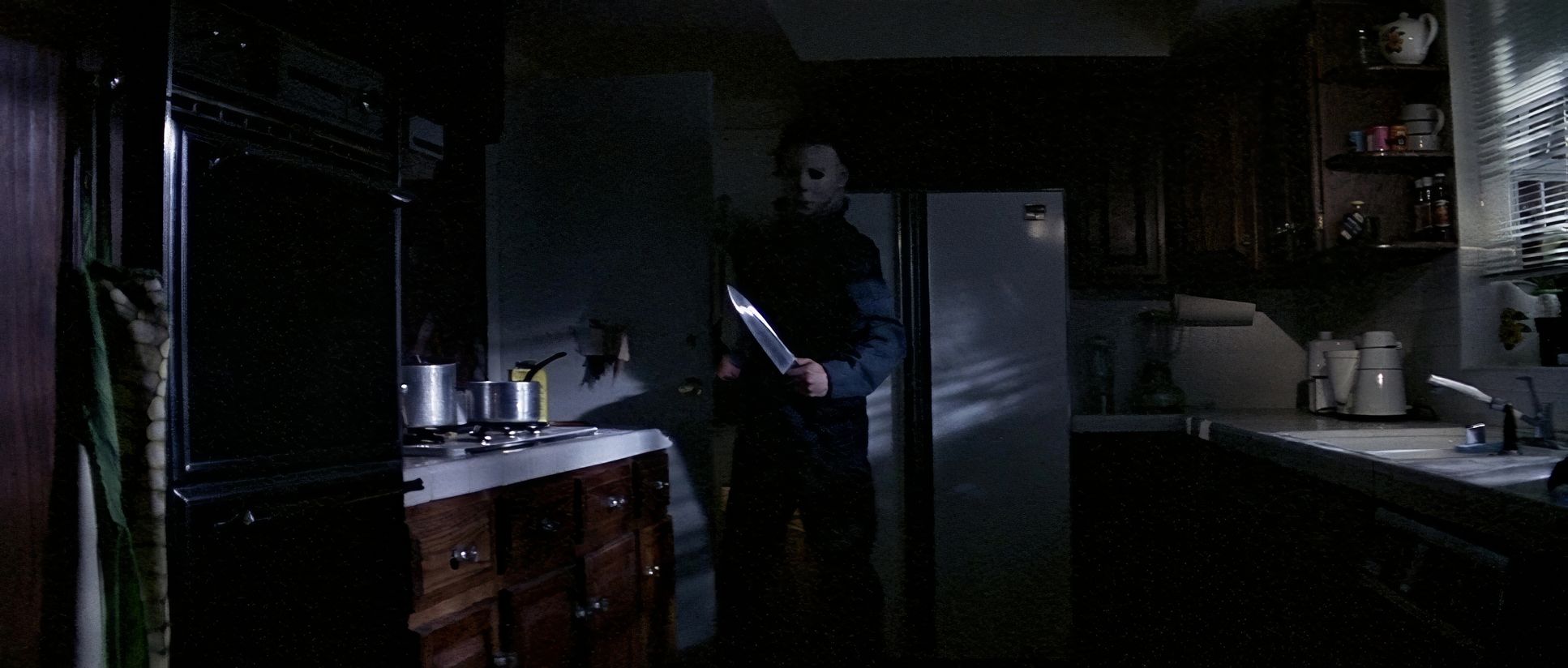
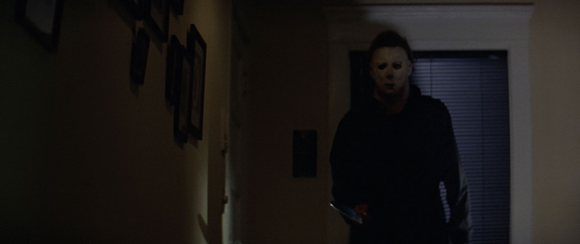
The lighting is what makes this movie feel “expensive” despite the budget. It’s all about high contrast and motivated light. We’re talking about hard light, edge lighting, and under-lighting that makes the characters pop from the darkness.
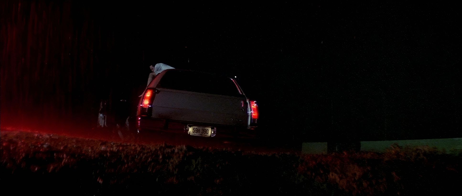
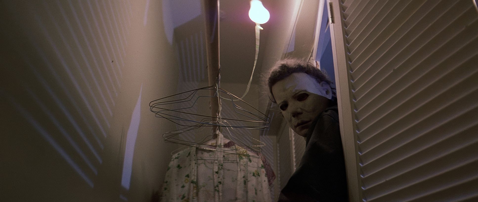
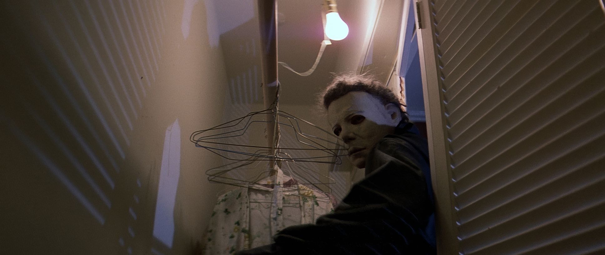
Think about the streetlights casting those long, jagged shadows, or the way the “moonlight” (which we know is just a big HMI or tungsten lamp with blue gel) hits the side of Michael’s mask. It’s selective. It’s not about seeing everything; it’s about what Cundey chooses not to show you. When Michael escapes the asylum in the beginning, that red emergency lighting is a total shift it feels hellish and chaotic compared to the sterile hospital. It’s a masterclass in using light to signal that the “shape” of evil has arrived.
Camera Movements
This is where the craftsmanship gets really precise. The camera moves are deliberate no shaky-cam here. The film famously opens with that POV shot of Michael as a kid. It’s voyeuristic and disorienting. It forces us to be complicit in the crime.
But look at the rest of the film: the slow, methodical pans and those creeping tracks down suburban streets. They used the Panaglide (a Steadicam competitor) to get those smooth, floating movements. It makes Michael feel like an omnipresent force. He doesn’t need to jump out; the camera just slowly reveals him standing behind a hedge or at the top of the stairs. The camera holds the shot just a second too long, forcing your eyes to scan the frame for the threat. It’s not flashy, but man, it’s effective.
Compositional Choices
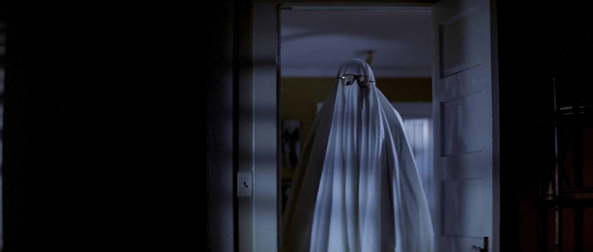
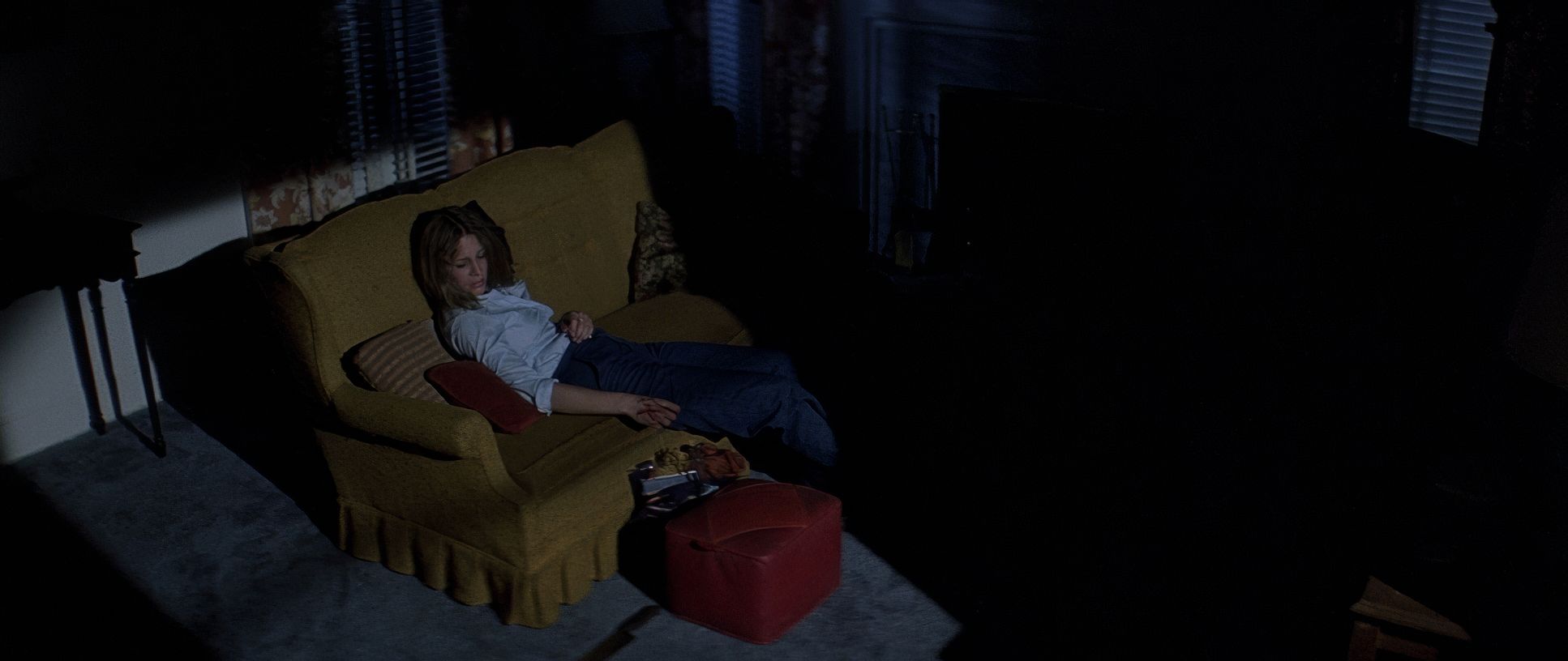
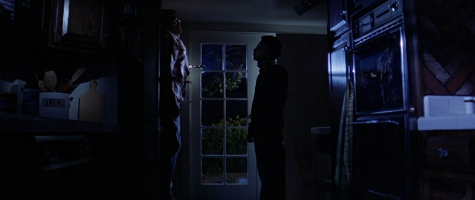
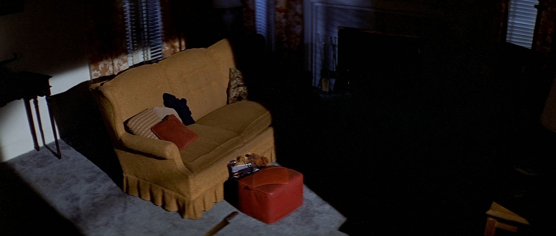
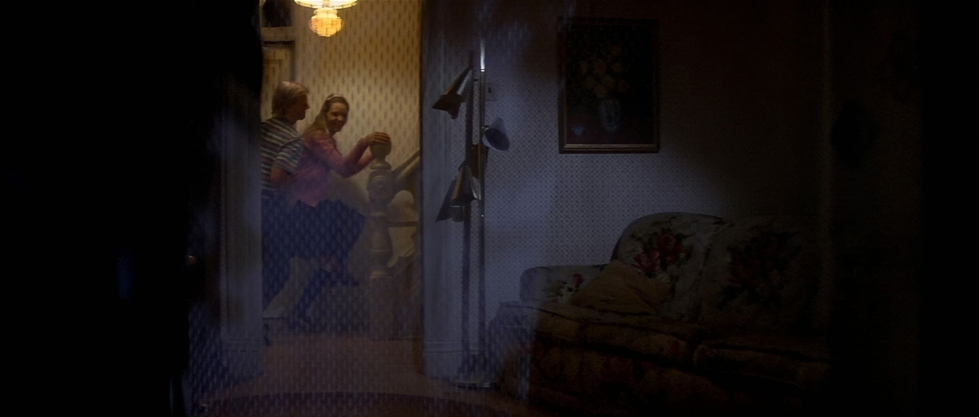
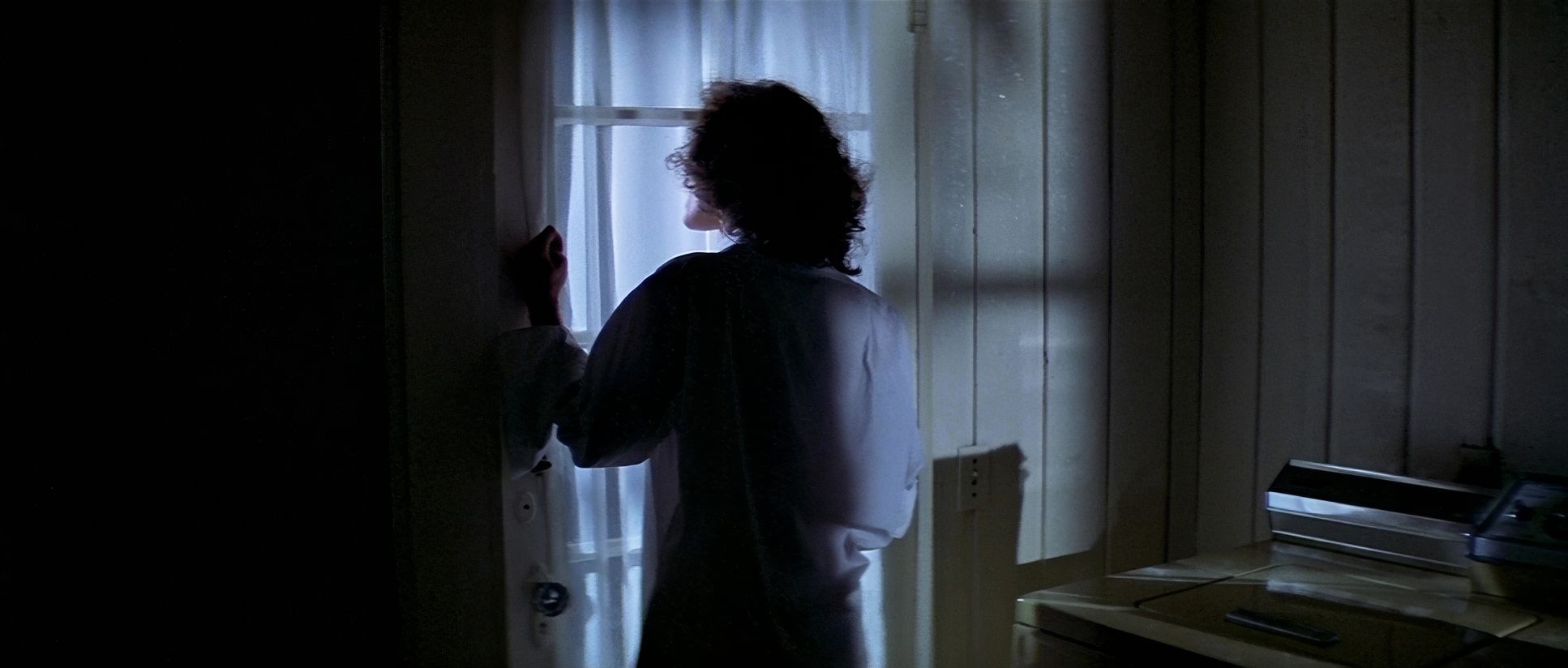
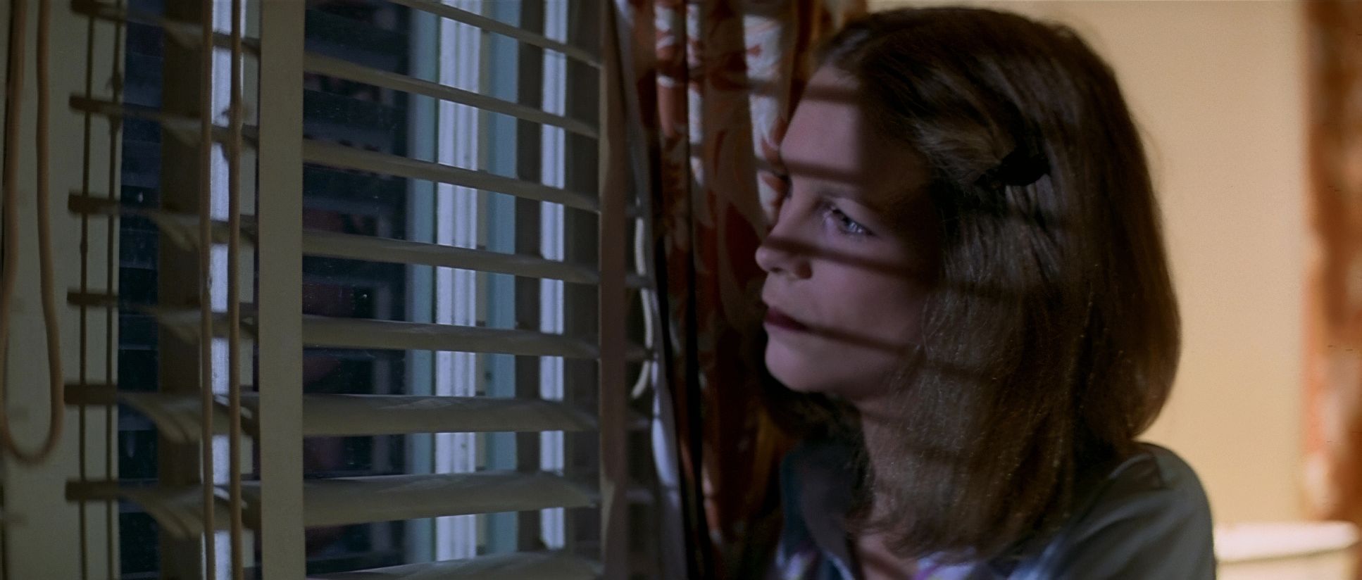
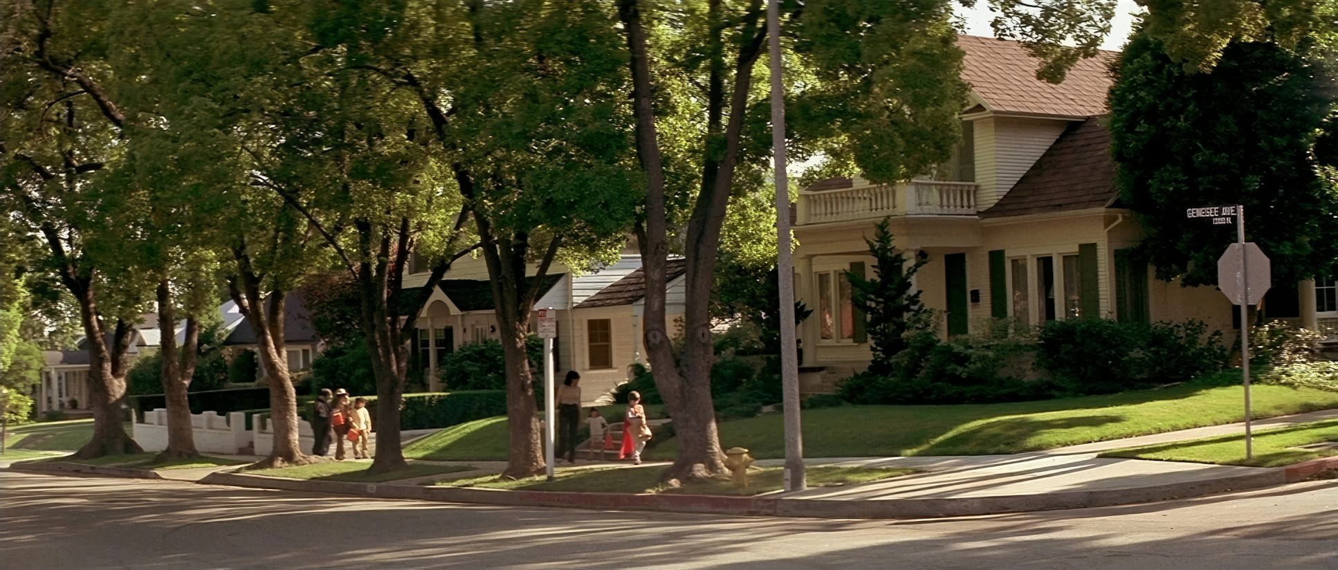
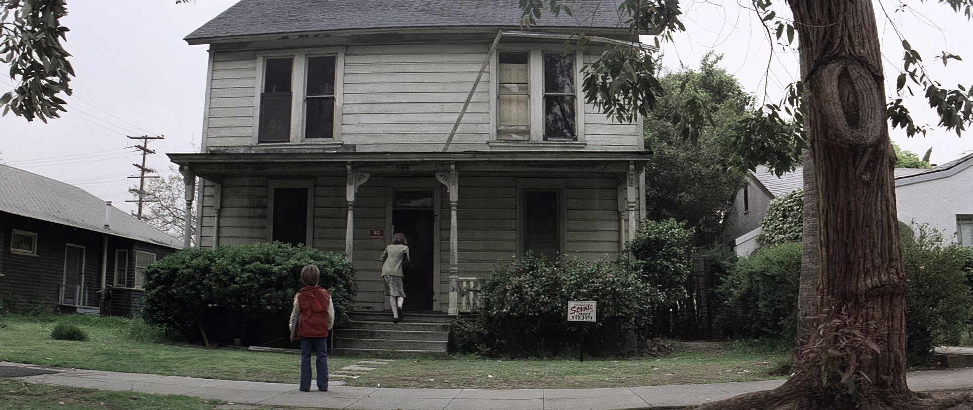
Carpenter uses the frame like a weapon. He loves deep staging. He’ll put Laurie in the mid-ground, her friends in the foreground, and then Michael way back in the deep background, slightly out of focus.
This does a few things:
- It creates massive depth.
- It triggers your “fight or flight” response because you see the threat before the characters do.
- It makes the audience an active participant.
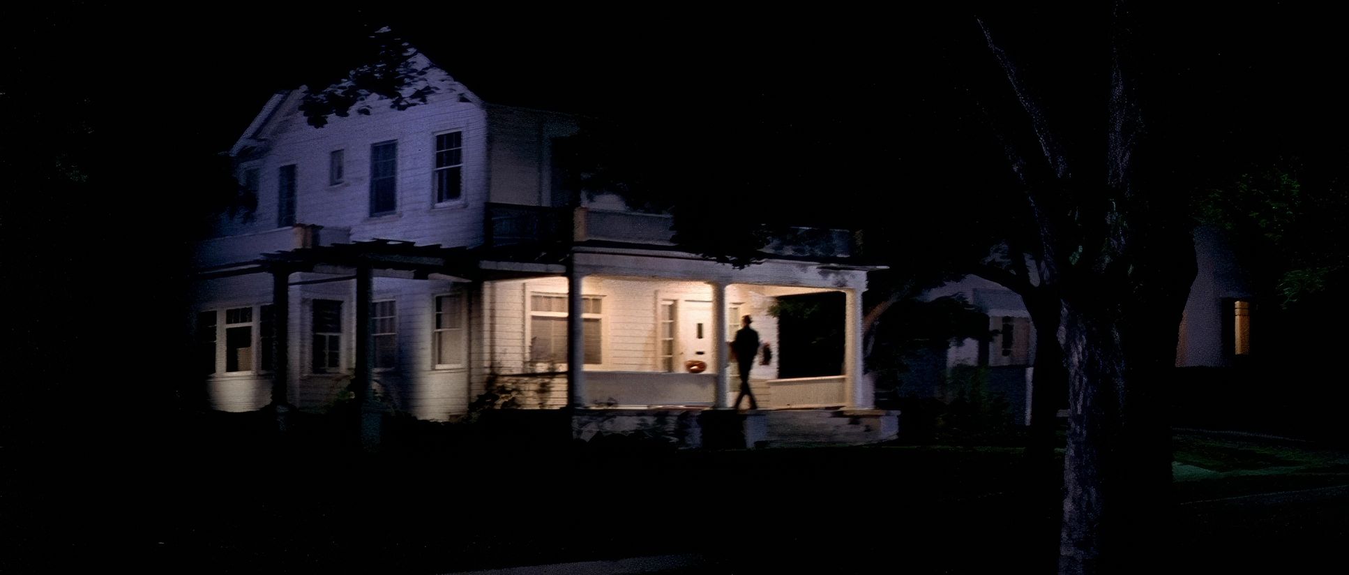
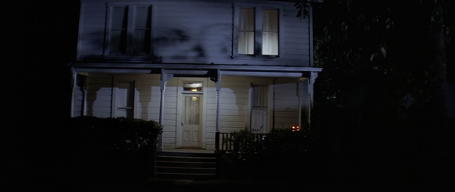
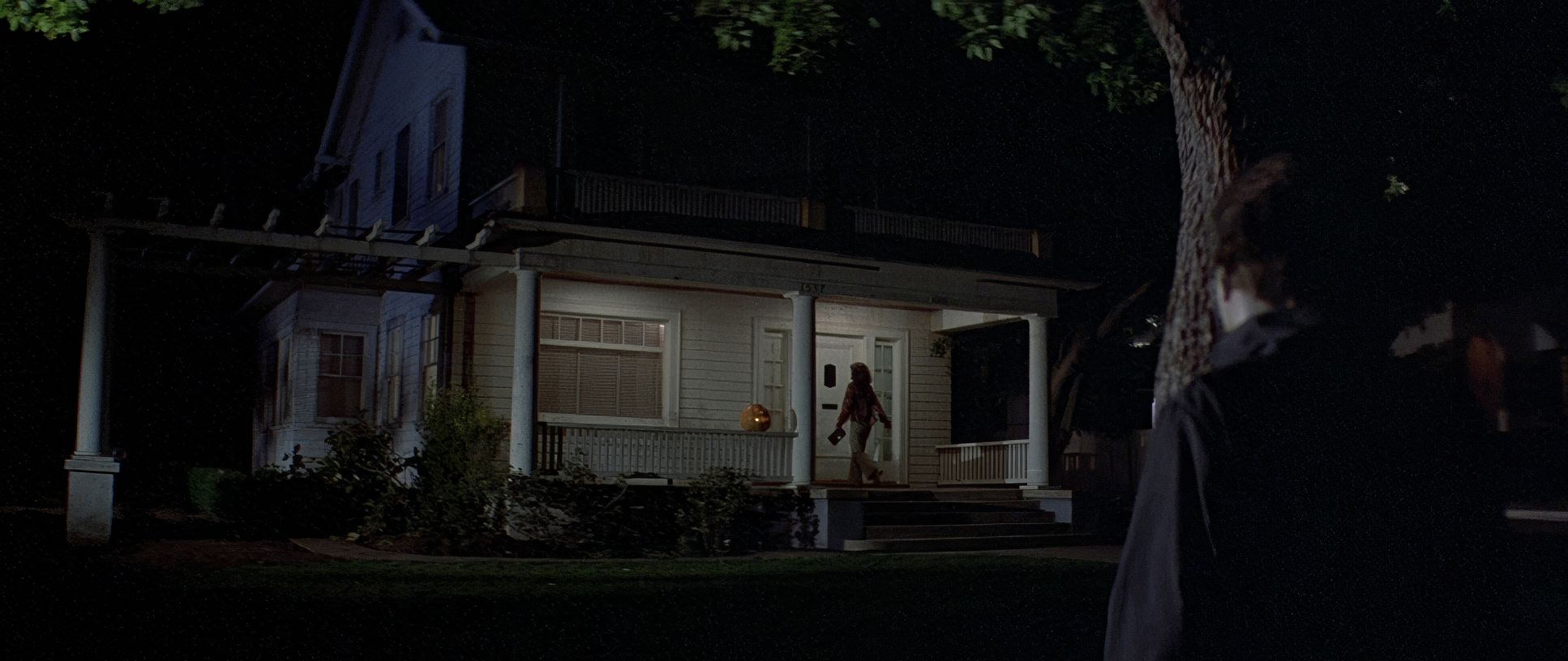
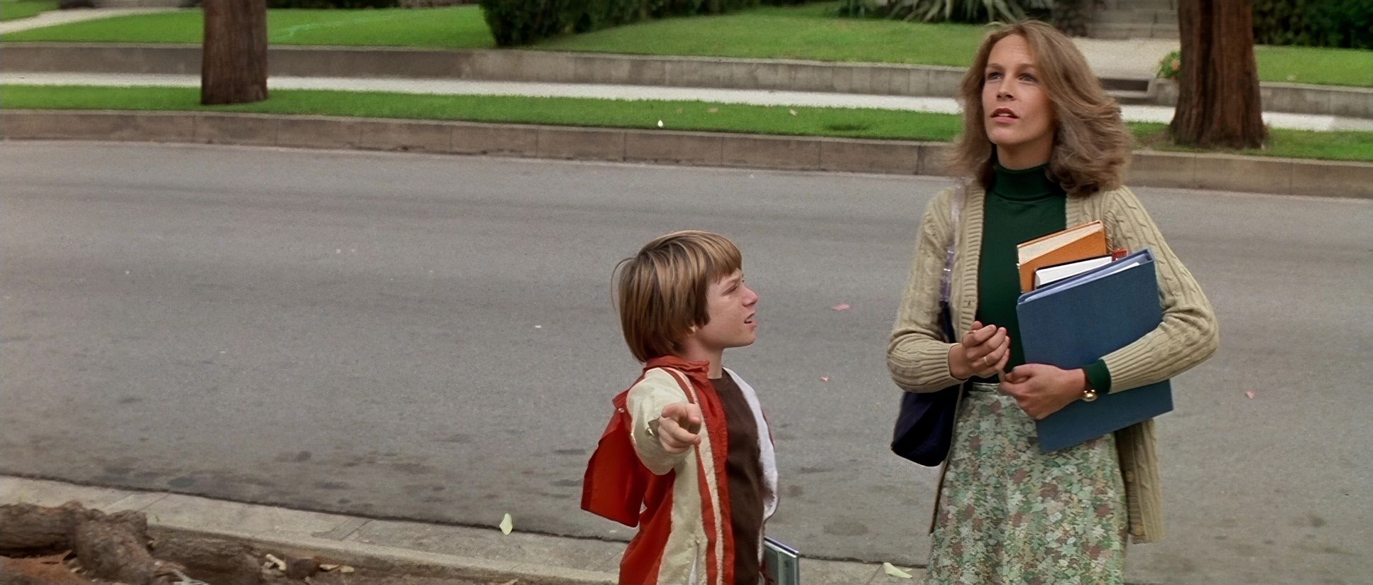
He also uses negative space beautifully. Haddonfield actually filmed in California, but we’ll let that slide feels empty and isolating. Wide shots of houses at night with only one porch light on make the world feel huge and the victims feel tiny. It taps into that primal fear of the thing lurking just outside the circle of light.
Inspiration Behind the Cinematography
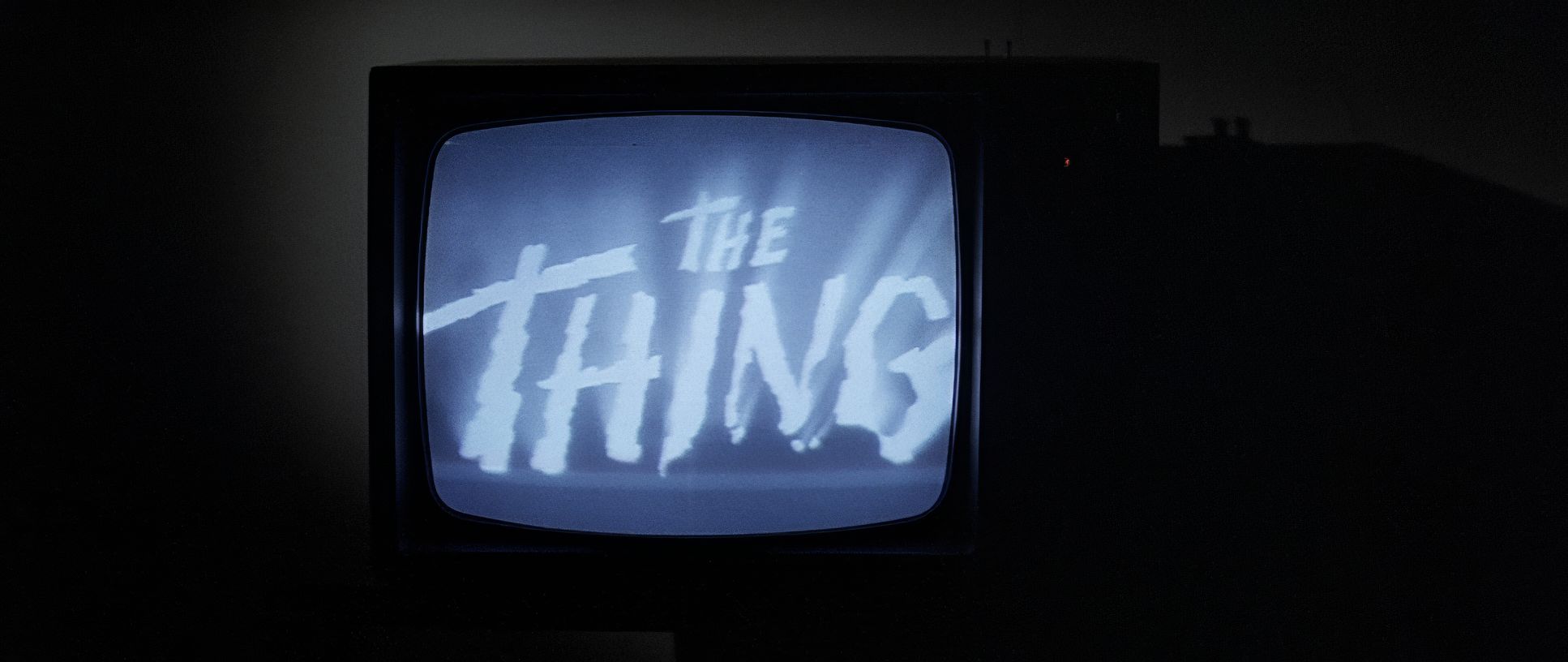
You can see the DNA of old-school suspense and film noir in every frame. The “movies within the movie” are the biggest giveaway. Watching the kids watch The Thing from Another World or Forbidden Planet isn’t just set dressing. It’s Carpenter telling us his influences. The Thing is about an unseen threat, and that’s exactly what Michael is he’s “The Shape.” He’s more of a concept than a man. By omitting “from another world” from the title on the TV, Carpenter is telling us that this evil isn’t an alien; it’s the guy next door. It’s a familiar house with the lights off.
Technical Aspects & Tools
Halloween (1978) — Technical Specifications
| Genre | Horror, Ghost, Thriller |
| Director | John Carpenter |
| Cinematographer | Dean Cundey |
| Production Designer | Tommy Lee Wallace |
| Costume Designer | Stephen Loomis, Bill Whitten |
| Editor | Charles Bornstein, Tommy Lee Wallace |
| Time Period | 1980s |
| Color | Mixed, Saturated, Blue |
| Aspect Ratio | 2.35 – Anamorphic |
| Format | Film – 35mm |
| Lighting | Hard light, High contrast, Underlight, Edge light |
| Lighting Type | Moonlight, Artificial light |
| Story Location | California > Antonio Bay |
| Filming Location | USA > California |
| Camera | Panavision Panaflex |
| Lens | Panavision C series |
The $300k budget is the elephant in the room. They had to be resourceful. Everyone knows the story of the spray-painted Captain Kirk mask, but from a technical side, they were just smart with their gear. They used Panavision Panaflex cameras because they were reliable and standard, but they relied on ingenuity to fill the gaps. Reused sound effects, shooting in California but scattering brown leaves to pretend it’s Illinois these are the “indie” compromises that you totally overlook because the visual language is so strong. It proves that if your blocking, lighting, and lens choices are tight, the audience won’t care if you’re using a cheap mask.
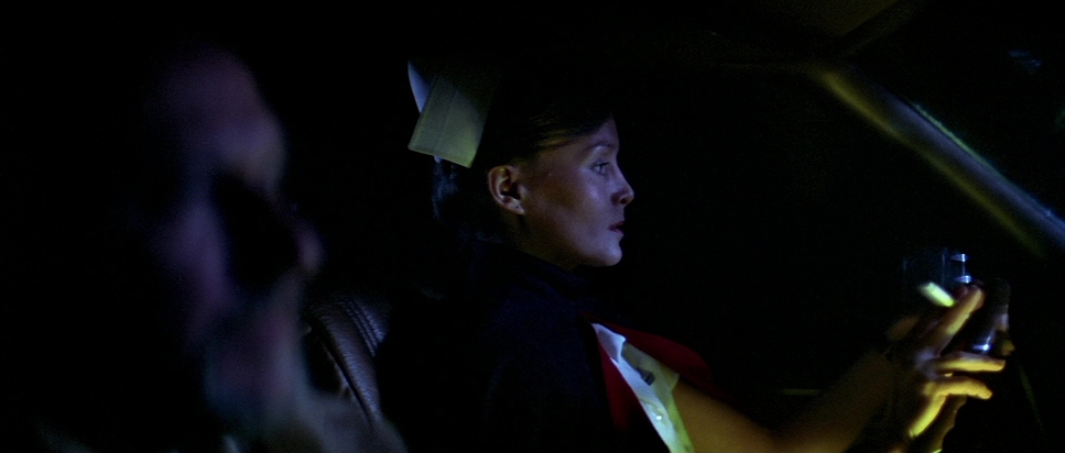
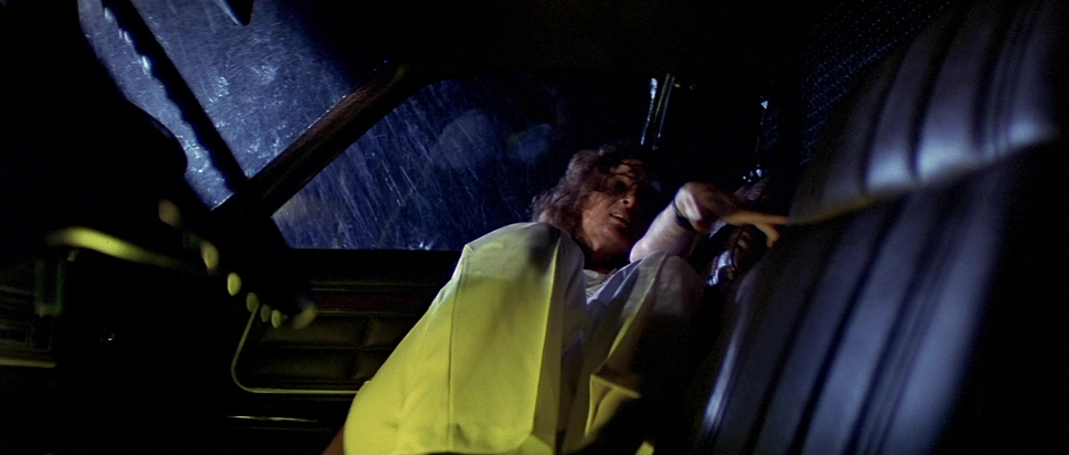
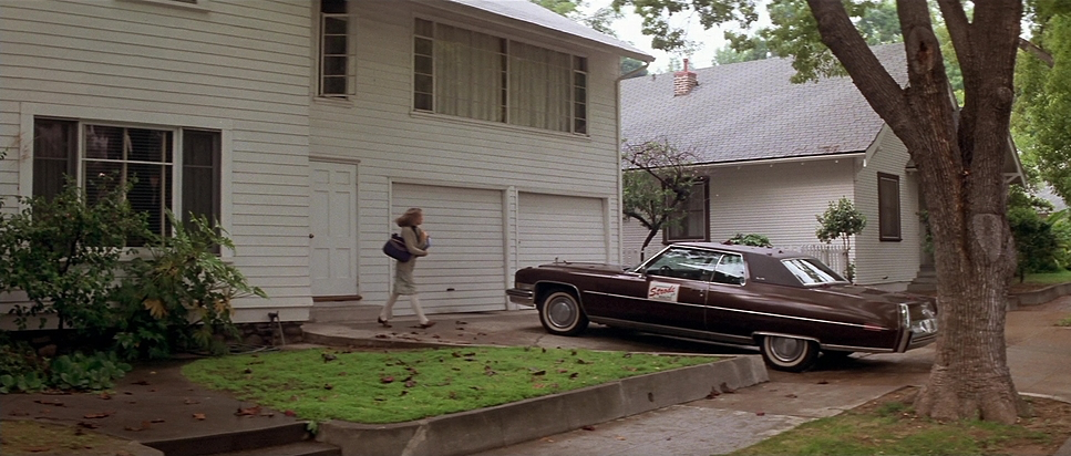
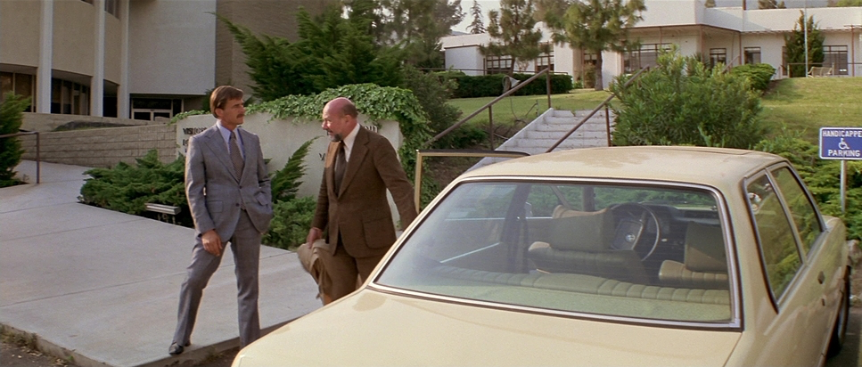
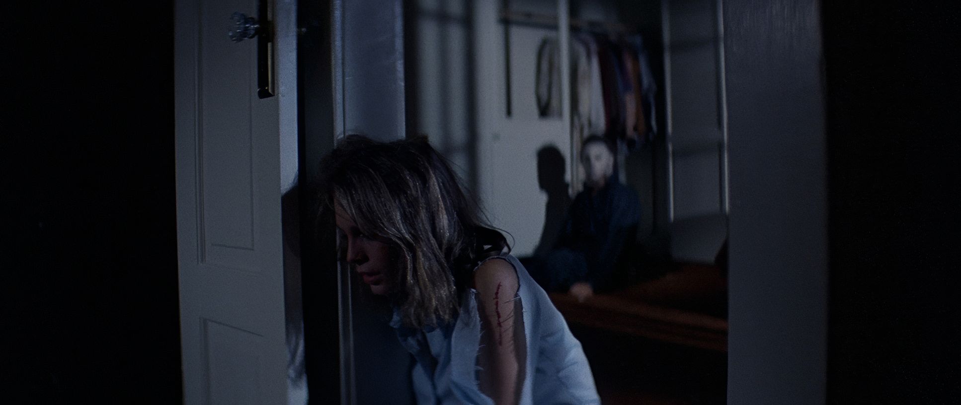
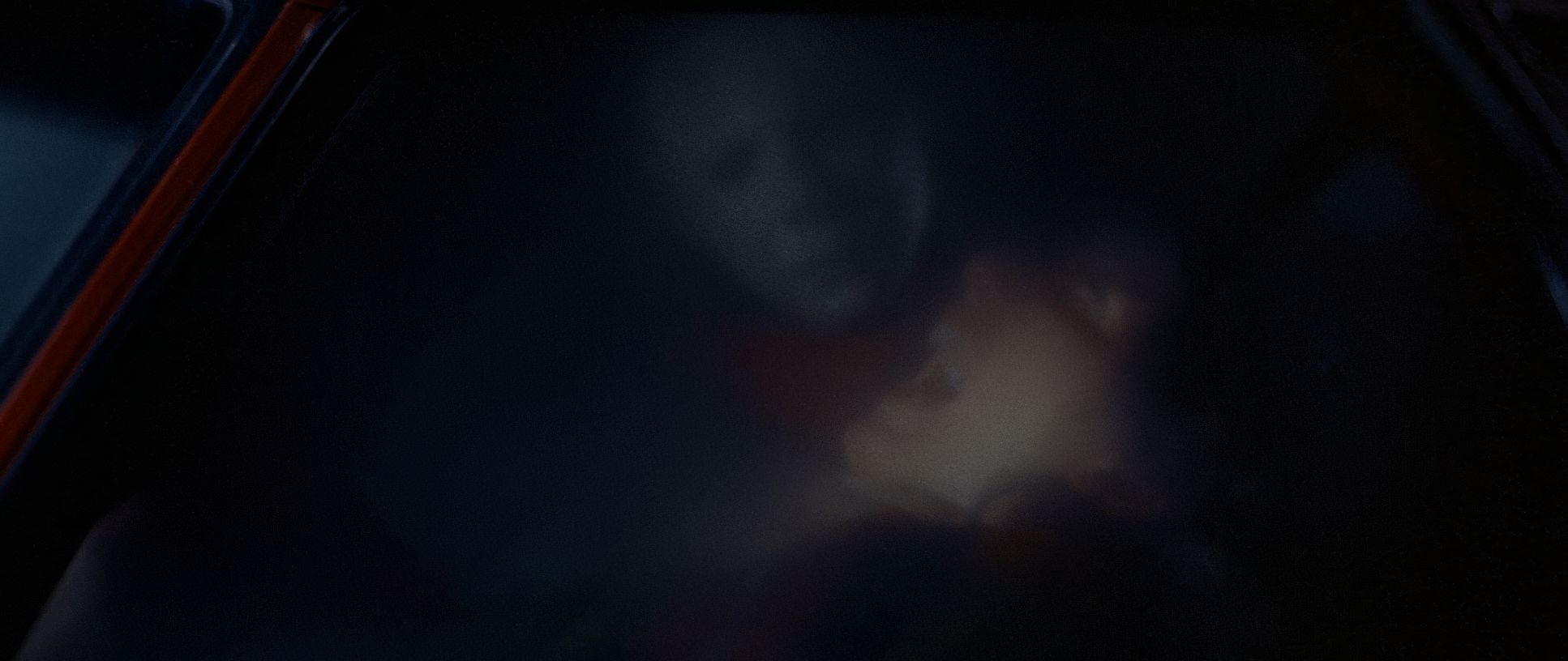
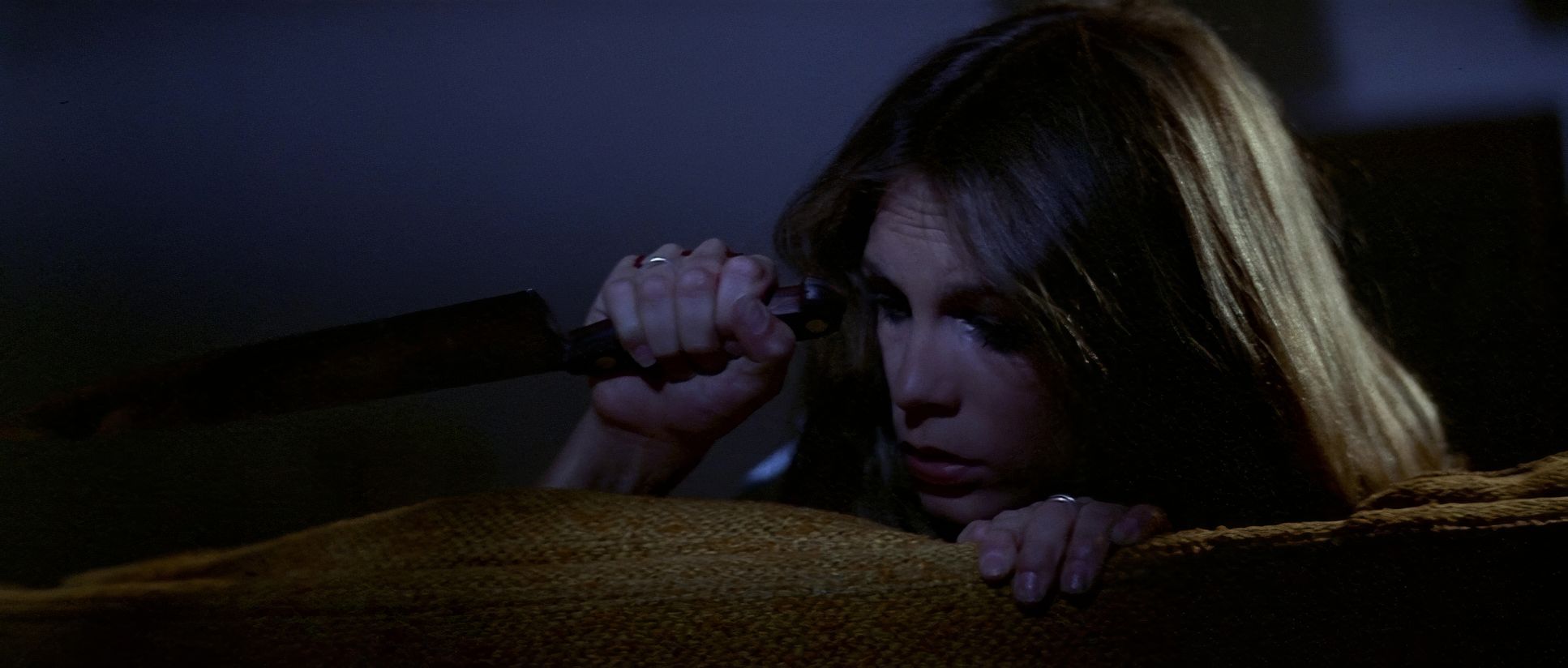
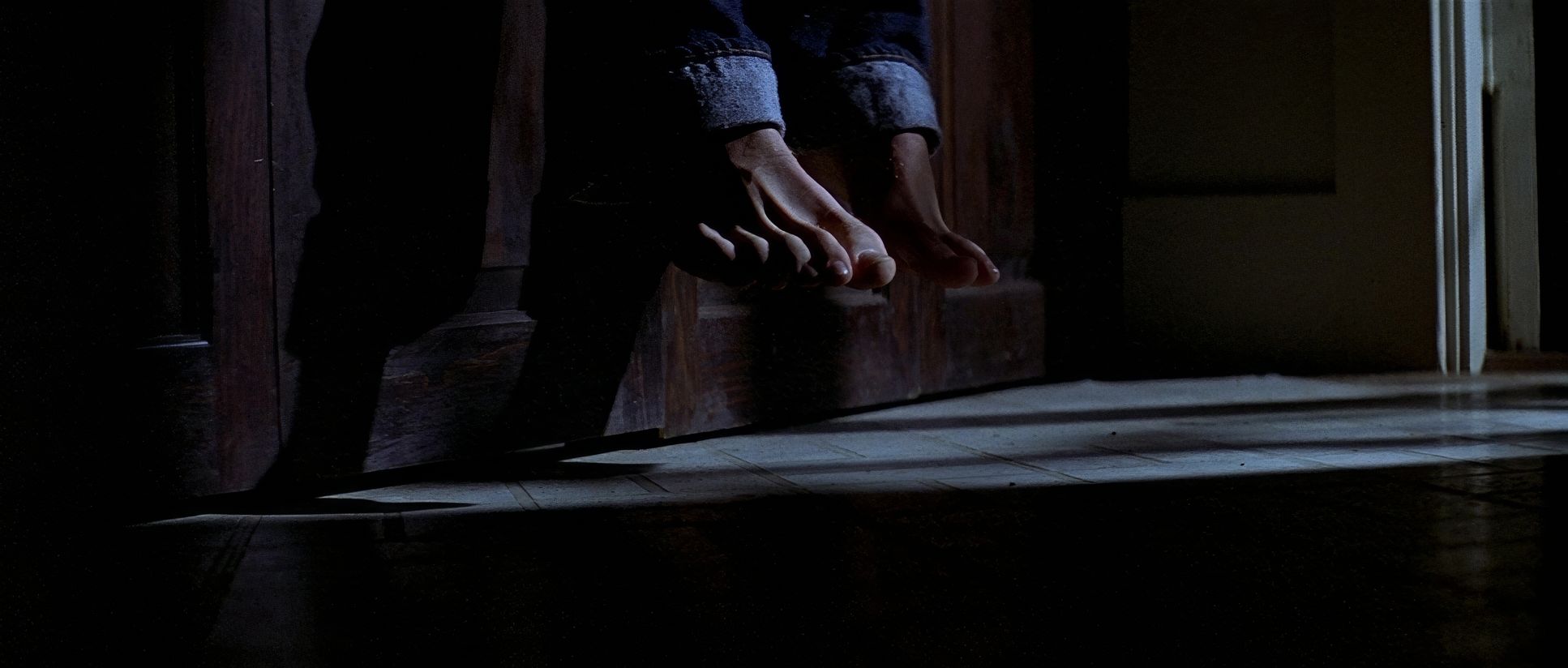
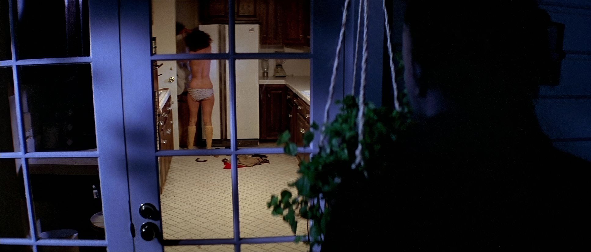
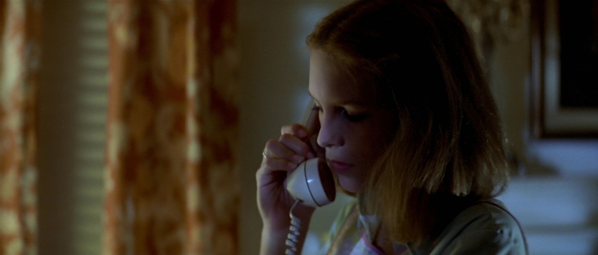
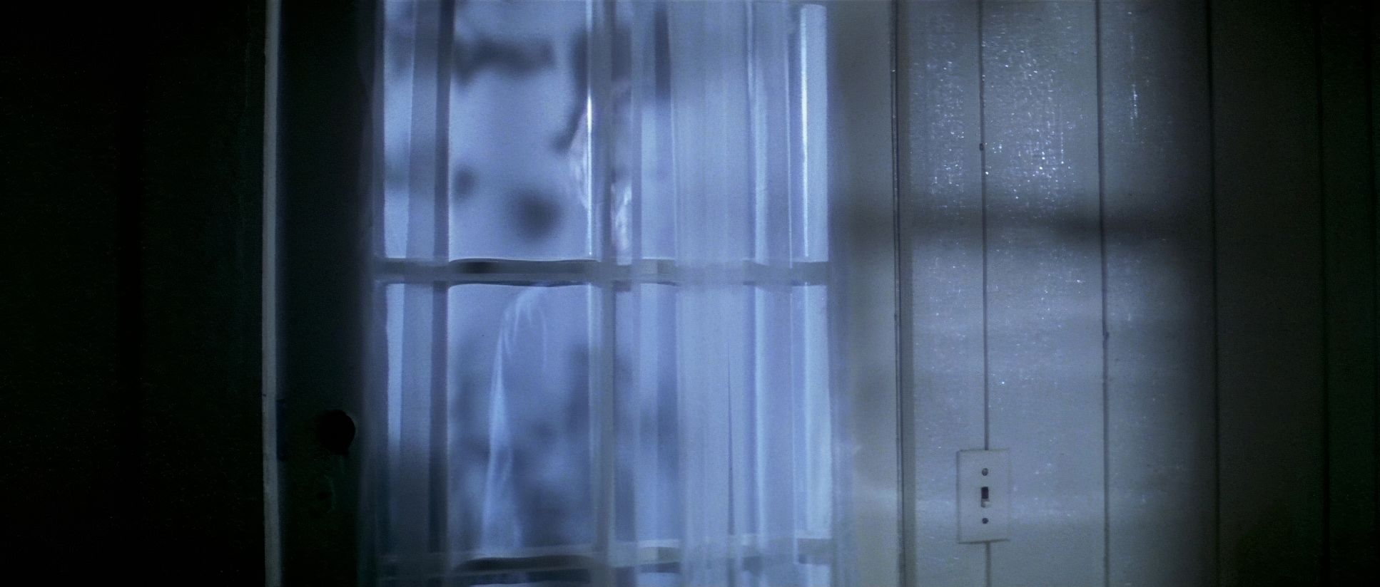
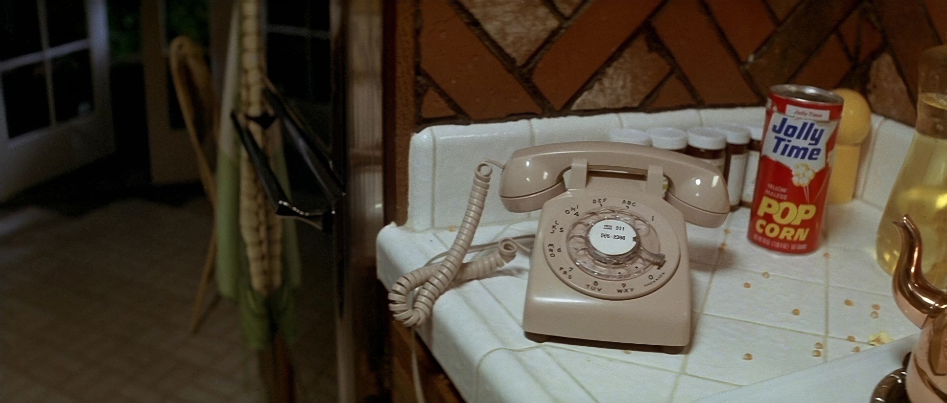
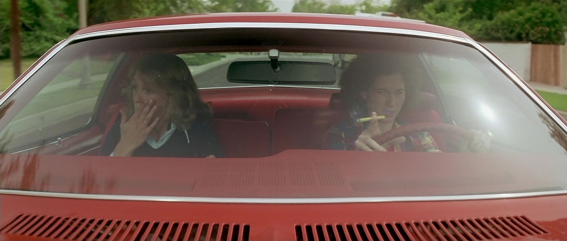
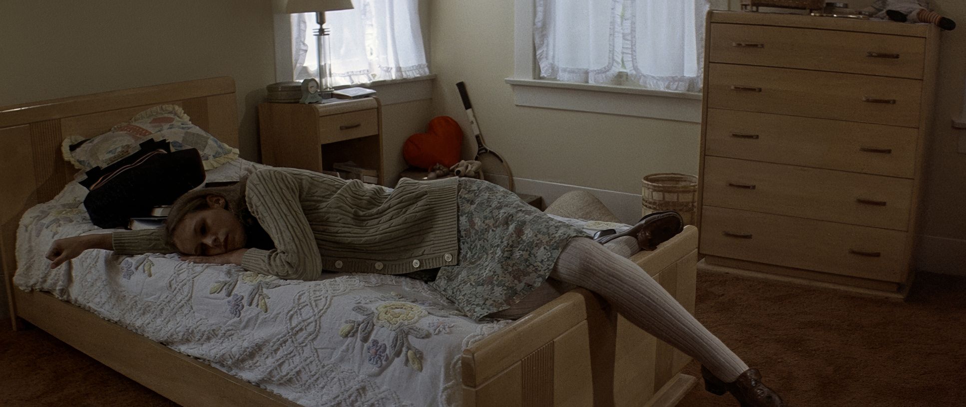
Halloween (1978) Film Stills
A curated reference archive of cinematography stills from HALLOWEEN (1978). Study the lighting, color grading, and composition.


- Also read: LUCKY NUMBER SLEVIN (2006) – CINEMATOGRAPHY ANALYSIS
- Also read: MULAN (1998) – CINEMATOGRAPHY ANALYSIS
Browse Our Cinematography Analysis Glossary
Explore directors, cinematographers, cameras, lenses, lighting styles, genres, and the visual techniques that shape iconic films.
Explore Glossary →