Let’s talk about Guardians of the Galaxy (2014). When this movie first dropped, a lot of us in the industry saw it as a massive gamble. Marvel was taking a roster of obscure, eccentric characters a raccoon, a tree, a green assassin and trying to carve out space in an established cinematic universe. But what James Gunn and cinematographer Ben Davis delivered wasn’t just a successful expansion; it was a visual pivot. They ditched the safe, polished look of superhero flicks and gave us a vibrant, irreverent space opera. It had that rare texture reminding me of Star Wars or Firefly gritty, lived-in, but exploding with color. From the opening scene, the visual language screams adventure, and from a craft perspective, it’s a joy to dissect.
About the Cinematographer
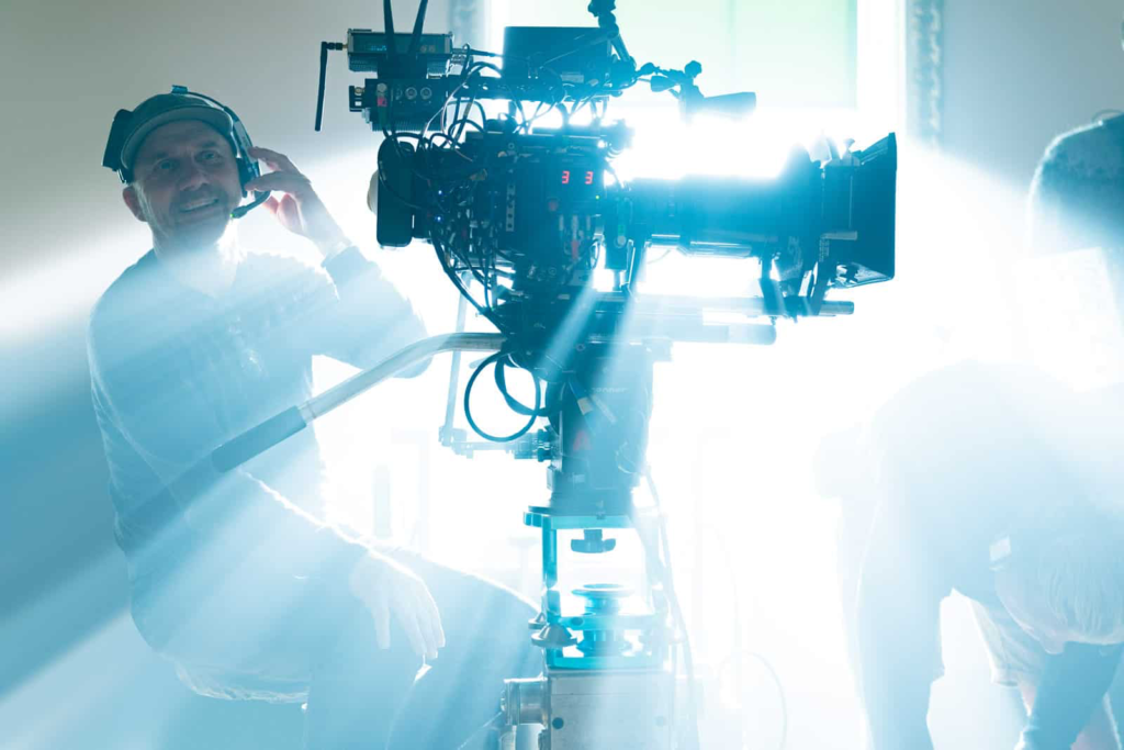
Ben Davis, BSC, is the kind of DP who understands that “big budget” doesn’t have to mean “generic.” Before Guardians, he shot everything from the gritty Layer Cake to the fantasy-heavy Wrath of the Titans. He had already dipped his toes into the MCU with Thor: The Dark World, but Guardians required a different gear.
He wasn’t just lighting for scale here; he was defining a new aesthetic. Davis had to balance cosmic landscapes with intimate character moments, often in the same frame. He had to shoot practical sets knowing they would eventually be populated by fully CG main characters. It’s a complex dance of interactive lighting and careful composition. You need a cinematographer who understands the technical demands of heavy VFX but refuses to let the green screen dictate the emotion. His work here proves that you can have a massive spectacle that still feels tactile and grounded.
Inspiration Behind the Cinematography
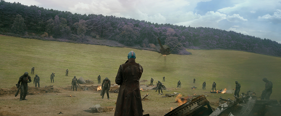
The visual DNA of Guardians is pretty clear: it’s what happens when you smash Star Wars and Star Trek together and filter it through a 70s jukebox. One reviewer nailed it early on, noting the blend of rugged, grimy realism with sleek, colorful optimism. Davis and Gunn leaned hard into a “retro-futuristic” vibe. They didn’t want the sterile, white-walled sci-fi of 2001: A Space Odyssey. They wanted the cover of a Heavy Metal magazine.
This meant practical sets loaded with motivated lighting neon signage, holographic displays, and the flickering hum of ancient alien tech. It gave the world a tactile feel, crucial when half your cast is digital. They wanted a universe that felt sprawling and dangerous, but also fun. It’s about creating scale without losing the immediate, grimy reality of the environment.
Camera Movements
The camera in Guardians is restless. It’s a dynamic participant in the film’s kinetic energy. For the big set pieces—the prison break, the dogfights Davis uses a blend of sweeping Technocrane shots and precise Steadicam work. It provides scale, sure, but it also keeps the geography clear in the chaos.
Where it really shines, though, is in the comedy. The camera movements support the timing. You get these quick whip-pans that punctuate a joke, or a sudden push-in on Rocket delivering a one-liner. It gives the humor a visual rhythm. Conversely, for the dramatic beats involving Star-Lord’s past, the camera slows down. There’s a specific shot in the Kyln where the camera creeps in on Quill’s face it’s imperfect, with a subtle float that feels like a stabilized handheld or a loose Steadicam. It doesn’t feel mechanical. It breathes. That variety prevents visual fatigue; the camera shifts perspective to match the story’s beat, not just to look cool.
Compositional Choices
Davis’s framing in this film is a lesson in managing an ensemble. He constantly alternates between epic scope tiny figures against massive star fields and tight, intimate reaction shots.
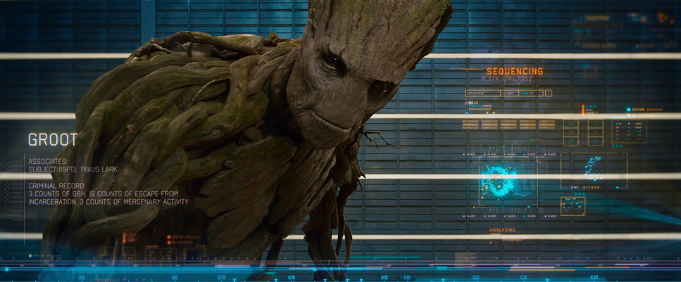
The blocking is where the real work happens. Davis employs deep staging, layering characters to emphasize the group dynamic. You’ll often see Rocket perched on Groot’s shoulder or the team spread across the mid-ground and foreground. It creates a rich, three-dimensional image. He’s also not afraid to break the rules, using Dutch angles sparingly to heighten tension during the more chaotic brawls. But it’s never arbitrary. Every choice feels motivated, usually to underscore the dysfunction of the team or to show off the seamless integration of the VFX elements.
Lighting Style
The lighting here is a masterclass in “dirty” sci-fi. Davis eschews the flat, glossy TV lighting often seen in comic book movies for something more organic. He relies heavily on practicals built into the production design the harsh overheads of the prison cells or the atmospheric, smoky glow of a cantina.
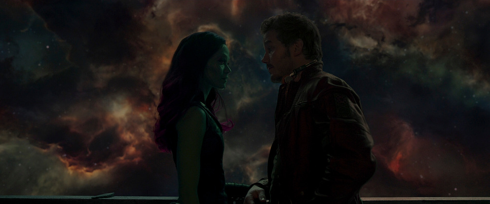
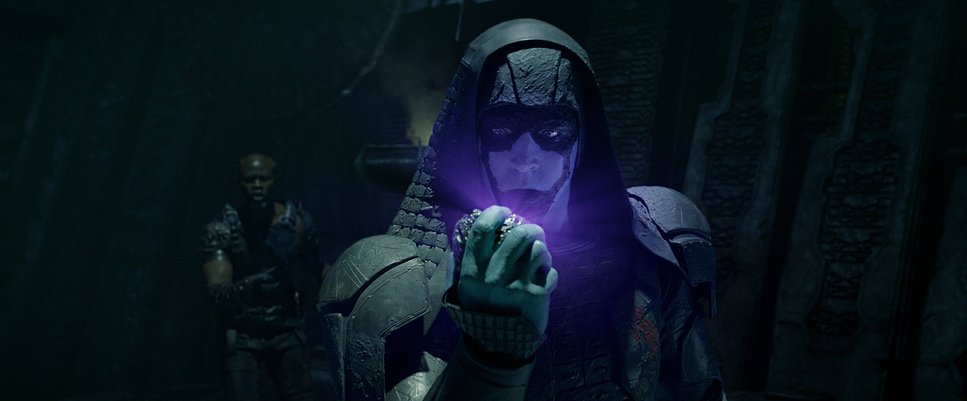
The standout element is how the lighting supports the tone. When the gang is bickering, the light is often softer, warmer. When Ronan arrives, the contrast ratio spikes. The shadows get deeper, and the light becomes stark. And let’s talk about color.
the vibrant blues, purples, and oranges aren’t just decoration; they define the locations. Xandar feels sun-drenched and clean; the Kyln is industrial and cold. As a colorist, I love that Davis uses negative fill to sculpt faces. He gives the image shape on set, rather than relying on post-production to fix a flat image. It makes the final grade sing because the depth is already there in the raw file.
Lensing and Blocking
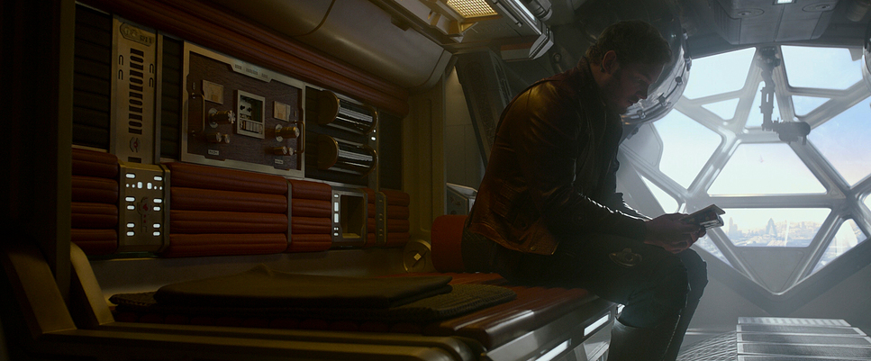
Here is where the look truly gets its character: Ben Davis shot this on Cooke Xtal Express lenses. These are vintage anamorphic lenses (essentially old Cooke S2/S3 glass rehoused), and they are full of imperfections.
You can feel it in the image. The Xtal Express lenses give you those classic oval bokehs and interesting, horizontal flares, but they also have a softness and a geometric distortion that takes the digital edge off the Alexa sensor. It separates the characters from the background in a way that feels cinematic and heroic. It screams “classic space opera.”
Blocking for anamorphic is tricky, especially with a group of five diverse sizes. Davis and Gunn use the width of the 2.39:1 frame to stack the team. When they are fractured, they are physically separated in the frame by architecture. When they unite, they are grouped cohesively. Handling the scale difference between Rocket, a human, and Groot requires precise blocking to ensure no one gets lost in the negative space. It’s a meticulous setup that looks effortless on screen.
Color Grading Approach
The grade on Guardians is pivotal. The film revels in color. The approach is vibrant and saturated, but handled with a restraint that keeps it from looking like a cartoon.
The team, led by colorist Steven J. Scott, clearly aimed for a print-film emulation. Even though it was shot digitally, there’s a beautiful highlight roll-off. The whites don’t clip harshly; they cream out, retaining detail. That’s the hallmark of a good LUT and careful exposure.
The hue separation is impeccable. You have Gamora’s green skin, Drax’s red tattoos, and Nebula’s blue mechanics all in the same frame. If you aren’t careful, that turns into mud. Here, every color feels distinct. There is deliberate tonal sculpting at play. Warm tones anchor Star-Lord’s humanity and his connection to Earth, while cooler tones signify the sterile authority of the Nova Corps. Even Rocket’s fur has nuanced browns and greys that stop him from looking like a video game character. The grade amplifies the fun without sacrificing the grit.
Technical Aspects & Tools
Guardians of the Galaxy (2014) Technical Specs
| Genre | Adventure, Fantasy, Science Fiction |
| Director | James Gunn |
| Cinematographer | Ben Davis |
| Production Designer | Charles Wood |
| Costume Designer | Alexandra Byrne |
| Editor | Fred Raskin, Hughes Winborne, Craig Wood |
| Colorist | Steven J. Scott |
| Time Period | 2010s |
| Color | Cool, Saturated, Purple |
| Aspect Ratio | 2.39 – Spherical |
| Format | Digital |
| Lighting | Soft light |
| Story Location | … Space |
| Filming Location | … United Kingdom > England |
| Camera | ARRI ALEXA XT / XTplus |
| Lens | Cooke Xtal Express, Angenieux Optimo Zooms |
For a film of this magnitude, the ARRI ALEXA XT was the workhorse. At the time, it was the gold standard for dynamic range. That latitude was essential here. With deep space blacks and bright explosions sharing the screen, you need a sensor that can hold onto information in both directions so the VFX artists and colorists have something to work with.
The post-pipeline was massive. Integrating Rocket and Groot meant Davis had to light for characters that weren’t there. It’s not just about matching the light direction; it’s about matching the texture and the fall-off. The “terrific special effects” work because the lighting on the CG characters matches the plate photography perfectly. This requires a cinematographer who is technically precise, using chrome balls and grey balls to capture lighting references constantly. It’s a collaboration where the practical photography provides the anchor for the digital extensions.
- Also read: THE AVENGERS (2012) – CINEMATOGRAPHY ANALYSIS
- Also read: DEMON SLAYER: KIMETSU NO YAIBA- THE MOVIE – INFINITY CASTLE (2025) – CINEMATOGRAPHY ANALYSIS
Browse Our Cinematography Analysis Glossary
Explore directors, cinematographers, cameras, lenses, lighting styles, genres, and the visual techniques that shape iconic films.
Explore Glossary →