Groundhog Day isn’t just a funny movie; it’s a study on repetition and ego. We follow Phil Connors (Bill Murray), an arrogant weatherman stuck in a time loop in Punxsutawney, Pennsylvania. He has to relive the same 24 hours until he drops his cynicism and actually connects with the people around him. Visually, the film has to do two conflicting things: it has to feel repetitive enough to be a prison, but dynamic enough to show Phil’s change from a jerk to a genuine human being. The “small-town aesthetic” here isn’t just background noise; it’s a character. My aim with this breakdown is to show you the nuts and bolts of how that visual journey works from the camera motivation to the specific color choices that make this high-concept fantasy feel grounded in reality.
About the Cinematographer
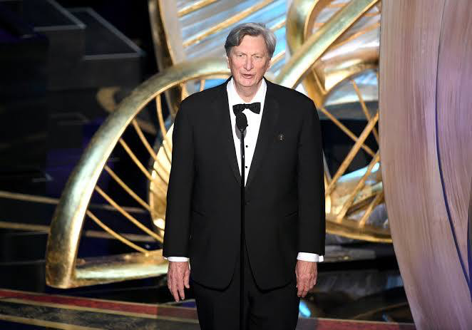
The DP behind Groundhog Day was John Bailey, ASC. Bailey wasn’t the type of cinematographer to use flashy lighting or “look-at-me” shots. His strength was making images feel honest. Before this film, he shot Ordinary People and The Big Chill, proving he knew how to handle character-driven stories. He understood that for a comedy to land, the world needs to feel real, not stylized. For Groundhog Day, he had to be invisible. His job was to collaborate with Ramis to create a visual language that was warm and inviting, but also contained. The cinematography serves the performance, creating a “normal” world that makes Phil’s supernatural situation feel even more jarring.
Inspiration Behind the Cinematography
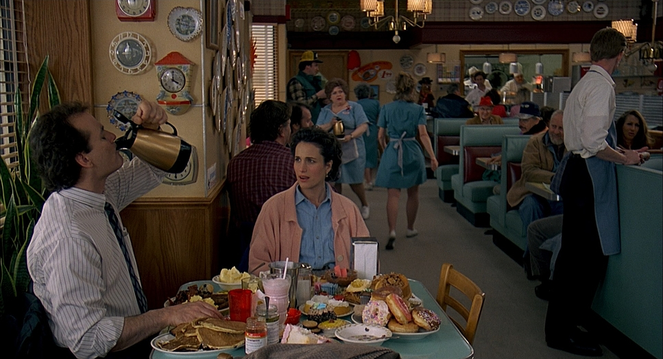
Visually, this film walks a tightrope. Ramis and Danny Rubin (the writer) essentially wrote an experiment: put a man in a box and see what happens. Bailey’s job was to visualize that box. They needed the audience to feel the duration of Phil’s entrapment whether it was two weeks or ten years without the film dragging. This required a level of consistency that is incredibly hard to pull off.
The script started as a “moody indie,” but evolved into a comedy. That shift dictated the look. It had to be naturalistic, but with enough room for the magical elements. Filming in Woodstock, Illinois, instead of the real Punxsutawney gave them a controlled set a theatrical town square. This square becomes Phil’s cage. The camera establishes the geography so clearly that we, the audience, start to memorize the street corners just like Phil does. The inspiration here is the paradox of the story itself: using a mundane, repetitive setting as the canvas for a massive internal change.
Camera Movements
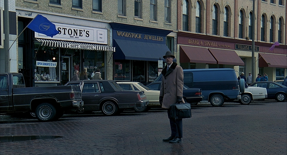
In a movie about a day that never changes, you might expect the camera to be static. But Groundhog Day uses movement very specifically to show us Phil’s headspace. At the start, the camera is functional. We get steady tracking shots and simple pans. We are just observing Phil, and Phil is just observing the town usually with judgment and detachment.
But watch what happens when Phil starts “abusing his power.” The camera wakes up. During the montage where he robs the armored truck or manipulates women, the camera moves are looser, faster, and more reckless. It matches his “god complex.” Later, when the depression hits, the movement slows down. It becomes heavy, sometimes slightly claustrophobic.
The real shift happens in the final act. As Phil starts helping people, the camera flows with him. It stops observing him and starts participating. When he’s catching the boy falling from the tree or changing the tire, the motion is fluid. By the end, the camera gets intimate with him and Rita, using gentle dollies to bring us into their emotional space. The repetition of the day doesn’t change, but the way the camera moves through it does.
Compositional Choices
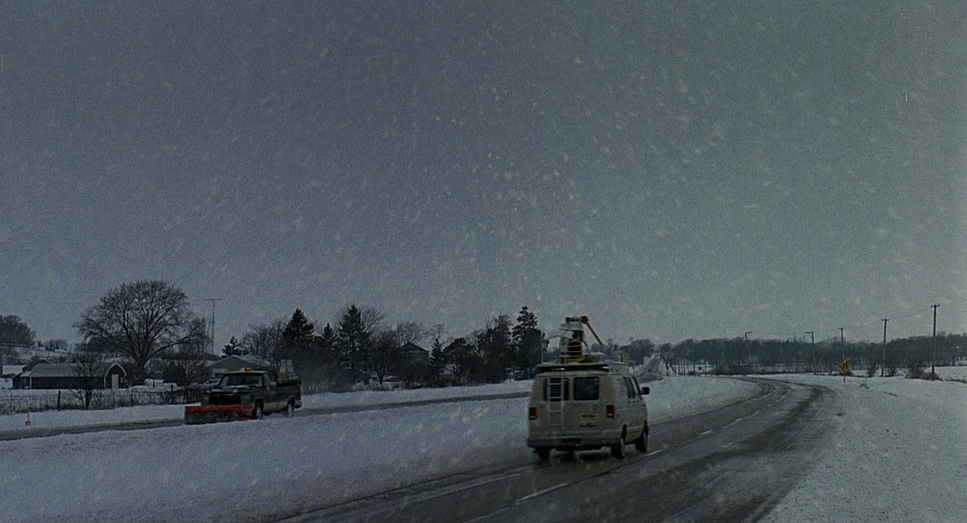
The framing in this film is a lesson in character isolation. Early on, look at how Phil is placed in the frame. He’s often small against the town square, or visually separated from Rita and Larry. He doesn’t share the frame well with others; he’s usually looking away or positioned slightly apart, reinforcing his arrogance. The opening scene in front of the blue screen is the perfect visual metaphor: Phil is standing in front of a fake void, disconnected from reality.
As the loop continues, the composition highlights the repetition. We see the same symmetry in the street corners and storefronts. But as Phil changes, his place in the frame changes.
In his “nihilistic” phase, the framing gets a bit chaotic maybe a loose angle here or there to show his unraveling. But as he moves toward acceptance, the compositions become balanced. We start seeing standard “two-shots” where he and Rita share the screen equally. He becomes integrated into the crowd shots rather than standing apart from them. The recurring gag with Ned Ryerson is a great example of blocking and composition working together Ned constantly pops into a close-up, invading Phil’s space, forcing an interaction Phil desperate wants to avoid, until finally, Phil embraces it.
Lighting Style
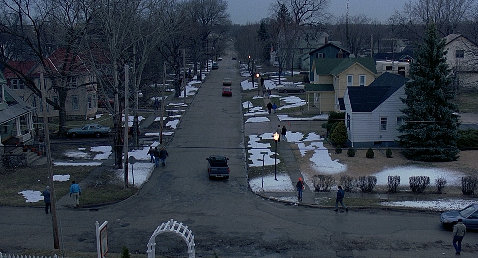
Lighting a comedy usually means “bright and flat,” but Bailey added layers here. The goal was “motivated naturalism.” They needed to create a winter look that felt consistent, day after day. This is harder than it sounds because production took place over months where the real weather was changing constantly. They had to fake that flat, soft winter light even when the sun was harsh.
For exteriors, the light is soft and diffused, mimicking a perpetually overcast February morning. This consistency is what sells the time loop. Interiors use practical sources lamps in the B&B, fluorescents in the diner—to keep it grounded.
But if you look closely, the lighting shifts with the mood. In Phil’s depressed phase, the contrast is a bit higher, the shadows a bit deeper. It’s not dramatic noir lighting, but it’s less inviting. Conversely, the final “perfect day” feels more radiant. The lighting on Rita in the final scenes has a soft, almost romantic glow to it. Bailey managed to keep the lighting looking natural while subtly manipulating the contrast to tell us how Phil is feeling.
Lensing and Blocking
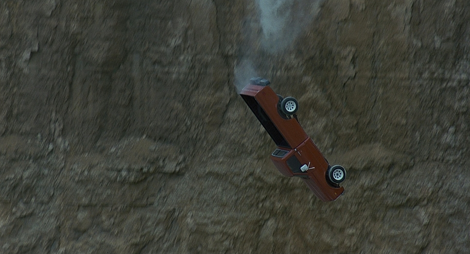
John Bailey stuck to standard focal lengths here mostly 35mm to 50mm. This mimics the human eye and avoids distracting the audience with wide-angle distortion or extreme telephoto compression. It keeps the world feeling honest. The wide shots are used strictly to establish the “cage” of the town square.
The blocking is where the real storytelling happens. In the beginning, Phil’s blocking is defensive. He walks away from people. He puts physical barriers between himself and Larry. He is constantly turning his back on the town.
As he evolves, he physically turns toward people. He starts entering the group. His proximity to Rita changes drastically. At first, he’s trying to corner her (literally blocking her path), which feels predatory. By the end, during the snow sculpture scene or the dance, the blocking is cooperative. They move together. The lensing provides a neutral window, but the blocking shows us the change in Phil’s soul.
Color Grading Approach
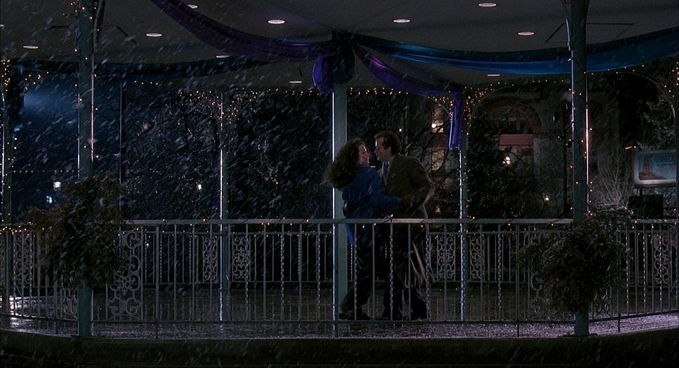
From a colorist’s perspective, it’s important to remember this was 1993. There were no digital intermediate workflows, no DaVinci Resolve, and no power windows. This was a photochemical finish. The “grade” was achieved through printer lights at the lab literally adjusting the intensity of Red, Green, and Blue light as the negative was printed.
Because of this, the color palette had to be baked in on set through production design and lighting. The look is rooted in that early 90s Kodak Vision stock sensibility warm midtones, slightly lifted blacks, and a gentle highlight roll-off. It’s a very “print” look.
If I were grading this today, I’d be using all sorts of windows to shape the light, but the beauty of Groundhog Day is that they couldn’t do that. The “grade” relies on the consistency of the dailies. That said, there is a subtle shift. The early parts of the film feel a bit flatter and cooler (the winter blues). As Phil warms up to the town, the skin tones seem to get a bit richer, and the warmth of the interiors feels more inviting. The final sequence has a definite warmth to it that contrasts with the cold exteriors, symbolizing his internal change. It’s a great example of how a restrained, chemical color timing process can still have an emotional impact.
Technical Aspects & Tools
| Groundhog Day — 35mm / 1.85:1 Spherical | |
|---|---|
| Genre | Comedy, Drama, Fantasy, Romance, Magical Realism, Time Travel, Rom-Com |
| Director | Harold Ramis |
| Cinematographer | John Bailey |
| Production Designer | David Nichols |
| Costume Designer | Jennifer Butler |
| Editor | Pembroke J. Herring |
| Colorist | Scot Deer |
| Time Period | 1990s |
| Color Palette | Cool, Desaturated, Blue |
| Aspect Ratio | 1.85 – Spherical |
| Format | Film – 35mm |
| Lighting Style | Hard light, High contrast, Side light |
| Lighting Type | Moonlight |
| Story Location | Pennsylvania > Punxsutawney |
| Filming Location | Illinois > Woodstock |
| Camera | Panavision Panaflex Platinum |
| Lens | Panavision Primo Primes |
Since this was the early 90s, this was a 35mm film shoot, using the workhorse cameras of the era likely Panavision Panaflex with Primo lenses.
The technical nightmare here wasn’t the equipment; it was the continuity. The shoot ran from March to June 1992. They were shooting winter scenes while spring was blooming in Illinois. They had to use fake snow and constantly fight the changing angle of the sun. As a colorist, I know that matching shots when the sun is shifting in and out of clouds is a headache. Doing it for a whole movie that is supposed to take place on one specific day is a monumental achievement.
- Also read: CASINO ROYALE (2006) – CINEMATOGRAPHY ANALYSIS
- Also read: BLADE RUNNER 2049 (2017) – CINEMATOGRAPHY ANALYSIS
Browse Our Cinematography Analysis Glossary
Explore directors, cinematographers, cameras, lenses, lighting styles, genres, and the visual techniques that shape iconic films.
Explore Glossary →