Green Book is the poster child for this aesthetic. But looking past the politics of the script or the “white savior” critiques that followed its Best Picture win, I want to analyze why this image works so well on a technical level. Sitting in my suite at Color Culture, looking at films that attempt this kind of period look, I often see them fail by trying too hard over-graining, over-halating. Green Book pulls off a magic trick it feels like a memory from 30 years ago, yet it was shot on hyper-modern, clinical equipment. That paradox is where the real craft lies.
Watching Green Book, you can feel the deliberate choices made to ensure “legibility.” In the color grading world, we talk about “audience friction.” A dark, high-contrast, desaturated grade creates friction; it forces the viewer to work. Green Book does the opposite. It is visually generous. It prioritizes connection and facial recognition over harsh realism. It’s a film that earns its charm not just through acting, but by designing a visual language that feels like a warm hug, even when the subject matter gets cold.
About the Cinematographer
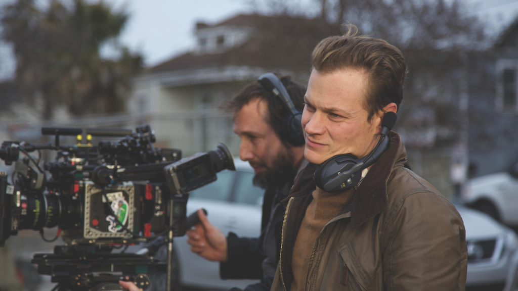
The director, Peter Farrelly, is known for broad comedies like Dumb and Dumber, so his jump to dramatic prestige was a massive pivot. To ground this, he didn’t hire a studio hack; he hired Sean Porter. I’ve followed Porter’s work on indie darlings like 20th Century Women, where he leans into naturalism and available light.
Bringing an indie DP into a polished studio period piece is a smart play. Porter doesn’t light for “glamour” in the traditional Hollywood sense; he lights for environment. For Green Book, he had to reconcile Farrelly’s need for a commercially accessible, bright movie with the inherent weight of the 1960s segregated South. Porter didn’t try to reinvent the wheel here. Instead, he adapted his naturalistic style to a period road movie, stripping away the indie “grit” in favor of a cleaner, more classical composition that lets the actors do the heavy lifting.
Inspiration Behind the Cinematography
The “Negro Motorist Green Book” itself a survival guide for Black travelers implies a world of hidden dangers versus safe havens. Visually, the film plays with this duality but keeps the safety guardrails on. The inspiration seems to be 1960s postcard photography: vibrant, slightly saturated, and sunny.
There’s a conscious decision here to avoid the “grime” often associated with period dramas about racism. The film doesn’t look like a gritty documentary; it looks like a fable. We see sun-drenched highways and the opulent, gold-hued interiors of concert halls. It’s almost a visual metaphor for the Hollywood version of history—bad things happen, but the world is ultimately beautiful. As a colorist, I see this in the highlights; they are never harsh white, but always creamy and rolled off. The cinematography invites the audience in to make Tony and Don’s journey feel relatable, ensuring we are never alienated by the harsh realities of the era, even when they are staring us in the face.
Camera Movements
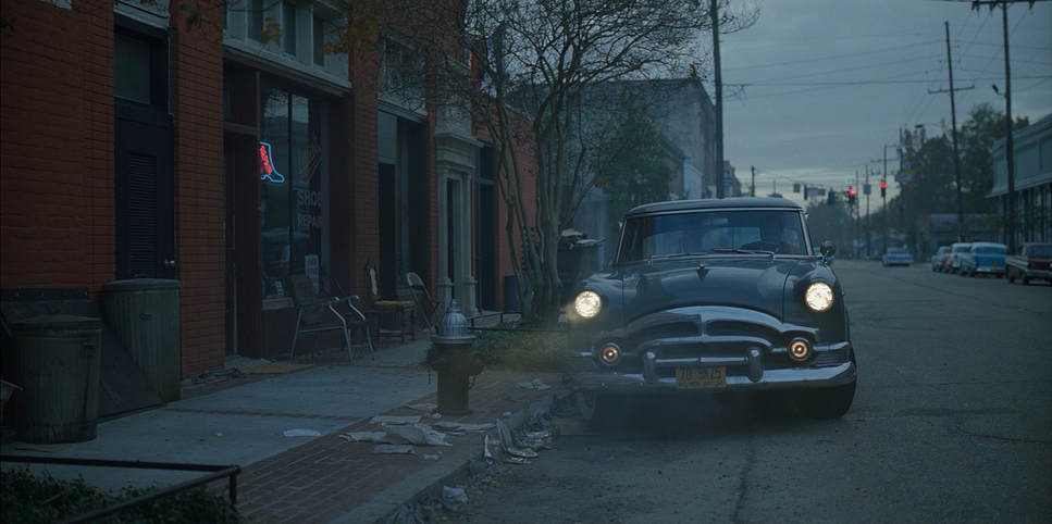
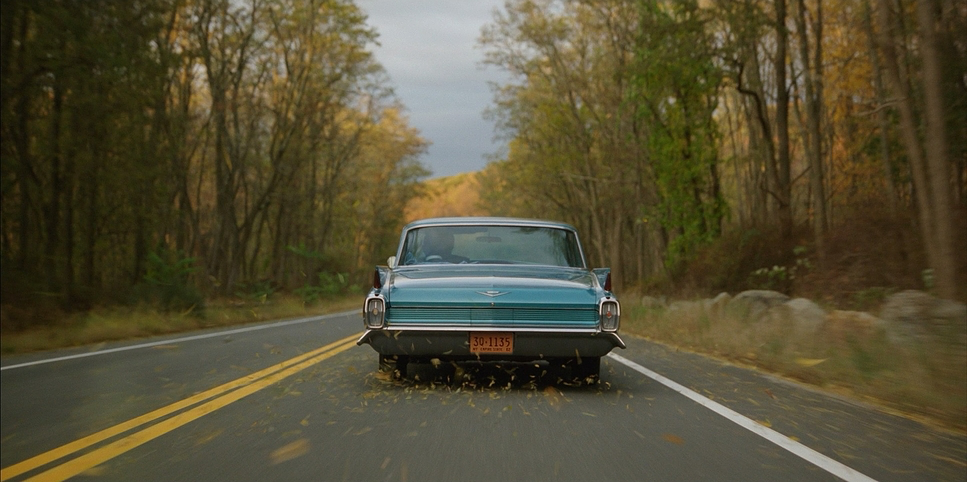
In a road movie, the camera usually just tracks the car. But here, the movement has a very specific “buddy movie” rhythm. Within the car specifically that turquoise Cadillac DeVille the camera is an intimate observer. The movement is fluid, utilizing dolly shots and smooth tracking that mimics the suspension of a luxury 60s vehicle. It’s rarely handheld; the stability suggests safety within the vehicle, contrasting with the instability outside of it.
When the film stops, the camera settles. Look at the scene where Don Shirley delivers his “identity” speech in the rain. A lesser DP might have gone handheld to induce anxiety. Porter keeps it locked off or on a slow, deliberate push. It isolates Don against the downpour, elevating the moment to something theatrical rather than chaotic. The camera movement, much like the script, is unfussy. It doesn’t want you to notice the operator; it wants you to notice the relationship.
Compositional Choices
The aspect ratio here is crucial. They shot this in 2.00:1 (Univisium). This is a fascinating choice for a road trip movie, where you’d expect the wider 2.39:1 CinemaScope to capture landscapes. But Green Book isn’t about the landscape; it’s about the car. The 2.00:1 frame is the perfect height to frame two men sitting in the front and back seat of a car without too much wasted headroom or cutting off chins.
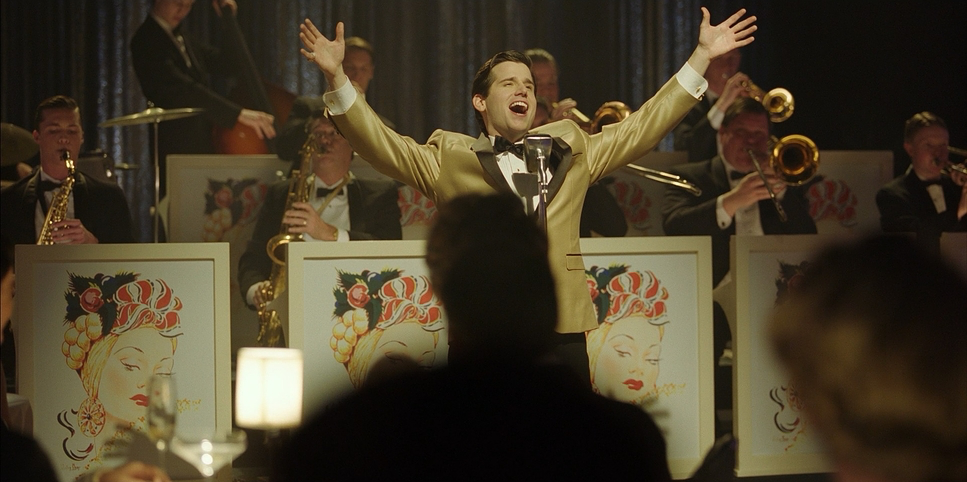
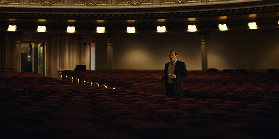
Compositionally, Porter uses the frame to define status. Don Shirley is introduced in his apartment above Carnegie Hall, framed centrally in a wide shot, looking like a king on a throne, yet dwarfed by the excessive production design he is isolated by his own success. Tony, conversely, is framed in messy, crowded compositions in the Bronx. As the film progresses, the “two-shot” becomes the visual anchor. By the third act, the framing tightens, bringing them physically closer in the lens, reinforcing the narrative arc of their bonding.
Lighting Style
The lighting strategy is where the “period” feel starts to emerge. While the film is set in the 60s, Porter avoids the hard, noir-ish lighting of actual 60s cinema. Instead, he uses large, soft sources to emulate a modernized version of that era. The exterior day scenes are pushed to be warm and naturalistic.
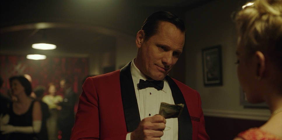
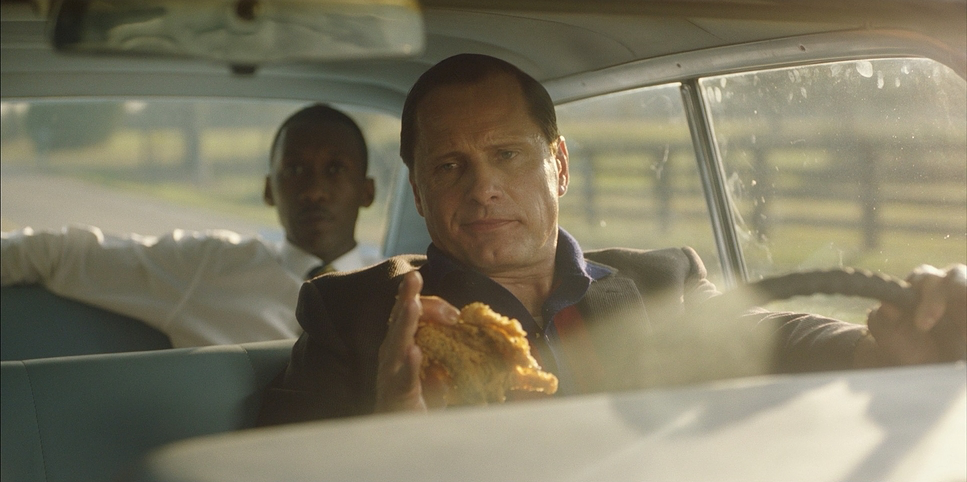
However, the interior work is where the polish shows. Look at the Copa Cabana scenes or the concert halls. Porter utilizes top lighting effectively to separate Don from the background, giving him a “halo” effect that suits his character’s prodigious talent. The practical lights table lamps, car headlights, stage spots—are all meticulously balanced. Nothing blows out. Even in the night scenes on the road, where Tony is driving through the “sundown towns,” the darkness is never crushing. There is always detail in the shadows. It’s a “safe” lighting scheme, ensuring that every facial expression is readable, which is essential for a drama that relies so heavily on micro-expressions between Mortensen and Ali.
Lensing and Blocking
Here is where the technical reality contradicts the “vintage” perception. A lot of viewers assume this was shot on vintage glass to get that retro feel. They are wrong. The production data confirms they used Leitz Summilux-C lenses.
This is a bold, almost counter-intuitive choice. Summilux-Cs are modern, incredibly sharp, and high-contrast lenses. They are clinical. They don’t have the natural aberrations or soft edges of a Cooke Speed Panchro or an old Canon K-35. So, why use them for a period piece? Likely for reliability and consistency across the varying locations (New Orleans doubling for everywhere from the Midwest to NYC). The “softness” we feel in the final image wasn’t in the glass; it was engineered later.
Blocking-wise, the car acts as a stage. The rearview mirror is used constantly as a device to connect the two characters without them looking at each other. In the beginning, the blocking emphasizes the divider between front and back seat the employee and the employer. By the end, the blocking relaxes, and we see them sharing the frame more equitably.
Color Grading Approach
This is where the magic happens. The colorist, Walter Volpatto, had a massive job: he had to take footage shot on a clinically sharp digital sensor with clinically sharp lenses and make it feel like 1962.
Volpatto didn’t just slap a sepia LUT on it. The grade (likely done in DaVinci Resolve) employs a sophisticated Print Film Emulation (PFE), likely modeled on a Kodak 2383 stock. This is what creates that “creamy” texture. The highlights are rolled off to remove the “digital sting” of the Alexa sensor. The palette is shifted towards the warm quadrants of the vectorscope—rich ambers, tobacco browns, and teals in the shadows.
Notice the skin tones. Despite the heavy look, the skin tones remain separated and clean. This is the mark of a high-end DI (Digital Intermediate). If you just put a warm wash over the whole image, the skin looks muddy. Here, the separation is pristine. The blues of Don’s suits pop against the warm browns of the set design. It’s a grade that evokes nostalgia; it feels “yummy,” for lack of a better technical term. It makes the past look like a place you want to visit, despite the dangers lurking in the script.
Technical Aspects & Tools
Green Book – Technical Specifications
| Genre | Comedy, Drama, Political, History, Biopic, Road Trip |
|---|---|
| Director | Peter Farrelly |
| Cinematographer | Sean Porter |
| Production Designer | Tim Galvin |
| Costume Designer | Betsy Heimann |
| Editor | Patrick J. Don Vito |
| Colorist | Walter Volpatto |
| Time Period | 1960s |
| Color | Warm, Saturated |
| Aspect Ratio | 2.00 – Spherical |
| Format | Digital |
| Lighting | Top light |
| Lighting Type | Artificial light, Practical light |
| Story Location | … New York > New York City |
| Filming Location | … Louisiana > New Orleans |
| Camera | ARRI ALEXA Mini |
| Lens | Leitz SUMMILUX-C |
| Film Stock / Resolution | 2K, ARRIRAW (3.4k) |
Let’s look at the hard data. The film was shot on the ARRI ALEXA Mini, likely recording in ARRIRAW 3.4k Open Gate to maximize the sensor area. As mentioned, they paired this with Leitz Summilux-C lenses.
This combination creates a massively high-resolution, sharp negative. For a colorist, this is actually a gift. It’s easier to soften a sharp image in post than to sharpen a soft one. The clean signal from the Alexa Mini allowed Volpatto to push the grade into that warm, saturated territory without introducing noise or artifacts. The digital format also allowed for the long takes and flexibility required for a road movie, where resetting a film magazine would have killed the momentum of the actors in the car.
- Also read: TOP GUN: MAVERICK (2022) – CINEMATOGRAPHY ANALYSIS
- Also read: FULL METAL JACKET (1987) – CINEMATOGRAPHY ANALYSIS
Browse Our Cinematography Analysis Glossary
Explore directors, cinematographers, cameras, lenses, lighting styles, genres, and the visual techniques that shape iconic films.
Explore Glossary →