Alright, let’s talk about Grave of the Fireflies. As a film colorist, I spend my days dissecting images, analyzing how every hue, shadow, and highlight contributes to the story. But sometimes, a film transcends technical analysis, hitting you on a purely visceral level. Grave of the Fireflies is one of those rare, profound experiences. It’s a film that leaves an indelible mark, and while its emotional weight is undeniable, its visual language is equally masterful, quietly guiding us through unimaginable pain with stark beauty and unflinching realism.
About the Cinematographer

In animation, the role of “cinematographer” is distinct from live-action, yet the principle remains the same: it is the execution of a visual philosophy. For Grave of the Fireflies, that vision was crafted by director Isao Takahata and executed by cinematographer Nobuo Koyama. Takahata wasn’t just directing the story; he was meticulously crafting its visual fabric. While the Studio Ghibli name is often associated with the whimsical and the magical, Takahata and Koyama’s work here operates on a completely different frequency. It is a testament to the power of animation to convey deeply realistic, traumatic human experiences. This isn’t just “drawing”; it is a relentless pursuit of authenticity, creating a visual world that feels tangible even as it breaks your heart.
Inspiration Behind the Cinematography
The visual inspiration stems directly from its harrowing subject matter: the firebombing of Japan during World War II and the subsequent struggle for survival. The film unflinchingly depicts the horrors of war, employing a visual style engineered to immerse us in that brutal reality. Takahata sought to create a snapshot of war-torn Japan, focusing on the human scale of the tragedy rather than abstract military strategy. The aesthetic is rooted in a naturalistic, Neo-realist approach. The visual grammar isn’t stylized or overtly fantastical; it’s grounded, almost documentary-like in its observation of Setusko and Seita.
This commitment to realism is crucial. It allows the film to correct or add to historical narratives that often overlook the civilian experience. By presenting the environment as a post-apocalyptic landscape, meticulously rendered to reflect the devastation of cities, the visuals become a historical record. The animation isn’t used to soften the blow but to allow for depictions that would be ethically challenging in live-action—like showing children slowly starving. The goal is to make us feel the ground beneath their feet, the ash in the air, and the overwhelming sense of loss through every frame.
Camera Movements
The camera movements are deliberate and restrained, serving to amplify the film’s grounded realism. During the initial air raid, the camera is far from static. It adopts a dynamic, chaotic energy, sweeping across the village as bombs fall and fires erupt. This motion, combined with the frenetic pace of the animation, plunges us into the palpable sense of urgency felt by the characters. We aren’t just watching; we are running alongside them.
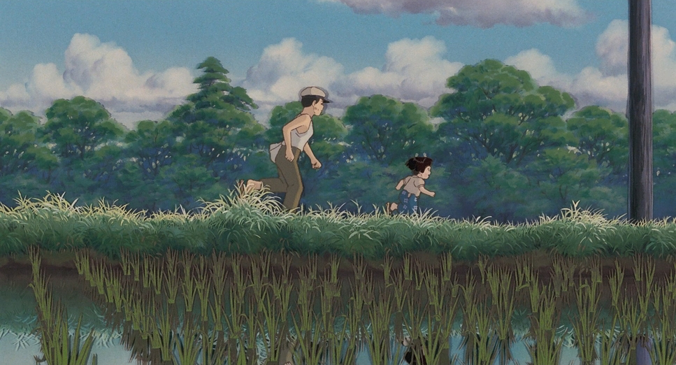
However, once the immediate danger passes, the camera settles into a more observational role. We see slow, measured pans or subtle push-ins that allow us to linger on the children’s faces or moments of quiet despair. This serves a dual purpose: first, it anchors us firmly in their subjective experience, making their plight deeply personal. Second, it grants the audience the space to witness the profound emotional toll. Tracking shots often follow Seita and Setsuko on their arduous journeys, these fluid movements emphasizing their isolation as they navigate an indifferent world. The camera acts as an unseen companion, mirroring the narrative structure where the siblings’ spirits observe their past lives.
Compositional Choices
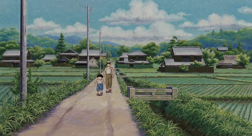
Takahata’s compositional choices are masterful in conveying vulnerability. He frequently uses wide shots to establish the vast, desolate landscapes of war-torn Japan, dwarfing Seita and Setsuko within the frame. This isn’t just for scale; it’s a visual metaphor for their extreme isolation and insignificance in the face of societal indifference. They are small figures against a backdrop of burned-out husks and open fields. This framing immediately highlights that they are truly on their own.
In contrast, close-ups are reserved for moments of intense emotion or fleeting tenderness. A tight shot on Setsuko’s face as she asks, “Why do fireflies die so soon?” effectively connects us with her innocence and impending fate. The film also utilizes deep focus, meticulously rendering backgrounds even when the focus is on the characters. This keeps the environment—with all its dangers and sparse resources—constantly present. Often, the children are framed off-center, suggesting a sense of precariousness, as if they could be pushed out of the picture, and out of existence, at any moment. It is a subtle visual echo of their deepening despair.
Lighting Style
The lighting is intensely motivated and plays a crucial role in establishing tone. Given the wartime setting, artificial light sources are rare. The animation primarily utilizes natural light—daylight, moonlight, and the glow of fire. During the day, scenes are often depicted with a stark, sometimes overexposed quality, especially in the bombed-out urban areas. This harsh, unfiltered light contributes to the feeling of exposure; there’s no soft, flattering studio lighting here, only the unforgiving glare of a world laid bare.
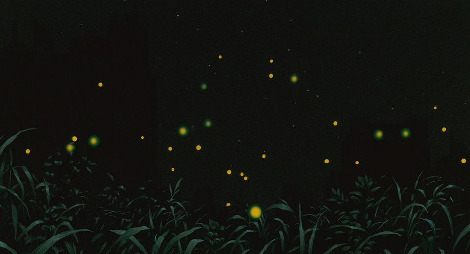
Night scenes, however, are where the lighting becomes evocative. The titular fireflies serve not only as a poignant symbol of fleeting souls but also as a primary practical light source. Their warm, flickering glow provides a brief, magical reprieve from the surrounding darkness. This contrasts sharply with the “fire” of the incendiary bombs, which bring death. The delicate, bioluminescent glow offers a sense of fragile hope amidst the pervasive gloom, making their eventual dying off all the more tragic. This careful attention to motivated lighting simulates the practical constraints of their existence, making the visuals powerfully immersive.
Lensing and Blocking
Even without physical glass, Grave of the Fireflies demonstrates a sophisticated understanding of focal length. The film utilizes simulated wide-angle perspectives to exaggerate the vastness of the bombed landscape, dwarfing the children against deep layers of debris. These wider views provide strong depth cues, emphasizing the scale of devastation. Conversely, Takahata switches to tighter, telephoto-style compression for character interactions, collapsing the background to force intimacy with Seita and Setsuko. This choice humanizes the experience, making their personal struggles feel immediate.
The blocking is equally precise, often used to illustrate rigid power dynamics. In scenes with the abusive aunt, the children are often positioned lower in the frame or at a distance, emphasizing their subordinate status. When they finally leave, their blocking becomes more central but also more isolated, visually representing their severance from societal support. The recurring motif of Seita crouching over Setsuko, shielding or comforting her, visually reinforces their unbreakable, yet ultimately tragic, bond.
Color Grading Approach

From my perspective as a colorist, Grave of the Fireflies is a masterclass in tonal sculpting. The overall palette is remarkably desaturated, leaning heavily into muted earth tones, drab grays, and dusty browns. This visual scarcity manifests the physical scarcity of wartime Japan. Bright, vibrant colors are starved out of the frame, making their rare appearance impactful. The fiery oranges and reds of the air raids are horrifying precisely because they burst forth from an otherwise muted world.
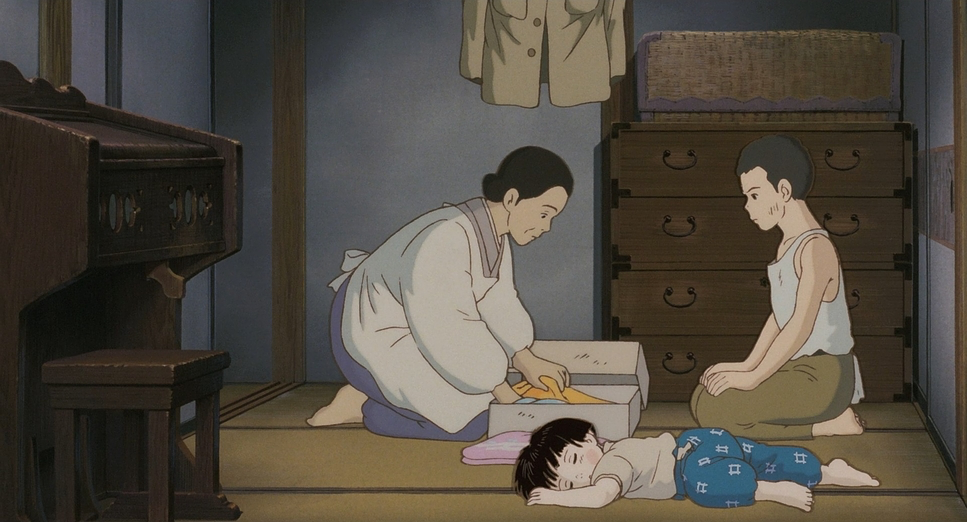
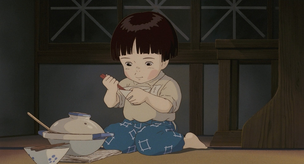
The contrast shaping is meticulously handled. Rather than the harsh, high-contrast look often associated with animation, the film embraces a softer, “print-film” sensibility. We see gentle highlight roll-off where bright skies are slightly bloomed, and shadows that aren’t crushed to pure black, retaining detail even in the darker corners of the shelter. This avoids a flat, graphic aesthetic, instead providing a textured, painterly quality. Hue separation is used subtly; Setsuko’s pink dress stands out as a fragile splash of color against the grays, symbolizing her innocence. The grading doesn’t shout; it whispers, ensuring the visual texture of their struggle is always felt.
Technical Aspects & Tools
Grave of the Fireflies — Technical Specs
| Genre | Animation, Drama, War, Survival, Traditional Animation, Military, World War II, History, Political, Epic, Family, Motherhood, Anime |
| Director | Isao Takahata |
| Cinematographer | Nobuo Koyama |
| Editor | Takeshi Seyama |
| Time Period | 1940s |
| Aspect Ratio | 1.85 |
| Format | Animation |
| Lighting Type | Daylight |
| Story Location | … Asia > Japan |
Considering its 1988 release, the technical aspects are rooted in traditional cel animation but executed with high cinematic ambition. This wasn’t about digital compositing; it was about the artistry of hand-drawn images and multiplane camera techniques. The animators used layers of painted cels over static, detailed background paintings to create depth, emulating the illusion of a three-dimensional world.
The “tools” were brushes, paints, and pencils, but the application was governed by the principles of live-action cinematography. The detailed rendering of debris, smoke, and fire demanded painstaking frame-by-frame work. The nuanced color palette and lighting were achieved through a deep understanding of how pigment translates to film stock. They essentially ‘shot’ the film by photographing each cel combination, creating a realistic sense of exposure that belies the hand-drawn nature. It is a testament to the skill of Koyama and the animation team that they produced such profound realism using techniques that predate modern digital pipelines.
- Also read: AVENGERS: INFINITY WAR (2018) – CINEMATOGRAPHY ANALYSIS
- Also read: AVENGERS: ENDGAME (2019) – CINEMATOGRAPHY ANALYSIS
Browse Our Cinematography Analysis Glossary
Explore directors, cinematographers, cameras, lenses, lighting styles, genres, and the visual techniques that shape iconic films.
Explore Glossary →