Ghost in the Shell (1995) is exactly that. It’s a film I keep coming back to, not just because it predicted our digital mess of a future, but because the cinematography is an absolute masterclass. Honestly, calling it “animation” feels like an understatement this is pure visual language, used to turn abstract philosophy into something you can feel in your gut.
Roger Ebert famously found the ideas “too murky,” but for me, that murkiness is the whole point. The visuals are the only thing keeping us grounded while the story asks what it even means to be human.
Inspiration Behind the Cinematography
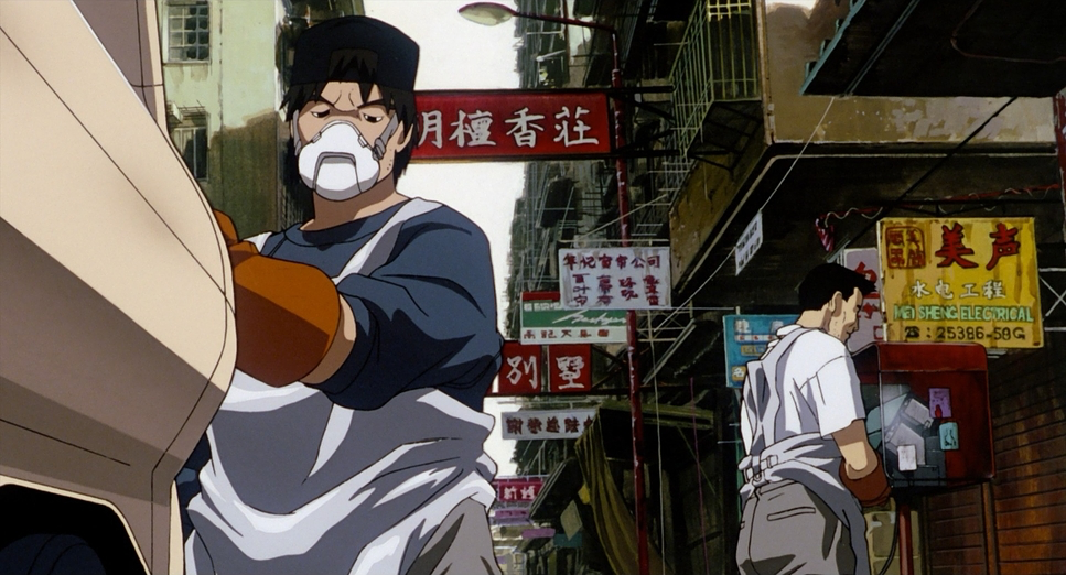
You can’t look at Ghost in the Shell without seeing the DNA of Blade Runner or Alien. It’s part of that same lineage that traded “shiny utopias” for grimy, rain-slicked megacities. But Oshii takes it further. The Hong Kong-inspired cityscape isn’t just a background; it’s a character that’s perpetually damp and neon-drenched.
The world feels “lived-in” because it’s a mess of the old and the new analogue wires hanging over digital interfaces. This vertical, stratified world reflects the “vast network” the characters plug into. It’s beautiful, sure, but it’s also oppressive. It’s a world where technology is everywhere, yet everyone looks incredibly lonely.
About the Cinematographer
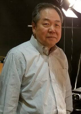
In animation, “cinematography” is a bit of a weird term since there’s no physical camera. But the vision here belongs to Director Mamoru Oshii and Cinematographer Hisao Shirai. Oshii isn’t your typical filmmaker; he’s a guy who openly admits his hobbies are “playing on machines” rather than fishing or hiking.
He believed technology changes people more than religion ever could, and you see that conviction in every frame. He didn’t just want to draw a sci-fi story; he wanted to use the control of animation to articulate ideas that live-action simply couldn’t touch in 1995.
Technical Aspects & Tools
Ghost in the Shell (1995) | Technical Specifications
| Genre | Satire, Political, Artificial Intelligence, Cyberpunk, Science-Fiction, Technology, Thriller, Dystopian, Action, Anime, Animation |
| Director | Mizuho Nishikubo, Mamoru Oshii |
| Cinematographer | Hisao Shirai |
| Production Designer | Takashi Watabe |
| Editor | Shûichi Kakesu |
| Colorist | Hiroaki Hirabayashi |
| Time Period | Future |
| Color | Cool, Saturated, Blue |
| Aspect Ratio | 1.85 |
| Format | Animation |
| Lighting | Hard light, High contrast, Underlight |
| Lighting Type | Artificial light |
| Story Location | Asia > Japan |
| Camera | Bell and Howell 2709 |
For 1995, this was the absolute bleeding edge. While it’s primarily hand-drawn cel animation, it’s the way they blended it with early digital techniques that still holds up. They used the legendary Bell and Howell 2709 a classic camera setup adapted for the complex layering required in animation.
The genius here is the digital compositing. Effects like the “thermo-optic camouflage” weren’t just “cool tricks”; they were sophisticated layers of CGI and digitally painted backgrounds. It allowed for a depth of field and a sense of texture that made the world feel tangible. The backgrounds aren’t just flat drawings; they have a “weathered” quality that makes you believe this city has existed for decades.
Lensing and Blocking
Even though the “lens” is simulated, the behavior is spot-on. They use wide-angle distortion to make the city look imposing and menacing, then snap to long, compressed “telephoto” shots when Kusanagi is lost in her own head.
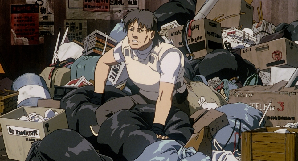
The blocking is where the storytelling really happens. Kusanagi is almost always framed alone or physically separated from her team. Even when she’s with Batou, there’s usually a doorway or a window frame between them. She’s “confined,” as she says, and the way she’s placed in these architectural labyrinths makes you feel her isolation. You’re constantly reminded that she’s a soul trapped in a corporate-owned shell.
Camera Movements
The camera moves in this film with a slow, observational pace that I find incredibly bold. Most animation tries to be frantic to keep kids’ attention, but Ghost isn’t afraid to let the camera pan slowly across a canal for ten seconds. These are meditative moments. They force you to sit with the melancholic atmosphere of Newport City.
Then, the movie just snaps. When the action hits, the camera becomes a kinetic force whip pans, tracking shots, and snappy cuts. The opening jump from the skyscraper is a perfect example: it uses that dizzying verticality to show off her superhuman side, but then it immediately slows back down to her internal struggle. It’s a constant tug-of-war between high-speed violence and quiet reflection.
Compositional Choices
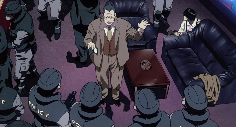
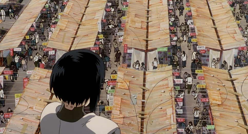
The frames in this film are dense. Oshii and Shirai love their extreme long shots, where the characters are tiny specks against massive, intricate architecture. It’s the visual version of saying, “You are a cog in a very big machine.”
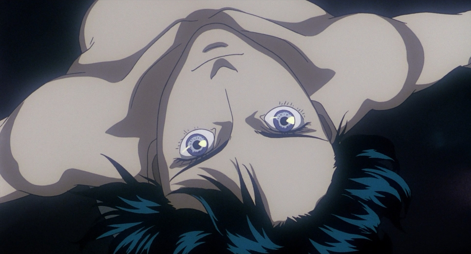
They also lean heavily into center composition for clean, single shots of Kusanagi, which gives her a sense of artificial perfection. But look closer, and you’ll see the “depth cues” layers of holograms and bridges receding into the distance. My favorite touch? The reflections. Characters are constantly seen through water or glass, distorting their images. It’s a literal visual metaphor for their fragmented identities.
Lighting Style
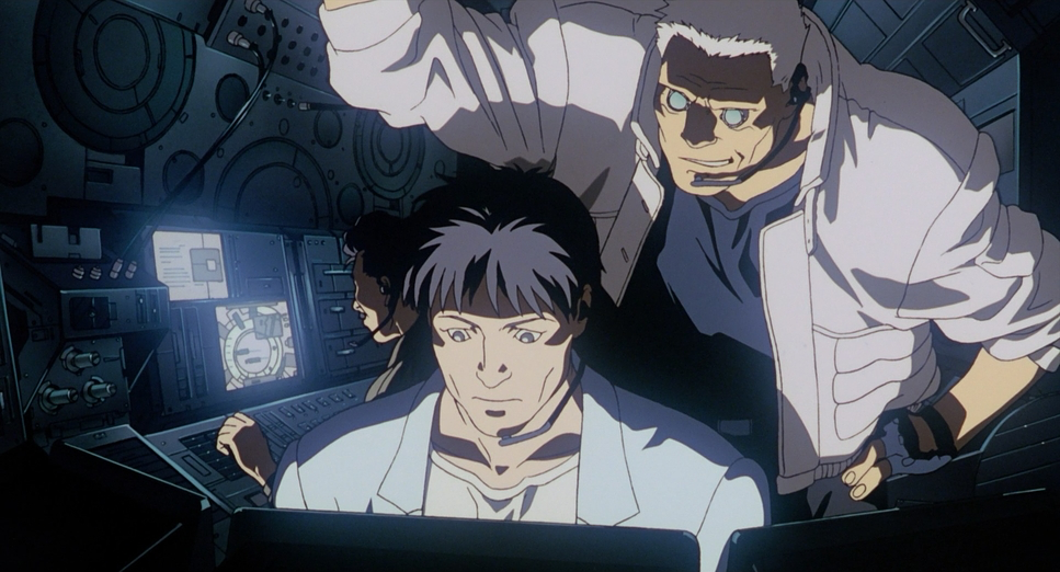
As a colorist, I look at the lighting here and see a masterclass in motivated light. There’s no “sun” in this movie; everything comes from the city harsh streetlights, flickering digital displays, and that iconic underlight that gives the characters a ghostly, synthetic look.
It’s a high-contrast, low-key style. The shadows aren’t just dark; they are thick and opaque, swallowing half the frame. Then you have these hard light highlights purples and oranges slicing through the dark. And because it’s always raining, every surface becomes a mirror, turning the lighting into this shimmering, distorted mess that perfectly asks: what is actually real here?
Color Grading Approach
This is where I get really excited. The palette, led by colorist Hiroaki Hirabayashi, is iconic. It’s dominated by those cool, saturated blues and teals that scream “cold technology.” But then you get these violent stabs of orange and red from explosions or streetlamps.
From a technical standpoint, the hue separation is incredible. Even in a frame that’s 90% blue, the different tones never turn into a muddy mess. There’s a distinct print-film sensibility to the grade it doesn’t feel like a sterile digital file. It has a slight desaturation and a “tonal sculpting” that feels organic. The way the highlights roll off without clipping into “digital white” gives the whole film a painterly, timeless quality. It’s proof that color isn’t just about making things look “cool”; it’s about defining the soul of the world.
- Also read: A CHRISTMAS STORY (1983) – CINEMATOGRAPHY ANALYSIS
- Also read: BEFORE MIDNIGHT (2013) – CINEMATOGRAPHY ANALYSIS
Browse Our Cinematography Analysis Glossary
Explore directors, cinematographers, cameras, lenses, lighting styles, genres, and the visual techniques that shape iconic films.
Explore Glossary →