Some films stick with you, not just for their story or performances, but for that intangible feeling they leave in your gut – a sense of pure, unadulterated cinema. Ford v Ferrari (2019) is absolutely one of those films for me. It’s the kind of movie that reminds you why we fall in love with this craft in the first place.
When it first dropped, the industry buzz was palpable people called it a “real movie” again. James Mangold’s direction, coupled with absolutely phenomenal cinematography, takes a story that could easily be a dry corporate history lesson and transforms it into a visceral, deeply human epic. It’s not just a racing movie; it’s a case study in visual storytelling where every frame feels meticulously crafted yet utterly alive.
About the Cinematographer
The man behind the lens for Ford v Ferrari was Phedon Papamichael, ASC. If you know his work, you know he doesn’t just shoot “pretty” images; he crafts visuals that are robust and grounded. He’s a frequent collaborator with James Mangold, having lensed Walk the Line, 3:10 to Yuma, and Logan. That shorthand is crucial. When a DP and Director have that level of trust, they stop talking about how to get a shot and start talking about why they need it.
Papamichael isn’t one for flashy, overtly stylized camera tricks just for the sake of a reel. His approach here serves the narrative first, making the extraordinary feel tangible. He’s a master of texture. For a film set in the gritty, high-stakes world of 1960s motorsports, his ability to blend epic scale with intimate character moments was indispensable.
Inspiration Behind the Cinematography
The core inspiration for the visual design comes from a deep respect for the era. 1960s racing wasn’t about slick digital dashboards or telemetry; it was metal, gasoline, and raw human skill. The filmmakers honored that by leaning heavily into practical effects.
You can feel the lack of CGI in the finished product. Real cars on real tracks give the sequences an astonishing weight. The goal wasn’t just to observe the cars, but to immerse us in the vibration, the heat, and the danger. Papamichael and Mangold pulled from the visual language of classic motorsport photography think Grand Prix (1966) but filtered through a modern sensor. They understood that the mythology of Le Mans needed to feel grand but also claustrophobic inside those cockpits. It’s a period piece that feels lived-in, not just a costume drama.
Camera Movements
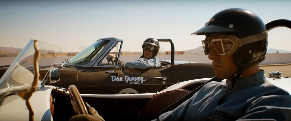
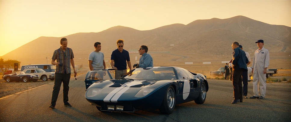
The camera movement in Ford v Ferrari is deliberate. It’s not shaking for the sake of “action energy”; it’s shaking because the car is terrifying. For the racing sequences, Papamichael creates a language based on physics. We see hard-mounted tracking shots that vibrate with the chassis. These aren’t just wide shots of cars going fast; the camera gets inthe race, feeling the G-force.
When the racing gets intense, the movements become aggressive subtle handheld jolts from inside the cockpit or rapid whip-pans that follow the blur of an overtaking vehicle. But this kinetic energy is balanced with precision. Look at the crane shots sweeping over the Le Mans track; they give us scale, then dive down to isolate Ken Miles, emphasizing his lone journey against the clock.
In the quieter moments, the camera breathes. It becomes restrained, employing slow, elegant pushes on a dolly. These movements underscore emotional weight without telling the audience how to feel. When Miles sits with his son, explaining the “perfect lap,” the camera is steady, letting the performance do the heavy lifting.
Compositional Choices
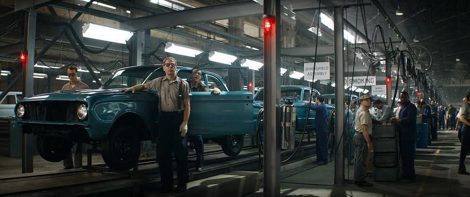
Composition here is strictly purposeful. Papamichael uses anamorphic wide shots to establish the epic scale of the world the sprawling track, the teeming pits, the imposing Ford factories. These provide depth cues, letting us grasp the sheer size of the machine these men are fighting against.
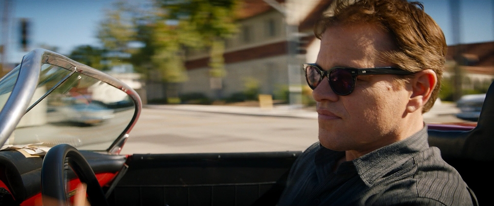
But he quickly shifts to tighter framing for the beats that matter. Close-ups on Christian Bale’s eyes behind the goggles or Matt Damon’s furrowed brow are incredibly effective because they are used sparingly. These tight compositions isolate emotion. We are with Ken Miles, feeling his singular focus.
The blocking is equally thoughtful. Often, we see characters framed against imposing backdrops a lone figure dwarfed by a factory line, or a small huddle of engineers in a vast garage. This visually underscores the “David vs. Goliath” dynamic. In the racing scenes, he uses leading lines the track markings, the guard rails to guide our eyes through the chaos. You always know where the cars are spatially, which is a testament to clean, smart composition.
Lighting Style
The lighting conveys the time period better than the costumes do. Papamichael opts for a motivated lighting style, favoring natural sources to anchor the film in reality. Daylight scenes on the track are harsh; the sun feels bright and uncomfortably hot, emphasizing the glare and exhaustion of the 24-hour endurance test.
When we move into garages, the lighting shifts. It becomes softer, utilizing practical fixtures like bare bulbs or industrial lamps to create pockets of warm light amidst the shadow. This lends a tangible, greasy texture to the environments.
Night racing scenes are where the lighting really shines. Papamichael uses headlights, track lights, and strategic backlighting to create silhouettes. Instead of artificially lifting the exposure so we can see everything, he embraces the darkness. The contrast is high, letting the shadows create tension. It’s a “cathedral of speed” atmosphere—pools of light surrounded by the dangerous unknown.
Lensing and Blocking
For a film with this scope, the glass choices are critical. Ford v Ferrari was largely shot with ARRI Alexa LF cameras paired with Panavision C and T Series anamorphic lenses. That anamorphic squeeze (2.39:1) brings an immediate classic cinema feel. These lenses have distinct characteristics: the flares are horizontal and organic, and the bokeh has that painterly, oval quality that digital spherical lenses just can’t replicate. The fall-off in focus is gentle, creating a separation between the subject and the environment that feels optical, not digital.
Blocking is used to reflect power dynamics. In the Ford boardroom scenes, executives are often positioned above Shelby and Miles, looking down on them, or flanking them to create a sense of entrapment. This contrasts sharply with the garage scenes, where Shelby and Miles are often side-by-side, moving freely. On the track, the blocking of the cars isn’t just about speed; it’s choreography. The way the cars weave and box each other in tells the story of the rivalry without a single line of dialogue.
Color Grading Approach
Now, this is where I really want to dig in. The color grade on this film is exceptional because it resists the urge to be “retro.” The palette leans towards warm, earthy tones, reflecting the California sun and the French countryside, but it avoids that washed-out sepia look that so many period films fall victim to.
The contrast shaping is aggressive but filmic. In the racing sequences, the toe of the curve is pushed down, giving us deep, robust blacks that anchor the image, while the mids are punched up to retain texture in the asphalt and machinery.
Hue separation is meticulously managed. The “Ferrari Red” is vibrant and dangerous, a clear visual antagonist to the Ford branding which leans into cooler, industrial blues and chromes. These colors sit in the pocket; they feel like they are reacting to the film stock, not painted on top. Skin tones are rendered with a density that feels like celluloid healthy and natural, holding up even under harsh mixed lighting.
The tonal sculpting is where the digital intermediate (DI) really shines. The highlight roll-off is incredibly smooth. Digital sensors can clip harshly, but here, the highlights on the car hoods and the sun flares bloom softly, mimicking the halation you’d get on film stock. It’s a grade that prioritizes density and weight over simple brightness. It feels thick, substantial, and expensive.
Technical Aspects & Tools
Ford v Ferrari – Technical Specifications
| Genre | Action, Drama, History, Biopic, Sports, Business |
| Director | James Mangold |
| Cinematographer | Phedon Papamichael |
| Production Designer | François Audouy |
| Costume Designer | Daniel Orlandi |
| Editor | Michael McCusker, Dirk Westervelt, Andrew Buckland |
| Colorist | Skip Kimball |
| Time Period | 1960s |
| Color | Warm, Desaturated |
| Aspect Ratio | 2.39 – Anamorphic |
| Format | Digital |
| Lighting | Hard light, Side light |
| Lighting Type | Artificial light, LED |
| Story Location | … California > Los Angeles |
| Filming Location | … California > Los Angeles |
| Camera | ARRI ALEXA LF, ARRI ALEXA Mini |
| Lens | Panavision C series, Panavision T series |
For a production of this scale, the technical foundation has to be bulletproof. Shooting on the Alexa LF gave them the resolution and dynamic range needed to protect the highlights in the harsh daylight while digging into the shadows during the night races.
To get those shots, the grip team had to be inventive. We’re talking about the “Biscuit” rig (a drivable platform that holds the picture car), the Russian Arm (a gyro-stabilized crane on a chase car), and hard-mounts rigged directly to the chassis. The logistical challenge of orchestrating real cars at 100+ mph while keeping them in focus is a nightmare, requiring perfect sync between the stunt drivers and the camera operators.
In post, the DI workflow ties it all together. The grade is the final polish that unifies the shots from the different rigs. Whether it was a messy handheld shot inside the vibrating cockpit or a pristine crane shot, the colorist (Skip Kimball) matched the texture and contrast so the cuts are seamless. The budget is on the screen here not just in the stars, but in the infrastructure that allowed them to capture this level of practical action.
- Also read: THREE BILLBOARDS OUTSIDE EBBING, MISSOURI (2017) – CINEMATOGRAPHY ANALYSIS
- Also read: LOCK, STOCK AND TWO SMOKING BARRELS (1998) – CINEMATOGRAPHY ANALYSIS
Browse Our Cinematography Analysis Glossary
Explore directors, cinematographers, cameras, lenses, lighting styles, genres, and the visual techniques that shape iconic films.
Explore Glossary →