When I first started working as a colorist, I thought I had a handle on what made a movie look “cinematic.” But the more time I spend in the suite, the more I realize that sometimes you have to look backward to move forward. Today, I want to break down a film that practically invented the vocabulary we still use: Sergio Leone’s 1965 classic, For a Few Dollars More.
It’s easy to write this off as just another spaghetti western. But look closer, and you see a clinic in building tension and visual storytelling. It’s not just about the Ennio Morricone score or the ponchos; it’s about sheer visual ambition. From the way the desert is exposed to the sweat on a character’s face, every frame is doing heavy lifting. As a filmmaker and colorist, dissecting this film isn’t just nostalgia it’s a necessary study in visual narrative.
About the Cinematographer
The man behind the lens was Massimo Dallamano. While Leone usually gets the credit for the “look,” it was Dallamano who had to actually capture it on film. This was a classic director-cinematographer collaboration: Leone had the vision, and Dallamano had the technical intuition to execute it.
Clint Eastwood famously noted that Leone was “very, very conscious of art” and would often show the crew paintings, saying, “this is the lighting… this is the kind of thing I’d like to duplicate here.” That’s a specific, difficult instruction. Dallamano’s job was to translate those static, painterly aspirations into moving images, managing the harsh Spanish light to match Leone’s mood. He wasn’t just a technician; he was Leone’s visual interpreter.
Inspiration Behind the Cinematography
The look of For a Few Dollars More comes from a strange mix of high art and gritty documentary realism. Eastwood’s comment about the paintings is key it tells us the visual language wasn’t about capturing reality, but composing it.
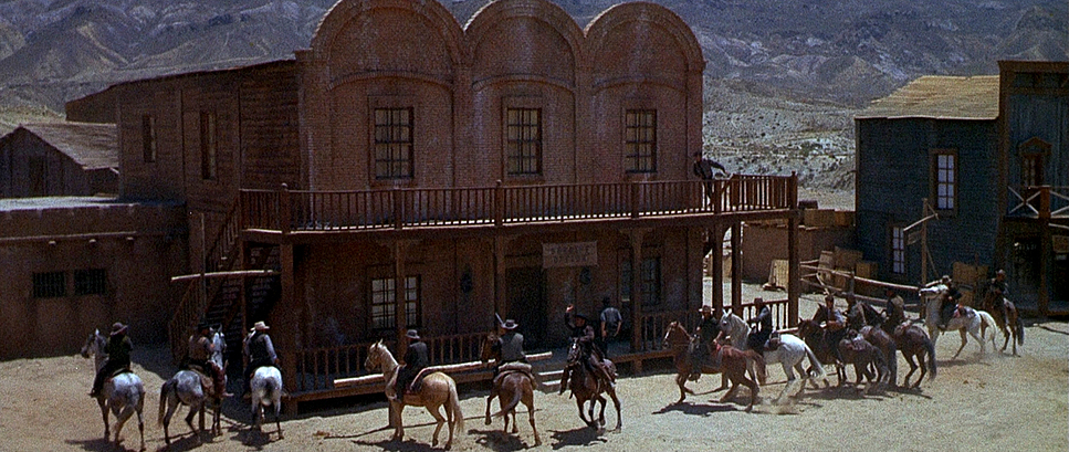
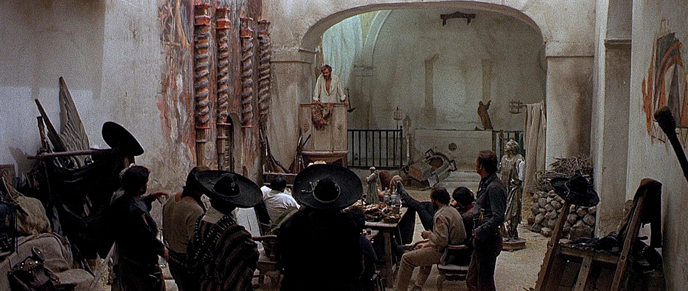
You see this in the framing. Characters are often isolated against massive backdrops or locked into tight portraits that feel like Renaissance paintings. The film’s themes revenge, greed, justice are visually amplified by this. The rugged terrain isn’t just a background; it’s an active participant. The camera sculpts a world where the harshness of the landscape mirrors the morality of the men inhabiting it.
Camera Movements
Leone is famous for his pacing, and that comes down entirely to how the camera moves or doesn’t move. There is a confidence in the stillness here.
We see slow pans that emphasize the isolation of a lone rider. Tracking shots are used sparingly, usually just to ground us in a location like a saloon. But the signature move is the “creeping zoom” leading up to a confrontation. The camera slowly pushes in on a face, or orbits a duelist. These aren’t flashy moves for the sake of it; they are strategic. They tighten the screws on the audience, dragging out the tension until the violence feels inevitable.
Compositional Choices
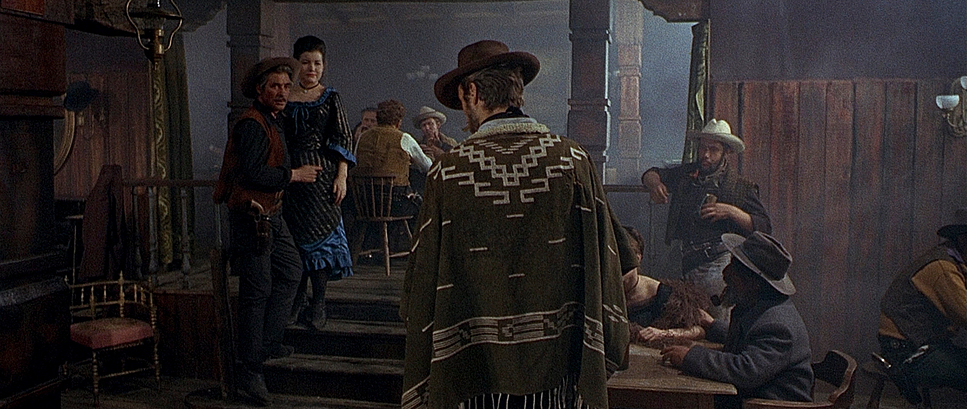
If I had to pick one visual element that defines this film, it’s the extreme contrast in scale. Leone bounces between massive wide shots and uncomfortable close-ups.
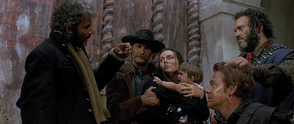
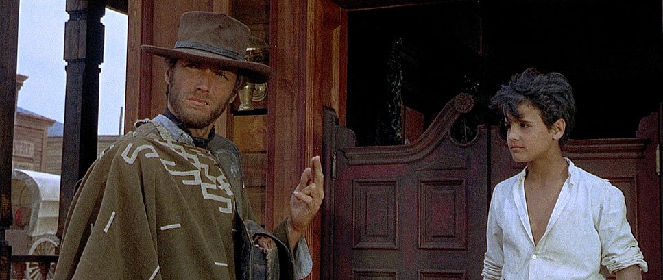
The wide shots usually use a deep depth of field, shrinking the characters against the mountains and sky. It provides immediate scale you feel the distance these men have to travel. Then, abruptly, Leone cuts to those famous “intense close-ups.” We aren’t just talking headshots; we are talking eyes, mouths, and trigger fingers. Eastwood was right about Leone being “great with faces.” These shots turn human features into landscapes of their own. It creates a push-pull effect for the viewer, disorienting us and forcing us to pay attention to the micro-expressions.
Lighting Style
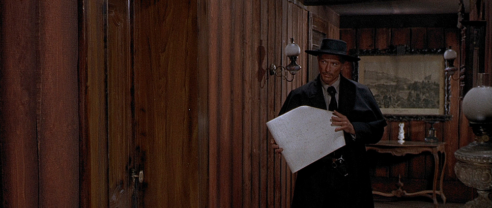
The lighting here is motivated realism at its best. Eastwood mentioned Leone’s painting references, and you can see the Caravaggio influence in the interiors stark contrasts between light and shadow that create immediate tension.
For exteriors, they used the blazing sun of Almería, Spain, to stand in for the American Southwest. Dallamano didn’t fight the harsh light; he used it to carve out deep, textural shadows. Faces are often half-hidden, which suits the mysterious nature of Monco and Mortimer perfectly. Indoors, the light sources feel practical lanterns, windows but they are always shaped to catch the gleam of a gun or the texture of a poncho. It’s tonal sculpting, ensuring the image has depth without losing that gritty, lived-in feel.
Lensing and Blocking
The lens choice and blocking are inseparable from the pacing. For the wides, they used short focal lengths to push the background away and exaggerate the space. For the close-ups, they switched to long lenses to compress the perspective, making the faces feel flatter and more imposing.
The blocking is essentially a dance. Monco (Eastwood) always keeps his right hand hidden; Mortimer is tactical and precise. They are often framed on opposite sides of the screen or through doorways, using negative space to imply the power dynamics before a word is spoken. I remember trying to block a scene recently and realizing just how hard this is getting the sightlines and negative space right is a delicate balance that Leone and Dallamano mastered perfectly.
Color Grading Approach
Now, let’s talk color. This is where things get interesting for us professionals. The recent 4K releases specifically the Kino Lorber versus the Arrow Video UK versions offer two completely different philosophies on how this film should look.
The Kino Lorber version leans into a “punchy” aesthetic. It’s bright, saturated, and makes the colors pop Eastwood’s poncho looks vibrantly green. It’s a modern look with aggressive contrast shaping that gives you deep blacks and crisp highlights.
The Arrow Video version, however, aims for “what the camera saw in 1965.” It utilizes HDR10 and Dolby Vision but keeps the palette restrained. The poncho is a murkier olive green. The contrast curve is less aggressive, preserving the highlight roll-off and shadow detail inherent to the film stock.
As a colorist, I have to side with the Arrow release. The Kino version looks “good” to modern eyes, but the Arrow version feels correct. It respects the limitations and texture of the era. The subtle tonal separation allows the grit of the film to shine through rather than being crushed by high contrast. It’s a great reminder that “better” specs don’t always mean a better image intent is everything.
Technical Aspects & Tools
For a Few Dollars More — Technical Specs
| Genre | Action, Western |
| Director | Sergio Leone |
| Cinematographer | Massimo Dallamano |
| Costume Designer | Carlo Simi |
| Editor | Eugenio Alabiso, Adriana Novelli, Giorgio Serrallonga |
| Time Period | 1800s |
| Aspect Ratio | 2.35 – Anamorphic |
| Format | Film – 35mm |
| Lighting Type | Daylight, Artificial light, Tungsten |
| Story Location | United States > Texas |
| Filming Location | Europe > Spain |
Beyond the grade, the physical foundation of the image is 35mm film. The specific grain structure of the 60s stocks dictated the texture. When you hear about “heavy greens” or “source issues” in 4K reviews, that’s usually just the reality of scanning older film elements at high resolutions you start to see the imperfections that were always there.
The Arrow restoration’s use of HDR is a technical leap, but it’s used responsibly. It expands the luminance range without breaking the original look. It’s a complex decision involving color science and archival research. And we can’t ignore the props as technical elements the Colt Single Action Army revolver isn’t just a gun; it’s an extension of the character, chosen specifically to reflect the precision of the film’s execution.
- Also read: THE STING (1973) – CINEMATOGRAPHY ANALYSIS
- Also read: GONE WITH THE WIND (1939) – CINEMATOGRAPHY ANALYSIS
Browse Our Cinematography Analysis Glossary
Explore directors, cinematographers, cameras, lenses, lighting styles, genres, and the visual techniques that shape iconic films.
Explore Glossary →