I spend most of my waking hours at Color Culture staring at waveforms and tweaking curves, so I have a bad habit of ignoring a film’s plot to obsess over the scaffolding beneath. Finding Nemo is one of those films that ruins you for other movies. On the surface, it’s a standard Pixar tearjerker. But if you look at the signal flow the way they handled light, density, and color in 2003 it’s a technical marvel. It didn’t just set a benchmark for CGI; it basically rewrote the textbook on how to light a volume as complex as the ocean.
About the Cinematographer

It’s lazy to say animated films don’t have cinematographers. They absolutely do, and Finding Nemo had two heavy hitters handling the duties usually reserved for a Director of Photography (DoP). Sharon Calahan served as the DoP for Lighting, while Jeremy Lasky handled the Layout (camera).
This distinction is crucial. Lasky’s team managed the blocking and virtual lenses, effectively operating the camera, while Calahan brought a painterly, almost impressionistic eye to the lighting. Calahan didn’t just want “realistic” water; she wanted a specific visual texture that felt like memory. The “cinematographer” here wasn’t a vague collective; it was Calahan and Lasky translating physical camera principles focal length, exposure, and shutter angle into a digital void that inherently has none of those things.
Inspiration Behind the Cinematography
The visual language here wasn’t pulled from thin air; it was built on rigorous, almost obsessive reference work. Director Andrew Stanton’s vision was rooted in the anxiety of parenting, and the visual world needed to reflect that massive, terrifying scale.
To get it right, the team didn’t just browse Google Images. They took diving expeditions to the Great Barrier Reef and sat through lectures from ichthyologists to understand the physics of fish movement. But the real key was the light. They needed to understand how sunlight breaks down as it travels through 50 feet of water versus 5 feet. That research is why the film feels grounded. They weren’t just making pretty pictures; they were simulating the density of seawater.
Camera Movements
Under Jeremy Lasky’s supervision, the camera work in Nemo mimics the friction of being underwater. In a typical action movie, camera moves are crisp. Here, everything has a slight “drag.”
When Marlin is panicking, the camera shakes, but it’s a dampened shake like trying to move a heavy housing through water. Conversely, in the jellyfish sequence, the camera floats with a drift that feels completely detached from gravity. I also love the focus pulling in this film. It’s not instant. You can feel the focus “rack” slowly, guiding your eye from a foreground coral element to a character in the mid-ground. It’s a subtle touch, but it adds a layer of optical realism that sells the illusion that this was shot through a physical glass lens.
Compositional Choices

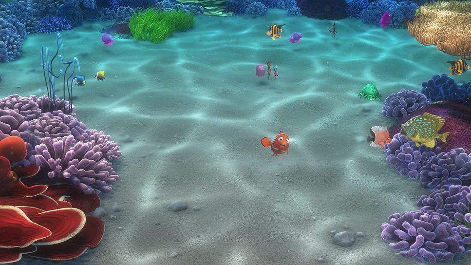
The composition creates a sense of isolation that does half the heavy lifting for the script. The ocean is massive, and the team used negative space aggressively. You often see Marlin and Dory framed in the lower third, crushed by a vast, empty blue expanse above them.
They also mastered “atmospheric perspective.” In live action, things get hazy the further they are from the lens. In Nemo, they used the water’s turbidity (murkiness) to create depth layers. The foreground is sharp and saturated; the background desaturates and shifts towards blue. It’s a classic painter’s trick, but applied to a 3D space, it prevents the image from looking flat or chaotic, especially in scenes crowded with hundreds of fish.
Lighting Style

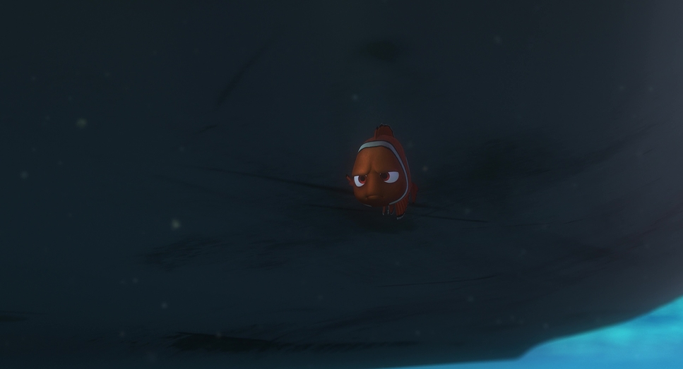
This is where Sharon Calahan’s work shines. Lighting water is a nightmare because it’s refractive, reflective, and diffusive all at once. The team had to build new tech to handle “caustics” those dancing patterns of light you see on the ocean floor. In 2003, rendering that was computationally expensive, but it was non-negotiable for the look.
They utilized a complex rig of virtual lights: key lights for shape, “bounce” lights to simulate floor reflection, and specific “murk” lights to volumize the water. Notice the highlight roll-off on the characters. It’s not harsh or digital; it’s soft, mimicking the diffusion you get underwater. When they go deep down to the Anglerfish the lighting shifts from broad, soft sources to a single, hard point-source (the lure). It’s a masterclass in motivated lighting, using the environment to dictate the contrast ratio.
Lensing and Blocking

In terms of virtual lensing, Pixar stuck to a very cinematic grammar. They generally used equivalents of 35mm and 50mm lenses for conversation, keeping the distortion natural. But for the “scary” open ocean shots, they went wider, pushing the background away to make the characters feel insignificant.
The blocking matches this logic. Characters don’t just float; they displace space. When the sharks circle, the blocking is tight and claustrophobic. When the turtles appear in the East Australian Current, the spacing opens up, matching the “surfer dude” relaxed energy. The layout team synced the character blocking with the camera movement so that the motion blur would look correct something that’s easy to mess up in animation.
Color Grading Approach
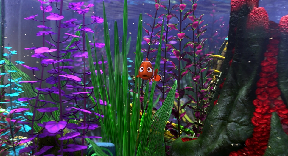
From a colorist’s perspective, Finding Nemo is a study in hue separation. When your entire world is blue, how do you make things pop? You control the density. The blues of the open ocean are deep and clean, pushing towards violet, while the reef water is teal and cyan, mixed with particulates.
The film relies heavily on the complimentary Orange/Teal contrast, but it’s organic, not forced. Nemo and Marlin (Orange) naturally separate from the background (Blue). But look at the shadows they aren’t crushed to black. They are lifted and tinted blue, mimicking how water absorbs the red spectrum first. The grade has a distinct “print film” feel to it; the highlights retain detail rather than clipping white. It feels like 35mm stock that was exposed well, rather than a raw digital file. The color temperature shifts are also precise warm and inviting in the safe zones, cold and monochromatic in the danger zones.
Technical Aspects & Tools
Finding Nemo
1.85 Aspect Ratio • Animation Format
| Genre | Animation, Family, Fatherhood, CGI Animation, Adventure, Drama, Wildlife |
|---|---|
| Director | Andrew Stanton, Lee Unkrich |
| Cinematographer | Sharon Calahan, Jeremy Lasky, Jericca Cleland |
| Production Designer | Ralph Eggleston |
| Editor | David Ian Salter |
| Time Period | 2000s |
| Color Palette | Cool, Saturated, Orange, Blue, Purple |
| Lighting Type | Daylight, Sunny |
| Story Location | Earth > Pacific Ocean |
The tech required to pull this off in the early 2000s is staggering. We’re talking about subsurface scattering (SSS) the way light penetrates a translucent surface like skin or fish scales being calculated for thousands of objects.
Pixar’s RenderMan software was pushed to the limit to handle the sheer volume of particles needed to create the “murk” and fog. The “caustic” lighting wasn’t just a texture map pasted on the floor; in many shots, it was a lighting simulation. They effectively built a virtual ocean simulator to get the light physics right, then placed cartoon fish inside it. That marriage of hard physics simulation with stylized character animation is why it holds up two decades later.
- Also read: KILL BILL: VOL. 1 (2003) – CINEMATOGRAPHY ANALYSIS
- Also read: THE TRUMAN SHOW (1998) – CINEMATOGRAPHY ANALYSIS
Browse Our Cinematography Analysis Glossary
Explore directors, cinematographers, cameras, lenses, lighting styles, genres, and the visual techniques that shape iconic films.
Explore Glossary →