Re-watching Ingmar Bergman’s Fanny and Alexander (1982) isn’t just research for me; it’s a pilgrimage.This was Bergman’s intended farewell to cinema, and he left everything on the screen. A quick tip: ignore the three-hour theatrical version. It’s fine, but if you want to actually see what Sven Nykvist was doing with the light, you have to watch the five-and-a-half-hour mini-series. In the long cut, the cinematography doesn’t just sit there it breathes. It’s a five-hour masterclass in how to use a camera to map out the distance between childhood dreams and the cold reality of growing up.
About the Cinematographer
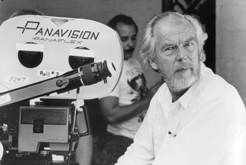
When we talk about the look of this film, we’re talking about Sven Nykvist. In the industry, his name is basically shorthand for “Master of Light.” Nykvist wasn’t just a DP for Bergman; they had this legendary, almost telepathic shorthand after working on twenty-plus films together.
Nykvist’s genius was his simplicity. He didn’t need a massive lighting rig to create mood; he was the king of using available light and subtle shadows to get inside a character’s head. For Fanny and Alexander, which is basically Bergman’s own life story on screen, Nykvist’s eye was the only thing that could have translated those fuzzy, complex childhood memories into something we could actually see.
Inspiration Behind the Cinematography
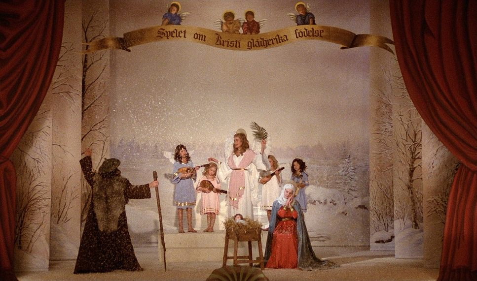
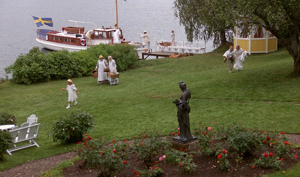
The look of Fanny and Alexander is a total “tale of two cities.” On one hand, you have the Ekdahl family pure theatricality, warmth, and messiness. On the other, you have Bishop Vergérus stark, cruel, and completely drained of life. This isn’t just a story choice; it’s a cinematographic manifesto.
Nykvist used these two poles to drive every technical decision. The Ekdahl house is a “rich colorful schema,” almost like a throwback to the ornate style of The Magic Flute. It’s life at 100% saturation. Then you hit the Bishop’s house. It’s that “Winter Light” style cold, ascetic, and very Scandinavian. It’s a visual gut-punch that mirrors Alexander’s journey from a world of imagination to a world of “shut up and obey.” It’s a reminder that film is essentially a “dream” or “music,” as Bergman liked to say a direct line to the dark rooms of the soul.
Camera Movements
The camera in Fanny and Alexander doesn’t just watch; it participates. In the Ekdahl home, especially during that massive Christmas feast, the camera is basically another guest. It moves with this fluid, dance-like grace. We’re talking elegant dolly shots that weave through the chaos, catching snippets of conversation and layers of family history. It feels organic and alive. It tracks with the kids, inviting us to see the world from four feet off the ground.
But look at what happens when they move to the Bishop’s house. The camera goes “dead.” The movement stops. Suddenly, everything is static and locked-off. You feel trapped because the camera won’t move for you. When it doesmove, it’s a slow, creeping push-in or a restrictive pan that feels like someone is watching you. It’s a masterclass in using movement to create a sense of surveillance and suffocation without saying a word.
Compositional Choices
Nykvist’s framing is how he sells the emotional stakes. In the Ekdahl world, the frames are busy. He uses deep focus and tons of foreground elements furniture, props, other people to create depth. It’s a “lived-in” look. You feel the abundance of the Christmas dinner because the frame is packed with faces and ornaments.
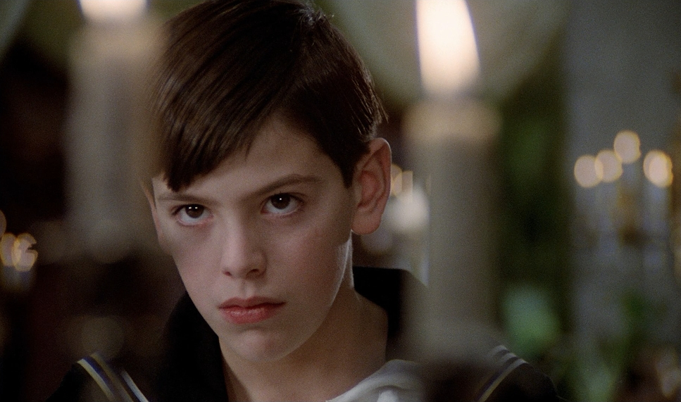
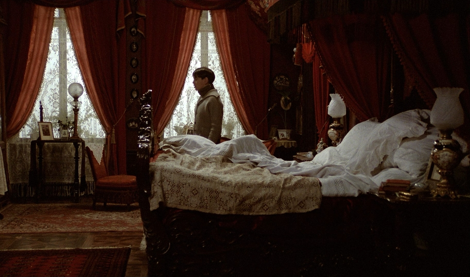
The Bishop’s house is the exact opposite. Nykvist lean heavily into negative space. He frames Alexander small against these massive, empty walls to show how powerless he is. The symmetry is rigid and cold. Even when two people are in the same room, he frames them so they feel miles apart. He also uses lower angles for the Bishop to make him look like a literal giant, emphasizing that “towering authority” that Alexander is trying to rebel against.
Lighting Style
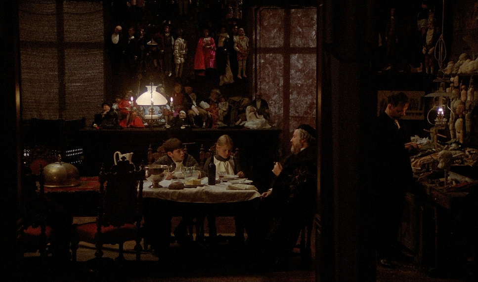
Now we’re getting into the good stuff. Nykvist’s lighting here is a masterstroke. In the Ekdahl’s world, everything is “motivated” by warmth candles, oil lamps, fireplaces. It’s a soft, golden glow that looks like a Dutch painting. From a colorist’s perspective, I love how he lets the practical lights “clip” just a bit in the highlights. It gives the image a tactile, realistic energy that feels like a warm blanket.
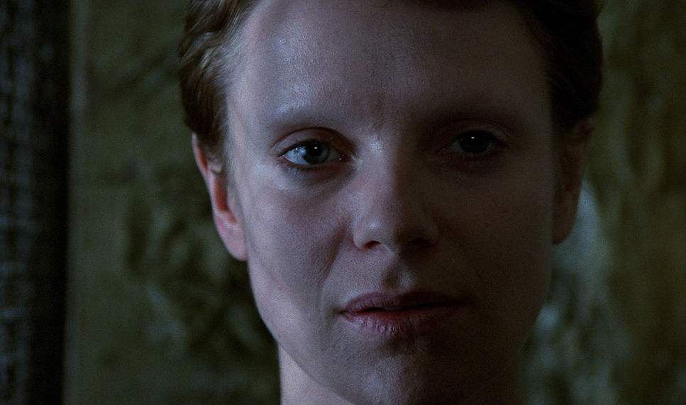
The shift to the Bishop’s house is chilling. The warmth is gone. It’s replaced by this cold, flat daylight that feels clinical and harsh. The shadows get harder and the “roll-off” in the highlights is much steeper and less forgiving. It’s not just “dark” it’s cold. Nykvist strips the warmth out of the light to make you physically feel the lack of love in that house. For the ghost scenes or the dream sequences, he’ll throw in some subtle diffusion or backlighting to let the imagination bleed into the frame, but it’s always grounded.
Lensing and Blocking
The lens choices are subtle but effective. In the warm scenes, Nykvist uses wider lenses to keep the world open and interconnected. It lets the family “breathe” together in the same frame. There’s a slight edge distortion on the wides that actually helps the “magical realism” of Alexander’s imagination feel more natural.
In the Bishop’s house, he goes for longer focal lengths. This flattens the space and makes the rooms feel claustrophobic. It compresses the distance between people, but in a way that makes them feel more alienated. The blocking becomes rigid, too. No more fluid movement; people are stuck in corners or behind architectural barriers. Alexander is often blocked against a flat wall with zero depth behind him he’s visually trapped.
Color Grading Approach
As a colorist, Fanny and Alexander is the ultimate “look-dev” study. Since it was shot in ’82, we have that gorgeous print-film foundation that digital struggle to mimic.
If I were grading the Ekdahl scenes today, I’d lean into that “rich colorful schema.” I’d sculpt the reds and emerald greens to pop, keeping the skin tones warm and healthy. I’d keep the contrast gentle velvety blacks and creamy highlights. You want it to feel luxurious, like you could reach into the screen and feel the velvet curtains.
For the Bishop’s house, I’d take the opposite route: heavy desaturation. I’d pull the saturation out of everything except the cold blues and sickly grays. I’d push the contrast harder to create a “dry” look. It’s about making the space feel sterile and emotionally draining. You want the audience to feel the “chill” through the palette alone.
Technical Aspects & Tools
| Genre | Drama, Fantasy, Mystery, Ghost, Horror, Epic, Family, Romance, Melodrama, Marriage, Motherhood |
| Director | Ingmar Bergman |
| Cinematographer | Sven Nykvist |
| Production Designer | Anna Asp |
| Costume Designer | Marik Vos-Lundh |
| Editor | Sylvia Ingemarsson |
| Time Period | 1900s |
| Color | Warm, Saturated |
| Aspect Ratio | 1.66 – Spherical |
| Format | Film – 35mm |
| Lighting | Soft light, Backlight |
| Lighting Type | Artificial light, Practical light |
| Story Location | Sweden > Uppsala |
| Filming Location | Sweden > Stockholm |
| Camera | Arriflex 35 IIb |
We are firmly in the world of 35mm celluloid here specifically Kodak Eastman stock from the early 80s. This gives the film that organic grain and highlight latitude that you just can’t get out of a sensor without a lot of work.
The gear was the classic ARRI/Panavision combo. For lenses, Nykvist usually went for glass that was sharp but “pretty” likely older Zeiss or Cooke models. These lenses have a beautiful fall-off and “bokeh” that makes skin look human rather than digital.
The final “look” was really baked in during the photochemical process. Working with the lab to timing the print film was where the real tonal sculpting happened. Whether it was for the theatrical run or the TV transfer, Nykvist’s intent was all about that chemical reaction on the negative. It gives the film a weight and texture that feels permanent.
- Also read: ALL QUIET ON THE WESTERN FRONT (1930) – CINEMATOGRAPHY ANALYSIS
- Also read: TUMBBAD (2018) – CINEMATOGRAPHY ANALYSIS
Browse Our Cinematography Analysis Glossary
Explore directors, cinematographers, cameras, lenses, lighting styles, genres, and the visual techniques that shape iconic films.
Explore Glossary →