In Brazil, Elite Squad 2: The Enemy Within (2010) didn’t just perform well it became a cultural phenomenon, outgrossing Avatar at the domestic box office. Yet, there’s a strange irony in how it was received abroad; while it broke records at home, it felt largely overlooked by international award circuits. As a filmmaker and colorist running Color Culture, that kind of disconnect usually tells me one thing: the film is so deeply embedded in its own local truth that its visual language likely prioritizes raw honesty over “Oscarbait” polish.
Directed by José Padilha, this sequel moves beyond the tactical raids of the first film to dissect the rot within the system itself. We follow Captain Nascimento as he realizes the “enemy within” isn’t just the gangs in the favelas, but a labyrinth of police corruption and political theatre. It’s a film that demands a visual style capable of capturing both the “vulnerability of the poor” and the sterile, cold-blooded calculations of the elite.
About the Cinematographer

The visceral impact of Elite Squad 2: The Enemy Within is often credited to Padilha’s direction, but the film’s visual soul belongs to Lula Carvalho. In the world of cinematography, Carvalho is a master of “calculated chaos.” He has a reputation for an unflinching, documentary-adjacent style that makes a scripted feature feel like a captured moment of history.
Carvalho doesn’t just “light a scene”; he creates an environment. His synergy with Padilha is evident in every frame, opting for a kinetic energy that aligns with the film’s themes of systemic decay. By blending a verité, handheld approach with moments of stark, powerful composition, Carvalho ensures the audience isn’t just observing Rio’s corruption they are trapped inside it.
Inspiration Behind the Cinematography
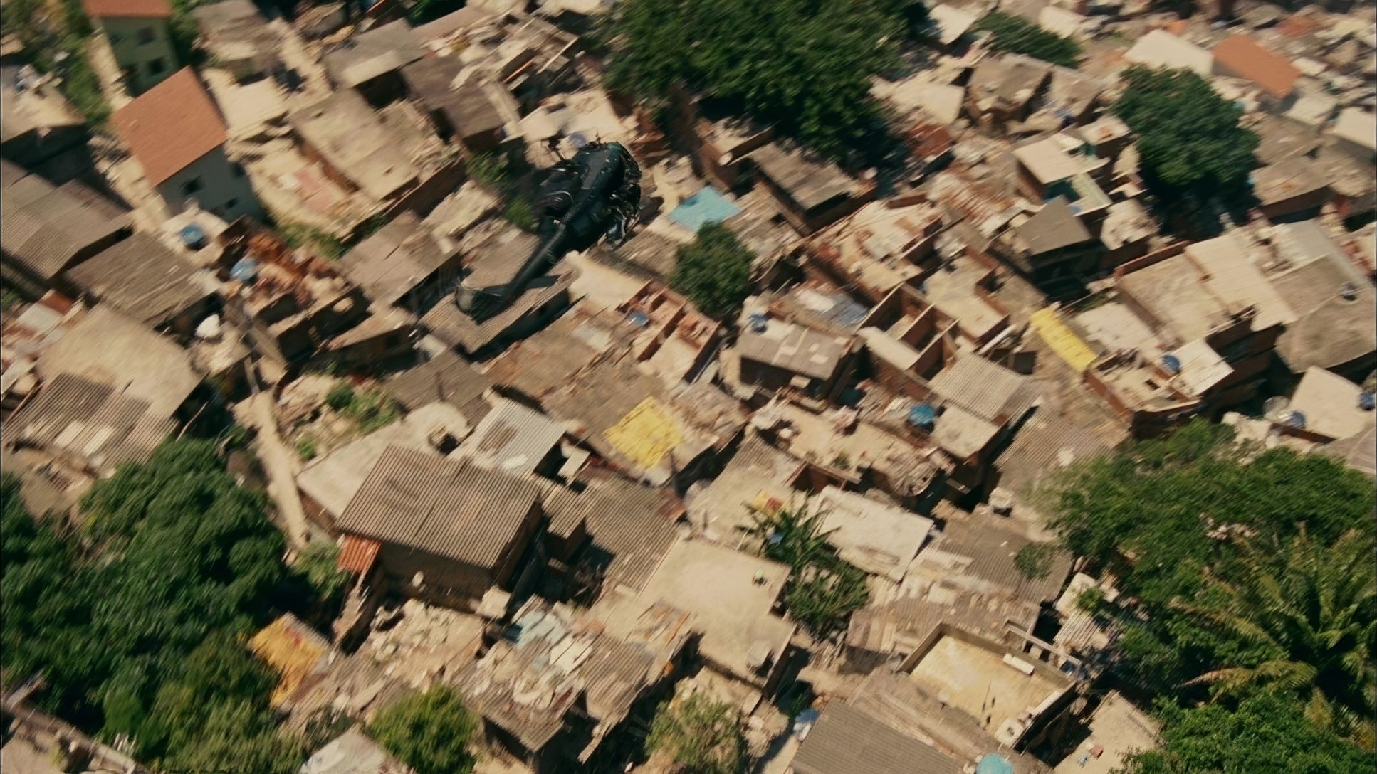
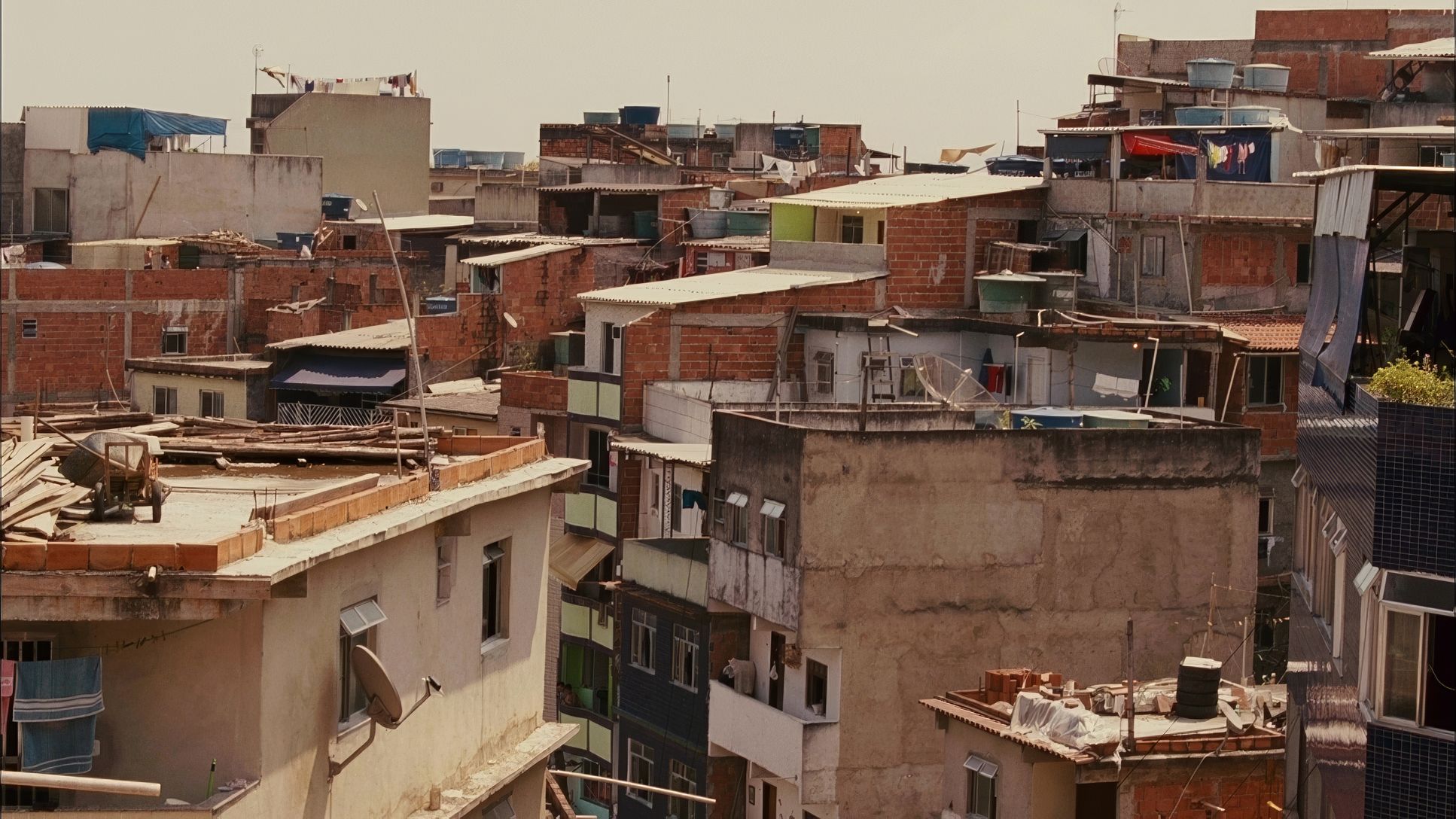
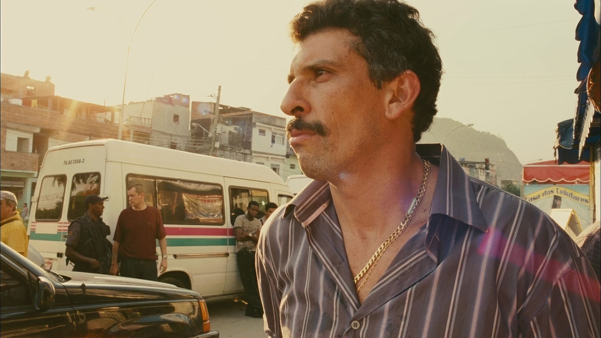
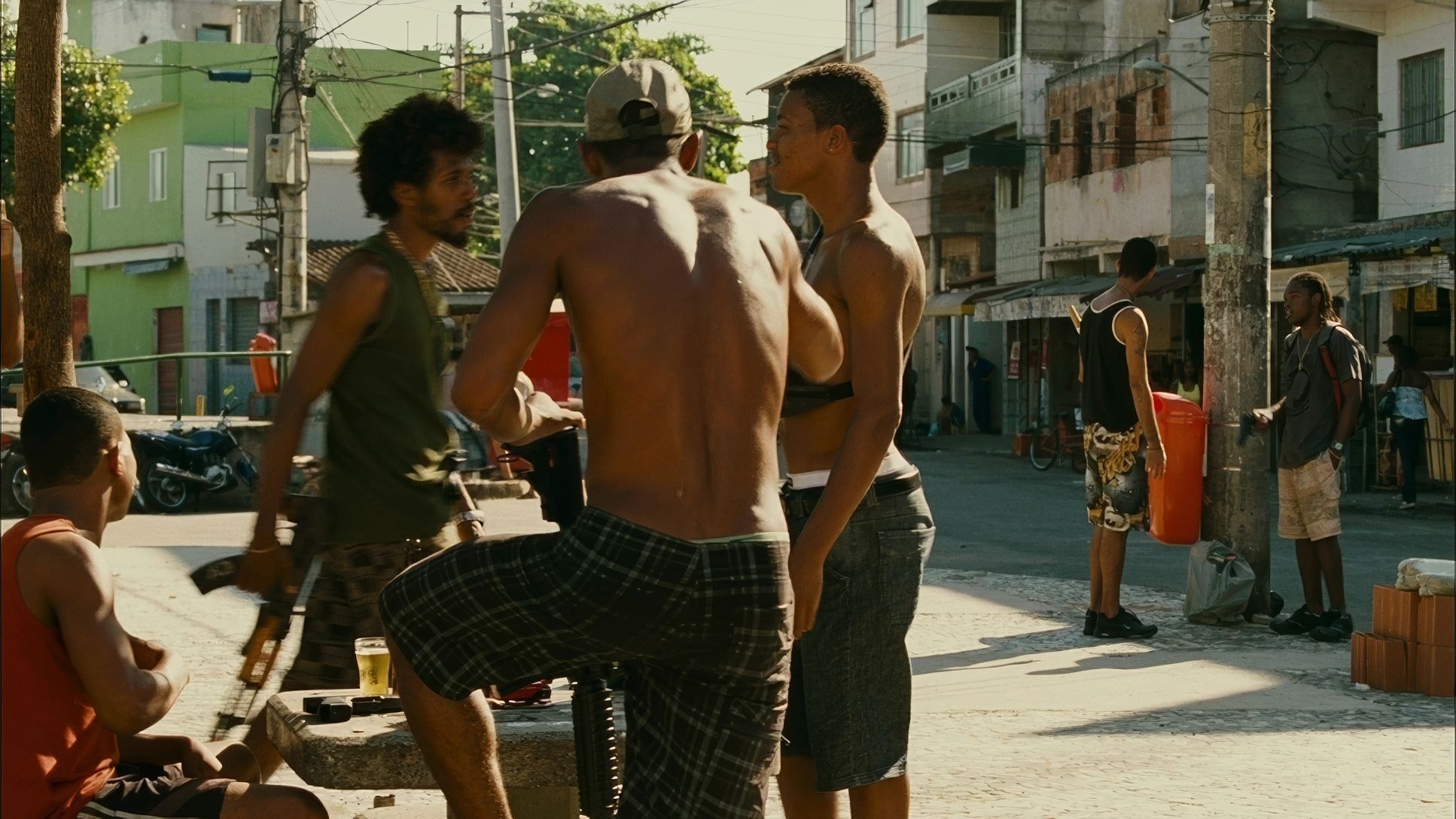
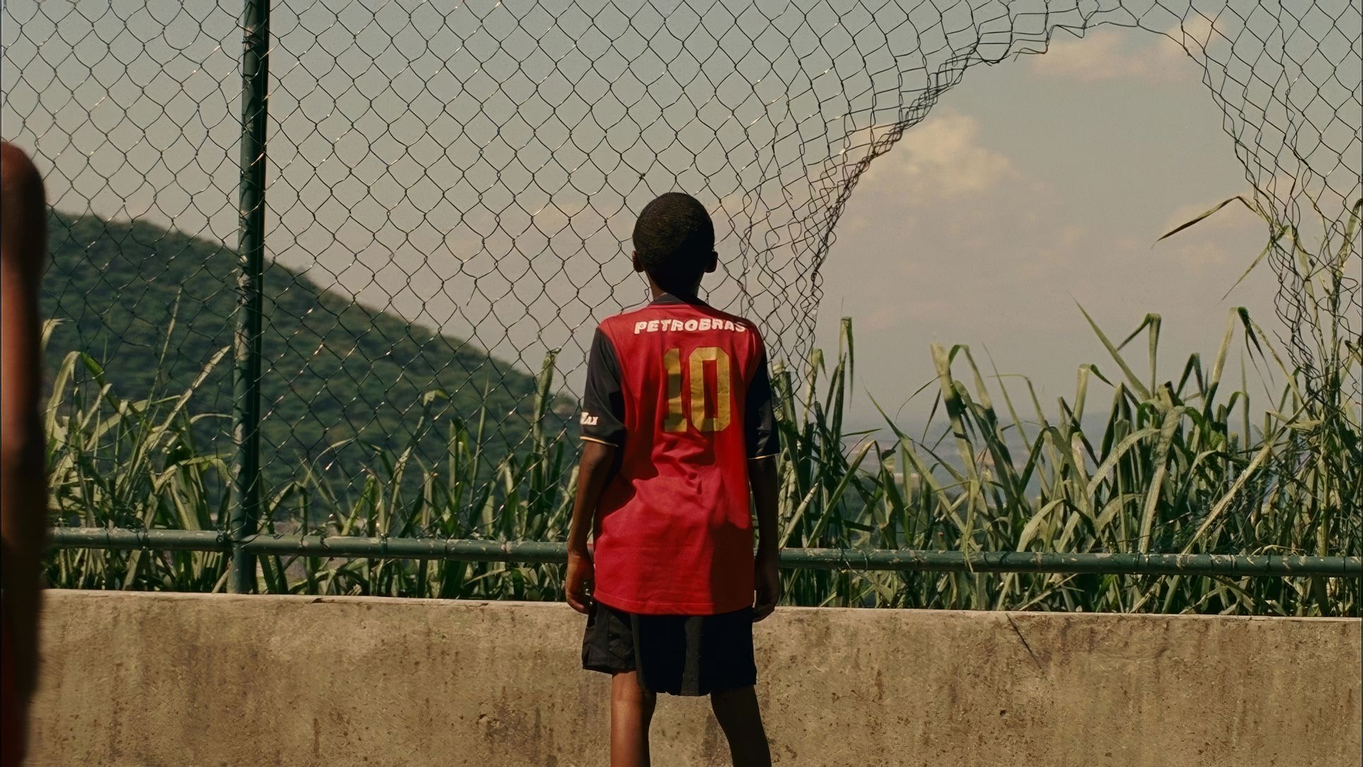
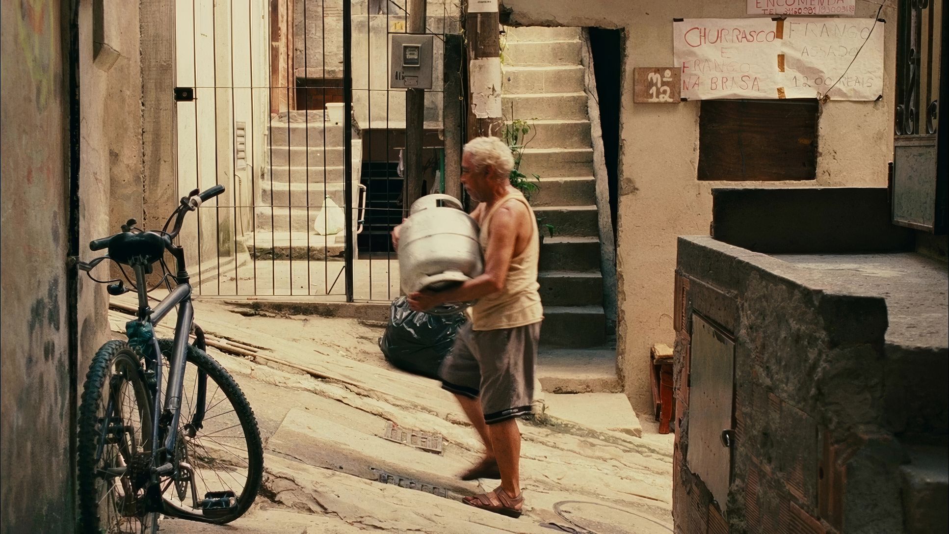
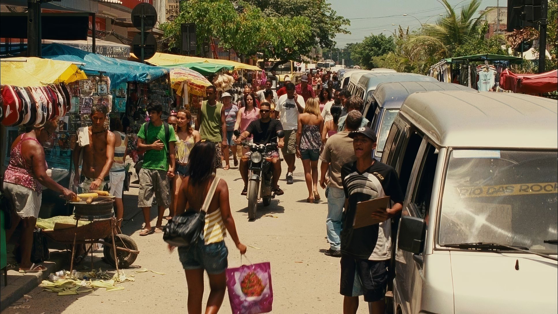
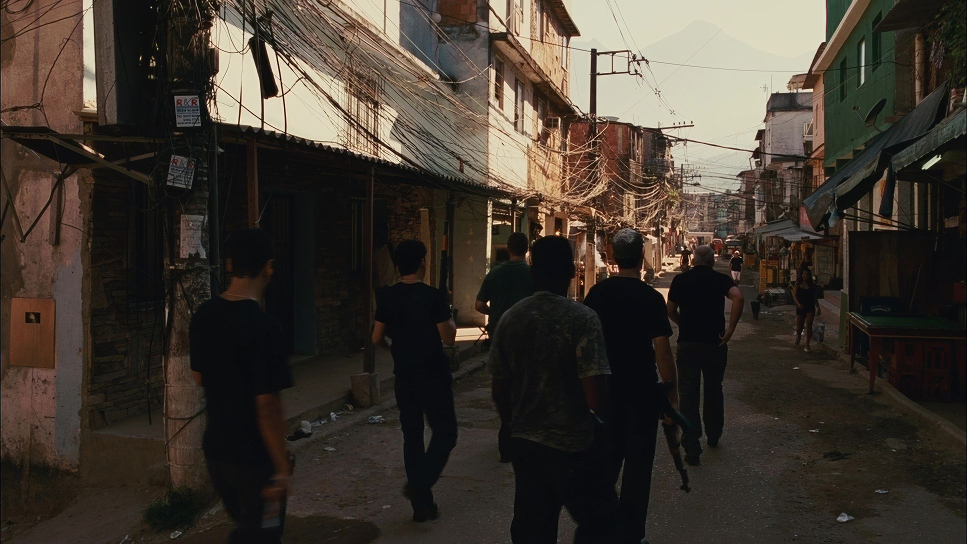
The visual grammar of Elite Squad 2: The Enemy Within is born directly from the geopolitical reality of South America. This isn’t a glossy Hollywood thriller; it’s a journalistic descent into a “depressing lifestyle” in the slums, fueled by political greed. Padilha and Carvalho clearly leaned into a hyper-realistic aesthetic that feels more like war-zone photojournalism than traditional cinema.
While some might label the look as “gritty,” I see it as a very intentional, high-level naturalism. The goal was to make the viewer feel the oppressive humidity of the streets and the cold sterility of government offices. Every choice from the choice of film stock to the restless camera serves the social commentary. It’s “styled” specifically to look “unstyled,” leveraging technical precision to create an atmosphere of immediate, unvarnished truth.
Camera Movements
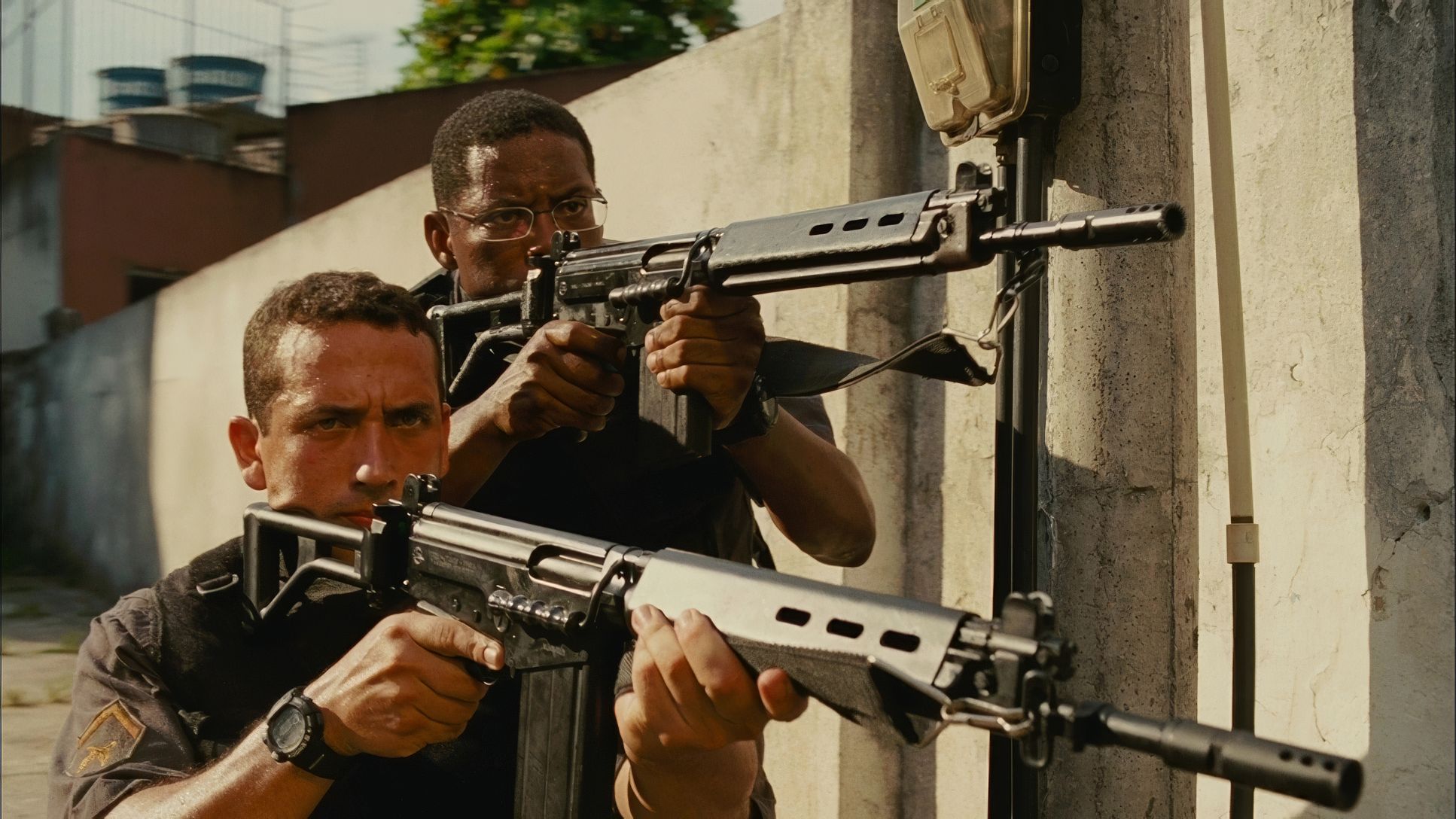
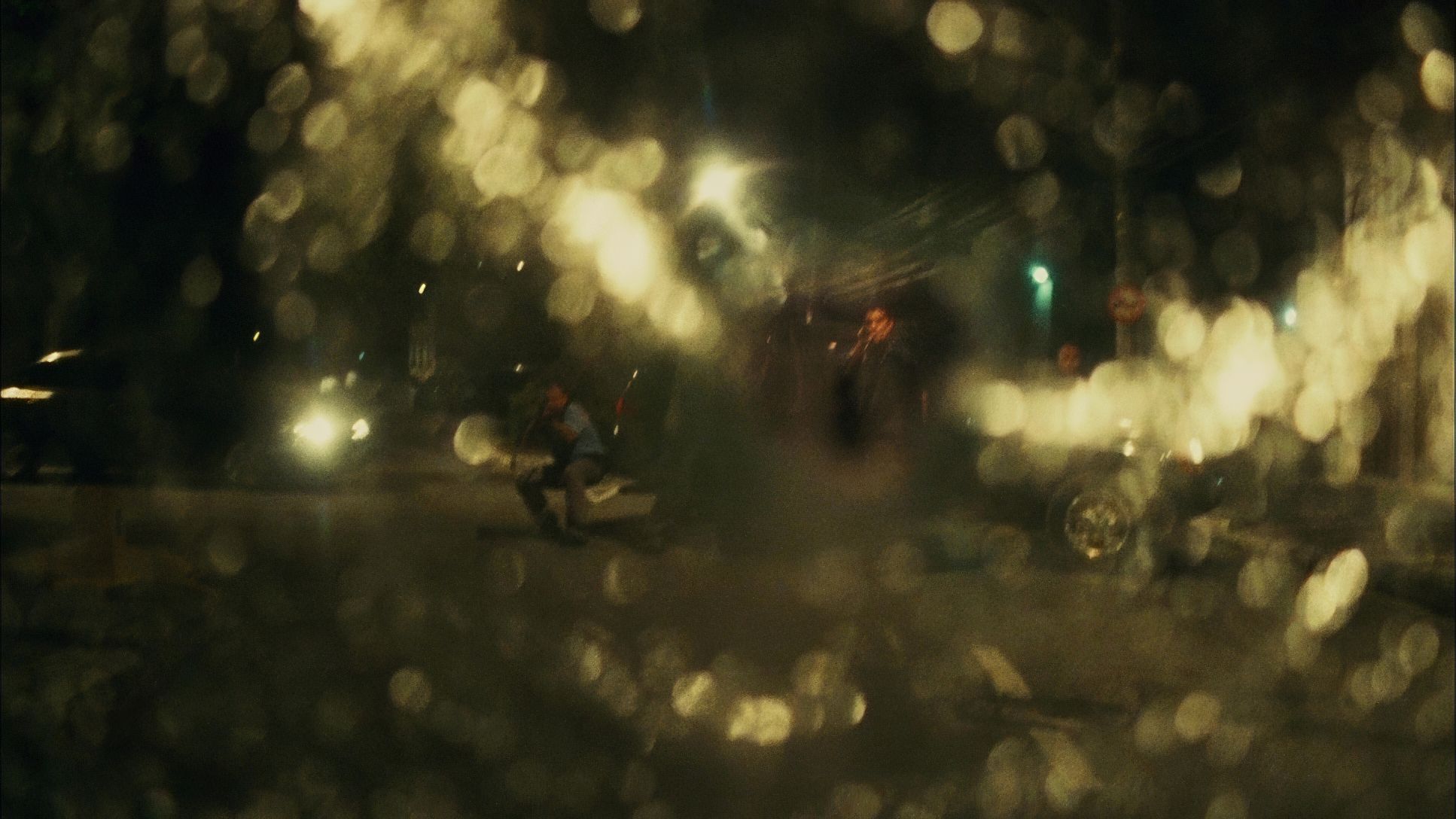
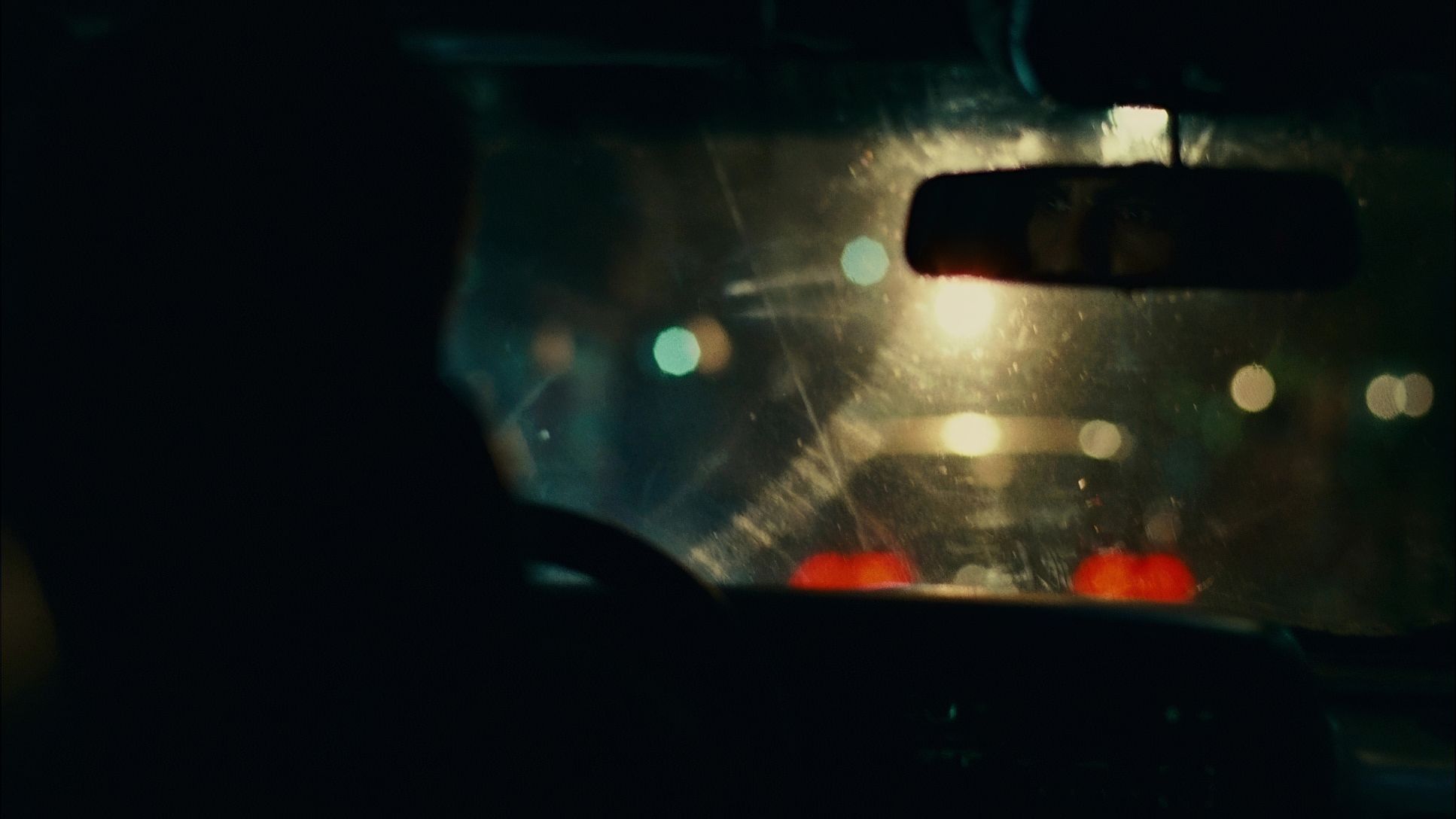
A common critique from casual viewers is that the camera feels “too shaky” or “disorienting.” From my perspective in the grading suite, I see those movements as foundational. That “jitter” is the film’s heartbeat. It rejects the artificiality of perfectly stabilized, “floaty” digital shots in favor of a restless, seeking lens.
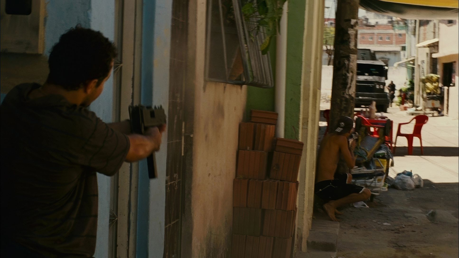
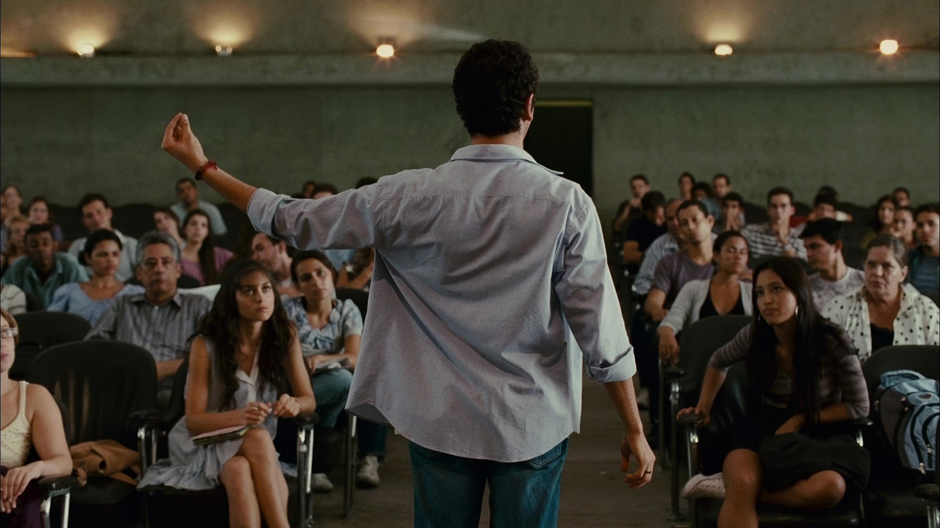
This handheld approach mirrors Captain Nascimento’s own psychological state. As he gets pulled deeper into a web of allegiances he can’t control, the camera moves with a frantic urgency. It places us right there in the middle of the Elite Squad, making the polished choreography of standard action films feel fake by comparison. It’s not just “shaky cam” it’s immersive subjectivity.
Compositional Choices
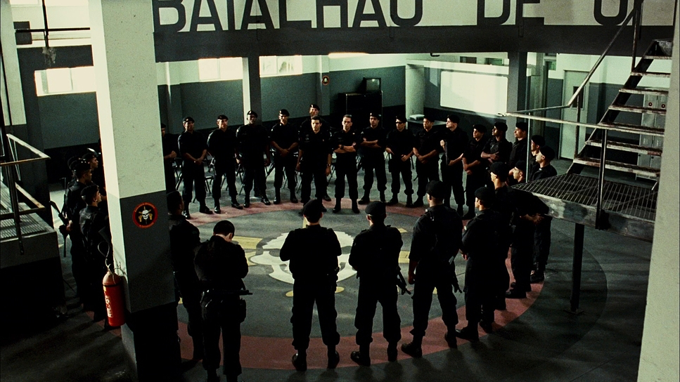
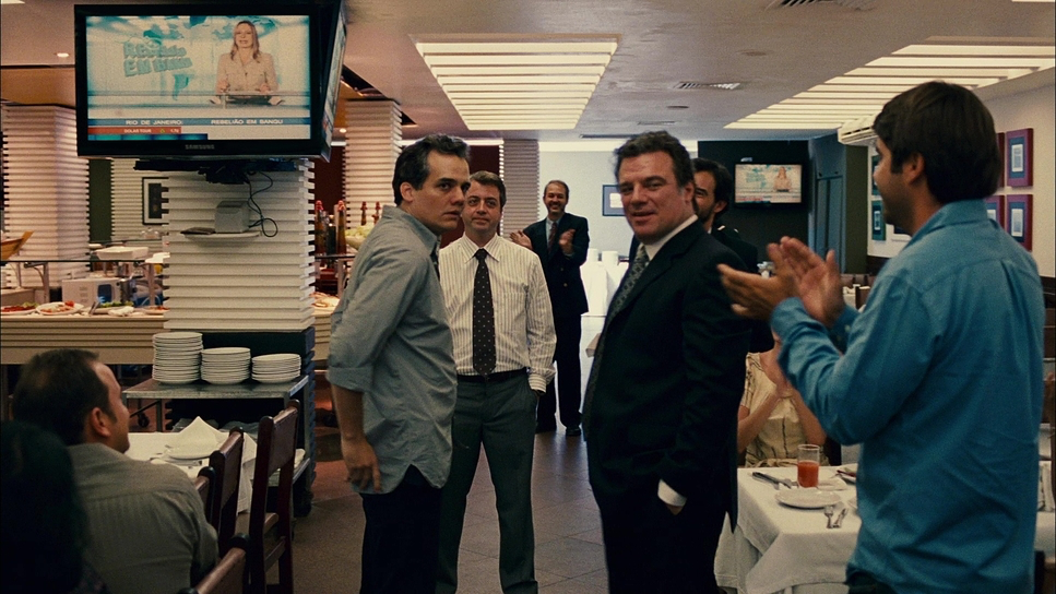
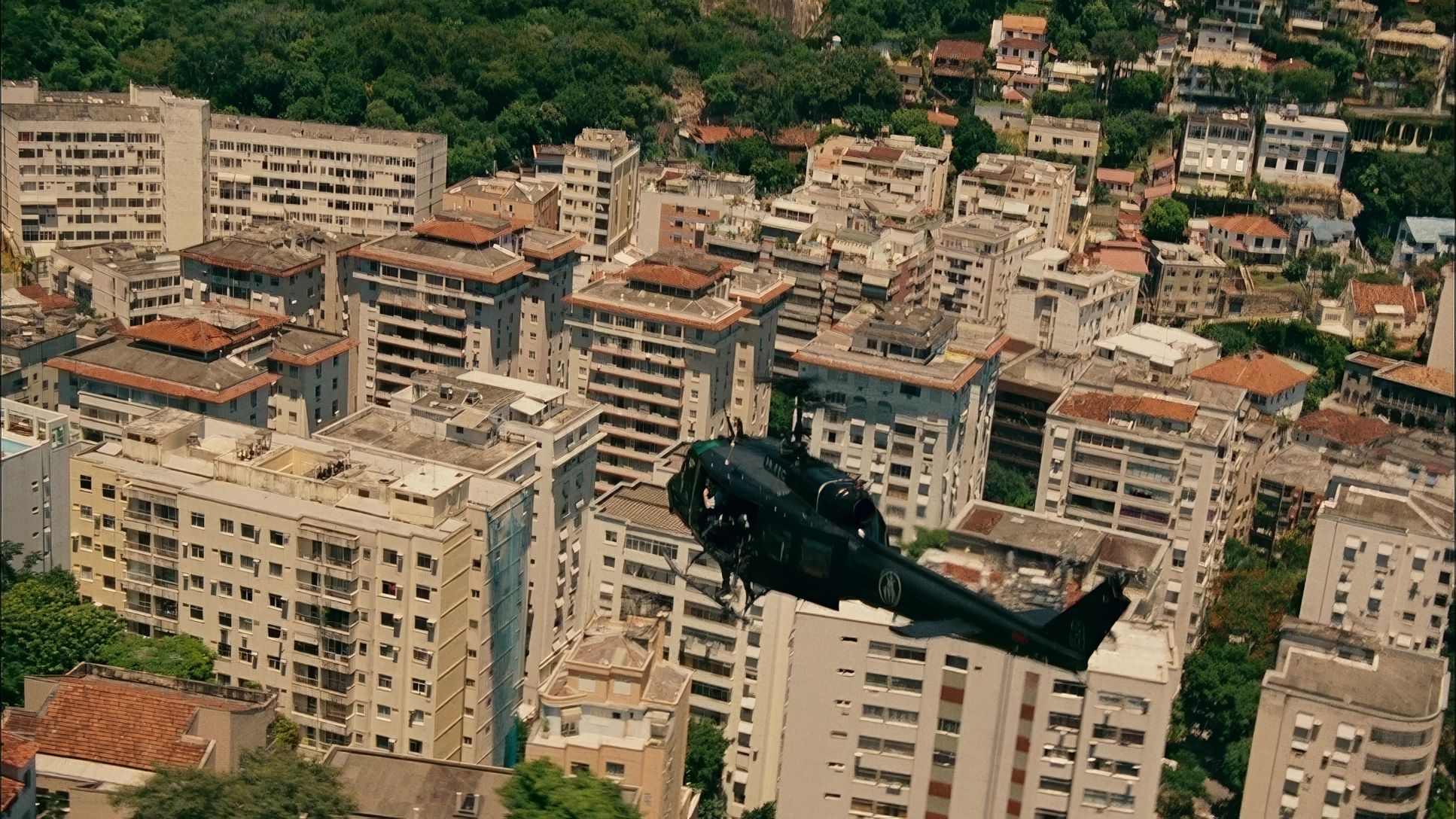
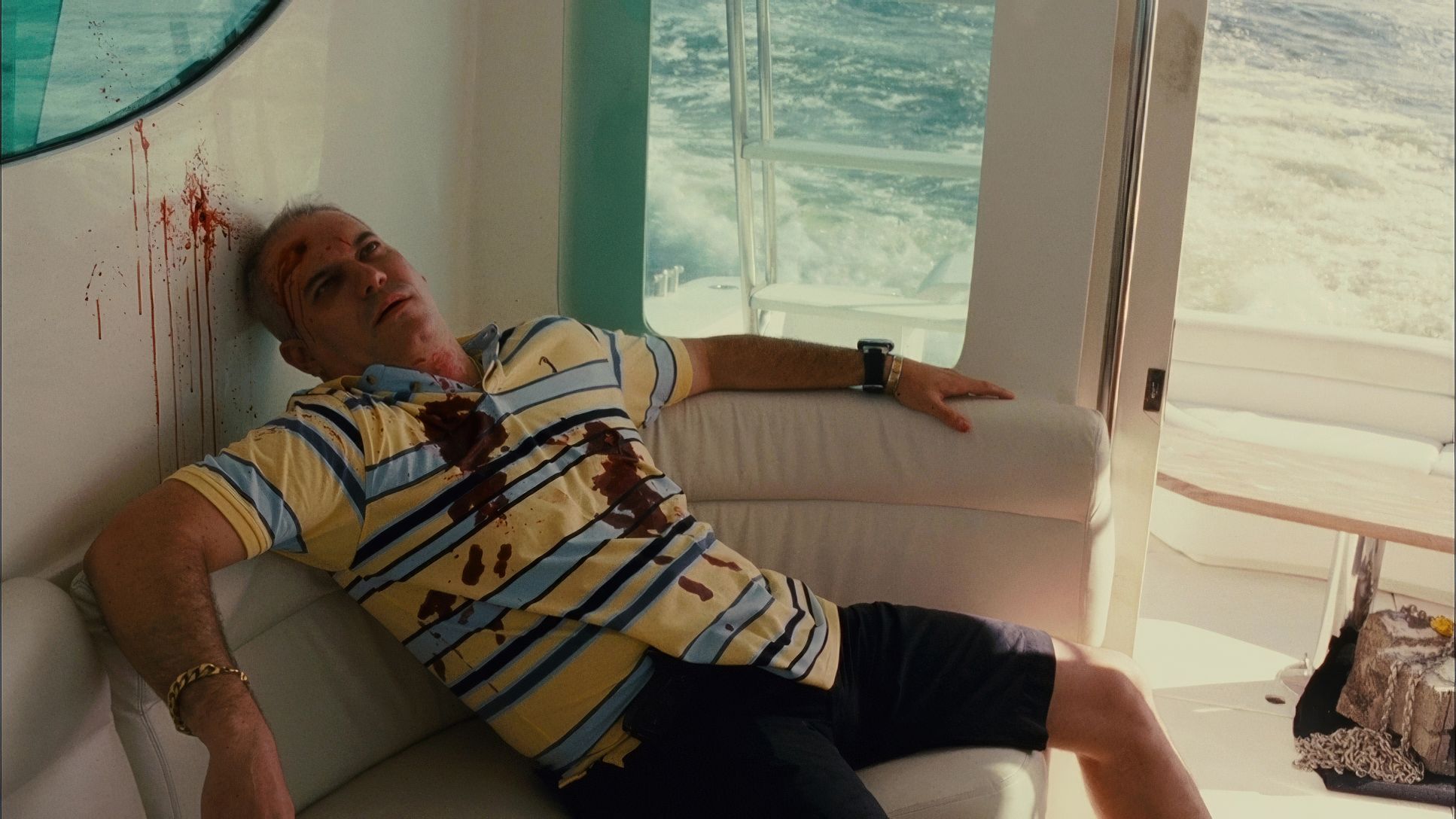
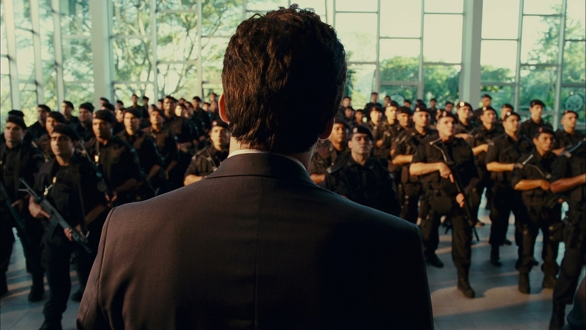
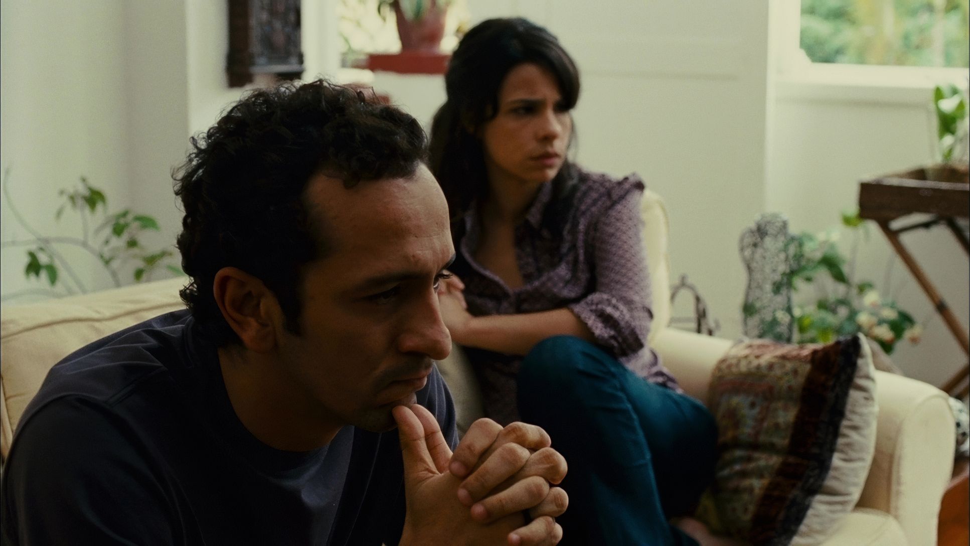
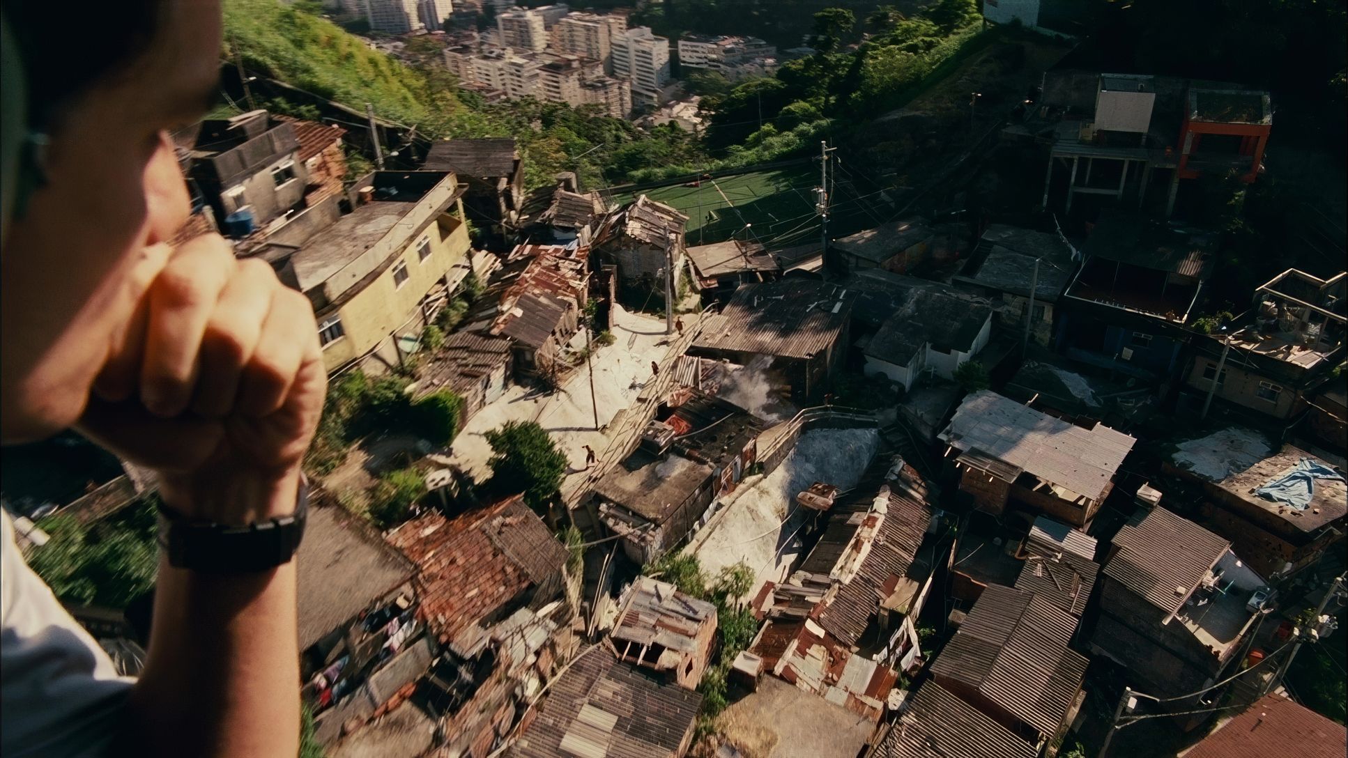
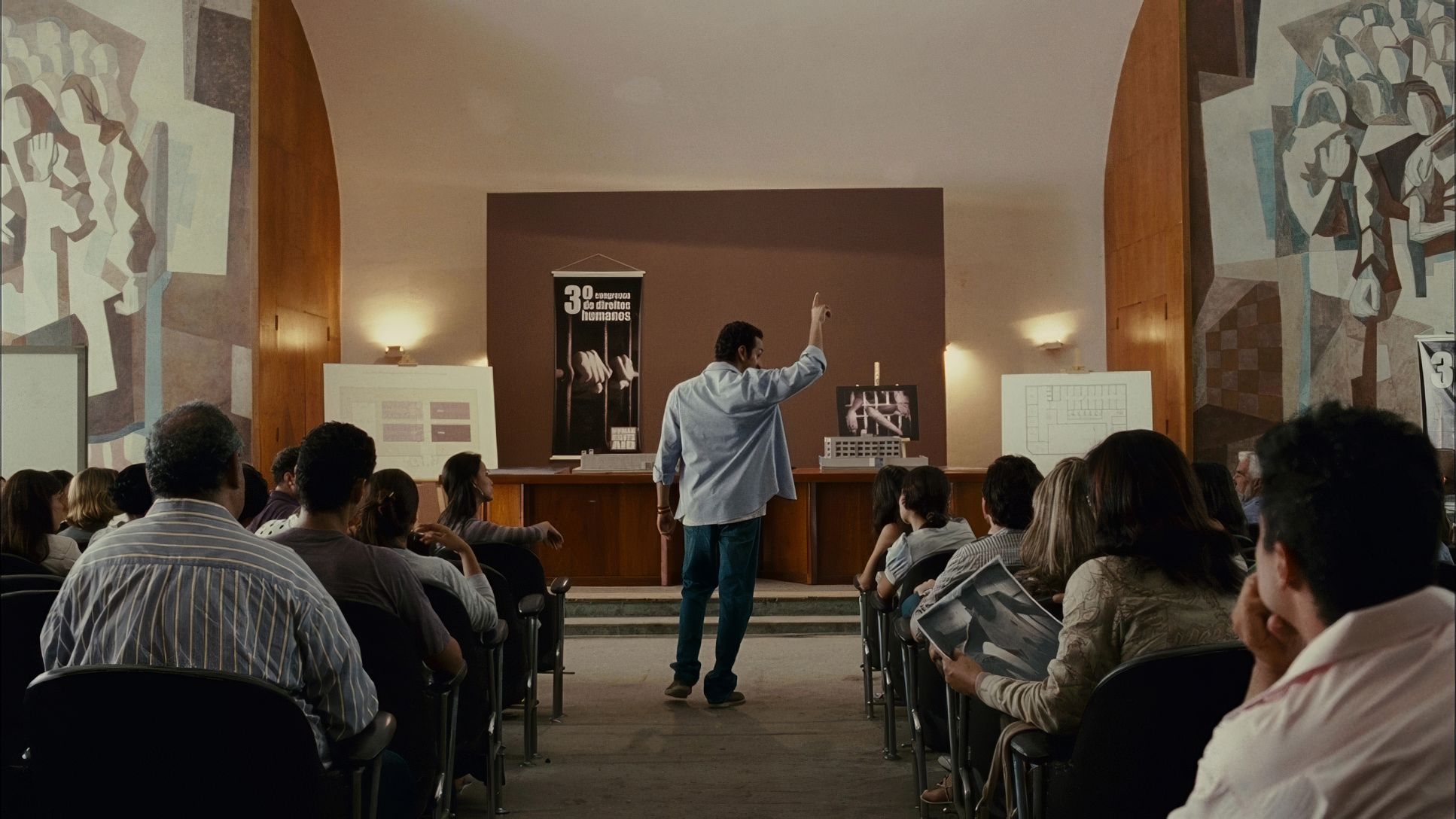
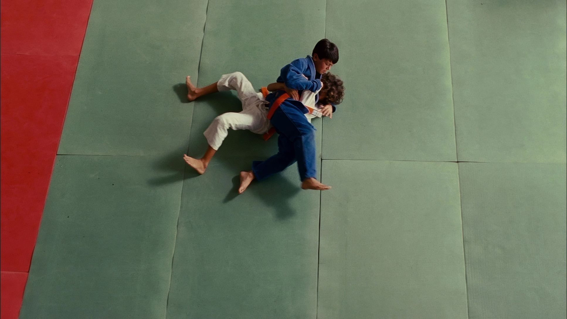
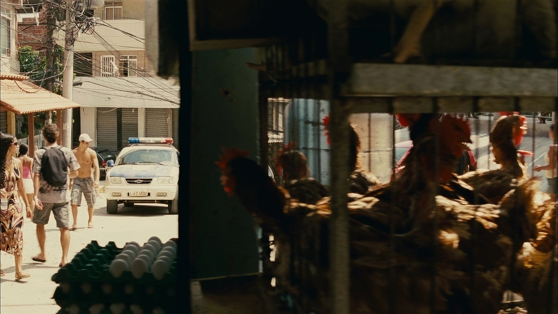
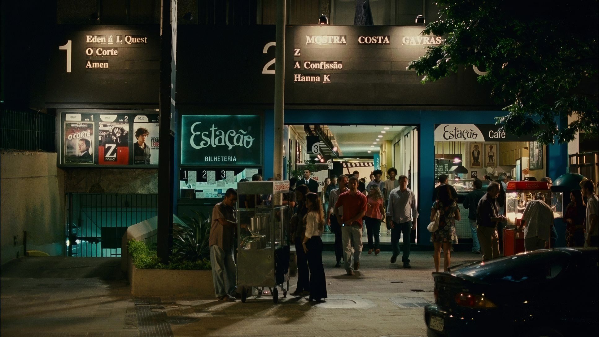
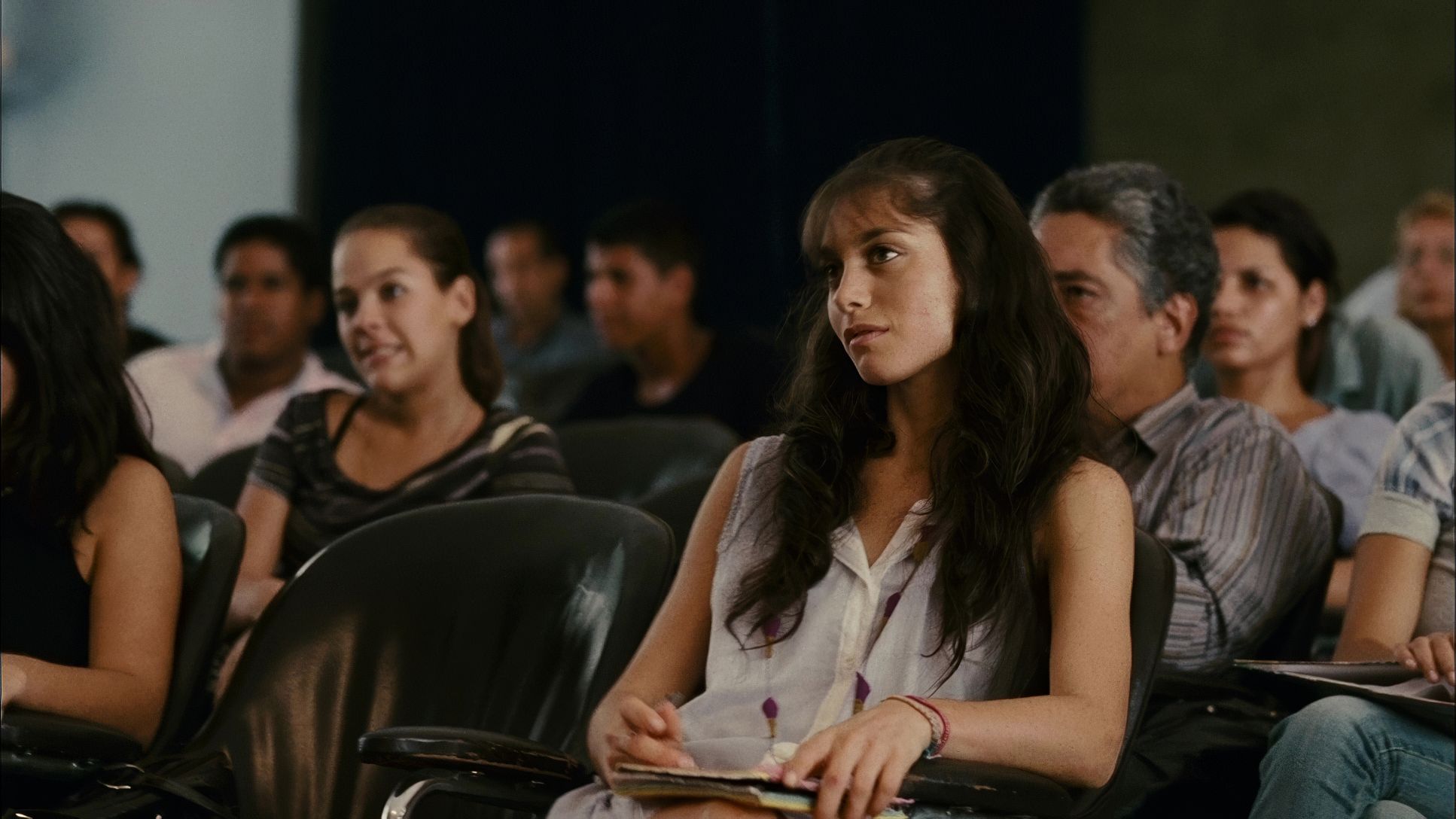
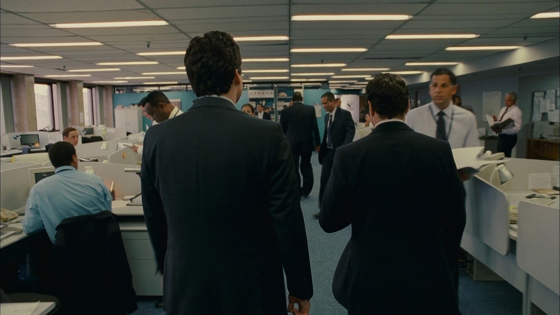
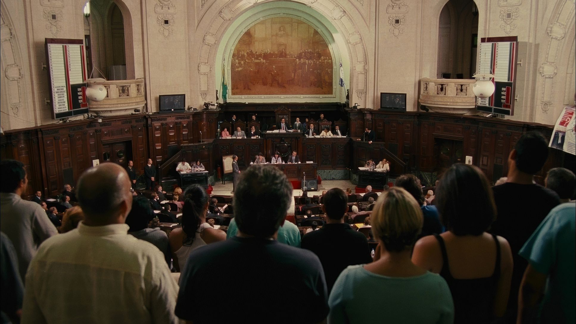
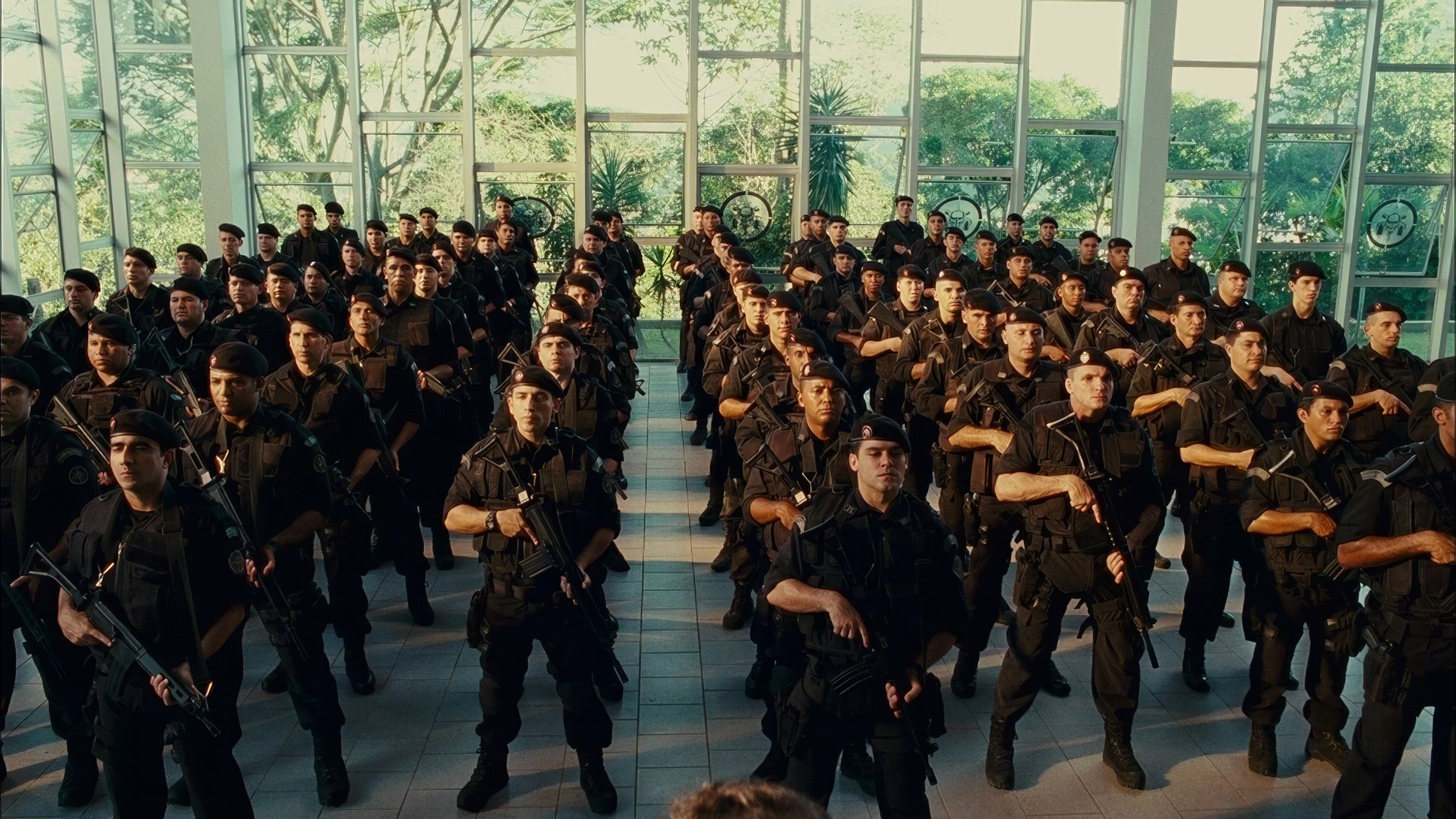
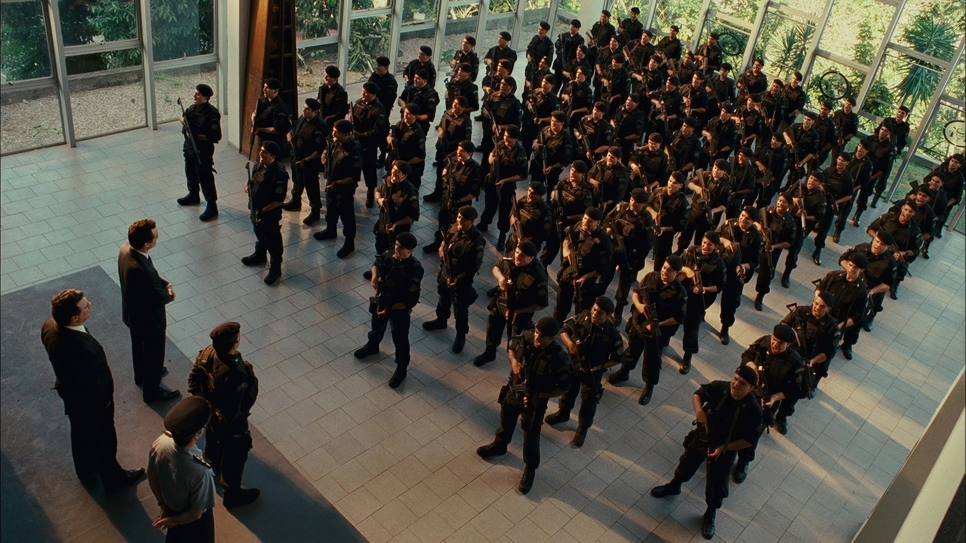
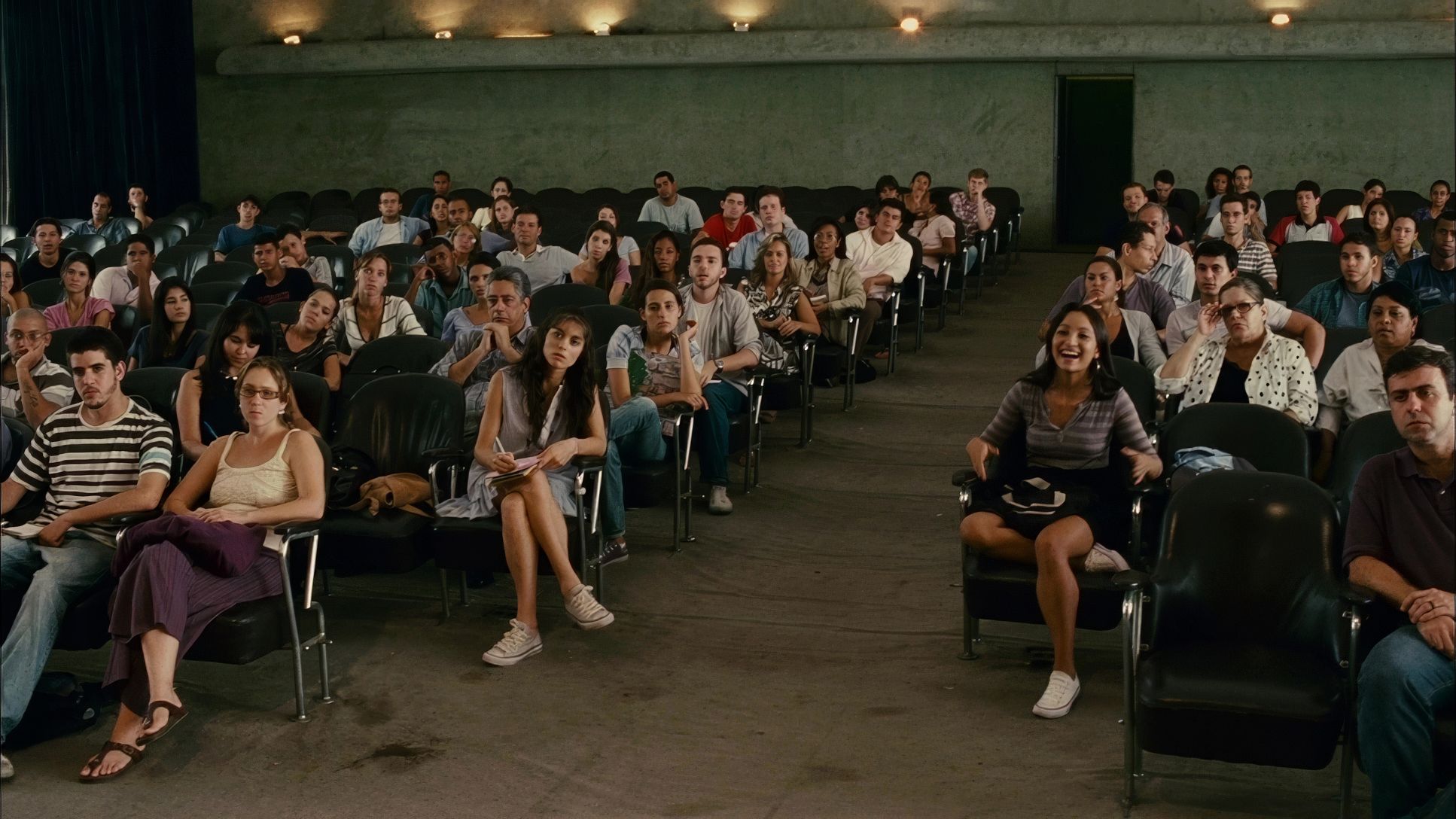
Despite the frenetic movement, Carvalho never loses sight of the narrative hierarchy. Elite Squad 2: The Enemy Within has a massive scope, juggling low-level cops, civilians, and high-ranking politicians. To manage this, the compositions often utilize deep focus, allowing the sprawling urban environment to weigh down on the characters.
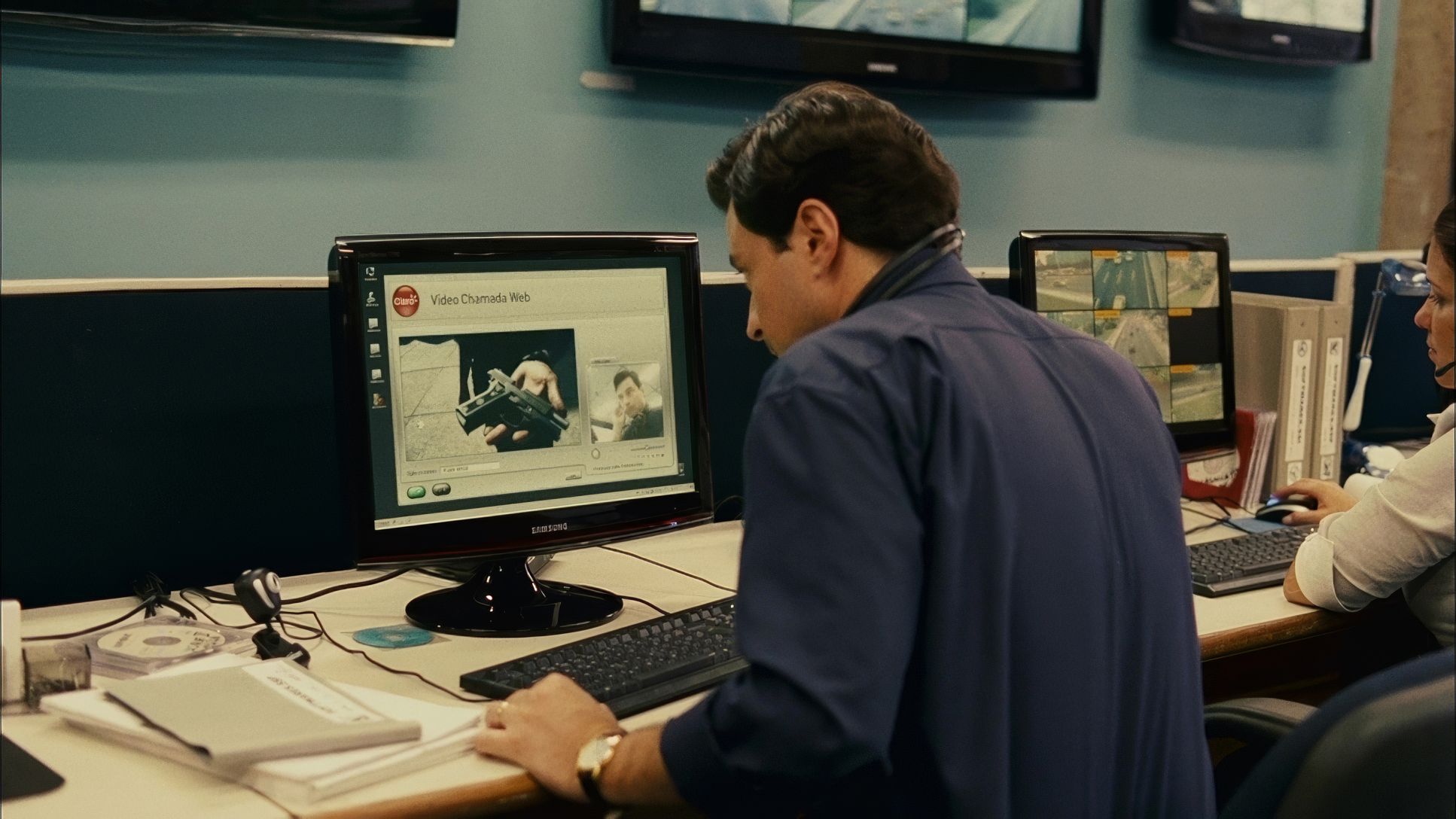
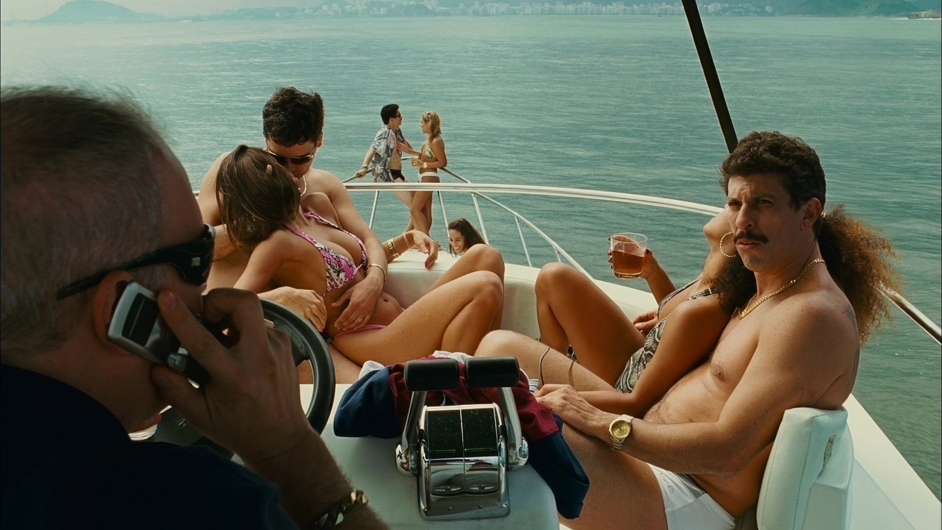
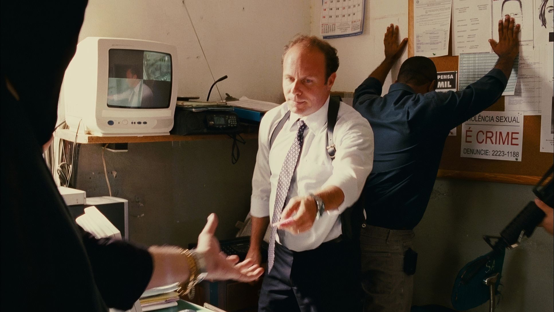
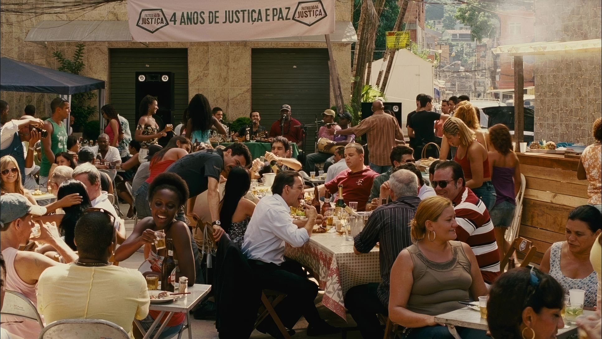
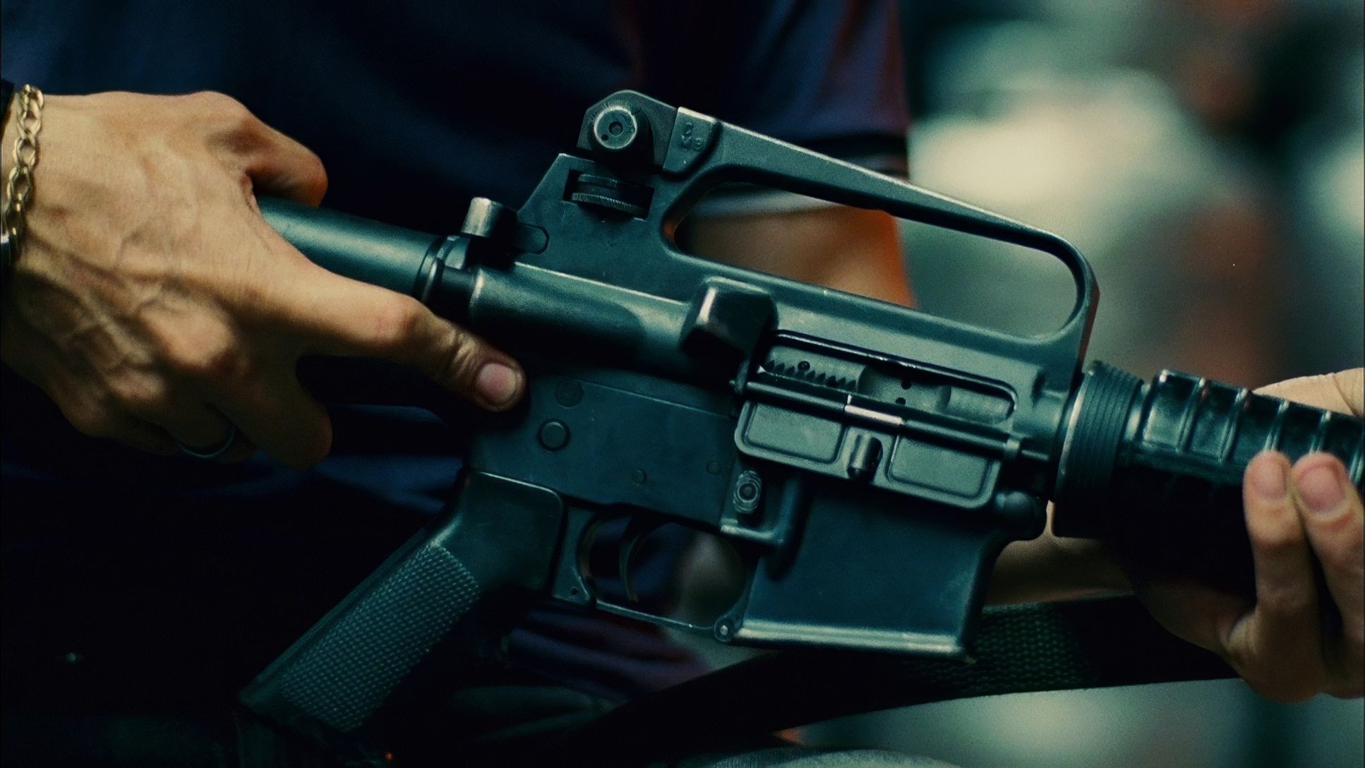
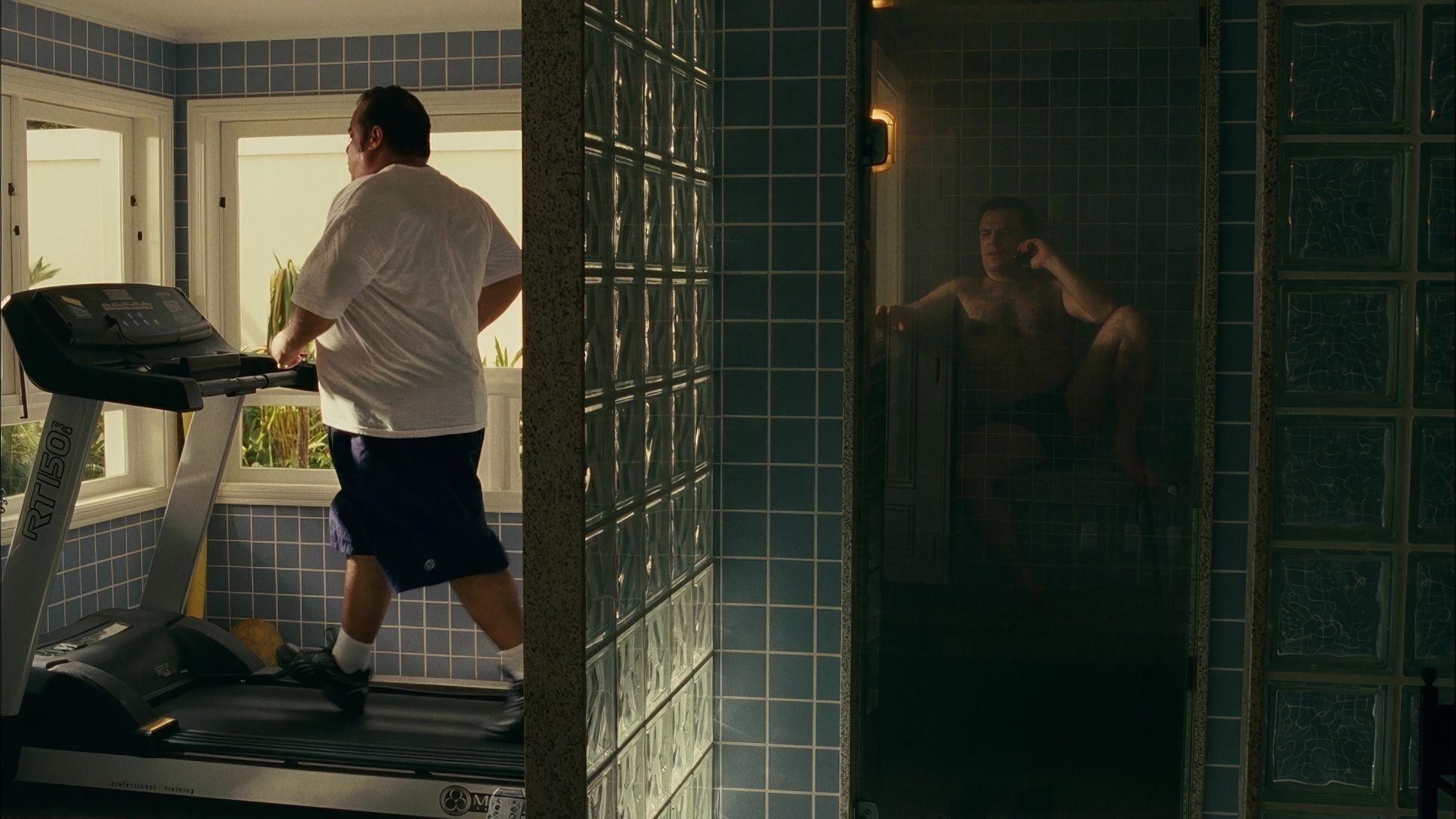
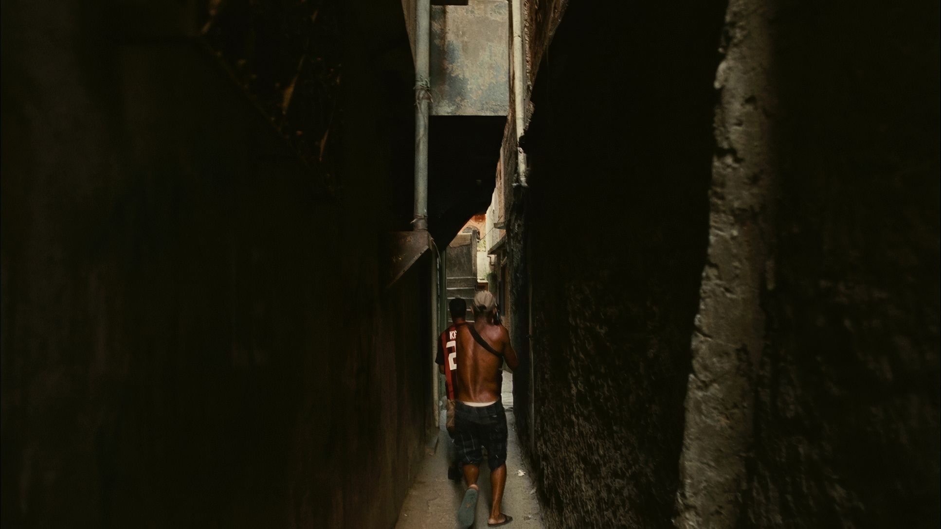
You’ll notice a recurring use of “entrapment” in the framing characters are often boxed in by doorways, windows, or the claustrophobic corridors of the favelas. There’s a brilliant contrast between the opulence of political spaces and the squalor of the streets, but Carvalho often frames the powerful and the powerless with the same sense of isolation. When Nascimento breaks the fourth wall during his voiceovers, it’s a calculated move to bridge the gap between his moral dilemma and our own.
Lighting Style
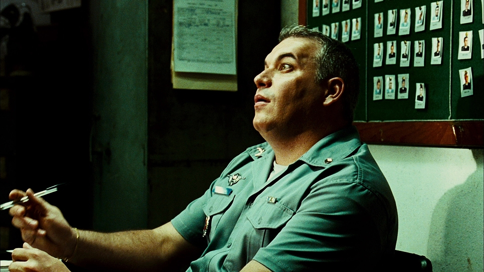
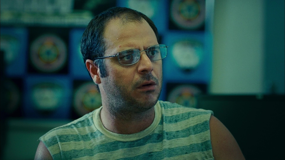
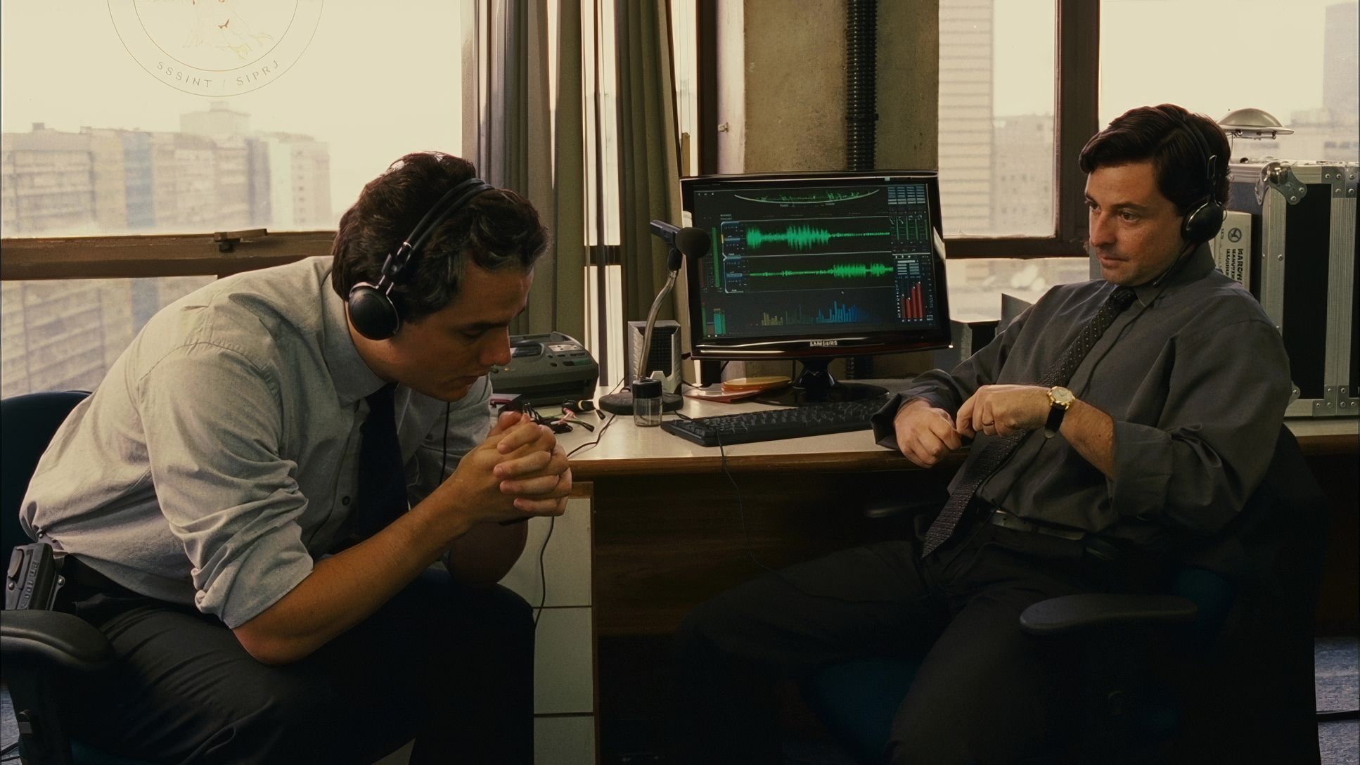
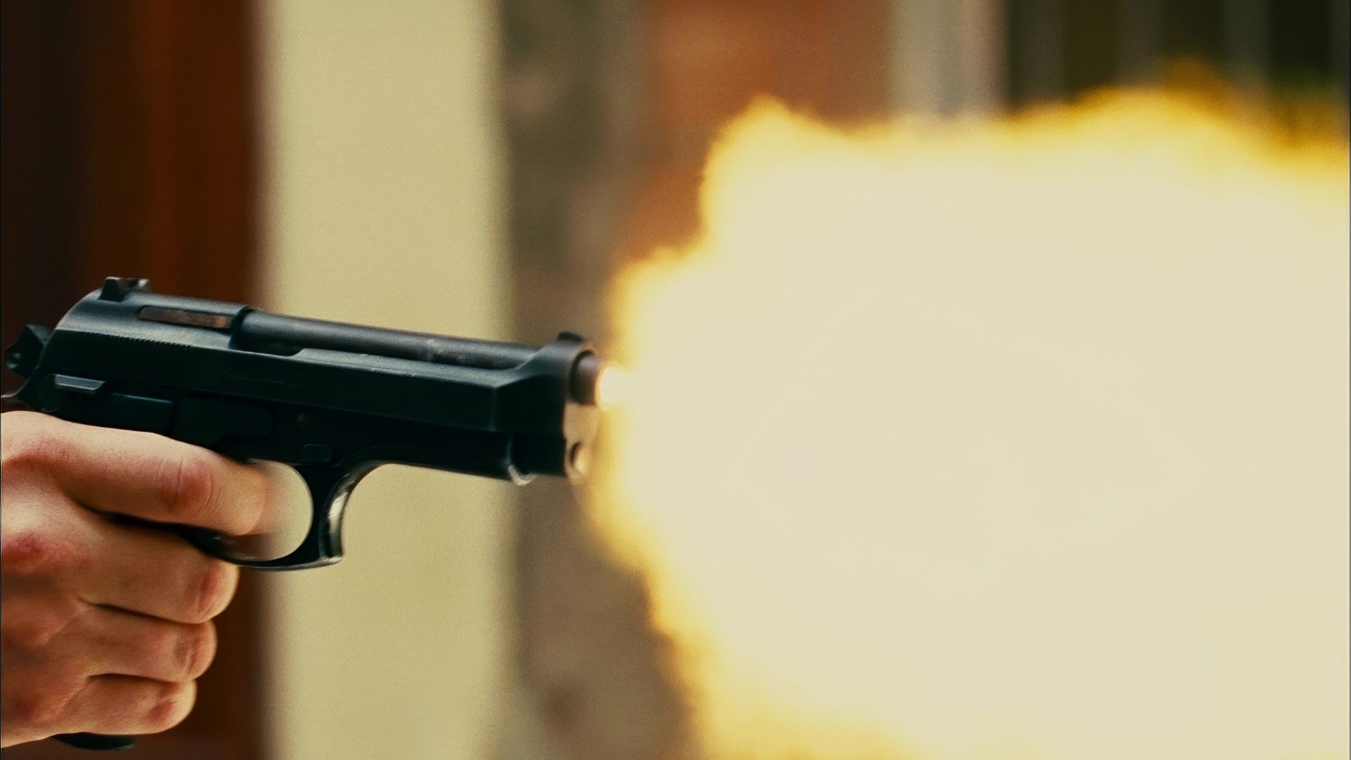
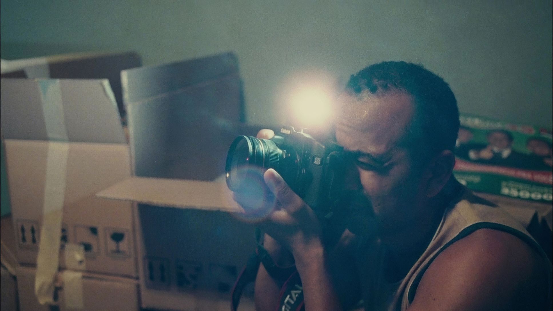
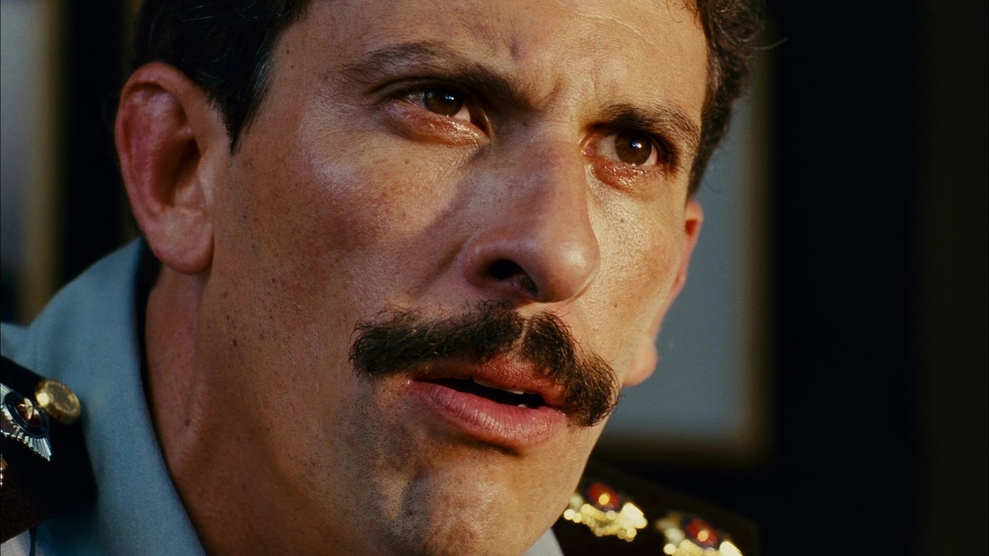
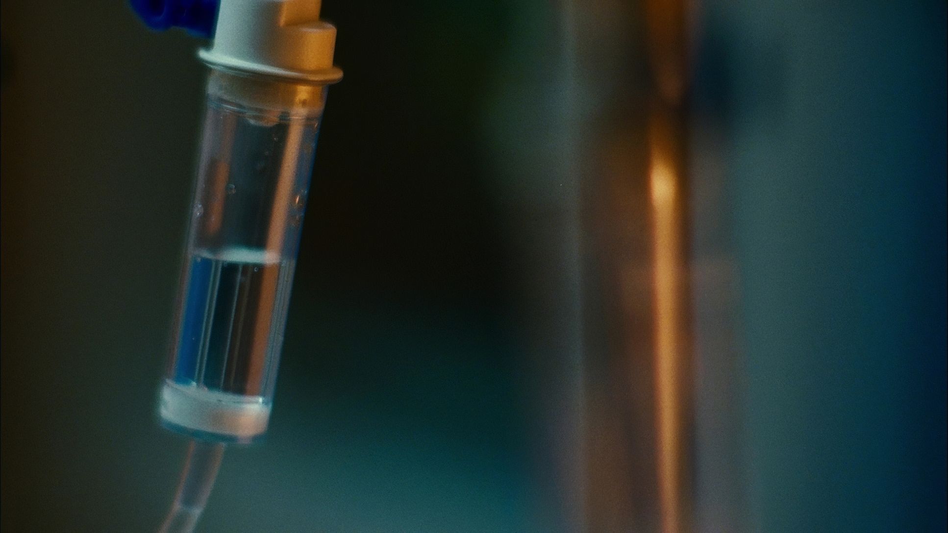
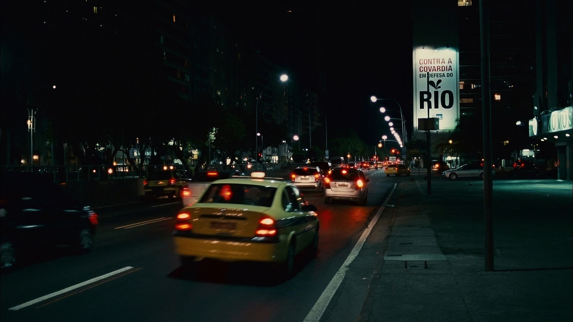
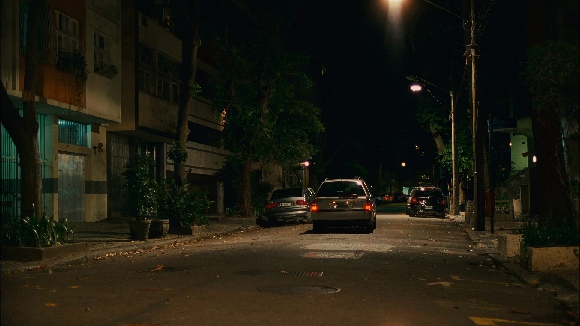
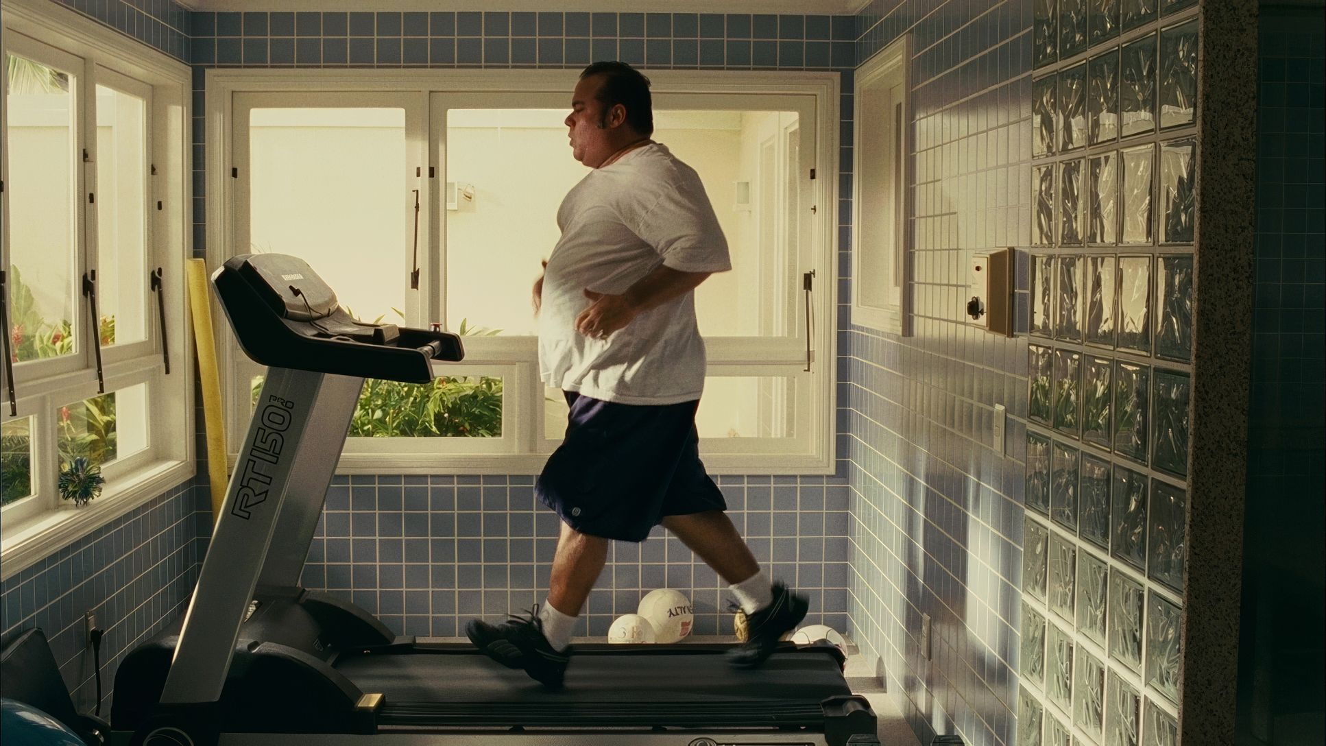
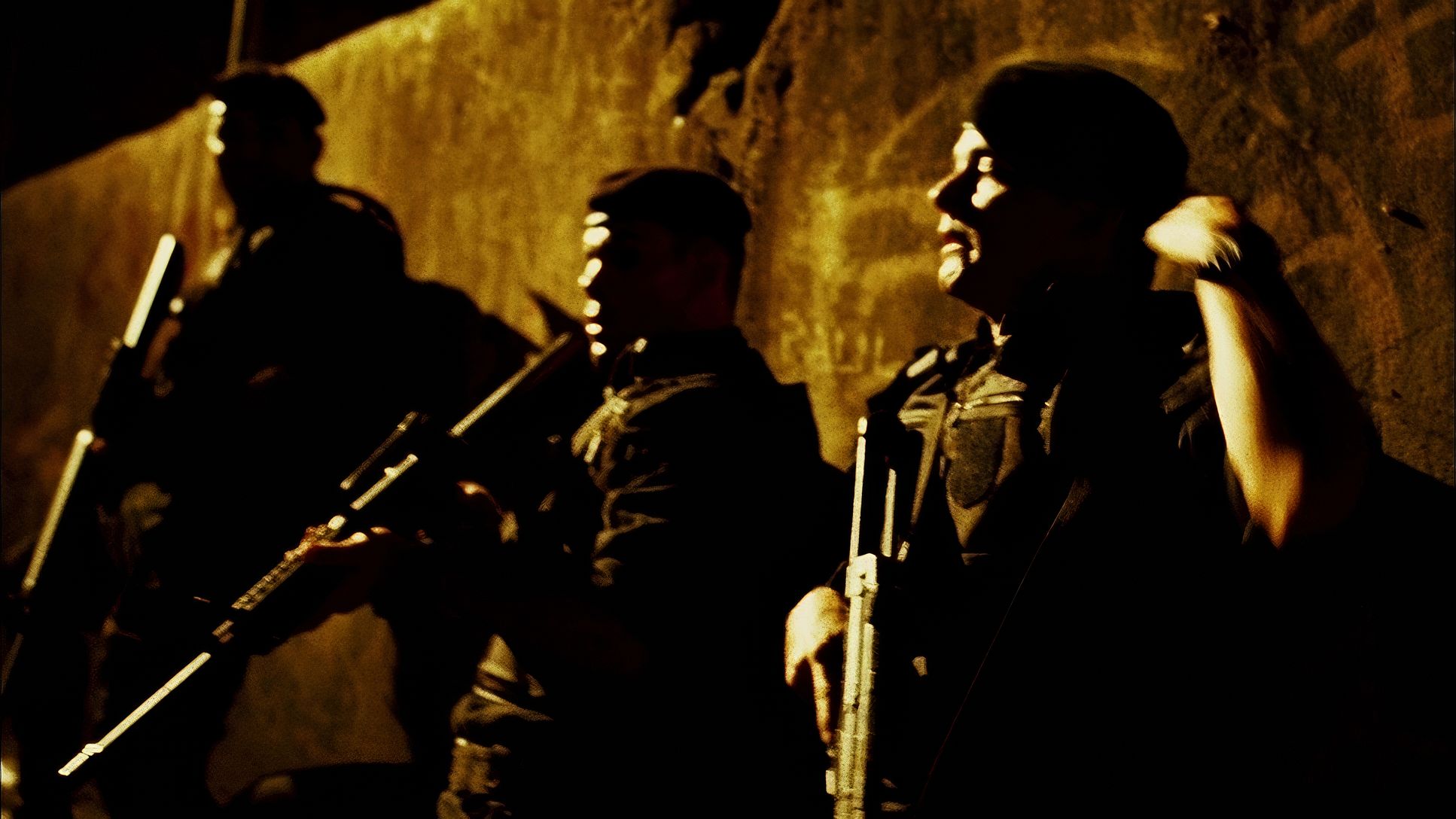
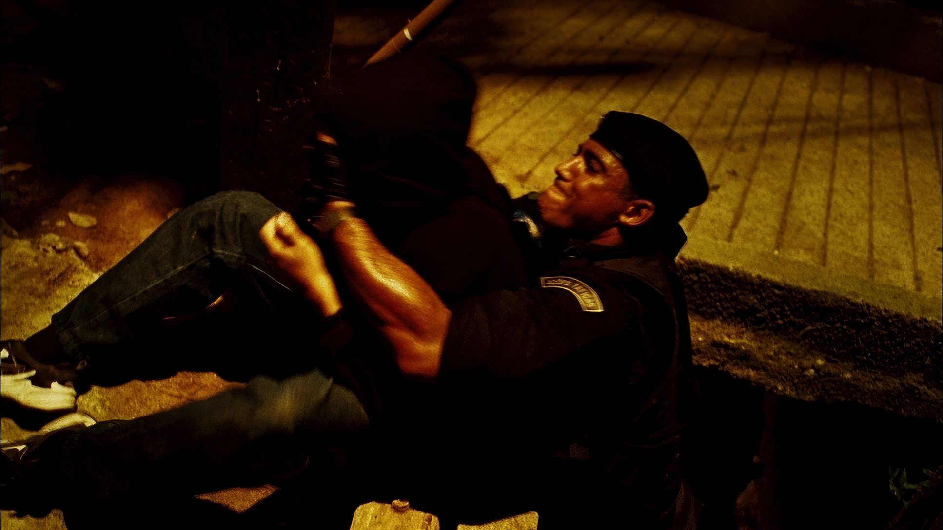
The lighting in Elite Squad 2 is aggressively naturalistic. Carvalho leans heavily into motivated sources the harsh, top-down glare of the midday Rio sun, sterile fluorescent tubes in police stations, and muted practicals in the slums. This isn’t about making actors look “pretty”; it’s about making the world look “real.”
For the night exteriors, the team utilized soft, artificial top-lighting to mimic the ambient glow of a city street. This creates deep, inky shadows that enhance the “gritty” feel mentioned by critics. Instead of fighting the darkness, the cinematography embraces it, allowing highlights to occasionally “clip” or blow out in the sun, much like the human eye would react to such extreme contrast. It’s a masterclass in using light to build tension rather than just visibility.
Lensing and Blocking
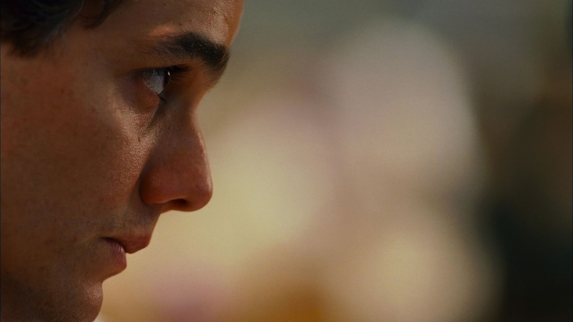
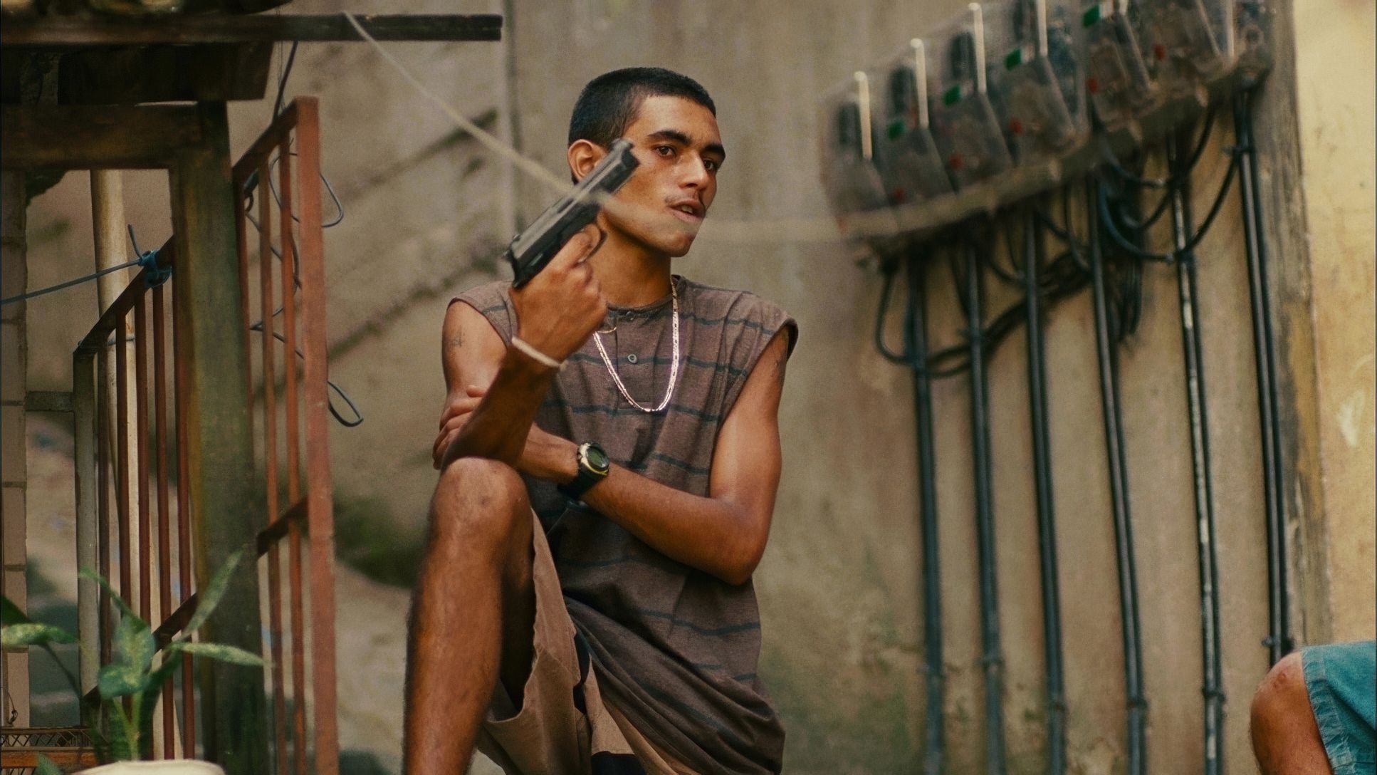
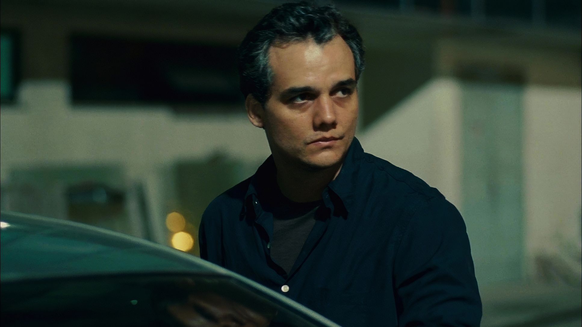
To achieve that intimate, “in-your-face” feeling, Carvalho and Padilha favored Cooke S4/i lenses. In the industry, we talk about the “Cooke Look” a specific way these lenses handle skin tones and provide a smooth, organic roll-off that feels very human. Even in the middle of a violent raid, the lensing keeps the human element front and center.
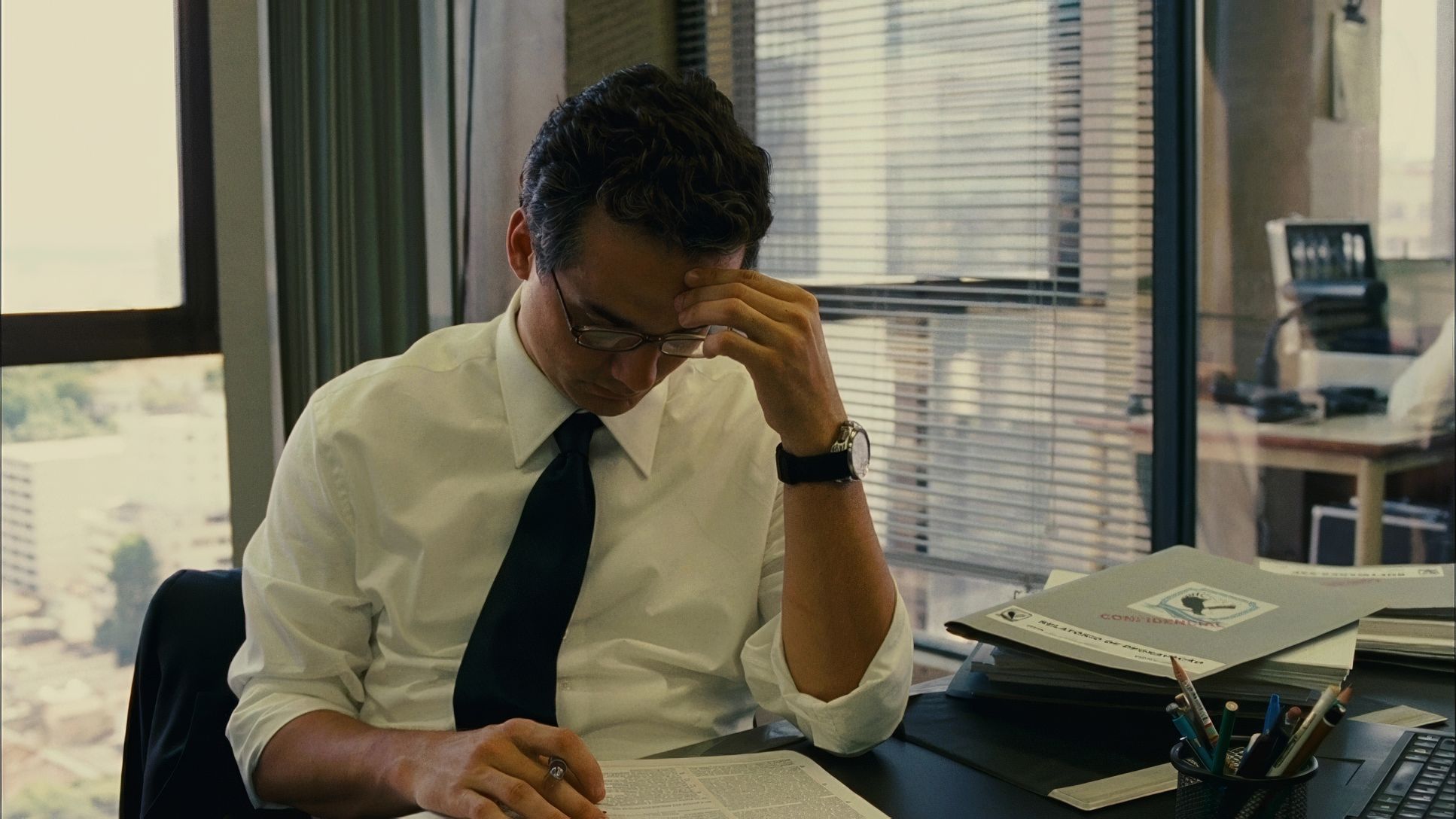
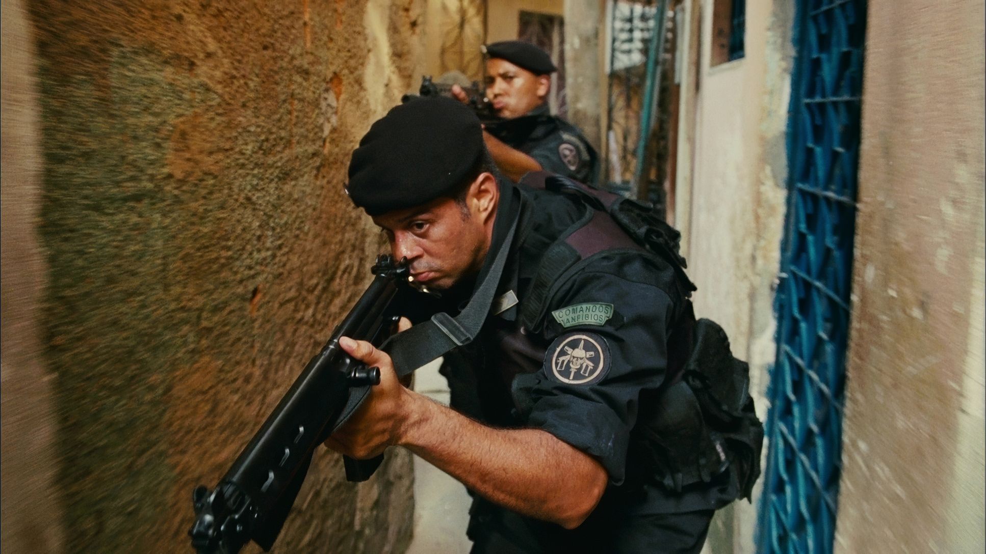
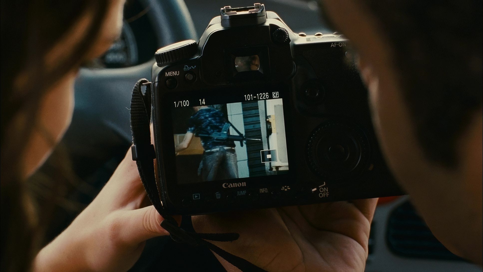
The blocking is equally intentional. In the tight confines of cars or narrow alleyways, the characters are packed into the frame, creating a palpable sense of claustrophobia. There’s a specific moment a “bullet time” pause where the blocking and editing (by the legendary Daniel Rezende) converge to highlight a point of no return. Using telephoto lenses for character isolation amidst the chaos helps the audience navigate the “web of allegiances” without getting lost in the visual noise.
Technical Aspects & Tools
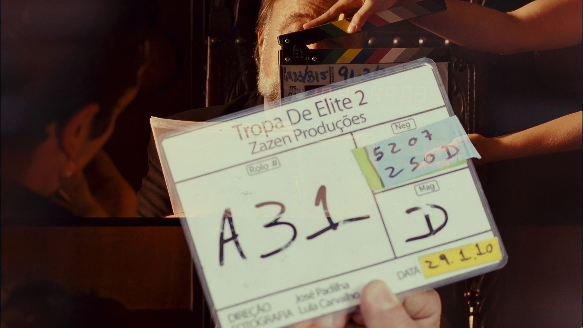
Elite Squad 2: The Enemy Within
Aaton Penelope | Cooke S4/i | 35mm Film
| Genre | Action, Crime, Drama, History, Political, Gangster, Thriller, Police |
| Director | José Padilha |
| Cinematographer | Lula Carvalho |
| Costume Designer | Cláudia Kopke |
| Editor | Daniel Rezende |
| Colorist | Jason Fabbro |
| Time Period | 2010s |
| Color | Cool, Desaturated |
| Aspect Ratio | 1.78 – Spherical |
| Format | Film – 35mm |
| Lighting | Soft light, Top light |
| Lighting Type | Artificial light |
| Story Location | Brazil > Rio de Janeiro |
| Filming Location | Brazil > Rio de Janeiro |
| Camera | Aaton Penelope |
| Lens | Cooke S4/i |
For a film that looks this raw, the technical choices were actually quite sophisticated. It wasn’t shot on the early digital cameras of the era, but on 35mm film using the Aaton Penelope. This choice is crucial; the 35mm format provides a textural density and dynamic range that digital struggled to replicate in 2010.
The Aaton Penelope is known for being a “quiet” and ergonomic camera, making it the perfect tool for Carvalho’s handheld, reactive style. By shooting on film, they captured a latitude that allowed for the deep blacks and punchy highlights we see in the final product. It’s a reminder that even when you want a “raw” look, the highest quality tools like 35mm glass and Cooke primes are what allow that grit to look cinematic rather than just messy.
Color Grading Approach
This is where the visual strategy really comes together. The colorist, Jason Fabbro, did a phenomenal job of maintaining a “cool and desaturated” palette that feels authentic to the film’s grim tone. If I were sitting at the console for this project, my priority would be exactly what Fabbro achieved: protecting the skin tones while desaturating the surroundings.
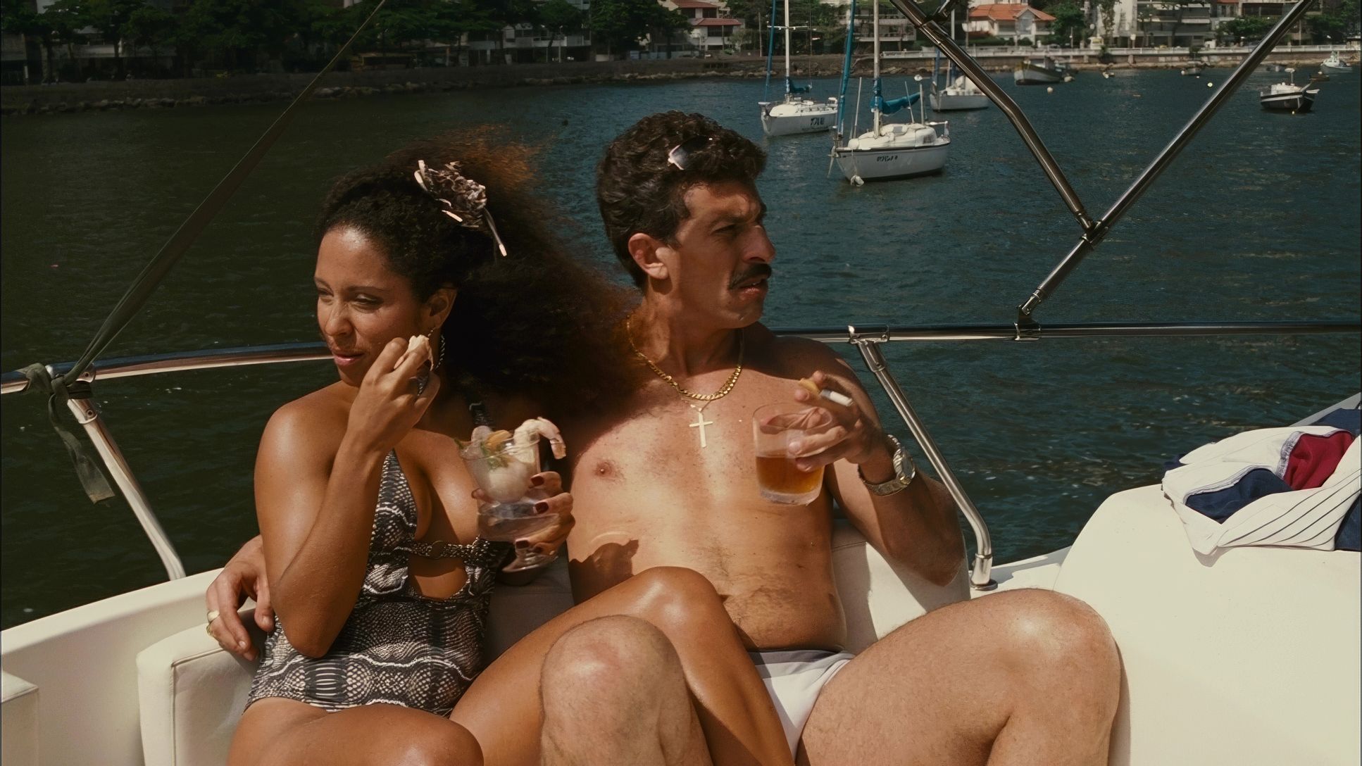
The grade leverages the natural “thickness” of the 35mm negative. The blacks are deep but textured, never feeling “crushed” or empty. There’s a subtle hue separation cool blues and greens in the institutional settings vs. warmer, dustier tones in the favelas that helps the audience subconsciously track the story’s location. The color doesn’t try to be “beautiful” in a traditional sense; it aims for a tonal consistency that reinforces the feeling of a world where justice is a rare, fleeting commodity.
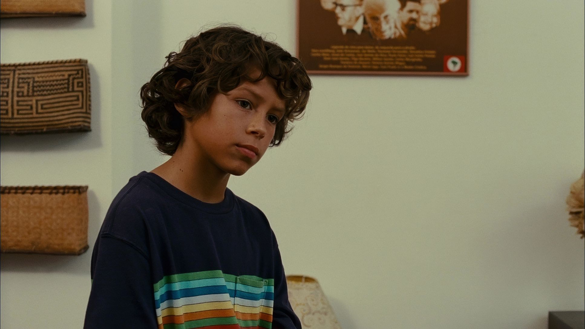
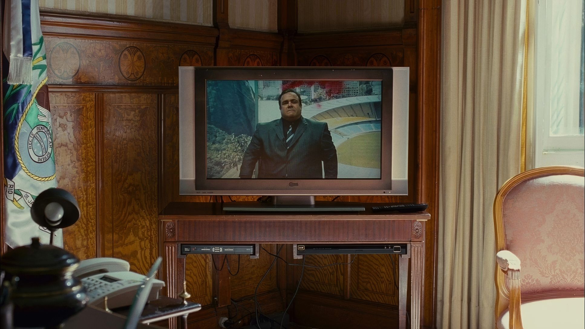
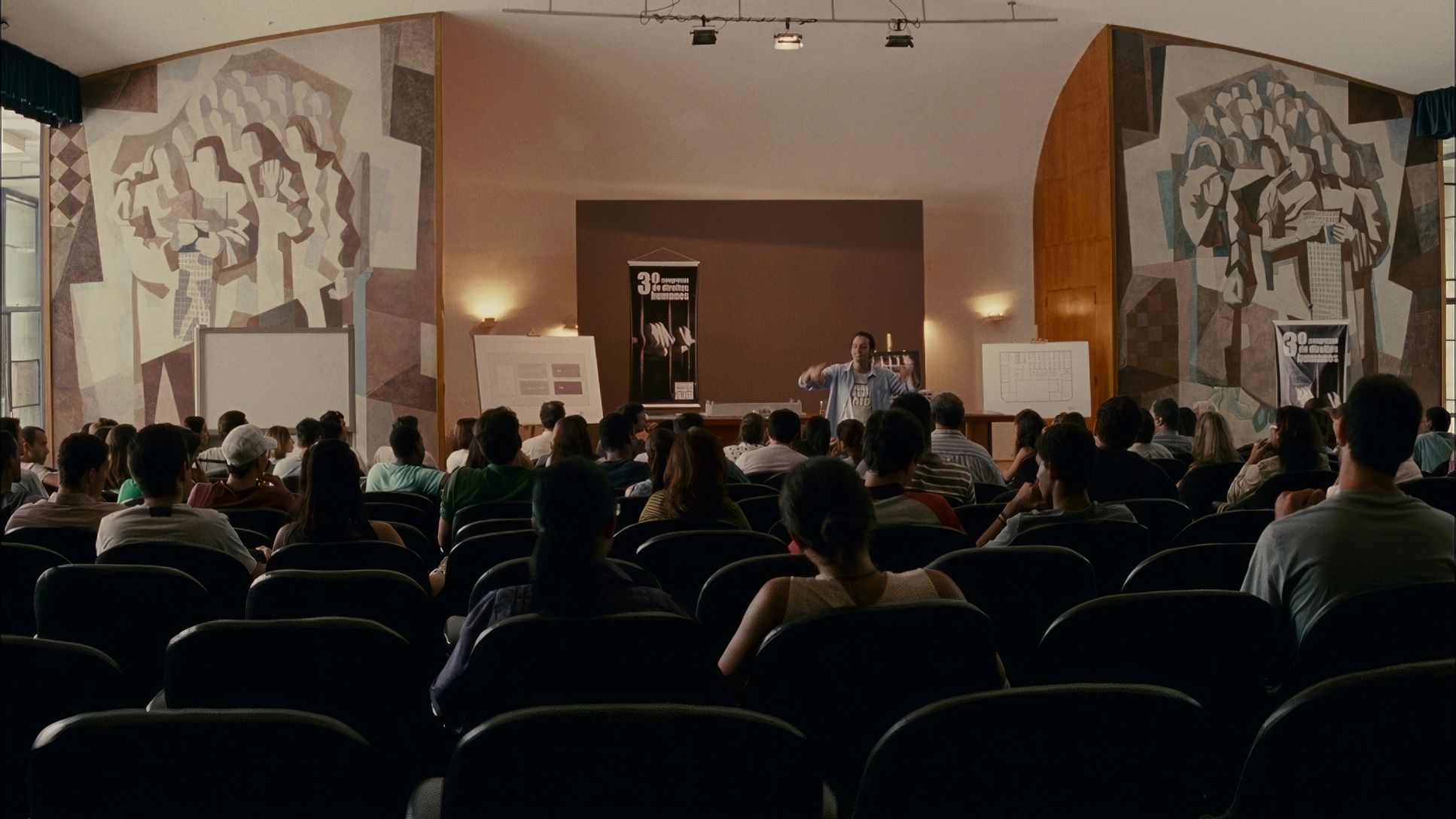
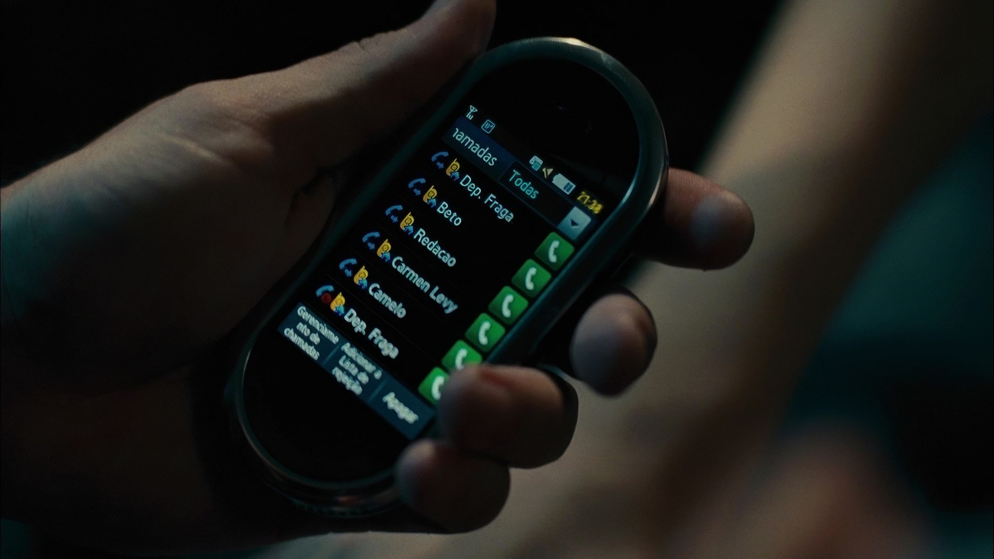
Elite Squad 2: The Enemy Within (2010) Film Stills
A curated reference archive of cinematography stills from Elite Squad 2: The Enemy Within (2010). Study the lighting, color grading, and composition.


- Also read: SHOPLIFTERS (2018) – CINEMATOGRAPHY ANALYSIS
- Also read: THE WILD BUNCH (1969) – CINEMATOGRAPHY ANALYSIS
Browse Our Cinematography Analysis Glossary
Explore directors, cinematographers, cameras, lenses, lighting styles, genres, and the visual techniques that shape iconic films.
Explore Glossary →