Let’s talk E.T. the Extra-Terrestrial. It’s not just about the script; it’s about how every visual decision amplifies the emotional core. E.T. fundamentally defined the “Amblin feel.” It’s a film that resonates with anyone who’s ever felt like an outsider, and the cinematography isn’t just capturing the action it is the primary tool creating that tangible sense of empathy.
About the Cinematographer
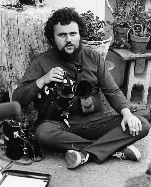
The visual soul of E.T. belongs to the late, legendary Allen Daviau, ASC. You can’t discuss this film’s look without understanding Daviau’s philosophy. He was a frequent collaborator with Spielberg early on, and their synergy here was at its peak. Daviau wasn’t interested in flashy, “look at me” lighting. He focused on source-motivated naturalism mixed with a heightened, almost painterly texture. He had a talent for wrapping light around a subject to create volume, which was critical here. He had to make a rubber puppet look like a living, breathing creature. As a colorist, I’m constantly studying how Daviau achieved inherent texture in-camera he delivered a negative so rich that the “grade” was essentially baked into the lighting ratios.
Inspiration Behind the Cinematography
Spielberg’s personal history is the wellspring here, specifically the loneliness stemming from his parents’ divorce. He needed to tell a story about a child processing separation, and the alien originally a horror concept from a project called Night Skies became the vessel for that. Because the story shifted from a “siege” movie to a tender coming-of-age drama, the visual approach had to pivot. The core mandate became the child’s perspective. The film visually mirrors Elliot’s experience: a world where adults are waist-up obstructions and magic is hidden in the closet. This wasn’t about the spectacle of a sci-fi creature; it was about the shared isolation of a boy and his friend. That emotional anchor dictated the lighting warm and safe inside, cool and mysterious outside. Form followed fiction.
Camera Movements
The camera movement in E.T. is a study in subjective perspective. Spielberg and Daviau committed to framing the world almost exclusively from a height of about four feet. We spend the majority of the film at a low angle, often observing adults only from the waist down (the famous “keys” shot of Peter Coyote is the prime example). This isn’t a gimmick; it’s a psychological depth cue. It forces the audience to physically inhabit Elliot’s world.
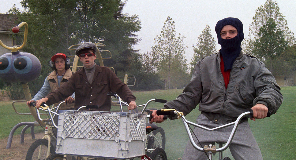
Take the bicycle flight sequence. The camera doesn’t just observe the kids flying; it tracks with them, dynamic and sweeping. We are often looking up against the moon or sun, creating silhouettes that feel iconic rather than just informative. These movements are designed to induce vertigo and joy. Spielberg even re-cut the edit to match John Williams’ score for this sequence, proving that the visual rhythm was prioritized above standard continuity. The camera moves less to show off, and more to make us feel the wind on our faces.
Compositional Choices
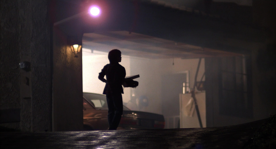
Following the camera height, the framing is deliberately isolationist. The 1.85:1 aspect ratio creates a taller frame than the widescreen anamorphic format Spielberg used on Jaws or Close Encounters. This was a crucial choice: it allowed them to frame Elliot and E.T. together without too much negative space on the sides, and it emphasized the height difference between the kids and the adults.
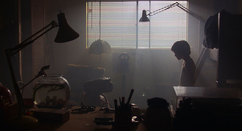
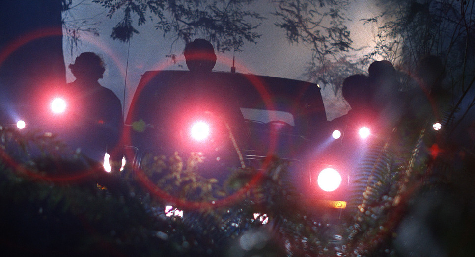
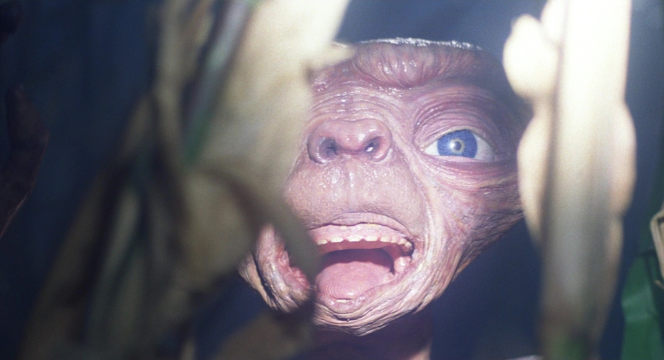
Think about the introduction of E.T. He is often framed in silhouette or obscured by the junk in the shed, slowly revealed by the beam of a flashlight. This builds suspense, but it also hides the limitations of the puppet. Contrast this with how the government agents are framed: almost always in groups, backlit, or seen through plastic sheets and windows. We rarely get a clean single of an antagonist. By denying the audience a clear view of the “threat,” the composition creates a sense of omnipresent danger. It’s only when Elliot says goodbye that we get the intimate, clean close-ups of E.T., rewarding the audience with that connection right at the end.
Lighting Style
Daviau’s lighting in E.T. is where the magic happens. He utilized a mix of hard tungsten sources and HMI lighting to create separation. The suburban home feels messy and warm, lit largely by practical lamps (or studio lights mimicking them). It feels lived-in.
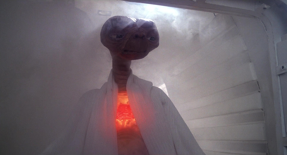
However, the real genius is the mood transition. The forest scenes are bathed in a hard, cool “moonlight” (likely uncorrected HMIs or heavy blue gels on tungsten) which cuts through the smoke and fog. This creates a distinct color separation from the warmth of the house. As a colorist, I love observing the dynamic range here. Daviau wasn’t afraid to let the “toe” of the film curve get crushed in the shadows to hide the puppet’s mechanics, while allowing the highlights like E.T.’s heart light to bloom. That bloom creates an organic “halation” that we are constantly trying to emulate digitally today. The lighting breathes; when E.T. is sick, the light is flat and clinical. When he heals, the warmth returns.
Lensing and Blocking
Contrary to the “cinematic equals anamorphic” myth, E.T. was shot on spherical Panavision lenses (likely Super Speeds). This was a technical necessity. Spherical lenses allowed for a faster aperture (crucial for the low-light forest scenes) and a closer minimum focus distance. You can’t get a lens inches away from E.T.’s face with an anamorphic glass without massive distortion.
The choice of wider focal lengths adds to the immersion. We see the environment wrapping around the characters. This impacted the blocking significantly. The kids are often huddled together, physically touching, reinforcing their conspiracy against the adult world. The shallow depth of field is used surgically keeping Elliot sharp while the background falls into a soft, spherical blur, isolating him in his wonder.
Color Grading Approach
This is where my brain truly lights up. E.T. was shot on Kodak 5247, a legendary stock with a very specific grain structure and color science. In the digital realm, we are often chasing this exact “print film” look.
The palette is strictly controlled. The interiors are defined by earth tones browns, oranges, and warm yellows grounding the sci-fi elements in 1980s suburbia. Skin tones on 5247 have a density and richness that is hard to beat; they look healthy and saturated. But look at the hue separation. The blues in the night scenes are deep and cyan-leaning, sitting perfectly opposite the skin tones on a vectorscope. E.T.’s skin texture a greenish-brown was meticulously lit to separate him from the human characters without him looking like a cartoon.
The contrast curve is also textbook print emulation. The shadows are dense, providing weight to the image, while the highlights have a gentle roll-off. Nothing clips harshly. The transition from the desaturated, pallid look of the “sick E.T.” scenes to the vibrant revival is a perfect example of color functioning as a narrative arc. It’s not an aggressive grade by modern standards, but it’s a confident one.
Technical Aspects & Tools
E.T. the Extra-Terrestrial – Technical Specs
| Genre | Adventure, Family, Fantasy, Science Fiction, Satire, Space, Drama, Coming-of-Age, Suburbia, Science-Fiction |
| Director | Steven Spielberg |
| Cinematographer | Allen Daviau |
| Production Designer | James D. Bissell |
| Costume Designer | Deborah Lynn Scott |
| Editor | Carol Littleton |
| Time Period | 1980s |
| Color | Warm, Saturated, Yellow |
| Aspect Ratio | 1.85 – Spherical |
| Format | Film – 35mm |
| Lighting | Hard light, Top light, Underlight, Edge light |
| Lighting Type | Artificial light, Mixed light, Tungsten, HMI |
| Story Location | … United States > California |
| Filming Location | … United States > California |
| Camera | Panavision Gold / G2 |
| Lens | Panavision Super Speed Zeiss MKII |
| Film Stock / Resolution | 5247/7247 Vision 125T |
The technical foundation here is pure 1980s craft. Shot on 35mm film using Panavision Gold cameras, the physical medium contributed to the texture. You can see the film grain it’s alive.
The practical effects by Carlo Rambaldi dictated much of the workflow. Because E.T. was a physical puppet (operated by cables, and sometimes inhabited by little people or a boy born without legs for walking shots), Daviau had to light for the material. Rubber reacts to light differently than skin. He had to use backlight and rim light to hide the seams and give the puppet dimensionality.
- Also read: ZACK SNYDER’S JUSTICE LEAGUE (2021) – CINEMATOGRAPHY ANALYSIS
- Also read: BIG FISH (2003) – CINEMATOGRAPHY ANALYSIS
Browse Our Cinematography Analysis Glossary
Explore directors, cinematographers, cameras, lenses, lighting styles, genres, and the visual techniques that shape iconic films.
Explore Glossary →