Most people remember Dr. Strangelove for Peter Sellers’ legendary triple performance or the dark satire. But as a filmmaker and the owner of Color Culture, I find myself obsessing over something else entirely: the density of the blacks and the geometry of the frames.
Stanley Kubrick’s Dr. Strangelove or: How I Learned to Stop Worrying and Love the Bomb (1964) challenges the modern idea that you need high-resolution color to tell a compelling story. Even in stark black and white, the cinematography feels more “alive” than half the blockbusters released today. It captures the terrifying absurdity of power through a lens that is simultaneously grand and claustrophobic.
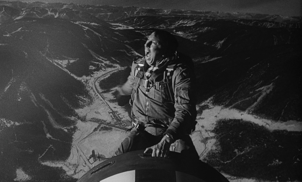
When I analyze Dr. Strangelove, I don’t look at the jokes; I look at the tension. The visuals do the heavy lifting here. The claustrophobia of the War Room, the lonely vastness surrounding Burpelson Air Force Base, and the gritty, documentary-style footage of the B-52 bomber—these aren’t just backdrops. They are characters.
Released just two years after the Cuban Missile Crisis, the film landed during peak nuclear anxiety. Originally, it was going to be a serious thriller based on the novel Red Alert. But Kubrick realized the concept of nuclear deterrence was inherently “absurd and paradoxical,” so he pivoted to satire. That pivot defined the visual language. He stripped away the gloss. By shooting in black and white, he gave the film a newsreel quality—a “documentary gravitas” that color would have destroyed. It grounds the absurdity in a terrifying reality.
About the Cinematographer
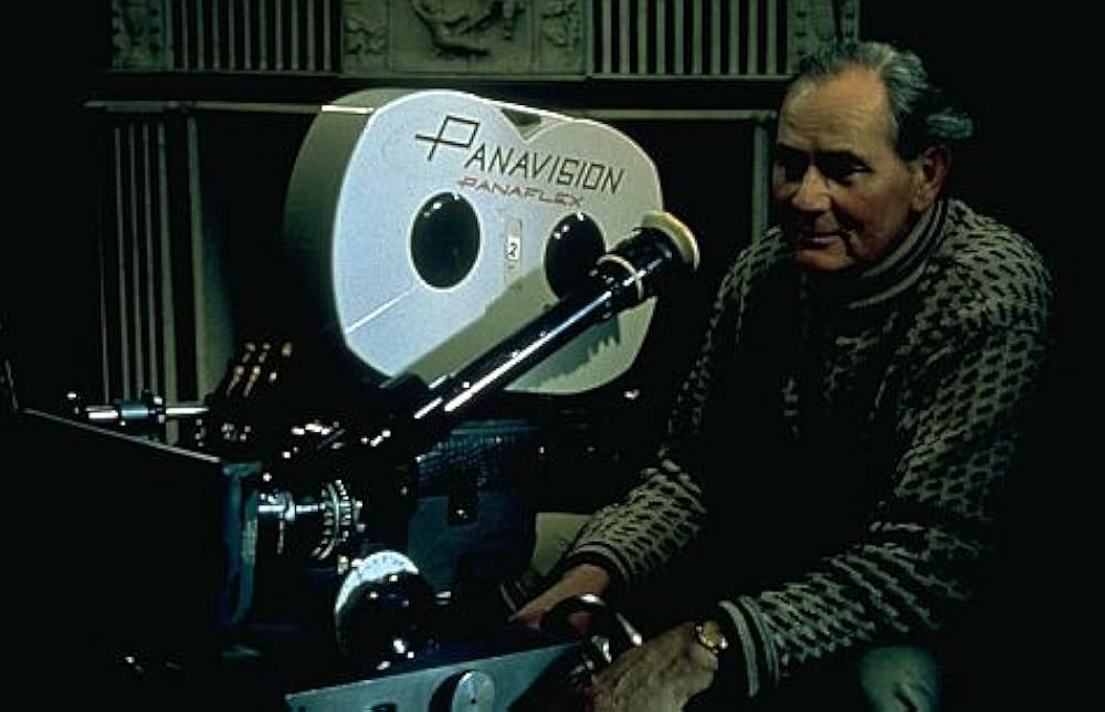
The Director of Photography was Gilbert Taylor, a legend who didn’t get nearly enough credit in his time. What impresses me most about Taylor isn’t just this film; it’s his range. This is the same guy who shot the polished space opera of Star Wars: A New Hope and the frenetic energy of A Hard Day’s Night.
For Strangelove, Taylor had to navigate Kubrick’s notorious perfectionism. The challenge wasn’t just exposure; it was tone management. He had to light a set that was supposed to look like a serious government facility while men argued about fluids and mine shafts. Taylor used lighting to underscore the irony creating an atmosphere that felt oppressive one second and clinically sterile the next. He bridged the gap between Kubrick’s rigid composition and the chaotic energy of the actors.
Inspiration Behind the Cinematography
The visual style is essentially a deconstruction of Cold War propaganda. It mimics the “official” look of military footage but twists it just enough to feel uncanny.
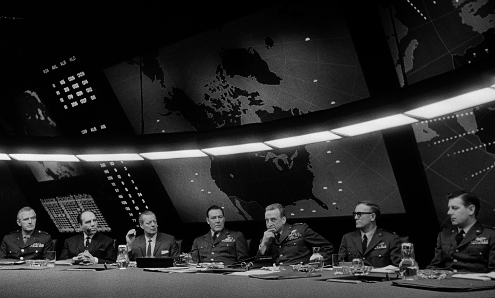
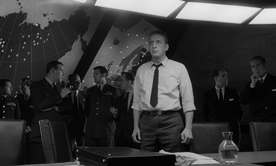
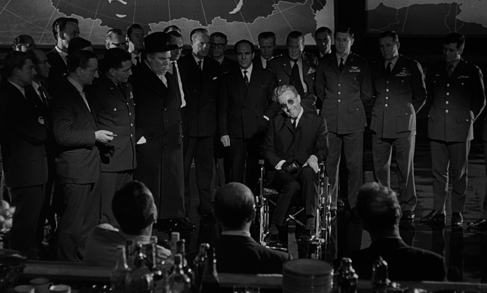
Look at the War Room. Designed by Ken Adam, that massive round table and the overhead “Big Board” turn the room into a high-stakes poker game. The cinematography emphasizes this by making the characters look like small pieces on a game board. The lighting creates a sense of entrapment these are powerful men locked in a cage of their own making.
Then you have the B-52 sequences. These were inspired by real military footage, and the “men within a machine” motif is potent. The visuals emphasize process: flipping switches, checking gauges, the mundane execution of global destruction. Kubrick wanted to mock the systems we trust, and the camera work supports that by making the bomber feel overwhelming, physically crowding the human crew into the corners of the frame.
Camera Movements
The camera work in Dr. Strangelove relies on a specific kind of contrast: static observation versus handheld panic.
In the War Room, the camera is a voyeur. We get slow, steady dollies or subtle pans that trace the table. It feels respectable, almost like we are eavesdropping on a serious historical event—until the dialogue reveals how insane everyone is. The camera keeps a respectful distance to show the scale of the room, then snaps into tight close-ups to catch the sweat on General Turgidson’s face.
Contrast that with the B-52. Here, the camera is active, vibrating with the plane. It’s handheld, gritty, and reactive. When the plane shudders, the frame shudders. This creates a tactile difference between the sterile, safe politicians in the War Room and the soldiers actually flying the mission. That shift in visual rhythm is what drives the film’s pacing.
Compositional Choices
Kubrick is famous for his one-point perspective, and he uses it here to devastating effect. He understands that symmetry implies order so he uses symmetrical framing to highlight how disordered the situation actually is.
The War Room is often shot with wide-angle lenses that distort the edges of the frame slightly, emphasizing the massive scale of the “Big Board” looming over the politicians. The famous round table is lit from above, acting like a stage. Kubrick frames the characters in opposition, visually representing the ideological divide.
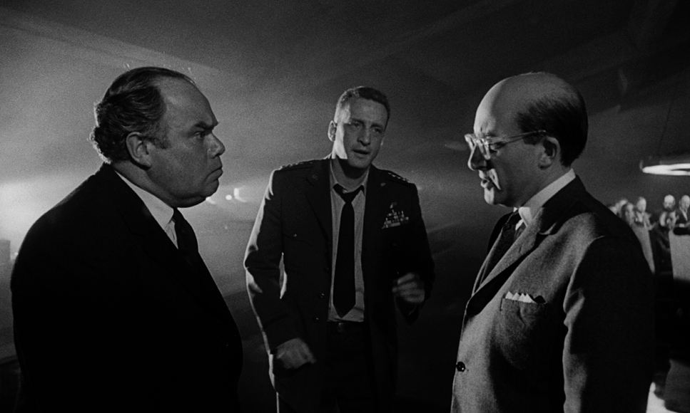
Outside the War Room, the composition changes rules. General Ripper is often shot from a low angle, dominating the foreground with deep focus, usually backed by American flags or harsh shadows. It reinforces his rigidity. Meanwhile, the bomber crew is framed in tight, medium close-ups, emphasizing their confinement. Every frame is calculated to tell you exactly who holds the power (or thinks they do) in that specific moment.
Lighting Style
For me, the lighting is the standout element. Gilbert Taylor’s work here is a textbook example of “source lighting” done right.
The War Room is lit almost entirely by that massive circular fluorescent fixture above the table. It’s a “motivated” source it exists within the world of the film. This creates a strong overhead wash that casts deep shadows in the eye sockets of the actors (the “raccoon eye” effect), making them look tired and sinister. Taylor also used what they called “flooded backlighting” to separate the actors from the dark walls, creating depth in what could have been a flat image.
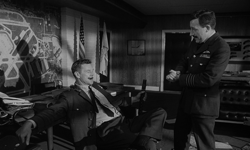
General Ripper’s office, on the other hand, is pure Film Noir. Hard shadows, high contrast, sharp highlights. It reflects his black-and-white view of the world. The B-52 interiors are softer, lit by the glow of instrument panels, which feels more naturalistic. This differentiation helps the audience subconsciously orient themselves in three very different psychological spaces.
Lensing and Blocking
Blocking—where the actors move—is just as important as where the lights are placed. In the War Room, Kubrick uses wide lenses to exaggerate distance. Even when the characters are in the same room, they feel miles apart emotionally. Peter Sellers (as President Muffley) is often isolated in the frame, a small figure of reason drowning in a sea of hawks.
For the tense moments in Ripper’s office, the lens choice tightens. Longer lenses compress the space, making the background loom larger behind the subject. When Ripper gives his monologue about fluoridation, the blocking keeps him front and center, trapping the audience in his delusion. It’s a subtle manipulation of space that forces us to feel the character’s paranoia.
Color Grading Approach
As the owner of a color grading house, I often hear people say B&W is “easier” because you don’t have to match colors. They couldn’t be more wrong. Black and white isn’t the absence of color; it is the translation of color into luminance.
If I were grading Dr. Strangelove today, I wouldn’t just be desaturating a digital image. I’d be fighting to replicate the density of that 1964 film stock. In the 60s, “grading” was done chemically and with printer lights. They had to choose wardrobe and sets based on how those colors would translate to gray. A red tie and a green tie might look identical in monochrome if you aren’t careful with your contrast ratios.
The look of Strangelove is defined by high contrast. The blacks are crushed and inky, especially in the War Room, while the highlights (like the bomb blasts or the lights on the board) are piercing. There is also a metallic texture to the mid-tones that reinforces the “Cold War” steeliness. The highlight roll-off on the film stock is gentle, keeping detail in the actors’ faces even under harsh lighting something digital sensors still struggle to emulate perfectly today.
Technical Aspects & Tools
Dr. Strangelove: Technical Specs
| Genre | Comedy, Drama, Satire, War, History, Political, Science-Fiction |
|---|---|
| Director | Stanley Kubrick |
| Cinematographer | Gilbert Taylor |
| Production Designer | Ken Adam |
| Costume Designer | Briget Sellers |
| Editor | Anthony Harvey |
| Time Period | 1960s |
| Color | Desaturated, Black and White |
| Aspect Ratio | 1.66 – Spherical |
| Format | Film – 35mm |
| Lighting | Hard light |
| Lighting Type | Daylight, Sunny |
| Camera | Mitchell BNC |
In 1964, there were no digital intermediates. This was shot on 35mm negative, likely a stock like Kodak Double-X 5222, which is known for its grit and beautiful grain structure. That grain is crucial it adds a layer of subconscious “texture” that makes the image feel raw.
They likely used workhorse cameras like the Mitchell BNC, which were heavy blimped cameras (soundproofed), essential for the long dialogue scenes in the War Room. The lenses were mostly primes. Today we abuse zoom lenses, but back then, you moved the camera or you changed the lens. That limitation forced more deliberate framing choices.
The final “grade” was achieved through timing lights at the lab adjusting the exposure of the print to control density. It was a physical, chemical process. Every shadow you see on screen was a decision made with light and chemistry, not a slider in DaVinci Resolve.
- Also read: OLDBOY (2003) – CINEMATOGRAPHY ANALYSIS
- Also read: BRAVEHEART (1995) – CINEMATOGRAPHY ANALYSIS
Browse Our Cinematography Analysis Glossary
Explore directors, cinematographers, cameras, lenses, lighting styles, genres, and the visual techniques that shape iconic films.
Explore Glossary →