Dog Day Afternoon(1975) it’s a film that resonates deeply with me, not just as a narrative of a bank robbery gone spectacularly wrong, but as a clinic in how cinematography specifically the work of DP Victor J. Kemper can elevate a true story by refusing to glamorize it.
I first watched Dog Day Afternoon years ago, and honestly, it’s one of those films that stays with you. You know the kind where the credits roll and you just sit there for a minute, letting the atmosphere dissipate. For me, it has always been the benchmark for that raw, “gritty realism” that so many modern films chase but few truly capture. We’re talking about a story that, despite being fifty years old, holds up incredibly well. It doesn’t feel dated because the visual language is based on honesty, not trends.
Lumet, working with Al Pacino at the height of his Godfather powers, crafts a narrative that’s not just a bank heist, but a pressure cooker of social commentary and human vulnerability. It’s suspenseful, full of twists, but fundamentally, it’s about everyday people thrust into an extraordinary situation. My job as a colorist often involves stripping away the digital “gloss” to reveal emotional truth, and Dog Day Afternoon feels like it arrived in the lab already perfectly honest.
About the Cinematographer (and Director’s Vision)

You can’t discuss the visual language here without acknowledging the cinematographer, Victor J. Kemper. He was the perfect partner for Lumet’s philosophy. Lumet was, by all accounts, an “actor’s director,” known for rigorous rehearsals and valuing performance over flashy camera tricks. This meant Kemper’s job was to be invisible to ensure the lighting and composition didn’t draw attention to themselves but framed the actors’ internal conflict.
Having directed 12 Angry Men years prior, Lumet was no stranger to creating immense drama within a confined space. A huge portion of this film takes place inside the bank, limiting the visual canvas. This forced Kemper to focus entirely on the characters. It’s a powerful lesson for any aspiring filmmaker: sometimes, the greatest drama comes from the tightest focus, letting the human element breathe rather than distracting the audience with complex setups.
Inspiration Behind the Cinematography
The core inspiration for the visual style stems directly from the film’s basis in a true story. Lumet had a strict mantra: “No movie lighting, no fake lighting outside.” For a colorist, that commitment to authenticity is both a challenge and a dream. They weren’t trying to make a “movie”; they were trying to document a heatwave in Brooklyn.
The film opens with that incredible montage of New York voyeuristic shots of real people, establishing the city not just as a backdrop, but as a living, breathing character. The cinematography had to reflect this urban tapestry, the sweat and tension of a hot summer day, and the anti-establishment zeitgeist of the 1970s. It wasn’t about beautifying New York; it was about capturing its pulse.
Camera Movements
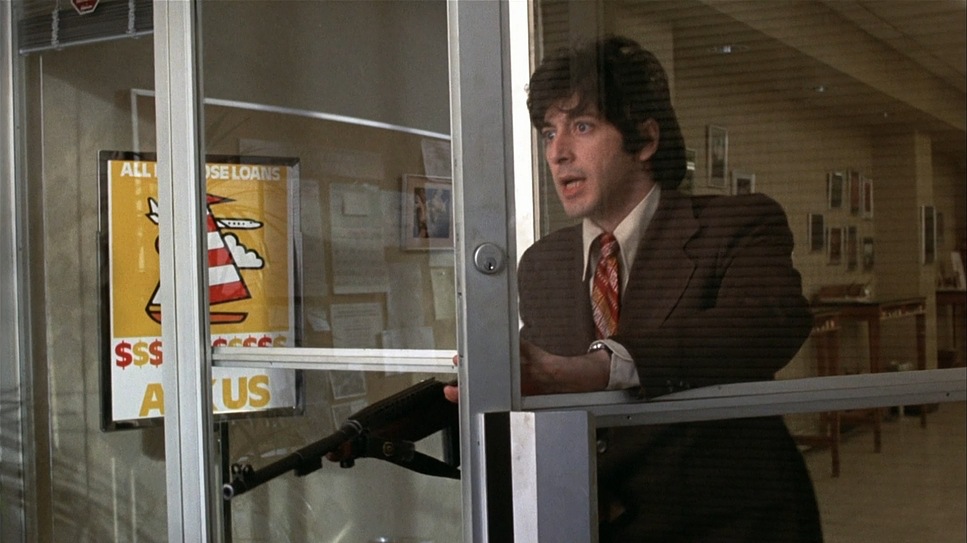
The camera in Dog Day Afternoon acts as a silent observer. Inside the bank, especially during the initial stages, the movements are grounded. We aren’t seeing flashy crane shots or aggressive push-ins. Instead, the camera mirrors the trapped feeling of the characters measured pans following Sonny’s frantic pacing, or slight adjustments to catch a reaction.
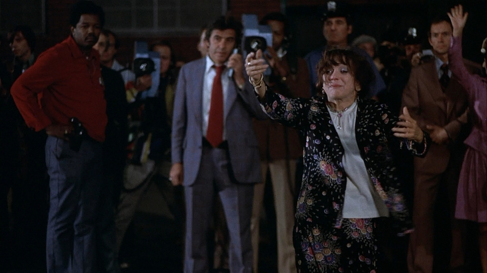
However, once the scope expands to the street outside, the visual language shifts. When the police and the crowds arrive, the camera adapts to capture the circus. We see the use of longer lenses here, compressing the distance between the onlookers and the bank, emphasizing the claustrophobia of being watched. The movements feel motivated by a journalistic desire to document the escalating chaos, moving from the intimacy of the interior to the overwhelming public gaze outside.
Compositional Choices
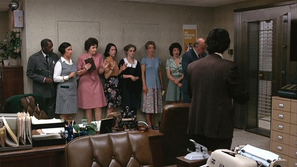
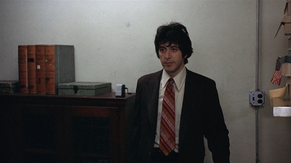
Compositionally, the film is a study in center-framed isolation. Inside the bank, the frames are often tight, creating a palpable sense of confinement. We see characters framed against walls, behind teller cages, or grouped in ways that emphasize their lack of exit. These tight compositions serve as depth cues, making the bank feel like a cage.
As the situation escalates, the contrast between the interior and exterior becomes the defining visual trait. We get shots of the street packed with media and police, often shot with that clean, single perspective that isolates Pacino against the mass of humanity. It’s never overly symmetrical; it’s designed to feel real and urgent. Looking at it now, the framing isn’t about making the crowd look cinematic; it’s about showing the sheer weight of public scrutiny. You feel the eyes on them.
Lighting Style
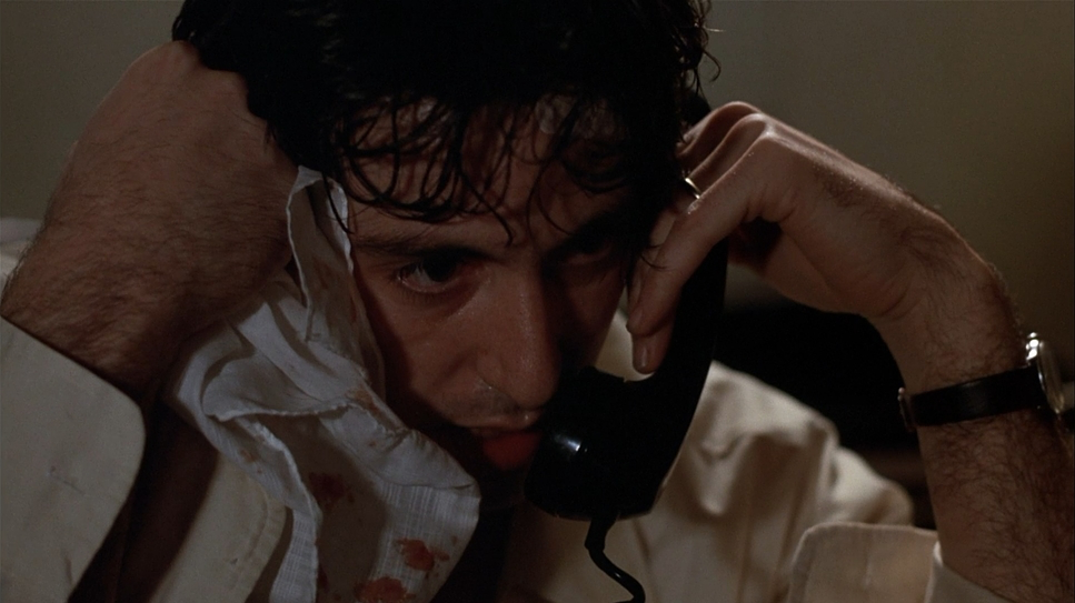
“No movie lighting” was the rule, but making that look good on 35mm film requires immense skill. Kemper relied heavily on motivated lighting. Inside the bank, he simulated the harsh, utilitarian practicals of the office space. It’s a soft light, but it falls naturally, allowing for a realistic spread that avoids dramatic, noir-style shadows in favor of a flatter, more documentary look.
As the day transitions into night, especially when the power is cut, the lighting shifts to high contrast. Kemper utilized HMI lights outside to blast the bank, mimicking the aggressive glare of police searchlights. This tonal sculpting is psychological: the darkness inside amplifies the isolation, while the blasts of cool, artificial light from outside feel like an assault. It’s a lighting setup that breathes with the narrative.
Lensing and Blocking
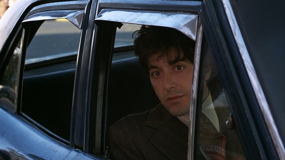
To achieve this naturalistic aesthetic, the production utilized the Panavision Panaflex camera system. While the interiors often feel intimate, the exterior work utilizes long lenses to great effect. These longer focal lengths flatten the space, making the police cordon feel suffocatingly close to the bank entrance. It creates a visual pressure that matches the narrative stakes.
Blocking is where Lumet’s background really shines. The camera was positioned to follow the actors’ natural movements rather than forcing them into rigid marks. Pacino moves with an agitated, unpredictable energy, and the camera operators had to be responsive, often using clean single shots to keep him isolated in the frame. This approach gave the actors room to improvise, resulting in performances that feel spontaneous rather than rehearsed.
Color Grading Approach
Ah, the colorthis is where I really get to geek out. Released in the 70s, the “look” was baked into the film stock and the lab processing, but the aesthetic is distinct. Despite being a film about a sweltering summer day, the palette is surprisingly cool and desaturated. It rejects the modern trend of warming up “hot” scenes with heavy orange tints.
If I were grading this today to emulate that 1975 feel, I’d focus on preserving that specific density. The skin tones are natural but stripped of vibrancy. The highlight roll-off is smooth classic 35mm but the shadows in the night scenes are deep and crushing. The cool, desaturated look reinforces the bleakness of the situation; it doesn’t let the audience feel “comfortable.” It’s a gritty, urban palette that feels tangible.
Technical Aspects & Tools
Technically, this film is a testament to the reliability of the Panavision ecosystem. Shooting on 35mm with Panavision Primes allowed for that sharp, spherical look that defines the era. The aspect ratio (1.78 / 1.85) frames the action perfectly for the character drama, avoiding the epic width of anamorphic lenses which might have romanticized the heist too much.
Beyond the visuals, we have to talk about the sound. The film makes a bold choice: no non-diegetic music. No score. It’s all atmosphere sirens, shouting crowds, the ringing phone. This forces the visuals to work harder. The “cool” visual tone combined with the raw, chaotic audio creates an immersive experience that feels more like a documentary than a Hollywood production.
- Also read: THE WRESTLER (2008) – CINEMATOGRAPHY ANALYSIS
- Also read: MAGNOLIA (1999) – CINEMATOGRAPHY ANALYSIS
Browse Our Cinematography Analysis Glossary
Explore directors, cinematographers, cameras, lenses, lighting styles, genres, and the visual techniques that shape iconic films.
Explore Glossary →