Spike Lee’s Do the Right Thing (1989) is unequivocally one of those films for me. Thirty-five years later, its portrayal of a sweltering summer day where racial tensions reach a boiling point remains disturbingly relevant. It’s a masterclass in how visual language can be used not just to tell a story, but to make the audience feel the physical discomfort of the heat and the inevitable friction of the neighborhood. I’ve lost count of how many times I’ve analyzed Ernest Dickerson’s cinematography, always finding some new detail in how Lee’s vision was brought to life.
About the Cinematographer

Ernest Dickerson was Spike Lee’s original cinematic partner the brilliant mind behind the camera who helped shape the visual identity of Lee’s early “joints.” For Do the Right Thing, Dickerson wasn’t just executing shots; he was defining the very atmosphere and emotional temperature of the movie. Their collaboration was forged on films like She’s Got to Have It, and by the time they hit the pavement in Bed-Stuy, there was a palpable synergy between them. Dickerson, who later moved into directing himself (you’ve likely seen his work on Juice), brought an incredibly expressive eye to this project. He had this talent for translating abstract concepts like “tension” into concrete visual choices. He understood that the cinematography needed to be as confrontational and as nuanced as the narrative itself.
Inspiration Behind the Cinematography
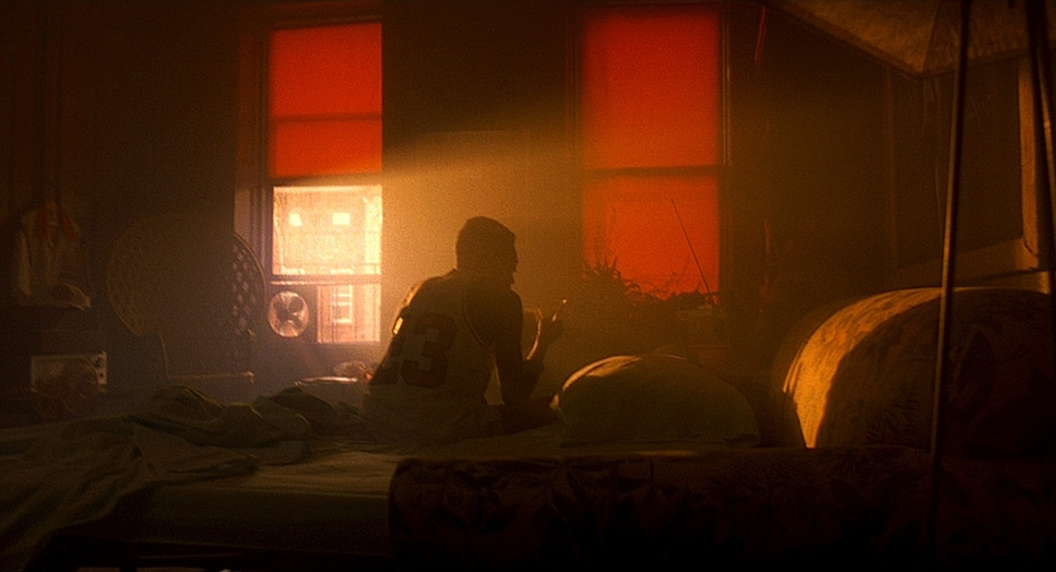
The primary engine for the visuals here was the oppressive heat of a Brooklyn summer. Lee and Dickerson weren’t just showing hot weather; they were weaponizing it, turning the temperature into a character that slowly ratchets up the tension. The project was born from a desire to capture the complex racial politics of the era and the real-life tragedy of a young Black man killed after being chased from an Italian pizzeria. That backstory imbued the project with a heavy sense of impending doom, which Dickerson’s camera had to reflect in every frame.
Their approach was incredibly deliberate. They aimed to visually articulate a “blistering day” in Bedford-Stuyvesant by stripping away anything that might cool the frame down. Production designer Wynn Thomas was tasked with removing blues and greens from costumes, sets, and props, leaving a palette dominated by warm reds, oranges, and yellows. It was a strategic move to create a pervasive sense of swelter. Then there’s the legendary technique of using a “heat bar” an electric heating element placed directly under the camera lens to create those wavy heat shimmers. It wasn’t just a gimmick; it was a tactile invitation into the world, a constant reminder of the suffocating conditions pushing these characters to their breaking point.
Camera Movements
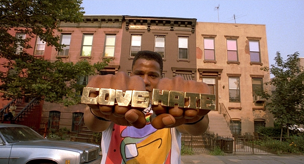
The camera movements in Do the Right Thing are a fascinating blend of meticulous choreography and an almost documentary-like immediacy. Lee and Dickerson were masters of the wide tracking shot, guiding us through the block with real purpose. These aren’t just simple pans; they’re expansive sequences where characters weave in and out, performing actions that underscore the neighborhood’s pulse. It’s like watching a carefully constructed ballet where minor characters move through the background to redirect the story. This kind of seamless, meandering movement is notoriously difficult to execute, yet here it feels utterly natural.
The opening sequence with Rosie Perez dancing to “Fight the Power” is a prime example of stylized movement. It’s assertive, electric, and sets the tone immediately. But as the day progresses, the language shifts. There are moments when the camera seems to loosen up, like when the kids open the fire hydrant. For a brief interlude, the camera mirrors their freedom with an almost documentary feel. But as soon as the white yuppie confronts the kids, the camera locks down again. This dynamic interplay between fluid movement and locked-off shots speaks volumes about the shifting moods of the block, keeping the audience unsure about which encounter is going to lead to trouble.
Compositional Choices
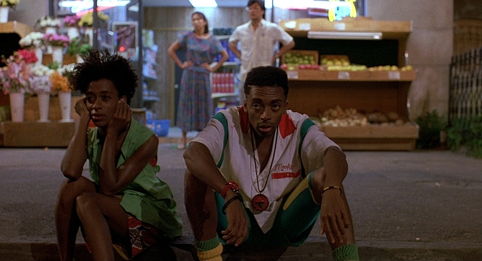
Dickerson’s compositions are as bold and unapologetic as the storytelling itself. They’re designed to confront and unsettle. Take the infamous Dutch or canted angles. When Lee and Dickerson tilt the camera 45 degrees, the effect is immediate and disorienting. The horizon line isn’t flat anymore, and the world feels unstable. This is a powerful visual metaphor for the psychological instability of the characters. As the day reaches its climax, Dickerson shoots almost the entire scene with Dutch angles to illustrate that things are fundamentally out of balance.
Then there’s the fourth-wall break. When characters look directly into the lens to unleash racial insults, it’s an incredibly aggressive, intimate moment. It pulls us into the confrontation, making us complicit observers. This fractured framing reinforces the deep divisions within the community, showing that however harmonious it may seem on the surface, the block is irrevocably fractured. It’s a bold choice that cuts through the cinematic illusion and forces the viewer to look inward.
Lighting Style
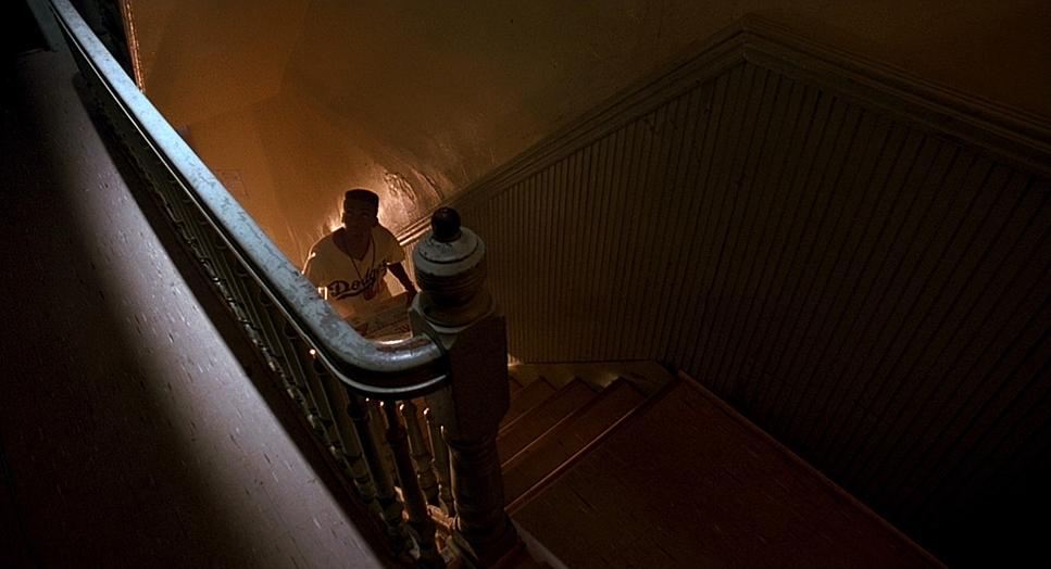
The lighting is fundamentally tied to the theme of escalating tension. Dickerson didn’t just light scenes; he sculpted light to feel hot. The sun isn’t just bright here; it has a tangible weight. We see hard, contrasty light throughout the day, often with exaggerated sun flares or hot spots that mimic the harsh reality of summer light reflecting off concrete.
The genius lies in the simplicity. Because they removed the blues and greens from the palette, the lighting didn’t have to fight against cool tones; it could simply amplify the warm ones. Scenes are bathed in yellows and oranges, whether from direct sunlight or the glowing interiors of Sal’s Pizzeria. As a colorist, I look at Dickerson’s lighting and see a very deliberate shaping of dynamic range. He wasn’t afraid of pushing highlights to convey scorching brightness, but he always maintained enough information in the shadows to keep the characters grounded. The light itself becomes a source of discomfort a relentless force contributing to the characters’ frayed nerves.
Lensing and Blocking
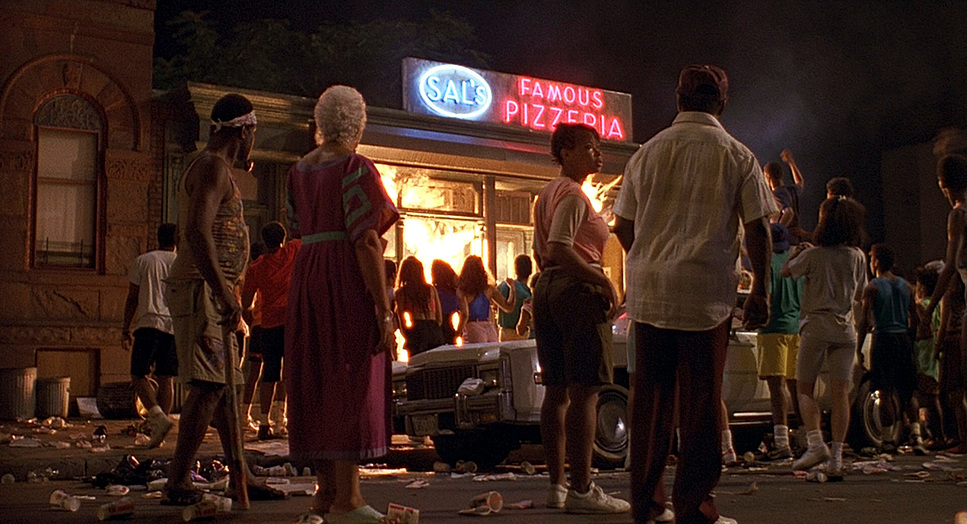
In terms of lensing and blocking, this film is a masterclass in using space to define power dynamics. The film largely stays on one single block, creating a sense of both inclusivity and claustrophobia. Dickerson frequently used wider lenses for the tracking shots to capture the breadth of the street, keeping multiple layers of action in focus. This reminds us that every individual skirmish is part of a larger communal tapestry.
Conversely, for moments of intense confrontation, Dickerson wasn’t afraid to get uncomfortably close. This shift from expansive wide shots to tight, intimate close-ups provides a visual ebb and flow that mimics the film’s shifting moods. Blocking is also key. Consider the scene where Buggin’ Out argues with Sal about the “Wall of Fame.” Sal and his sons are framed together behind the counter a united front while Buggin’ Out stands alone. Even Mookie’s position in the climax, sharing a shot with Sal’s family before crossing the street to throw the trash can, is a crucial piece of visual blocking that externalizes his internal conflict.
Color Grading Approach
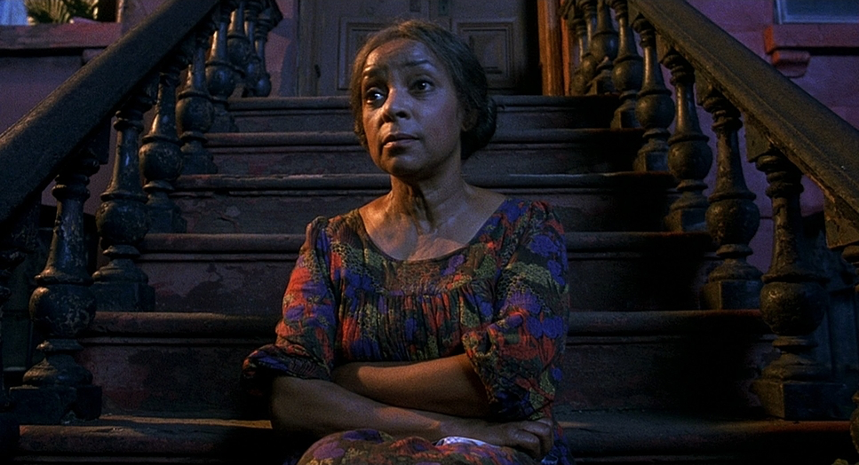
Ah, the color this is where I really get to sink my teeth in. Do the Right Thing is a benchmark for how color can be a narrative tool. The overall approach is unapologetically warm and high-contrast. This wasn’t just a “look” applied at the end; it was a deliberate choice that began with the production design and was carried through to the final grade.
When I analyze the color work, I see very thoughtful contrast shaping. The highlights are often pushed to the limit, bordering on clipped, to create that sun-baked feel. The highlight roll-off is aggressive, making the sun feel like a tangible force. But crucially, the mid-tones and shadows are rich, maintaining the details in the darker skin tones and the gritty texture of the neighborhood. This preserves the humanity of the characters even as the environment oppresses them. There’s an organic feel to the highlights that we try so hard to simulate in digital suites today, but which comes naturally to the film stocks of that era. It’s an incredibly brave grade that fully commits to its core emotional logic.
Technical Aspects & Tools
Do the Right Thing
35mm Film | 1.85:1 Aspect Ratio | Bleach Bypass
| Genre | Comedy, Crime, Drama, Political, American Civil Rights Movement |
| Director | Spike Lee |
| Cinematographer | Ernest R. Dickerson |
| Production Designer | Wynn Thomas |
| Costume Designer | Ruth E. Carter |
| Editor | Barry Alexander Brown |
| Colorist | Bob Hagans, John Nicolard |
| Time Period | 1980s |
| Aspect Ratio | 1.85 – Spherical |
| Format | Film – 35mm – Bleach Bypass |
| Lighting | Hard light |
| Lighting Type | Daylight, Sunny |
| Story Location | Brooklyn > Bedford-Stuyvesant |
| Filming Location | New York City > Stuyvesant Street, Bedford-Stuyvesant, Brooklyn |
| Camera | Arriflex, Arriflex BL4 |
While the artistry is paramount, it’s underpinned by some specific technical choices. Being a 1989 release, it was shot on 35mm film, which imparts a grain structure and color rendition that digital acquisition just can’t quite replicate. The dynamic range of the stock allowed Dickerson to achieve those punchy highlights while keeping the shadows robust.
The gear also played its part. The smooth tracking shots suggest professional-grade Arriflex systems (like the BL4), paired with versatile prime lenses. But the most impressive “tech” was the practical use of the heat bar under the lens. This wasn’t a post-production trick; it was a physical manipulation of the air to distort the image. It speaks to Dickerson’s willingness to experiment with physics to achieve an atmospheric effect. This wasn’t about digital filters it was about making the heat a tangible, visual element right there on the negative.
- Also read: BOWLING FOR COLUMBINE (2002) – CINEMATOGRAPHY ANALYSIS
- Also read: WILD STRAWBERRIES (1957) – CINEMATOGRAPHY ANALYSIS
Browse Our Cinematography Analysis Glossary
Explore directors, cinematographers, cameras, lenses, lighting styles, genres, and the visual techniques that shape iconic films.
Explore Glossary →