When I watch Die Hard now, I’m not just seeing Bruce Willis shoot bad guys; I’m seeing a film that is meticulously, almost obsessively, crafted. It’s a testament to practical filmmaking that holds up in a way modern CGI fests simply don’t.
About the Cinematographer
The look of Die Hard belongs to Jan de Bont. Before he went on to direct Speed and Twister, he was the cinematographer who defined the look of late-80s action.
What de Bont brought to the table was a European sensibility—a kind of grounded realism that clashed beautifully with Hollywood’s love for excess. He didn’t just light the set; he lit the space. Working with McTiernan (who was fresh off Predator), de Bont understood that for the action to feel real, the camera couldn’t just be a spectator. It had to be a participant. He framed vulnerability just as well as he framed explosions, a balance that feels practically extinct in today’s superhero era.
Inspiration Behind the Cinematography
The smartest thing this movie did was subvert the 80s action hero trope. This was the era of Stallone and Schwarzenegger—invincible muscle men who treated gunfire like a minor inconvenience. Die Hard pivoted. Hard.
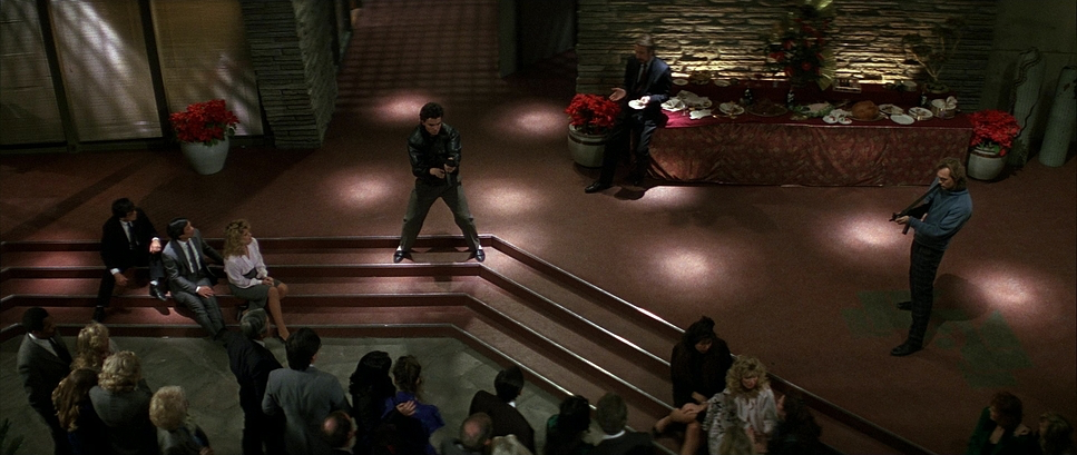
McClane isn’t a superhero; he’s a balding, barefoot cop who is visibly terrified. The cinematography reflects that. Instead of heroic low-angle shots glorifying his physique, the visual language leans into isolation and claustrophobia. The Nakatomi Plaza isn’t just a backdrop; it’s a hostile environment. De Bont used the darkness of the unfinished floors and the labyrinthine architecture to make McClane look small. He’s an “everyman” trapped in a steel box.
There’s also this concept of “earned fireworks.” The movie doesn’t blow everything up in the first ten minutes. The visual tension builds slowly. By the time the roof blows, you feel it in your gut because the camera work has spent an hour establishing the geography and the stakes.
Camera Movements
This is where the film really flexes its muscles. The camera movement in Die Hard is never just “cool”; it’s motivated.
When McClane is crawling through the air ducts, the camera goes handheld. It’s restless. It’s janky. It’s not the smooth, stabilized gimbal footage we see today that floats through space like a ghost. This feels tactile. You feel the cramped space, the sharp edges, the claustrophobia.
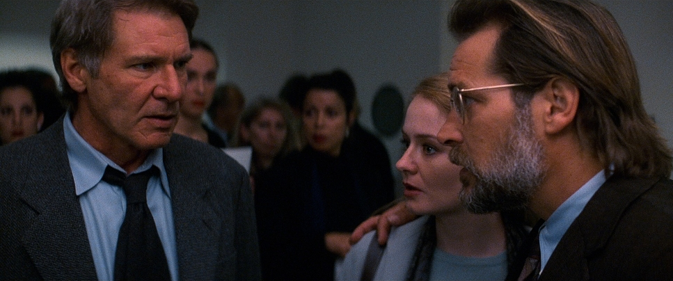
Contrast that with the shots of Hans Gruber. For him, the camera is steady, deliberate, often on a dolly. It visually communicates his control before he even speaks.
But the real genius is the clarity. Even in the chaotic shootout on the roof or the elevator shaft explosion, you always know exactly where everyone is. The camera acts as a guide, not a distraction. It’s “competently shot and brilliantly staged”—a rare feat where you can enjoy the mayhem but still understand exactly what is happening.
Compositional Choices
Compositionally, Die Hard is a textbook on how to use space. De Bont uses the architecture of the building to trap his hero.
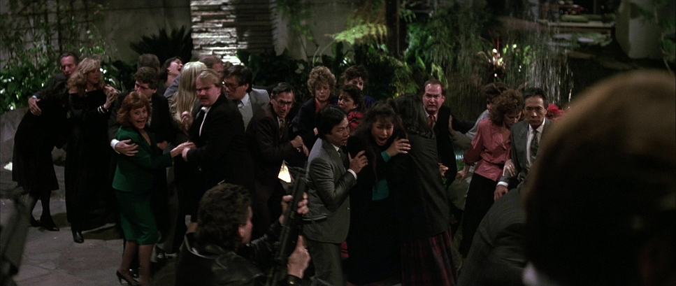
Once the terrorists take over, the framing tightens. McClane is constantly pushed into the corners of the frame or hidden in shadows. He’s often placed in the lower third, dwarfed by the vertical lines of the skyscraper. It visually reinforces the odds: one guy against a massive machine.
Gruber, on the other hand, gets the power frames. He’s centered. He’s backed by strong architectural lines. When the terrorists are watching the hostages, the framing is suffocatingly tight. It’s a visual game of cat and mouse that tells you everything about the power dynamic without a single line of dialogue.
Lighting Style
The lighting in this film is just… chef’s kiss. It’s practical, it’s motivated, and it’s gritty.
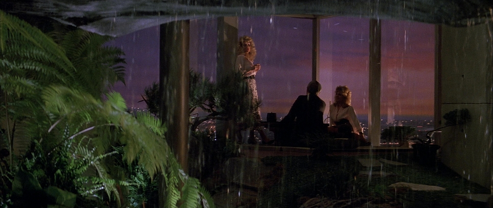
They didn’t over-light the set with big, artificial studio rigs. They used the environment. The film is lit by Christmas lights, harsh office fluorescents, and emergency flares. It grounds the movie in reality. When McClane is hiding, he is actually in the dark.
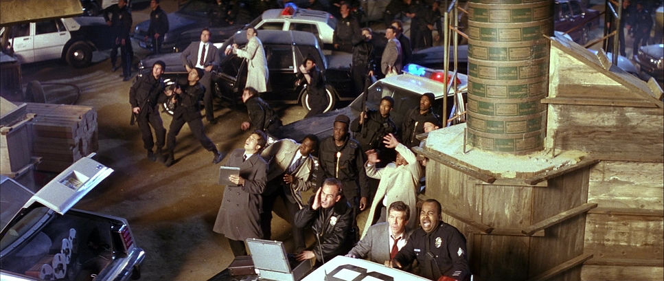
The fact that they were shooting in the actual Fox Plaza while it was under construction was a happy accident. De Bont used that raw, industrial texture. The light shafts piercing through the unfinished floors create this high-contrast, noir-ish vibe. And as the movie progresses, the lighting shifts from cool corporate blues to the fiery oranges of explosions. The building literally goes from an office to an inferno, and the light tells that story.
Lensing and Blocking
Lensing is subtle here, but crucial. Wide lenses establish the massive scale of the plaza, making McClane look insignificant. But when he’s in the vents, wider lenses distort the space just enough to make it feel like the walls are closing in.
And the blocking? It’s active. McClane is always moving, using columns and walls for cover. He’s reactive. Gruber and his goons, however, stand still. They occupy space with authority.
There’s a scene where Gruber meets McClane and pretends to be a hostage. Watch the blocking there. They shift positions, physically trading power dynamics in real-time. It’s brilliant staging that creates tension purely through physical placement.
Color Grading Approach
From a colorist’s perspective, Die Hard is fascinating because it relies on the inherent characteristics of film stock, not digital manipulation.
The palette is cool—lots of cyans, teals, and grays to sell the corporate steel-and-glass feel. But it’s punctuated by these warm, motivated sources—the amber desk lamps, the red Christmas bows, and eventually, the fire. That hue separation is what gives the image depth.
The contrast is where the magic happens. The shadows are dense. They aren’t lifted to “save detail” like we often do in modern HDR grades. They are crushed just enough to hide McClane, adding to the mystery. The highlights roll off naturally, blowing out in a way that feels organic, not clipped.
If I were trying to recreate this look today, I’d be fighting against the cleanliness of digital sensors. I’d have to dirty up the image, add grain, and manually compress the dynamic range to get that thick, textured feel. Die Hard got it for free just by shooting on 35mm.
Technical Aspects & Tools
Die Hard — Technical Specifications
| Genre | Action, Thriller |
| Director | John McTiernan |
| Cinematographer | Jan de Bont |
| Production Designer | Jackson De Govia |
| Costume Designer | Marilyn Vance |
| Editor | John F. Link, Frank J. Urioste |
| Colorist | Marc Wielage |
| Time Period | 1980s |
| Aspect Ratio | 2.35 – Anamorphic |
| Format | Film – 35mm |
| Lighting | Top light |
| Lighting Type | Daylight |
| Story Location | … California > Los Angeles |
| Filming Location | … California > Los Angeles |
| Camera | Panavision Gold / G2, Panavision Panaflex, Panavision Cameras |
| Lens | Cooke Varotel Zoom lenses, Panavision Ultra Speed Zeiss |
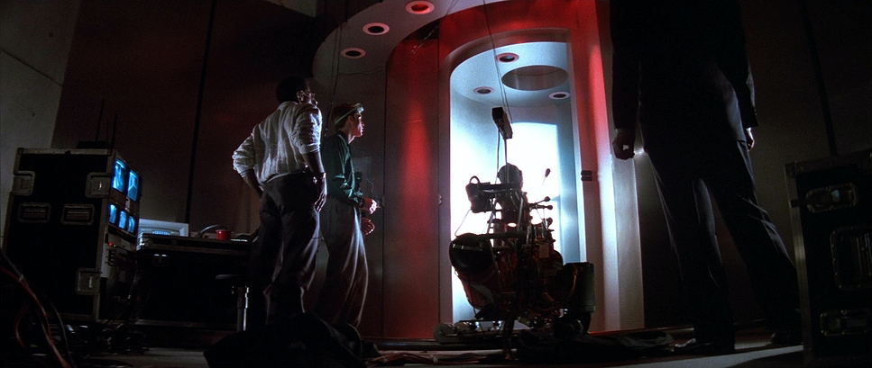
We have to remember this was 1988. No DI (Digital Intermediate), no VFX suites. This was analog filmmaking.
They shot on 35mm Kodak stock, using workhorse cameras like Panavision. The grain structure you see? That’s real silver halide crystals, not a plugin.
The location was the biggest tool. Using the unfinished Fox Plaza meant they didn’t have to build sets; they just had to light what was there. The dust, the exposed wires it’s all real texture.
And the effects? Practical. When things blow up, they actually blew up. When Alan Rickman falls from the building, they actually dropped him (and famously dropped him on the count of “one” instead of “three” to get a real reaction). That tangible weight is something you just can’t fake with pixels.
- Also read: A BEAUTIFUL MIND (2001) – CINEMATOGRAPHY ANALYSIS
- Also reade: THE SIXTH SENSE (1999) – CINEMATOGRAPHY ANALYSIS
Browse Our Cinematography Analysis Glossary
Explore directors, cinematographers, cameras, lenses, lighting styles, genres, and the visual techniques that shape iconic films.
Explore Glossary →