We tend to look to the past for narrative structure, but rarely do we dissect the very bones of their visual language. Dial M for Murder (1954), directed by the master Alfred Hitchcock, is one such film. On the surface, it appears deceptively simple. Yet, beneath its stage-play origins and confined setting lies a fascinating study in meticulous visual storytelling. It’s a film that constantly reminds me how technical limitations in this case, the era’s nascent and clunky 3D technology can forge some of the most innovative approaches to cinematography.
About the Cinematographer
While Hitchcock’s directorial stamp is on every frame, the lens through which his vision was translated belonged to Robert Burks, ASC. Burks was Hitchcock’s visual anchor, having shot iconic titles like Strangers on a Train, Rear Window, and Vertigo. Their partnership was symbiotic; Hitchcock knew exactly what he wanted, and Burks possessed the technical mastery to execute it. For Dial M for Murder, Burks faced the unique challenge of adapting to a studio mandate for 3D a format Hitchcock himself wasn’t exactly thrilled about. This collaboration stands as a testament to Burks’s skill: he had to fulfill a specific directorial vision while battling the bulky, temperamental dual-camera rigs of the 1950s.
Inspiration Behind the Cinematography
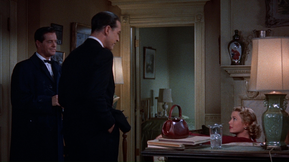
The core inspiration for the cinematography stems directly from the film’s theatrical roots. Frederick Knott’s play provided a tight, dialogue-driven narrative focused on a “perfect crime” within a suffocatingly intimate setting. Hitchcock deliberately chose not to “loosen up” the source material by expanding locations. Instead, he leaned into the confinement. The vast majority of the film takes place in the small London apartment of Tony and Margot, with only a brief excursion to a party and the street outside. This wasn’t laziness; it was a crucial decision to maintain the film’s unity. If we had wandered off to a courtroom scene, the tension of that apartment would have evaporated.
The curveball, of course, was Warner Bros. insisting on shooting in 3D. They were riding the “nine-day wonder” of the 1950s 3D craze. This directive forced Burks to find ways to exploit depth in a room that physically didn’t have much of it. The inspiration became a game of maximizing narrative tension through spatial geometry trying to make a static, talky film work in a medium designed to throw objects out of the screen. Because Hitchcock hated the “gimmick” aspect of 3D, the team had to be inventive, using depth cues to serve the story rather than just tossing things at the audience for cheap thrills.
Camera Movements
In a film this confined, camera movement stops being just “coverage” and becomes a psychological device. Hitchcock demanded super-precise camera work here. Since we are stuck in one living room, extensive tracking shots weren’t practical. Instead, the camera acts as a probing eye. It slowly reveals information or subtly shifts perspective to align us with Tony’s manipulative gaze or Margot’s increasing dread.
You’ll notice deliberate pushes and pulls that accentuate the tension. The camera draws us closer to a face during intense dialogue, or pulls back to emphasize isolation. When Tony lays out his “sinister plan” to Swan, the camera reframes tightly to emphasize the gravity of the conversation, then tracks slightly to lock them both in a power dynamic. There is a particular elegance in how the camera moves around foreground objects sometimes almost comically so to maintain visual interest in 3D. These aren’t grand cinematic gestures; they are extensions of the characters’ internal states, making the movement indispensable to the atmosphere.
Compositional Choices
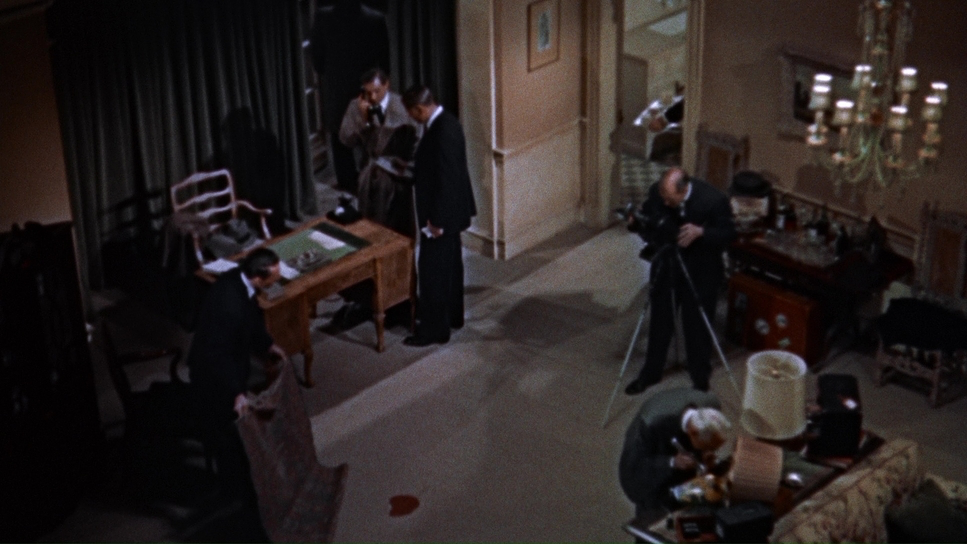
Composition in Dial M for Murder is a masterclass in making a small space feel both expansive and claustrophobic. The most aggressive strategy specifically for the 3D mandate was the heavy reliance on foreground elements. To solve the problem of limited depth, Hitchcock and Burks constantly stuck props between the lens and the actors.
The infamous green table lamp is the best example. It becomes an almost constant fixture, “hogging the foreground” from various angles. To a modern viewer watching in 2D, it might seem like odd blocking, but in 3D, that lamp provides the necessary parallax to create a sense of separation and depth. It’s not just lamps; we see rows of bottles, flowers, and even shots through a bed headboard. These “visual tunnels” guide the eye deeper into the scene.
Beyond the props, the composition utilizes architecture to frame characters, creating a sense of looking through spaces rather than just at them. We often view the action through open doorways, or from a high “god-view” angle. This layering prevents the single set from becoming visually monotonous and subtly enhances the feeling of an omniscient observer watching a trap snap shut.
Lighting Style
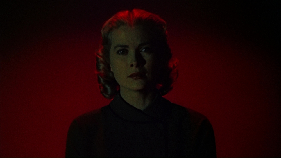
The lighting in Dial M for Murder is where the psychological tension really lives. While many analyses focus on the camera, as a colorist, I see a very specific lighting intent. The film is set in an affluent London apartment, so the base lighting is warm, sophisticated, and inviting initially. This provides a stark, ironic contrast to the murder being plotted.
However, as Tony’s machinations take hold, notice how the lighting shifts. It doesn’t go full German Expressionist, but shadows become more pronounced. We start seeing selective lighting that isolates characters, particularly Tony, emphasizing his cunning. Motivated sources table lamps, windows, practicals are meticulously controlled to create pools of light and shadow.
Look at the telephone during the murder scene. The light hits it in a way that makes it feel like an accusatory object. The contrast is handled expertly; it never becomes overtly harsh like a gritty noir, but maintains a glossy, high-end feel that allows the darkness to creep in more insidiously. The dynamic range decisions here were key, sculpting light to maintain detail in the shadows while keeping the highlights creamy a balance that mirrors the narrative’s walk between domestic civility and deadly intent.
Lensing and Blocking
Lensing and blocking were the technical puzzle pieces Burks had to solve. Lensing for 3D in the 50s meant using a massive twin 35mm camera rig two cameras side-by-side. This dictated focal lengths and physical distance. You couldn’t just throw on a macro lens for a close-up because the inter-axial distance between the lenses wouldn’t allow it.
This led to one of the most famous practical solutions in the film: the oversized telephone prop. To get a close-up of the rotary dial that read correctly in 3D, they couldn’t get the camera close enough. So, they built a giant phone and placed it further back. It’s a brilliant, practical fix to a hard optical limit.
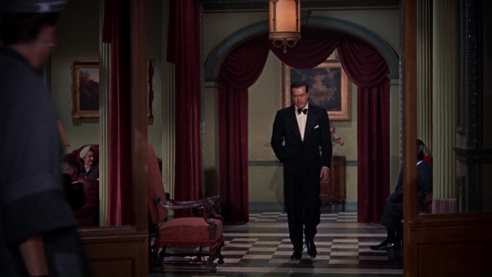
Blocking became the primary narrative tool. Hitchcock used the movement of actors to define power dynamics. When Tony manipulates Swan, their physical proximity isn’t arbitrary; it’s designed to show dominance. Because the cameras were so cumbersome, the actors had to do the work of creating visual energy. Unlike Rope, which attempted the continuous shot, Dial M embraces cuts, but within each shot, the spatial coherence is absolute. You can spot the technical struggles if you look closely occasional soft focus in one “eye” or retinal rivalries where a background element shifts but these are just the battle scars of pioneering a new format.
Color Grading Approach
If I were grading Dial M for Murder today, my approach would be rooted in print-film emulation. We aren’t trying to make it look “old”; we are trying to honor the density of 1954 Technicolor.
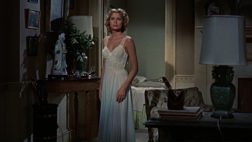
Technicolor was known for its incredible separation and rich primaries. I’d aim for robust, well-defined hues. Grace Kelly’s wardrobe is the key signal here. Her initial red dress is a stunner. In the grade, I’d want that red to sing not a digital, neon red, but a deep, blood-red that commands the frame, signaling her vivacity.
Crucially, the film offers a colorist a dream narrative arc: the desaturation of Margot. As the plot breaks her down, her clothing, hair, and makeup lose their vibrancy. I would emphasize this by subtly pulling saturation and cooling the skin tones as the film progresses. This is “tonal sculpting” using the grade to mirror the psychological state. I’d also look to shape the contrast to be slightly richer than a raw scan, ensuring deep, inky blacks that hold detail. The goal is a “film reality” that feels grounded yet heightened, preserving that beautiful separation where colors don’t bleed into each other, but stand distinct and proud.
Technical Aspects & Tools
Dial M for Murder
Technical Specifications| Genre | Crime, Music, Murder Mystery, Mystery, Thriller |
|---|---|
| Director | Alfred Hitchcock |
| Cinematographer | Robert Burks |
| Production Designer | Edward Carrere |
| Costume Designer | Moss Mabry |
| Editor | Rudi Fehr |
| Colorist | Janet Wilson |
| Time Period | 1950s |
| Color | Cool, Green |
| Aspect Ratio | 1.78 – Spherical |
| Format | Film – 35mm |
| Lighting | Soft light, Hard light, Top light |
| Lighting Type | Artificial light |
| Story Location | England > London |
| Filming Location | Burbank > Warner Bros. Studios |
| Camera | Mitchell |
The technical backbone of this film is the “twin strip” 3D process. Capturing with two synced 35mm cameras introduced headaches we rarely deal with in the digital age. Synchronization was paramount. If one camera’s shutter was slightly off, or the focus didn’t match perfectly, the audience would get a migraine.
You can actually see moments where this slipped. There are shots where the right-hand camera is a tiny bit soft compared to the left. In 2D, you’d miss it. In 3D, it creates a “conflict” that the brain struggles to resolve. There are even moments of “halo” artifacts or retinal rivalry where, say, a wall looks white to the left eye and slightly red to the right due to lighting angles. These are the nightmares of a stereographer.
- Also read: THE WILD ROBOT (2024) – CINEMATOGRAPHY ANALYSIS
- Also read: KLAUS (2019) – CINEMATOGRAPHY ANALYSIS
Browse Our Cinematography Analysis Glossary
Explore directors, cinematographers, cameras, lenses, lighting styles, genres, and the visual techniques that shape iconic films.
Explore Glossary →