I revisit a film that reminds me why I got into this business in the first place. It’s not just work; it’s a deep well of inspiration. Henri-Georges Clouzot’s 1955 classic, Diabolique, is exactly that. It’s a chilling psychological thriller that gets under your skin and stays there, and it does it without a single cheap jump scare or a drop of gratuitous gore. It is, quite simply, the raw power of visual storytelling.
I’ve noticed a lot of people skip this one because it’s “old” or “foreign,” which is a massive mistake. If you love cinema, subtitles are just a tiny price to pay for this level of craft. This isn’t just another scary movie; it’s the scary movie for the greats even Robert Bloch, who wrote Psycho, called it his all-time favorite. Once you watch it through the lens of a cinematographer, you’ll see why Hitchcock was reportedly so jealous he missed out on the rights.
About the Cinematographer
The man behind the look was Armand Thirard. He was a powerhouse of French cinema with over a hundred credits, but he wasn’t a “flashy” shooter. He was a chameleon. His gift was an incredible precision in serving the director’s vision, which is why his collaborations with Clouzot (like The Wages of Fear) are so legendary.
In Diabolique, Thirard isn’t just lighting a set; he’s designing fear itself. He had this profound, almost intuitive understanding of how to use light to sculpt the air of a room until it felt heavy with dread. It’s a visual lexicon for suspense that feels both stark and deeply, deeply unsettling.
Inspiration Behind the Cinematography
Clouzot famously beat Hitchcock to the film rights by mere hours. He knew he had a potent mix of deceit and paranoia on his hands. What’s wild about the cinematography here and likely what dictated the visual approach is how much it rejects typical horror tropes. There are no loud musical stings or “boo” moments.
Instead, the inspiration comes from a commitment to psychological realism. Thirard and Clouzot knew that real horror lives in the unseen. They leaned heavily into the film noir tradition and German Expressionism, where shadows aren’t just dark spots they’re active characters. The grimy, decaying boarding school isn’t just a backdrop; it’s a visual metaphor for the moral rot of the people inside it. Every frame is designed to make you feel as trapped as the protagonist.
Camera Movements
In Diabolique, the camera doesn’t show off. It creeps. The movements are purposeful, almost surgical, designed to slowly tighten the screws on the audience. We see these slow, deliberate dolly shots through the school’s labyrinthine hallways that feel less like they’re following the characters and more like they’re stalking them.
Think about the scenes where Christina wanders the school at night. The camera becomes her anxious gaze. It pans slowly, lingers just a second too long on a closed door, or pushes gently into a dark corner. It’s suffocating. Then, Clouzot will hit you with a completely static, locked-off shot of a character’s face. That stillness, punctuated by the tiniest shifts in the frame, creates a sense of entrapment that a handheld, shaky camera could never achieve. When this camera moves, it means something.
Compositional Choices
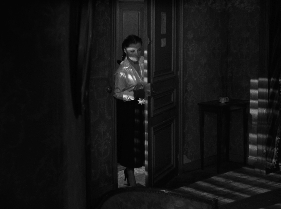
This film is a masterclass in framing claustrophobia. Thirard uses depth cues brilliantly, stacking elements in the foreground and background to make the frame feel dense and cluttered. Characters are constantly framed within doorways or windows, visually “caging” them within the school’s oppressive architecture.
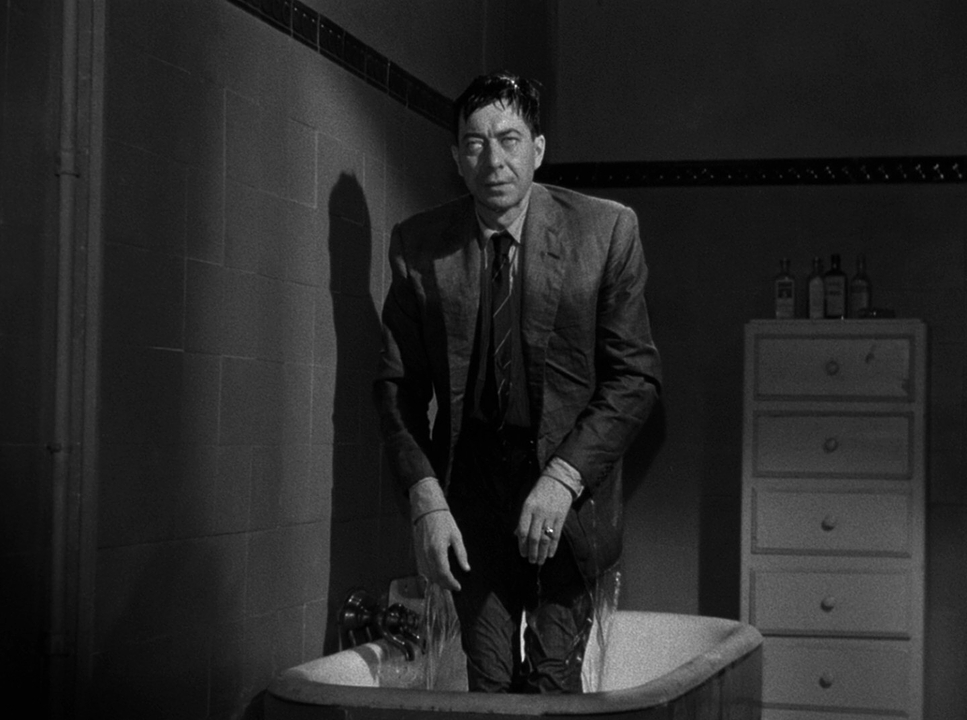
Then, of course, there’s the bathtub scene. It’s legendary for a reason. The composition here is meticulously orchestrated to trap the viewer. Before the reveal, the camera pins us to Christina’s increasingly frail face, then pans down to that still, ominous water. When Michael finally rises, the shot is uncomfortably tight. There is no “negative space” for the eye to escape to. By using low angles for Michael and high, vulnerable angles for Christina, the composition does all the heavy lifting for the power dynamics. It’s not about grand vistas; it’s about pinning the audience into a corner.
Lighting Style
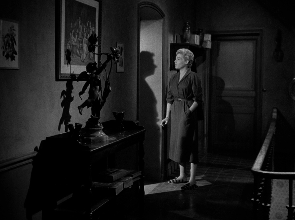
In the world of black and white, lighting is color. It’s your texture, your mood, and your psychology all wrapped into one. Thirard’s work here is a testament to the power of low-key lighting. He uses high contrast and cavernous shadows to create a pervasive sense of “wrongness.”
The lighting feels “motivated” a single lamp, a bit of moonlight, a bare bulb but the application is highly stylized. Shadows are active participants. They hide threats, distort faces, and create visual uncertainty. The way light rakes across a face in this film can reveal a glint of desperation in an eye while burying the rest of the motive in darkness. It’s a hard, judgmental light that makes the darkness feel as tangible as the furniture.
Lensing and Blocking
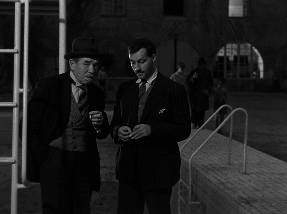
For the most part, the lensing stays in the realm of “normal” focal lengths, which grounded the film in a gritty reality. Wide lenses are rare, used only to show how isolated Christina is in those big, empty rooms. But mostly, we’re on medium to slightly telephoto lenses. This compresses the space, making the rooms feel smaller and bringing us uncomfortably close to the characters’ faces.
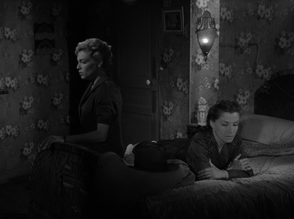
The blocking is just as calculated. It’s often asymmetrical, which keeps the viewer’s eye from ever feeling “settled.” When Nicole and Christina are conspiring, they are jammed together in the frame, heads close. But as the guilt eats them alive, the blocking separates them. They start being positioned at opposite ends of the frame or separated by furniture. It’s a subtle, visual way of showing their relationship falling apart.
Color Grading Approach
As a colorist, I find the term “color grading” is still totally relevant here, even if we’re only talking about luminance. Diabolique is a masterclass in tonal sculpting. If I were remastering this today, I wouldn’t touch the “color” I’d be obsessing over the contrast shaping.
I’d start by looking at the 1955 film stock’s grain and how it renders highlights. My goal would be to use localized contrast to create shape and separation. I’d be using custom masks on the faces to make sure the eyes have that haunting sparkle, or deepening the hollows of the cheekbones to show Christina’s exhaustion.
In B&W, your “palette” is just shades of grey. A good grade isn’t just hitting a “desaturate” button; it’s a deliberate manipulation of values. I’d be thinking about how the original colors of the set would translate into grey tones and exploiting that for the story. For example, I’d want to make sure the highlights have a soft, ethereal roll-off so they don’t blow out harshly. You need just enough detail in those deep blacks to suggest something is lurking there. If you “crush” the blacks into oblivion, the dread can’t breathe.
Technical Aspects & Tools
Diabolique (1955)
Technical Specifications & Credits
| Genre | Drama, Horror, Thriller, Psychological Horror, Murder Mystery, History, Music |
| Director | Henri-Georges Clouzot |
| Cinematographer | Armand Thirard |
| Production Designer | Léon Barsacq |
| Costume Designer | Carven |
| Editor | Madeleine Gug |
| Time Period | 1950s |
| Color | Desaturated, Black and White |
| Aspect Ratio | 1.33 – Spherical |
| Original Aspect Ratio | 1.37 |
| Format | Film – 35mm |
| Lighting | Hard light, High contrast, Top light, Side light |
| Lighting Type | Artificial light |
| Story Location | Hauts-de-Seine, Saint-Cloud |
| Filming Location | France, Yvelines |
Shooting in 1955 meant working with serious limitations that, honestly, forced more artistry. They were on 35mm celluloid with cameras that were heavy, studio-bound beasts. That’s why the movements feel so deliberate you couldn’t just “run and gun.”
There was no DaVinci Resolve or digital intermediate back then. The “look” was baked in on set through lighting and then finalized in the lab through chemistry. This required an immense amount of foresight. Thirard had to visualize exactly how a specific light would hit a specific film stock and how that would eventually look on a print. It’s a reminder that even with “limited” tools, vision and craft will always trump technology.
- Also read: THE BEST YEARS OF OUR LIVES (1946) – CINEMATOGRAPHY ANALYSIS
- Also read: FREE SOLO (2018) – CINEMATOGRAPHY ANALYSIS
Browse Our Cinematography Analysis Glossary
Explore directors, cinematographers, cameras, lenses, lighting styles, genres, and the visual techniques that shape iconic films.
Explore Glossary →