Demon Slayer: Kimetsu no Yaiba – The Movie – Infinity Castle (2025) felt less like work and more like a wake-up call. Rarely does a project hit you with this kind of progressive vision. UFOtable isn’t just making another anime film here; they are setting a benchmark that makes a lot of traditional live-action cinematography look lazy.
The hype is real. It’s not just marketing noise. When I hear people describe it as “what I’ve always imagined anime would look like in the future,” that hits home. We are seeing animation that finally pushes the medium to its absolute limit. It’s breaking box office records, sure, but for me, the real story is how it shatters our preconceived notions of visual storytelling. Let’s break down the alchemy behind it.
About the Cinematographer

In live-action, you usually point to one person as the Director of Photography. For Infinity Castle, that man is Yûichi Terao. As UFOtable’s Digital Team Chief and Director of Photography, Terao is the architect behind this distinctive look.However, to truly understand the visual language here, you have to view Terao and his team as a single, collective machine.
Terao’s approach is unique because the animation, digital photography, and effects departments at UFOtable are incredibly integrated. Under his direction, they’ve cultivated a “house style” that is unmistakable—opulent 2D character art sitting inside dynamic 3D environments, glued together by world-class compositing. There’s a meme online that UFOtable has “unlimited budget works,” but money doesn’t buy taste. Terao’s reputation is earned through a refusal to compromise on detail, ensuring that every frame maintains visual integrity even when the scene is chaotic.
Inspiration Behind the Cinematography
The visual goal here seems to be “hyper-drama.” The team wants to craft an experience that feels monumentally epic but intimately character-driven. It’s not just about cool fights; it’s about making sure those fights carry weight.
The Infinity Castle itself is the muse. It’s an Escher-esque nightmare where gravity is a suggestion and perspective is constantly shifting. This environment allows for the “absurd level of detail” and “hyperactive fight sequences” that reviewers are losing their minds over. But beyond the spectacle, the cinematography has to handle the quiet moments too. We shift gears constantly from high-octane combat to 25-minute flashbacks. It’s a massive challenge to translate the emotional weight of a villain’s backstory into a visual language that holds the audience, keeping even the “antsy” viewers glued to the screen.
Camera Movements

The camera work in this film is aggressive. It operates with a fluidity that blurs the line between traditional 2D and volumetric 3D cinematography. We aren’t just watching the fight; we are being propelled through the space alongside the characters.
I noticed a masterful use of complex tracking shots. These aren’t simple pans; they are multi-axis movements tilts, rolls, and cranes operating simultaneously. The integration of CG is what makes this possible, allowing for camera paths that physics simply wouldn’t allow in live-action. One reviewer nailed it when describing a scene where “platforms are rising when it’s Akaza vs Giyu vs Tanjiro… with additional platforms that pour water out.” The camera doesn’t just observe the platforms; it moves with them. It creates a verticality and sense of danger that static framing just can’t match. They also use whip pans and rapid zooms with surgical precision—not to hide lazy animation, but to sell the impact of the blows.
Compositional Choices
Compositionally, the film knows exactly what it’s doing. Given the non-Euclidean nature of the castle, the framing often emphasizes depth. They use layers foreground debris, midground action, background expanse to create a sense of scale that feels claustrophobic and massive at the same time. Wide shots dwarf the characters, reminding us of the odds they face.
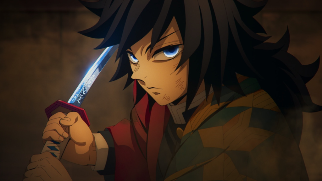
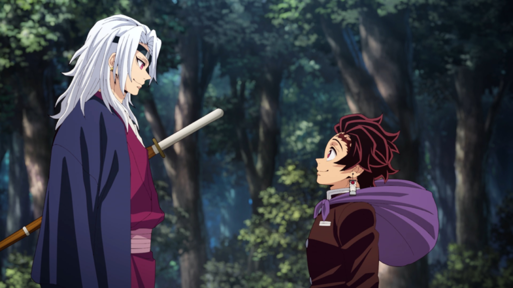
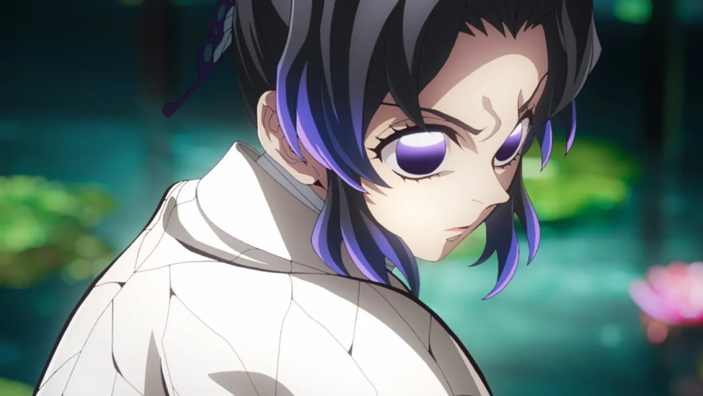
But during the flashbacks, the strategy flips. It becomes all about the close-up. The framing isolates characters, using negative space and implied shallow depth of field to force us to look at their internal struggle. This is critical for humanizing villains like Akaza. Even in the fast-paced fights, the composition leads the eye. They use splintering wood and demon blood as foreground elements to add texture and guide our focus. It’s smart spatial arrangement that reinforces the narrative stakes.
Lighting Style

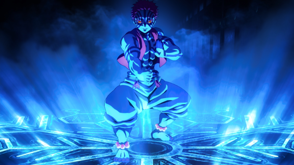
The lighting is where the “spectacular” animation really shines. It’s a masterclass in motivated illumination. The castle is shrouded in deep shadows (chiaroscuro), which amplifies the suspense. But every light source feels like it belongs there whether it’s the glow of a demon art or the cold, ambient light filtering through the endless rooms.
What impressed me most was the dynamic range. They aren’t afraid to let the shadows crush down to absolute black, which makes the highlights the breathing techniques and effects pop with incredible intensity. It gives the image a rich, tactile feel. They also use backlighting effectively to create silhouettes, emphasizing the power of the Hashira. The color temperature creates the mood: cool blues and purples for the oppressive castle atmosphere, shifting to warmer hues for moments of resolve or fire. Light and shadow here are basically supporting characters.
Lensing and Blocking
In animation, “lensing” is about the implied focal length, and UFOtable plays with this beautifully. Establishing shots use wide angles to push the perspective and exaggerate the dizzying scale of the castle. But when the fighting starts, they often switch to a tighter, longer lens feel. This compresses the background, making the hits feel heavier and bringing the viewer right into the kinetic energy. It enhances that “soap opera level of drama” by pulling the characters’ expressions right into our personal space.
Blocking this film must have been a nightmare. Characters are traversing multiple planes in a world that is literally rotating. Yet, the spatial geography remains clear. The seamless CG integration allows for complex blocking maneuvers that maintain coherence even when the world turns upside down. It’s a delicate ballet where the characters, camera, and environment all move in sync.
Color Grading Approach

Now, this is my turf. This is where I really get under the hood. The grading in Infinity Castle isn’t just about making things look “pretty”; it’s technical, deliberate, and sophisticated.
First off, the palette avoids that flat, digital wash you see in cheaper productions. They’ve applied a robust contrast curve that feels almost like a print-film emulation. The density in the shadows is excellent rich and deep without losing distinct shapes providing a solid foundation for the image. The highlight roll-off is equally impressive. Even with the neon-bright breathing effects, the whites don’t clip harshly; they bloom naturally, preserving texture.
Then there’s the hue separation. Demon powers often lean into sickly greens or vibrant purples, and these are carefully saturated to cut through the monochromatic blues of the castle. It guides the eye. They’re effectively “relighting” scenes in post, using what looks like heavy power windowing to sculpt the image darkening the edges to focus attention on the action. This meticulous control over tone allows the explosive, high-energy moments to retain their integrity. It’s this grade that helps the “boner jam” music find its visual match. It’s cohesive, punchy, and cinematic.
Technical Aspects & Tools
The technical prowess here is undeniable. The film proves that CG in anime, when done right, isn’t a compromise it’s an enhancement. As reviewers noted, the CG “integrates seamlessly” and actually “elevated some of the scenes.” This isn’t that “wonky dog shit like Berserk 2016 level CG.” It’s a sophisticated blend.
The secret sauce is the compositing. Character animation remains predominantly 2D (hand-drawn), while the complex environments are rendered in 3D. The “seamless” look comes from matching the lighting, texture, and motion blur perfectly between the two. The render engine is likely producing photorealistic lighting data that is then stylized to fit the anime aesthetic. It’s a powerful statement: bad CG isn’t a fault of the medium, it’s a fault of the artist. UFOtable is using the tools to serve the story, not to cut corners.
- Also read: HIGH AND LOW (1963) – CINEMATOGRAPHY ANALYSIS
- Also read: JUDGMENT AT NUREMBERG (1961) – CINEMATOGRAPHY ANALYSIS
Browse Our Cinematography Analysis Glossary
Explore directors, cinematographers, cameras, lenses, lighting styles, genres, and the visual techniques that shape iconic films.
Explore Glossary →