This film is different. It hits the ground running. There’s no exposition, no “previously on.” From frame one, you’re on a speeding train. It’s a relentless, urgent ride, and the visual choices are doing the heavy lifting to translate that breathless pace onto the screen. We’re going to pull apart those choices to see how the team crafted an ending that didn’t just satisfy fans, but cemented its place as a triumph of visual storytelling.
About the Cinematographer
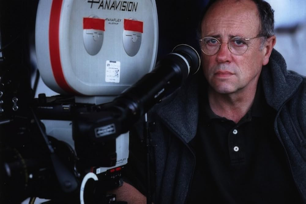
The DP behind Deathly Hallows: Part 2 was Eduardo Serra. If you don’t know the name, look him up. He has a specific knack for gritty realism mixed with elegance a perfect fit for the final chapters. His resume is wild, ranging from the painterly, soft lighting of The Girl with the Pearl Earring to the harsh, handheld chaotic energy of Blood Diamond.
For DHP2, he stepped into massive shoes. He inherited a visual legacy but had the unique headache of bringing a story split into two parts to a coherent close. The pressure on him and director David Yates must have been insane. Serra had to reconcile the fantasy elements with the harsh realities of war. He had to turn Hogwarts our visual “safe space” into a scarred battlefield while keeping it recognizable. It’s a testament to his skill that he balanced these elements without the film turning into a mess of CGI and noise.
Inspiration Behind the Cinematography
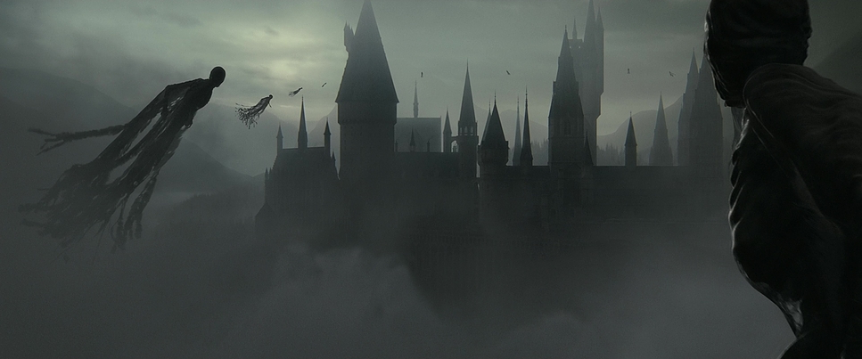
So, what fueled the look? I’d argue it was a cocktail of despair and resolution. The prevailing mood was “Armageddon with Magic.” The filmmakers needed a post-apocalyptic feel. Gone are the bright, wonder-filled hues of the Columbus era. This is a universe stripped bare.
The core inspiration seems to come from the narrative urgency. Everything comes to a halt in this movie. Serra and Yates aimed for a raw, immediate look. They drew from war films not necessarily for specific shots, but for the tenor—the grit, the terror. The return to Hogwarts offered a powerful contrast. It allowed them to juxtapose a sanctuary being torn apart. The grandeur of the castle is marred, scarred. It’s about capturing that shift from the familiar to the dangerous.
Camera Movements
When a story is this fast-paced, the camera can’t be static. Serra’s movement here is smart. We see a huge shift towards handheld work during the battle sequences. This isn’t just style; it’s narrative. The handheld shake puts us in the fray. It creates a documentary-like urgency as Hogwarts falls.
Think about the Gringotts sequence the dragon ride. The camera feels unmoored, reflecting that terrifying escape. Later, during the Battle of Hogwarts, Steadicam shots navigate the crumbling corridors. They maintain fluidity amidst the destruction, keeping us focused on the emotional beats rather than just the falling masonry. The pacing of these movements leads to quick, sharp cuts a nod to Mark Day’s editing which prevents stagnation. It propels the narrative forward like a runaway train.
Compositional Choices
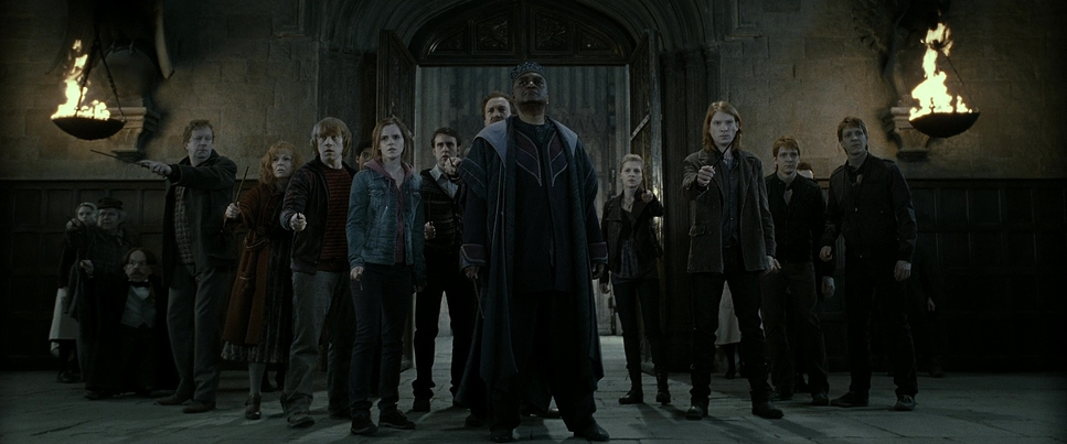
In a film this big, composition is everything. Serra uses deep depth of field for the battles, showcasing the sheer breadth of the conflict. You see characters from the Sorcerer’s Stone era, now grown up, fighting in the background. It adds visual density.
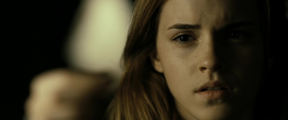
Conversely, in moments of vulnerability, Serra drops the aperture. Shallow depth of field isolates the characters. Take Harry in his moments of quiet despair; the background blurs out, emphasizing his internal struggle. There’s also a great use of negative space. When Neville makes his speech, the framing emphasizes his underdog status he’s often offset, or surrounded by weary faces, visually cementing him as the rallying point. The power dynamics with Voldemort are stark: low angles for the villain, emphasizing his dominance, while Harry is often framed to appear smaller, until he asserts his strength.
Lighting Style

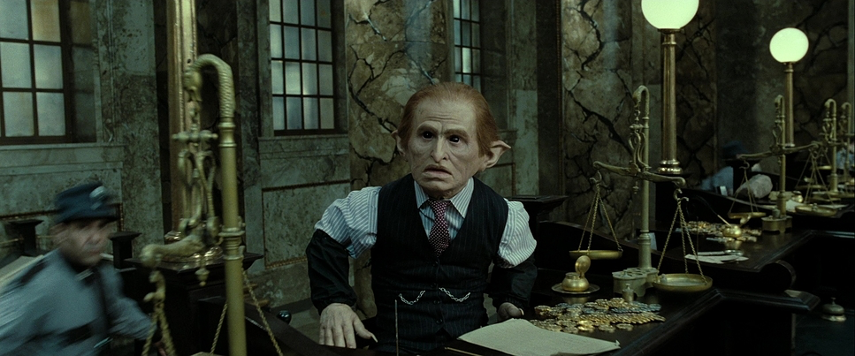
The lighting here is a world away from the gentle glow of the early films. Serra embraces a high-contrast, desaturated style. “Motivated lighting” is the key phrase here. The magical bursts, explosions, and flickering torches make the lighting feel physical and real.
The Battle of Hogwarts is lit predominantly by the ambient glow of spells and fires. It creates a tableau of light and shadow where danger lurks in the unlit corners. For the intimate scenes like Snape’s memories the lighting shifts. We see a careful interplay of chiaroscuro. The flashback imagery has a softer quality, a slight haze, distinguishing it from the brutal present.
As a colorist, I love the dynamic range decisions here. Serra and the grading team aren’t afraid to crush the blacks. In modern HDR grading, we often obsess over retaining shadow detail, but here, they let the shadows die. It’s oppressive. It adds weight. But when magic ignites, the highlights roll off beautifully. They don’t clip harshly; they bloom. It’s a delicate balance, achieving that heavy feel without blowing out the image.
Lensing and Blocking
Serra’s lens choice shapes the experience. For the battles, anamorphic wides are crucial. They provide that cinematic scope, the 2.39:1 aspect ratio allowing us to absorb the scale. They also introduce that subtle optical distortion at the edges, enhancing the disorientation.
Honestly, usually, I hate it when epic battles are shot entirely on long lenses it can create a sense of detachment. I initially thought a consistent use of wide lenses would be better to show the scale. But as I watched closely, I realized Serra’s approach was smarter. He intersperses wides with medium and telephoto lenses to pick out individual duels. This compresses the background, isolating the faces. This way, we don’t lose the human element. We see Neville’s stand, McGonagall’s defense, and the final moments of Fred and Lupin.
Blocking where the actors are is just as critical. Characters are positioned in defensive formations. The collaboration between the camera team and VFX ensured that the blocking worked with the digital elements. The choreography communicates the ebb and flow of the battle, making us feel every spell and sacrifice.
Color Grading Approach
Ah, the grade. This is where Deathly Hallows: Part 2 separates itself. The supervising colorist, Peter Doyle, did incredible work here. The palette isn’t just “dark”; it’s narrative. It’s strikingly desaturated, leaning into cool, steely blues and cyans.
Yet, specific hues are used with surgical precision. Fiery reds and oranges burst from explosions, acting as vibrant accents against the cool backdrop. It works because it’s used sparingly.
From a technical perspective, the contrast shaping is aggressive. The blacks are dense giving the scenes a suffocating presence but the mid-tone detail remains. The highlight roll-off on the magical effects is smooth, avoiding that “digital video” look. It feels like a film print. There is texture to the image.
Consider the “Princess Tale” (Snape’s memories). These moments are graded differently likely a touch more warmth, or a shift in the white point to evoke nostalgia. The hue separation between these flashes and the desaturated present creates an emotional contrast. The grade isn’t just a “look”; it’s an emotional filter.
Technical Aspects & Tools
Harry Potter and the Deathly Hallows: Part 2 — Technical Specs
| Genre | Adventure, Fantasy |
| Director | David Yates |
| Cinematographer | Eduardo Serra |
| Production Designer | Stuart Craig |
| Costume Designer | Jany Temime |
| Editor | Mark Day |
| Colorist | Peter Doyle |
| Time Period | 1990s |
| Color Palette | Cool, Desaturated, Blue |
| Aspect Ratio | 2.39 – Anamorphic |
| Format | Film – 35mm |
| Lighting Style | Soft light, Low contrast |
| Lighting Source | Moonlight |
| Story Location | Earth |
| Filming Location | Europe > United Kingdom |
| Camera | Arricam LT, Arricam ST |
| Lens | Cooke S4/i, Panavision Lenses |
| Film Stock | 5217/7217 Vision 2 200T, 5218/7218 Vision 2 500T |
For a film of this magnitude, the technical foundation had to be solid. It was primarily shot on 35mm film (Kodak Vision 2 stocks), which provided a texture that digital cameras in 2011 were still struggling to replicate. That grain structure is crucial for the grim atmosphere.
The VFX integration is seamless. The cinematography provided a solid base consistent lighting and camera data that allowed the CGI to merge with the practical sets.
And we have to talk about the edit. Mark Day’s work demonstrates how post-production fulfills the DP’s vision. Weaving “scene placement using B-roll” in Snape’s memories, or intercutting the duel with Neville’s heroism, relies on having the right footage. The synergy between Serra’s camera and Day’s timeline is what makes this a standout.
- Also read: MAD MAX: FURY ROAD (2015) – CINEMATOGRAPHY ANALYSIS
- Also read: CATCH ME IF YOU CAN (2002) – CINEMATOGRAPHY ANALYSIS
Browse Our Cinematography Analysis Glossary
Explore directors, cinematographers, cameras, lenses, lighting styles, genres, and the visual techniques that shape iconic films.
Explore Glossary →