Everyone talks about Deadpool’s marketing or its R-rating, but from a filmmaking perspective, the real miracle was the budget. It looks like a massive blockbuster, yet it was produced for a fraction of the cost of a typical MCU entry.
Deadpool is a prime example of “smart cinematography” over “expensive cinematography.” Ken Seng (DoP) and Tim Miller (Director) managed to craft a look that feels expensive, gritty, and polished all at once. It wasn’t just about shooting a comic book movie; it was about creating a specific, texture-heavy aesthetic that hid the budget limitations in the shadows and let the character shine.
About the Cinematographer

The visual backbone of Deadpool comes from Ken Seng, whose previous work on films like Max Payne showed he knew how to handle dark, gritty textures. But the secret weapon here was his collaboration with director Tim Miller.
Miller wasn’t a standard first-time feature director; as the co-founder of Blur Studio, he is a veteran of high-end visual effects. This background meant Miller didn’t use CGI as a crutch; he used it as a precise tool. The synergy between a cinematographer who knows how to light for texture and a director who deeply understands the VFX pipeline allowed them to create sequences that feel refreshingly “in-camera.” They bridged the gap between practical plates and digital assets so seamlessly that the audience rarely questions the reality of the image.
Inspiration Behind the Cinematography
The visual mandate for Deadpool was clear: differentiate from the X-Men and Avengers. The film needed to mirror Wade Wilson’s personality violent, erratic, but surprisingly sharp.
Instead of the high-gloss, high-key lighting of traditional superhero fare, Seng leaned into a grittier, more tactile aesthetic. The action needed to feel visceral, not sanitized. This meant embracing a rougher edge in the lighting and texture. It’s a visual dichotomy: the brutality of a mercenary film mixed with the precise timing of a comedy. The camera language had to pivot from intense action to a fourth-wall break without the transition feeling jarring, requiring a visual grammar that was flexible but consistent.
Camera Movements
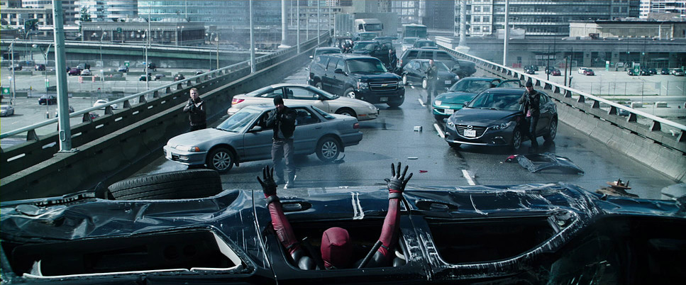
In an era defined by “shaky cam” to hide poor choreography, Deadpool made a deliberate choice to keep the camera stable. The action is fast, but the camera movement is controlled.
If you look at the opening freeway sequence, it’s a lesson in spatial clarity. Seng utilizes fluid tracking shotslikely Steadicam or dolly work to keep the geography of the fight clear. When the camera whips, it’s to follow specific momentum, not to manufacture false energy. Even during the comedic beats, the camera often maintains a steady, knowing presence, sometimes pushing in slowly to emphasize a joke or reframing subtly when Deadpool addresses the audience. This stability is what gives the film its “big budget” feel; it suggests confidence in the stunt work and blocking.
Compositional Choices
Compositionally, the film balances traditional cinematic grandeur with comedic intimacy. Seng and Miller shot with anamorphic lenses, utilizing the 2.39:1 aspect ratio to capture the breadth of the chaos.
In the action sequences, they use the wide frame to provide negative space, allowing for dynamic entries and exits. But for the comedy and fourth-wall breaks, the composition often breaks traditional rules. Deadpool is frequently center-framed, looking directly down the barrel of the lens. This direct address cuts through the “movie magic” layer, creating an immediate connection with the viewer. The use of foreground elements shattered glass, debris, car interiors adds depth to these shots, preventing the image from feeling flat or “TV-like.”
Lighting Style
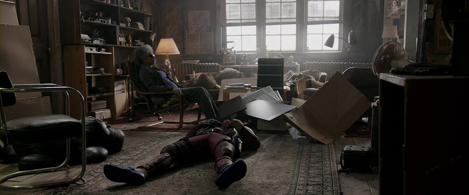
The lighting is where the budget management really shines. To achieve a premium look without a premium price tag, Seng leaned into high-contrast lighting. By utilizing hard light sources and deep shadows, you not only create a dramatic, “graphic novel” look, but you also hide the edges of the set and reduce the need for expensive background dressing.
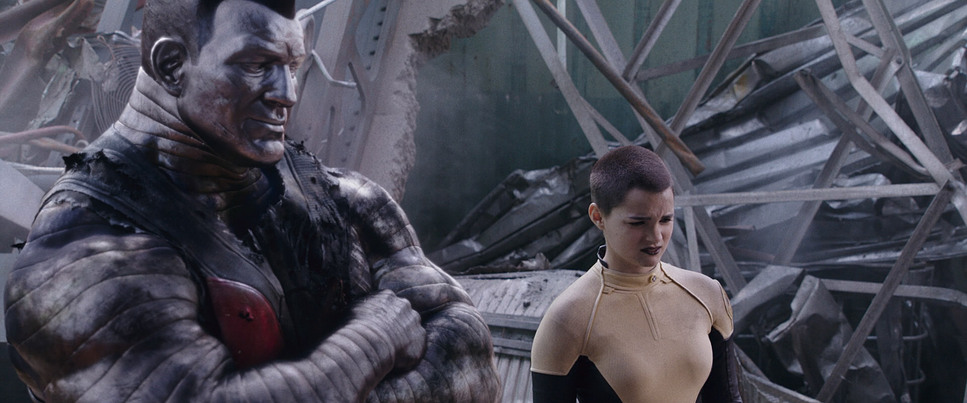
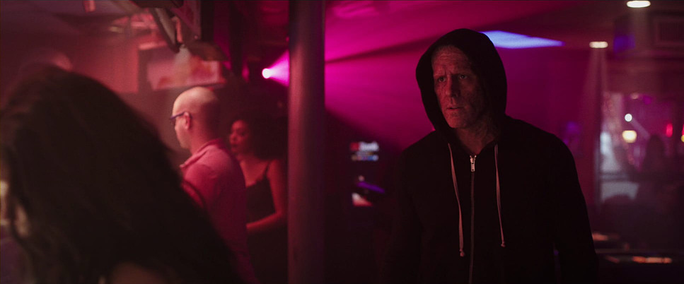
The lighting is strictly motivated. In the bar scenes, we see mixed color temperatures neon practicals clashing with tungsten creating a seedy, realistic vibe. In the lab sequences, the light is harsh and clinical. This commitment to realistic, motivated source lighting helps ground the more fantastic elements. When Colossus steps into the frame, he looks real because the light interacting with his metallic surface matches the practical environment perfectly.
Lensing and Blocking
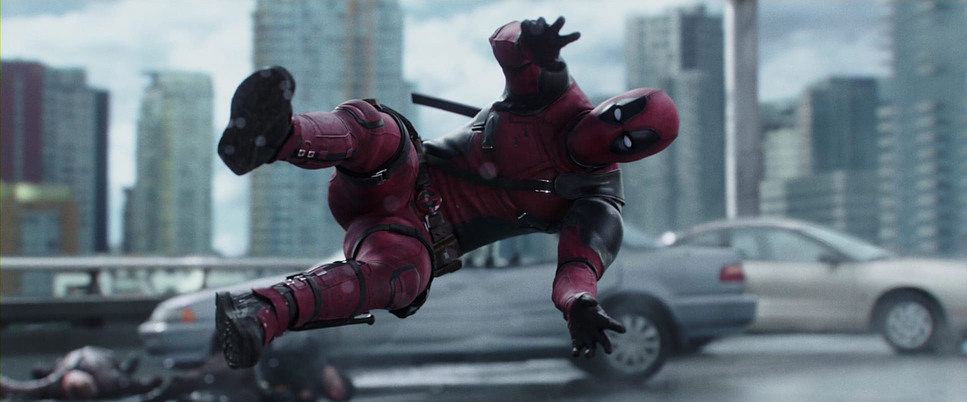
Shooting on the ARRI Alexa XT with anamorphic lenses was a bold, necessary choice. Anamorphic glass inherently adds production value. You get that distinct oval bokeh, the subtle barrel distortion, and the flare characteristics that scream “cinema.” It separates the subject from the background in a way that feels organic, not digital.
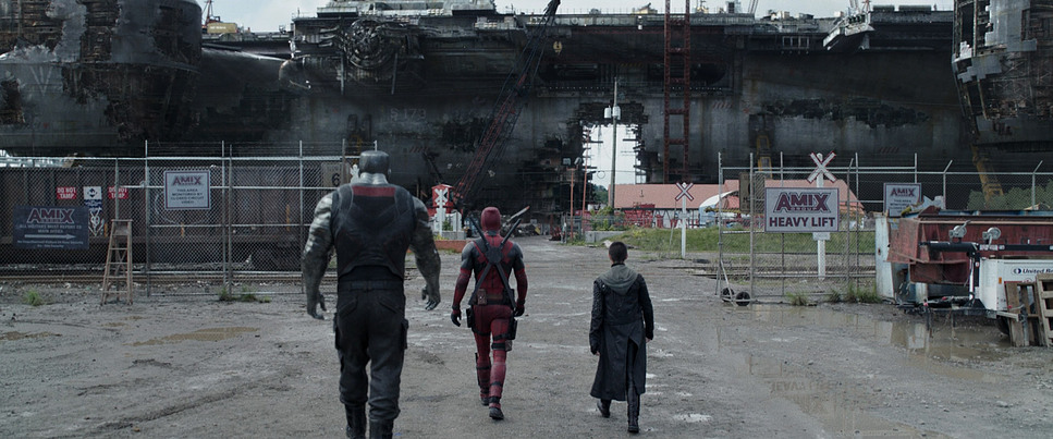
Blocking-wise, Miller and Seng choreographed the action to maximize depth. Characters are rarely static on a single plane; they move deep into the background or rush the foreground. This z-axis movement keeps the energy high. The visual interplay between Colossus and Deadpool is particularly fun framing the massive, rigid steel giant against the agile, frantic red suit creates a visual contrast that sells the comedy before a word is even spoken.
Color Grading Approach
For me, the grade is where Deadpool finds its true identity. This isn’t a standard Rec.709 conversion; it’s a heavily stylized look designed to separate the hero from the world.
The grade relies on strong hue separation. The environments are generally pushed toward cooler, desaturated tones cyans, steels, and muted greens. This allows the specific frequency of Deadpool’s red suit to pop aggressively without the need for oversaturation. It’s a smart isolation technique.
The contrast curve is steep. We’re seeing dense, crushed blacks that add weight to the image, reinforcing the “R-rated” grit. However, the highlight roll-off is smooth, preventing the digital clip that often plagues lower-budget productions. There also appears to be a subtle film emulation happening likely a print LUT or a bleach-bypass inspired look that adds texture to the midtones and unifies the CGI with the live-action footage. It feels like a film print, not a video file.
Technical Aspects & Tools
| Genre | Action, Adventure, Romance, Comedy |
| Director | Tim Miller |
| Cinematographer | Ken Seng |
| Production Designer | Sean Haworth |
| Costume Designer | Angus Strathie |
| Editor | Julian Clarke |
| Colorist | Tim Stipan |
| Time Period | 2010s |
| Color | Blue |
| Aspect Ratio | 2.39 |
| Format | Digital |
| Lighting | Soft light, Top light |
| Lighting Type | Daylight, Overcast |
| Story Location | … New York > New York City |
| Filming Location | … Canada > British Columbia |
The technical win here is the integration of digital and practical assets. Because of Tim Miller’s background, the VFX pipeline was likely streamlined from day one.
Colossus is a fully CGI character, yet he feels tangible. This requires meticulous data capture on set high-quality HDRI maps and reference spheres to ensure the digital lighting matches Seng’s practical lighting exactly. The choice of the Alexa XT provided the dynamic range necessary to hold detail in the bright exterior skies while maintaining information in the dark suit textures, giving the post-team a robust negative to work with.
- Also read: GUARDIANS OF THE GALAXY (2014) – CINEMATOGRAPHY ANALYSIS
- Also read: THE AVENGERS (2012) – CINEMATOGRAPHY ANALYSIS
Browse Our Cinematography Analysis Glossary
Explore directors, cinematographers, cameras, lenses, lighting styles, genres, and the visual techniques that shape iconic films.
Explore Glossary →