Coraline (2009) for years, I just didn’t get the hype. When it first dropped in 2009, I sat through it and… nothing. It didn’t leave a mark. Looking back now as a filmmaker and colorist who basically breathes stop-motion and horror, that realization is wild to me. It should have been my absolute jam, but for some reason, the frequency just didn’t align.
Maybe it was a timing thing. You know how it is sometimes a film has to wait for you to be ready for it. After 14 years of hardcore fans singing its praises (and let’s be real, Coraline fans are a different breed of passionate), I finally sat down for a rewatch.
Honestly? I finally get it.
This thing is deceptively simple a dark fairy tale about temptation. But when you peel back the layers from a craft perspective, it’s a masterclass. As someone running Color Culture, I’m obsessed with the “small details,” and this film is the embodiment of that. It’s not just a story; it’s a meticulously curated visual trip.
About the Cinematographer
In the world of stop-motion, the line between the Director and the DP is almost non-existent. They have to share a single nervous system. While Henry Selick provided the vision, the heavy lifting on the “look” came down to the legendary Pete Kozachik. If you know stop-motion, you know his name he’s the guy behind The Nightmare Before Christmas and Corpse Bride.
To call Kozachik’s work “meticulous” feels like an insult to how hard this actually is. In this medium, every frame is a still photograph. You aren’t just “lighting a scene”; you are micro-adjusting shadows and highlights frame by agonizing frame. Kozachik wasn’t just operating a camera; he was sculpting time. He managed to give a bunch of silicone and wire a tactile, dreamlike quality that still holds up better than most CGI from that era.
Inspiration Behind the Cinematography
If I had to boil the inspiration here down to one word, it’s perspective. The whole visual language is built around how Coraline sees her world and more importantly, how that perception is being manipulated.
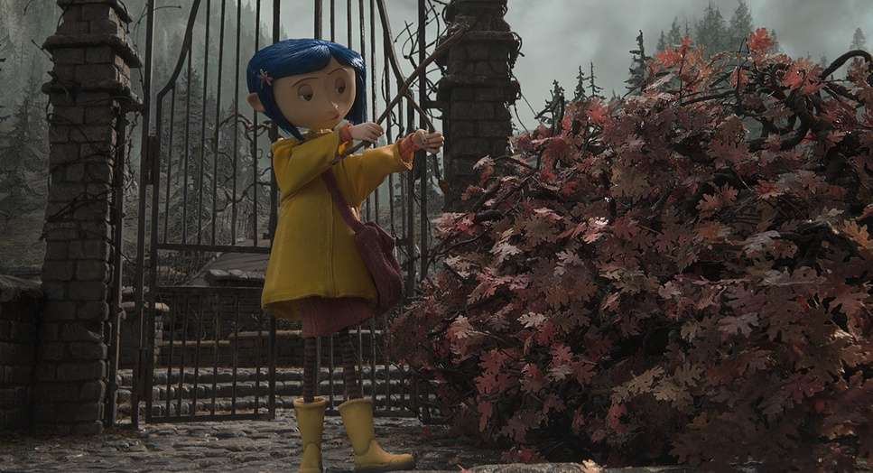
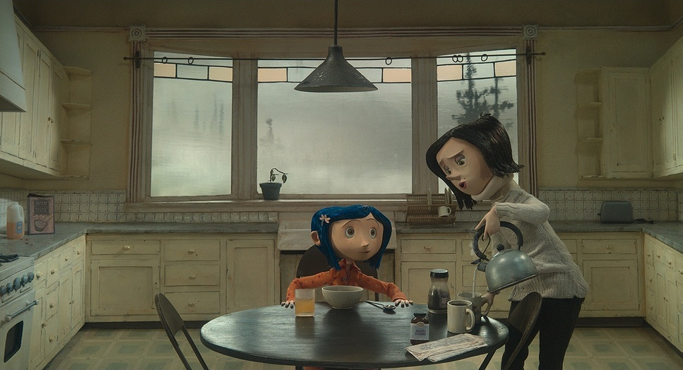
The “Real World” is a slog. The filmmakers went for this muted, grainy, almost depressing palette. Her yellow raincoat and blue hair aren’t just character design; they’re the only things with any “chroma” in her life. It highlights her as an anomaly in a world that feels lethargic and uncaring.
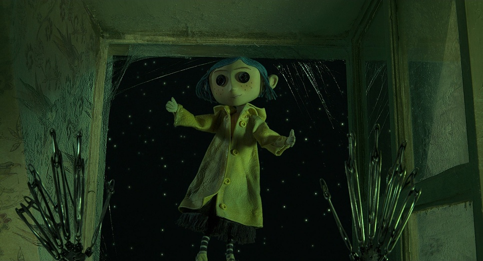
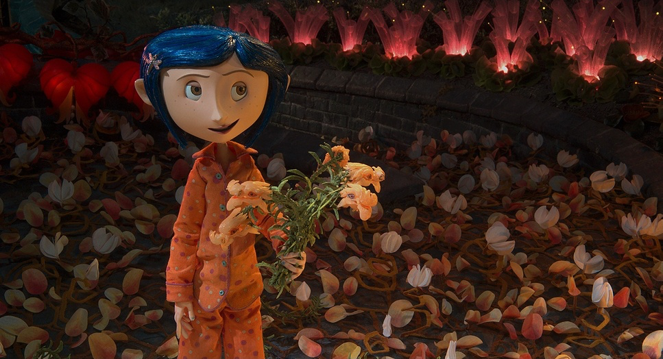
Then, she hits the tunnel. The transition isn’t subtle the vibrancy of the Other World hits you like a freight train. This isn’t just a style choice; it’s the visual “hook” the Other Mother uses to bait the trap. It taps into that surrealist fairy tale atmosphere where everything feels too perfect. The cinematography doesn’t just show us a cool set; it makes us feel Coraline’s desperation to stay there.
Lighting Style
Lighting is usually where I get the most nerdy, and Coraline gives you so much to chew on.
In the real world, the light is intentionally “unmotivated” and flat. It’s like the sun is perpetually stuck behind a thick layer of Oregon clouds. The dynamic range is compressed; there’s no real “pop.” It’s designed to feel mundane.
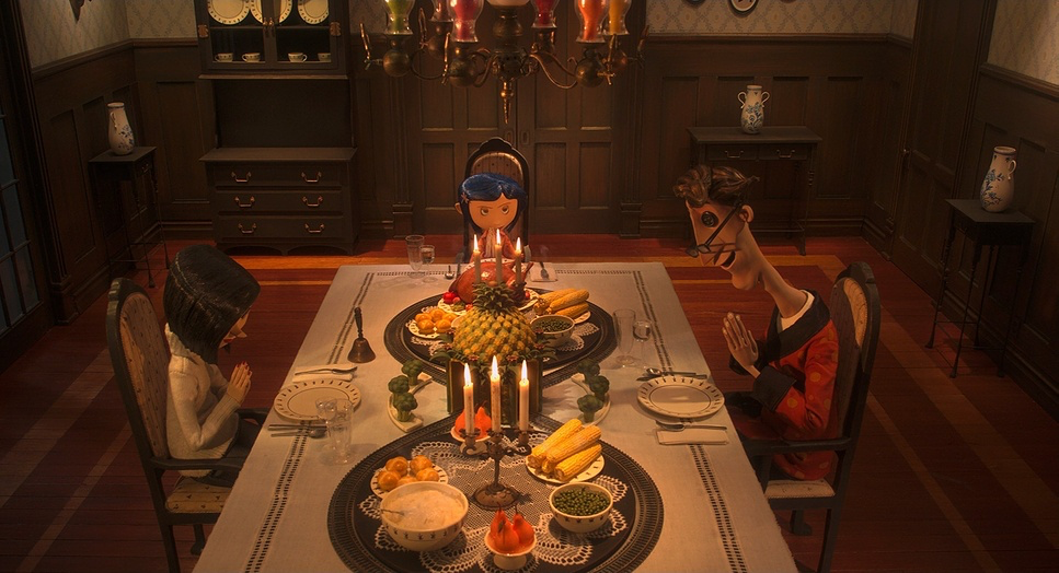
But the Other World? That’s where the theatricality comes out. The contrast ratios are aggressive. You’ve got rich, inky blacks and highlights that actually sparkle. In the kitchen scenes, the light feels warm and inviting it’s designed to make you feel safe.
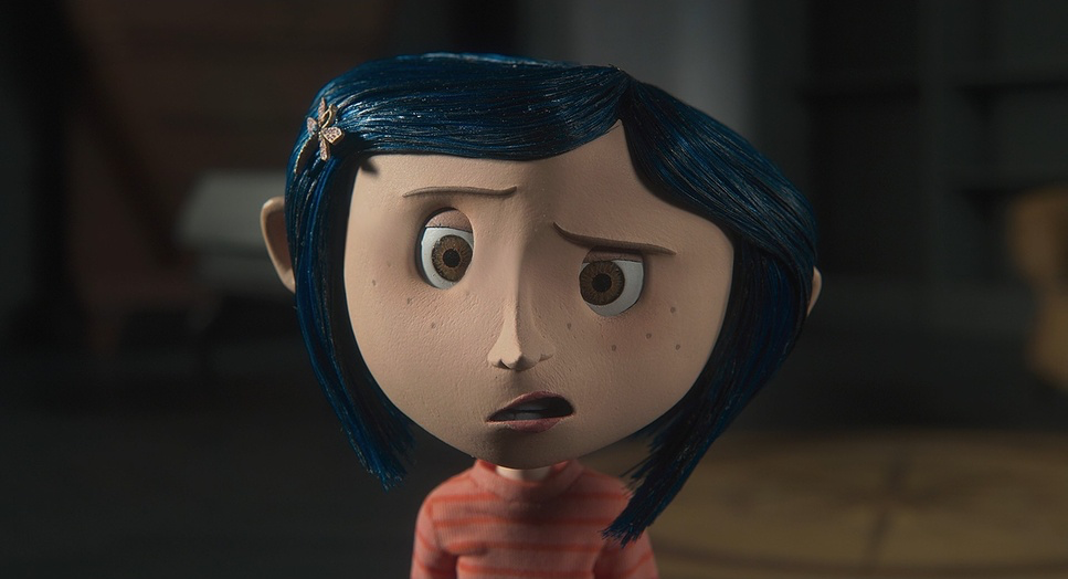
But watch how it shifts. As the Other Mother’s mask slips, the lighting goes sour. We move into these sickly greens and high-contrast, almost monochromatic setups. By the end, when the charm is gone, the lighting becomes oppressive. It’s not just illuminating the puppets; it’s narrating the death of a dream.
Color Grading Approach
As a colorist, analyzing Coraline is a dream because the grade isn’t just an “overlay” it’s the narrative’s heartbeat.
We start with that desaturated, cool-toned “Real World.” I love how they handled the black levels here they feel a bit “crushed” but dusty, lending to that melancholic air. Then, the jump to the Other World is a saturation explosion. We’re talking rich reds and electric blues. I suspect there was a lot of “tonal sculpting” done to ensure the colors felt enticing but just a hair too saturated to be real.
The highlight roll-off in the early Other World scenes is creamy and soft, almost like a vintage film stock (think 2383 Vision). But as the hunt for the ghost eyes begins, the grade turns cold. The “clash between green and blue” in the climax is a classic horror trope, but here it feels earned. The way the world literally bleeds out into black and white at the end is a brutal emotional gut-punch. It’s a masterclass in using the palette to signal that the “life” has been sucked out of the room.
Camera Movements
In stop-motion, you don’t get “fluid” movement for free. Every pan, tilt, or dolly shot is a series of calculated increments. This gives Coraline a very deliberate, almost unsettling energy.
What really stands out to me are the “surveillance shots.” The camera often feels like it’s lurking hidden behind a bush or peering through a crack in the door. It feels voyeuristic. You’re constantly asking: Who is watching her? Is it the cat? The Other Mother? Or just us?
The dolly shots are used with surgical precision. They don’t just move the camera to move it; they use it to “push” the audience into a discovery. When the camera traces the doll in the opening sequence, it’s setting the tone for the entire film: nothing here is accidental.
Compositional Choices
This is where the film shows its high-level IQ. One of the most effective tools they used was the “Dutch Angle.” Now, usually, I find tilted frames a bit gimmicky, but here they use them to build actual existential anxiety.
The film also plays with “Screen Weight.” For the first 15 minutes, Coraline is almost always on the right side of the frame when she’s with other people. We’re conditioned to associate that “spot” with power or narrative focus. Then, right before she finds the portal, the film flips the script and puts the doll on the right. It’s a subtle visual “handoff” that tells your brain something has changed before your eyes even register it.
Lensing and Blocking
Blocking in stop-motion is a nightmare of logistics, which makes the results here even more impressive.
They used wider lenses in the Other World to make the sets feel massive and immersive, emphasizing how small Coraline is in this giant trap. Conversely, they’d go tighter for the emotional beats to isolate her.
There’s a great scene with Coraline’s mother working while Coraline sits in the middle ground with rain on the window. Even though the rain is moving in the foreground, the lighting and blocking force your eye to the mother. It’s a brilliant way to show the emotional distance between them they’re in the same frame, but they couldn’t be further apart.
Technical Aspects & Tools
| Genre | Animation, Family, Music, Musical, Stop-Motion Animation, Satire, Horror, Puppetry, Holidays, Claymation |
| Director | Henry Selick |
| Cinematographer | Pete Kozachik |
| Production Designer | Henry Selick |
| Costume Designer | Deborah Cook, Margaret Meyer |
| Editor | Christopher Murrie, Ronald Sanders |
| Colorist | Tim Peeler |
| Time Period | 2000s |
| Color | Warm, Saturated, Green |
| Aspect Ratio | 1.85 – Spherical |
| Format | Film – 35mm |
| Lighting Type | Artificial light |
| Story Location | … Ashland > Other House |
| Filming Location | … Oregon > Portland |
| Camera | Princeton Instruments ES1100, RED One / OneMX, Nikon D80 |
| Lens | Nikkor Lenses, Sigma Cine Lenses, Tamron Lenses |
| Film Stock / Resolution | 2383/3383 Vision, Digital Intermediate (3.2K), Digital Stills, Redcode Raw |
Let’s talk shop for a second. This wasn’t just a “movie”; it was a massive data-management project. Shooting on the Nikon D80 and RED One, Laika was basically inventing the digital stop-motion pipeline as they went.
Capturing for 3D meant every frame had to be shot twice (left eye/right eye), doubling an already insane workload. And while the puppets are physical, the “Blue Curtain” principle is always there. Sometimes a choice is deep and thematic; other times, you’re just trying to hide a rig or a seam. But in Coraline, the tech and the art are so fused that it’s hard to tell where the puppet ends and the digital grade begins.
- Also read: FANTASTIC MR. FOX (2009) – CINEMATOGRAPHY ANALYSIS
- Also read: BOOGIE NIGHTS (1997) – CINEMATOGRAPHY ANALYSIS
Browse Our Cinematography Analysis Glossary
Explore directors, cinematographers, cameras, lenses, lighting styles, genres, and the visual techniques that shape iconic films.
Explore Glossary →