Come and See (1985), Elim Klimov’s anti-war opus, does the exact opposite. It isn’t a film I just admire; it’s a film that scares me. It is a masterclass in how cinematography and color can weaponize the frame to inflict a psychological state rather than just tell a story. It demands you come and see, forcing an uncomfortable intimacy with the absolute worst of humanity.
About the Cinematographer
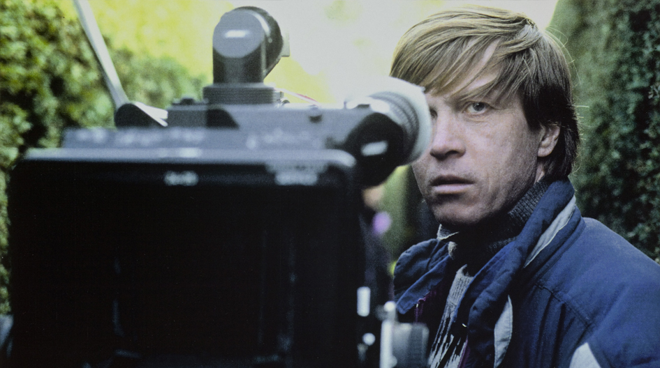
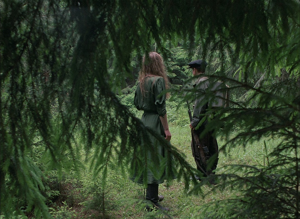
The visual landscape of Come and See is the work of cinematographer Aleksei Rodionov. While many DPs in the 80s were chasing polished, stylized looks, Rodionov went rogue. His work here feels less like a technician crafting a pretty image and more like a war photographer running for his life. He embraced the messy, unpredictable nature of the shoot, translating it into a visual language that feels urgent and uncomfortably real. It’s not about “cinematic beauty”; it’s about piercing authenticity. Every technical choice from the lens flares to the erratic framing serves to amplify the protagonist Flora’s subjective journey, blurring the line between the events on screen and the hallucinations of a traumatized mind.
Inspiration Behind the Cinematography
Klimov’s goal was a brutally realistic depiction of the Nazi occupation of Belarus. But he wasn’t interested in documentary-style neutrality. He wanted a “hyper-realism” filtered through the eyes of Flora, a 14-year-old boy. This means the visuals had to be inherently subjective. I recall reading about how Klimov battled Soviet censorship for years to get this made, and you can feel that pent-up frustration in the final image.
The film’s title, referencing the Book of Revelation, hints at the apocalyptic journey Flora undertakes. It’s a bildungsroman from hell. The camera effectively becomes the “first-person observer.” You aren’t watching Flora; you are struggling alongside him. Rodionov had to make every shot feel like it originated from Flora’s vision—a blend of verifiable reality and the distorted input of a mind snapping under pressure. The result is a style that is disorienting and profoundly personal, designed to place us directly in his muddy, worn-out boots.
Camera Movements
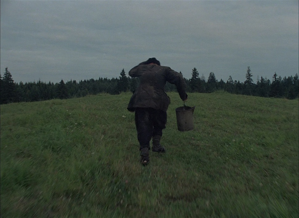
The camera in Come and See is never just a recording device; it’s a restless, anxious entity. There’s a distinct sense that the camera is alive, echoing Flora’s deteriorating mental state. Sometimes it floats like a ghost, observing the horror with a detached, sickening smoothness. Other times, the movement is jagged and reactive.
We see dynamic, handheld sequences where the camera mirrors Flora’s chaotic flight. When explosions deafen him, the camera movements become dazed, floating aimlessly to mimic his concussion. It’s a striking contrast: a blend of documentary spontaneity and highly choreographed emotional mapping. Rodionov also utilizes the “Vertigo effect” (dolly zoom) in key moments once in the partisan camp and again before Flora shoots at Hitler’s portrait. These aren’t just cool tricks; they visually represent a psychological break. The background warps and pulls away while Flora remains fixed, literally separating him from the reality around him. It’s one of the most powerful ways to convey internal turmoil I’ve ever seen.
Compositional Choices
Rodionov’s compositions are designed to make you uncomfortable. One of the most distinctive tools he uses is the split diopter lens. This piece of glass allows for both extreme foreground and extreme background elements to be in sharp focus simultaneously, creating an image that the human eye can’t naturally produce. It feels wrong, and that’s the point.
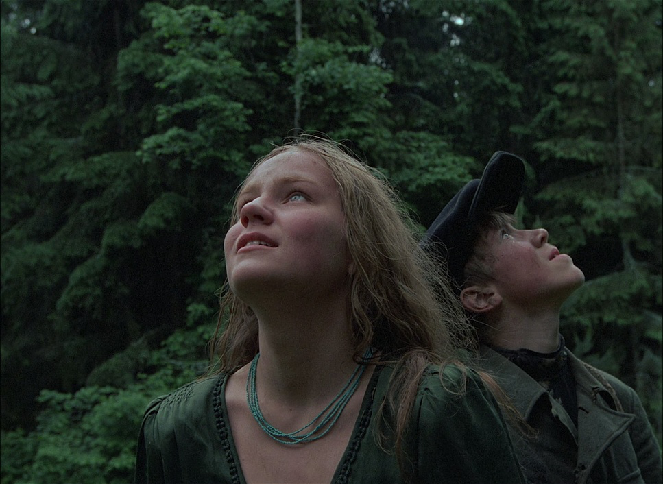
The film uses this to link characters across space like when Flora encounters the traumatized girl, Glasha. The split diopter visually handcuffs them together in their shared trauma, even when they are physically apart. It forces the viewer to process two focal planes at once, increasing the cognitive load and tension.
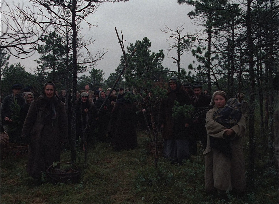
Beyond the diopters, the film relies heavily on the 1.37:1 aspect ratio (Academy ratio). This boxy frame “locks” characters in. There is no horizontal escape; they are trapped in the center. This is most effective in the famous portrait shots where characters stare directly into the lens breaking the fourth wall. By the end of the film, it feels like they are staring at us, judging our complicity as we sit safely in our chairs watching their destruction.
Lighting Style
The lighting here is aggressively naturalistic. It rarely seeks to beautify. It’s a pragmatic, brutal approach. If the sun is harsh, the image is harsh. If the hut is dark, the image is crushed.
There is a consistent embrace of high dynamic range, but not the clean HDR we see today. We see blown-out, clipped highlights in the sky, contrasted with deep, muddy shadows in the forest. This isn’t a mistake; it’s a texture. It reflects an unforgiving world where there is no fill light to save you.
For interior scenes, the lighting often feels sparse, relying on practicals or dim window light to create pools of visibility. When the village is burned, the fire becomes the key light a terrifying, all-consuming glow that paints the scene in horrifying hues of orange and red. The shadows dance violently. This approach grounds the film in a tactile reality; the horror feels inescapable because the light source itself is the thing that is destroying them. Even the literal fog often blankets the landscape, acting as a massive, soft diffuser that makes the environment feel dreamlike and ghostly.
Lensing and Blocking
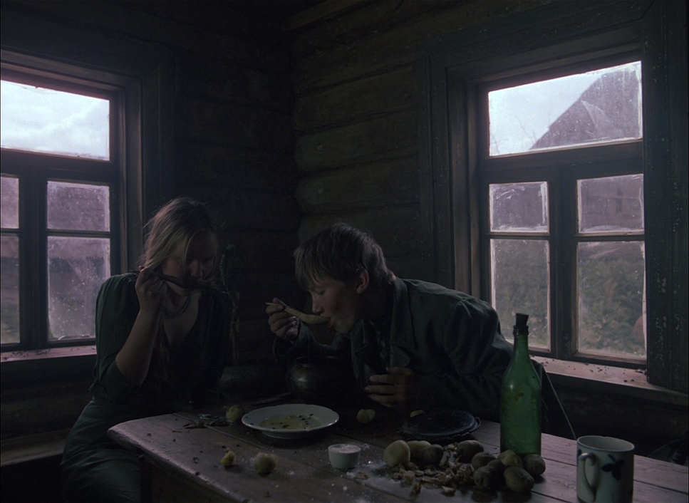
The lensing choices prioritize intimacy over epic scale. While there are wide shots of the desolate landscape, the film lives on medium and close-up lenses. This forces us to confront every twitch and wrinkle on Flora’s rapidly aging face.
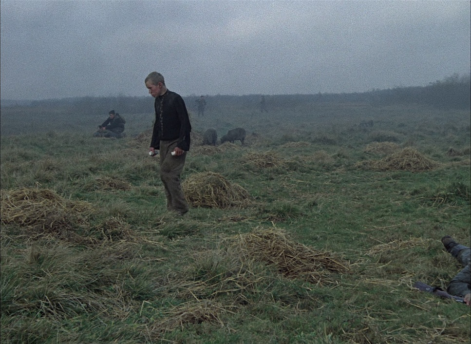
The blocking is remarkably complex, especially considering the chaos on screen. Characters move toward and away from the lens to create depth, rather than the camera just panning to find them. It creates a theatrical energy within a chaotic environment.
You also have to consider the practical reality of this set: the young actor was reportedly dodging live ammunitionduring filming. This insane commitment to “authenticity” necessitated precise blocking not just for art, but for safety. The camera’s proximity to Flora suggests a mix of wider lenses to capture the action around him, and telephoto compression to isolate him in moments of despair. This interplay is what gives Come and See its unique visual tension.
Color Grading Approach
From my perspective as a colorist, the grade in Come and See is fascinating because it refuses to be “clean.” The palette is raw, unrefined, and deeply psychological. Early in the film, we see a lot of “thick” analog greens and blues. These aren’t the teal-and-orange of modern blockbusters; they are sickly, desaturated tones that establish a sense of hopelessness. The greens of the forest feel mossy and damp, setting an ominous stage.
Periodically, these cool tones are broken by warmth but it’s rarely comforting. Initially, warm skin tones or sunsets might offer a glimpse of hope, but as Flora’s trauma deepens, the warm colors turn violent. The palette shifts into aggressive reds and purples during the fire sequences. The saturation is pushed to the limit, mirroring the rage and destruction.
If I were grading this, I’d be looking at a heavy print film emulation. The contrast curve is distinct—the mid-tones feel compressed and dense, creating a “heavy” image, while the highlights roll off abruptly. A modern digital grade would try to recover that highlight detail, but here, the blown-out skies add to the sensory overload. The blacks are crushed but retain a muddy texture they aren’t pure digital zero. It’s a look that prioritizes texture mud, rough wool, burnt wood over color separation.
Technical Aspects & Tools
Come and See – Technical Specifications
| Genre | Survival, Drama, Epic, History, Political, Military, War, World War II |
| Director | Elem Klimov |
| Cinematographer | Alexey Rodionov |
| Production Designer | Viktor Petrov |
| Costume Designer | Eleonora Semyonova |
| Editor | Valeriya Belova |
| Time Period | 1940s |
| Aspect Ratio | 1.37 – Spherical |
| Format | Film – 35mm |
| Lighting | Soft light |
| Lighting Type | Daylight |
| Story Location | Europe > Belarus |
| Filming Location | Europe > Belarus |
| Camera | Arriflex BL3 |
The technical execution is even more impressive when you consider the era. Filmed in 1985 on Soviet film stock, the raw aesthetic is partly a product of the medium. The grain structure is prominent, adding a layer of noise that feels like visual static or interference. The 1.37 aspect ratio was a deliberate throwback, rejecting the widescreen format to focus on the human face.
The use of the split diopter, as mentioned, required careful calibration. But the real “technical” feat here was the environment. The fact that Flora was reacting to real explosions and live rounds underscores a terrifying commitment to realism. This wasn’t “method acting” in the traditional sense; it was a child reacting to actual danger.
For us watching today, the recent restorations (like the Criterion release) are a godsend. They allow us to see the film with the dynamic range Rodionov intended, preserving the specific grain structure and the deep blacks of the original negative. It ensures we can experience the film as it was meant to be seen: loud, large, and overwhelming.
- Also read: HAMILTON (2020) – CINEMATOGRAPHY ANALYSIS
- Also read: THE KID (1921) – CINEMATOGRAPHY ANALYSIS
Browse Our Cinematography Analysis Glossary
Explore directors, cinematographers, cameras, lenses, lighting styles, genres, and the visual techniques that shape iconic films.
Explore Glossary →