My name is Salik Waquas, a film colorist with a keen eye for the subtleties and intricacies of cinematography, especially in iconic works like The Godfather Part II, directed by Francis Ford Coppola. As I delved into this analysis, I couldn’t help but feel a deep admiration for Gordon Willis, the cinematographer whose genius permeates every frame of this film. Known as the “Prince of Darkness,” Willis took lighting to a place of profound emotional depth, where every shadow tells a story, every composition echoes the turmoil within the characters, and every color choice heightens the film’s tragic grandeur.
In this article, I’ll explore how Willis’s choices in lighting, camera movement, composition, and color contributed to a visual masterpiece that remains one of the most celebrated films in cinematic history. This is more than a mere analysis; it’s my personal reflection on what makes The Godfather Part II an eternal source of inspiration for anyone in the field of visual storytelling.
Cinematography Analysis of The Godfather Part II
The Vision of Gordon Willis

Gordon Willis didn’t merely light scenes in The Godfather Part II; he crafted a visual language that communicated the film’s darkest themes. Known for his high-contrast lighting style, Willis embraced shadows not just as a visual choice but as a storytelling device. This approach clashed with traditional studio expectations at times. For example, in The Godfather, the studio was concerned that Marlon Brando’s eyes were obscured, yet Willis remained steadfast, seeing shadows as a way to underscore characters’ inner conflicts.
In The Godfather Part II, he elevated this style further, crafting a world steeped in moral ambiguity and darkness, aligning with the film’s themes of power, betrayal, and isolation. Willis’s dedication to his aesthetic vision, despite pushback, made this film a groundbreaking achievement, influencing generations of filmmakers.
Inspiration Behind the Cinematography

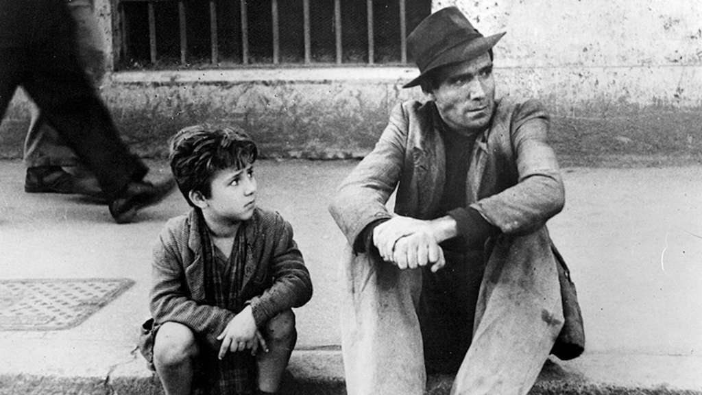
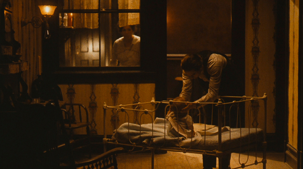
Willis’s inspiration stemmed from various sources, including classical cinema, Italian neorealism, and fine art. In The Godfather Part II, we see his affinity for minimalist, painterly compositions, particularly evident in the flashbacks to Vito Corleone’s rise. These scenes are bathed in warm, orange-golden tones, contrasting sharply with the cold blues and grays of Michael Corleone’s timeline. This deliberate contrast is a visual representation of the familial warmth that once was and the chilling loneliness that Michael inherits.
Inspired by Caravaggio’s use of chiaroscuro, Willis brought depth and symbolism to his frames. His lighting techniques, combined with a restrained use of minimal light sources, lend a painterly quality that feels timeless. By underexposing shots, Willis not only intensified the weight of Michael’s moral decline but also grounded the film in a realism that transcends its setting.
Camera Movements: The Power of Restraint

In The Godfather Part II, Willis’s use of camera movement is marked by restraint, an approach that lets the story unfold with a heavy, almost inevitable sense of fate. Unlike Scorsese’s kinetic style in Goodfellas, Willis’s camera moves only when necessary, heightening the gravity of each scene. In moments of decision and introspection, the camera closes in on Michael, capturing his growing emotional isolation without ever feeling intrusive.
One of the most effective uses of movement comes during conversations, particularly when Michael assumes a position of power. The slow zoom-in technique on his face draws the viewer into his internal conflict, subtly suggesting that as he gains control over his world, he also loses his humanity. The camera’s stillness reinforces Michael’s quiet menace, creating a tension that pulses with his transformation into a colder, more ruthless figure.
Composition: Reflecting Relationships and Isolation

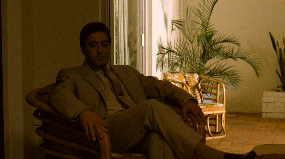
Willis’s compositions in The Godfather Part II are nothing short of masterful. He frames characters in ways that reveal their inner struggles and shifting power dynamics. A perfect example is the scene where Michael decides to kill Sollozzo and McCluskey in the first film—his place in the background, almost hidden, shifts as he assumes control. In The Godfather Part II, Willis expands on this technique, often positioning Michael alone in vast, empty spaces, or against enclosing walls that echo his psychological isolation.
Characters often enter the frame in relation to Michael, reflecting their loyalty, defiance, or fear. This composition style, with its use of negative space and symmetry, enhances the cold precision of Michael’s decisions. Willis’s frames are meticulously structured, turning each scene into a portrait of the Corleone family’s struggles with power and betrayal.
Lighting Style: Darkness as a Character

The lighting in The Godfather Part II is Willis at his finest, using shadows as much as light to craft a mood that feels both haunting and intimate. His top lighting on Michael often casts shadows over his eyes, obscuring expressions and creating an enigmatic, intimidating presence. The light and shadow play reflects not only the film’s aesthetic but also its thematic layers—darkness surrounds each character, as if it were an omnipresent force.
Willis’s experience with lighting grew from his work on the first film, where he sometimes struggled with scenes being too dark. In Part II, he found a balance that allowed shadows to suggest deceit and danger without sacrificing clarity. This approach to light transformed each scene into a painting, with characters partially illuminated, emerging from shadows to reveal just enough of their complexities. Willis’s preference for ambient light in intimate scenes shows the Corleone family’s warmth, however strained it may be.
Lensing and Blocking: Power and Isolation in Focus

In The Godfather Part II, Willis’s lensing and blocking choices enhance the film’s themes of power and isolation. Using lenses that allowed a shallow depth of field, he created intimate yet distant moments, surrounded by shadows. In scenes with Michael and Fredo, for instance, the blocking places them physically apart, underscoring their emotional rift. The lighting in these scenes adds a melancholic tone, reinforcing the sense of betrayal and estrangement.
Blocking is particularly powerful here; characters’ positions reveal their loyalties and tensions. Willis’s longer lenses compress scenes, creating a claustrophobic effect that mirrors the secrecy and betrayal surrounding Michael. This approach makes every scene feel like a strategic play, where shadows and distance speak volumes about each character’s motives and emotions.
Color: A Tale of Two Timelines

The Godfather Part II
Mitchell BNCR • Bausch and Lomb Super Baltar • 1.78 Aspect Ratio
| Genre | Crime, Drama, Mafia, Gangster, Science-Fiction |
| Director | Francis Ford Coppola |
| Cinematographer | Gordon Willis |
| Production Designer | Dean Tavoularis |
| Costume Designer | George Newman, Marilyn Putnam, Nancy McArdle |
| Editor | Barry Malkin, Richard Marks, Peter Zinner |
| Time Period | 1950s |
| Color | Warm, Desaturated |
| Aspect Ratio | 1.78 |
| Format | Film – 35mm |
| Lighting | Hard light, Top light |
| Lighting Type | Daylight, Sunny |
| Story Location | Italy > Sicily |
| Filming Location | Italy > Sicily |
| Camera | Mitchell BNCR |
| Lens | Bausch and Lomb – Super Baltar, Kowa Cine Prominar |
The color of The Godfather Part II is essential to its storytelling. Willis and Coppola used a warm, nostalgic palette for Vito’s flashbacks, contrasting with the cold, desaturated hues of Michael’s present. The orange-golden tones in Vito’s timeline symbolize hope and family unity, while the steel-gray of Michael’s era reflects his moral decay and emotional detachment.
The color choices go beyond aesthetics, communicating the Corleone family’s transformation over generations. The warmth of Vito’s scenes invites viewers to feel the aspiration and unity that once defined the family, while Michael’s cold palette shows the price of power and control. As a colorist, I find this approach deeply inspiring. Willis’s grading choices create an unspoken dialogue between past and present, underscoring the thematic contrasts that define The Godfather Part II.
Conclusion: A Cinematic Masterpiece in Darkness and Light
The Godfather Part II is an unparalleled achievement in visual storytelling, largely due to Gordon Willis’s visionary cinematography. Through intentional compositions, restrained camera movements, selective lighting, and nuanced color, Willis transformed each frame into a canvas that reflects the Corleone family’s tragic descent. For me, as a colorist, this film is a source of endless inspiration, showcasing how cinematography can transcend dialogue and invite viewers to feel the emotional weight behind every decision.
In The Godfather Part II, we don’t just see the characters—we feel their struggles and conflicts. Willis’s choices communicate a narrative as complex as the dialogue itself, proving that cinematography can elevate a film’s story to an art form.
- Also Read: CINEMATOGRAPHY ANALYSIS OF CASABLANCA (IN- DEPTH)
- Also Read: CINEMATOGRAPHY ANALYSIS OF TOKYO STORY (IN-DEPTH)
Browse Our Cinematography Analysis Glossary
Explore directors, cinematographers, cameras, lenses, lighting styles, genres, and the visual techniques that shape iconic films.
Explore Glossary →