As a colorist and filmmaker, I’ve always been drawn to the transformative power of visuals, and there are few films that capture this better than The Godfather , directed by Francis Ford Coppola. My journey from engineering to color grading has instilled in me a deep respect for the art and technique of cinematography. In my work at my color grading suite, I have the privilege of studying and experimenting with visuals that tell stories as richly as words. This analysis of The Godfather reflects my personal insights into the iconic work of cinematographer Gordon Willis, whose shadow-laden style and meticulous composition elevate the film to timeless artistry.
Cinematography Analysis Of The Godfather
About the Cinematographer
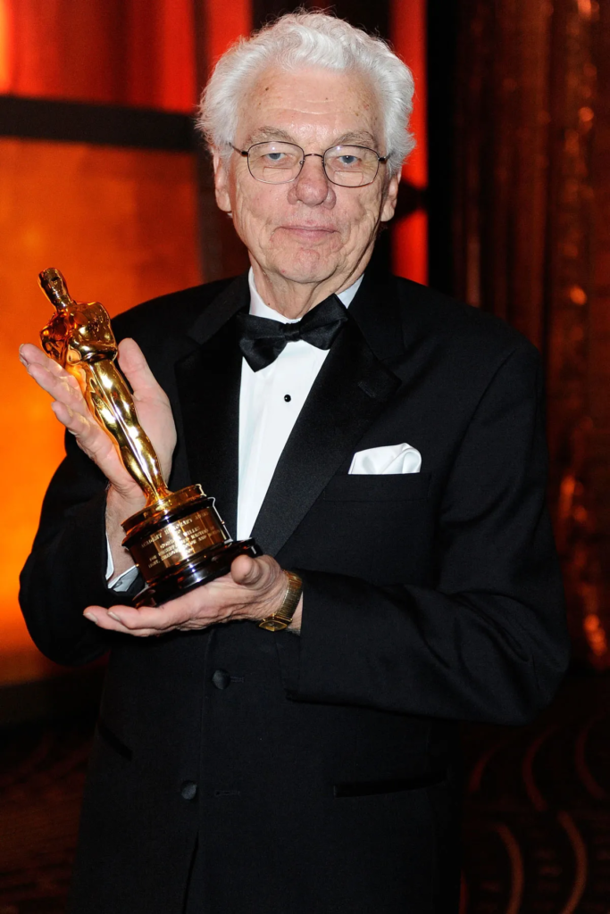
Gordon Willis, aptly dubbed the “Prince of Darkness,” brought an unprecedented approach to The Godfather‘s visual language. Willis’s style is unmistakable—he used shadows and darkness not just as a backdrop, but as a fundamental narrative element. Unlike other films of the era that often prioritized clear, bright images, Willis’s cinematography embraces darkness to create a sense of moral ambiguity, which perfectly complements the story of the Corleone family. His visual approach, inspired by the chiaroscuro of classical painters like Rembrandt and Caravaggio, adds layers of meaning to each frame, making the film not just a story of crime and family, but also a journey into the depths of human nature.
Inspiration for the Cinematography of The Godfather
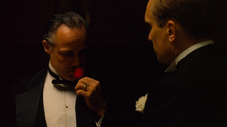
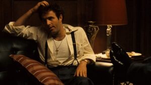
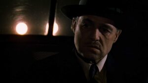
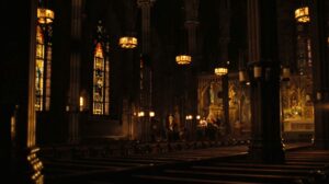
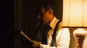
The visual language of The Godfather is grounded in classic art, particularly the tenebrist style championed by Caravaggio. Willis’s use of contrast, where light emerges from deep shadow, mirrors the moral complexities faced by each character, especially Michael Corleone. This chiaroscuro effect allowed the film to transcend traditional cinematic lighting, inviting viewers into a morally ambiguous world. Willis’s vision bridged old-world art with modern color cinematography, allowing the film to communicate visually the weight and struggles of the Corleone family’s existence. To me, this effect is masterful, turning each frame into a canvas that invites the viewer to interpret hidden motives and explore unspoken tensions.
Camera Movements Used in The Godfather
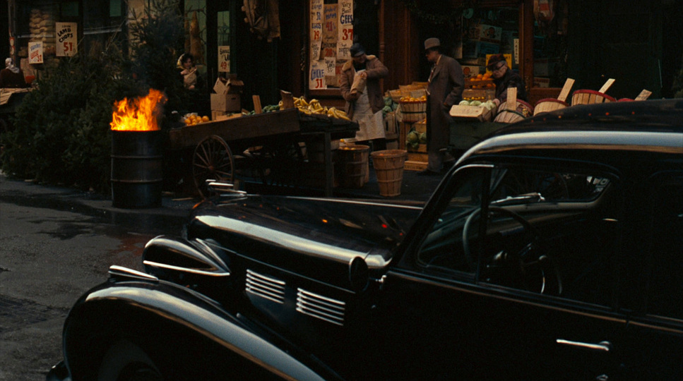
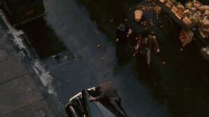
One of the most remarkable choices Willis made was his restrained use of camera movement. The majority of scenes feature static shots, with the camera often locked off and observing characters from a fixed perspective. This lack of movement immerses viewers in the Corleone family’s world without directing their attention; instead, the audience becomes a passive observer, as if watching events unfold in real time. In a world where camera movement is often employed to create excitement, The Godfather takes a different route. The choice to restrict motion enhances the gravity of each scene. Notable exceptions, such as the zoom in the opening scene and the overhead shot during Vito Corleone’s assassination attempt, are precisely timed to heighten tension, pulling the audience deeper into pivotal moments.
Compositions in The Godfather
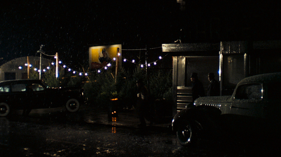
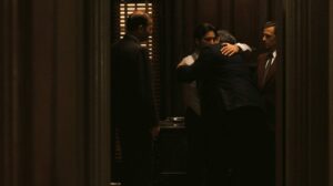
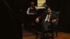
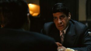
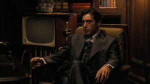
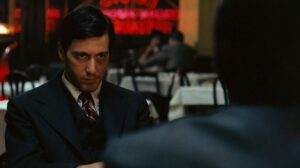
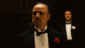
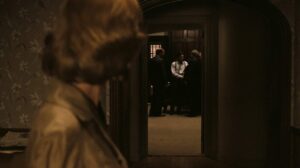
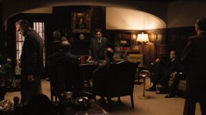
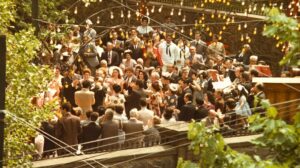
Willis’s compositions are a testament to the power of framing and symmetry. Each shot seems carefully sculpted, positioning characters within the frame to reflect their relationships and power dynamics. The opening scene, which starts with a close-up of a minor character and zooms out slowly, is a great example. This methodical pace is crucial in establishing the film’s introspective tone and gives a sense of entering an intimate, shadowy world. For example, Michael’s rise to power is symbolized through shots where he often appears isolated or dominates the frame, foreshadowing his eventual transformation into a ruthless godfather. Willis’s compositions use depth to layer relationships and allegiances, making the background just as narratively significant as the foreground—a feature that makes this film endlessly rewarding to revisit.
Lighting Style of The Godfather

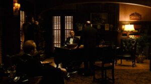
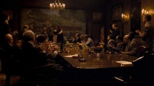
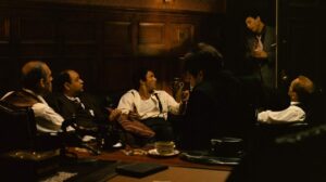
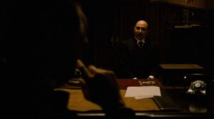
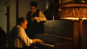
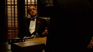
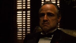
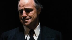
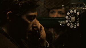
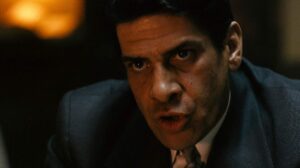
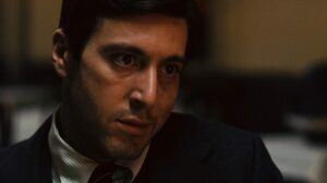
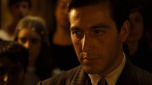
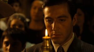
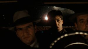
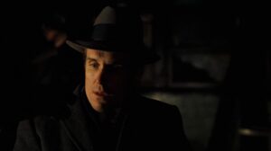
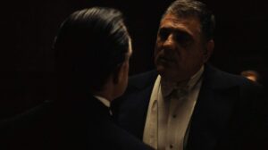
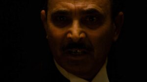
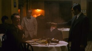
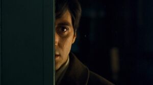
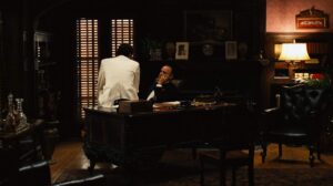
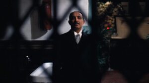
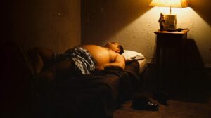
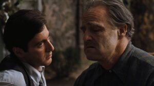
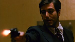
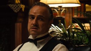
Lighting in The Godfather is arguably its most iconic aspect. Willis abandoned Hollywood’s preference for bright, uniform lighting, opting instead for a world dominated by shadows. His use of overhead lighting cast ominous shadows across characters’ faces, often leaving half of a face obscured. This technique resonates on a symbolic level, representing the hidden agendas and moral complexities each character harbors. Rather than merely illuminating the frame, Willis’s lighting tells a story. When I see Vito Corleone’s darkened eyes or Michael’s gradual drift into shadow, I feel the film drawing me into its murky depths. The shadows become almost tangible, shaping the tone of the narrative and allowing viewers to feel the characters’ concealed motives.
Lensing and Blocking of The Godfather

Willis’s approach to lensing and blocking is masterfully subtle, underscoring the nuances within the Corleone family’s relationships. He favored longer focal lengths to create intimacy and tension, compressing space to heighten the emotional stakes of each scene. Blocking, the deliberate placement of characters within the frame, further reveals the psychological landscapes of each character. In scenes where Michael interacts with his family, the positioning of each character reflects their relationships and power dynamics. One of my favorite instances is when Michael stands over Fredo, a visual representation of their strained relationship. This minimalistic approach allows the characters’ expressions and body language to speak volumes, transforming each scene into a carefully constructed portrait of tension and authority.
Color of The Godfather
| Genre | Crime, Drama, Mafia |
| Director | Francis Ford Coppola |
| Cinematographer | Gordon Willis |
| Production Designer | Dean Tavoularis |
| Costume Designer | Anna Hill Johnstone, Marilyn Putnam |
| Editor | William Reynolds, Peter Zinner |
| Time Period | 1950s |
| Color | Warm, Desaturated |
| Aspect Ratio | 1.78 – Spherical |
| Format | Film – 35mm |
| Lighting | High contrast, Top light |
| Lighting Type | Artificial light, Tungsten |
| Story Location | New York > New York City |

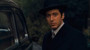
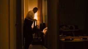
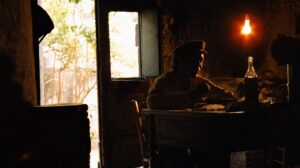
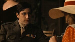
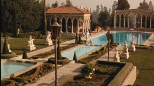
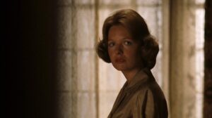
The color palette of The Godfather is another element that contributes to its immersive atmosphere. Willis employed a muted, desaturated color that leans toward sepia tones, creating a sense of timelessness. The rich earth tones in the film’s New York scenes contrast with the bright, warm hues in Sicily, symbolizing Michael’s brief escape from his family’s dark influence. Even Kay, Michael’s wife, is initially presented with a softer, lighter color to signify her innocence. As Michael’s transformation intensifies, however, the color grading around her character darkens, marking her inevitable entanglement in the Corleone’s shadowed world. This sophisticated use of color enhances the emotional depth of the narrative, reinforcing the film’s somber, brooding atmosphere.
In my experience, the choice of color palette can define the tone and era of a film, and The Godfather exemplifies this. By favoring warm, desaturated tones that mirror the traditional aesthetic of an old photograph, Willis achieves a sense of nostalgia that feels authentic yet cinematic. The film’s color treatment effectively binds together the world of the Corleones, creating a cohesive look that has influenced countless films since.
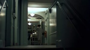
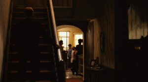
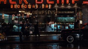
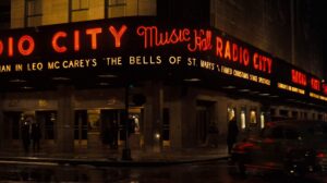
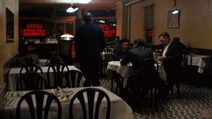
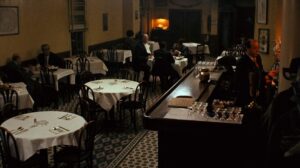
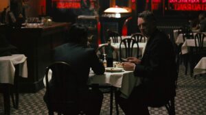
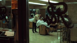
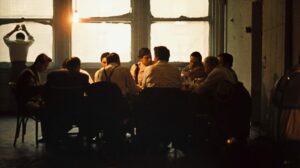
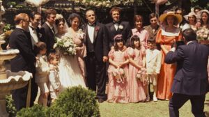
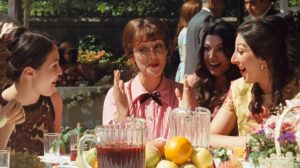
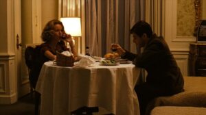
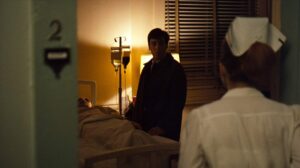
The Godfather Film Stills
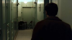
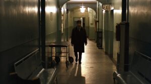
A curated reference archive of cinematography stills from The Godfather. Study the lighting, color grading, and composition.











Final Thoughts
As a filmmaker and colorist, I view The Godfather as the pinnacle of cinematographic achievement. Every element—lighting, composition, camera movement, color grading—serves a narrative purpose. Willis’s work on this film teaches us that cinematography is not just about creating a visually stunning image, but about crafting a visual language that resonates with the themes and emotions of the story.
Willis and Coppola’s collaboration on The Godfather demonstrates that great cinematography doesn’t merely support the narrative—it is the narrative. This film transcends time, and its visual style remains relevant because it speaks to universal themes of power, morality, and the human condition. Studying The Godfather has been an invaluable experience for me, providing insights that I carry into my own work, inspiring me to embrace shadows, restraint, and subtlety as powerful storytelling tools.
- Also Read: CINEMATOGRAPHY ANALYSIS OF RASHOMON (IN DEPTH)
- Also Read: CINEMATOGRAPHY ANALYSIS OF CITIZEN KANE (IN DEPTH)
Browse Our Cinematography Analysis Glossary
Explore directors, cinematographers, cameras, lenses, lighting styles, genres, and the visual techniques that shape iconic films.
Explore Glossary →